The project of the school building is a truly high-profile one, its ideas are indeed progressive: modern educational methods, no screening based on the applicants’ abilities – everyone who will be the first to submit the application will be taken in – and 15% of adopted children, including the ones with special needs, whose families [large families of so-called “professional parents – editor’s note] will live in a settlement constructed next to the school building: “for the first time in Russia, the school program will contain elements of inclusion and social adaptation”. In short, “Point of the Future” must give the best to the unluckiest ones: modern education, based on individual approach and high level of adaptability, to the orphans of one of the problem regions of the Russian Federation.
The idea of a progressive school that would host orphaned children was proposed back in 2011 by the TV anchor Tina Kandelaki; she also became the initiator of this project, whose development in specifically the city of Irkutsk has to do with the social situation in this region. In 2017, there were more orphans in the Irkutsk region than in other regions of the Russian Federation, now the statistics are improving, but not very quickly. The project was “announced” in 2013; at the same time the development of the program began. According to Tina Kandelaki, “For Russia, this project is like designing Google headquarters for the US.”
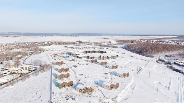
It is expected that the instruction in “Point of the Future” will be free; even the families living on the campus will not have to pay the rent – just the utility bills. The whole thing operates without any federal funding because the school is a 100% private charity project: both construction and support of subsequent operations are privately sponsored by the “Novy Dom” (“New Home”) foundation, founded by the native of the Irkutsk region, Albert Avdolyan. The building construction already cost 6 billion rubles. The first academic year in “Point of the Future” began September 1, 2020, the applications having been collected back in April. The school supports a full instruction cycle from the junior school up to senior high, and, with all of its progressive methods, fully complied with all the appropriate standards of the Russian Federation, both educational and construction-wise. It is expected that in three years, by 2023, the overall number of students will be increased up to 1022 people, about 150 of them being adopted children. The houses will be hosting 20 families.
“Point of the Future” educational complex
Copyright: Photograph« »Point of the Future"
The educational program, just like the program of teacher training, was developed by the center of educational program development “Umnaya Shkola” (“Smart School”); the head of the center, Mark Satran, also took part in preparing the brief for the architectural competition, which he created in collaboration with KB Strelka.
Mark Sartan, the head of the center for developing educational systems “Smart School”
When developing this architectural project, we set for ourselves the task of making the building itself an educational tool. For our colleagues from the Danish architectural company CEBRA, it was an inspiring challenge. In the course of joint workshops, they instantly responded to queries, together with us they worked out daily educational scenarios in the designed space and accordingly adjusted their engineering and planning solutions.
The most challenging thing was to fit our architectural and educational ideas into the Procrustean bed of Russian norms. In the extremely regulated kindergarten, in order to meet external requirements, individual group cells had to be fenced off and connected by corridors, which contradicts all modern trends. In the other buildings, we were able to preserve multiple links and create public spaces saturated with educational functions, adjusting them in accordance with the required standards.
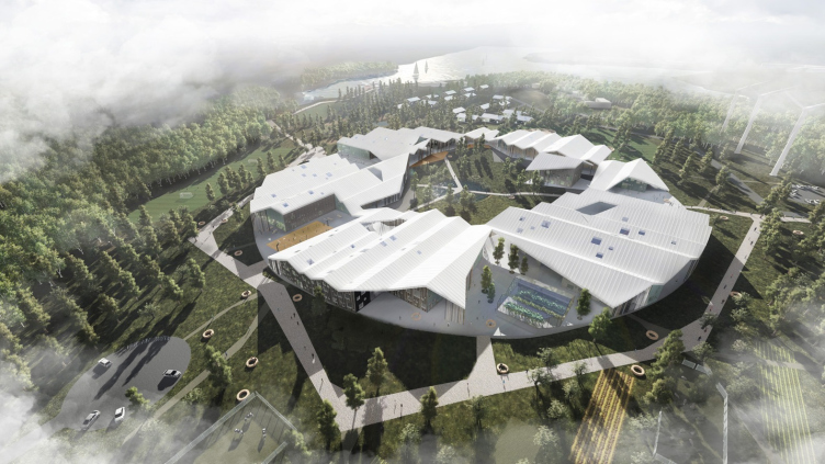
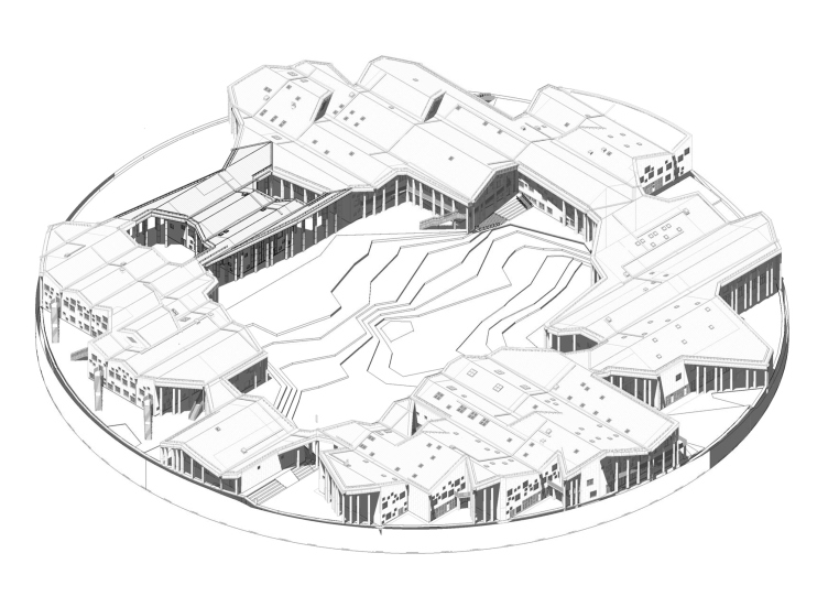
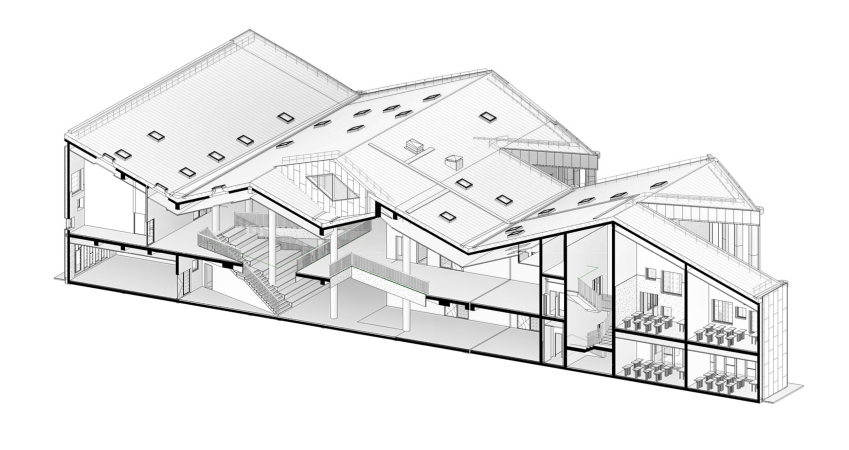
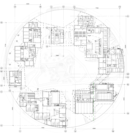
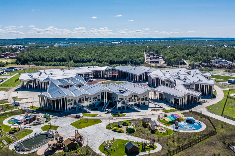
The building was supposed to embody the idea of unity, fundamental for a charity project, to help the child make choices, inspire him to act, reflect his growing up, teach him to responsibly manage space and his education. The architects proposed a circle of separate buildings under a unifying roof, where the child, as he grows up, moves from one building to another, and the daily route can be chosen from many options. The result is a complete reflection of the educational idea in the architectural and spatial solutions.
The Danish architectural company CEBRA, which headed the victorious consortium, specializes, among other things, on modern school buildings, which match new educational concepts, or even, as the Danes put it, “on creating spaces that can be education in themselves”.
“Point of the Future” educational complex
Copyright: Photograph« »Point of the Future"
The proposed concept, according to the architects’ description, was not subjected either to any specific set educational program, or much less to any specific educational paradigm – rather, it was about “following the educational vibes as such”. The main idea is flexibility and diversity; what’s remarkable is the fact that some kind of “gravitational attraction” between different functions arises, just like “between stars in a galaxy”, which is highly conducive to growth and development.
All of this is accurately described in a video presentation of the project on the Cebra website:
Carsten Primdahl, the co-founding partner of CEBRA and the head of the competition-winning consortium
The competition program was all about finding a new type of school based on the knowledge and logic of modern research in the field of teaching science.
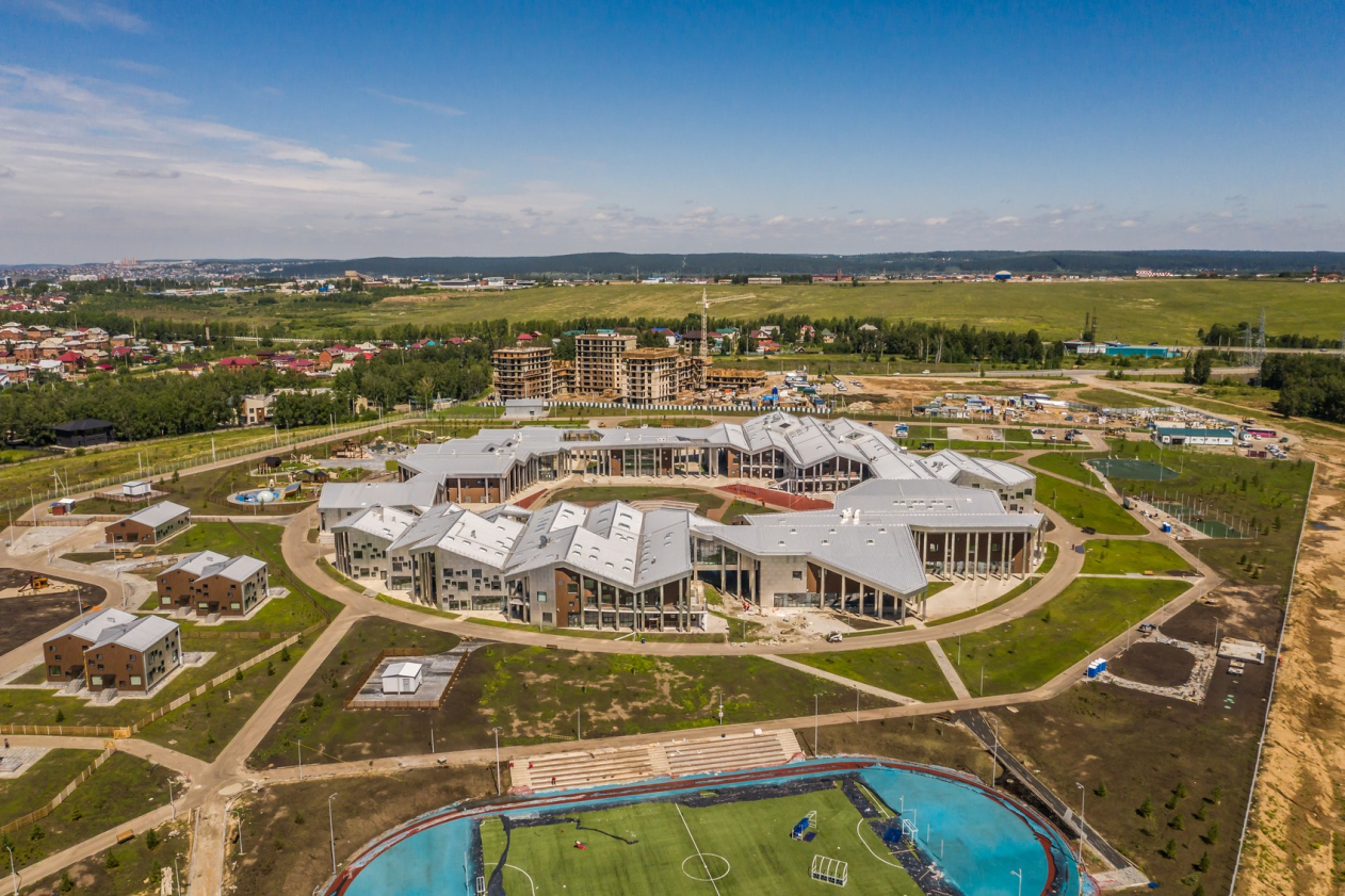
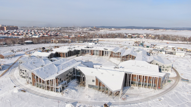
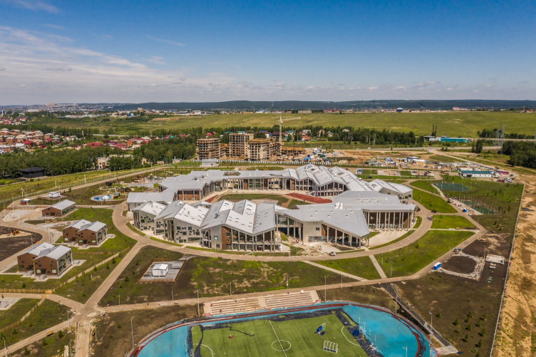
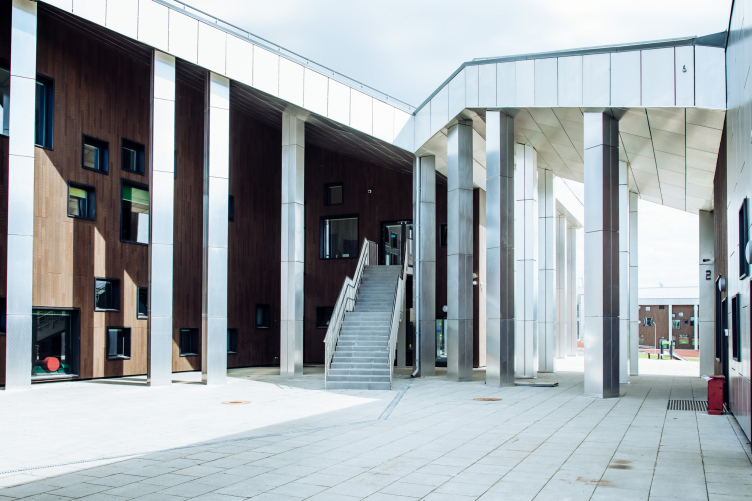
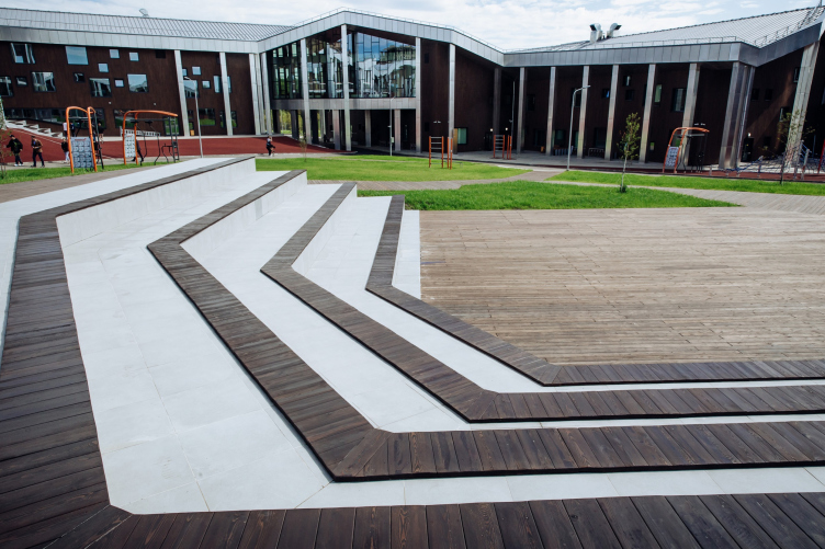
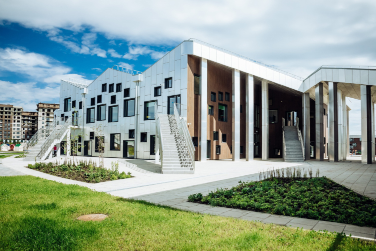
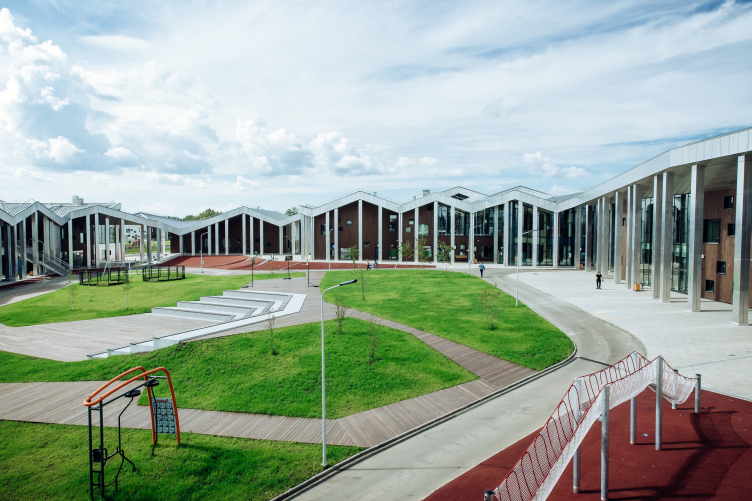
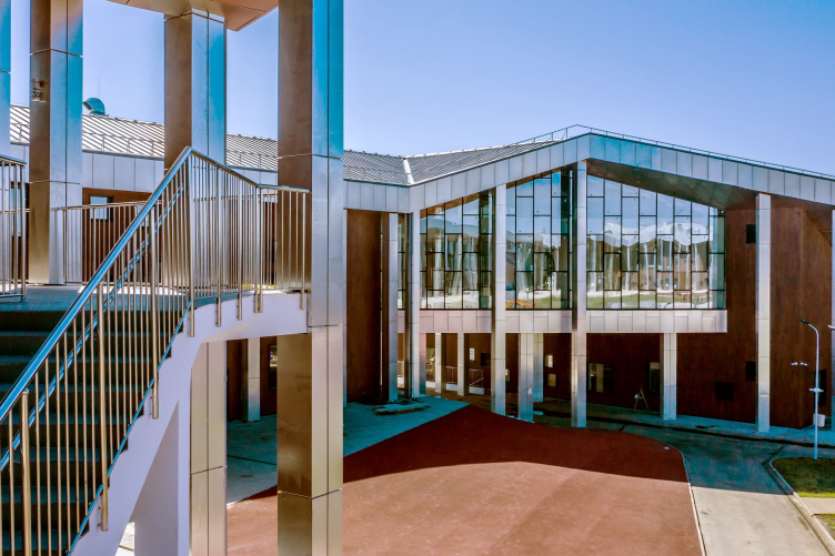
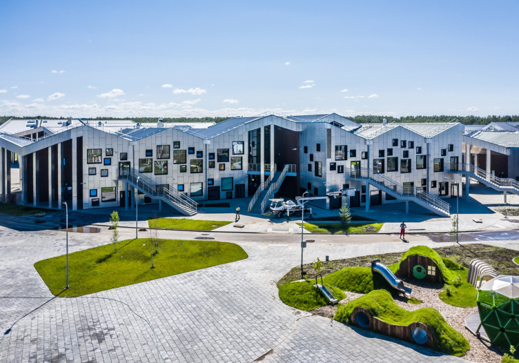
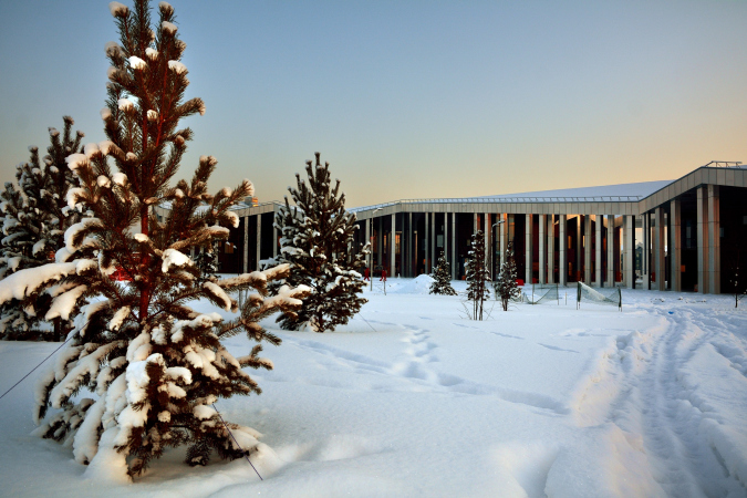
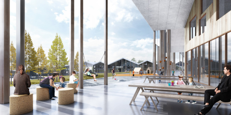
We achieved that by creating recognizable architecture with a strong identity. Several volumes with gable roofs are grouped into a ring cut from the outside like a circle: as if several individual buildings were connected by a common roof. Large outlets of eaves, protecting from sun and rain, will allow people to use the external space at different times of the year. In addition, the educational program of the classrooms, according to our plan, should be continued in the space of the center of the ring, in the green courtyard/patio: it should become active, lively and busy. Quiet contemplative classrooms set off the activity of the center; on the other hand, they are grouped along the outer contour, taking advantage of the beauty of the surrounding landscape.
We see architecture as a learning tool in itself; it can stimulate our ability to learn. I recommend checking out WISE, an e-book by CEBRA’s research department, and our sensor-based smart school design technology called Common Sense.
“Point of the Future” educational complex
Copyright: Photograph« »Point of the Future"
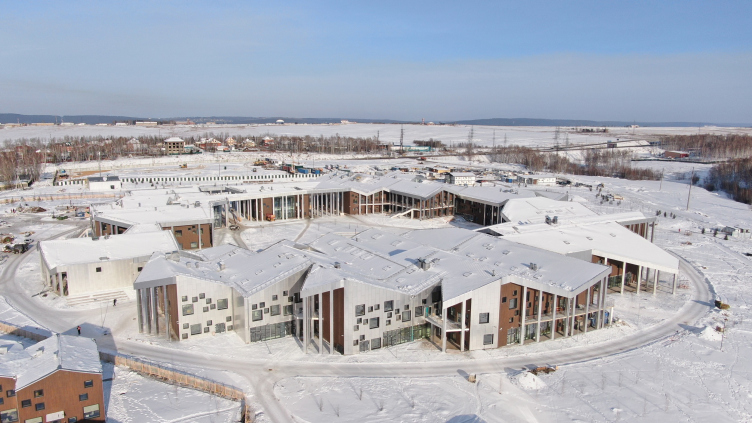
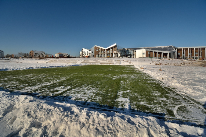
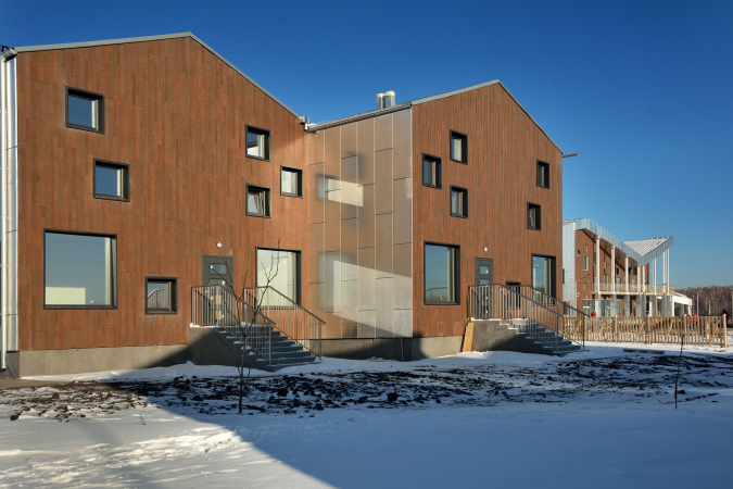
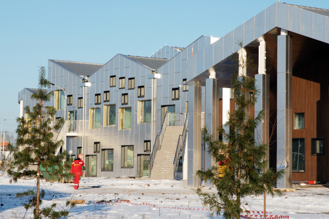
Recapping the words of CEBRA’s Carsten Primdahl, one could say that the school develops from the inside out, accumulating the energy of learning, and spilling the children’s vigor over to the yard in search for the catalyst for the educational process, mesmerized by the beauty of the surrounding landscape. The surroundings are indeed beautiful: the land site is situated next to the south border of the city and the Cherguteevsky Bay, behind the airport and the Solnechny District, which is considered to be the most prestigious in town, yet, unlike Solnechny, this place, located a little bit more to the south, is ruled not by five-story buildings, but by villa communities. Therefore, the school is mostly surrounded by stone houses with pitched roofs that echo the zigzagging silhouette of the school, both fitting in nicely with each other.
“Point of the Future” educational complex
Copyright: Photograph« »Point of the Future"
“Point of the Future” educational complex
Copyright: Photograph« »Point of the Future"
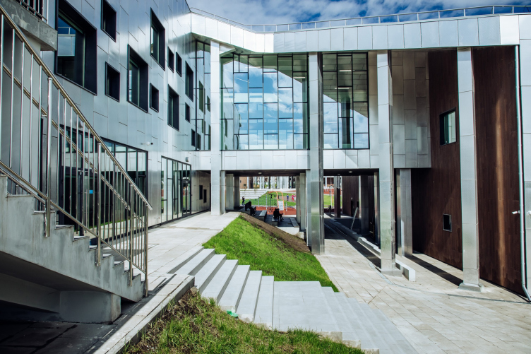
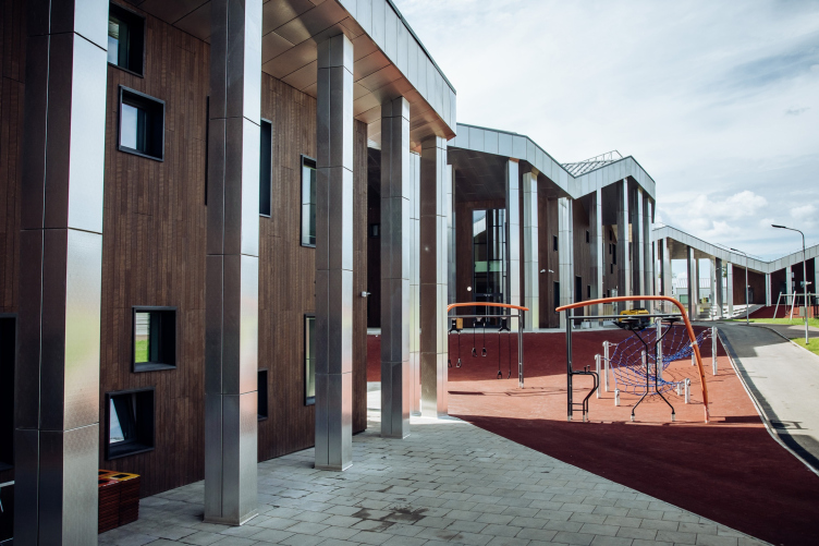
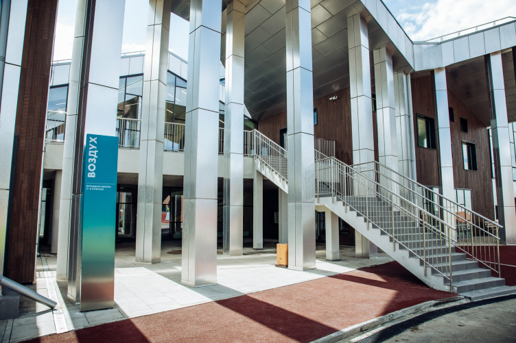
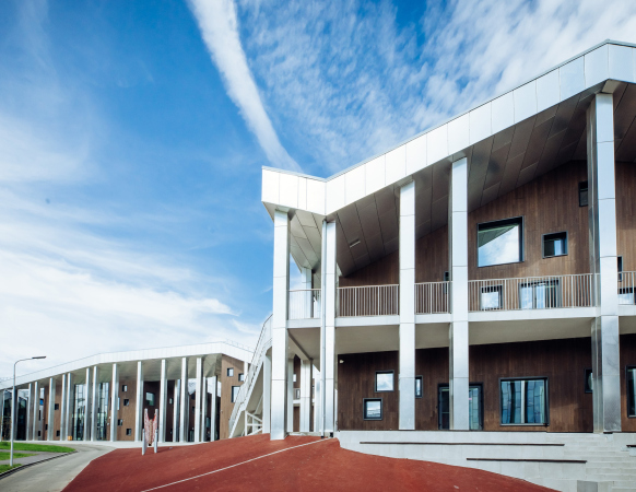
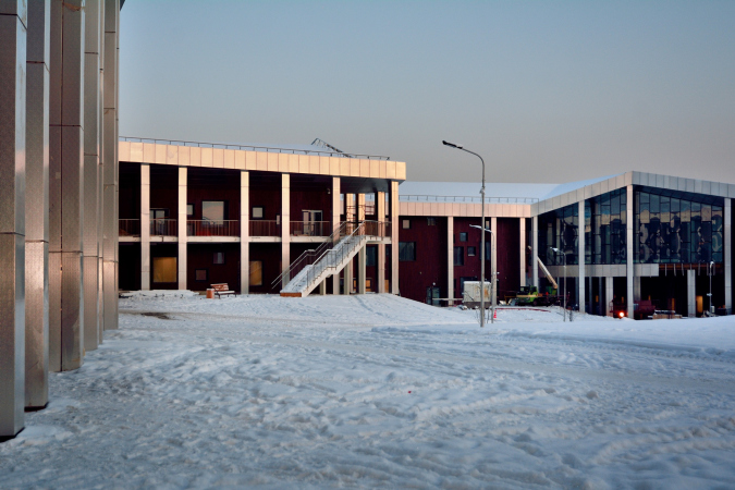
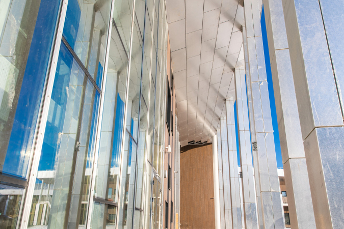
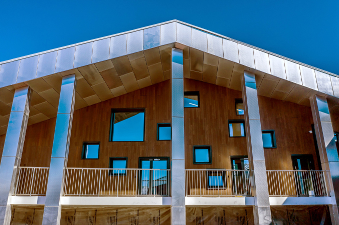
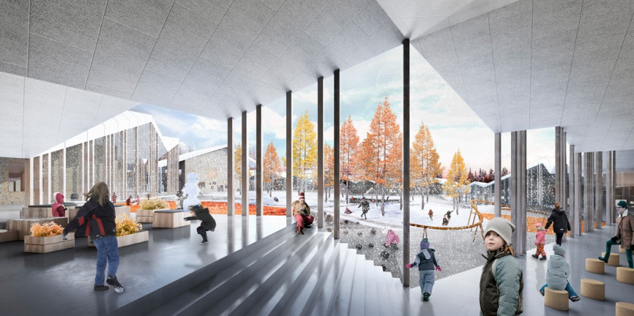
The eaves, mentioned by Primdahl, are supported by slender columns – essentially, these are porticos that perform two tasks: protecting the windows from direct sunlight, canceling the need for extra blinds and curtains, and developing as much as possible activity in this space, intermediate between the school and the landscape, protected from the rain, yet open to fresh air. Most of us know how important a schoolyard is, even as a part of a standardized project – things we learned there back in the day! And here yet another transitional link appears, which, in addition, resonates with the history of classical education, because let’s remember how the great philosophers of antiquity taught their disciples! Walking in fresh air in the shadow of a portico!
“Point of the Future” educational complex
Copyright: Photograph« »Point of the Future"
“Point of the Future” educational complex
Copyright: Photograph« »Point of the Future"
“Point of the Future” educational complex
Copyright: Photograph« »Point of the Future"
“Point of the Future” educational complex
Copyright: Photograph« »Point of the Future"
“Point of the Future” educational complex
Copyright: Photograph« »Point of the Future"
“Point of the Future” educational complex
Copyright: Photograph« »Point of the Future"
“Point of the Future” educational complex
Copyright: Photograph« »Point of the Future"
The spaces underneath the columns are quite numerous, located along the inner and outer contours, which makes the school look like an antique town gathered in a ring – or like a European college, built around a yard with galleries (at this point, not so much Aristotle as Harry Potter come to mind). Incidentally, unlike the Skolkovo Institute, designed by Herzog & de Meuron, where the chessboard alternation of rectangular volumes and similar yards is enclosed in a pristine circular border, here all of the contours are designed deliberately asymmetric, leaving a lot of “room to breathe” and accentuating the likeness to a mini-city. When I asked the CEBRA architects about the similarity between their project and Herzog & de Meuron’s, they answered that the projects by the Swiss “star” architects are worthy of admiration, yet the CEBRA concept rests upon the company’s own research, which began in its works of 2006-2008, and in addition, all the similarity comes down to the circular plan and the gable roofs, the two projects being totally different otherwise.
The project is of colossal complexity and scale, unprecedented for Russia. Compared to Moscow, this is a school of the level of Moscow’s Khoroshkola and Letovo, but “Point of the Future” is still larger and is located very far from the nation’s capital, in the remote city of Irkutsk. Therefore, I think it was a very lucky thing that our colleagues from the Danish CEBRA, an architectural company with experience in this area, developing new trends in the field of education, were involved in this project – their portfolio already included implemented projects of modern schools. We often called each other, discussing the concept; the main idea belongs to the Danes, but I must say that we also managed to add something. This work was mutually beneficial; it provided us with useful experience in the area of designing school buildings.
The image of the building is based on two major themes: since an important starting point of the project was to create a place in which orphaned children would be comfortable learning, the circle is a kind of wall that should create an effect of being securely protected – it is very important for these children to feel safe. The second idea is a house, hence the contour of the pitched roofs; it is important for children to perceive school as a second home.
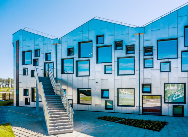
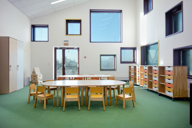
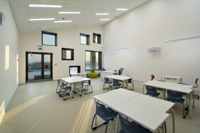
The spatial concept is based on two key features of the new model of education: it should instill in people responsibility, primarily for themselves, independence, and, most importantly, the ability to educate themselves. A person learns throughout his entire life, in modern society this is more and more relevant, all the time you have to master something new, more and more cross-platform knowledge is required. Multifunctional and flexible are the two key words of the modern world, and we have incorporated them into the curriculum of this modern school. We even have different windows, somewhere small, somewhere large. Children are immediately taught to live, work, study, and interact in complex spaces. A significant part of the training does not take place according to the traditional model “teacher at the blackboard and children at their desks”, but differently, for example, in a playful way; children learn and teach each other, even during the recesses.
We highly value this project, and have put in a lot of effort to ensure that, in the course of further development and forced streamlining of the budget, we take care of both the educational concept underlying it, and the ideas proposed by our Danish colleagues.
“Point of the Future” educational complex
Copyright: Photograph« »Point of the Future"
“Point of the Future” educational complex
Copyright: Photograph« »Point of the Future"
“Point of the Future” educational complex
“Point of the Future” educational complex
Revising the concept, created by by joint efforts of CEBRA and UNK project, was first of all due to the financial crisis: the ruble’s rate fell, and the architects had to streamline the costs by about 20%, the main difficulty being that you could not just go ahead and sacrifice this or that part; you had to streamline the budget in a smart way, keeping up every essential component. At some places the architects had to replace the building materials. Particular attention was paid to the “snow pockets” in the hollows of the gable roofs. UNK project supervised the entire project from the design stage down to the last interior detail, taking on the function of the general contractor.
“All of these things were far from easy – Julius Borisov shares – In addition to the need for streamlining the budget, we still had to observe all the construction regulations, including making the school complex earthquake-resistant up to 8 points. The school had to be super-safe. That’s when our experience came in very handy, as well as the fact that we have all sorts of different divisions in our company, from engineering to interior design.”
“Generally, our Russian colleagues were completely loyal to the original project – Carsten Primdahl says – Possibly, if you compare the end result to the competition concept, there are some project solutions and some aesthetic subtleties that CEBRA would have realized in a different way. However, I consider the overall result to be a success; upon closer inspection I would say that the columns, the skylights, the colors and textures, as well as the building materials that were eventually used, may raise a few questions. I can see that the program of spatial organization supports the principles of education, based on students’ activity, but it is difficult for me to evaluate the program on a more detailed level because I am not that closely familiar with the end project and the ideas that ultimately constituted its basis.
“Point of the Future” educational complex
Copyright: Photograph« »Point of the Future"
One of the problems was that we essentially had to combine two types of schools – a new-type school and a traditional one, subjected to outdated regulations; we had to observe the code that by default meant inefficient use of space. I believe that these standards require revision and updating, this would make the construction more economical and would reduce the running costs of maintaining the building, and, consequently, gain more funds for the training itself” – the architect emphasizes.
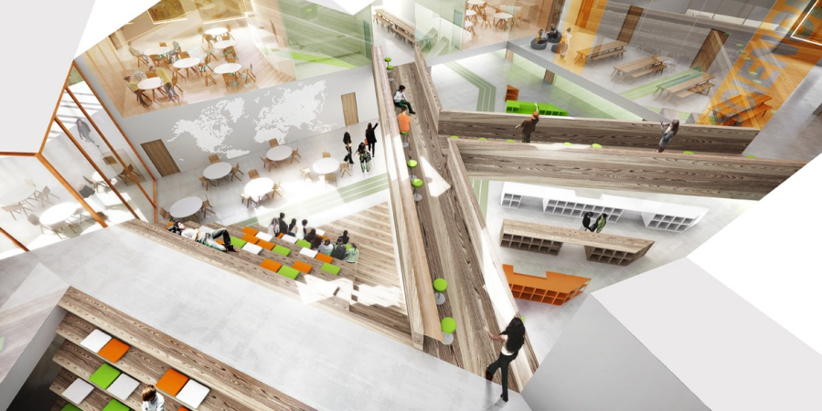
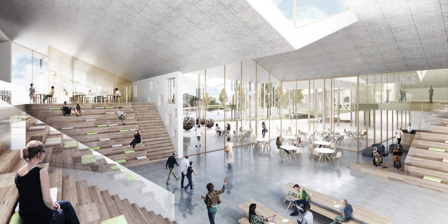
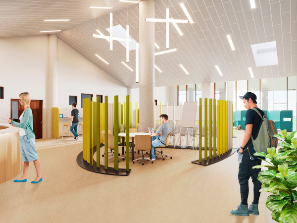
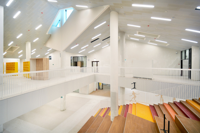
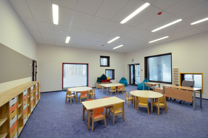
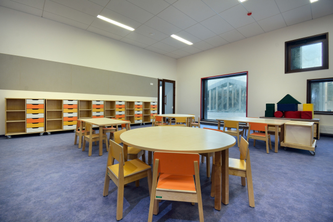
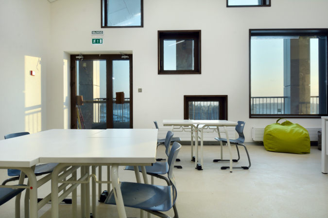
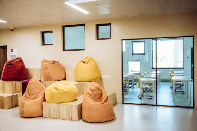
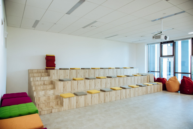
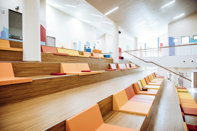
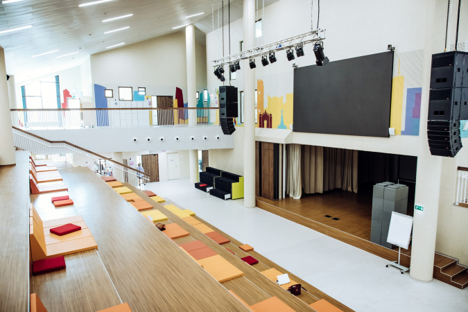
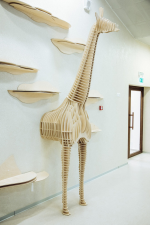
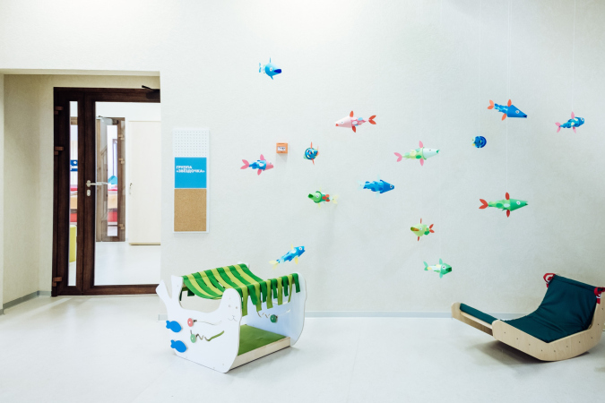
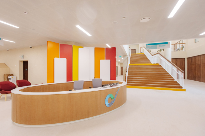
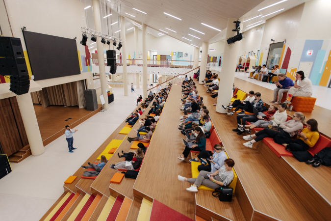
The interiors of the school, as was already said, are based on the idea of flexibility and combining different spaces, from traditional classrooms to various halls and atriums with numerous benches, meant to enhance communication and help students to spend more time together. The pristine look and some dryness of the original project, almost completely white and monochrome, was livened up by inclusions of positive light green, orange, rich yellow.
Julia Tryaskina, UNK Project
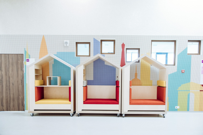
In the CEBRA concept, the interiors were minimalist and even ascetic, built on neutrality and lack of color, which is not typical for Russia. What we added was based on one of the ideas of the school complex – namely, that the interior grows with the child, and the scale and emotional perception. In the baby spaces, we added textures with which they could interact. We gradually increased the scale of the interior according to the child’s age. We also added a bit of color, accents, and murals. But these are just accents, in general we followed the concept, reviving and emphasizing a few things here and there.
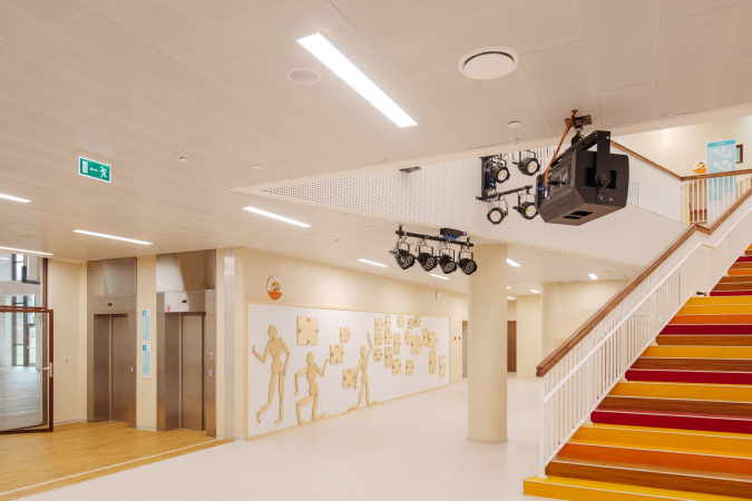
Indeed, these inclusions serve as highlights on the wooden benches of the amphitheater, as well as in the frames of various windows and furniture. The overall tone of the walls is white, which makes the spaces look visually larger; it is further highlighted by linear lights on the ceiling, they also complement the skylights.
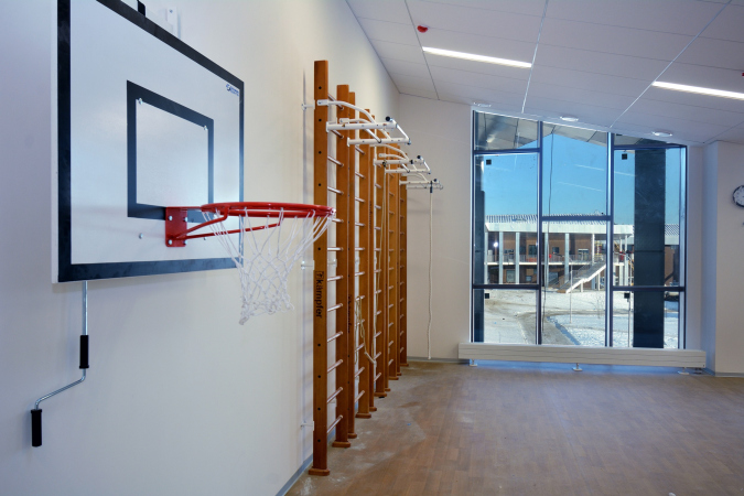
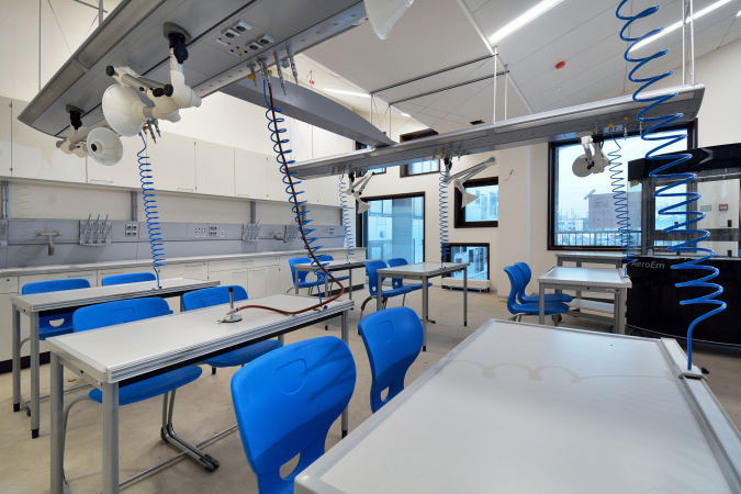
Inside, there is a swimming pool and a gym, as well as fully equipped classrooms.
Irene Belyanova, the President of the charity foundation “New House”
In February, we received permission to put the educational complex into operation. The “Point of the Future” building is essentially not one, but six buildings positioned in a circle and united by one common roof. It is not only modern and comfortable, but also reliable, because we are talking about children here.
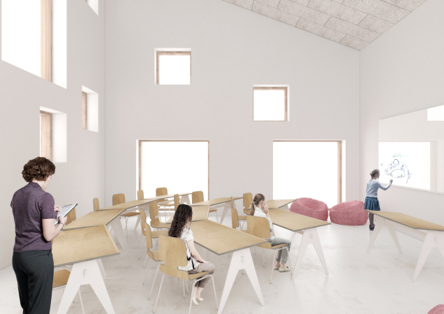
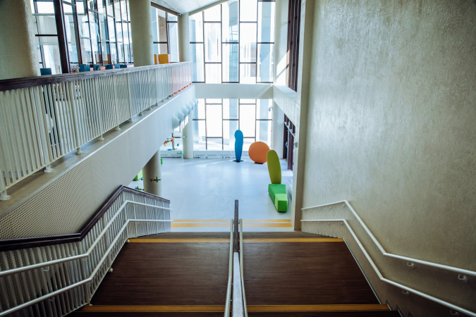
In the kindergarten classrooms, large and small windows are placed at different heights so that light evenly falls into the classrooms at any time of the day. There are practically no corridors in the complex – all large halls, passages, and open spaces. We have everything so that children could better communicate, study, and rest.
The project of a Danish company was taken as a basis, and the Russian specialists adapted it taking into account local specifics. For example, they took into account the high seismic activity of the region and reinforced the bearing structures. In Irkutsk, temperatures are low in winter and high in summer, so the building got extra insulation.
I really wanted the complex to have some local flavor about it. We live in a forest region here. Therefore, wooden benches from the Scandinavian countries were replaced with benches made of Siberian wood. We have been looking for Irkutsk craftsmen for a long time, who would make theme playgrounds for kids. As a result, we got unique gaming complexes that also perform an educational function. A large landscape park has already begun to be laid out around the building. It will consist mainly of native plants.
In a word, the Irkutsk school is a progressive and large-scale educational initiative. It is pointed to the futures with the best practices that are supported by architectural solutions, carefully carried over from the original concept to the final implementation, despite all the difficulties caused by the financial crisis. Another thing that comes to mind is the Tsarskoe Selo Lyceum with all of its history – and it doesn’t matter much that the Lyceum had a corridor – something that the new project is studiously trying to get rid of. Two hundred yards have passed, new methodologies have come around, yet what has remained in changed is the hope that new education will help to raise better people: new children will grow up, and learn how to make a better place. Yes, there is one thing about enlightenment that never changes: there must be hope.

