По-русски

A Journey to the Country of Art Deco

The “Little France” residential complex on the 20th line of the Vasilyevsky Island presents an interesting make-believe dialogue between its architect, Stepan Liphart, the architect of the New Hermitage, masters of the Silver Age, and Soviet Art Deco, about interesting professional topics, such as a house with a courtyard in the historical center of Saint Petersburg, and the balance between the wall and the stained glass in the architectonics of the facade. Here are the results of this make-believe conversation.

03 April 2020
Object
mainImg
Under the wing of Voronikhin

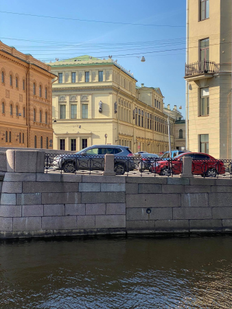
The house is being built on the Vasilyevsky Island, on the block that faces the Lieutenant Schmidt Embankment, and within a dense historical environment, next to the houses of the XIX and the early XX centuries, in the stead of the now-demolished Aluminum Institute that stood here in the Soviet time. The main vis-à-vis of the new house, situated not exactly across from it, but still within the visual range, is the monument of classicism architecture, the Gorny Institute, designed and built by Andrey Voronikhin (1806 – 1811). “Andrey Voronikhin is really my hero, he was head and shoulders above Rossi and Kvarnegi” – Stepan Liphart says, explaining his love for the author of the Kazansky Temple with his ability to create a special “space of beauty” around his works.

A house with a courtyard

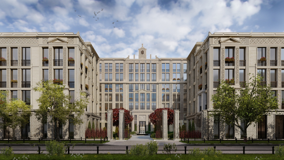
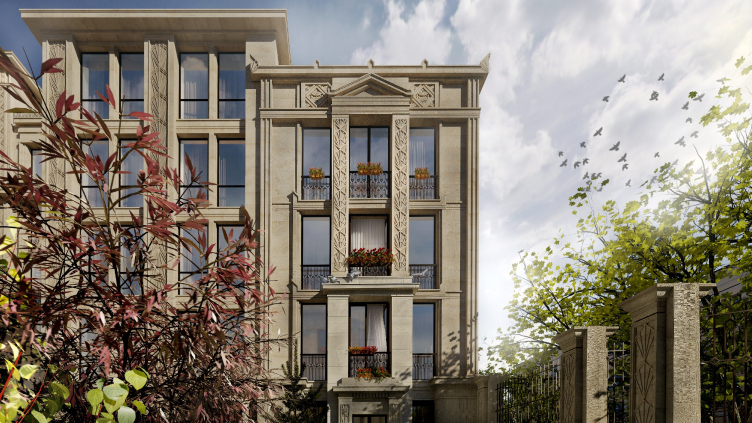
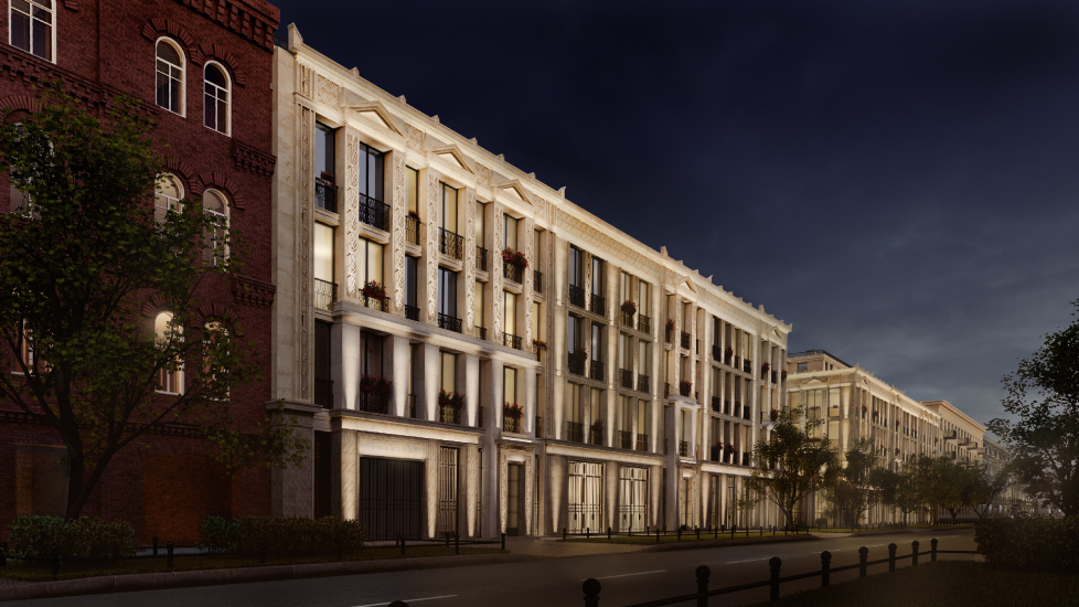
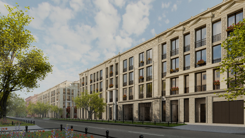
The name of “Little France” was authored by the client, Alexander Zavyalov, and is based on the pearly “Parisian” coloring. The light-gray fiber concrete, combined with exquisite wrought-iron grilles and French windows reaching to the ceiling, does indeed remind you of the French capital. It was also the client who proposed to build a courtyard – and this coincided with the architect’s intentions because a composition of a house with a courtyard creates a very Saint Petersburg image.

  • zooming
    1 / 3
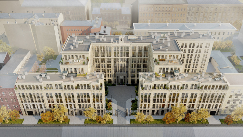
    “Little France” housing complex. Birds-eye view from the west side
    Copyright: © Liphart Architects
  • zooming
    2 / 3
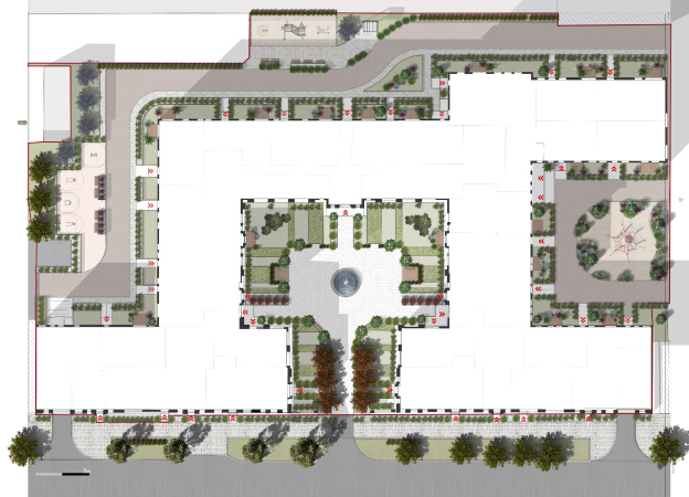
    “Little France” housing complex. The land site with the landscaping project
    Copyright: © Liphart Architects
  • zooming
    3 / 3
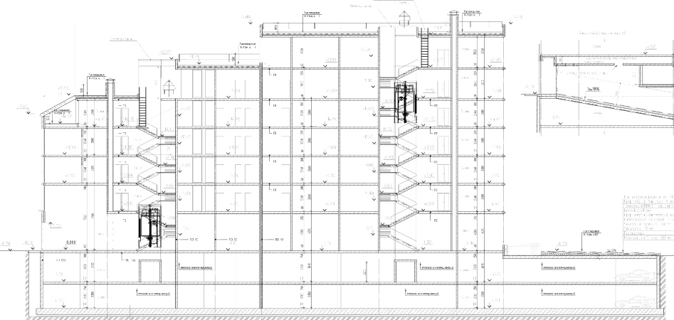
    “Little France” housing complex. Section view
    Copyright: © A-Architects


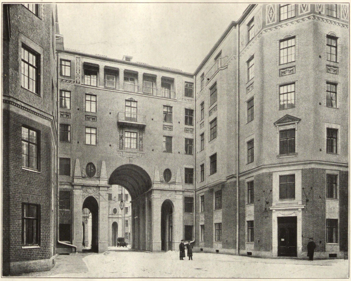
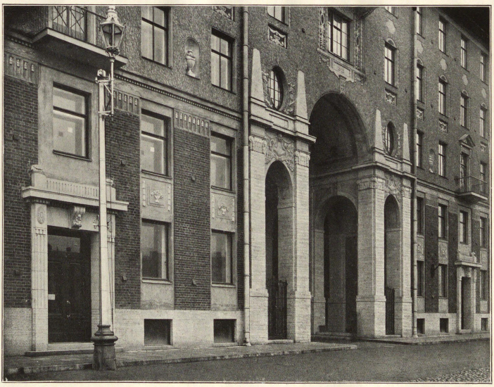
And, although courtyards or “courts of honor” are characteristic not so much of the Vasilyevsky Island as of the Petrograd Side, the 20th line of the Vasilyevsky Island does have a historical building with one, which means that the architect did address the rhythm, the scale, and the parceling of the historical construction. As for Stepan Lipgart himself, he names his main source of inspiration as being Lidval, whose courtyards are to be seen in the Lidval House on the Kamennostrovsky Avenue, and in the Tolstoy House on the Rubinshteina Street. This was also the source of inspiration for the grand propylaea.

  • zooming
    The tenement house, Saint Petersburg, Fontanka 52-54. The inner yards, project and construction by Lidval. Annual book OAH #7
    Copyright: © Stepan Liphart
  • zooming
    The tenement house, Saint Petersburg, Fontanka 52-54. The inner yards, project and construction by Lidval. Annual book OAH #7
    Copyright: © Stepan Liphart


The first thing that came to my mind, however, was the House of the three Benois with its grand courts of honor. Either way, I think, there is a reference to the neoclassicism of the Kamennostrovsky Avenue. This street, which was built within a span of ten years from 1905 to 1915 – the time of the “vertical cultural curve” of our country – is the Mecca and the endless source of ideas for the masters of traditional architecture, where architectural masterpieces and techniques are concentrated, still relevant today. Basically, in your mind’s eye you can easily see the new house in that environment, style-wise, scale-wise, and in terms of the sheer number of inventions.

A tenement house of the Silver Age as the perfect housing

The neoclassical houses of the Silver Age and the Soviet Art Deco are commonly considered to be the perfect example of modern housing. It is not by chance that the Tolstoy house or the Levinson house on the Karpovka or Moscow’s high-rises are aggressively marketed as the hot places of residence for the young and affluent hipsters of today.

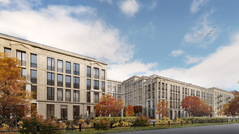
Today, there are no problems with the amount of light in the courtyards. “Little France” features two courtyards – a grand one and an in-block one – plus a few small-sized yard territories, neatly organized. While in “Renaissance”, the previous Liphart project, the context was essentially presented by a high-rise sleeping-belt neighborhood, and you simply could not cancel the 20-story-high scale, this project on Vasilyevsky Island, thank God (and thank the height restrictions), has exactly as many stories as needed in a historical city. The “French” house steps on the redline in symmetric four-story units with a fifth attic floor, and then, withdrawing into the depth of the yard, gradually increases its height up to the main unit, seven-stories high. This is already a fundamental difference from the houses of the Silver Age, in which different parts, if any, of course, had the same height. And, if you have ledges – you will have terraces. Generally speaking, terraces, tiers, and registers, as well as the ledgy composition of units, are very relevant in a modern city.

  • zooming
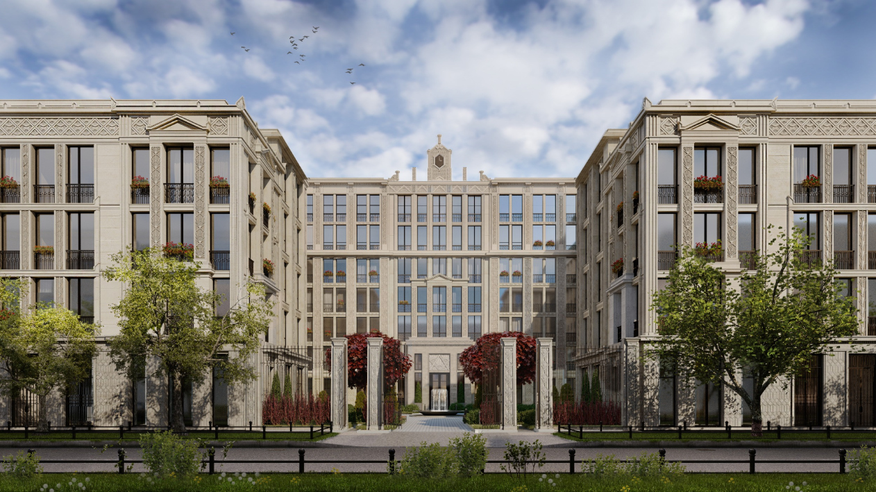
    “Little France” housing complex. View of the central courtyard from the 20th line
    Copyright: © Liphart Architects
  • zooming
    “Little France” housing complex. Perspective view along the 20th line, view from the north.
    Copyright: © Liphart Architects


From Leo von Klentze to Burov

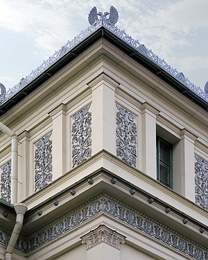
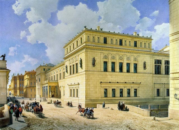
The architecture of the house on the Vasilyevsky Island can be best characterized as geometric and ornamental – the two qualities that nevertheless do not conflict with the architecture of orders. In this case the architect is basing himself on the experience of his predecessors. Stepan Liphart: ““Little France” shows references to the neo-Greek German style of the New Hermitage designed by Leo von Klentze. The architecture of this building made a great impression on me, especially its decor, based on strict geometry and repetitiveness. In my project, it is closer to Art Deco, more generalized and more geometric; at the same time, I borrowed from Klentze a number of plastique elements of the facade.” Indeed, some of the details of the Liphart house, such as acroterions in the window frames and pilaster porticos are the joints of the cornices did come from the New Hermitage: they are different, yet in the same places. The flat and ornamental character of the side-end facades of the New Hermitage was quite unexpected by the standards of those days, passing quite unnoticed behind the portico and the atlases, and, mind, this is almost XX century.

  • zooming
    1 / 3
    The New Hermitage. The architect: Leo von Klenze
    Copyright: © Maxim Atayants
  • zooming
    2 / 3
    Luigi Premazzi. View of the New Hermitage from the Millionnaya Street, 1861.
    Copyright: © Stepan Liphart
  • zooming
    3 / 3
    The New Hermitage. The architect: Leo von Klenze
    Copyright: © Stepan Liphart


From the flat and ornamental order authored by Klentze, one can draw a line to the Andrey Burov house on Tverskaya with ornaments executed in the scratch-work technique. Accordingly, Stepan Liphart entwines this line into his own work, and it starts working as the intermediate context, actualizing different layers of the neoclassical tradition.

“Little France” housing complex. View from the yard to the street from the north
Copyright: © Liphart Architects


What is interesting is that the order elements of the French house, although flattened by the ornament (ornamented pilasters are always more incorporeal because they are “clad”) still do not disappear completely. When Sergey Tchoban used ornaments in the Granatny Alley, he created a complex light-and-shade facade surface – and this is his manifesto expressed in his book “30:70. Architecture as a balance of forces” – he most likely based himself on the rationalistic modernist architecture. Light and shade – yes, architecture of orders – no. Stepan also takes into consideration Sergey Tchoban’s experience (currently, test work with fiber concrete is being done, of which the client has his own production facility; they are making tests to make the surface texture as beautiful and as deep as possible). In Liphart’s project, however, the articulation of the facades is more prominent and traditional: not just grid lines but order decoration, a structure of piers and risalits. The theme of porticos (external window frames two stories high with pilasters and a fronton) on the risalits alternates with a less saturated part of the facade (intermedia), where the pulse and the rhythm of windows are still present but elements of architecture of orders are almost absent.

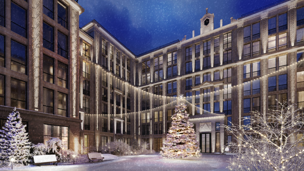
The facade of the tall central unit is marked by a grand risalit with an Art Deco portal (almost like on the building of the Ministry of Foreign Affairs in Moscow), a portico of the dress-circle, and a crown inspired by the clock turret of the Marble Palace. As usual, this facade in the depth of the courtyard becomes a theater backdrop, getting a distance that increases the perception effect. The already mentioned “Lidval” propylaea at the entrance add to the solemnity of the courtyard’s visual appearance. After all, a courtyard is always a very strong spatial experience.

  • zooming
    “Little France” housing complex. View of the central courtyard from the south in the wintertime
    Copyright: © Liphart Architects
  • zooming
    “Little France” housing complex. Overview of the facade from the 20th line from the north
    Copyright: © Liphart Architects


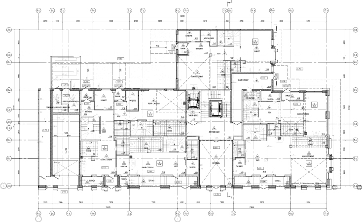
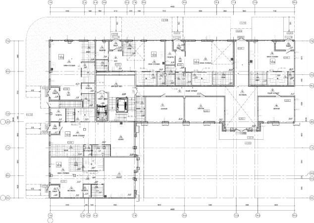
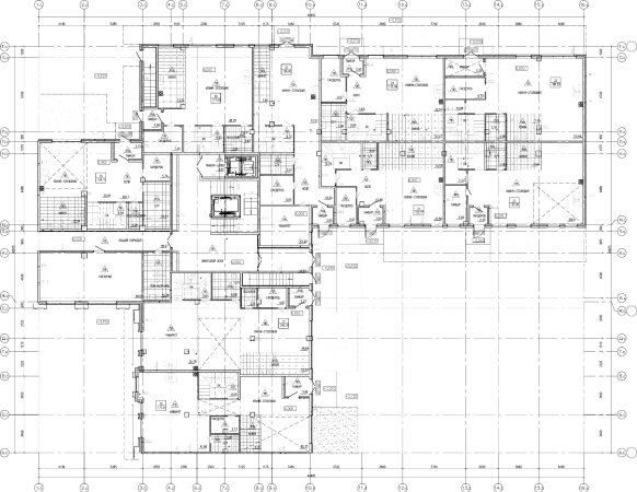
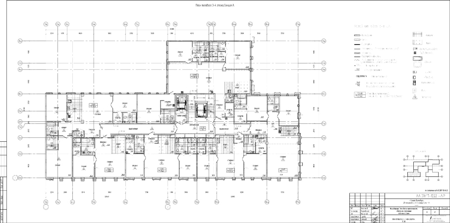
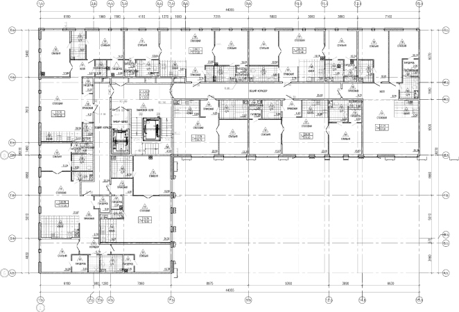
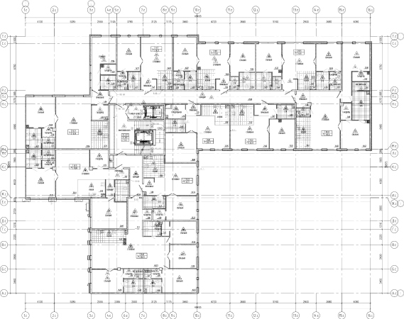
In addition, Liphart attempted to make the facades reflect the inner structure of the building, such as division into individual apartments, and mark the entrances to apartments and lounges with portals and frames. There is a rule – let us conditionally call it the rule of Mikhail Filippov, because he pronounced it in the 1990’s – that the windows of different stories of a residential building must be different in size and decoration because there is a family that lives here occupying the whole floor. Such structure is characteristic of the houses of the 1910’s, yet it disappears in the architecture of “the country of the victorious proletariat” in the 1930-50’s, when all the windows become completely alike. Filippov called for getting back to the Silver Age. Today, of course, such families that can afford enfilades of eight rooms are few and far between, and generally our society is more atomized, and, hence, the apartments are smaller. In the house on the Vasilyevsky, however, all of the apartments feature French windows (I do not even know what social conclusions I am to draw from this – I will leave that up to you to decide); they are of the same height but of varying width. Some of them are grouped in threes marking the borders of the apartments. In this case, the inner structure is shown by different means – these are tiers and risalits, pilaster side of the cornice, composition in the spirit of architecture of orders, lower galleries of the city houses, and the upper terraces of the penthouses.

  • zooming
    1 / 6
    “Little France” housing complex. The first floor of Section A
    Copyright: © A-Architects
  • zooming
    2 / 6
    “Little France” housing complex. The first floor of Section B
    Copyright: © A-Architects
  • zooming
    3 / 6
    “Little France” housing complex. The first floor of Section C
    Copyright: © A-Architects
  • zooming
    4 / 6
    “Little France” housing complex. The standard floor of Section A
    Copyright: © A-Architects
  • zooming
    5 / 6
    “Little France” housing complex. The standard floor of Section B
    Copyright: © A-Architects
  • zooming
    6 / 6
    “Little France” housing complex. The standard floor of Section C
    Copyright: © A-Architects


Anyway, we see the traditional “tripartite” character of the building, a symmetric composition from the street side, and orderly techniques of articulating the facades. At the same time, it is clear that the building was created in the XXI century. So, what is new about it?

The dialectics of architecture of orders and stained glass

Here I am approaching my favorite subject of the order / glass ratio that is promising to become the main one on the XXI century. There is a thousand ways of combining the two, for example, in such a genius way as Samoilov did in the “Nauka” health resort in Sochi (1938), where the stained glass windows, pierced by the sunbeams, miraculously supported rather sensuous order elements, columns and porticos, hovering in space. According to Stepan Liphart, his goal was to “achieve the optimum balance between the order elements and large glass surfaces. The glass surfaces yield a lot of light. But this emptiness is compromising the tectonics of the building.” The windows of the house on the Vasilyevsky Island are almost transom-less, and the facades are indeed perceived as an order framework that is suspended in space. Yet this framework is sturdy and well thought out. In spite of its flat character, it has a lot of layers in it, and the very order of the graceful dry drawing is very convincing and tectonic. This is not the romantic vitality of Art Nouveau and Art Deco, but the transparent slenderness and knight-like perseverance of the classical amidst the overall chaos. Some kind of “in defiance” by Hermann Hesse, one of whose books became the inspiration for the headline of this article.

“Levinson softened by Lidval”?

Trying to come up with some sort of a formula for the style of the house on the Vasilyevsky Island, Stepan Liphart said that this was “Levinson softened by Lidval”. As for me, I do not really sense Levinson here, unlike in the “Renaissance” housing complex, where his influence is obvious. The large scale and the vast expanses of land required powerful plastique of the facades that was expressed in the mega-order constructed of bay windows protruding far ahead. As for the signature Klentze flat surface, it is indeed felt in the French house. So, probably, a more apt formula would be: Klentze-Lidval-Levinson-Liphart. This is what I mean by the make-believe communication with the masters of traditional architecture – something similar to what takes place in the Hermann Hesse “Journey to the East”, where in one place meet Mozart and Anselm of Canterbury, Paul Klee and Hesse himself, the poets and artists of different centuries.

The beaming ornament

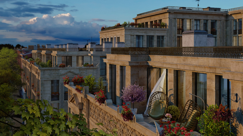
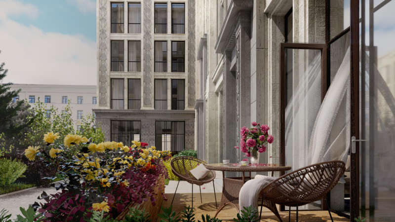
Generally speaking, Art Deco sounds pretty muffled here. Most of it is concentrated in the portal of the main entrance and in the outstanding laconic cornices of the in-yard units, as well as in the beamy ornaments that adorn the pilasters and the propylaea, not so much in the spirit of Voronikhin as reminiscent of the Soviet coat of arms. Stepan Liphart states that these motifs of a diagonal and an arc, added by triangles in the friezes, first came to him, and he only later realized that a triangle was a pair of compasses. In any case, the motif is beaming and radiant, born at the Airport metro station. Also, Art Deco is felt in the deluxe formats of the apartments. The terraces, for example, bring up associations with the tribeca penthouses in the Art Deco houses of New York. The terraces command breathtaking views of the most beautiful city in the world.

  • zooming
    1 / 3
    “Little France” housing complex. View of the terrace of the street facade from the street side
    Copyright: © Liphart Architects
  • zooming
    2 / 3
    “Little France” housing complex. Perspective view along the 20th line, view from the south.
    Copyright: © Liphart Architects
  • zooming
    3 / 3
    “Little France” housing complex. A fragment of the yard part, view of the exit from the two-story apartment, and a little garden next to it
    Copyright: © Liphart Architects


Personal gallery and personal entrance

Alongside the penthouses, Little France uses the deluxe format of the so-called city houses – two-story apartments with an individual entrance from the street. Historically, city houses are few in Russia, but recently, they have become more numerous. This is like a townhouse, only set into a mid-rise residential building, with a public zone on the first floor and bedrooms on the second. The whole idea presupposes friendly society, which, of course, was unimaginable in Russia of the 1990’s. This affirms the dignity of privacy. In Great Britain, there are plenty of street entrances, for example – it is enough to remember these colorful narrow doors, often featuring a coat of arms, framed by porticos. In “Little France”, the entrance to the city houses is made through gateways with ornamental wrought iron fences – an homage to the Summer Garden that features “the most beautiful fence in the world” – in the summer time one can leave a go-cart or a bicycle. The gateways exit into the 20th line of the Vasilyevsky Island, quiet and green, with almost no vehicles or pedestrians on it. Essentially, these gateways are indoor galleries in the body of the building. The city houses, situated on the yard side, feature little gardens where one could plant strawberry or just have a cup of coffee.

03 April 2020

Headlines now
Living in the Architecture of One’s Own Making
Do architects design houses for themselves? You bet! In this article, we are examining a new book by TATLIN publishing house. This book – unprecedented for Russia – features 52 private homes designed and built by contemporary architects for themselves. It includes houses that are famous, even iconic, as well as lesser-known ones; large and small, stylish and eccentric. To some extent, the book reflects the history of Russian architecture over the past 30 years.
A City Block Isoline
Another competition project for a residential complex on the banks of the Volga in Nizhny Novgorod has been prepared by Studio 44. A team of architects led by Ivan Kozhin concluded that using a regular block layout in such a location would be inappropriate and developed a “custom design” approach: a chain of parceled multi-section buildings stretching along the entire embankment. Let’s explore the features and advantages of this unconventional method.
Competition: The Price of Creativity?
Any day now, we’re expecting the results of a competition held by the “Samolet” development group for a plot in Kommunarka. In the meantime, we share the impressions of Editor-in-Chief Julia Tarabarina, who managed to conduct a public talk. Though technically focused on the interaction between developers and architects, the public talk turned into a discussion about the pros and cons of architectural competitions.
Terraced Design
The “River Park” residential complex has confidently and securely shaped the Nagatinsky Backwater shoreline. Featuring a public embankment, elevated courtyards connected by pedestrian bridges, and brick façades, the development invites exploration of its nuanced response to the surrounding context, as well as hints of the architects’ megalithic design thinking.
A Kremlin’s Core and Meteorite Fragments
We continue our coverage of the competition projects for the residential district that the development company GloraX plans to build along the embankment of the Rowing Channel in Nizhny Novgorod. ASADOV Architects approached the concept through a deep dive into local identity, using storytelling to pinpoint a central idea for the design: the master plan and composition are imagined as if a meteorite had struck a “proto-Kremlin”. Sounds weird? Find more details below!
The Volga Regatta
GloraX plans to develop a residential complex spanning 14 hectares along the Volga River in Nizhny Novgorod. The winning design in a closed-door competition, created by GORA Architects, features housing typologies ranging from townhouses to terraced high-rise slabs, a balance of functions, diverse ways of engaging with the water, and even a dedicated island (no less!) for the city residents.
A New Track
We took a thorough look at D_Station, a railcar repair depot dating back to 1906, recently reconstructed while preserving its century-old industrial structure, upon the project by Sergey Trukhanov and T+T Architects. Though work on the interiors – set to house restaurants and public spaces – is still underway, the building’s exterior already offers plenty to see. Visitors can explore the blend of old and new brickwork, appreciate the architect’s unique interpretation of ruin aesthetics, and enjoy the newly built pedestrian route that connects the Citydel Business Center’s arches to Kazakova Street.
Four Different Surveys
The “Explore the City” competition, organized this year by the Genplan Institute of Moscow, stands out as a pretty unconventional one for the architectural field but aligns perfectly well with the character of urban planning work. The winning project analyzed contemporary residential complexes, combining urban planning insights with a realtor’s perspective to propose a hybrid approach. Other entries explored public centers, motivations for car ownership, and housing vacancy rates. A fifth participant withdrew. Here’s a closer look at the four completed works.
Scheduled Evolution
ASADOV Architects unveiled the EvyCenter pavilion, a microcultural hub for fostering personal growth, organizing workshops, and doing gymnastics. Additionally, this pavilion serves as a prototype for a scalable country house, drawing inspiration from the “Loskutok” project, and constructed from CLT panels in a factory. This marks the beginning of a developer project initiated by the architectural firm (sic!), which is seeking partners to expand both small Evy settlements and even larger Evy cities, which are, according to Andrey Asadov, aimed at fostering the “evolutionary” development of the people who will inhabit them.
The Golden Crown
The concept for a dental clinic in Yekaterinburg, developed by CNTR Studio, revolves around the idea of a “mouth full of gold”: pristine white porcelain stoneware walls are complemented by matte brass details. To avoid an overly literal interpretation, the architects focused on the building’s proportions, skillfully navigating between sunlight requirements and fire safety regulations.
Flexibility and Integration
Not long ago, we covered the project for the fourth phase of the ÁLIA residential complex, designed by APEX. Now, we’ve been shown different fence concepts they developed to enclose the complex’s private courtyards, incorporating a variety of public functions. We believe that the sheer fact that the complex’s architects were involved in such a detail as fencing speaks volumes.
A Step Forward
The HIDE residential complex represents a major milestone for ADM architects and their leaders Andrey Romanov and Ekaterina Kuznetsova in their quest for a fresh high-rise aesthetic – one that is flexible and layered, capable of bringing vibrancy to mass and silhouette while shaping form. Over recent years, this approach has become ADM’s “signature style”, with the golden HIDE tower playing a pivotal role in its evolution. Here, we delve into the project’s story, explore the details of the complex’s design, and uncover its core essence.
Gold in the Sands
A new office for a transcontinental company specializing in resource extraction and processing has opened in Dubai. Designed by T+T Architects, masters of creating spaces that are contemporary, diverse, flexible, and original, this project exemplifies their expertise. On the executive floor, a massive brass-clad partition dominates, while layered textures of compressed earth create a contextually resonant backdrop.
Layers and Levels of Flight
This project goes way back – Reserve Union won this architectural competition at the end of 2011, and the building was completed in 2018, so it’s practically “archival”. However, despite being relatively unknown, the building can hardly be considered “dated” and remains a prime example of architectural expression, particularly in the headquarters genre. And it’s especially fitting for an aviation company office. In some ways, it resembles the Aeroflot headquarters at Sheremetyevo but with its own unique identity, following the signature style of Vladimir Plotkin. In this article, we take an in-depth look at the United Aircraft Corporation (UAC) headquarters in the Moscow agglomeration town of Zhukovsky, supplemented by recent photographs from Alexey Naroditsky – a shoot that became only recently possible due to the fact that improvements were finally made in the surrounding area.
Light and Shadow
In this article, we delve into the architectural design of the “Chaika” house by DNK ag architects, which was recently completed in 2023 as part of the collection of signature designs at ZILArt. As is well-known, all the buildings in this complex follow a design code, yet each one is distinct. This particular building stands out not only for its whiteness and minimalism but also for the refined use of a limited number of techniques that, together, create what can confidently be called synergy.
Casus Novae
A master plan was developed for a large residential area with a name of “DNS City”, but now that its implementation began, the plan has been arbitrarily reformatted and replaced with something that, while similar on the surface, is actually quite different. This is not the first time such a thing happens, but it’s always frustrating. With permission from the author, we are sharing Maria Elkina’s post.
Treasure Hunting
The GAFA bureau, in collaboration with Tegola and Arkhitail, organized an expedition to the island of Kilpola in Karelia as part of Moskomarkhitektura’s “Open City” festival. There, amidst moss and rocks, the students sought answers to questions like: what is the sacred, where does it dwell, and what sustains it? Assisting the participants in this quest were landscape engineer Evgeny Levin, artist Nicholas Roerich, a moose, and the lack of cellular connection. Here’s how the story unfolded.
Depths of the Earth, Streams of Water
In the Malaya Okhta district, the Akzent building, designed by Stepan Liphart, was constructed. It follows a classic tripartite structure, yet it’s what you might call “hand-drawn”: each façade is unique in its form and details, some of which aren’t immediately noticeable. In this article, we explore the context and, together with the architect, delve into how the form was developed.
Fir Tree Dynamics
The “Airports of Region” holding is planning to build an airport in Karachay-Cherkessia, aiming to make the Arkhyz and Dombay resorts more accessible to travelers. The project that won in an invitation-only competition, submitted by Sergey Nikeshkin’s KPLN, blends natural imagery inspired by the shape of a conifer seed, open-air waiting spaces, majestic large trees, and a green roof elevated on needle-like columns. The result is both nature-inspired and WOW.
​A Brick Shell
In the process of designing a clubhouse situated among pine trees in a prestigious suburban area near Moscow, the architectural firm “A.Len” did the façade design part. The combination of different types of brick and masonry correlates with the volumetric and plastique solutions, further enhanced by the inclusion of wood-painted fragments and metal “glazing”.
Word Forms
ATRIUM architects love ambitious challenges, and for the firm’s thirtieth anniversary, they boldly play a game of words with an exhibition that dives deep into a self-created vocabulary. They immerse their projects – especially art installations – into this glossary, as if plunging into a current of their own. You feel as if you’re flowing through the veins of pure art, immersed in a universe of vertical cities, educational spaces – of which the architects are true masters – and the cultural codes of various locations. But what truly captivates is the bold statement that Vera Butko and Anton Nadtochy make, both through their work and this exhibition: architecture, above all, is art – the art of working with form and space.
Flexibility and Acuteness of Modernity
Luxurious, fluid, large “kokoshniks” and spiral barrel columns, as if made from colorful chewing gum: there seem to be no other mansion like this in Moscow, designed in the “Neo-Russian-Modern” style. And the “Teremok” on Malaya Kaluzhskaya, previously somewhat obscure, has “come alive with new colors” and gained visibility after its restoration for the office of the “architectural ecosystem” as the architects love to call themselves. It’s evident that Julius Borisov and the architects at UNK put their hearts into finding this new office and bringing it up to date. Let’s delve into the paradoxes of this mansion’s history and its plasticity. Spoiler: two versions of modernity meet here, both balancing on the razor’s edge of “what’s current”.
Yuri Vissarionov: “A modular house does not belong to the land”
It belongs to space, or to the air... It turns out that 3D printing is more effective when combined with a modular approach: the house is built in a workshop and then adapted to the site, including on uneven terrain. Yuri Vissarionov shares his latest experience in designing tourist complexes, both in central Russia and in the south. These include houseboats, homes printed from lightweight concrete using a 3D printer, and, of course, frame houses.
​Moscow’s First
“The quality of education largely depends on the quality of the educational environment”. This principle of the last decade has been realized by Sergey Skuratov in the project for the First Moscow Gymnasium on Rostovskaya Embankment in the Khamovniki district. The building seamlessly integrates into the complex urban landscape, responding both to the pedestrian flow of the city and the quiet alleyways. It skillfully takes advantage of the height differences and aligns with modern trends in educational space design. Let’s take a closer look.
Looking at the Water
The site of Villa Sonata stretches from the road to the water’s edge, offering its own shoreline, pier, and a picturesque river panorama. To reveal these sweeping views, Roman Leonidov “cut” the façade diagonally parallel to the river, thus getting two main axes for the house and, consequently, “two heads”. The internal core – two double-height spaces, a living room and a conservatory, with a “bridge” above them – makes the house both “transparent” and filled with light.
The White Wing
Well, it’s not exactly white. It’s more of a beige, white-stone structure that plays with the color of limestone – smoother surfaces are lighter, while rougher ones are darker. This wing unites various elements: it absorbs and interprets the surrounding themes. It responds to everything, yet maintains a cohesive expression – a challenging task! – while also incorporating recognizable features of its own, such as the dynamic cuts at the bottom, top, and middle.
Urban Dunes
The XSA Ramps team designed and built a three-part sports hub for a park in Rostov-on-Don, welcoming people of all ages and fitness levels. The skate plaza, pump track, and playground are all meticulously crafted with details that attract a diverse range of visitors. The technical execution of the shapes and slopes transforms this space into a kind of sculptural composition.
Proportional Growth
The project for the fourth phase of the ÁLIA residential area has been announced. The buildings are situated on an elongated plot – almost a “ray” that shoots out from the center of the area towards the river. Their layout reflects both a response to Moscow’s architectural preferences over the past 15 years, shifting “from blocks to towers”, and an interpretation of the neighboring business park designed by SOM. Additionally, the best apartments here are not located at the very top but closer to the middle, forming a glowing “waistline”.
The “Staircase” Building
In designing the “Details” residential complex in New Moscow, Rais Baishev spiced up the now-popular Moscow theme of a “courtyard” building with an idea drawn from the surrealist drawings by Maurits Escher. He envisioned the stepped silhouettes and descending slopes as a metaphysical mega-staircase, creating a key void within the courtyard that gave the project an internal “spine”. This concept is felt both in the building’s silhouette and on its façades.
Projection of the Quarter
No one doubted that the building that Vladimir Plotkin designed as part of the “Garden Quarters” would be the most modernist of all. And it turned out just that way: while adhering to the common design code, the building successfully combines brick and white stone, rhythmically responding to the neighboring building designed by Ostozhenka, yet tactfully and persistently making a few statements of its own. This includes the projection of the ideal urban development composition “14–9–6”, which can be found right next door, mathematical calculations, including those for various types of terraces (and perhaps the only reminder of the Soviet past of the Kauchuk rubber factory!), and the white “cross-stitch” pattern of the façade grid.