The Russian Wikipedia says that the Lipharts were a noble Baltic German family, known in Livonia (part of the modern Latvia and Estonia) since the XVI century; in the XIX-XX centuries, the Lipharts were engineers, artists, and even designers of submarines. Who of them are your ancestors?
My mom’s parents were third cousins to each other, both born Liphart, the descendants of an ancient family of Baltic Germans coming from the city of Pernau (today’s Pärnu, Estonia), which indeed boasted a noble title back in the day. My ancestors, however, lost that title by the beginning of the XIX century. My grandmother’s grandfather, Ernst Liphart, engineer by education, inherited from his father a large factory that produced cement and agricultural machinery. His son, Woldemar (or Vladimir) originally studied to be an architect, yet later on he decided to become a painter. His life ended tragically – in the late 1930’s he was pronounced “missing”, yet, as we found out decades later, he fell victim to the Stalin repressions, and was shot dead at the Butovo testing ground. At the start of World War II, my grandmother, also German, was deported from Moscow to Kazakhstan’s Karaganda.
My grandfather’s father, Andrey Aleksandrovich Liphart, coming from another family branch, was the head of a large and close-knit family, and an outstanding personality as well. In 1933, he became the main designer of the Gorky Automotive Plant, where he spent two decades creating dozens of car models. Andrey Liphart’s achievements were quite recognized by the Soviet government, and he had enough authority, for example, to retrieve his distant relative, my grandmother, from the exile. This is how she met my grandfather.
The privileges that my grand-grandfather enjoyed in the 1950’s – a large country residence and an apartment in a Stalin-built high-rise – became the environment where I also spent the best days of my childhood. The festive atmosphere of our family gatherings, solemn yet soulful at the same time, that took place in that apartment with high ceilings, rich plasterwork, and panel framed doors, out of which Santa Claus would inevitably appear – all of this probably became the impression that defined my artistic taste and aesthetic preferences for decades to come.
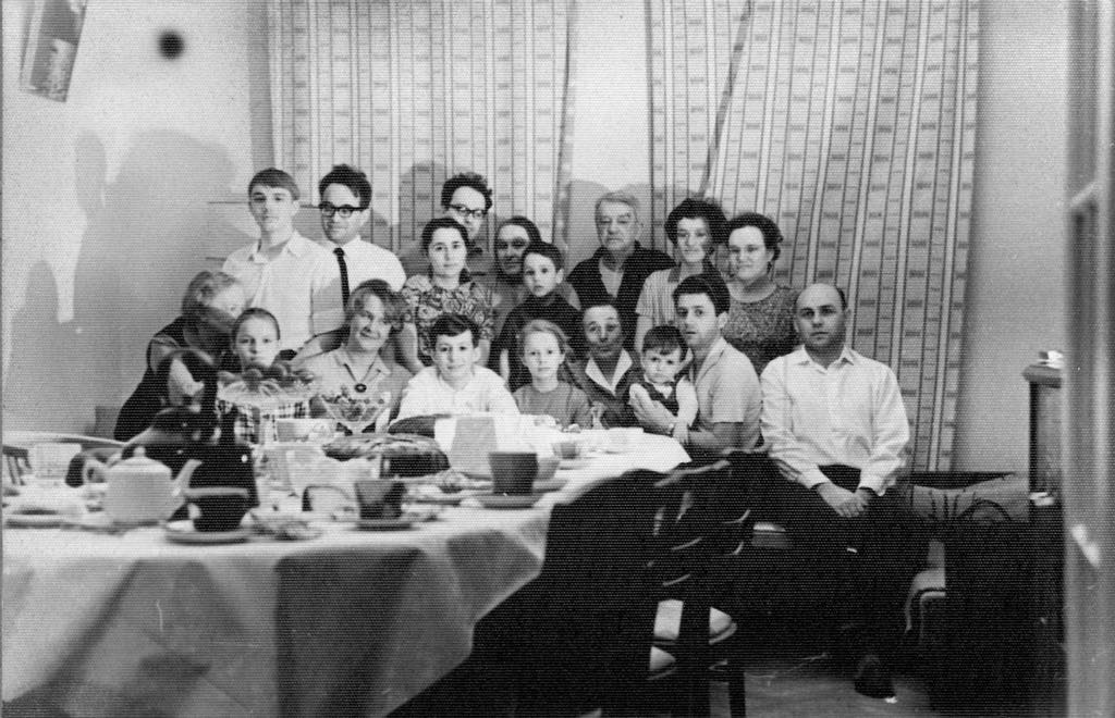
The Liphart family headed by Andrey Liphart, the main designer of the Gorky Automotive Plant
Copyright: © Stepan Liphart
What ultimately influenced your decision to become an architect, apart from your engineering and artistic genes?
I think that it is not by chance that architecture is a hereditary profession. In my case, I was of course influenced by my mom, even though during her whole life she did not so much practical architecture as the theory of it; yet, ever since I was a kid, she kept telling me that our profession was the best one there is, that it combined creativity, engineering thought, and sheer beauty, while the Moscow Institute of Architecture was simply one of the greatest places to be at, period.
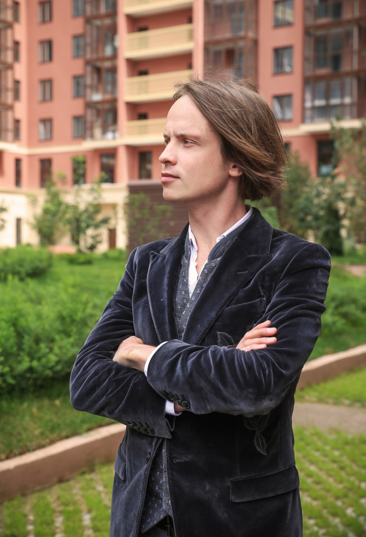
Stepan Liphart
Copyright: Photograph © P.Evsyukov
The Calling
Whom of your teachers from the Moscow Institute of Architecture can you remember best of all? Who inspired you, whom can you name as your mentor?
It is with tremendous awe and gratitude that I remember two of my teachers, who, sadly, are not around anymore. When I entered the institute, I got really lucky: during the first two years, my teacher was Konstantin Vladimirovich Kudryashov. He was a man with a big heart, a really great guy, and an excellent drawing artist – I remember us avidly watching his hand producing with consummate skill the clear-cut, living and breathing lines of his sketches. His breadth of mind seemed to be reflected in the topics of his drawings: hunting with hounds, which he was a great fan of, ancient firearms, horses, ships and sails... Probably, this romantic and slightly nostalgic world view of his determined his architectural taste: he was a great devotee of Venturi and Aldo Rossi. On the whole, Konstantin Kudryashov never spoke of postmodernism as something that was necessary “bad”. He never spoke negatively about the Stalin architecture either – during our first practical session, which took place outside the institute walls, he took advantage of the situation and drew our attention to the belvedere house, designed by Rybitskiy, which is on the Zemlyanoi Val Street, calling it a fine example of robust and meaningful architecture. And, probably because of that, the order elements and compositions, which constituted the basis for the academic program of the first year, were something that I, without thinking twice about it, turned into my creative method that I used in my first student project during my second year. Konstantin Kudryashov did not discourage me in any way, but in the end of my second year he finally said: “You seem to be really attracted to architecture of orders, try to break away from it a little next year”.
Did he warn you by saying this that you might have problems because of that?
Well, he did not say that directly, but I think that is what he meant. Generally speaking, from my third to my fifth year, my architectural design education was pretty strange. In any case, the main working method practiced in our institute, which consisted in making a Xerox copy of some western architectural magazine, and then wedging these ideas and techniques into your project, did not seem to make a much sense to me. At the same time, my passion for classic architecture, the legacy of the Soviet 1930’s – 1950’s grew deeper and deeper, and more and more motivated. I remember me coming to Konstantin Kudryashov and complaining that modern architecture of those days just did not inspire me, and he said that if you feel it in your gut that you are right, you need to stand your ground, to go through with it.
Of course, initially, this “going through with it” meant getting lower grades, and a huge lack of understanding from the other teachers but later on they got used to the strange interests of this promising but wayward student, and they pretty much left me to my own devices.
In my sixth year, it was time for me to choose the scientific advisor for my diploma project, and, again, I was lucky to be in the group led by Vladimir Vladimirovich Khodnev. The diploma year was pure bliss for me – the formalistic approach of my former teachers was replaced by intoxicating freedom of creativity and expression. It turned out that standing your ground was worth it, and you should really listen to your heart when it comes to making choices. The care and attention, which my teacher gave me, and which I will always remember with tremendous gratitude, allowed me to learn and understand a lot of things. Ultimately, my diploma project turned out to be very bright, even if a bit eccentric and naive in some respects – but it was still mine. I must also say that the “Deti Yofana” (“Jophan’s Children”) architectural group also appeared during that year, in which, by the way, I got a lot of support from Vladimir Khodnev. It was a great time – we started to believe in ourselves.
The “Jophan’s Children” group was an instant success. It was appreciated by the advocates of all architectural styles. How did it appear?
I suppose you are twenty-two only once in a lifetime: you are young, you are bustling with energy, and you don’t think about money, reputation, or connections. In the spring of 2006, I met and made friends with Boris Kondakov. I remember our first conversation: “What do you think of the Palace of Soviets?” “Too bad it was never built”. This was like a password that for a long time determined our complete mutual understanding from then on. We started working together, even though it wasn’t by any means about money back then. The artistic talent of Boris’s, combined with my architectural vision, were embodied in competition projects, art objects, and we also worked together on the diploma project that I mentioned, populating the Moscow of 2006 with people from paintings by Deineka and Samokhvalov. An important part in our biography was played by the “Goroda” (“Cities”) architecture festival that was organized by Ivan Ovchinnikov and Andrey Asadov. Making open-air installations with our own hands gave us the first opportunity to check our spatial design ideas in real life. The first event that we took part in was called “Gorod Detstva” (“Childhood City”), where we built an object that looked like agitation campaign constructions of the 1930’s – “The Red Tribune” – and the name of our team, Jophan’s Children, was resonant with the name of the festival.
The controversial “roaring thirties”, the turning to which was marked by Jophan’s project, resonated with people’s experiences of youth, craving for action and change. By contrast with the chaos of Luzhkov’s Moscow, we tried to visualize it the way it was designed to be in the 1935 master plan. We would walk around for hours in search of the fragments of that city: redlines, directions, unfinished housing projects, unraveling it like a charade, trying to imagine an integral and balanced ensemble of robust architecture, created by the masters of those years, whose names alone were enough to thrill us: Fomin, Shchuko, Rudnev, Dushkin...
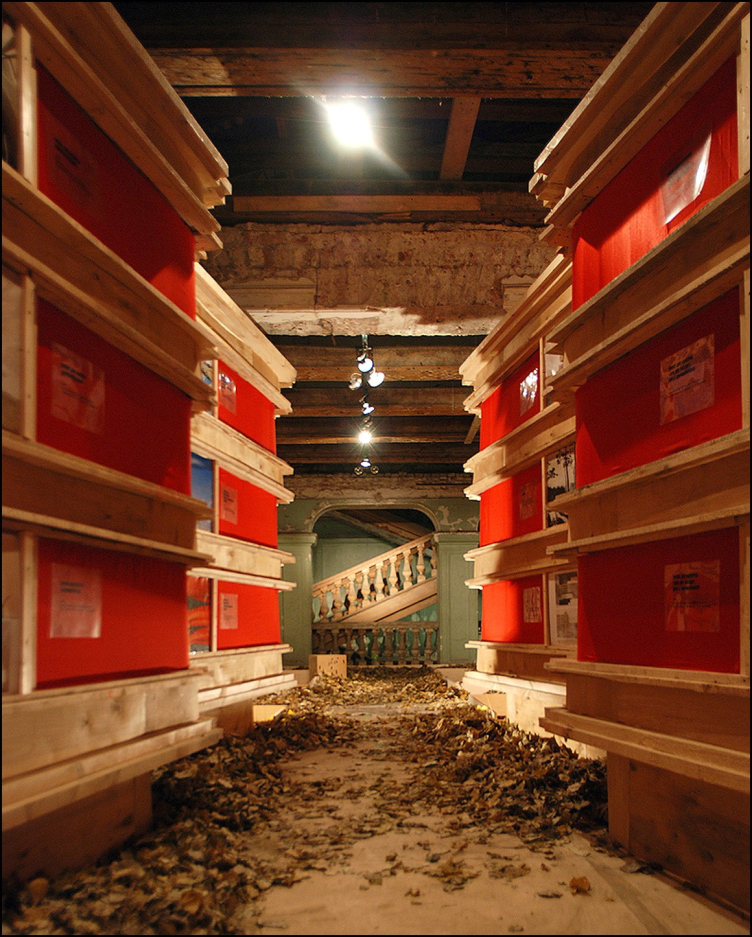
The exhibition "Foraward, to the 1930′s!", Museum of architecture, 2008. “Jophan′s Children” architectural gruop
Copyright: © Stepan Liphart
What was that scandal that you had with Tom Mayne?
Well, it would be an overstatement to say that there was a scandal but that incident did have an effect on me. I was in my third year, and that lecture by the founder of Morphosis Architects aroused a lot of interest: the snow-white Vlasovsky Hall in the Central House of Artists was filled to capacity, it looked as though the whole Moscow Institute of Architecture showed up. The creative works by Mayne are bright and inspiring – all these soaring, levitating structures, looking as if they were falling apart in front of our eyes, are quite stunning. At the moment, however, everything that he was demonstrating seemed hideous to me – it was totally misplaced, it just didn’t make any sense, but, worst of all, it looked totally anti-human. Summoning up my courage, I asked him after the lecture – and what about people? And the thing that struck me most was that at first Mayne did not even understand what I was on about. He again began to speak about the design technologies, about the computer being just a tool, and about the architects being the creators. And he never did answer my question about the users of those buildings. One way or another, after that lecture, any modern architectural shape seemed preternatural to me.
This reminded me about how at one time the composer Arvo Pärt broke away from avant-garde music because he said he simply could not express himself adequately in that language. You were many times asked why you picked the 1930’s as your primary source of inspiration, but I will ask you once more to explain about your attitude towards that architecture.
The way I feel it, by the beginning of the XX century, the architecture of the Russian Empire, and especially its metropolitan architecture, reached the world-class level, and, if we are to put it against not the cultural centers of that time, like France or Austria Hungary, or against Italy, for example, the Russian architecture even surpassed it. Let’s, for example, take the construction of Rome at the turn of the centuries – it was sturdy, neatly drawn, but still secondary architecture: attempts to recreate Renaissance, absurd pseudo-antique compositions, or following the French fashion, for that matter. Still, the Saint Petersburg of the Silver Age, of the time of Benoit and Lidval, was the splendid galaxy of true masters of architecture. Let’s remember buildings designed by Marian Peretyatkovich, or the Vavelberg house on the Nevsky Prospect – a brilliant work, really, a virtuoso synthesis of a Florentine palazzo and northern Art Nouveau, or the emotional opuses by the young Belogrud, filled with vague energy of anticipation of some major changes.
When in 1917 these “major changes” did occur, most of the architects of the older generation got involved in building a new country, and their students joined in with even greater zeal, the galaxy of outstanding architects who studied before the Revolution and in the first years following it: Lev Rudnev, Noah Trotsky, Evgeny Levinson, and many others. And I am speaking not only about the Saint Petersburg academy here because the creators of Moscow constructivism – Alexander and Victor Vesnin, and Alexander Kuznetsov – were also the professionals of the old school.
Paradoxically, the turn of the early 1930’s enriched the Soviet architecture for a while: for a few years, both avant-garde and classical concepts peacefully coexisted. The masters of the old school got a chance to “finish” the neoclassical architecture that they had started back in the 1910’s and fully pass on their knowledge and experience to the new generation of great architects: George Goltz, Mikhail Barshch, Leonid Polyakov, Ilia Rogozhin, and others. In a word, the way I see it, Soviet architecture is a grand-scale phenomenon, rich in ideas and ambitions, one that inherited high quality from the preceding epochs.
The concept of facade solutions for a housing project designed within the framework of the project by Atayants Architects, “Opalikha 03”. Developer: Urban Group, 2014. Computer simulation. Implemented
Copyright: © Stepan Liphart
Meaning, the main motif of your interest for the 1930’s is the high quality of that architecture?
I am fascinated by the artistic potential of that time, as one of the aspects of high quality.
Your favorite work of architecture?
I have a great temptation to recall something from the Silver Age, but, for the sake of the purity of the topic, I will name the building from the 1930’s which indeed stunned me. So! For the International Exposition 1937, France built, among other things, two grand-scale exhibition complexes, and I would like to mention one of them, specifically Palais des Tokyo. The architecture of the palace is close both to the Mussolini style and the fine samples of Soviet architecture, like the Lenin Library in Moscow. However, its pristine monumental visual appearance is somewhat softened by the picturesqueness of the composition, as well as by the sensuous plastique of the sculpture that fills the spaces next to the facades of the palace. However, I believe that Palais des Tokyo, totally devoid of the perfunctory character of “totalitarian” architecture, and even implying a certain degree of intimacy, is conditioned by the fact that the palace was built in a country of bourgeois democracy, after all.
For me, there is a certain benchmark of the higher architectural quality: it is when a grand-scale building is so perfect, integral, and harmonious that the city space getting under the influence of its architecture starts looking like the world of exceptional beauty, markedly different even from the most beautiful architectural ensembles of the surrounding city. In Saint Petersburg, such feelings are aroused by the colonnade of the Kazansky Cathedral, and in Paris – by Palais des Tokyo. The world of the latter is dominated by proportions and line, by spirit and will, by love and passion carved in stone.
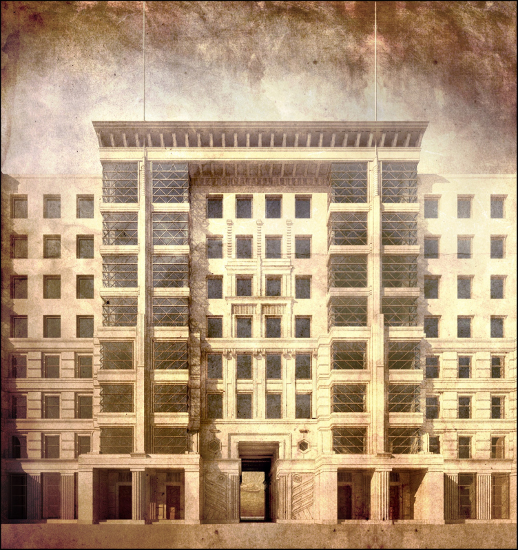
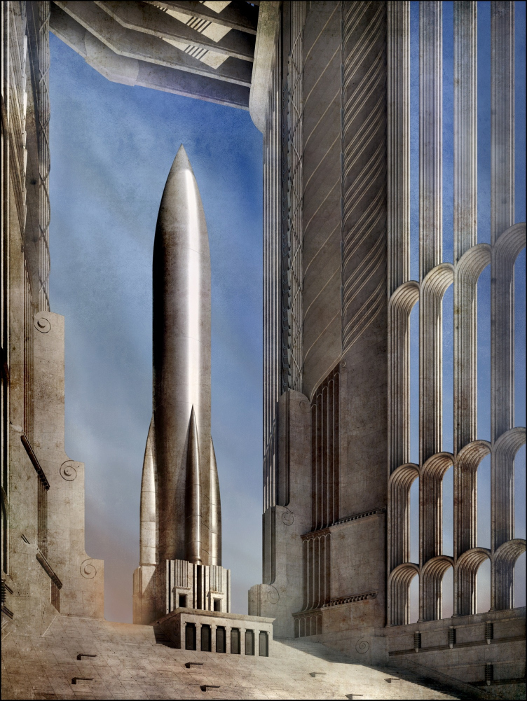
“Triumphal Arch”, 2012-2014. Computer simulation.
Copyright: © Stepan Liphart
In what competitions and contests did you take part, and with what projects? Any awards?
In 2017, first in Moscow, then in Saint Petersburg, I had two personal exhibitions (“The Seventeenth Utopia” and “In Search of a Hero”), for which I am extremely grateful to their curators, Alexandra Selivanova and Lucia Malkis. It is with special tenderness, however, that I am recalling our exhibition with a flashy name of “Forward to the 1930’s!” that opened in the Museum of Architecture back in 2008. Its preparation somehow looked like yet another “Goroda” festival. We had very little money, but at the same time we had a lot of friends ready to help, and we ourselves were quite resourceful as well. The curator of that exhibition, the art critic Masha Sedova, was also my friend.
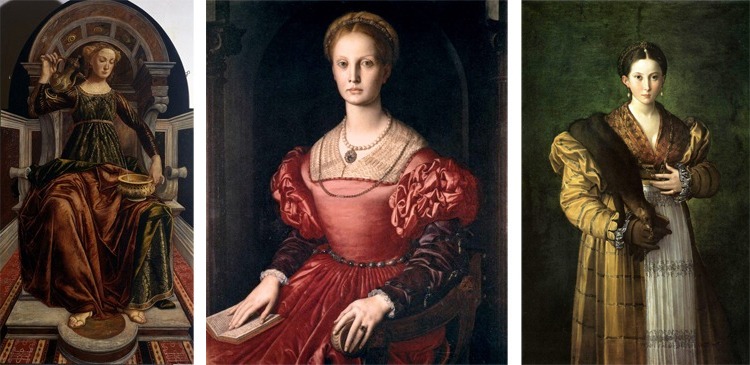
Left to right: “Allegory of Temperance”, Pierrot del Pollaiuolo, 1470; “The portrait of Lucrezia Panciatichi”, Agnolo Bronzino, 1545; “Antea” Francesco Parmigianino 1524-1527
Copyright: Uffizi Gallery
For two months and a half, living together like a small community, we were busy creating models, exposition installations, billboards, and other expo materials. The end result looked really bright, at least, the special guest at the exhibition, Grigory Revsin, for the first time took notice of “Jophan’s Children”.
As far as competitions and contests are concerned, we, probably, because of the special character of our creations, haven’t been quite as successful in that area, but then again, we didn’t really try that hard. We scored a couple of awards at ARCHWOOD but I rather think this is an exception to the general rule.
What are your impressions from working in Mikhail Filippov Studio?
In my opinion, Mikhail Filippov is a genius artist, and his vision of architecture presupposes the quality of reality – both social, cultural, and technological – that is yet unreachable today. To make Mikhail Filippov architecture become part of the material world in full effect, a lot of things must be changed, and a lot of things must be remembered about. I am as much scared as disappointed by this thought, yet it looks that this something that one person, however talented, cannot pull off single-handed. I worked at Mikhail Filippov Studio for a year, and I am glad to have made this master’s acquaintance, and grateful to him for his creative work.
Architectural practice
Since you turned thirty, you have been designing large-scale housing projects in Saint Petersburg. The “Renaissance” housing complex on the Dybenko Street is all but complete, and “Little France” on the 20th line of the Vasilyevsky Island is under construction. Very few architects can boast having landed such big contracts at such a young age. What is your secret?
A couple of months ago I talked to Aleksey Komov about it, and he defined the situation like this: “There is your position as a master, which is a Renaissance one. There is your world, in which you live, not making a difference between “paper” and real-life projects, and the top-league clients feel the existence of this world, feel the sturdiness of your beliefs, and they want to be part of it. And, since this world is grand-scale, so are the projects: residential complexes and factories, and not some private residences and interior design projects”.
I do realize that this may sound over-dramatic and boasting-like, but, on the other hand, you cannot attribute some serious achievements like these to blind luck. I remember when I was about thirty, I was selecting materials for the ArchMoscow festival, and I was going through a lot of pictures: paper and competition projects, photographs of installations, and such like, and I had a feeling that I had enough of images and ideas for some of them to finally break through into the real world – which happened pretty soon after that. Of course, my earlier connections did play a certain part: Grigory Revzin introduced me to Kusnirovich, and Maxim Atayants, who is my hero both professionally and personally, and was instrumental in getting me to meet the Saint Petersburg developer.
Tell me about the inner structure and the methods of Liphart Architects.
I see my main task as working with the architectural image, and, accordingly, everything is designed in such a way as to make the most of what we have with a minimum number of people. Our studio is really small, there are only five of us, and we do almost nothing except architectural design projects. The outward appearance of the building is something that I prefer to create myself, from the first pencil line to the last millimeter of the end facade model, which is computer-assisted, of course. As for the rest of the work, this is something that I usually delegate to my colleagues. The project documentation is outsourced; we take part in the construction process performing the author supervision.
When I worked on my first Saint Petersburg project, Renaissance housing complex, I designed it by the preset floor plans. Of course, the designers introduced some changes and corrections to them in the process, which affected my solutions as well, but I must say that the implementation is very close to the original idea. What also helped was the client’s order to keep the architecture as intact as humanly possible.
In the case of the so-called “Little France” – our first project done in the historical center of the city – I had a little more freedom of maneuver: what was preset was the volume and the number of floors, and a few general ideas referring to the formats of the apartments; everything else was designed based on the visual appearance that I came up with. Designing this project coincided with me moving to Saint Petersburg, and because of that l drew that project with a lot of passion, with this newcomer’s zeal; its architecture was influenced to a large extent by the works by Lidval and Klentse, whom I had just discovered for myself.
A number of Saint Petersburg projects that we are currently working on – housing complexes on the Magnitogorskaya Street – they are similarly designed. The house on the 12th line of the Vasilyevsky Island – of a very complex configuration, very saturated; it took me a year to draw it. Probably, I invested maximum effort into this project, and I really hope it will be realized.
Did this prescription to “do as drawn” appear because your clients were your allies? Do they feel the beauty that you create?
I think that this ability to see beauty is a gift that everyone possesses by birth; on the other hand, some life circumstances, environment, or prejudice can take this birthright away from a person, or significantly compromise it. Sometimes it seems to me that in today’s Russia, which has been through a lot of hardships over the past century, people not only forgot how to multiply beauty, but how to tell it from ugliness. And this makes it all the more exciting when I meet somebody who looking to create something aesthetically pleasing. In my opinion, both Alexander Zavyalov, the owner of the Saint Petersburg development company, and Mikhail Kusnirovich, obviously have such an ambition.
Then, what also plays a part, are the client’s taste preferences, which, I must note, may also change with time, from full understanding to a total lack of it. In the first projects that I did with Alexander Zavyalov, for example, my architecture of orders was unconditionally accepted, we spoke the same language, and we were on the same page. Now, however, more and more often I meet with a principle that I’ve known since my student years: “Do everything for me like on this photograph”. And then I involuntarily start asking myself – to which extent am I ready to compromise? Generally speaking, yes, some certain disappointment in your profession is inevitable after a few years of practical work. At least, I can say that the most important and valuable things that I designed are still in the paper projects, and not in realizations.
The paper projects
More than two years ago, in one of my comments on Archi.ru, I mentioned that the main topic that interests was unsolved contradictions, which are inherent to the Russian culture, and which manifested themselves particularly vividly in the 1930’s. The clash between the machine and the handmade. The line of heroic Saint Petersburg architecture, embodied both in the Art Deco by Levinson and Trotsky and in the dark “archaic” architecture by Belogrud and Bubyr, and still earlier in the arch of the Joint Staff and the monument to Peter the Great. The line of a hardened breakthrough, the line of conquest, having directly to do with the nature of this city, which was several times subjected to coercive Europeanization.
In your works, architecture of orders and modern technology enrich each other, instead of contradicting: Art Deco and a nuclear reactor, Art Deco and a space rocket... Which of your paper projects is the most valuable to you, and why?
This “Near the Reactor” series of mine is my personal dedication; it embodies the image of a nuclear reactor as a power that keeps this world cozy and warm, at the same time threatening to destroy it. This energy is similar to human passion. The nuclear power grid looks like a temple to me; this theme of deification of machine is also there.
I also remember quite vividly how the subject for my “Triumphal Arch” came about. Shortly before that, I had a very inspiring conversation, where my vis-a-vis called on me to create a manifesto image of my idea of the future. Probably, he found the right words, and the picture was born within minutes: it was a daring rocket ready to soar up in the sky and fly to the worlds yet unknown, framed by a giant architectural form. Space exploration, which was made possible thanks to the technological breakthrough, and the dynamic lines that sounded in unison with it, carrying the message of Art Deco with multiple meanings.
At your Moscow exhibition, there were projects of some rather arty villas. And villa is essentially an image of a private person. What is this person like, what features does he possess?
Interesting is the fact that each of my projects is in fact an offer for a specific customer; however, none of them would venture to build his house in such forms. I think that it was Maxim Atayants who characterized them rather accurately by saying that these were not private residences but expo halls for exhibiting the client and his day-to-day routine. Yes, probably this ostentatiously representative, monumental, and solemn character of architecture do not leave any room for privacy, coziness, and unperturbed routine. The image of this house is a challenge to its resident, first of all aesthetically, and in other respects as well. And here we come to grips with the theme of an exceptional personality, a Hero, if you like.
Metaphysics
What makes your concept of the hero different from the concept of the XIX century, when a hero does battle against his fate, when he is up against the crowd; from the Superman and the Demiurge of avant-garde; from the libertarian of the XX century?
In one of Khan-Magomedov books, I once read that Ivan Leonidov, when he created his “City of the Sun”, was probably unfamiliar with the Tommaso Campanella book. His utopian constructivism yielded a picture of the bright future, while this narrative of the City of the Sun was resonant with how he felt. For the record, I would like to mention at once that my “concept of a hero” is not really deep from the philosophical standpoint – it does not have any long texts or research behind it, or any empirical basis. What matters here is my intuition and certain exaltation experience. And the most effective way of the proverbial “search for a hero” is the observance of artistic display of human beauty. The most obvious example here is the portrait of the epoch of Renaissance with its glorification of human essence. However, still closer to the ideal are those canvases, in which the heavenly light gets into a contradiction with the dark side of human nature. One of the freshest and strongest impressions that I had was seeing live the works by Parmigianino and Bronzino – they do not have the light-hearted peace of the Renaissance harmony about them, quite the opposite, they make you sense the piecing cold of immaculate features, the brittle balance between the Apollonian and Dionysian, which implies the answer, the venture, and the work of soul.
In Skryabin “Divine Symphony”, the Demiurge hero creates the world from nothing. The theomachist concept creates beautiful music, but it is very broad in terms of ethics. Your hero – who is he?
My hero is somewhere in the middle between the human being with its weaknesses and vices, and the Divine Principle. The hero is not somebody who is endowed with divine abilities not somebody whose soul and spirit are reaching for the ideals, both in terms of ethics, and sheer physical beauty.
But an artist is a hero during the moment he creates something. The appearance of beauty in a work of art is always a daring miracle. If we are to get back to the 1930’s, both the creators and the images that they created were heroic. In this country, the architects would design buildings, and the composers would write music, risking their lives. In 1938, Shostakovich would sit every night on the landing with his little suitcase packed, waiting to be arrested, because a friend of his, Marshal Tukhachevsky, was already arrested and shot. Shostakovich was slandered in press since the early 1930’s. However, in 1937, he wrote his 5th symphony, in which, as Pasternak put it, he “said everything and got away with it”. In this piece of music, the hero dies fighting the totalitarian machine.
The thirties witnessed the ultimate attempt to push the heroic and the demiurgic over the limit – the Third Reich. It wasabi attempt to change the basic human values, to create a new man, and a new city. The cult of a hero, which mesmerized tens of millions. The result was monstrous in every respect, from the ethic and from the humanistic standpoints, and it cannot be condoned. But you need to remember that the border is really transparent here.
Yes, it is. Because the means were monstrous. But then again, the ends were also monstrous, for that matter.
Are any other means at all possible? Let’s take the knighthood and chivalry, for example – it was based on violence and murder, yet at the same time everyone remembers the beautiful medieval castles and the cult of the paramour.
I disagree that the heroic concept is inevitably connected with violence – maybe with resistance to violence and overcoming your own self? If you are to coordinate life with the vertical dimension, then it’s about the hero who sacrificed himself for the sake of people.
By the way, the Nazi Germany also glorified self-sacrifice. As a result, there is an opinion in modern Germany that striving for intrinsically valuable beauty may equal fascism.
This is a mistake. An artist creates a form, this is a willful gesture, totalitarian in some respects, but art is an area where hierarchy does a lot of good. Postmodernism tried to deconstruct this gesture, but the artistic result was far from convincing. The silver age teetered on the edge of art and life construction. Yes, it did create beauty but it stayed in the artistic area without overstepping its border (or, to be more precise, the poets and artist’s experimented with various indecent cults, as we know from the reminiscences of Alexander Benoit, but that is beside the point). Lenin is not Silver Age.
However, the artists were calling on these thunder clouds to come in the years running up to the drama of 1917 – they were craving for them. What is thunder and lightning? Something uncontrollable! Of course, Skryabin must have had a different idea of the “new man” – in any case, it was not some kind of “revolutionary sailor” pointing his gun at you. The siege of Leningrad, as the realization of the worst nightmares of the Silver Age, fits in with that “self-sacrificing superman” feeling, and these feelings of cold, embodied in the Belogrudov houses. They already had about them the premonition of an imminent tragedy, the premonition of archaic architecture that came in the image of Stalin from the darkest depths. Elaborating on this topic, I can say that I see the image of the hero in the works by such sculptors as Joseph Thorak and Arno Breker. In these sculptures, the impulse is definitely biased towards the dark side but it is impressive nonetheless.
The same holds true for the daring experiments of the libertarian artists of the XX century. Wright, Sullivan, and Skryabin were Nietzschean. Yet I think that they understood Nietzsche in a vulgar way. When he said his famous phrase about God’s death, Nietzsche meant that people stopped turning to Heaven, stopped being thankful, and stopped comporting his actions with God. Then people channeled the resulting free energy towards achieving their own goals, and they really did achieve a lot. Yet at the same time the fallen human nature manifested itself in full effect.
And it still keeps manifesting itself today. Too bad that these manifestations do not have any artistic value.
Yes. But people still understood a few things. The world conquered fascism, and the precarious balance seems to be generally holding. Albert Sweitzer once said that, inventing the unclear bomb, man became super-powerful but did not become super-sensible. Possibly, my hero is in fact a super-sensible man. Not in the sense of being super-cautious but in the sense of being able to show compassion and empathy. But then again, a holy saint fully answers this description. We’ve got values that I don’t want us to lose. Speaking of architecture, a historical European city is one of such values, while the architecture of the 1930’s is an integral part of it.
Yes, but there was also some new quality about it. Getting back to my Paris experience, I’ll say that it was a very short and jam-packed visit: during the eight hours that I was there, I made my way from Pantheon to Trocadéro, visiting the Louvre Museum along the way. It’s a great city that mesmerizes you with its sheer scale, luxurious facades of natural stone, its broad avenues, the beauty and splendor of its enormous palaces, but still, exiting towards the buildings of the Paris Fair, I could not help but feel some other dimension, a different degree of importance, the image of the future that never did happen because the destructive human nature took the upper hand over its creative part.
One thing is clear: you just cannot keep on creating things as if the XX century never happened. Probably, our culture is about to witness the time of search for a hero, but I want to believe that it is not going to be some “evil” person generating new challenges. Rather, I hope it will be somebody who feels these challenges and is able to stand up to them.


