Its possessing technique. This is a word that I picked up in childhood from my father, the architect Igor’ Georgevich Yaveyn, from his conversations with colleagues. They made no attempt to define the term in a scientific fashion, but in their mouths it could be equally the highest praise and a sentence of condemnation: ‘Golosov is simply a decorator; he has no technique.’ And everything became clear without another word having to be said.
Your father belonged to the generation of Constructivists, for whom technique was as much a key concept as it was for contemporary writers such as Shklovsky, Eykhenbaum, and Tynyanov. Shklovsky’s manifesto ‘Art as technique’ was published in 1919. Subsequently, both groups were branded by official Soviet ideology as formalists… But let’s get back to our own days. Where do you derive your techniques or architectural ideas?
From the context. I would even say, from a variety of contexts. Only this should not be taken too literally. What I mean is the situation that surrounds the building which is to be built. Context for me is equally the history of a site and a mythology that’s connected to that site, the evolution of this or that type of structure, and the way that all this is reflected in literature. The jumping-off point may also be an analysis of the building’s functional programme. Although for us function is usually not the only determinant of architectural form. It’s not enough to give proper depth.
And what does proper depth require?
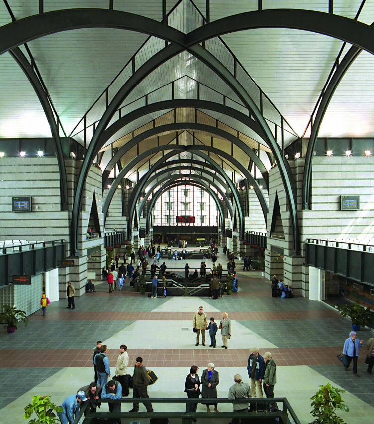
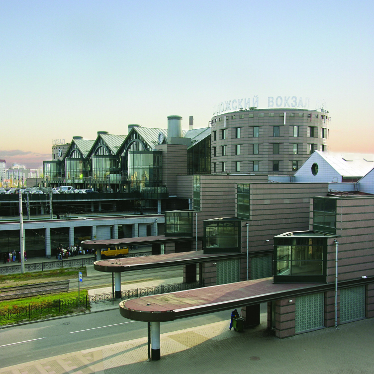
For this a technique has to work in several dimensions simultaneously. Take, for example, our Ladozhsky vokzal [the Ladoga Railway Station in St Petersburg]. This is a building with a number of motivations, a number of sources. The first is a matter of function: the projection of flows of movement through the floor plan and in space. This layer is embodied in a modern high-tech aesthetic. I regard rootless high-tech as a good thing, but we wanted something more. We wanted to fit our station into the long series of precursors, to reach back to the railway stations of the 19th century and, through them, to
the Roman thermae and basilicas which served as a source of inspiration to the authors of the first stations. This is, you
could say, world history. But there are also regional roots: motifs taken from the forts of Kronshtadt and Ivan Fomin’s competition design for the Nikolaevsky Railway Station (which is a ‘brand item’ as far as Petersburg Neoclassicism is concerned).
But the ordinary person may be ignorant of these ‘brand items’, and so will miss the associations which you have programmed. You may have been thinking of the Basilica of Maxentius, but people see the main hall as ‘proletarian Gothic’. You talk of the forts at Kronshtadt, but they mention inhabitable bridges. Do such alternative readings make you uncomfortable?
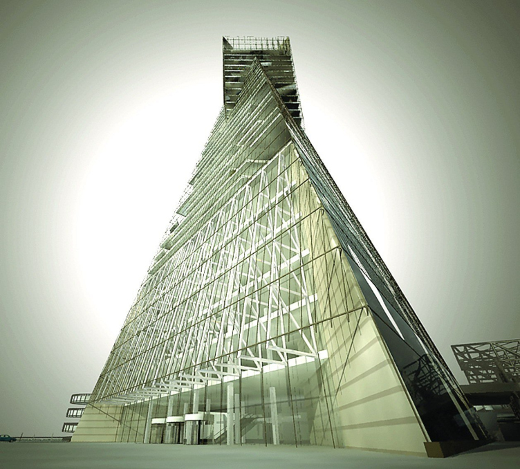
Not at all. On the contrary, the more categorically someone says that this resembles a G othic cathedral, the better. This means that the architecture has started living its own life. Form is animated by the cultural meanings which it acquires uring the course of its reincarnations in history. Take the pyramid, for instance. This is not perceived as a pure abstraction,
but merely as a geometrical figure. It is a symbol of stability, calm, majesty – from Egypt to Empire and so on.
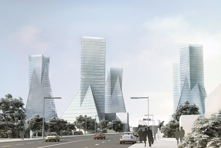
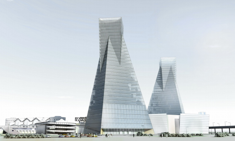
As far as I know, this is one of your favourite shapes. It’s present in many of your designs – the skyscrapers beside Ladozhsky vokzal, the campus of the Higher School of Management at Mikhaylovka, the Leningrad Region Administration building, etc.
I find the so-called ‘geometrical primary elements’ – and, in particular, the ideal ‘Platonic bodies’ – rather more interesting
than all the latest fads in non-linear architecture. Their potential was studied by Ledoux, L’vov, Stirling, and the Russian Avant-garde. You could say that these extremely rich deposits have been explored, but by no means exhaustively revealed.
But doesn’t architecture of this kind become vulnerable if it is not read properly but treated as a kind of ‘building set’ consisting of geometrical parts?
I agree. Here we are slightly balancing on the border line, due to our constant aspiration to clean up the form and squeeze
out of it a certain geometrical or spatial extract and, at the same time, to make our associational moves clear to the viewer.
And it’s here that the viewer’s erudition becomes important… Although I think that our viewer is an ordinary person who lives in all kinds of cultural space, and he or she will find the meanings invested in the architecture obvious – or at least, the main meanings.
Perhaps there’s no point in overloading architecture with meanings? Peter Zumthor, for instance, has written that messages and symbols are not primary to architecture. That architecture needs to be cleansed of meanings brought in from outside, which cover it like a patina, so that it can once more become ‘shiny and alive’.
For all their apparent simplicity, Zumthor’s works are fraught with metaphysics and almost transcendental meanings. And,
unlike the ‘globalists’, he is inspired by the specific qualities of a site and does not reproduce a formal technique, once he
has discovered it, in different parts of the world. It’s another matter that he expounds his philosophy with excessive pathos.
Konstantin Mel’nikov behaved in the same way, and he is still unsurpassed in terms of the richness of meaning in his images, the originality of his ideas, and the free flight of his fancy. For instance, he explained the origin of the form of his Rusakov Club as follows: ‘The site was very small, so I had to create consoles.’ And now we find in this three-dimensional plot a multiplicity of plot lines – there’s the materialization of the processes of looking, form turned inside out, variations on the theme of the triangle, architecture as sculpture, and ‘the megaphones of Communism’… And that’s always how it is with Mel’nikov. There are at least four to five possible interpretations and each thing has four or five meanings. And at the same time you get compact floor plans, brilliant organization of interior space, and maximal useful floor areas coupled with minimal total volumes of buildings. All in all, Mel’nikov is the quintessence of what I’m aiming for.
And yet the main thing for Mel’nikov was the invention of new forms. They say he simply could not understand how he could use anything discovered before he came along. But you, I think, go in more for interpretation; you appeal to the architecture of previous ages.
Wait a moment: Mel’nikov cannot be characterized in such simple terms. He is, above all, a profound and original thinker and only secondly an inventor of new forms. Here’s another thing he said about the Rusakov Club. He said that previously theatres were tiers, boxes, and so on; but he had been commissioned to design an auditorium with nothing more than an amphitheatre. The argument was that this was what was required by democracy and social equality. He wanted to get away from this spatial simplicity and so divided part of the amphitheatre into three box-like structures. This means that you have
both togetherness and separation of the audience and spatial richness within the framework of a single stalls space. So what
was this: innovation or interpretation?
Incidentally, in his day my father came up with the idea for an ‘amphitheatre of boxes’ – a synthesis of the ancient amphitheatre and the tiered box theatre. My brother and I have employed this idea in several competition designs. It has never yet been realized, but I don’t doubt that it will be eventually. Modern architecture owes a big debt to that generation of Constructivists. During the Stalinist persecutions, they retreated into the creative underground, but they never renounced their ideas; instead, they passed them on to their pupils.
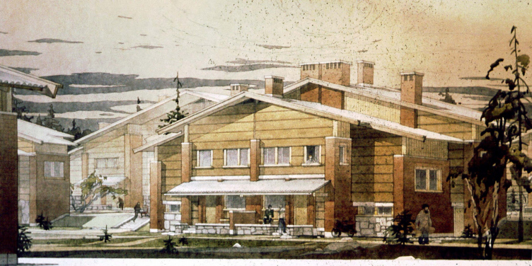
Personally, I’ve inherited from the 1920s a love for placing different functions on different levels. In our ‘Kvartal za gerbom’ project at Peterhof [outside St Petersburg] we are creating a microlandscape with two levels, private and public. We are reconstructing Apraksin dvor as a city on three levels – the lower one for cars, the middle one for pedestrians, and the upper for office workers etc. In our Ladoga Railway Station the suburban trains are underground, the long-distance trains above ground level, and only public transport and railway maintenance are at ground level itself. Sometimes we even go too far with this technique, lapsing into a kind of level-mania. But this is already like the scene of a crime to which you can’t help
returning. Function is pressurized, so to speak, in order to produce complex spatial structures in the spirit of Piranesi.
But at the same time the floor plans are almost classical, and sometimes almost absolutely symmetrical. Is this a legacy of the classical tendency in Constructivism?
Spatial complexity is possible only when you have floor plans that are clear and simple. It’s just as in a print by Escher: brainteasing compositions are put together from elementary geometrical particles.
But the classical tendency in Constructivism is a very Petersburg thing. Classical Petersburg is such a powerful tuning fork that all movements in architecture have been only too glad to resonate to it. Here you find the various styles at their peak; any momentary flashes have been smoothed out. This city has melted everything down into a single artistic whole. It is customary to say that the Petersburg school is conservatism or even an obsession with the past. But this is not where its heart lies. In Petrograd and then in Leningrad there was an intense quest going on at the border of two seemingly such heterogeneous phenomena as Classicism and the Avant-garde, with the aim of reducing them to a common denominator, a single root, to the primary essences of architecture. Aleksandr Nikol’sky used to say that a bathhouse is circular and a swimming pool circular because a drop of water is circular…
So, when you’re working [in St Petersburg] on Petrogradskaya storona or in the region of the Sovetskie streets, everywhere where Neoclassicism and Constructivism are borderline, you can’t help wanting to produce a fresh take on the
experience of your precursors, to continue the line which they began. In general, it’s right that architecture should grow from
inside and not be brought in from outside. It’s important to understand what the site itself wants.
What do you mean?
A site can contain a hidden impulse for transformation which you try to guess, reveal, and realize. This was the case with the five high-rise buildings by Ladozhsky vokzal. An unshaped, chaotic situation in a tense hub for all kinds of activity was simply crying out for intervention, for an appropriate response to the urban-planning challenge. This project was in fact our own initiative: the client’s idea was for a single skyscraper or two at the most.
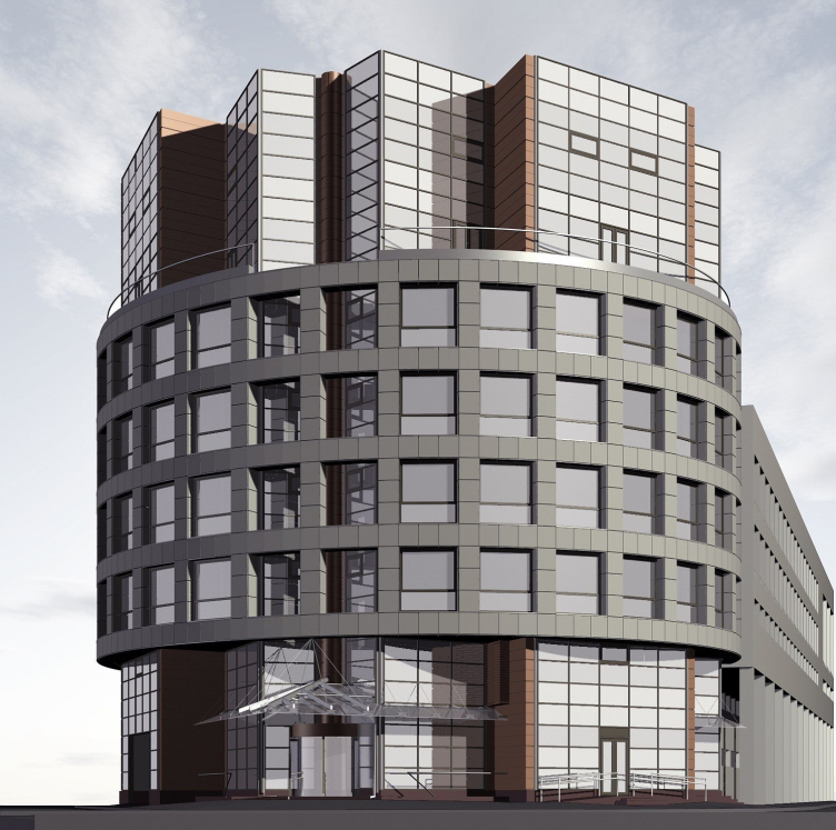
The Linkor Business Centre is a reaction to the anonymous mediocrity of the buildings on an important section of the embankment. Here we permitted ourselves an energetic form and a slightly literal figurativeness. But this figurativeness is not one-dimensional: the ‘bottom’ of the ship forms a canopy over the car park, and its contours are not absolutely ship-like – they are more an allusion to Corbusier’s porticos. Finally, the idea for Linkor [the Russian word means ‘battleship’] would never have arisen were it not for the presence nearby of the river, the Battleship Avrora, and the Nakhimov Naval College.
Do you permit yourselves such radical gestures only in new buildings or in reconstruction projects as well?
Linkor is the reconstruction of two industrial blocks. Our skyscrapers can also be regarded as reconstruction, but on the scale of a large piece of the urban environment. Almost everything done by Studiya 44 is to one extent or another reconstruction, given that we are not in the business of building new towns on greenfield sites. As for the nub of your question, my answer is that I am not a fan of contrasting oppositions in projects which are situated in the historical centre or
involve listed buildings. Some people may think this kind of approach eye-catching, but it reminds me of conflicts between
children and their parents when the former are fighting to establish their own identity. Projects involving listed buildings are in
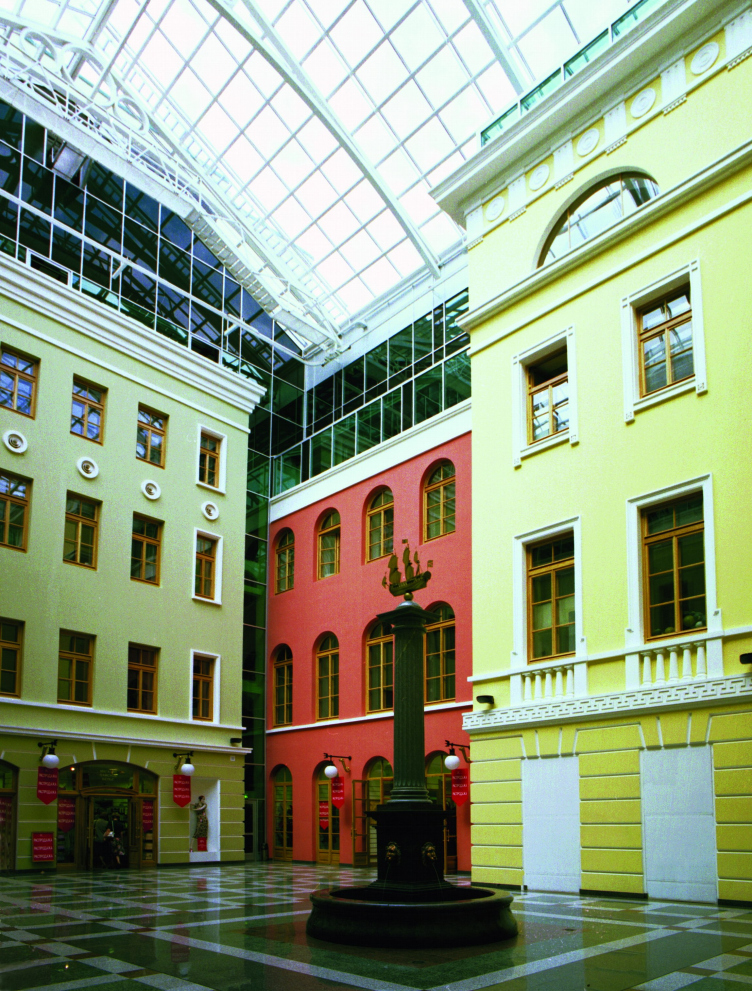
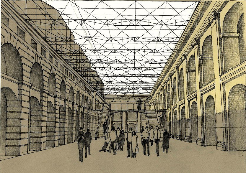
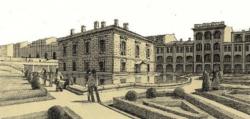
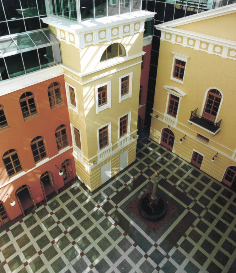
some respects more difficult than new construction, since they require a colossal amount of specialized knowledge. But when you have this knowledge, then such projects can actually be easier because you’re dealing with an existing organism which doesn’t have to be grown from an embryo – you merely have to correct it without harming it, and then add some things, but things with the same ‘DNA ’. In our reconstruction of Nevsky 38 we tried to preserve as much as possible of what was valuable, that which constitutes the building’s soul, without introducing any new figurative elements, with the exception of the arcades. The ideology for the reconstruction of the General Staff Building has been evolved from archetypes taken from the historical Hermitage and interior space in St Petersburg – enfilades, hanging gardens, exhibition rooms lit from above, and views into the distance.
You worked on the project for the General Staff Building with Rem Koolhaas. What was his contribution to the project?
Rem Koolhaas’s OMA/AMO was one of three consultants to the Hermitage on the Guggenheim-Hermitage project (the two others were the Guggenheim Foundation and Interros). Their criticism and comments were a great help in honing the ideology for the project for the reconstruction of the General Staff Building. But an even greater help was Mikhail Piotrovsky, Director of the Hermitage – in that he created conditions for the evolution of the project. There aren’t many clients who, instead of hurrying the architect along, join him in thinking and researching.
The process of ‘growing’ a design clearly takes a long time. But how does this happen in an office with a staff of 120? Who generates the ideas? Is it always you?
Not always. In the case of the General Staff Building, it’s mainly been my brother, Oleg Yaveyn. Sometimes my part in the process is limited to words – during the first stage, when we’re discussing the concept, and later, when I correct something during design work. But it all begins with me gathering together a group of architects to analyze all aspects of the brief – the
site, function, construction programme. This leads us to a general idea which, as a rule, exists initially in a verbal form. Subsequently, it’s translated into handdrawn sketches or working models and only then does the team sit down at the computer.
Do you always proceed by reasoning? Can it never happen that someone takes up a pencil and conceives a desire that on this site…
Never. This is not an intuitive process. There’s no room for artistic self-expression.
Everything has to be thought through and analyzed? So this is more cognition than creation?
Cognition, certainly. As soon as we start playing at creativity, the result is worse than work done by other people. I have to confess, I am by no means always satisfied with the sketch stage. Which is to say, the idea comes quickly, but then it has to be properly dressed up, it has to accumulate resonance and meanings. Not even details, but meanings. And the details appear in the footsteps of new meanings. We are growing a thing. We watch how it develops. And, at the same time, we develop ourselves. And it’s only at the third or fourth level of cognition that a degree of freedom appears. Free drawing begins only during execution of the working drawings. Which is why our working drawings are always better than the concept stage. The realization may be worse, but we are always happy with the working drawings.
What do you consider to be a complete success?
When the client’s greed and caprices have not ruined the architecture during its construction. When it has proved possible to obviate the initial difficulties and restrictions and arrive at a figurative solution. When you end up with something that is not one-dimensional, but multilayered and with a multiplicity of meanings. And finally, when this project is understood and appreciated.
And a final question – don’t be alarmed! What do you find troubling?
The fact that architecture has started living according to the laws of show business, haut couture, and object design. It’s when each season you have a new ‘product range’ coming off the podium and the previous range automatically becomes unfashionable and old hat. It’s when architecture is compared with makes of car and clothing. To my mind, this is vulgar. For me architecture, like culture, is a fundamental category.
Today globalism imposes not even a style, but an image which determines everything – from the curving shape of a building to the ‘star-like’ behaviour of its creator. And everyone comes out with exactly the same glamorous clichés. Well, with the exception of a few figures who stand out from the crowd (Botta, Siza, Moneo, Zumthor, Nouvel) and regional schools (such as the Hungarian), whose existence is known to only a few.
Here in Russia, as is the case with all new converts, the state of affairs is both more terrifying and more comic. Currently, every governor in Russia knows that skyscrapers are in fashion and that they should be spiral. And if a skyscraper is not spiral, then it is indecent and provincial.
Gunnar Asplund said there are buildings which it’s impossible to change and that this is awful. On this basis, many of the products of the globalist range have short service lives. To buy disposable objects for the price of a masterpiece is as stupid and wretched as to go chasing after fashion with your trouser legs rolled up.
Back in 1967 wise old Mel’nikov warned us that when there is an abundance of materials and ‘everything shines’, you need great courage in order to work with space, light, and ideas and not just with gloss and constructional tricks. In order to use the enormous opportunities available for more than just vacuous effect, you need much more ‘profundity, concentration, and penetration’.


