In Moscow and St Petersburg you have designed several buildings with decorative facades that are extremely original – from both the artistic and technical points of view. Is ornamentation important to you?
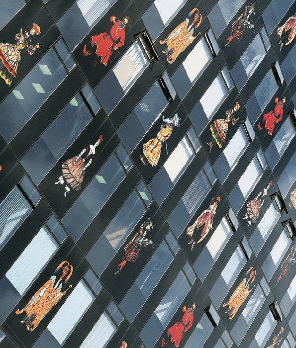
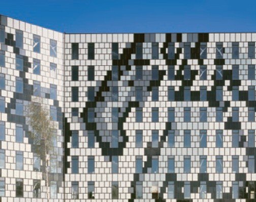
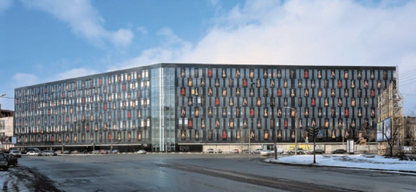
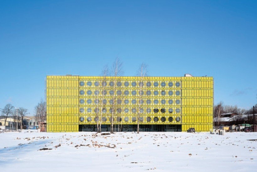
It seems to me that ornamentation is a complex subject in modern architecture – it is controversial and provokes debate. There are two principal architectural types in the West: sculpture buildings and façade buildings. But if we design a façade building, then presumably it must be decorated in some way? Nevertheless, in Germany and in Europe in general, this is something that is regarded with a great deal of prejudice. There are many examples of decorative façade even today, but almost always there’s an element of irony or a subtext, so to say that ornamentation has again become a component in the development of façade architecture (not structure, but façade) would, of course, be premature. So, when I learnt of the existence of a technology for scale electronic printing on glass surfaces, I decided to give it a try. This method was first used in two buildings in St Petersburg – one on Kamennoostrovsky prospekt, where classical, renaissance forms were printed, and the other the Benua business centre. The former is an ‘optical illusion’ building in which ‘classicism’ is fused into the panels; the latter is a building with a narrative ornament based on themes from the theatre sets of Aleksandr Benua. We are currently doing a series of projects for the client who built these two buildings. All of them follow the same pattern. They are all industrial buildings which have ‘seen better days’ and which need to be revitalized in some way, not just in terms of technology, but with regard to image as well. These buildings stand on different sites and have different characteristics. And they will be completely different from one another. However, they will be united by this technique of ornamental printing on glass, a feature which can turn all these scattered structures into a recognizable brand.
Can your house in Granatny pereulok [in Moscow] be considered part of this series?
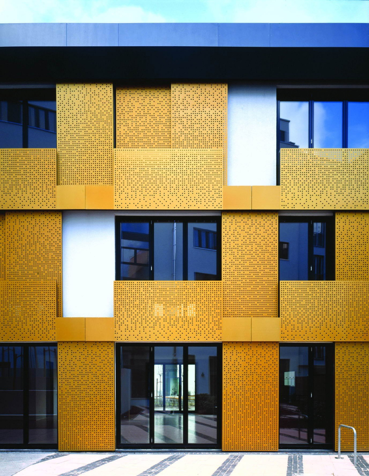
No, that’s a completely different theme. The path taken was very complex. It’s worth starting with my student memories. When I was at college, Andrey Burov’s book On Architecture was held in high esteem. Burov himself was known as a great fan and inculcator of the architecture of Le Corbusier, of purist Modernism. I saw his works from the 1920s, but I was surprised to find that in his book he seems to talk more of his works from the 40s and 50s and to put the emphasis on them. This is not an exact quote, but he says, I think, that if he were asked how to decorate buildings today, he would reply that the examples to follow are the house on Polyanka and the house on Leningradsky prospekt – the one with the interwoven ornament on panels. When we started working on the building in Granatny pereulok, I wanted to pay my respects to Burov – nearby is his portal at the House of Architects, so it was thoughts of him that led me to use a kind of paraphrase or even retort, but in different materials and with different ornamental imagery.
But in your house in Granatny pereulok there is a very distinctive combination of décor and the shape of the structure itself; it’s as if they exist in different dimensions…
This is the result of a complex situation and some complex work. The quest for forms tended towards a cubic composition – and I should say that here my personal desires coincided with the views of the planning authorities. Which is to say that I made a number of proposals, of which some were rather sculptural in terms of shape and detailing. I’ll say it again: either we solve the problem of the façade or we create a sculptural building which contrasts strikingly with its surroundings and treats those surroundings as an indistinct forest around the clearing where this sculpture stands. So, to begin with, I perceived these surroundings as a forest ‘around’ my building. If this had worked out, there would have been no need for this technique of ornamentation. Then this sculptural form would have take upon itself the main role and anything that happened on the surface of the façade would have had to take a backseat – because there would have been a play of shadows and the building’s sculptural shape would have come into play. But when you’re operating in places like the centre of Moscow, your creative quest is not a matter for you alone; you have to take into account the opinions of the planning authorities, and they were insistent that the basic shape of the building should be rectangular (i.e. non-sculptural) and its squares, rectangles, and cubes should echo the likewise rectangular structures of the stately homes, mansions, and Stalinist houses which surround the site to be built upon. The result is a composition consisting of three cubes that border the site on two sides. And then, of course, the façades of these three cubes took on an enormous role. Because these buildings were now of a standard shape.
So problems with planning permission led to an attempt to create an ‘intriguing façade’?
Yes, we had to decide what kind of ‘dress’ to create for this building, what material to select for it so that the surface of the façade would be deep and interesting and give interesting shadow play and so that the building would age in a particular way, revealing its texture with the passing of time. And it was then that I thought of what Burov had said about ornamentation and the path he took towards a new quest for ornament. Given this kind of geometry of shapes, ornamental décor struck me as entirely appropriate, but it needed to be in relief – not flat and not in glass, because here in Granatny pereulok glass would not be right. Glass creates neither relief nor depth of surface; it doesn’t age gracefully, but is a smooth, cold material. And so I hit upon the idea of using stone – and in fact the kind of traditional use of stone that was practiced in Ancient Rus.
How does this go with your image as a ‘Western architect’?
In the West minimalism is not just an architectural approach, but also the stance that society takes with regard to culture – which is to say that people’s eyes are tuned slightly differently there. But I didn’t come back from Germany to start instilling Western culture here – although during the time I spent there, I developed a close understanding of that culture. I even believe that the commonly perceived desire of Russian architects to find what is progressive in the West and recreate it here is mistaken and distasteful; I don’t see anything beneficial in this tendency. Which is to say that, of course, the West has a lot to teach us when it comes to quality of construction and working with form and detailing – they’ve got this mastered. But promoting the minimalist approach to the structure of a building, to playing with almost imperceptible surface effects is, it seems to me, a route that will lead nowhere for Russia. That kind of thing does not work here.
Why?
First, because Russia has a different, softer, light and the minimalist approach to surfaces makes buildings seem pale, disused (compared with France or Italy, where there is more sun and more surface play). Secondly, even if you were to import all the Western technologies, it would be very difficult to achieve a Swiss-clockwork kind of precision in architecture. And for 400-500 years Russian architecture has presented rich surfaces, rich ornamentation, rich colour, and rich relief.
But as well as formally enriching the façade, you are enriching its content too, giving it a literary or culturological subtext?
Yes, undoubtedly: the building receives a certain literary identification. This can either be based on the mythology of the site on which the building is situated or it may be a theme that gives the building content.
In the final analysis, the building is enriched both semantically and ornamentally. When you talk of tradition, does this mean certain classical values – as a counterweight to the ‘poverty’ of purism?
For me Classicism is not a stylistic movement like Baroque. I see Classicism as something that has endured over time. It’s that which has survived as an absolute value and come through the ageing process with dignity.
Does your work not contain elements of ironic postmodernist play?
Play is what should be avoided. Architecture is a serious business. I have a project in which I wanted to crown the building with a series of sculptures. And why should I here engage in irony directed at myself? The problem of how to top the building off remains, as does the problem of how to ‘enrich’ the shaping of its façade, walls, and forms. And this problem is especially acute in Russia with its climate and traditions.
From our conversation you might think that Russia is a place which is not only not suited to minimalist Modernism, but also not really accepting of it. Is this your diagnosis?
But the two are linked. Northerners are ill suited to tanning. I believe that its climate and traditions make Russia similarly ill suited to certain formal quests that are currently developing fast in the West. Work based on zero joins, absolute absence of depth on the façade: all this is quickly wiped out by the bad weather and severe climate. Russia had its own ‘minimalist’ architecture; this was the medieval architecture of Novgorod and Pskov’, but in these cases the severity was softened by the considerable ornamentation on the facades. In a sense, this can be regarded as a precedent for us.
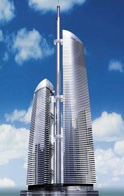
And what about the Federation Tower? This has no ornamental or literary motifs.
This is pure ‘sculpture’. Here the form works by itself and for itself and there is almost no façade (the façade does, of course, exist, but it is merely a perimeter wall – a ‘skin’).
So when required, this kind of architecture is possible in Russia?
First, this is not minimalism but sculpture. And, secondly, if the city considers sculpture to be possible, then, undoubtedly, this may be sculpture with a smooth surface: first and foremost, a sculptural building works through its form and silhouette. Although at the moment I’m designing a hotel in St Petersburg which will combine a sculptural form with ornamented facades.
What can you say about relations between Prussia and Russia when it comes to architecture? Even in Berlin, following the ‘explosion’ of Modernism on Potsdamer Platz, you see more and more block-shaped buildings with pilaster strips, with tranquil structures, and it seems that the traditional Prussian (or Brandenburg) mentality is getting the upper hand. And isn’t it true that this has been felt and conveyed on the facades of the hotel you are designing too? Is this Prussian traditionality and restraint to some extent suited to today’s Moscow? Yes, especially given that Prussian
architecture sought an answer in details – the main urban forms in traditional Berlin were very restrained. Potsdamer Platz was merely a temporary exception. But in Russia you have to show a building’s structure on the outside more than in Berlin.
In Berlin you’re currently designing a building with ornamented glass panels. Is this a case of repatriating forms that were discovered for Petersburg?
You’re absolutely right. In this case the client liked my building on Kamennoostrovsky prospekt and insisted on repeating this technique. The distinctive feature of this part of Berlin is that in the Hackescher Markt district there has been a collision between architects working with relief and traditional forms and architects who in this environment have been able only to put down a glass box, a glass screen from the wall of one surviving old building to the wall of another. We triedhere to interpret these two tendencies in a single building, creating an ornamentally saturated glass façade. I allowed myself on this one occasion to re-export forms, but I think that from the point of view of the cultural tradition of the location a completely different building could have stood on this site.
What is your attitude to wealth? In Russia today wealth, prestige, and glamour all in one way or another find their way into architecture as well: architects are forced to work with this…
I have sympathy for this. And I can say so without fear of the reproaches that would undoubtedly have come showering down on me in the West. In the West architects treat a building as an expensive piece of clothing which balances on the borderline between absolute modesty and absolute refinement. I am capable of creating a building which can tread this line, but nonetheless I believe that in order to explore further possibilities and their boundaries, this is insufficient. Both from the point of view of a sculptural building and from the point of view of one with tranquil forms where he main role is placed by the façade, the concept of glamour is important. Glamour is superfluity, is something that is more than necessary. Superfluous form (as, for instance, in the architecture of Zaha Hadid or Frank Gehry) is glamour, just as the decoration of a façade can be superfluous. So you have to balance on the borderline of superfluity, but with a sense of measure and an understanding of that same glamour that we’re talking about.
There’s a Neoclassical movement springing up in Russia at the moment. I’d like to know what you think of this.
I’ve long since been wondering what’s going on. My view is that in order to create new and truly original examples of this architecture that can compete in the right way with examples from the past, you have to spend all your life working hard at it. For this you have to turn yourself into a school. Because a school of classical architecture has to be based on the canon. If you go down the route that I’m trying to go down or the route which many architects in the West are going down, this is to a certain extent a matter of finding a niche of one’s own. This niche may be very narrow. It may be (as in painting) a single shade of paint. Or it may be an entire palette. This depends on your objectives and your talent. But today tradition is born and dies together with the architect, and this is where things are so different from Classicism, where there is a great external tradition. Which is to say, the architect dreams up some personal tradition but creates no school. Classicism, on the other hand, is precisely that kind of school. The Classicists learn not from their teachers (they are separated from the school proper by the whole tradition of Modernism); they learn from their forefathers, i.e. they try to put down a bridge to that school which ended in the 1930s and 40s. They are oriented on the past. I cannot see myself in the role of a fighter in the centuries-old tradition of changing the classical order.
Your work contains a fairly wide range of styles – from an extreme sculptural Modernism to a more literary, narrative architecture which is part of the same Modernism, but from its ‘right’ wing.
Perhaps I don’t seem very consistent, but on the other hand I’m able to find spontaneous answers to questions that arise, without following particular canons which predetermine an answer. For me following only the classical norm would narrow my ability to give spontaneous answers to this or that particular challenge. I’m now 45 years old. I have been active as an architect for 12 years. When I arrived in Germany, I was 30. Until the age of30 I studied at the Academy of Arts and worked on paper projects which led nowhere, and that was all. To begin with, I didn’t know the language and all I could do was architectural graphics. So I have been properly active as an architect from approximately 1995 to the present day. Twelve years: that’s not very long, and for the most part it’s been a time of quest. I’ve already said that modern architecture moves along two routes. The first is sculptural shaping of a building, and the second is when a building’s façade becomes a kind of screen. But it should not be thought that this is a soulless surface, that it’s simply a minimalistic ratio of closed and open surfaces. No, this is a surface which in itself, in its decoration and ornamentation, must express something in addition to the fact that it is a series of windows and closed surfaces. In my most recent designs I have tried to express this. But Classicism I regard as an absolutely different movement where the two forms mentioned above – sculpture and façade – are united in an attempt to find both a form and the expression of the surface of this form.
Many people today regard the classical language as impossible. What do you think?
No, I don’t regard it as impossible. My view is as follows. If today I understood, if I could narrow myself to the understanding that this is the path for me, then I would have to take it very seriously. It is a minimalist school, but it is not a minimalism of denial of possibilities but a minimalism of choice of possibilities. In the path I have chosen there is the possibility of exaggeration and grotesque, while in Classicism the possibility of grotesque is minimal – a step to the left or right is a deviation which smells of bad taste. Moreover, this deviation towards bad taste leaves much less room for mistakes than a situation where you are to a considerable extent compiling styles. It is a process of purification on a path which is absolutely distinct. At the present moment, I am not ready to take this path. I am not ready to renounce the wide range of opportunities offered by modern architecture. For instance, were I a Classicist, I wouldn’t have created my Dom Benua. I’m simply not ready to winnow out border phenomena in the way that Classicism demands.
Your work means that you are involved in two countries and two cultures at the same time. Does this enrich you in some way?
Yes, working like this has given me a great deal. I came to architecture from drawing and was really a ‘paper’ architect, so when I landed in Germany, this gave me a school of practical work, meaning that I now know how to build architecture. For me Germany is undoubtedly a chance to properly get to know what technology can do. And then the West is a place for honing the way you work with materials, with detailing; it teaches you how to integrate and aestheticize the latest achievements in engineering. At the same time, for European culture, which has been brought up on Modernism, many themes remain closed, almost ‘taboo’. In this respect, Russia today offers the architect more opportunities. Working and living in Russia imparts to my buildings that additional, literary content of which you were talking. Here I try to pack architectural forms with additional content.
