You are an architect with a very distinctive personal programme. How do you define
your place in modern architecture?
There is no such thing as modern architecture. All my life – well, the last 25 years at least – has been shaped by this major discovery, which I have been articulating forcefully in the last few years, even though it came to me earlier, in 1981. That which we call modern architecture is non-architecture. It’s another genre, another type of activity. That which is called modern architecture is really construction design, design that lays claim to monumentality. I have no wish to occupy a place in it. I want to replace design with architecture in the true meaning of that word.
Is it worth placing such importance on words?
These are not words, but an essential opposition. Modern architecture is based on a programme which comes from design – i.e. on the quest for the form of things which move. It has nothing to do with the expressiveness of stable, vertically standing objects. It’s the opposite aesthetic, and it stands in opposition to the very beamand- support nature of architecture, the latter’s fundamentally static quality, the idea that ‘the Universe is unmoving’.
This is a very abstract level of reasoning.
No, it’s extremely specific. Take a simple example, from antiques. An Empire-age chair, for instance. Its leg always tapers towards the bottom. But no column – either in Empire or in any other classical style – ever narrows towards the bottom. Why? Because a chair is something that moves. Its stability is based on the idea of providing maximum reliability where there is maximum load – where seat and legs join. The main load borne by a chair is not vertical, but horizontal. The same goes for a carriage, ship, airplane, etc. But not for architecture. Architecture created using the instruments of design is, ontologically speaking, ugly. It’s the application of the aesthetic of moving objects to that which is unmoving. What is beautiful in an automobile is ugly in a house. What is beautiful in a horse is not acceptable in
a woman.
I agree with your opposition between the aesthetic of the moving and the non-moving. But what do you mean by ‘ontologically speaking’? Yes, the aesthetic of one has been transferred to the other. But this has been done entirely consciously. Modern architecture’s striving for movement and flight have been declared at a programmatic level by a plethora of manifestos for modern architecture. When Corbusier said, ‘A house is a machine for living in,’ this was brilliant, comprehensible, and unambiguous. But the fact that he said everything in advance does not relieve him of responsibility. And the same goes for modern architecture’s other founding fathers. There is aesthetics as an aesthetic imperative, a commandment which cannot be broken because it would be wrong to do so. He broke the commandment – or rather, reflected the internal mutation which had taken place in society. Architecture has one rather strange characteristic: it is a portrait of Dorian Gray. It is inseparable from the life of a person, just as skin is inseparable from the body. Architecture grows out of daily life, imparting form to it and revealing its meaning. We are slaves of a certain spiritual reality, and the point is that in our creative processes nothing should prevent the manifestation in a man’s life of that Man with a capital letter which constitutes the meaning of his life. We should be able to look at the facade of a house and see ourselves, our own lives, in it, and see that it is beautiful or ugly.
If someone is ugly, then it is terribly difficult to hold back this horror by some movement of talent. I’ll give an example: Zholtovsky’s house on ulitsa Mokhovaya. It is clear today – and it was clear to everyone at the time when it was built – that it is impossible to cover up a Palladian Constructivist prison using the most beautiful columns. The prison seeps through to the surface and represents the reality of 1930s Russia that gave rise to it. But here, at any rate, people still had a chance to become better. It is a crime when our creative process deprives a person in advance of this opportunity and destroys the very possibility of an image being manifested. This is what I call ugliness in the ontological sense – when the very structure of existence offers no possibility of an image being yielded. What is meant by ‘the Universe is unmoving’? Not that the universe is devoid of movement. For it is not – we see this for ourselves. But rather that the universe cannot be pushed aside, i.e. is indestructible, eternal. That which moves subsequently stops – dies. That which is unmoving is everlasting. The loss of an image means the loss of the possibility of eternity. This is the crime.
It’s good that they declared everything in advance. Take Hitler – he also said everything in advance. Mein Kampf was written in 1923, not in 1939, and it contains an animated account of what exactly he was going to do with mankind. Or take Lenin. He came out with his programme of revolutionary terror in 1905, not in 1917. Does this relieve them of responsibility for their crimes?
These comparisons strike me as too harsh.
Possibly, this is a response to the customary slander directed by Modernists at Classicism, which they regard as clothing for totalitarianism. Incidentally, on the subject of totalitarianism. Le Corbusier advised the future wise khalif of Paris simply to cut off the head of any who opposed the architect’s brilliant project, and to his dying day Gropius simply could not understand why his beloved Hitler had rejected Bauhaus. The crimes committed by modern architecture are aesthetic; they are sins against the image of man, as opposed to against his life. I’m simply comparing them with moral sins because people have engaged in them consciously. They have joyfully acted with aggression towards old cities – as is especially clear in Le Corbusier’s plan for Voisin, which is symbolic to the point of madness. Voisin were precursors of Peugeot. Corbusier was working to increase their sales of cars. For this he felt it necessary to clear the old city. Everything was to be destroyed and in its place towers completely devoid of any detailing were to be erected; the justification was that that they would be seen from speeding automobiles. Today Moscow’s skyline is dominated by skyscrapers. I’ve been in one of them; it has a view over all Moscow. The city in which we were born is a terrible sight. It’s as if they’ve started making a garden and then scattered the most awful rubbish all over the place. Like in the forest after an incursion of tourists. Boxes and boxes. Everything’s been covered with rubbish, as with the discarded packaging from life after life itself has been consumed. The same thing is happening in cities all over the world. From the point of view of overall silhouette, scale, and from the point of view of life at street level, it’s a catastrophe. And this catastrophe has happened everywhere, with a few exceptions such as Venice and St Petersburg. That place in a city which should be occupied by living architecture is occupied instead by a trashy sea of used designer packaging. Architecture becomes rubbish, ecological pollution, and the city becomes a rubbish tip. This explains my comparisons, which strike you as too harsh.
Doesn’t it worry you that almost no one shares your views on architecture? Hundreds of architects have gone down the path taken by Corbusier. Were they all mistaken?
The number of people sharing a point of view is not a measure of its truth. Mankind can commit collective mistakes. Just remember communism. For me proof that I’m right is that old architecture is alive for people. There’s almost no work of world architecture that is dead. Most continue to work in accordance with their primary functions. As cathedrals which people continue to visit just as they did when these buildings were first built. Or, for instance, a medieval centre may be a political centre. Like the Kremlin. Or even a centre of tourism. A Petra or Acropolis can bring in just as much money as oil, which Greece and Jordan don’t have.
Yes, it’s not hundreds but hundreds of thousands of architects that have taken the wrong path. But there are ordinary people as well, and they number not hundreds of thousands but millions. The point of view I’m talking about is shared, I’m quite sure, by the majority of people on the planet. For ordinary people the old museum aesthetic is still alive. They visit the old cities and fill the museums. But there’s not a single person who would go to Mitino [a suburb of Moscow] to admire the architecture. People don’t take holidays in Brasilia or Chandighar. No, they go to Italy.
So you are appealing to the tastes of the speechless masses, who maybe manifest certain views in their economic behaviour, but in no way express them.
The fact that the people I’m talking about are not professionals does not make them a speechless mass that has nothing to do with culture. On the contrary, the accepted view is that people infused with the old museum aesthetic have a very significant relation to culture. Opposition to Modernism is culture’s opposition to barbarism. Where I’m unique is in that I’m a professional architect with such views. But the views themselves are definitely сommonly accepted ones. You have reproached me for unjustified harshness in comparing Le Corbusier to Hitler. In response, I’d like to quote Iosif Brodsky’s Rotterdam Romance:
Corbusier and the Luftwaffe
have in common
That both worked flat out
to change the look of Europe.
What was forgotten
by the Cyclopes in their fury
Was soberly completed by pencils.
Do you really think Iosif Brodsky belongs to the speechless masses?
Of course not. But it does happen that professionals advance in leaps and bounds and then it takes time for common tastes to catch up.
‘Leap ahead’: that’s a modernist myth. As if the existence of mankind is a sprint towards progress and whoever fails to get there in time is too late. I would like to know where we’re running to and where the finishing point is. What the Modernists have done can much more accurately be compared with vandalism. The Vandals were Christians, you know. Heretics and Arians, but Christians. And they destroyed Rome not because they did not know Roman culture, but because they wanted liberation from culture. This is a very subtle intellectual barbarianism, a side-product of the development of culture. As, incidentally, is fascism and communism.
Fine: your position is clear. How did you arrive at it? Where does this come from?
Since childhood I’ve felt a desire to say something new. But prophecy is a very difficult thing to carry off. It’s not enough to guess something; you also have to do something in yourself. You have to do a great deal with yourself. I have educated the artist in myself. But you also have to persuade everyone else, and for this you need enormous willpower and a great deal of talent, and this is what, I suppose, I don’t have enough of.
No, and what about the content of your programme?
There’s something strange I can tell you. I came to Classicism through the Avantgarde. There is a central myth in modern art. The myth of the lonely genius who knows something that no one else knows – like Picasso or van Gogh or Modigliani. People whom no one understands and who then find themselves on top of the world. The myth of the artistic prophet, in short. All modern artists and modern architects spend their whole time trying to live this myth. I am no exception. Of course, I dreamt of becoming the main hero of this myth. So I painfully thought up the most original, most marginal point of view. I wanted to be unlike everyone else. This is the proud, absurd, and senseless thought which drives all artists. But I should be honest with myself. I thought up everything I’m saying now out of a desire to draw attention to myself.
So you had no initial predisposition for classical architecture?
I suppose it would have been impossible for me to think up anything else. I was born in the house in which Pushkin wrote The Bronze Horseman. My kindergarten was in the house of Arakcheev. My first, and literally the first, art school [Art School No. 1] was the house of Prince Golitsyn. I honestly loved all this. We spent the whole time visiting the Hermitage and the Russian Museum. I knew the Hermitage collection by heart, room by room. The natural environment in which I grew up was the world’s best aesthetic education. Furthermore, I was imbued with an extremely strong dislike for everything Soviet. This was the period of socialist Modernism. We hated everything that came from the Soviet regime, whereas pre-Revolutionary Petersburg was, on the contrary, the aesthetic ideal of an alternative to Soviet vulgarity. The result does not have to be guessed.
Nevertheless, you came to Classicism through the myth of the Avant-garde artist?
Yes, but the idea was so radical that it turned me upside down. It was impossible to go back to what I had been doing. It turned out that this was not simply a technique, a new style, etc., but existence itself. I had myself baptized. The ideology of Orthodoxy and canonical art seemed to me incredibly alike. I guessed that modern art and modern architecture are the syncretic icon of the atheistic consciousness. True, it proved impossible to use Orthodoxy as support for my aesthetic position because if you do that, then you immediately find yourself in the company of patriotic Pharisees crowding the church railings – as does almost everyone who tries to use ideology as a substitute for serious artistic work in creating beauty. I began looking for a proper aesthetic route.
In what does this consist?
I immediately realized one very important thing. I realized that in Classical architecture as such there is no recipe to be found. Which is to say, if you simply learn the various classical orders and start affixing them to boxes, you won’t create a proper work of art. The recipe lies in creating aesthetic experience in yourself. In the oldest, most serious meaning of this word. Just as pianists spend five to six hours each day playing the piano. ‘Why?’ you ask, given that they are already able to play. But, no, it’s only when you do something beautiful constantly that you’ll be able to do it well. You have to be always drawing, always doing something. In the old days everyone understood this, and it wasn’t even discussed. All architects worked all the time, like artists. But to prove that you need to sketch Antinous in order to design Mitino is very difficult. This is impossible to prove.
So you became an artist for intellectual reasons, in order to realize an aesthetic programme?
Yes, I never set myself the task of simply being an artist; this was something I did for the sake of architecture. Possibly, this slightly narrowed the opportunities I had as a painter or graphic artist. But in itself this was a very true path to take. I find it difficult to tell a L esbian from a D oric cymatium, but I never err in choosing a colour scheme or proportions. When I visit a building site, I can spot a 5-centimetre error on the 9th floor. The guys at the office who visit the building sites may look, but they don’t see; they think everything’s fine. But I see – because I know that I wouldn’t have been able to draw like that. And in the old days it was absolutely elementary; it wasn’t a subject for discussion. This was experience that everyone possessed. I want to say this to everyone who is trying to return to traditional architecture, and I’m sure that sooner or later this is bound to happen. Traditional architecture is a matter of constant quest and raising your own standards. In this lies the morality of the old aesthetic programme – in a very exacting attitude towards ones own work. Do not spare yourselves, do not spare your work. If you have drawn something and you’ve liked it immediately, then either your eyesight is bad or you’re lazy. You must apply the highest standards to yourself.
In your architecture do you employ only this artistic experience? Experience in drawing old architecture?
I can say that I am essentially the son of my own school. The school of the 1970s – inventiveness, complex compositional structures. This school had an emphasis on inventing spatial effects, and this was very interesting. Only it has nothing at all to do with the plastic problems of antiquity, and there is no contradiction between the compositional quests of the 1970s and the classical order. On the contrary, combining the one with the other is terribly interesting.
But there’s a self-evident contradiction. Classical, order-based architecture is about harmony. The architecture of the 1970s is about disharmony. Dissolution, breakage, conflict. A fundamentally non-classical architecture.
What about the classical ruin? It consists entirely of precisely this: dissolution, breakage, conflict. There are thousands of such ruins. And people travel hundreds of kilometres to pay homage to them. This is based on a boundless wealth of plastic techniques. And the most important attraction is freedom. A ruin contains freedom, which does not at all exclude a profound historical aesthetic.
Can I ask you a number of specific questions? Can you tell us about your experience of ‘paper’ architecture?
I am sceptical about the ‘paper architecture’ period. The way I see it, this period’s importance has been unjustifiably distorted, including by critics. Paper architecture as a whole, as a phenomenon, is not worth talking about it seriously. I am grateful to paper architecture for its giving me the opportunity to declare my programme – and declare it quite loudly – given that my Style 2001 won first prize. But that’s all. In order to understand this phenomenon, you have to picture the situation in which it came about. How did we live then? We saw nothing in the flesh; we bowed down before the magazines. We looked at an image and conceived in our minds the reality that lay behind it. Magazines were a window onto Europe (onto America and Japan, to be more exact). And when I came to Moscow and found out that it was possible to take part in competitions – and Misha Belov had already done so and won – this was amazing. There was this feeling that, firstly, you can yourself draw these windows, and, secondly, if all turns out well, you can pass through the window that you have drawn and appear on the other side. In the same way that these others had triumphed and travelled abroad. All the excitement about paper architecture is 75% explained by this miracle. Essentially, paper architecture consists of cheerful or sad caricatures illustrating an architectural kapustnik [‘cabbage party’], a type of event which was very popular at the time. The word kapustnik came from the feasts organized by actors at Great Lent, when theatres closed and the pies eaten contained cabbage and mushrooms. The second half of the 20th century was precisely a fast for architecture. Architecture died as an art and creative young people poured out their unspent talents – into the kapustnik called ‘paper architecture’.
In 2000 you represented Russia at the architecture biennale in Venice. Your exhibition on that occasion consisted of apartment interiors and urban utopias. Since then you have acquired a large office and large commissions. Has your understanding of architecture changed? Have you had new experience?
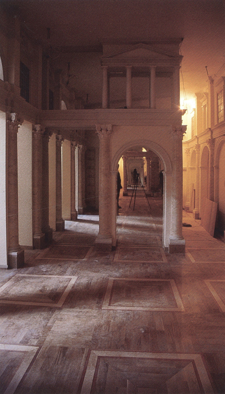
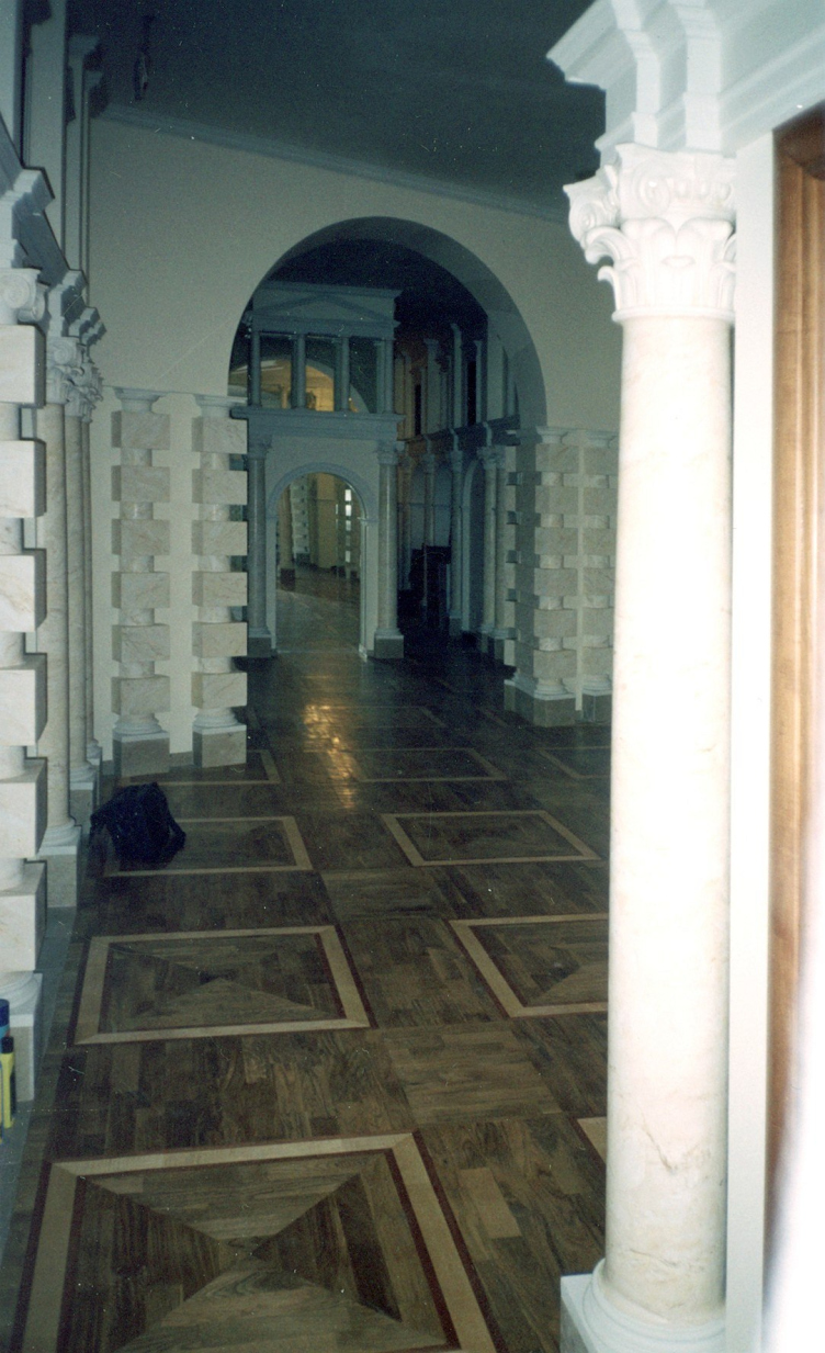
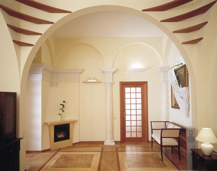
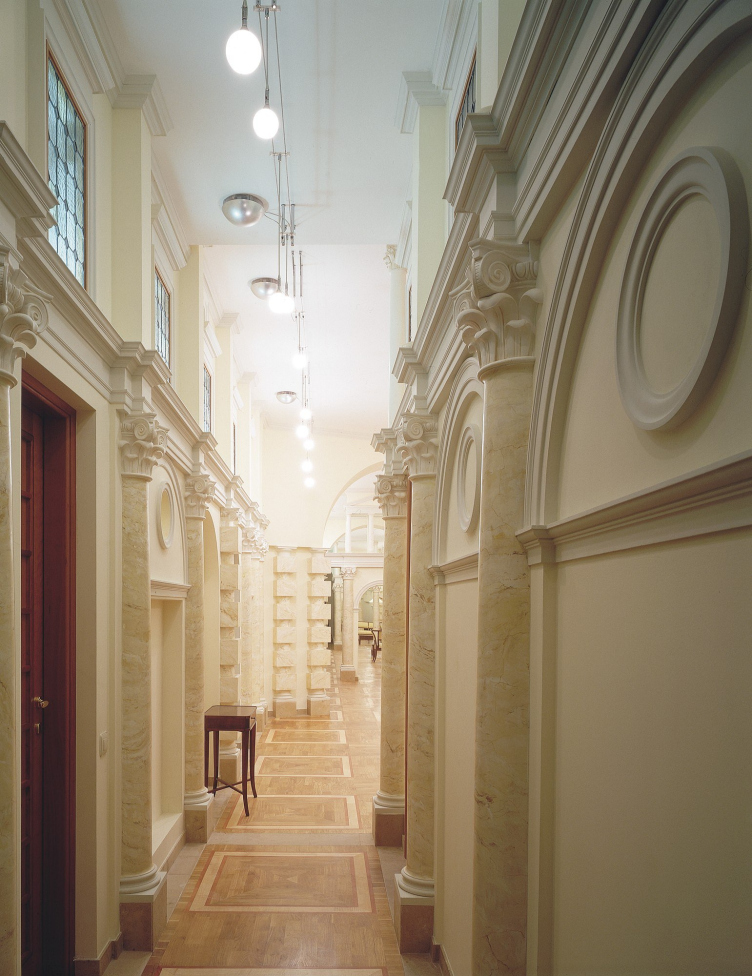
As for apartments and utopias, here I was inspired by the example of the brilliant Neoclassicist Ivan Fomin. For seven years I was banged up in apartments, but Fomin went through exactly the same thing. He designed the apartments and mansions of Vorontsova-Dashkova, Lobanov-Rostovsky, the Abamelek-Lazarevs, and at the same time devised the grand utopias of ‘New St Petersburg’.
After the Venice biennale of 2000 this period came to an end. Yes, commissions on a larger scale started coming my way.But I can say that I have in no way changed. Everything that I can do, that I want and know, I conceived in 1982. My programme has not changed since then. Nor should it
have.


