

-
 1 / 6View of the facade on the Dalnevostochny Avenue, the evening light. “Renaissance” housing complexCopyright: Photograph © Dmitry Tsyrenshchikov /provided by Liphart Architects
-
 2 / 6View from the northeast, a fragment. “Renaissance” housing complexCopyright: Photograph © Dmitry Tsyrenshchikov /provided by Liphart Architects
-
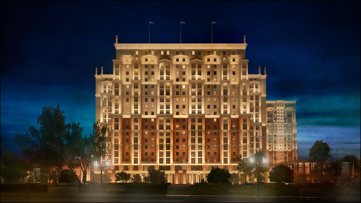
 3 / 6Overall view from southeast. “Renaissance” housing complexCopyright: Photograph © Dmitry Tsyrenshchikov /provided by Liphart Architects
-
 4 / 6The northern facade, the evening light. “Renaissance” housing complexCopyright: Photograph © Dmitry Tsyrenshchikov /provided by Liphart Architects
-
 5 / 6“Renaissance” housing complexCopyright: © Liphart Architects
-
 6 / 6“Renaissance” housing complexCopyright: © Liphart Architects


The house is called “Renaissance”, and, although this name was proposed by the client, and not by the architect, it does live up to its name, which literally means “revival”. The house revives so many things that they ultimately lead us to new discoveries. So, what does it revive? First of all, “Renaissance” refers us to Leningrad’s Art Deco of the 1930’s. This “airtight” architecture with an injection of constructivism is still a mystery to be unraveled. The artistic value of its form is something that is apparent to everyone. Its contents have long since become the subject of heated debates at scientific conferences and on social media. Second, “Renaissance” has achieved an organic form, very much like a new European symphony, because one can see here the architect’s work with big form and contrastive themes, motif development, and a climax – well, lots of such things that have long since become optional, yet it is still these things that make true art. Third, this architecture picks up the powerful cultural Faustian metaplot of the XX century, “man and machine”, obviously continued in the XXI century. And, fourth, here we can see the artistic tasks of modern architecture solved on the basis of modern technique and modern materials.
The big form
The “Renaissance” house is a monumental ensemble that reaches a height of 24 stories at some places, and holds the space for miles around. Creating a composition of a tall building, and making it into something more than just a sum of its stories, is quite a challenging thing to do. And the architect is handling this task with a consummate skill. “Renaissance” forms a whole elongated city block at the corner of the Dybenko Street and the Dalnevostochny Avenue. The longer side of the complex is marked by grand propylaea that open the way to the in-block park with a plan of Rome’s Piazza del Poppolo; across from them, there is a high terraced tower (the second stage of construction), whose side end overlooks the yard.
-
 1 / 4The master plan. “Renaissance” housing complexCopyright: © Liphart Architects
-
 2 / 4Plan of the 1st floor. “Renaissance” housing complexCopyright: © A-Architects
-
 3 / 4View of the south facade of the second stage on the Dybenko Street. “Renaissance” housing complexCopyright: Photograph © Stepan Liphart /provided by Liphart Architects
-
 4 / 4“Renaissance” housing complexCopyright: © Liphart Architects


The left wing of the complex, if we are to look from the propylaea standpoint, is now in construction so far (the third stage). This specific article deals mostly with Stage 1 – the building with a U-shaped plan, joining the Dybenko Street and the Dalnevostochny Avenue. The tall 19-story section, which overlooks the Dalnevostochny Avenue, is flanked by two lower terraced sections on each side. The building looks as if it were sweeping upwards – this is exactly the kind of avant-garde dynamics when the resultant of forces is situated beyond the confines of the building. However, dividing the facades into altitudinal brackets, as well as the diverse and concordant articulation of the wall, are essentially classical techniques, which help the architectural ensemble to keep its integrity and recognizability.
The deleted corner divides the powerful volume into individual buildings, better grasped by human perception, and, instead of hovering over the street or barging into it with a sharp corner, the house recedes, dropping a polite courtesy, accompanied by an inviting gesture from a semi-rotunda.
-
 1 / 4“Renaissance” housing complexCopyright: Visualization © Liphart Architects
-
 2 / 4“Renaissance” housing complexCopyright: Photograph © AAG
-
 3 / 4The “Renaissance” housing complexCopyright: Photograph © AAG
-
 4 / 4A fragment of the facade on the Dybenko Street, the evening light. “Renaissance” housing complexCopyright: Photograph © Dmitry Tsyrenshchikov /provided by Liphart Architects


The big form of the classical city block of a house, invented in the Silver Age (like the Benoit house on the Kamennoostrovsky Avenue), was developed in the neoclassical architecture of the 1930-50’s, for example, in the Moscow “city block” houses built in the form of grand courtyards with parks inside on the Kutuzovsky and Leninsky Avenues, which kept up, with a fair share of success, the harmony of composition. In the 1950’s, the tradition was broken after Khrushchev issued a decree against architectural excesses, and never was revived, but for a few occasional exceptions in the post-Soviet neoclassical architecture. Stepan Liphart has his reasons of addressing it. Here is how he describes his goal:
“A home is a space where a personality lives, or many personalities. The type of housing, which the modernist XX century passed on to us, reaches up to 9 or 11 floors in height, and in most of the cases, personality here is out of the equation. At best, the human-friendly environment is presented by the yard, but almost never by the multistory house itself.
For this reason, I saw my main task in tying in this twelve-story volume with a human scale, at the same time making sure that I don’t fracture the volume itself, and don’t ruin it, giving it some strict logic and some set of rules. In addition, I was to find the composition principles and those details that would allow me to join this rather large and rather diverse complex with one main theme, at the same time avoiding monotony by all means.
As a matter of fact, the main methods for solving these tasks in a certain way can be traced in Moscow’s housing construction of the early 1950’s. A residential building as an element of the city fabric could be a landmark (even of the municipal importance), but what remained unchanged was the articulation of individual segments of such an imposing edifice. This work with the volume consists in dividing it into separate sections: tiers, floors (horizontal), projections, and bay windows (vertical). The basis for the whole system is the cornice of a rather simple shape: it is a pristine shelf and a molded cyma recta, these two “notes” being enough to hold the entire building together.
The main proportion is the vertical waning of the volume. The difference in textures and materials is supplementary, and of secondary importance. Eventually, this method, which at a first glance looks pretty abstract and theoretic, now adds to this building, thanks to its anthropomorphic antique order system and its elements, a harmonious look that can be easily “read” by the human eye. Essentially, it “humanizes” the huge volume of thousands of cubic meters and allows the human being not to get lost against its enormous background”.
The Liphart Rotunda
The “Renaissance” house is essentially a dialogue with the Leningrad Art Deco of the 1930’s, and, specifically, House 14 on the Ivanovskaya Street, designed by Fomin-Levinson. In that house, a separately standing rotunda resting on slim and tall faceted columns marks the side end of the house, serving as a variation of similar porticos, “stripped down” by constructivism, which form the plastique of the facades. In the “Renaissance”, however, the role played by the rotunda is more important. Like a brooch that holds together the flaps of an overcoat, the rotunda holds together all of the parts of the composition. The rotunda stands on the corner, like some sort of inversion of a tower from the Silver Age, yet, compared to the tower, it is more elegant and empathetic. In a symphony, it sometimes happens that all themes develop in accordance with certain laws: exposition, development, reprise, and things take place in due course, but sometimes, during the climax, a new theme comes up, heart wrenching, and very important – some oboe solo in Shostakovich music or some elegiac tune of Mozart’s, and it becomes clear that the whole piece was written with this tune in mind. Likewise, what we are seeing here is an enormous and harmonious building of the symphony, this brittle theme holding the entire composition together. This exquisite rotunda on the corner conducts this house that is going to become a home for about 3000 people – a population of a small town. (Seriously, I am looking forward to this rotunda being actually built. For the time being, its parts are lying in wait at the factory that belongs to the client; this is the factory that also manufactured the other orderly elements and parts from fiber concrete).
-
 1 / 5View from the southeast of the rotunda. “Renaissance” housing projectCopyright: © Liphart Architects
-
 2 / 5Overall view from the southeast. “Renaissance” housing complexCopyright: © Liphart Architects
-
 3 / 5View from the southeast, the evening light. “Renaissance” housing complexCopyright: Photograph © Dmitry Tsyrenshchikov /provided by Liphart Architects
-
 4 / 5An overview from the northeast. “Renaissance” housing complexCopyright: © Liphart Architects
-
 5 / 5I.Fomin, E.Levinson. House 14, Ivanovskaya Street, Saint Petersburg. 1940Copyright: Photograph © Stepan Liphart


This semi-rotunda can be described as the architect’s “signature”. There is a “Mozart” cadence, and what we are seeing here is a “Liphart” rotunda. Even though this can be also considered as homage to the architecture of the 1930’s or maybe even to the Cameron colonnade of Apollo in the town of Pavlovsk, in this case the product takes on a new quality. The semi-rotunda has only four floors in it, but it is not lost at all against the backdrop of the tall 19-story building, but conversely, takes in, like radar, all the energy of the space around it, crowning three streets: Dybenko, its continuation, and the Dalnevostochny Avenue. It is both climax, and visiting card, and leitmotif. As well as an element with a rich cultural memory; this is always a great thing for a building.
The love and hate of man and machine as a metaplot of architecture
This is an important metaplot of the architecture of the XX century that transited into the XXI century. After Corbusier saw the perfect architecture in dams, and Malevich in steam engines, the techno poetics took root for the long haul, the human individual disappeared from the poetics of modernism, yet it did stay in Art Deco, and the “man and machine” controversy still brings about intellectual fermentation.
Man and machine are not necessarily opposed to one another. What we are dealing with in this case is rather the mutual attraction of two extremes, and sometimes a questionable compromise. A subversion of the “man and machine” metaplot is also the dichotomy “artist and authorities”, which in turn can be traced back to the Faustian “in the beginning, there was power”. The ambivalence of this power, just as the ambivalence of technology and authorities, is known to everyone. Will technology become our tool that will make our lives easier or will it ultimately kill the human species? Is the power essentially a necessary restriction of the chaos inherent to our fallen nature – or is it a tool for repressing one’s freedom? These questions seem to be quite trivial but on the Art Deco manufacture they manifest themselves as vividly as nowhere else, and the topic is still relevant.
In the article entitled “In Search of a Hero”, devoted to the exhibition bearing the same name, Stepan Liphart explained why he opted for Art Deco, and not modernism. When he was studying at the Moscow Institute of Architecture, he visited a lecture read by the famous deconstructionist Tom Maine, asked him about the place of the human individual in the poetics of architecture, and got no answer. In the same article, Stepan elaborated why the theme of the architecture of the 1930’s was close to him. He was interested in the unsolved controversies inherent to the Russian culture and history, which manifested in the 1930’s particularly vividly. The clash between the machine and handmade. The line of heroic architecture of Saint Petersburg, embodied both in the Art Deco of Levinson’s and Trotsky’s and in the bleak archaic marriage of Belogrud and Bubyr (and still earlier in the arch of the Joint Staff), as well as in the monument to Peter the Great. The line of a hardened breakthrough, of overcoming, connected with the nature of the city that was subjected to compulsory Europeanization several times. And in some cases this Europeanization would do this city a lot of good, bringing about the rise of culture that enriched the whole world, and some cases it meant the peril of this city, like in the Russian revolution.
The collision of love and hate between man and machine is sometimes embodied in the aesthetics of Art Deco as a glass grid and antique order, and sometimes in a combination of mechanistic look-alike windows and a vibrant classical detail. If we are to look at a series of “paper” projects by Stepan Liphart, entitled “U Reaktora” (Next to the Reactor), and playing the role of his manifesto, such combination of anthropomorphic matter and grid, a slightly altered order and glass yields some truly magnificent images. The architect himself is saying that the wavy motifs on the facades embody the image of a nuclear reactor as a power that both warms this world and is threatening to destroy it. This energy has something in common with human passion. The nuclear power grid is like a temple, and the theme of deification of machine is also present here. In the “Renaissance” house, all of these motifs were taken to a whole new level. The techniques that the architect found in his “Reactor” project were successfully transferred to the housing complex on the Dybenko Street: the plinth, the grid, and the rock-face coating of the walls. And the semicircle or the rotunda is also some kind of circular tower of the nuclear “temple”.


“Next to the Reactor” Series, 2014. Computer graphics. Paper project
Copyright: © Liphart Architects
The plinth forms a grand podium for the house and a walking terrace for the offices on the second floor. The plinth hosts the public functions, whilst the bottom floors of the brick tier contain small offices with individual entrances; higher up, there are apartments. Just like the introduction to the first part of the symphony includes a leitmotif that resurfaces in the four ensuing parts, the plinth embraces all of the buildings and sets the order theme in the form of a brutal Berens-style colonnade (just like in the German consulate, designed by Berens, in Saint Petersburg) with glass gridded arrangement of columns and Egyptian granite portals. The semi-rotunda and two-storied propylaea are also part of the plinth.
-
 1 / 6A fragment of the facade on the Dybenko Street. Portal of the entrannce to the commercial premises, the evening light. “Renaissance” housing complexCopyright: Photograph © Dmitry Tsyrenshchikov /provided by Liphart Architects
-
 2 / 6View from the southeast, evening light. “Renaissance” housing complexCopyright: Photograph © Stepan Liphart /provided by Liphart Architects
-
 3 / 6View from the northeast side of the plinth column, a fragment. “Renaissance” housing complexCopyright: Photograph © Stepan Liphart /provided by Liphart Architects
-
 4 / 6A fragment of the facade on the Dybenko Street, the decoration of the auxiliary entrance to the hallways. “Renaissance” housing complexCopyright: Photograph © Stepan Liphart /provided by Liphart Architects
-
 5 / 6The colonnade of the plinth. A fragment. The evening light. “Renaissance” housing complexCopyright: Photograph © Stepan Liphart /provided by Liphart Architects
-
 6 / 6A fragment of the plinth. “Renaissance” housing complexCopyright: Photograph © Stepan Liphart /provided by Liphart Architects


The mega portico. The magnified theme
Back to the composition of the high-rise building! What do you have to do in order to make this giant look harmonious and human-friendly? Organizing the facades, Stepan Liphart explores the technique that has been known since the Silver Age. When an order system, be that a portico or an arch, is stretched over the entire facade, this immediately adds to its integrity (because we as humans subliminally associate ourselves with columns because of similar proportions). At this point we can remember the Mertens house on the Nevsky Prospect, designed by Lyalevich, with a giant antique order on a glass facade, essentially modern. In one of his other projects, Stepan Liphart used an “arch” frame the height of the entire facade. The rectangular arch is formed by big segments – the role of the supports is played by glass double-axis bay windows, top being formed by a powerful cornice. Such powerful plastique is also characteristic for the “Renaissance” house. The six rectangular bay windows form something like a six-column portico. Being enlarged, this theme holds the structure together really well. The giant six-column “portico” is covered by an “entablement” of the two upper floors. This “mega-colonnade” technique is somewhat familiar to us from the Parisian housing complex of Bofill, where the role of the giant columns was also played by semicircular glass bay windows, even though Stepan Liphart’s order does not look anything like Bofill. Meaning – the forms look nothing like it, but the overall romantic mood is the same.
-
 1 / 3Fragment of the facade on the Dalnevostochny Avenue. “Renaissance” housing complexCopyright: Photograph © Dmitry Tsyrenshchikov /provided by Liphart Architects
-
 2 / 3View of the facade on the Dybenko Street. “Renaissance” housing complexCopyright: Photograph © Stepan Liphart /provided by Liphart Architects
-
 3 / 3The concept of the facade solutuions of the residential building within the framework of the project developed by the Atayatnts studio “Opalikha 03”. 2014. Computer graphics.Copyright: © Lipghart Architects


The bay windows are the main theme of “Renaissance” consisting of two contrasting elements: the glass grid and the molded order. The theme gets its development, as if sounding in different keys. At first, it “sounds” against the backdrop of a ribbed rock-face wall, then against a thicker stuccoed rock-face wall, and then against the background of a smooth flesh-colored wall. And, what is interesting, the order develops from the blades in the bottom tier to ionic pilasters in the upper one. Plastique-wise, this project is very eventful; there are plenty of things to look at. The bay windows also change: in the upper tier, they become faceted, while in the “entablement” the wall is decorated with faceted balconies and expressive semi-columns, which, like rapiers, “run through” the balconies and soar with their beams of flagstaffs up into the sky – the vivacious order looks as if it has too little room in the facade, and it soars upwards in pinnacles, flagstaffs, and other things (this theme is slightly akin to Art Nouveau architecture, whose semi-columns also often “sprout” flower vases. What also comes to mind is Skryabin music, from which Stepan Liphart also drew his inspiration while doing his “paper” projects).
-
 1 / 7Fragment of the facade on the Dalnevostochny Avenue. The bay windows and the balconies of the top floors. “Renaissance” housing complexCopyright: Photograph © Dmitry Tsyrenshchikov /provided by Liphart Architects
-
 2 / 7“Renaissance” housing complexCopyright: © Liphart Architects
-
 3 / 7“Renaissance” housing complexCopyright: © Liphart Architects
-
 4 / 7“Renaissance” housing complexCopyright: © Liphart Architects
-
 5 / 7“Renaissance” housing complexCopyright: © Liphart Architects
-
 6 / 7“Renaissance” housing complexCopyright: © Liphart Architects
-
 7 / 7Copyright: © Liphart ArchitectsCopyright: © Liphart Architects


The vertical structure of the “Renaissance” house is traditional, clear-cut, and classical: the four tiers grow smaller as they go upwards in accordance with the “golden section” principles – accordingly, they have eight, five, three, and two stories in them. The other facades are essentially variations of the architect’s ideas. The bay windows give way to stanzas. The tiers and the golden section remain. The rubber brickwork of the first tier, which added to the wall’s rich play of lights and shadows, is kept throughout the complex, giving the facades a winsome handmade look.
The Cyma Recta and Granny’s Pancakes
About ten years ago, we had a discussion with Alexander Skokan. He contended that, although he does like Palladio and Zholtovsky, he does not believe in modern classics. Because – and I quote him here – “the old masters, architects and mold designers alike, knew how the eaves molding must run, and how the cyma recta must turn the corner. Today’s architect, however, doesn’t know how to do that. It’s like the recipe for you Granny’s pancakes: if you read it in a recipe book, you will also make pancakes, but they’ll look more like balls. And if you used to make pancakes with your granny as a kid, you will get the right kind of pancakes”.
However, as turned out, in the XXI century, in spite of the absence of hand molding, it is quite possible to adapt the process of making the cyma recta and the eaves molding to the fiber cement technology. And Stepan Liphart is telling an exciting story about the difficult path from the hand drawing to the render stage, then to the working draft, and then to making the actual parts at a factory belonging to the client. And the whole thing eventually turned out to be a success, even if it did come at a price. At first, the client’s designers distorted the proportions of the windows, the piers, and the cornices, the whole process had to be reversed back, the drawings had to be redone, and then the designers did stick to the project, getting the approvals for an occasional minor change. In spite of the fact that the order details were made at a factory, the artistic quality of the drawing did remain unchanged. On the corners, the eaves moldings are strengthened and backed up by extra profiles; on the walls, they are flatter. Again, musical comparisons come to mind: the orchestration of the cornices on the corners is denser and more powerful; on the wall it is more transparent. Meaning – the effect is still achieved, yet by different means.
The glass grid and the order. The forecast
As was already said, the metaplot “man and machine” in the architecture of the XX and XXI centuries is expressed in the comparison of the order and the glass grid. The glass grid is responsible for the Cartesian mathematical order. The columns and other “antique” elements – for the presence of the human being in the artistic system of the building. In the 1930’s, Frank Lloyd Wright, inspired by the possibilities that glass opened, once said: “Glass alone, with no help from any of us, would eventually have destroyed classic architecture, root and branch”. As we can see some 90 years later, glass and antique order hit it off very well together, and even enrich one another. Actually, the House of Artists on the Verkhnyaya Maslovka Street (Krinsky/Rukhlyadev, 1934), belonging to the same epoch of the 1930’s, was one of the first cases when the grid and the antique order got together to create completely glass walls of the artists’ studios and the dramatic countenance of the facade. This was the branch that was also explored by the neoclassical architects, for example, Quinlan Terry in his building of Tottenham Court in London. This theme – glass grid / antique order – is a very promising one, and far from exhausted. Function-wise, it makes a perfect answer to the tasks of modern architecture: light spaces, mutual penetration of the interior and the nature, yet the facade at the same time keeps its columns and other antique order details, “human agents” in the poetics of the building. The charismatic and romantic image of “Renaissance” finds and interpreted the line that’s important for our century. And, in my opinion, it has a future.
***
UPD: a commentary on the installment of air conditioning units
The spots for the air conditioning units are provided on the yard-side facades, where they can be installed if approved by the management company. In the apartments that only have access to the street facade, also if approved by the management company, the air conditioning units can be installed in the unheated stanzas in the bay windows. Most of the bay windows are essentially unheated stanzas.


