По-русски

Aleksandr Asadov. Interview by Yulia Tarabarina

Interview for the catalogue of the Russian pavilion

02 September 2008
Report
mainImg

Whom do you look upon as your teacher?

I decided to take up architecture only in the 10th class at school – at the suggestion of my mother, who, though she was a doctor, always felt a strong attraction for art. After a year of attending art classes, I entered Odessa Institute of Engineering and Construction, from where, three years later, I switched to the Moscow Architectural Institute (MAR CHI ). At the time I had only a superficial knowledge of the profession, and when I started rooting around in the institute’s library, I came across Konstantin Mel’nikov – an amazing discovery for me. His designs are very energetic, and they made a very fresh impression. I think he ‘charged me up’ when I was young. At that time there was still no published monograph on Mel’nikov and the architect himself was still alive. I walked around his house and even thought about calling in on him, but was too shy to do so. Mel’nikov’s house made a huge impression on me. Such a mysterious tower.
Personally, I have long since found an answer to the question of why Mel’nikov is such a R ussian architect. There are two principles that meet in him. The first is a breathtaking, irrational movement of the soul, an impulse to make everything spin around or spill over to one side, to present an idea that will have everyone gasping in amazement. This is a very Russian freedom of character and recklessness. The second quality is wit and invention. So non-rational movement of the soul is followed up by some very rational design work.

How do you hit upon the forms in your architecture?

Intuitively, I think. It’s important that a design should avoid being primitive or dull. There was a period when we said that a design is lots of beautiful lines. Then we said that it is a beautiful line. Then we began saying that a beautiful line is sufficient for several designs.

So you start with a drawing?

It so happens that my head works only in conjunction with my hand. Sometimes solutions come to you when you’re half asleep, before waking up. You pick up a pencil; and your vision disintegrates. And then suddenly you end up with something altogether different. Only hand and head working together – a kind of dual instrument. There was a moment when I realized I was never going to learn how to use the computer and gave up trying. I calmed down when I found out that Khazanov had also given up. And I realized that without a computer I’m actually quicker. My objective at the moment is to generate ideas. To get my young architects thinking. There was a very long period of almost ten years when everyone worked for small firms. We had small children we needed to bring up. So we did a lot of piecework to earn extra money, and for a long time I was very worried that I would get swallowed up in this and never produce anything creative. But, evidently, this was a period of accumulation. Then, when I learned that Lloyd Wright produced his most famous works from the age to 60 to 90, I calmed down and decided that I had it all in front of me. And it’s when you calm down that you begin to come up with interesting things. Although I’m always in doubt, always in despair (evidently this is the mark of a creative profession). I would say, though, that the most difficult part of our profession is attaining inner freedom. It’s only if you have this that your designs will seem graceful and the sweat and blood you’ve put into them not show. Freedom can give you a great deal. It makes it possible for you to stand on a new step each time and this, I think, is the most precious thing. You could say that we spend all our life moving towards a state of inner freedom, and only when we reach it can we start doing proper architectural design. Perhaps, if our projects have actually achieved something, then they are the result of those moments when we suddenly became free inside.

What is it that shackles you? Clients, context, the need for planning permission?

Usually, we shackle ourselves. It’s very convenient to blame something – clients or technology… But I’ve realized that we only have ourselves to blame. Even if your project has been axed, that means you didn’t defend it properly. Although it can happen that the client imposes his own solution, and you have to accept it, digest it, and remain on top of the situation. Incidentally, I collect all the material, all the information that has a bearing on a project – even the client’s scribblings and everything that was done by other people before we came along – since it all gets digested.

So external factors can be beneficial for you?

After graduating from MAR CHI , I got a job at the experimental sector of Moszhilniiproekt [the Moscow Housing-design Institute] under Yevgeny Borisovich Pkhor. There the experience of working on a number of reconstruction projects and the time we spent stewing in the old city taught us all about complexity, diversity, and ambiguity – in contrast to the then prevailing orthodox Modernism, which at the time seemed impossibly dry and emasculated. So reconstruction was where I learnt my stuff. For me seeing what used to be and then taking it to pieces and creating something new is an ideal direction in which to work. It’s very important to have an initial impulse – from the client, the site itself, or even an idea supplied by an employee, which I then digest in my own way. It’s not essential for my idea to be primary. I’m quite relaxed about that. Your reconstruction projects and buildings in the old city centre do not hide in their surrounding context; they’re very conspicuous.

Is this a principle of yours?

It’s is an utterly conscious principle. We told ourselves from the outset that the old should be old and the new should be new. But the new should be worthy of the old. It should exist without having to play to other buildings’ tunes. Previously, due to the smaller scale of projects, old and new rubbed shoulders within a single building; the new was heaped on top of the old, crawled all over it, leant against it. But now that projects have become larger, we can take the liberty of, say, creating a stylized superstructure on top of an old building, as they did prior to and after the war. And then, next to it or in the depths of the complex, we can build something altogether different. The contrast has moved: it’s no longer within a single building, but between two buildings.

At the beginning of the 1980s you took part in the competition to design the arch at La Défence. What did this give you? It was a chance to take risks and let our hair down – our first opportunity to take part in an international competition. There’s a small detective story connected with this event: in order to get our hands on the competition programme, we met an attaché from the French Consulate beside the monument to Tchaikovsky. Half an hour later, some people dressed as firemen came to our studio, supposedly to do a fire-safety check, and looked through all our papers. To take part, we needed a serious prize-winning architect. Our team leader was Professor Gol’zamdt, and the team itself consisted of a dozen or so young architects, including Khazanov, Skuratov, and Mikhail Kokoshkin; we all worked on the same project. As a result, it contained a host of different themes. The project didn’t win, but was shortlisted. Surprisingly, when we recently dug it out of the archive, we found it’s still of interest and not at all anything to be ashamed of. Then, by inertia, we took part in the Bastille opera house competition. For this Skuratov came up with an interesting idea. He played around with the typical theatre layout and invented a new variation. But his idea was then ruined by ‘pestilent’ architecture.

At the time were you aware of yourselves as part of the global context?

No, at the time we weren’t yet aware.

What currently strikes you as interesting in the global context?

The real interest is in what’s happening here in Russia. It’s simply a gift of fate. Everyone who’s remained in the profession has been rewarded by the way things have becoming so interesting here now. To begin with, we had second-rate foreign architects coming here; now it’s the first team that comes. And then people used to do sketches only for the sake of reputation, but now everything is for real; we have Foster working here. This is probably the most interesting stuff happening in the world right now.

So, you see the presence of big-name architects as a positive thing rather than as competition?

I’ve even found myself up against competition and lost out as a result. I’ve felt its effects personally. So I look upon it as a natural phenomenon, an element of nature. We were expecting spring, but then snow came instead. Well, it’s in the natural order of things.

What do you think of curvilinear architecture?

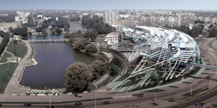
The real danger is when you allow a technique to become a law unto itself. Curvilinear forms were a reaction against dull rectilinear shapes. Then people very quickly tired of them and I too kept my distance, especially when there became so many of them, including in Moscow. Now I tend to work with diagonal grids and natural elements. Although this leads every time to collisions with technology, as, for instance, in my design for the theatre in Kaliningrad, where there are complex technological solutions which, if we are dismissed from implementation of this project (something which is already happening), cannot be realized to a satisfactory standard.Without the original authors the result may well be shameful for all concerned…

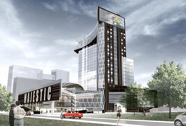
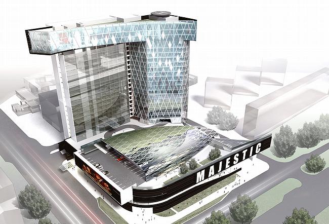
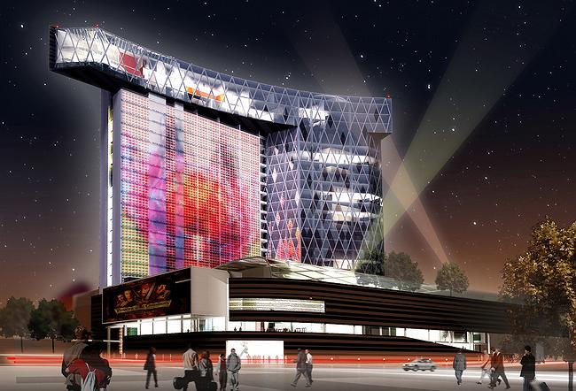
In addition to the theatre, you’re also designing a building with a media screen and a building over a railway. Do you specifically aim for modern technological solutions?

Undoubtedly. Of course, not every project we do manages to be innovative, but we do try. Sometimes this helps in promoting a project or in our dealings with a client. Today flash innovation is increasingly popular.

You’re not afraid to build on top of a railway?

Not at all. Perhaps because we’ve already seen such buildings. We made a special trip to Belgium to take a look at large complexes of this kind. There are consultants we can call upon.

You say that plastic technique should not be allowed to become a determinant factor in itself. What then should?

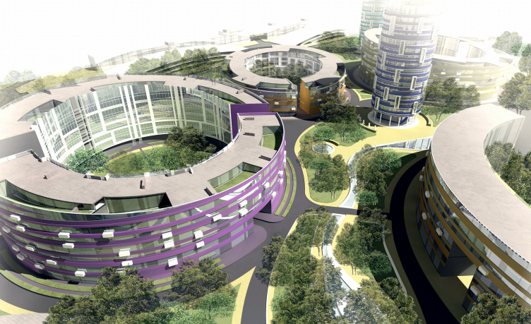
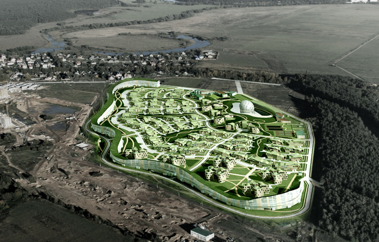
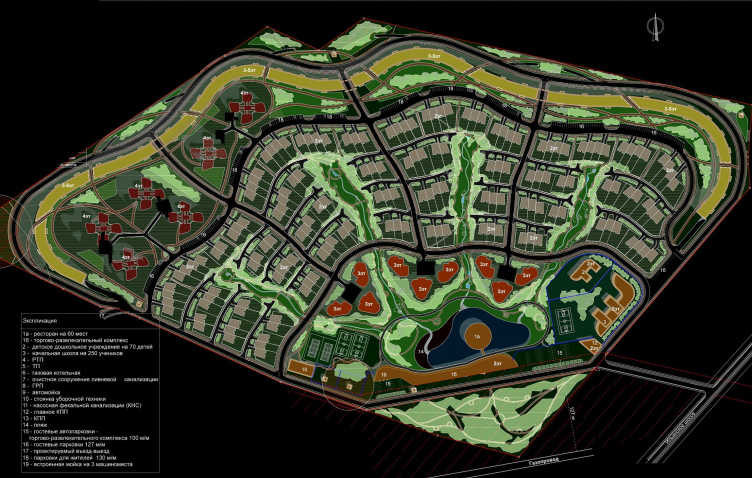
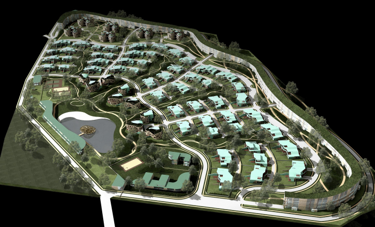
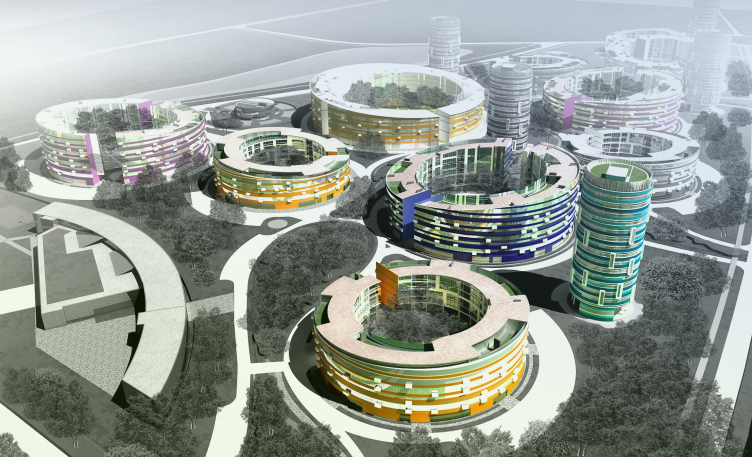
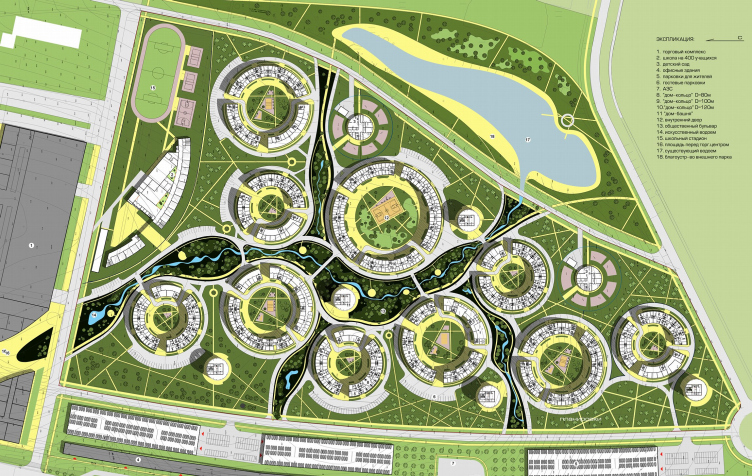
Different things in different projects. Currently, we are expanding our palette. For each project, especially commercial projects, we try to think up a logo, name, and image that will help the architecture. At this year’s MIPIM we showed a project which we’ve called ‘the pearl’. It’s a settlement screened off by a kilometre-long undulant building around its perimeter. Inside are single-family houses, a public centre, and a lake. There’s a restaurant on the water under a semi-translucent pergola-like dome made from mother-of-pearl triangles. It’s a genuine pearl in a genuine shell. And that’s the name we’re promoting it by – ‘the pearl on Il’inka’. We were fired up by the fact that this was to have been a competition between ourselves and Zaha Hadid. We were so scared and tried so hard, but then Hadid for some reason failed to take part. But we were stimulated. If it actually happens, it’ll be quite an event.

Your architecture is sculptural. This can be seen in your work from the very beginning. Is a sculptural quality your theme?

I suppose so. Previously, less consciously, but now more consciously so. A number of our designs have a hard and even form, but even so the form is slightly sculptural. On the other hand, your architecture is frame-based.

This was probably what has caused it to be described as ‘Deconstructivist’…

Frame-based structures have two aspects. The first is a frame that is easily read. Now that I’ve grown up and gained experience, I realize that this is very much a southern technique. It’s only in the south that you can set up a frame and then fill it in. And in my early projects such elements were imitative. The external column was in fact borne by an inner one, but you have the impression that the construction is bursting outwards. It’s a striking technique, and you can find it being used in Moscow today – detached and floating cornices and pergolas: these are southern techniques. It’s much more difficult to create your own, northern technique. The kind of ‘well-wrapped-up’ architecture whose insides do not burst outwards. It’s architecture that relates to cocoons and potatoes. This is closer to us because our direct prototypes are northern peasant houses where accommodation and production are gathered together under one roof. This kind of structure is all tranquillity and closer to natural lines: it’s all one piece and under cover. To create architecture without eyecatching projecting columns or structures, without baring the framework, is much harder. But it’s what is typical for us and could be taken as the distinguishing feature of our architecture. I suppose I still haven’t designed a single building that meets these standards, but I understand that if we are to keep moving forwards, then this is the direction we must take. The second kind of framework is internal self-discipline. Plans, regularity. When you have a regular grid, a structured floor plan. The lack of such a framework seems to me a mark of carelessness. All good architectural things are structured, internally modulated, proportional.

My final question is about your dream as an architect: what would you like to design?

In 2000, when we started designing an island on land reclaimed from the sea (before this had been done in the Emirates), my dream was to build such an island. In 1998 we had an idea for a sail building on Kalininsky prospect [in Moscow]. Then the sail building appeared in Dubai, and this dream vanished. When we designed the Yugra Island near Tuapse, we dreamed of creating an area reclaimed from the sea. I even had t he idea that I was a bit like God, creating a piece of reality, but then, when the project has failed to get built and I’ve got busy with other projects, the dream has disappeared. So my dream is always changeable and elusive. My dream, I suppose, is to attain inner freedom. And what I actually build while attaining it is not really that important.

zooming
zooming


02 September 2008

Headlines now
The Golden Crown
The concept for a dental clinic in Yekaterinburg, developed by CNTR Studio, revolves around the idea of a “mouth full of gold”: pristine white porcelain stoneware walls are complemented by matte brass details. To avoid an overly literal interpretation, the architects focused on the building’s proportions, skillfully navigating between sunlight requirements and fire safety regulations.
Flexibility and Integration
Not long ago, we covered the project for the fourth phase of the ÁLIA residential complex, designed by APEX. Now, we’ve been shown different fence concepts they developed to enclose the complex’s private courtyards, incorporating a variety of public functions. We believe that the sheer fact that the complex’s architects were involved in such a detail as fencing speaks volumes.
A Step Forward
The HIDE residential complex represents a major milestone for ADM architects and their leaders Andrey Romanov and Ekaterina Kuznetsova in their quest for a fresh high-rise aesthetic – one that is flexible and layered, capable of bringing vibrancy to mass and silhouette while shaping form. Over recent years, this approach has become ADM’s “signature style”, with the golden HIDE tower playing a pivotal role in its evolution. Here, we delve into the project’s story, explore the details of the complex’s design, and uncover its core essence.
Gold in the Sands
A new office for a transcontinental company specializing in resource extraction and processing has opened in Dubai. Designed by T+T Architects, masters of creating spaces that are contemporary, diverse, flexible, and original, this project exemplifies their expertise. On the executive floor, a massive brass-clad partition dominates, while layered textures of compressed earth create a contextually resonant backdrop.
Layers and Levels of Flight
This project goes way back – Reserve Union won this architectural competition at the end of 2011, and the building was completed in 2018, so it’s practically “archival”. However, despite being relatively unknown, the building can hardly be considered “dated” and remains a prime example of architectural expression, particularly in the headquarters genre. And it’s especially fitting for an aviation company office. In some ways, it resembles the Aeroflot headquarters at Sheremetyevo but with its own unique identity, following the signature style of Vladimir Plotkin. In this article, we take an in-depth look at the United Aircraft Corporation (UAC) headquarters in the Moscow agglomeration town of Zhukovsky, supplemented by recent photographs from Alexey Naroditsky – a shoot that became only recently possible due to the fact that improvements were finally made in the surrounding area.
Light and Shadow
In this article, we delve into the architectural design of the “Chaika” house by DNK ag architects, which was recently completed in 2023 as part of the collection of signature designs at ZILArt. As is well-known, all the buildings in this complex follow a design code, yet each one is distinct. This particular building stands out not only for its whiteness and minimalism but also for the refined use of a limited number of techniques that, together, create what can confidently be called synergy.
Casus Novae
A master plan was developed for a large residential area with a name of “DNS City”, but now that its implementation began, the plan has been arbitrarily reformatted and replaced with something that, while similar on the surface, is actually quite different. This is not the first time such a thing happens, but it’s always frustrating. With permission from the author, we are sharing Maria Elkina’s post.
Treasure Hunting
The GAFA bureau, in collaboration with Tegola and Arkhitail, organized an expedition to the island of Kilpola in Karelia as part of Moskomarkhitektura’s “Open City” festival. There, amidst moss and rocks, the students sought answers to questions like: what is the sacred, where does it dwell, and what sustains it? Assisting the participants in this quest were landscape engineer Evgeny Levin, artist Nicholas Roerich, a moose, and the lack of cellular connection. Here’s how the story unfolded.
Depths of the Earth, Streams of Water
In the Malaya Okhta district, the Akzent building, designed by Stepan Liphart, was constructed. It follows a classic tripartite structure, yet it’s what you might call “hand-drawn”: each façade is unique in its form and details, some of which aren’t immediately noticeable. In this article, we explore the context and, together with the architect, delve into how the form was developed.
Fir Tree Dynamics
The “Airports of Region” holding is planning to build an airport in Karachay-Cherkessia, aiming to make the Arkhyz and Dombay resorts more accessible to travelers. The project that won in an invitation-only competition, submitted by Sergey Nikeshkin’s KPLN, blends natural imagery inspired by the shape of a conifer seed, open-air waiting spaces, majestic large trees, and a green roof elevated on needle-like columns. The result is both nature-inspired and WOW.
​A Brick Shell
In the process of designing a clubhouse situated among pine trees in a prestigious suburban area near Moscow, the architectural firm “A.Len” did the façade design part. The combination of different types of brick and masonry correlates with the volumetric and plastique solutions, further enhanced by the inclusion of wood-painted fragments and metal “glazing”.
Word Forms
ATRIUM architects love ambitious challenges, and for the firm’s thirtieth anniversary, they boldly play a game of words with an exhibition that dives deep into a self-created vocabulary. They immerse their projects – especially art installations – into this glossary, as if plunging into a current of their own. You feel as if you’re flowing through the veins of pure art, immersed in a universe of vertical cities, educational spaces – of which the architects are true masters – and the cultural codes of various locations. But what truly captivates is the bold statement that Vera Butko and Anton Nadtochy make, both through their work and this exhibition: architecture, above all, is art – the art of working with form and space.
Flexibility and Acuteness of Modernity
Luxurious, fluid, large “kokoshniks” and spiral barrel columns, as if made from colorful chewing gum: there seem to be no other mansion like this in Moscow, designed in the “Neo-Russian-Modern” style. And the “Teremok” on Malaya Kaluzhskaya, previously somewhat obscure, has “come alive with new colors” and gained visibility after its restoration for the office of the “architectural ecosystem” as the architects love to call themselves. It’s evident that Julius Borisov and the architects at UNK put their hearts into finding this new office and bringing it up to date. Let’s delve into the paradoxes of this mansion’s history and its plasticity. Spoiler: two versions of modernity meet here, both balancing on the razor’s edge of “what’s current”.
Yuri Vissarionov: “A modular house does not belong to the land”
It belongs to space, or to the air... It turns out that 3D printing is more effective when combined with a modular approach: the house is built in a workshop and then adapted to the site, including on uneven terrain. Yuri Vissarionov shares his latest experience in designing tourist complexes, both in central Russia and in the south. These include houseboats, homes printed from lightweight concrete using a 3D printer, and, of course, frame houses.
​Moscow’s First
“The quality of education largely depends on the quality of the educational environment”. This principle of the last decade has been realized by Sergey Skuratov in the project for the First Moscow Gymnasium on Rostovskaya Embankment in the Khamovniki district. The building seamlessly integrates into the complex urban landscape, responding both to the pedestrian flow of the city and the quiet alleyways. It skillfully takes advantage of the height differences and aligns with modern trends in educational space design. Let’s take a closer look.
Looking at the Water
The site of Villa Sonata stretches from the road to the water’s edge, offering its own shoreline, pier, and a picturesque river panorama. To reveal these sweeping views, Roman Leonidov “cut” the façade diagonally parallel to the river, thus getting two main axes for the house and, consequently, “two heads”. The internal core – two double-height spaces, a living room and a conservatory, with a “bridge” above them – makes the house both “transparent” and filled with light.
The White Wing
Well, it’s not exactly white. It’s more of a beige, white-stone structure that plays with the color of limestone – smoother surfaces are lighter, while rougher ones are darker. This wing unites various elements: it absorbs and interprets the surrounding themes. It responds to everything, yet maintains a cohesive expression – a challenging task! – while also incorporating recognizable features of its own, such as the dynamic cuts at the bottom, top, and middle.
Urban Dunes
The XSA Ramps team designed and built a three-part sports hub for a park in Rostov-on-Don, welcoming people of all ages and fitness levels. The skate plaza, pump track, and playground are all meticulously crafted with details that attract a diverse range of visitors. The technical execution of the shapes and slopes transforms this space into a kind of sculptural composition.
Proportional Growth
The project for the fourth phase of the ÁLIA residential area has been announced. The buildings are situated on an elongated plot – almost a “ray” that shoots out from the center of the area towards the river. Their layout reflects both a response to Moscow’s architectural preferences over the past 15 years, shifting “from blocks to towers”, and an interpretation of the neighboring business park designed by SOM. Additionally, the best apartments here are not located at the very top but closer to the middle, forming a glowing “waistline”.
The “Staircase” Building
In designing the “Details” residential complex in New Moscow, Rais Baishev spiced up the now-popular Moscow theme of a “courtyard” building with an idea drawn from the surrealist drawings by Maurits Escher. He envisioned the stepped silhouettes and descending slopes as a metaphysical mega-staircase, creating a key void within the courtyard that gave the project an internal “spine”. This concept is felt both in the building’s silhouette and on its façades.
Projection of the Quarter
No one doubted that the building that Vladimir Plotkin designed as part of the “Garden Quarters” would be the most modernist of all. And it turned out just that way: while adhering to the common design code, the building successfully combines brick and white stone, rhythmically responding to the neighboring building designed by Ostozhenka, yet tactfully and persistently making a few statements of its own. This includes the projection of the ideal urban development composition “14–9–6”, which can be found right next door, mathematical calculations, including those for various types of terraces (and perhaps the only reminder of the Soviet past of the Kauchuk rubber factory!), and the white “cross-stitch” pattern of the façade grid.
Domus Aurea
In this issue, we examine the “Tessinsky-1” house, designed by Sergey Skuratov and completed in 2023. Located in the middle of the Serebryanicheskaya Embankment district, at the intersection of its main streets, this house assumes a sort of “nodal” role: it not only responds to everything around it and preserves many memories of the former EMA factory within itself, but it weaves all this into a newly directed pattern, reconciling bright “gold” and dark-colored brick, largely with the help of the new, modern-yet-archaic Columba brick, which, come to think about it, is the most precious element here.
The Chimney of Nikola-Lenivets
In this issue, we are examining the “Obelisk House” designed by KATARSIS and built for the Arkhstoyanie 2023 festival. However, it was only finished later on, and this is why we are examining it now. It seems to us that after the “Obelisk House” appeared in Nikola-Lenivets, a dialogue and a few inner connections appeared between the temporary structures built here. These houses no longer look like “accidental neighbors”, more of which below.
​Periscope by the Bay
The jury awarded the second place in the competition for a public and cultural center in Petropavlovsk-Kamchatsky to the companies GORA (“Mountain”) and M4. In the consortium’s proposal, the building resembles a sperm whale with a calf swimming next to it or a periscope, whose lenses capture the most spectacular views from the surrounding landscape.
From Arcs to Dolmens
While working on the competition project for Petropavlovsk-Kamchatsky, ASADOV Architects prioritized the value of the natural and urban environment, aiming to preserve the balance of the location while minimizing the resemblance of the volume that they designed to a “traditional building”. The task was challenging, and the architects created three versions, one of which having been developed after the competition, where their main proposal took third place. However, the point of interest here is not the competition result but the continuity of creative thinking.
Hide and Seek
The ID Moskovskiy house, designed by Stepan Liphart in St. Petersburg, in the courtyards near Moskovskiy Avenue beyond the Obvodny Canal and recently completed, is notable for several reasons. Firstly, it has been realized with considerable accuracy, which is particularly significant as this is the first building where the architect was responsible not only for the facades but also for the layouts, allowing for better integration between the two. On the other hand, this building is interesting as an example of the “germination” of new architecture in the city: it draws on the best examples from the neighborhood and becomes an improved and developed sum of ideas found by the architect in the surrounding context.
The Big Twelve
Yesterday, the winners of the Moscow Mayor’s Architecture Award were announced and honored. Let’s take a look at what was awarded and, in some cases, even critique this esteemed award. After all, there is always room for improvement, right?
Above the Golden Horn
The residential complex “Philosophy” designed by T+T architects in Vladivostok, is one of the new projects in the “Golubinaya Pad” area, changing its development philosophy (pun intended) from single houses to a comprehensive approach. The buildings are organized along public streets, varying in height and format, with one house even executed in gallery typology, featuring a cantilever leaning on an art object.
Nuanced Alternative
How can you rhyme a square and space? Easily! But to do so, you need to rhyme everything you can possibly think of: weave everything together, like in a tensegrity structure, and find your own optics too. The new exhibition at GES-2 does just that, offering its visitor a new perspective on the history of art spanning 150 years, infused with the hope for endless multiplicity of worlds and art histories. Read on to see how this is achieved and how the exhibition design by Evgeny Ace contributes to it.
Blinds for Ice
An ice arena has been constructed in Domodedovo based on a project by Yuri Vissarionov Architects. To prevent the long façade, a technical requirement for winter sports facilities, from appearing monotonous, the architects proposed the use of suspended structures with multidirectional slats. This design protects the ice from direct sunlight while giving the wall texture and detail.