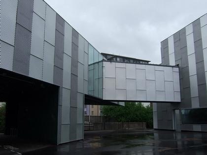
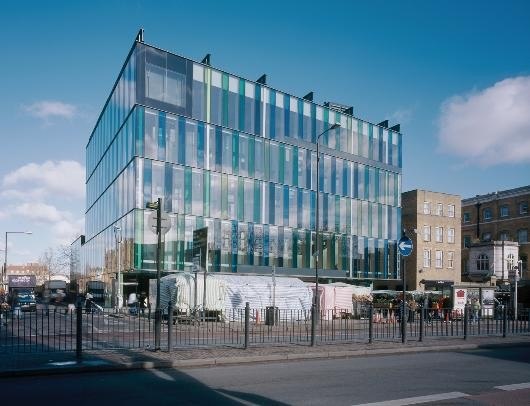
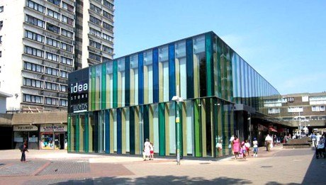
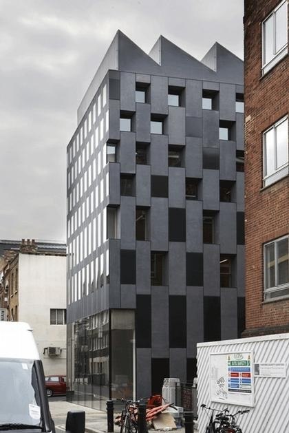
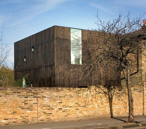
Chris Ofili and Olafur Eliasson are his clients and collaborators. Adjaye reformed his studio in 2000 as Adjaye Associates and has since realized a number of prestigious commissions, including Nobel Peace Center in Oslo, Stephen Lawrence Centre in London and the Museum of Contemporary Art in Denver.
Adjaye was born in Tanzania to the family of a diplomat from Ghana in 1966. Until 1978, he lived in Africa and the Middle East. Then moved to London where he studied art and architecture and in 1993 received his Master of Architecture from Royal College of Art. In his work he is preoccupied with making space itself present, to intensify its experience through sculpted shafts of light, different tonalities of color and materials. He lectures widely in Europe and America and taught at Harvard and Princeton universities. The architect’s first book on his houses was published in 2005 and the following year his book Making Public Buildings was published on the occasion of his studio’s first exhibition, which traveled in Europe and North America. In 2007, David was made an Officer of the Order of the British Empire for services to architecture in the Queen’s Birthday Honours list.
Adjaye is working on International School of Management in the Skolkovo district of Moscow and he recently participated in Perm Art Museum competition. We met at the architect’s office in East London’s trendy Hoxton neighborhood. One of the spaces in the office is completely taken over by numerous building material samples and there is a strong sense there
that architecture is about fascination, materiality and just the right balance of limitless possibilities. You interviewed famous architects for BBC.
What kind of question would you want to ask yourself to begin our interview?
(Laughter) I would ask myself – what is the intention of your work?
Then let me start with that. What is the intention of your work?
My interest in architecture is to find strategies, which emanate new senses of publicness. What I mean by that is new ways
of seeing each other and new ways of being with each other. I see architecture as an agency to facilitate this kind of opportunities within public life.
Among architects that you interviewed are Oscar Niemeyer, Charles Correa, Kenzo Tange, I.M. Pei, Moshe Safdie, who else?
Philip Johnson was the sixth architect on that list, but he died before these interviews took place. The idea was to interview the generation of architects who were very close to such great modernists as Mies van der Rohe, Le Corbusier, Louis Kahn, Alvar Aalto, Walter Gropius and Louise Sert.
Was there one particular question that you asked all the architects?
The first question was – what was it that inspired them through their encounter with these great architects and what was the
spirit of that encounter? So in a way, I was trying to discover a genealogy of ideas.
How did they respond?
The responses varied. For example, Oscar Niemeyer met Le Corbusier when he was 27. So for him it was a very radical conversion from where he was to Modernism. For Charles Correa architects like Kahn and Aalto represented a very
profound meaning in the origins of Modernism. It was important for me to witness the emotional connection of these
architects to the ideals of Modernism and also their profound way to view the world. I find it interesting that many architects
derive their inspiration from very small pool of sources. It is the same water fountain that all of us keep going back to.
You have three active practices in London, New York and Berlin. How do they operate?
I think the traditional and ideal model of an architectural studio – being either in the hills of Switzerland or the coast of Portugal, as a kind of a beautiful isolated idea is no longer common. Yet, I am not a corporate office with the ambition to expand globally. I would say I am a planetary architect and as other architects, I work by tracking economies and places where the patrons are. They provide opportunities for work. I need to act strategically and react to various opportunities globally and for that, I need to be present at various places in the world. So I set up three practices in places where
we have projects. The main office is here in London with about forty people and in New York and Berlin, we have very small teams and they are spearheaded by directors who have been with me for a long time. I usually go there once or twice a month. Thank god that architecture is very slow. It takes three to five years to complete a project so we are able to work on many projects on parallel tracks at the same time.
You are known for various collaborations with well-known artists. How did these opportunities come about?
I sought the opportunities as a way to rethink architectural practice. I try to bring together different experts to make a complete work, a sort of Gesamtkunstwerk, which is the synthesis of the arts to fulfill artistic and technical aspirations of the complete work of architecture.
How did you start these relationships?
Well, from the beginning of my studies I slightly rejected architecture schools. I was educated in the 1980s, at the age of heavy theory. But I didn’t want to experiment through thinking alone and wanted to learn through building. Theory is incredibly important to the practice of architecture, but for me theory resides in the making and understanding, and reflecting and then remaking, not a kind of hypothesis position. In my observation many architects theorized about the meaning of the universe, while others were producing ridiculous pastiche postmodernist buildings. And then the artists were the ones who were building their thoughtful environments and installations, some of which was real architecture. So for me the artists were the natural people to follow in terms of where to move. So I went to art school and then to the Royal College of Art where I met a lot of artists.
So people who eventually became your collaborators and clients were your classmates at school and in a way, you are
one of them?
Yes. They are my generation of people.
When did architecture and art first attract your interest?
I didn’t really know much about architecture until my late teens. I found out about it through my art teacher in high school.
In Southbank University your dissertation was on the Yemen city Shibam and in Royal College of Art, it was on sacred place and tea ceremony in Japan. What role does culture play in your work?
Culture for me makes the mythology. It is something that architects can build around to reinforce the story of our civilization.
For me architecture depicts how we write the story of our civilization. I am fascinated with various cultures. Shibam in Yemen is this kind of phenomenon – a city built out of a dry riverbed and it is a towering feet of engineering in the middle of the desert, a sort of a powerful mirage. And Japan is very fascinating because it is routed in Chinese culture, but completely rewritten and practically invented by the ability of Japanese to curate culture. I lived in Kyoto for one year.
Let’s talk about your work in Russia – first your proposal for Moscow School of Management in Skolkovo on the outskirts of Moscow. Was it a result of a competition?
Yes, we were invited to take part in a limited competition based on our previous work. The other competitors included I.M. Pei, Santiago Calatrava and Dixon Jones. I was the youngest among them and had never worked on that scale before. Our
proposal was about imagining another utopia. Because the idea of an educational campus is one of the last moments that
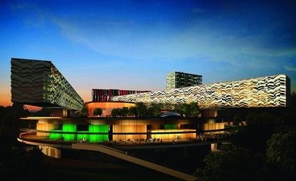
you can make a utopia because in a way, the college campus is a perfect monastic place. It is an idyllic paradise and the world is far away. And I thought – ok we have this idea of a fantastic utopia in Moscow where it snows, and is very cold in winter, but also very hot in summer. All other people proposed college campuses and I proposed this kind of hierarchy. In a way it is a modernist idea of a vertical city on top of a massive disk that connects to the landscape and within that disk there are various spaces – public squares, plazas and open spaces, residential and leisure facilities. The footprint of the project is
absolutely minimized and suspended like a dot over 27 acres of a beautiful landscape. In a way, it is a monastery, conceptually similar to La Tourette by Le Corbusier. But the form of the building is a homage to Malevich’s work, which I am a big fan of. It is a major source for understanding the history of Modernism and modernity. For me Mies represents International Style Modernism, which is largely orthogonal organizing system and Malevich represents a different Modernism, which never fully manifested. And if Miesian Modernism is related to the city then Malevich’s Modernism is about certain randomness but within this randomness there is a kind of implicit order about the environment and relation to nature. Another influence on this project is Yoruba bronze sculptures, which the client doesn’t know about. It is about the
idea of lifting people from one world to the other on plates. So it is a fusion of ideas, but essentially it is an experimentation in creating utopia.
You also participated in Perm Museum competition, right?
Yes. It was a very large competition. We made it through the second stage, but not to the final stage. Perm was for us about
making a collection of art buildings. We proposed a very simple strategy, which was like a pixelated agglomeration of small
buildings, packed together in a horizontal way and related to landscape. It was a collection of rectangular buildings in a shape of an oval, partly packed together and partly spread out and providing various views or relationships to the city or water. Also the idea was for architecture not to dominate over the curatorial agenda. We have been working with art curators for a long time and the big problem with a lot of museum projects is that architecture dominates the art. Good museums provide opportunities for many curatorial possibilities, not just for one, defined by architecture. So you can make the building as crazy as you want as long you solve that one central problem.
So there are museums that have one purpose, one meaning and one image and then there are museums that address many issues and let the art transform the original intentions of the architect.
Yes. For example, Daniel Libeskind’s Jewish Museum Building in Berlin offers only one way to experience it. It can never be used any other way. End of story. Or, even Zaha Hadid’s building in Rome. It is beautiful, but it can only be explored a certain way. Architecture should be always in reference to the building and not in reference to the architect’s repertoire. So the question for all art curators is always the same – does the building support or does it define the art? If it defines, then it is a disaster or just a vanity project for the architect. Maybe that what you need in the city but it is terrible for art. Art needs many meanings and many stories, not just one told by the signature architect.
Have you traveled to Russia? What is your perception of it?
find Russia wildly exciting and also incredibly reflective. First time I went to Russia as a college student right before
Perestroyka in the mid 1980s. It was still a communist country but the change was already visible in the people. I was there with architecture lovers and we saw everything. I have visited all major constructivist projects by Melnikov, Ginsburg and so many others in and out. Then I went back in the ‘90s and experienced such a huge change. What was interesting for me was the kind of speculation of this new city, which was being built and simultaneously superimposed over the old city, which is very fascinating and frightening at the same time.
What do you think of the constructivist architecture?
I think it is one of the most important and underappreciated periods of Modernism because these early projects showed very powerful potentials of what Modernism could be and it was very quickly taken over by the West and very quickly changed and slightly buried. I find a great deal of inspiration in the early soviet architecture period.
How would you describe the influence of Soviet architecture on your work?
It is not about seeing any influence on my work literally. I am not seeking particularly Russian references. The way it plays a role is that we all inherit this great legacy of creative work and now I can warp my own trajectory towards a particular source pool of certain reading that I find more appropriate. My source pool goes the other way. And that is the beauty and the flexibility of architecture. You can go one way and become ultra rational and everything will look very performative technical building or you can be extremely expressive and you can express the ideas of culture and people, which is more my tendency. For me architecture is not a machine it is a kind of expression of the desires of people in the age that we live in.
OK. You are creating your beautiful ideal monastery in a very secluded setting in Moscow, but what kind of architecture do you imagine in Moscow that would be an integral part of a particular urban condition there?
I would rather ask – what are the ways of looking at Moscow? And one of the ways of looking at Moscow is not to look at Moscow through western eyes. What I mean is that you look at the city and try not to fill it up with the image of what your city of that image is. This strategy forces architects to really look and observe. And looking is tough. Most people project. They come and they project their preconceived ideas, and then they fuzz the edges and it fits. And sometimes, even the people who live in the place don’t see or recognize the character of their own civilization and psychology of the local context.
Let’s go back to your utopia project in Moscow. What did you observe there?
In my project, the idea was to make a utopia, but the utopia in the eyes of my clients was a traditional college campus. So they were all saying – campus, head building, four buildings on either side, a plaza, trees, the lake and so on. And then they thought – it will be minus 30 degrees – how are we going to deal with getting from this building to this building? Then the question is – do we go underground? And everybody was coming up with these crazy elaborate schemes that would try to solve this climate issue. But why project the idea of a campus where there is no need for it. So I said – we need a new model, a new utopia. And there is no way I could have imagined this project on my own. It came out of a discourse.
There is a concern in Russia that the foreign architects may not be aware of local history, context or building traditions. From your experience, what do you think are the benefits for a large metropolis to let foreign architects come and build?
I think we live in the world in which not to take notice and not to learn from what is happening in metropolitan conditions of
the world is a potential disaster. Because a notion of a metropolis is not a localized condition, but a highly networked global
system. So we need to understand the capacities that are occurring in New York or Shanghai and be able to apply some of
these hub notions in other places. There is no way a local group of experts can learn different conditions occurring in other
cities by simply flying out there, grab that knowledge, come back and apply at home. And it is not a condition of now. The classical language occurred by Italians coming to St. Petersburg or Norway. The Italians went up and taught others how to do it. So the image of a city that is somehow indigenous to a group is fictitious. It was always global and about a source of ideas that emanates to the next place and then it can grow into a certain culture. At the end, it is all about sharing ideas and if particular ideas are coming from a foreign person then so be it.
We talked about the influence of the constructivists on your work. What about traditional Russian architecture?
Absolutely. I visited several Russian monasteries and churches in the Golden Ring region. I am fascinated with the idea of an articulated roof on a vault, which is a microcosm of the whole world. This image is a very powerful figure of heaven, utopia or a magical and perfect city or a heaven with a perspective that always points up. I was impressed by the ability of ranslating these ideas into very beautiful forms of towers and domes of the Russian Orthodox churches.
You worked for the Portuguese architect Eduardo Souto de Moura. Was he someone you specifically wanted to work for and just went to his office and knocked at the door? Why were you drawn to his work?
Yes, absolutely, he is my papa! I saw his work in the late ‘80s and he had just completed an amazing cinema club in Porto.
It was architecture out of nothing. It was basically a granite wall with two mirrored doors at the ends and the most beautiful
garden that I have ever seen. For me he was an architect who practiced metaphysical architecture – not just about function, but completely about ideas. I found somebody who is not a rationalist, just producing a machine, but producing utter poetics. It was very compelling because to me it was a signal about another way of working that I was very interested in. So I went to Portugal to tell him that I loved his work and wanted to work for him. He had eight people then. He hired me because I think he loved the fact that I flew over just to see his work.
Souto de Moura said: “the building site is whatever you want it to be. The solution never comes from the site but always from people’s heads”. Do you agree with that statement and how do you yourself try to connect to local context and local culture?
I think our job as architects is to come up with propositions, which are placed out there for the public to identify with certain
meanings and if the public can cognitively react in a way that would claim the building into their context, then you succeed in
making this local connectivity. It is a way of working with phenomenological and physiological topographies of scales and
spaces that recognizes the existing context and identifies the new one.
In one of your interviews you said that as a young architect you are “searching for a new authenticity to architecture, not simple styling, returning to thickness of the materials”. Could you elaborate on this?
The point is to suggest that I don’t seek the limits of our time. I am not interested in saying that – well, we used to be able to
build very beautiful thick brick walls…and now we can’t. I don’t care because that is not the age I live in. And if the age I live in is about thinness then I will work with it and will express it in the most rigorous way. For me the issue is the act of making. It is all about who is the author.
Does your architecture bring you into conflict with contemporary British Architecture, which is systemized, transparent, ephemeral, thin and immaterial?
Yes. On the one hand I was educated here. Peter Smithson was one of my teachers. My first projects were built here. I embrace what I learned from British architecture. But I try to go beyond it in my references. The ability to make things good and to perfection. This is British tradition. I love it. The thing I reject is the manifestation of a building as a cold perfect machine. To me that is an emotional cultural thing. My work is different all the time. Every project is a response to very particular criteria and even if I build in the same neighborhood I come up with different projects. I think it is richer. This is my position.
Walking around London, one constantly gets exposed to this almost religious fascination with machinery and the joint. This tradition goes back into history and of course, now some buildings have been striped of everything that used to identify them as buildings and they have completely and literally transformed into these robotic machines. I was amused by a woman who was pointing to a Richard Rogers building, saying that it is dangerous for people to walk around a building that is still under construction. Of course, the building is fully built and occupied.
Yes, this is Britain. But for me architecture is not about a machine being perfected and then applied. It is about evolving and changing, mutating, manipulating and twisting. I try to tune my architecture to various conditions and life changing around it.
When you visit other architects’ work what are the qualities that you admire most and what are the examples that impressed you most – old or new?
When I explore architecture, I always seek to see phenomenological qualities and whether the author sees a new vision and if that new vision connects to the ideas of the people and the place. Then what ever that is – it moves me. Good architecture for me is the one that is not defined. It can be a lot of very different things and I am very open to many possibilities.
I imagine you have made a lot of pilgrimages to many places to see architecture.
Oh, yes, there is no place I haven’t been. The one privilege I have is that I have been able to crisscross the globe right through the North Pole.
Could you name some of the architects, practicing today that you admire most?
In Tokyo, Japan it is Taira Nishizawa, in the desert of Arizona in America there is a young architect Rick Joy, in Melbourne,
Australia there is a young brilliant architect Sean Godsell, in Frankfurt, Germany there is an amazing young architect Nikolaus Hirsch, in South Africa there is a young architect Mphethi Morojele who has offices in Johannesburg, Cape Town and branch in Berlin. There is also a number of good architects in London. There is a young architect Jonathan Wolff and Foreign Office. So there are many great young architects of my generation and I have seen their work and I said – wow this represents the age that we live in! We all know each other and we are all one network.
Adjaye Associates office in London
23-28 Penn Street, Hoxton
April 23, 2008

