14 Wall Street, Financial District
April 1, 2008
World’s tallest towers are no longer built in America, but many of the highrises defining the look of new cities in South East Asia and the Middle East are still imagined and engineered in the US where they were invented. The firm that distinguished itself in building high is Skidmore, Owings and Merrill, SOM. Founded in 1936, SOM presently employs 1,200 professionals – half in New York and the rest – in Chicago, San Francisco, Washington DC, Los Angeles, London, Hong Kong and Shanghai. In over 70 years of practice, the firm has completed more than 10,000 buildings and received over
1,000 prestigious awards. The list of internationally recognized projects is endless and impressive: Lever House, Chase Manhattan, 9 West 57th Street Tower, Manufacturers Hanover Trust Bank and Skyscraper Museum all in Manhattan,
John Hancock and Sears Towers in Chicago, US Force Academy Chapel in Colorado, Beinecke Rare Book Library at
Yale University and Jin Mao Building in Shanghai. Burj Dubai, the world’s tallest building is currently under construction
in Dubai. When completed next year it will reportedly reach astonishing 2,300 feet (700 m) with over 160 floors of hotel,
offices and apartments. It is designed and engineered by SOM Chicago office. The firm has always attracted great design
talents from all over the world. The most widely recognized is Gordon Bunshaft (1909-1990), who in 1988 was awarded the coveted Pritzker Prize.
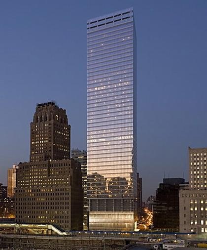
Peter Ruggiero, 49 is a design partner at SOM’s Chicago office. His experience spans a multitude of project types, including airport terminals in Toronto, New York and Washington D.C., commercial buildings, mixed-use complexes, residential developments, university research facilities and office towers in Europe, America and the Middle East. He is currently overseeing the design of several projects in Russia, including 4.5 million square feet of mixeduse complex Plot 16 at Moscow City development for Capital Group. We met in SOM New York office on Wall Street, the playground for the firm’s mightiest clients. Striking views of the surrounding towers in downtown Manhattan added visual reference to our conversation. Among them is the Seven World Trade Center at the edge of Ground Zero, which Ruggiero designed in collaboration with David Childs, SOM’s consulting partner and the coauthor of the rising nearby Freedom Tower.
Is the height of Burj Dubai still confidential?
It is actually a secret and I can’t reveal that information. Despite all kinds of guessing numbers published in the press, I can
only confirm that it is going to be over 600 meters.
Do you think American architects and engineers still have no competition in designing skyscrapers?
No, not at all. I think this may have been true 20 or 30 years ago. But the people that we are competing against today are no longer only American firms. Such European practices as Norman Foster, Richard Rogers and Renzo Piano are very reputable firms and are doing very beautiful and daring skyscrapers.
In the 1980’s and 90’s SOM became a corporate factory, producing uninteresting buildings dressed in pastiche postmodernist suits. How did this situation change and who was behind modernizing and reestablishing the firm?
In the 1980’s architects embraced the notion of historical continuity. This was the time of searching for historical references
not just for SOM, but also for the profession in general. What contributed to coming out of that period was the recession of the early 1990’s. By the time the developers started to build again, there was a lot of rethinking about what was built in the
previous building cycle. At SOM a new generation of young partners came in. These were architects in their 30’s and
early 40’s – Roger Duffy, Brian Lee, Gary Haney and Mustafa Abadan among others. They began reexamining the firm’s roots as modern architects. SOM now has a history of practicing architecture of its time.
Based on very diverse portfolio of projects produced in recent years SOM deserves to be called a true laboratory for architectural experimentation. How does a large, established firm remain fresh and current?
It is a collaborative process through the interaction between partners, studio heads and studios. Our work grows from studios up. Partners set the direction and studios work it through. We work hand in hand with studios. That way there is an opportunity for every young architect to contribute to the process. There is an old myth saying – oh, I worked at SOM for five years and all I did – designed bathrooms. There is some truth to that, but in my experience, I have seen very young architects contributing in a very meaningful way.
Another tool that helped to reestablish the firm as a design powerhouse is the SOM journal. It is very introspective, process oriented and selfcritical publication, which focuses on our own current work. The journal started ten years ago and now we are in our fifth issue. The projects for review are selected by outside multidisciplinary jury – architects, engineers, artists, urban planners, sociologists, etc. who look at our work critically. We distribute these journals to our clients, which helps them to understand what we do. The lectures series is a great forum for SOM community to address current issues in the profession worldwide. We invite well-known architects or artists to come to present and discuss their innovative work.
Did you join SOM immediately following your graduation from Harvard?
I graduated from Harvard in 1984 with a Masters Degree in Urban Design and moved back to New York where I am
originally from. For a year, I worked in a very small office. But I always wanted to work on big scale projects. There was
a building boom at the time and I wanted to be a part of it. SOM seemed to me a very good choice.
How did you like Harvard?
Harvard is a wonderful place to learn. What I especially admire about the school is their pluralistic approach. It allows many
points of views to be expressed. I was very interested in the role that buildings play in making cities and understanding social
and economic dynamics of city planning. I particularly enjoyed writings by Aldo Rossi. My professors were – Fumihiko Maki, Jorge Silvetti, Rudolph Machado, Moshe Sadie and Fred Koetter, who wrote Collage City with Colin Rowe. My thesis project was about using the High-Line as a catalyst for redevelopment of Manhattan’s West Side, which is now so important and is the focus of so many interesting urban projects. Growing up I was always fascinated by the city infrastructure – bridges, highways, piers and of course, such a wonderful and strange urban relic as the High-Line.
At SOM did you immediately start working on projects of your dreams?
In the first couple of years, there were a few not very exciting hospital projects in New York and then I joined a team to work on a great project, Dulles International Airport extension in Washington D.C., originally built by Eero Saarinen. For me it was a natural progression in my interest in infrastructure. Airports are such fantastic public spaces. They are first impressions of new places. Since then I have done a number of airports internationally and so many years later, I am still involved with Dulles Airport project.
Do you think it is possible within a large corporate firm to have an individual voice?
Absolutely. What always attracted me to SOM is that we don’t preach for any particular signature style. Its true signature
is the commitment to design excellence and technical innovation. You can’t stylistically define SOM projects. That is because work comes out of real collaborations of different people. Presently we have 30 partners. All of us are individuals but we also share the firm’s great resources, which also allows every new generation of designers to leave its mark.
What region in the world would you describe currently as the most exciting to work at and why?
From my own experience, clearly China is a very exciting place. What is interesting about China is that right now we are
beginning to do a lot of work in cities that many westerners never heard of. In the Middle East, places like Dubai and Abu
Dhabi now go through another ambitious phase of development, which is building entertainment and new cultural and public
institutions. India and Russia are very exciting centers that have experienced phenomenal growth. There is a lot of work
all over India in our office and in Russia we are now beginning to do more projects not just in Moscow but also in St. Petersburg.
In your clients’ eyes what is the image of a new city?
I think what makes cities so interesting is their unique parts and qualities. I would not want to replicate, for example New York all over the globe. Obviously, the icon of a successful western city is the high-rise building. That is what new cities want to import, but the challenge for architects is to relate to local vernacular architecture and find meaningful ways to weave this very tall object into the local urban fabric. For example, in the Middle East, the climate is a big challenge for building glass towers and Moscow has a unique cultural history, which makes building tall modern buildings also challenging. Yet, I think Norman Foster’s Russia Tower will be a great iconic addition to the skyline.
What recent successful examples set the tone for high-rise buildings around the world?
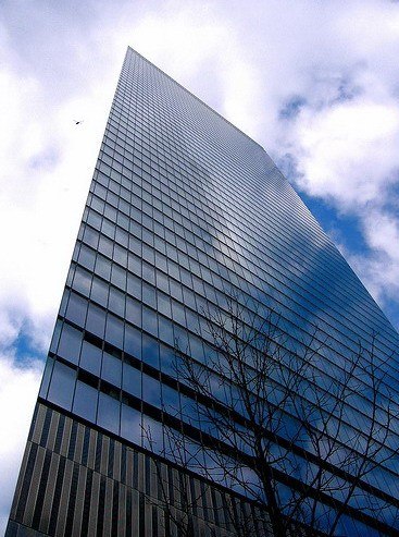
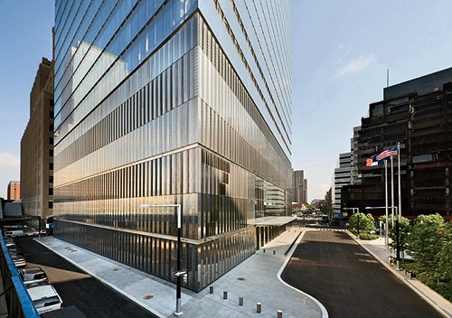
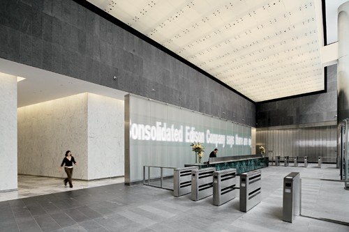
There are many good buildings. For example, Seven World Trade Center was the first major tower built in New York, post 9/11. So we saw it as an opportunity to rethink many life-safety issues, such as very thick reinforced concrete core, very wide and interconnected fire escape stairs that exit immediately to the street and redundant water supply in case of a fire. The project also incorporates sustainable issues for which it earned Gold LEED certificate. The building sets the tone for excellent quality for upcoming towers around it. There are many innovations. For example, the floor to ceiling transparent glass curtain wall system was designed in collaboration with James Carpenter to capture maximum natural light. We received numerous inquiries internationally about both the look and performance of this building.
Let’s talk about your projects in Russia.
We have done a number of projects in Russia, including Moscow Sugar Factory master plan, Ducat Place III business center, commercial projects for Forum Management and a number of competitions. But the project I am most involved in is Plot 16 in Moscow City for Capital Group who contacted us based on our other projects in Moscow.
How do you find working with your Russian clients?
Our clients are very different, but Capital is a very experienced and knowledgeable group of developers. They know the global market and are very familiar with our recent work internationally. We speak the same language so it is very easy to work with them.
How personally do you get involved with the Moscow projects and how well did you get to know the city?
I direct the design team that works on various aspects of design and travel to Moscow once every six to eight weeks.
The first time I went there a few years ago in winter during record braking freezing temperature. I would like to know the
city better, but I know our site and the neighborhood around it very well (Peter juggles freely with many difficult street
names, various Moscow landmarks, long last names of local developers and throughout our conversation he demonstrates a very good understanding of precise views that will open from different heights of his project). From what I have seen, I like some small-scale contemporary projects and very handsome low-rise neighborhoods with early 20th and 19th century classicist buildings. They make very nice streets. However, I did not see any distinguished contemporary high-rises. I think Moscow deserves better buildings, especially given the wealth and the speed of growth of the economy. It is indeed a city of many great opportunities. I like the concentric city plan, which has a very recognizable pattern to it. I love the metro system, which is by far the best I have ever been to personally. It is very grand, impressive, very fast and convenient.
I don’t understand why people would not want to give up their private automobiles that waste so much time in traffic.
How does this local character affect your design strategies?
What interests me about Moscow is not just its visual character but also its latitude or environmental context. One of the first times I was in Moscow was on December 21 and the fact that the sun would rise at 8:30 in the morning and set down at 3:15 in the afternoon intrigued me. Then in summer, the days get very long. So I’m interested in responding to this local condition. How do you design a building to maximize natural light, which is so rare in winter? No matter where I am around the world I always take into account such issues as climactic conditions. In the Middle East, for example, the climate is exactly the opposite and you have to minimize the amount of light that gets into the building with sun shading devices and so forth.
How do you think your projects contribute to the context of historical urban fabric and existing culture?
You have to be very careful, but you always have to do buildings of your own time. It is a tragedy when architects get nostalgic, trying to make buildings look like they are from a different time. It is important to find the good balance between the building being a good neighbor and working in service of keeping the street line. A good analogy is a family aligning for a portrait. There are many generations, wearing many kinds and styles of clothes that reflect their tastes and times, but somehow everything aligns when everybody comes together to make that family portrait. Another good analogy for designing a city is a great symphony orchestra. Everyone in that orchestra is a fantastic musician and a strong individual, but on stage, they realize that their role is to work as a collective and occasionally one of these musicians is asked to stand up and play a virtuoso performance. Therefore, to build a good neighborhood, the architects have to understand the history of the site, its growing pattern, the traffic condition, the flow of people and the movement of the sun. That is why every time I go to Moscow I take time to visit all our sites there. For example, for Forum Management we worked a lot in historical neighborhoods and that usually requires a very detailed site study. But even in the case of Moscow-City, it is important
to see the site at various times of the day and year.
Your Moscow City project is like Tabula Rasa in a sense that it is practically free of any historical context and is a new city in the making.
Yes, it was the desire of the city government to build an International Financial Center. In relation to that immediately certain
iconic images come to mind in terms of what is expected here for the business community. In Plot 16 the idea was to
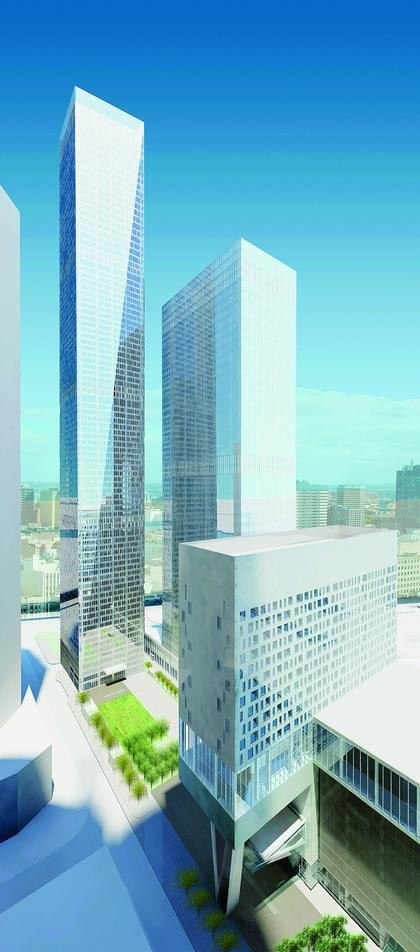
create a crystalline object to optimize and harness natural light and contribute to the skyline of the new business center. Our
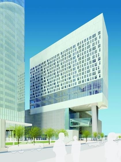
complex consists of four structures and sits right between the Federation Tower and Russia Tower by Norman Foster. When we designed our project, the orchestra analogy became very important. We knew which buildings around us were going to be virtuoso structures. Hence we decided to do a very quiet and elegant building. It is the quiet background of the buildings that make cities work. Icons are for tourists. They are just one layer, a very distant view of a city. Traveling to Moscow and learning about projects around us, we were struck by the fact that so many of these object towers sit on plinths, which leave very little open space. There are no plazas – just walls of six to seven story buildings with very tall towers growing out of them. We proposed a composition of four structures – the office and residential towers, the hotel block and the parking low-rise building, all organized around an open plaza open to the public, which is what Seagram Building did in New York.
Do you see any particular shifts in the demands of your clients internationally?
In recent years, clients in general give a lot more emphasis to design. They recognize that successful design can create an
iconic status, which creates value for their properties. Tenants want to be in distinct buildings that have a recognized address. Visual characteristics become as important to developers as their business concerns. We also find that the clients are very aware of energy consumption, sustainability issues and the fact that thoughtful design can improve internal quality and working conditions in their buildings. For example, we recently did a master plan for the Kingdom of Bahrain and our clients were very interested in building non energy dependent solutions for the entire country.
At this time in history what is the most exciting thing about being an architect?
I think being able to practice on a global scale is very exciting. There is a lot of concern right now about a slow down in the
US economy but so many architects have been finding more work internationally. I think we have projects on almost every
continent. World population is growing very rapidly and becoming more urban. Architects are in big demand and many
projects we are building today will be replaced in just 30 years or less. Therefore, the amount and scale of work ahead of
us is very fascinating. It is very exciting to be a part of such unprecedented urban growth just about everywhere in the world. I think Moscow is just making initial steps in terms of gaining a prominent presence on global stage architecturally. Look at China. There is a whole new art and architecture community emerging and becoming wellknown throughout the world. I think Russia is going to emerge as well. The opportune time for architecture is here.


