По-русски

​The Merging Method

A version of modern contextualism: textured and ornamental architecture, reservedly classical, yet not belonging to any specific style. T+T Architects used this modern approach for delicate work in the historical center of Ekaterinburg.

16 December 2019
Object
mainImg
The housing complex “Aleksandrovsky Sad” is being built in the historical center of Ekaterinburg, not far away from the Iset River and the Bazhov Museum, and a ten minutes’ walk away from the “Geologicheskaya” metro station and the dendrological park. T+T Architects started working on its project as a result of a competition, yet not quite in the usual way: initially, there was a project of a housing complex, almost complete, but the client decided to change its visual appearance and conducted a competition for the best facade design. Taking part in this competition, the architects put forward such a large number of suggestions on optimizing the overall design, getting the facades in sync with the buildings’ structure, and others, that ultimately T+T became the authors of a new concept of this housing complex, whose construction has already begun this year.

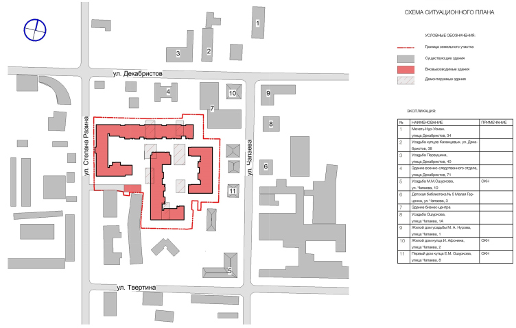
“Aleksandrovsky Sad” housing complex. The location plan
Copyright: © Т+Т Architects


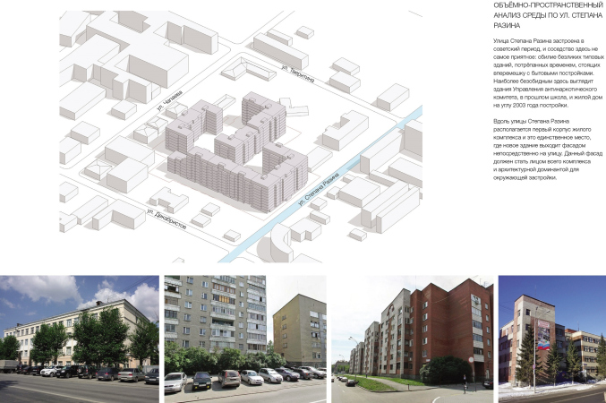
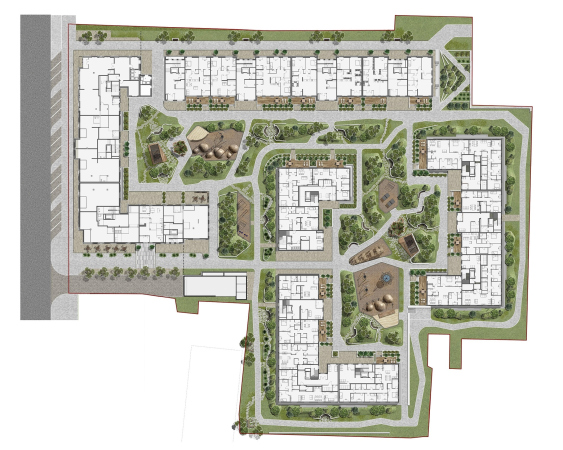
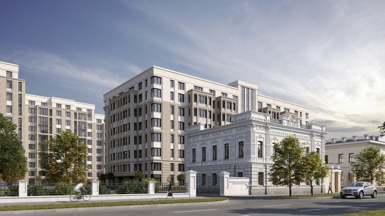
The complex is being built on a 2-hectare land site of a slightly zigzagged contour, yet of convenient broad proportions. It is situated in the middle of the city block, with a withdrawal from the outside streets, only stepping on the red line on the Stepana Razina Street, where the two entrances to the territory of the future housing complex will be situated. Although the place is essentially surrounded by the historical city, it has a rather mottled character, with lots of lacunae and later additions: for example, the Stepana Razina Street is dominated by the characteristic Soviet buildings, while the Chapaeva Street (ex Arkhiereiskaya, this “revolutionary” name having been given to it in the 1920) is essentially a congregation of the nineteenth century eclectics and partially classicism. The most interesting of these buildings is situated on the side that is opposite from the housing complex – it is the palace of the Oshurkov Brothers Estate, a house with luxurious Corinthian columns.

“Aleksandrovsky Sad” housing complex
Copyright: © T+T architects


“Aleksandrovsky Sad” housing complex
Copyright: © T+T architects


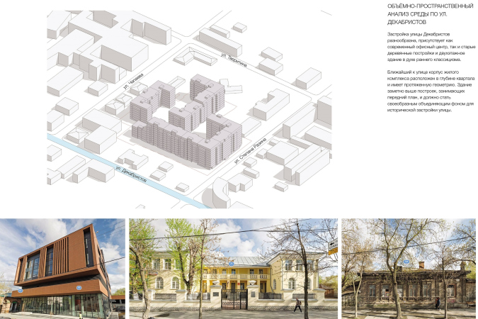
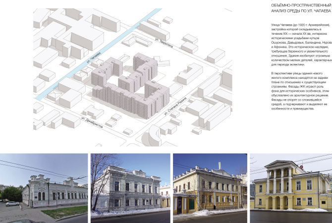
On the Chapaeva Street, there are three less imposing buildings, yet they are still monuments of architecture: two more Oshurkov houses, one of them the “older” one, i.e. preceding the palace across from it, and the brick house of merchant Afonin on the corner, behind which stands the corner-shaped Au Room business center, quite a decent example of modern architecture. On the Dekabristov Street, there is yet another two-story house that can be traced back to classicism; we can also see a wooden eclectic house standing next to it.

  • zooming
    1 / 3
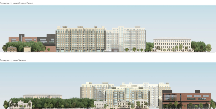
    “Aleksandrovsky Sad” housing complex. The construction analysis
    Copyright: © T+T architects
  • zooming
    2 / 3
    “Aleksandrovsky Sad” housing complex. Construction analysis
    Copyright: © Т+Т Architects
  • zooming
    3 / 3
    “Aleksandrovsky Sad” housing complex. Construction analysis
    Copyright: © Т+Т Architects


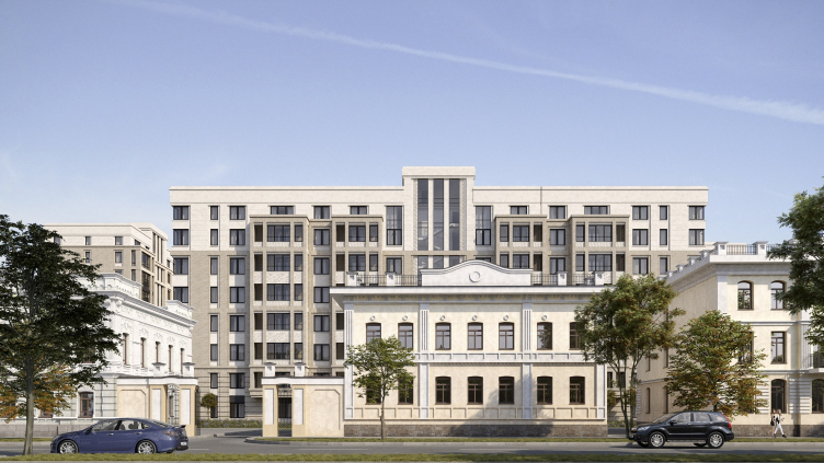
All of these historical buildings have a protected status and their respective protected zones; in addition, the architects themselves consider them to be of historical and architectural value, just as the entire Arkhiereiskaya Street, not trying to contradict it in any way, and emphasizing the project’s loyalty to the monuments. From its eastern side, the complex looks more in a neutral key, while its west facade, conversely, broadcasts the “discrete charm” of the reserved classic to the sloppy “former Soviet” context, which, essentially, is the solution of the first task that the architects set for themselves: to “merge” or “saturate” the existing environment in a conflict-free way, “glue” it together, forming a steady nucleus with a reserved and tactful classic architecture. 

“Aleksandrovsky Sad” housing complex
Copyright: © T+T architects


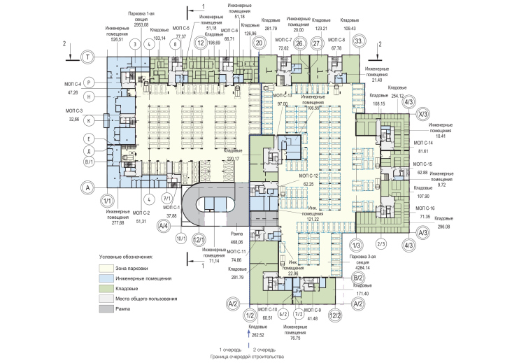
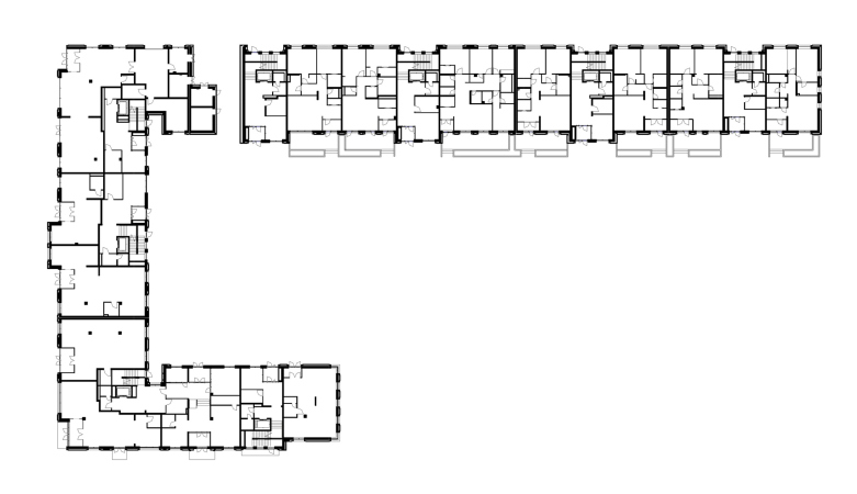
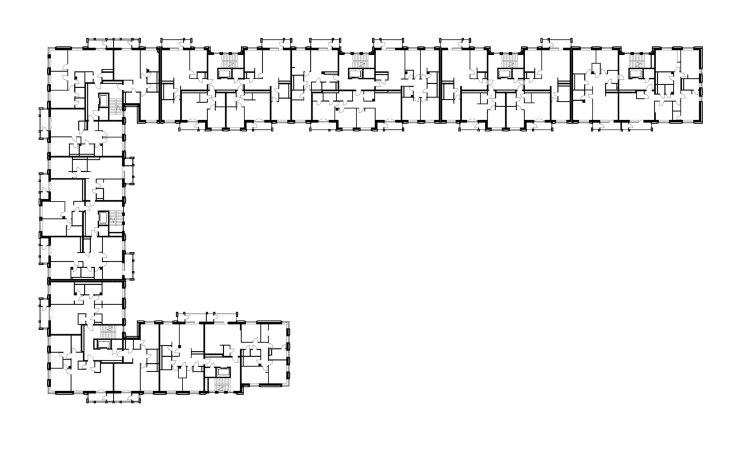
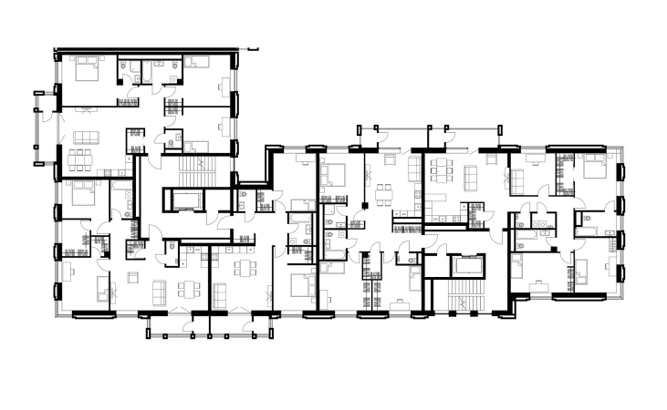
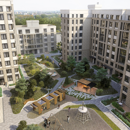
The three sectional buildings, corresponding to the three stages of construction, are all U-shaped on the plan, yet each one of different proportions. Unit 1, whose facade overlooks the Stepana Razina Street, has asymmetric “legs” that project far into the depth of the site, ending in a 4-story section of a reduced height in the area ruled by the Afonin house. Otherwise, the height of the sections varies from 7 to 9 floors. The “legs” projected by the two other units are shorter, and they are all positioned on the land site as a spacious jigsaw puzzle: the use the space efficiently, without leaving unnecessary voids, yet they do leave enough space for the yards, connected with each other, formed by the frames of the U-shaped buildings. This way, the space ends up dissected into zones, yet coherent, although not overly parceled. The one-level underground parking garage occupies the entire blueprint underneath all of the yards, the peculiar detail being that underneath the houses, there are storage places, and underneath the yard of Unit 1, there is yet another mini parking level.

Plan of the -1st level. “Aleksandrovsky Sad” housing complex
Copyright: © T+T architects


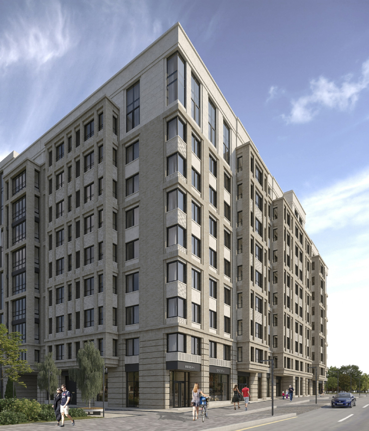
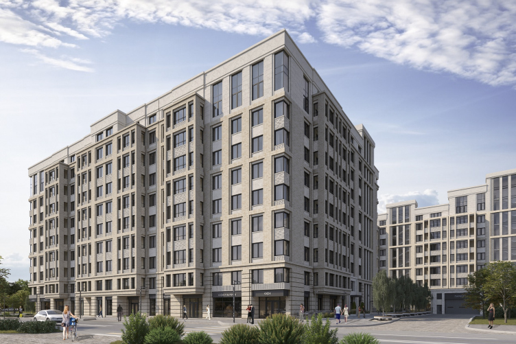
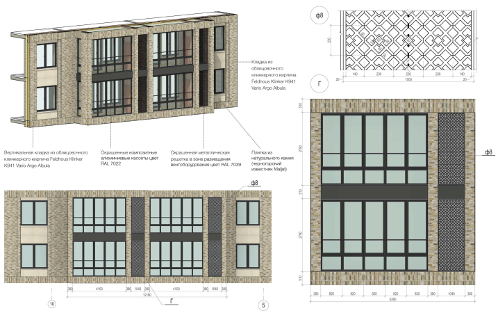
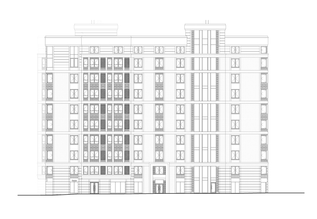
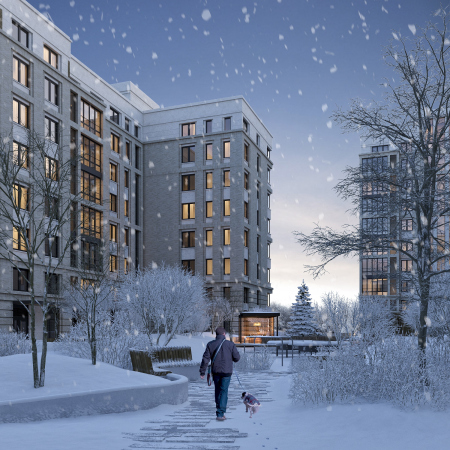
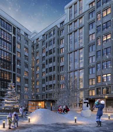
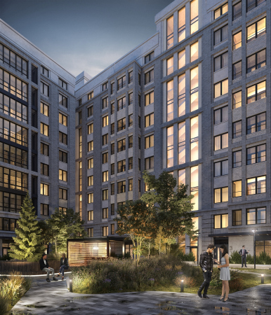
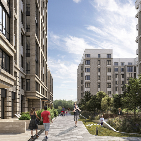
The plastique and the texture of the facades combines the technique that is characteristic of tenement houses of the eclectic period – which is more than contextual in this environment – with the techniques of Bauhaus and the “working settlements” of the 1920’s, as well as modern ones. Lots of bay windows unite the stanza balconies of the apartment: slightly more reserved on the outside facades, they afford more glass surfaces, yet in either case their image can be traced back to the XIX century. The sticking-up volumes of the staircase and elevator halls, as well as slight, one-floor high, height differences, ensure the terraced look of the complex’s silhouette, preventing monotony. The “avant-garde” corner windows not only provide the apartments with extra light, but also refer us image-wise to the XX century.

“Aleksandrovsky Garden” housing complex
Copyright: © T+T architects


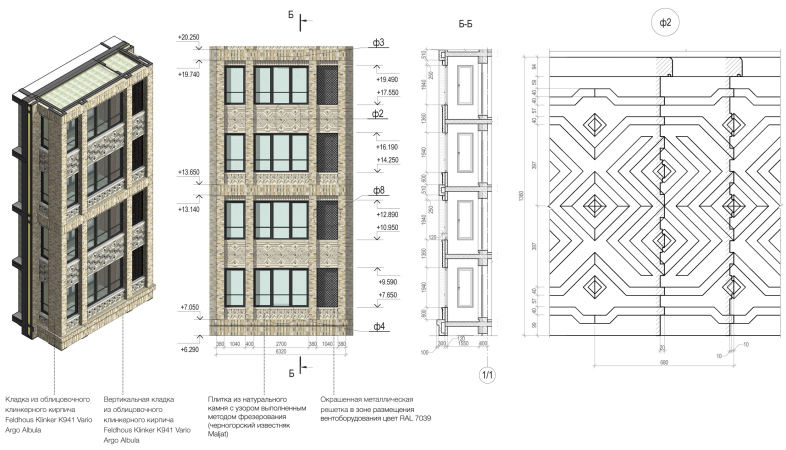
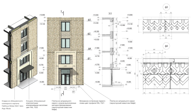
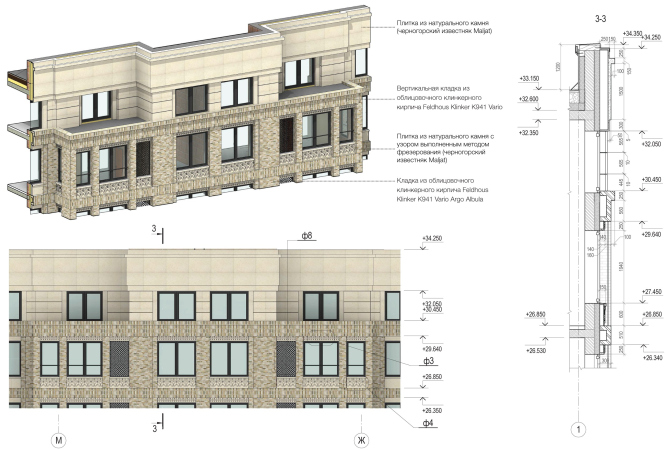
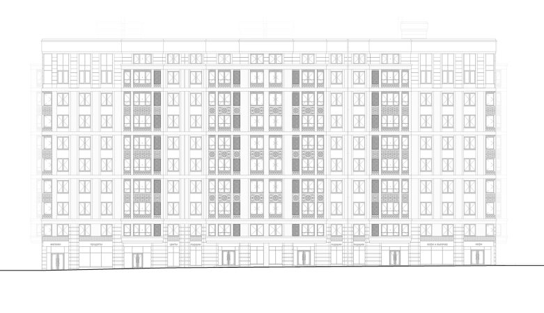
The facades follow the principles of the classic three parts, developed in the 1930’s by Art Deco architects: the two lower floors are united by horizontal rock-face stripes of light-colored textured brick; the same kind of brick, only now without stripes, is responsible for the main “body” of the building. The two upper floors are coated with lighter stone that is dissected by thin “graphic” grooves. However, the brick bay windows, getting one tier higher, emphasize the mutual penetration of the textures, allowing the architects to avoid the excessive rigidity of the tripartite structure.

Renovation of a former industrial territory into the loft block Studio #8
Copyright: © T+T architects


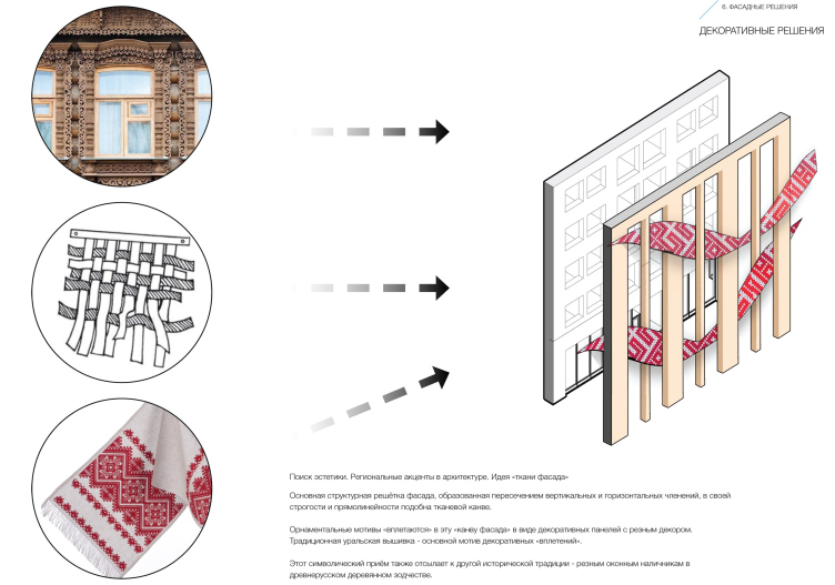
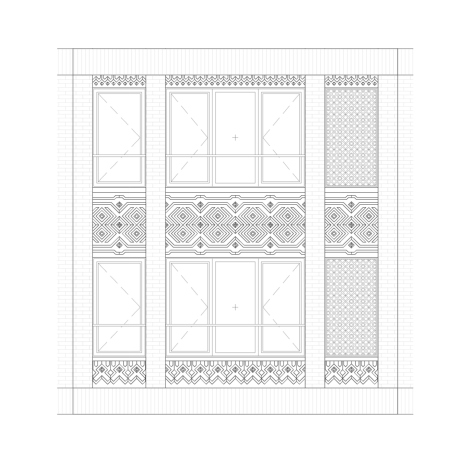
But then again, the dialogue between stone and brick surfaces is to be seen everywhere around here: the facades are interpreted as multilayered ones; the ledgy brick verticals are underlined by stone horizontals – a popular technique that makes it possible to accentuate the thickness and the plastique of the wall, and, as the authors of the project justly note, resembling weaving or wickerwork.

“Aleksandrovsky Sad” housing complex
Copyright: © T+T architects


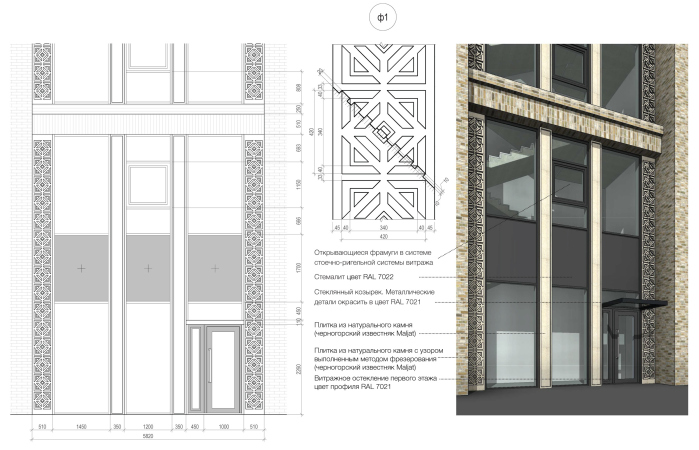
The stone horizontals are covered with carved ornaments that can be traced back to both folk Ural embroidery tradition and Ekaterinburg’s carved wooden frameworks around window openings. If we are to consider the fact that one of the inspiration sources for the carved wooden frameworks during the eclectic period was embroidery, it all comes back to one and the same prototype. This, however, is a minor consideration; what is more important is the fact that the authors are emphasizing the local identity of the house and its being at one with the history of the city, at the same time saturating the facades with ornaments and thus following one of the popular trends of modern architecture.

“Aleksandrovsky Garden” housing complex
Copyright: © T+T architects


If we really pay attention to the end result, we will see that the layered character of the facades refers us to the early French classicism, the ornaments to the wooden eclectic; the bay windows remind about the tenement houses, while the pale-beige tone of the stone and brick, just as the thin horizontal strokes, are slightly resonant with Osman Paris architecture – a similarity that the future buyers will probably warm up to.

  • zooming
    1 / 7
    “Aleksandrovsky Sad” housing complex
    Copyright: © T+T architects
  • zooming
    2 / 7
    “Aleksandrovsky Sad” housing complex
    Copyright: © Т+Т Architects
  • zooming
    3 / 7
    “Aleksandrovsky Sad” housing complex
    Copyright: © Т+Т Architects
  • zooming
    4 / 7
    “Aleksandrovsky Sad” housing complex
    Copyright: © Т+Т Architects
  • zooming
    5 / 7
    “Aleksandrovsky Sad” housing complex
    Copyright: © Т+Т Architects
  • zooming
    6 / 7
    “Aleksandrovsky Sad” housing complex. Unit 1, a fragment
    Copyright: © Т+Т Architects
  • zooming
    7 / 7
    “Aleksandrovsky Sad” housing complex. Unit 1, a fragment
    Copyright: © Т+Т Architects


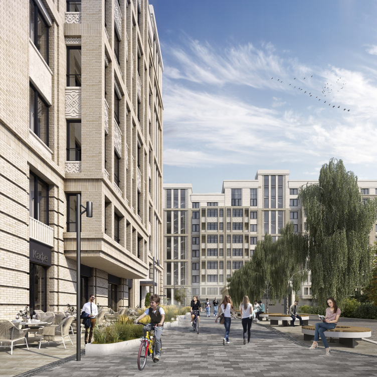
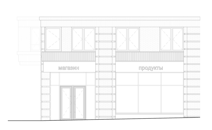
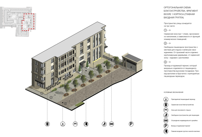
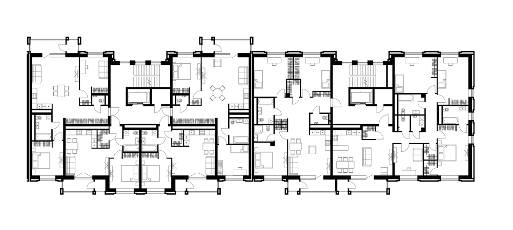
The range of apartments is quite diverse, and is not prone to being dominated by studios, as is sometimes the case: this business class house consists chiefly of two and three room apartments, with an occasional four and five-room one. The apartments on the top floors have double-height living rooms in them; the apartments on the first floor got high ceilings, some of them also getting exists to the yard and little private gardens of their own. The premises for the commercial infrastructure premises are grouped alongside the Stepana Razina Street, where the complex “steps” on the red line; this location will also feature a mini promenade with cafe table going alongside the wing of Unit 1 – a peaceful yet still belonging to the city part of the complex.

  • zooming
    1 / 6
    “Aleksandrovsky Sad” housing complex. Unit 1, plan of the 1st floor
    Copyright: © T+T architects
  • zooming
    2 / 6
    “Aleksandrovsky Sad” housing complex. Unit 1, plan of the 3rd floor
    Copyright: © Т+Т Architects
  • zooming
    3 / 6
    “Aleksandrovsky Sad” housing complex. Unit 1, Section 1-2
    Copyright: © Т+Т Architects
  • zooming
    4 / 6
    “Aleksandrovsky Sad” housing complex. Unit 1, Section 7-8
    Copyright: © Т+Т Architects
  • zooming
    5 / 6
    “Aleksandrovsky Sad” housing complex. Unit 1, Facade 1-12
    Copyright: © Т+Т Architects
  • zooming
    6 / 6
    “Aleksandrovsky Sad” housing complex. Unit 1, Facade A-T
    Copyright: © Т+Т Architects


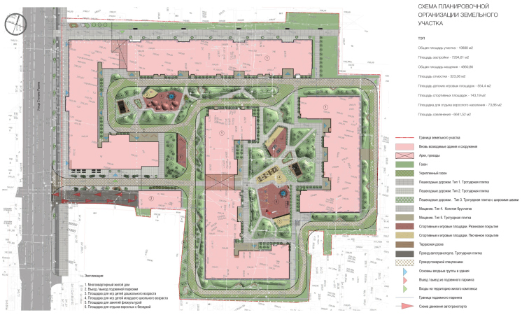
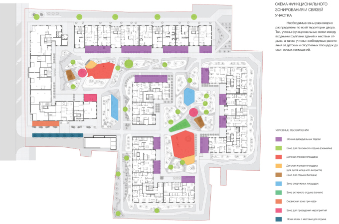
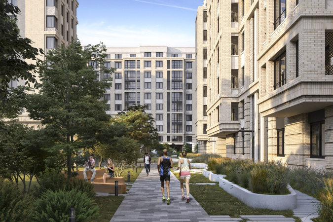
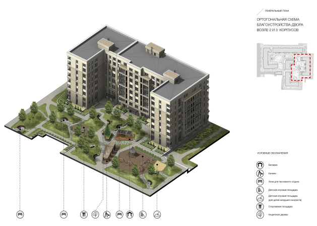
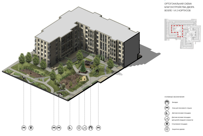
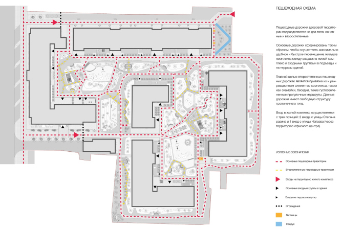
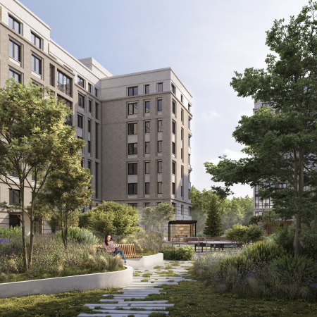
An important task was also to turn the yards into as much as a landscaped park. The architects came up with two sets of trails: the main stone-paved ones, connecting important points, and secondary, like punctured lines in the grass, separated by hills and benches installed into the slopes. The landscape design appears not only in the yards but also in front of the facades turned inside the city block; every strip of land is used for the creation of this park. In the project, this yard is filled with functions as much as with greenery: sports fields and playgrounds for kids of different ages, gazebos, and a pergola with a swing.

  • zooming
    1 / 3
    “Aleksandrovsky Sad” housing complex. The master plan
    Copyright: © T+T architects
  • zooming
    2 / 3
    “Aleksandrovsky Sad” housing complex
    Copyright: © Т+Т Architects
  • zooming
    3 / 3
    The landscaping arrangement. “Aleksandrovsky Sad” housing complex
    Copyright: © Т+Т Architects


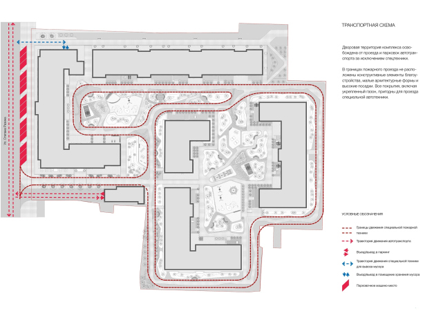
The main paved trails also function as the driveways for emergency vehicles; otherwise, the yards are car-free, for the sole exception of a few overland parking places on the Stepana Razina Street. We will note here that the very idea of such “park” yard, just as the U-shaped plan of all the unite and some bias towards classicism, particularly visible on the facades, can also be understood as homage to the old town, for example, a reminiscence about the park in the Oshurkovs estate on the bank of Iset. The combination of textured facades and abundant landscaping of the yards, probably, does an adequate job of conveying the coziness of the old town, so characteristically Russian, combining the charm of the facades and the greenery.

  • zooming
    1 / 13
    “Aleksandrovsky Sad” housing complex
    Copyright: © T+T architects
  • zooming
    2 / 13
    “Aleksandrovsky Sad” housing complex
    Copyright: © T+T architects
  • zooming
    3 / 13
    “Aleksandrovsky Garden” housing complex
    Copyright: © T+T architects
  • zooming
    4 / 13
    “Aleksandrovsky Sad” housing complex
    Copyright: © T+T architects
  • zooming
    5 / 13
    “Aleksandrovsky Garden” housing complex
    Copyright: © T+T architects
  • zooming
    6 / 13
    “Aleksandrovsky Garden” housing complex
    Copyright: © T+T architects
  • zooming
    7 / 13
    “Aleksandrovsky Garden” housing complex
    Copyright: © T+T architects
  • zooming
    8 / 13
    “Aleksandrovsky Sad” housing complex
    Copyright: © T+T architects
  • zooming
    9 / 13
    “Aleksandrovsky Sad” housing complex. Landscaping arrangement 3
    Copyright: © T+T architects
  • zooming
    10 / 13
    “Aleksandrovsky Sad” housing complex. Landscaping arrangement 2
    Copyright: © T+T architects
  • zooming
    11 / 13
    “Aleksandrovsky Sad” housing complex. Landscaping arrangement 1
    Copyright: © Т+Т Architects
  • zooming
    12 / 13
    “Aleksandrovsky Sad” housing complex. The transportation scheme
    Copyright: © T+T architects
  • zooming
    13 / 13
    “Aleksandrovsky Sad” housing complex. The pedestrian routes
    Copyright: © Т+Т Architects


As we can see, this housing complex corresponds to most of the modern principles of comfortable urban housing, and is respectful to the monuments of architecture, keeping a tactful distance and settling for a modest background role. It is also characterized by detailed elaboration of many of its aspects: proportions, apartment layouts, building and decoration materials, landscaping, and the lighting – all of this becomes the basis for the high quality of execution, which not necessarily must be something that immediately meets the eye. At the same time, a fair amount of respectable conservatism in this particular case does not at all mean direct borrowing from the classics or the fractured decoration pattern of the neighboring eclectic houses – the new complex is not contradicting, it is just being different.

16 December 2019

Headlines now
The Golden Crown
The concept for a dental clinic in Yekaterinburg, developed by CNTR Studio, revolves around the idea of a “mouth full of gold”: pristine white porcelain stoneware walls are complemented by matte brass details. To avoid an overly literal interpretation, the architects focused on the building’s proportions, skillfully navigating between sunlight requirements and fire safety regulations.
Flexibility and Integration
Not long ago, we covered the project for the fourth phase of the ÁLIA residential complex, designed by APEX. Now, we’ve been shown different fence concepts they developed to enclose the complex’s private courtyards, incorporating a variety of public functions. We believe that the sheer fact that the complex’s architects were involved in such a detail as fencing speaks volumes.
A Step Forward
The HIDE residential complex represents a major milestone for ADM architects and their leaders Andrey Romanov and Ekaterina Kuznetsova in their quest for a fresh high-rise aesthetic – one that is flexible and layered, capable of bringing vibrancy to mass and silhouette while shaping form. Over recent years, this approach has become ADM’s “signature style”, with the golden HIDE tower playing a pivotal role in its evolution. Here, we delve into the project’s story, explore the details of the complex’s design, and uncover its core essence.
Gold in the Sands
A new office for a transcontinental company specializing in resource extraction and processing has opened in Dubai. Designed by T+T Architects, masters of creating spaces that are contemporary, diverse, flexible, and original, this project exemplifies their expertise. On the executive floor, a massive brass-clad partition dominates, while layered textures of compressed earth create a contextually resonant backdrop.
Layers and Levels of Flight
This project goes way back – Reserve Union won this architectural competition at the end of 2011, and the building was completed in 2018, so it’s practically “archival”. However, despite being relatively unknown, the building can hardly be considered “dated” and remains a prime example of architectural expression, particularly in the headquarters genre. And it’s especially fitting for an aviation company office. In some ways, it resembles the Aeroflot headquarters at Sheremetyevo but with its own unique identity, following the signature style of Vladimir Plotkin. In this article, we take an in-depth look at the United Aircraft Corporation (UAC) headquarters in the Moscow agglomeration town of Zhukovsky, supplemented by recent photographs from Alexey Naroditsky – a shoot that became only recently possible due to the fact that improvements were finally made in the surrounding area.
Light and Shadow
In this article, we delve into the architectural design of the “Chaika” house by DNK ag architects, which was recently completed in 2023 as part of the collection of signature designs at ZILArt. As is well-known, all the buildings in this complex follow a design code, yet each one is distinct. This particular building stands out not only for its whiteness and minimalism but also for the refined use of a limited number of techniques that, together, create what can confidently be called synergy.
Casus Novae
A master plan was developed for a large residential area with a name of “DNS City”, but now that its implementation began, the plan has been arbitrarily reformatted and replaced with something that, while similar on the surface, is actually quite different. This is not the first time such a thing happens, but it’s always frustrating. With permission from the author, we are sharing Maria Elkina’s post.
Treasure Hunting
The GAFA bureau, in collaboration with Tegola and Arkhitail, organized an expedition to the island of Kilpola in Karelia as part of Moskomarkhitektura’s “Open City” festival. There, amidst moss and rocks, the students sought answers to questions like: what is the sacred, where does it dwell, and what sustains it? Assisting the participants in this quest were landscape engineer Evgeny Levin, artist Nicholas Roerich, a moose, and the lack of cellular connection. Here’s how the story unfolded.
Depths of the Earth, Streams of Water
In the Malaya Okhta district, the Akzent building, designed by Stepan Liphart, was constructed. It follows a classic tripartite structure, yet it’s what you might call “hand-drawn”: each façade is unique in its form and details, some of which aren’t immediately noticeable. In this article, we explore the context and, together with the architect, delve into how the form was developed.
Fir Tree Dynamics
The “Airports of Region” holding is planning to build an airport in Karachay-Cherkessia, aiming to make the Arkhyz and Dombay resorts more accessible to travelers. The project that won in an invitation-only competition, submitted by Sergey Nikeshkin’s KPLN, blends natural imagery inspired by the shape of a conifer seed, open-air waiting spaces, majestic large trees, and a green roof elevated on needle-like columns. The result is both nature-inspired and WOW.
​A Brick Shell
In the process of designing a clubhouse situated among pine trees in a prestigious suburban area near Moscow, the architectural firm “A.Len” did the façade design part. The combination of different types of brick and masonry correlates with the volumetric and plastique solutions, further enhanced by the inclusion of wood-painted fragments and metal “glazing”.
Word Forms
ATRIUM architects love ambitious challenges, and for the firm’s thirtieth anniversary, they boldly play a game of words with an exhibition that dives deep into a self-created vocabulary. They immerse their projects – especially art installations – into this glossary, as if plunging into a current of their own. You feel as if you’re flowing through the veins of pure art, immersed in a universe of vertical cities, educational spaces – of which the architects are true masters – and the cultural codes of various locations. But what truly captivates is the bold statement that Vera Butko and Anton Nadtochy make, both through their work and this exhibition: architecture, above all, is art – the art of working with form and space.
Flexibility and Acuteness of Modernity
Luxurious, fluid, large “kokoshniks” and spiral barrel columns, as if made from colorful chewing gum: there seem to be no other mansion like this in Moscow, designed in the “Neo-Russian-Modern” style. And the “Teremok” on Malaya Kaluzhskaya, previously somewhat obscure, has “come alive with new colors” and gained visibility after its restoration for the office of the “architectural ecosystem” as the architects love to call themselves. It’s evident that Julius Borisov and the architects at UNK put their hearts into finding this new office and bringing it up to date. Let’s delve into the paradoxes of this mansion’s history and its plasticity. Spoiler: two versions of modernity meet here, both balancing on the razor’s edge of “what’s current”.
Yuri Vissarionov: “A modular house does not belong to the land”
It belongs to space, or to the air... It turns out that 3D printing is more effective when combined with a modular approach: the house is built in a workshop and then adapted to the site, including on uneven terrain. Yuri Vissarionov shares his latest experience in designing tourist complexes, both in central Russia and in the south. These include houseboats, homes printed from lightweight concrete using a 3D printer, and, of course, frame houses.
​Moscow’s First
“The quality of education largely depends on the quality of the educational environment”. This principle of the last decade has been realized by Sergey Skuratov in the project for the First Moscow Gymnasium on Rostovskaya Embankment in the Khamovniki district. The building seamlessly integrates into the complex urban landscape, responding both to the pedestrian flow of the city and the quiet alleyways. It skillfully takes advantage of the height differences and aligns with modern trends in educational space design. Let’s take a closer look.
Looking at the Water
The site of Villa Sonata stretches from the road to the water’s edge, offering its own shoreline, pier, and a picturesque river panorama. To reveal these sweeping views, Roman Leonidov “cut” the façade diagonally parallel to the river, thus getting two main axes for the house and, consequently, “two heads”. The internal core – two double-height spaces, a living room and a conservatory, with a “bridge” above them – makes the house both “transparent” and filled with light.
The White Wing
Well, it’s not exactly white. It’s more of a beige, white-stone structure that plays with the color of limestone – smoother surfaces are lighter, while rougher ones are darker. This wing unites various elements: it absorbs and interprets the surrounding themes. It responds to everything, yet maintains a cohesive expression – a challenging task! – while also incorporating recognizable features of its own, such as the dynamic cuts at the bottom, top, and middle.
Urban Dunes
The XSA Ramps team designed and built a three-part sports hub for a park in Rostov-on-Don, welcoming people of all ages and fitness levels. The skate plaza, pump track, and playground are all meticulously crafted with details that attract a diverse range of visitors. The technical execution of the shapes and slopes transforms this space into a kind of sculptural composition.
Proportional Growth
The project for the fourth phase of the ÁLIA residential area has been announced. The buildings are situated on an elongated plot – almost a “ray” that shoots out from the center of the area towards the river. Their layout reflects both a response to Moscow’s architectural preferences over the past 15 years, shifting “from blocks to towers”, and an interpretation of the neighboring business park designed by SOM. Additionally, the best apartments here are not located at the very top but closer to the middle, forming a glowing “waistline”.
The “Staircase” Building
In designing the “Details” residential complex in New Moscow, Rais Baishev spiced up the now-popular Moscow theme of a “courtyard” building with an idea drawn from the surrealist drawings by Maurits Escher. He envisioned the stepped silhouettes and descending slopes as a metaphysical mega-staircase, creating a key void within the courtyard that gave the project an internal “spine”. This concept is felt both in the building’s silhouette and on its façades.
Projection of the Quarter
No one doubted that the building that Vladimir Plotkin designed as part of the “Garden Quarters” would be the most modernist of all. And it turned out just that way: while adhering to the common design code, the building successfully combines brick and white stone, rhythmically responding to the neighboring building designed by Ostozhenka, yet tactfully and persistently making a few statements of its own. This includes the projection of the ideal urban development composition “14–9–6”, which can be found right next door, mathematical calculations, including those for various types of terraces (and perhaps the only reminder of the Soviet past of the Kauchuk rubber factory!), and the white “cross-stitch” pattern of the façade grid.
Domus Aurea
In this issue, we examine the “Tessinsky-1” house, designed by Sergey Skuratov and completed in 2023. Located in the middle of the Serebryanicheskaya Embankment district, at the intersection of its main streets, this house assumes a sort of “nodal” role: it not only responds to everything around it and preserves many memories of the former EMA factory within itself, but it weaves all this into a newly directed pattern, reconciling bright “gold” and dark-colored brick, largely with the help of the new, modern-yet-archaic Columba brick, which, come to think about it, is the most precious element here.
The Chimney of Nikola-Lenivets
In this issue, we are examining the “Obelisk House” designed by KATARSIS and built for the Arkhstoyanie 2023 festival. However, it was only finished later on, and this is why we are examining it now. It seems to us that after the “Obelisk House” appeared in Nikola-Lenivets, a dialogue and a few inner connections appeared between the temporary structures built here. These houses no longer look like “accidental neighbors”, more of which below.
​Periscope by the Bay
The jury awarded the second place in the competition for a public and cultural center in Petropavlovsk-Kamchatsky to the companies GORA (“Mountain”) and M4. In the consortium’s proposal, the building resembles a sperm whale with a calf swimming next to it or a periscope, whose lenses capture the most spectacular views from the surrounding landscape.
From Arcs to Dolmens
While working on the competition project for Petropavlovsk-Kamchatsky, ASADOV Architects prioritized the value of the natural and urban environment, aiming to preserve the balance of the location while minimizing the resemblance of the volume that they designed to a “traditional building”. The task was challenging, and the architects created three versions, one of which having been developed after the competition, where their main proposal took third place. However, the point of interest here is not the competition result but the continuity of creative thinking.
Hide and Seek
The ID Moskovskiy house, designed by Stepan Liphart in St. Petersburg, in the courtyards near Moskovskiy Avenue beyond the Obvodny Canal and recently completed, is notable for several reasons. Firstly, it has been realized with considerable accuracy, which is particularly significant as this is the first building where the architect was responsible not only for the facades but also for the layouts, allowing for better integration between the two. On the other hand, this building is interesting as an example of the “germination” of new architecture in the city: it draws on the best examples from the neighborhood and becomes an improved and developed sum of ideas found by the architect in the surrounding context.
The Big Twelve
Yesterday, the winners of the Moscow Mayor’s Architecture Award were announced and honored. Let’s take a look at what was awarded and, in some cases, even critique this esteemed award. After all, there is always room for improvement, right?
Above the Golden Horn
The residential complex “Philosophy” designed by T+T architects in Vladivostok, is one of the new projects in the “Golubinaya Pad” area, changing its development philosophy (pun intended) from single houses to a comprehensive approach. The buildings are organized along public streets, varying in height and format, with one house even executed in gallery typology, featuring a cantilever leaning on an art object.
Nuanced Alternative
How can you rhyme a square and space? Easily! But to do so, you need to rhyme everything you can possibly think of: weave everything together, like in a tensegrity structure, and find your own optics too. The new exhibition at GES-2 does just that, offering its visitor a new perspective on the history of art spanning 150 years, infused with the hope for endless multiplicity of worlds and art histories. Read on to see how this is achieved and how the exhibition design by Evgeny Ace contributes to it.
Blinds for Ice
An ice arena has been constructed in Domodedovo based on a project by Yuri Vissarionov Architects. To prevent the long façade, a technical requirement for winter sports facilities, from appearing monotonous, the architects proposed the use of suspended structures with multidirectional slats. This design protects the ice from direct sunlight while giving the wall texture and detail.