По-русски

​Mission Anadyr

The project of turning a derelict garage building in the remote city of Anadyr into an all-year-round youth center is based on the research done by the agency for strategic development “Center”, interviewing local young people, and studying Anadyr’s city center. The architectural concept was developed by MAParchitects, and is expected to be implemented within a year.

19 July 2019
Object
mainImg

Let’s start with the fact that Anadyr is the capital of the Chukotka Autonomous Okrug and the easternmost city of Russia – further on, there is only a couple of villages before the Bering Straits. It’s still about two hundred kilometers to go to reach the Arctic Circle, the sun comes up, well, not at midnight but at 2 a.m. in the morning, but winter sets in somewhere around September. On the other hand, the climate is somewhat softened by the vicinity of the sea – the city is situated in the bay of the Anadyr Gulf.

The “Center” agency started its work in Anadyr being invited by the local government in February this year. Its task was to turn the abandoned building of the former garage on the territory of the Chukotkommunkhoz, an industrial park situated at the edge of town but almost on the very bank of the coastal lake, into a modern innovative public space under the name of ANGAR (“The Hangar”). The “Center” experts came to Anadyr a few times, met with the city council, and, still more importantly, with the local young people to find out more about their needs and tastes, organized focus groups and interviews, as well as analyzed various city locations that were suitable for the project. The project also got its pages on Instagram, Telegram, and VK.

The research showed, on the one hand, some pretty obvious things: the city is really far away, even flights to it are often cancelled, but it still has the governing function as the center of the region. In addition, it is a mining industry center, the average salaries are pretty high here, there are plenty of young people in the city, and the city center is compact and low-rise enough to match, at least in terms of its scale, the ideals of modern urbanism. By the way, let’s take a look at the Yandex photos – the city looks quite alright, the façades of the prefab houses, mostly up to five stories high, have been restored to a healthy state, maybe not always beautiful but tidy anyway; the streets are clean, and the city’s only hotel (at least it seems to be one) looks decent and even modern. The city church is wooden, which only adds to its beauty and charm.

Photographs by Maria Sedletskaya:

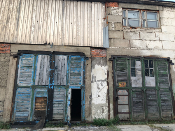
The former garage and the future youth culture center ANGAR in Anadyr. The current state
Copyright: Photograph © Maria Sedletskaya
  • zooming
    1 / 3
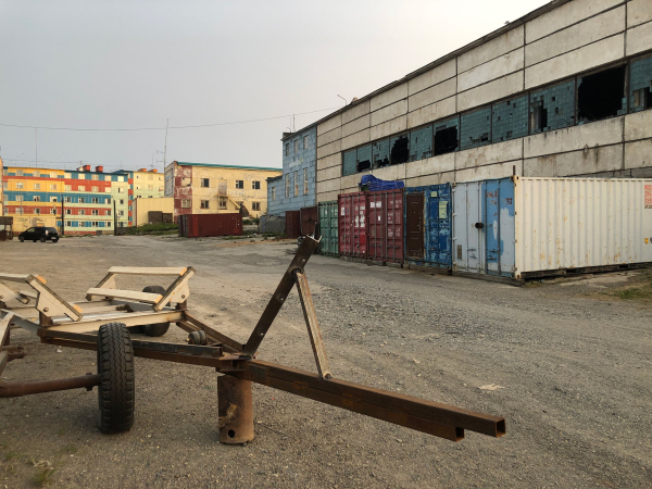
    The former garage and the future youth culture center ANGAR in Anadyr. The current state
    Copyright: Photograph © Maria Sedlitskaya
  • zooming
    2 / 3
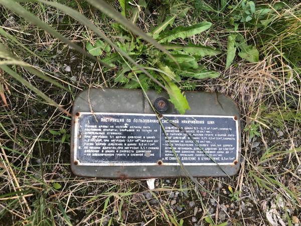
    The former garage and the future youth culture center ANGAR in Anadyr. The current state. The plaque will be used as an element of identity of the future complex.
    Copyright: Photograph © Maria Sedletskaya
  • zooming
    3 / 3
    The former garage and the future youth culture center ANGAR in Anadyr. The current state
    Copyright: Photograph © Maria Sedletskaya


On the other hand, the research elicited a few very important details – the western outskirts of the city are the place where people come to admire the sunsets, i.e. it is already loved by the romantically involved part of the population. Second, in spite of the fact that the city generally has a sufficient number of youth centers of, let’s say, official character, like a “Young Pioneers Palace”, it still lacks a place for informal meetings of young people under a warm roof.

The hangar is situated not far away from the Otke Street – it begins in the center, next to the city council, and belts the entire northern part of the city – there is also a driving and pedestrian access to it but in the context of the industrial park the architects had to highlight the hangar by contrast, at the same time keeping its identity and references to its industrial past. The center had to be an all-season one, warm, and comfortable, with a possibility to get outdoors in summer. The researchers also noted a large number of other details, such as the fact that in winter the snow falling from the building accumulates in the south corner, probably because of the sea winds.

Luckily, the project of the informal youth culture center is supported by the government of the Chukotka Okrug. According to the government, the ANGAR project became a part of the new social and economic Far East policy.

zooming


Roman Kopin,
the governor of Chukotka Autonomous Region: 

“At our focus groups with the local people and the young activists of our region I many times heard questions about building such a space. The young people of Chukotka have a lot of creative ideas but today they do not have a venue for implementing them. We will have to do some serious work in order to realize this project. We are planning to show the concept at a few forums and discuss the future project with the federal government. This is going to be a youth center of a new format, providing lots of possibilities for personal development and organizing the local young people’s leisure time”. 

The experts of the “Center” agency gathered and analyzed both global information – about the social and economic specifics of the city – and the local, about the needs of the future users of the project.  

zooming


Maria Sedletskaya,
chief analyst at the “Center” agency for strategic development: 

“Anadyr is a city of a very peculiar character. You can consider it to be the nation’s remotest city not only because it’s the easternmost city of the Russian Federation lying thousands of kilometers away from the largest cities of the European part of the nation, but also because it’s pretty far away even from the large agglomeration centers of the Far Eastern Federal District and the little towns of the Chukotka Region too. 

One of the things that Anadyr lacks is the entertainment infrastructure and entertainment events for young people aged from 14 to 35, devised outside the so-called “cultural programs” and outside of the walls of the municipal governmental organizations. The lack of informational unity and the territorial isolation of Anadyr, together with the global competition among cities makes the deficit of its “own” youth spaces all the more prominent.

Unlike many other cities of Russia’s Extreme North, the central residential part of Anadyr has a rather compact and human-proportionate plan. The peculiarities of territory development include a large stock of production and storage facilities, a large part of which recently fell into disuse. The territory includes the building of “Hangar” (the former garage), and its reconstruction has a huge potential because it will make it possible to transform the vacant building to meet any of the needs of its potential users”. 

zooming


Sergey Georgievsky,
CEO of the the agency for strategic development “Center”:

We defined the mission of the public space created by us as “creating the optimum conditions for self-realization of young people, their integration into the processes that take place outside the city boundaries, and fostering the culture of social responsibility”. This way, ANGAR must create such an environment that will allow the young people not only to satisfy their various leisure needs but also self-realize themselves in those fields of activity that will be in demand in the future. At the same time, the Mission of the place is broadcast to the outside audience and serves as a basis for gradually increasing the role of the Center – from the level of the city district and Chukotka region to the global level.

In terms of future redevelopment, the most promising territory is the production facilities area in the western part of town, surrounded by residential houses, and a waterfront area with an access to the Anadyr coastal lake – the popular youth location for admiring the sunsets and going for picnics. Including this territory into the life of the city will give an impulse to the development of new kinds of services, will increase the feeling of safety and comfort, and will make it possible to use the territory more effectively, especially if the appropriate engineering infrastructure and transport connection to the city will be maintained”.

The architectural concept of ANGAR youth culture center, 2019
Copyright: © MAParchitects / “Center” agency research


More about the project, though! Having gathered all the information and requests, in order to develop a full-fledged architectural proposal, the “Center” agency invited MAParchitects, whose task was to turn a rank-and-file hangar, built from large reinforced concrete panels, into a warm, cozy, and modern building, noticeable from a distance and attractive, suitable for the development of modern youth culture, multifunctional and transformable, and also not devoid of signs of its previous life, which became an indispensable part of today’s approaches to reconstructing industrial buildings. Such buildings must become convenient, at the same time keeping up their unique identity. 


zooming


Alexander Poroshkin, 
leader of the architectural company MAParchitects:

“When we were working on the project of this all-season youth center, it was crucially important for us to keep up the authenticity of this building, its industrial past, making for the people of Chukotka a so-called “third place” – a place where they could come to in order to have a great time with their friends, maybe listen to a lecture, develop their communicative skills, make their creative plans become a reality and generally diversify their leisure. The future ANGAR center, in addition to its main function, will also become an eventful place that accumulates the young people’s energy and enthusiasm and turns them into useful initiatives”. 

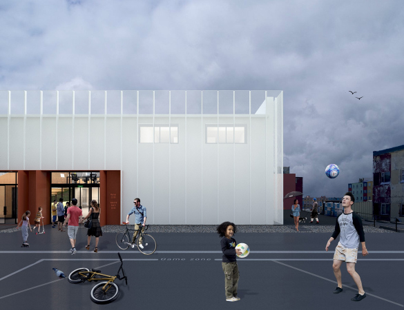
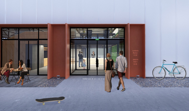
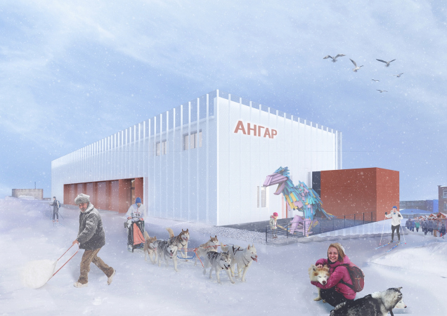
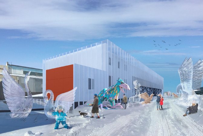
Thus, the two most noticeable techniques are determined by the search for an aesthetically pleasing and vibrant image coupled with the down-to-earth heat-insulated walls. The latter is ensured by sandwich panels filled with mineral cotton; a layer of such panels will cover the concrete walls of the hangar, and on the outside the walls will be covered by a grid of punch metal panels, capable of handling some of the wind load, and at the same performing a decorative function. The brightness is also ensured by the contrast between the snow-white walls and the warm red color of the entrance group and the minor volumes. Generally speaking, ANGAR must ultimately look like a rectangular block cut out from snow with an entrance looking like a conditional fireplace, warm and attractive like any housing in these cold latitudes – something that is archetypal for these parts.

The architectural concept of ANGAR youth culture center, 2019
Copyright: © MAParchitects / “Center” agency research


In addition, the architects are widening the entrance, proposing to take apart the brickwork of the old gate – the entrance group gets an extra glass aperture that will be opened in the summertime, letting in more light and widening the connection between the inside and the outside space, and closed in the wintertime with metallic shutters to keep the warmth inside. There is also a terra-cotta-colored depression next to the main entrance that takes in the role of a peculiar modernist portico; it is rather lengthy yet not without industrial allusions – the pylons are interpreted as large double-L beams.  

On the other side, the white metallic grid steps rather far away from the walls and grows higher than the roof, clearly indicating the fact that the building is encased in some kind of tight grid subjugated to the rhythm of vertical joints. The semi-transparency is created by the second layer, aka the layer of meanings: in winter, it will make it possible to mount the backlights creating an aurora borealis effect (although, probably, the light will be adjustable, and the dynamic settings will be there as well). In the wintertime, the façades will echo the warm glow of the white nights.  

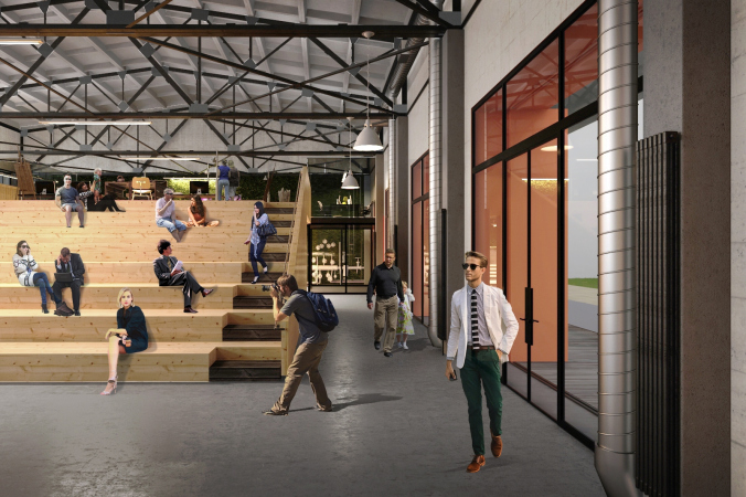
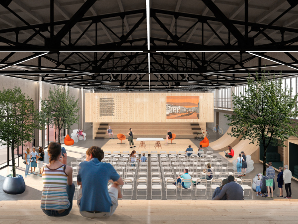
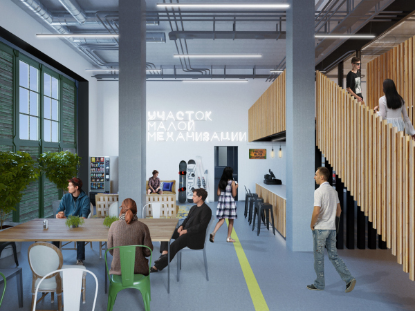
The main merit of the space inside lies in the fact that it is unsupported and rather high, too – 5.8 meters from the floor to the beams and then another 3 meters of height occupied by the metallic beams. The architects are planning to keep them, just as a number of plaques and concrete textured surfaces that remind about the old industrial garage. The plaques may become a part of the trash art exposition – the architects explain – or they will be simply included in the interior design as permanent elements. Another decoration will be the host of pipes with valves and facets – also the heritage of the old industrial garage.

  • zooming
    1 / 4
    The architectural concept of ANGAR youth culture center, 2019
    Copyright: © MAParchitects / “Center” agency research
  • zooming
    2 / 4
    The architectural concept of ANGAR youth culture center, 2019
    Copyright: © MAParchitects / “Center” agency research
  • zooming
    3 / 4
    The architectural concept of ANGAR youth culture center, 2019
    Copyright: © MAParchitects / “Center” agency research
  • zooming
    4 / 4
    The architectural concept of ANGAR youth culture center, 2019
    Copyright: © MAParchitects / “Center” agency research


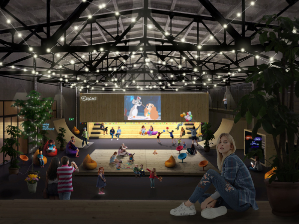
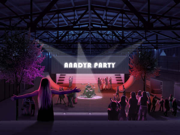
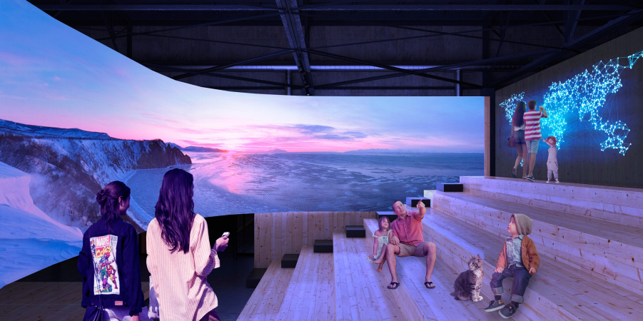
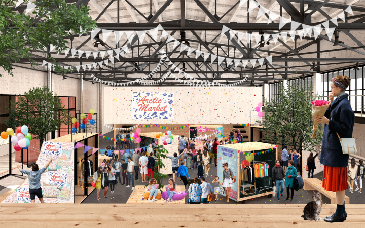
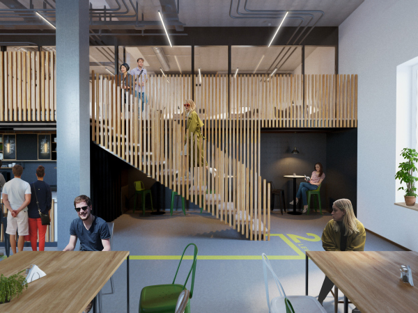
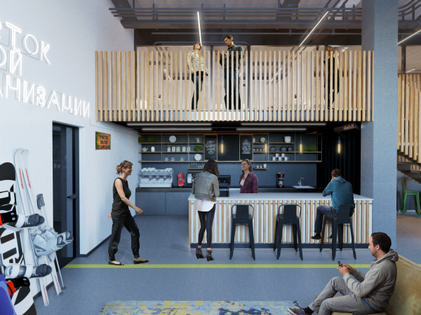
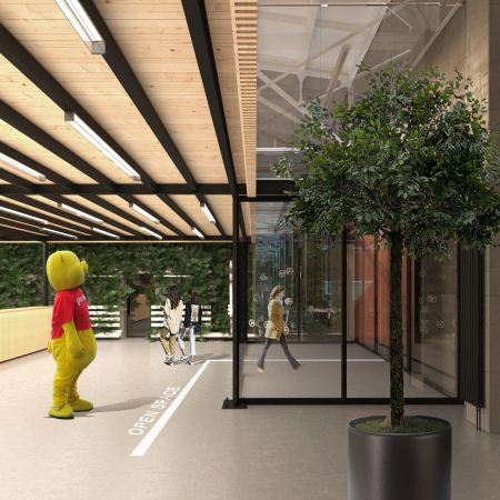
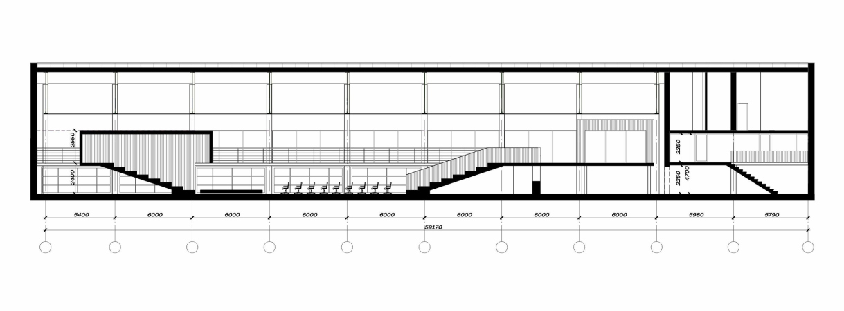
One of the main elements of this project is the open space venue for concerts, lectures, fairs, and the like. This place gets two wooden amphitheaters, a media screen, and a cafe; the transformable space is very flexible and is capable of performing really different functions, even becoming a small skate park. The smaller spaces of the workshops are situated on the perimeter gallery – they can be accessed by staircases, and from the galleries people will be able to watch what’s going on in the open space. 

  • zooming
    1 / 10
    The architectural concept of ANGAR youth culture center, 2019
    Copyright: © MAParchitects / “Center” agency research
  • zooming
    2 / 10
    The architectural concept of ANGAR youth culture center, 2019
    Copyright: © MAParchitects / “Center” agency research
  • zooming
    3 / 10
    The architectural concept of ANGAR youth culture center, 2019
    Copyright: © MAParchitects / “Center” agency research
  • zooming
    4 / 10
    The architectural concept of ANGAR youth culture center, 2019
    Copyright: © MAParchitects / “Center” agency research
  • zooming
    5 / 10
    The architectural concept of ANGAR youth culture center, 2019
    Copyright: © MAParchitects / “Center” agency research
  • zooming
    6 / 10
    The architectural concept of ANGAR youth culture center, 2019
    Copyright: © MAParchitects / “Center” agency research
  • zooming
    7 / 10
    The architectural concept of ANGAR youth culture center, 2019
    Copyright: © MAParchitects / “Center” agency research
  • zooming
    8 / 10
    The architectural concept of ANGAR youth culture center, 2019
    Copyright: © MAParchitects / “Center” agency research
  • zooming
    9 / 10
    The architectural concept of ANGAR youth culture center, 2019
    Copyright: © MAParchitects / “Center” agency research
  • zooming
    10 / 10
    The architectural concept of ANGAR youth culture center, 2019
    Copyright: © MAParchitects / “Center” agency research


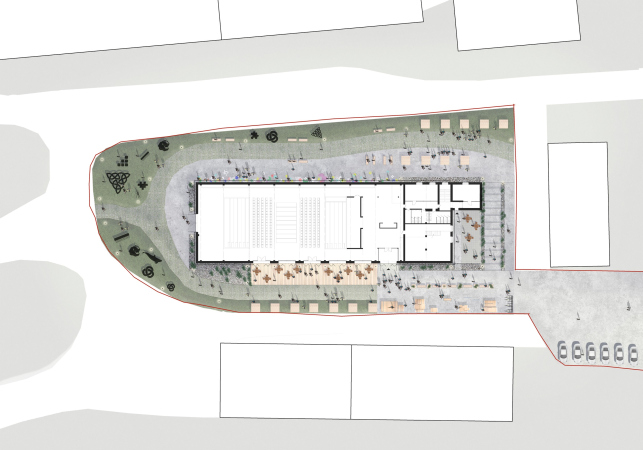
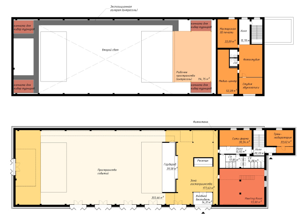
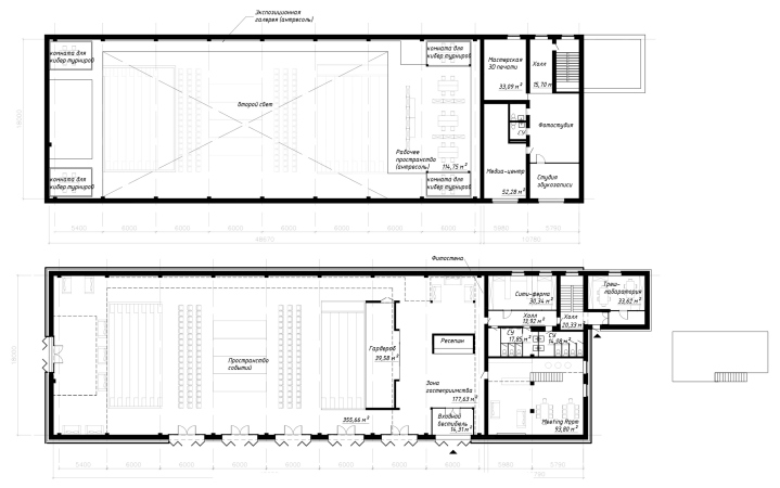
As for the functional program of this building, it is planned to be very diverse. Furthermore, as the analysts claim, the youth center is designed with a view for future development and expansion. Its Instagram account bustles with callings to young people to file in their own ideas on developing the composition of the complex. Currently, it already includes a chill-out, a city farm, a meeting-room, photo and video studios, and a place for cyber sports contests. 

  • zooming
    1 / 4
    The master plan. The architectural concept of ANGAR youth culture center, 2019
    Copyright: © MAParchitects / “Center” agency research
  • zooming
    2 / 4
    Distribution of function. The architectural concept of ANGAR youth culture center, 2019
    Copyright: © MAParchitects / “Center” agency research
  • zooming
    3 / 4
    Plans of the 1st and 2nd tiers with a loft. The architectural concept of ANGAR youth culture center, 2019
    Copyright: © MAParchitects / “Center” agency research
  • zooming
    4 / 4
    The section view. The architectural concept of ANGAR youth culture center, 2019
    Copyright: © MAParchitects / “Center” agency research


Maria Sedletskaya,
chief analyst at the “Center” agency for strategic development: 

“What makes this venue different is the fact that we developed the event content and the architectural solutions for zoning the hangar space based on the needs of its future users because it is the young Chukotka activists form the basis for developing the creative potential. These were ideas for creating an open and transformable space, as well as various specialized premises for print works, a media center with an interactive map of Russia, a sound recording studio, photo and video studios, cyber sports contests, grow boxes, a graffiti festival, and whatnot.  

The brand events form the calendar schedule depending on the season and the weekly engagement of the premises. Interacting with lots of stakeholders will make it possible to perform lots of useful activities aimed at continuous education, public communications, intellectual pastime, collective usage of assets, and exchange of ideas.  

One of the high-profile events presupposes developing the already existing movie festival Zolotoy Voron (“The Golden Raven”), which fills the houses to capacity and attracts participants from the North America, Scandinavia, and the Northern regions of Russia. The list or international and interregional events specifically includes trendy and modern event formats based on the local identity, for example, “Bering-Fest” youth festival. Large-scale open air events will be chiefly held in the summertime – the outdoor exhibition of trash art, a video art competition, etc”.  

The project is due to be implemented by the end of 2019 or the beginning of 2020.  


zooming


19 July 2019

Headlines now
The Golden Crown
The concept for a dental clinic in Yekaterinburg, developed by CNTR Studio, revolves around the idea of a “mouth full of gold”: pristine white porcelain stoneware walls are complemented by matte brass details. To avoid an overly literal interpretation, the architects focused on the building’s proportions, skillfully navigating between sunlight requirements and fire safety regulations.
Flexibility and Integration
Not long ago, we covered the project for the fourth phase of the ÁLIA residential complex, designed by APEX. Now, we’ve been shown different fence concepts they developed to enclose the complex’s private courtyards, incorporating a variety of public functions. We believe that the sheer fact that the complex’s architects were involved in such a detail as fencing speaks volumes.
A Step Forward
The HIDE residential complex represents a major milestone for ADM architects and their leaders Andrey Romanov and Ekaterina Kuznetsova in their quest for a fresh high-rise aesthetic – one that is flexible and layered, capable of bringing vibrancy to mass and silhouette while shaping form. Over recent years, this approach has become ADM’s “signature style”, with the golden HIDE tower playing a pivotal role in its evolution. Here, we delve into the project’s story, explore the details of the complex’s design, and uncover its core essence.
Gold in the Sands
A new office for a transcontinental company specializing in resource extraction and processing has opened in Dubai. Designed by T+T Architects, masters of creating spaces that are contemporary, diverse, flexible, and original, this project exemplifies their expertise. On the executive floor, a massive brass-clad partition dominates, while layered textures of compressed earth create a contextually resonant backdrop.
Layers and Levels of Flight
This project goes way back – Reserve Union won this architectural competition at the end of 2011, and the building was completed in 2018, so it’s practically “archival”. However, despite being relatively unknown, the building can hardly be considered “dated” and remains a prime example of architectural expression, particularly in the headquarters genre. And it’s especially fitting for an aviation company office. In some ways, it resembles the Aeroflot headquarters at Sheremetyevo but with its own unique identity, following the signature style of Vladimir Plotkin. In this article, we take an in-depth look at the United Aircraft Corporation (UAC) headquarters in the Moscow agglomeration town of Zhukovsky, supplemented by recent photographs from Alexey Naroditsky – a shoot that became only recently possible due to the fact that improvements were finally made in the surrounding area.
Light and Shadow
In this article, we delve into the architectural design of the “Chaika” house by DNK ag architects, which was recently completed in 2023 as part of the collection of signature designs at ZILArt. As is well-known, all the buildings in this complex follow a design code, yet each one is distinct. This particular building stands out not only for its whiteness and minimalism but also for the refined use of a limited number of techniques that, together, create what can confidently be called synergy.
Casus Novae
A master plan was developed for a large residential area with a name of “DNS City”, but now that its implementation began, the plan has been arbitrarily reformatted and replaced with something that, while similar on the surface, is actually quite different. This is not the first time such a thing happens, but it’s always frustrating. With permission from the author, we are sharing Maria Elkina’s post.
Treasure Hunting
The GAFA bureau, in collaboration with Tegola and Arkhitail, organized an expedition to the island of Kilpola in Karelia as part of Moskomarkhitektura’s “Open City” festival. There, amidst moss and rocks, the students sought answers to questions like: what is the sacred, where does it dwell, and what sustains it? Assisting the participants in this quest were landscape engineer Evgeny Levin, artist Nicholas Roerich, a moose, and the lack of cellular connection. Here’s how the story unfolded.
Depths of the Earth, Streams of Water
In the Malaya Okhta district, the Akzent building, designed by Stepan Liphart, was constructed. It follows a classic tripartite structure, yet it’s what you might call “hand-drawn”: each façade is unique in its form and details, some of which aren’t immediately noticeable. In this article, we explore the context and, together with the architect, delve into how the form was developed.
Fir Tree Dynamics
The “Airports of Region” holding is planning to build an airport in Karachay-Cherkessia, aiming to make the Arkhyz and Dombay resorts more accessible to travelers. The project that won in an invitation-only competition, submitted by Sergey Nikeshkin’s KPLN, blends natural imagery inspired by the shape of a conifer seed, open-air waiting spaces, majestic large trees, and a green roof elevated on needle-like columns. The result is both nature-inspired and WOW.
​A Brick Shell
In the process of designing a clubhouse situated among pine trees in a prestigious suburban area near Moscow, the architectural firm “A.Len” did the façade design part. The combination of different types of brick and masonry correlates with the volumetric and plastique solutions, further enhanced by the inclusion of wood-painted fragments and metal “glazing”.
Word Forms
ATRIUM architects love ambitious challenges, and for the firm’s thirtieth anniversary, they boldly play a game of words with an exhibition that dives deep into a self-created vocabulary. They immerse their projects – especially art installations – into this glossary, as if plunging into a current of their own. You feel as if you’re flowing through the veins of pure art, immersed in a universe of vertical cities, educational spaces – of which the architects are true masters – and the cultural codes of various locations. But what truly captivates is the bold statement that Vera Butko and Anton Nadtochy make, both through their work and this exhibition: architecture, above all, is art – the art of working with form and space.
Flexibility and Acuteness of Modernity
Luxurious, fluid, large “kokoshniks” and spiral barrel columns, as if made from colorful chewing gum: there seem to be no other mansion like this in Moscow, designed in the “Neo-Russian-Modern” style. And the “Teremok” on Malaya Kaluzhskaya, previously somewhat obscure, has “come alive with new colors” and gained visibility after its restoration for the office of the “architectural ecosystem” as the architects love to call themselves. It’s evident that Julius Borisov and the architects at UNK put their hearts into finding this new office and bringing it up to date. Let’s delve into the paradoxes of this mansion’s history and its plasticity. Spoiler: two versions of modernity meet here, both balancing on the razor’s edge of “what’s current”.
Yuri Vissarionov: “A modular house does not belong to the land”
It belongs to space, or to the air... It turns out that 3D printing is more effective when combined with a modular approach: the house is built in a workshop and then adapted to the site, including on uneven terrain. Yuri Vissarionov shares his latest experience in designing tourist complexes, both in central Russia and in the south. These include houseboats, homes printed from lightweight concrete using a 3D printer, and, of course, frame houses.
​Moscow’s First
“The quality of education largely depends on the quality of the educational environment”. This principle of the last decade has been realized by Sergey Skuratov in the project for the First Moscow Gymnasium on Rostovskaya Embankment in the Khamovniki district. The building seamlessly integrates into the complex urban landscape, responding both to the pedestrian flow of the city and the quiet alleyways. It skillfully takes advantage of the height differences and aligns with modern trends in educational space design. Let’s take a closer look.
Looking at the Water
The site of Villa Sonata stretches from the road to the water’s edge, offering its own shoreline, pier, and a picturesque river panorama. To reveal these sweeping views, Roman Leonidov “cut” the façade diagonally parallel to the river, thus getting two main axes for the house and, consequently, “two heads”. The internal core – two double-height spaces, a living room and a conservatory, with a “bridge” above them – makes the house both “transparent” and filled with light.
The White Wing
Well, it’s not exactly white. It’s more of a beige, white-stone structure that plays with the color of limestone – smoother surfaces are lighter, while rougher ones are darker. This wing unites various elements: it absorbs and interprets the surrounding themes. It responds to everything, yet maintains a cohesive expression – a challenging task! – while also incorporating recognizable features of its own, such as the dynamic cuts at the bottom, top, and middle.
Urban Dunes
The XSA Ramps team designed and built a three-part sports hub for a park in Rostov-on-Don, welcoming people of all ages and fitness levels. The skate plaza, pump track, and playground are all meticulously crafted with details that attract a diverse range of visitors. The technical execution of the shapes and slopes transforms this space into a kind of sculptural composition.
Proportional Growth
The project for the fourth phase of the ÁLIA residential area has been announced. The buildings are situated on an elongated plot – almost a “ray” that shoots out from the center of the area towards the river. Their layout reflects both a response to Moscow’s architectural preferences over the past 15 years, shifting “from blocks to towers”, and an interpretation of the neighboring business park designed by SOM. Additionally, the best apartments here are not located at the very top but closer to the middle, forming a glowing “waistline”.
The “Staircase” Building
In designing the “Details” residential complex in New Moscow, Rais Baishev spiced up the now-popular Moscow theme of a “courtyard” building with an idea drawn from the surrealist drawings by Maurits Escher. He envisioned the stepped silhouettes and descending slopes as a metaphysical mega-staircase, creating a key void within the courtyard that gave the project an internal “spine”. This concept is felt both in the building’s silhouette and on its façades.
Projection of the Quarter
No one doubted that the building that Vladimir Plotkin designed as part of the “Garden Quarters” would be the most modernist of all. And it turned out just that way: while adhering to the common design code, the building successfully combines brick and white stone, rhythmically responding to the neighboring building designed by Ostozhenka, yet tactfully and persistently making a few statements of its own. This includes the projection of the ideal urban development composition “14–9–6”, which can be found right next door, mathematical calculations, including those for various types of terraces (and perhaps the only reminder of the Soviet past of the Kauchuk rubber factory!), and the white “cross-stitch” pattern of the façade grid.
Domus Aurea
In this issue, we examine the “Tessinsky-1” house, designed by Sergey Skuratov and completed in 2023. Located in the middle of the Serebryanicheskaya Embankment district, at the intersection of its main streets, this house assumes a sort of “nodal” role: it not only responds to everything around it and preserves many memories of the former EMA factory within itself, but it weaves all this into a newly directed pattern, reconciling bright “gold” and dark-colored brick, largely with the help of the new, modern-yet-archaic Columba brick, which, come to think about it, is the most precious element here.
The Chimney of Nikola-Lenivets
In this issue, we are examining the “Obelisk House” designed by KATARSIS and built for the Arkhstoyanie 2023 festival. However, it was only finished later on, and this is why we are examining it now. It seems to us that after the “Obelisk House” appeared in Nikola-Lenivets, a dialogue and a few inner connections appeared between the temporary structures built here. These houses no longer look like “accidental neighbors”, more of which below.
​Periscope by the Bay
The jury awarded the second place in the competition for a public and cultural center in Petropavlovsk-Kamchatsky to the companies GORA (“Mountain”) and M4. In the consortium’s proposal, the building resembles a sperm whale with a calf swimming next to it or a periscope, whose lenses capture the most spectacular views from the surrounding landscape.
From Arcs to Dolmens
While working on the competition project for Petropavlovsk-Kamchatsky, ASADOV Architects prioritized the value of the natural and urban environment, aiming to preserve the balance of the location while minimizing the resemblance of the volume that they designed to a “traditional building”. The task was challenging, and the architects created three versions, one of which having been developed after the competition, where their main proposal took third place. However, the point of interest here is not the competition result but the continuity of creative thinking.
Hide and Seek
The ID Moskovskiy house, designed by Stepan Liphart in St. Petersburg, in the courtyards near Moskovskiy Avenue beyond the Obvodny Canal and recently completed, is notable for several reasons. Firstly, it has been realized with considerable accuracy, which is particularly significant as this is the first building where the architect was responsible not only for the facades but also for the layouts, allowing for better integration between the two. On the other hand, this building is interesting as an example of the “germination” of new architecture in the city: it draws on the best examples from the neighborhood and becomes an improved and developed sum of ideas found by the architect in the surrounding context.
The Big Twelve
Yesterday, the winners of the Moscow Mayor’s Architecture Award were announced and honored. Let’s take a look at what was awarded and, in some cases, even critique this esteemed award. After all, there is always room for improvement, right?
Above the Golden Horn
The residential complex “Philosophy” designed by T+T architects in Vladivostok, is one of the new projects in the “Golubinaya Pad” area, changing its development philosophy (pun intended) from single houses to a comprehensive approach. The buildings are organized along public streets, varying in height and format, with one house even executed in gallery typology, featuring a cantilever leaning on an art object.
Nuanced Alternative
How can you rhyme a square and space? Easily! But to do so, you need to rhyme everything you can possibly think of: weave everything together, like in a tensegrity structure, and find your own optics too. The new exhibition at GES-2 does just that, offering its visitor a new perspective on the history of art spanning 150 years, infused with the hope for endless multiplicity of worlds and art histories. Read on to see how this is achieved and how the exhibition design by Evgeny Ace contributes to it.
Blinds for Ice
An ice arena has been constructed in Domodedovo based on a project by Yuri Vissarionov Architects. To prevent the long façade, a technical requirement for winter sports facilities, from appearing monotonous, the architects proposed the use of suspended structures with multidirectional slats. This design protects the ice from direct sunlight while giving the wall texture and detail.