По-русски

​A Futuristic Network

A highway bridge as a place for recreation and contemplation; a network of pedestrian arteries and capillaries full of greenery, also meant for locomotion and communication, and a network of “smart devices” meant to help people – all of this is combined in the project called “Linked City”.

13 September 2019
Object
mainImg

Developed by a consortium of Nikken Sekkei, UNK project, D&S, and JLL, this project became one of the three finalists of the competition for the architectural and town-planning concept developed for a large piece of land in the area of Rublevo-Arkhangelskoe, lying just beyond the Moscow Ring Road, and officially proclaimed to be a part of Moscow in 2012 (more information about the competition and the land site is available here).

Working with the pre-approved site plan, all of the contestants were supposed to propose solutions that would uncover the Smart City concept, essential to this project, demonstrating the contestant’s idea of this “smart city” in as much detail as possible, and showing possibilities for its implementation in real life. “Our team proposed to create what we called a “linked city”, in which the architectural environment is closely connected to the natural one, and which incorporates smart technologies of the “city of the future” – share the architects of Nikken Sekkei – Our project attaches particular importance to fostering creativity and manifesting the individuality of every resident of this area; the project is meant to create a public space that would be conducive to people communicating with one another and with the city”.

“What was slightly peculiar in this competition was the fact that, among other things, you had to submit the economic model – says the leader of the UNK, Yuliy Borisov – Together with our colleagues from Nikken Sekkei, we invited the top experts in this area for economic calculations both in terms of the likeliest property sales, and the economics of the construction process. Because here is the thing – today people buy real property or change their place of residence not because they’ve got nowhere to live – the architect continues – but because they want to improve the quality of life for themselves and, more importantly, for their children. And they are looking to improve their residential conditions not only on the down-to-earth level, like increasing the number of square meters or buying an apartment closer to a metro station, but they are also looking to improve their living environment in terms of a combination of factors: a school nearby, places to work at, and the environmental situation. Using a whole range of tools and techniques, we tried to increase as much as possible the attractiveness of this housing property on the whole, and also in terms of its probable aftermarket value”.

Rublevo-Arkhangelskoe, architectural and town planning concept. The competition winning project
Copyright: © Nikken Sekkei / provided by AO “Rublevo-Arkhangelskoe”
  • zooming
    1 / 4
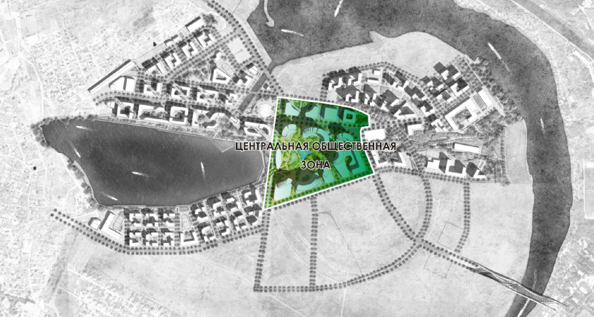
    “Rublevo-Arkhangelskoe” housing complex, master layout
    Copyright: © Nikken Sekkei
  • zooming
    2 / 4
  • zooming
    3 / 4
  • zooming
    4 / 4


Thus, the joint Russian-Japanese project is all about new technologies, a look at the public territories as “real-life” internet, and the abundance of vegetation.

A City of Smart Technologies

Some of the technological novelties of our time are rather predictable and lie in the area of the rules of an environmentally responsible city. Waste sorting, purification and recycling of technical water, using the solar energy and the energy of wind, warmth storage and using it for heating the houses. The architects are augmenting this list: specifically, for the energy supplies of the office buildings, they are proposing a trigeneration complex that produces not only heat and electricity but cold as well. In addition to the joint power network, the office buildings are united by an underground parking garage lying underneath the entire construction blueprint.

For the office towers, the authors proposed double glass façades: in the summertime, cool air will circulate between the two layers of glass; while warm in spring and in fall, in the wintertime this air barrier gets heated up from the heating elements on each floor. The system is complemented by vertical lamella ribs that dissect the façades in order to protect them from direct sunlight – the shape of the lamellas and their presence being flexibly dependent upon the expected amount of light: in those places that are likely to be less exposed to sunlight, they gradually become smaller and then disappear altogether. The architects are proposing to equip the apartments with heated glass units and inbuilt floor radiators, replaced, in the less expensive versions, with low-rise radiators 30 centimeters tall, instead of the usual half meter.

Rublevo-Arkhangelskoe, architectural and town planning concept. The competition winning project
Copyright: © Nikken Sekkei / provided by AO “Rublevo-Arkhangelskoe”


Meanwhile, the architectural techniques per se are also not without some “fine tuning” innovations. For example, the structure of the office buildings also allows for a possibility of flexible change. And the window apertures in the residential buildings grow in size from the low floors up to the top: down below, the smaller windows ensure privacy, while the larger windows of the higher floors command fine views of the surrounding scenery. In the joint project by Nikken Sekkei and UNK, yet another innovation for Russia, a country where people tend to rather buy housing property than rent it, is the relatively high percentage of apartments meant for rent.

Still another type of innovation refers to organization and planning: the architects are proposing to build community centers, from playgrounds to marketplaces and museums, in a few stages. Initially, a few simple temporary facilities will do, which with time will be replaced with constant ones, more interesting from the architectural standpoint. What is important is the fact that the construction process, by all estimates, is going to stretch until 2045.

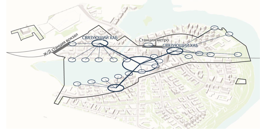
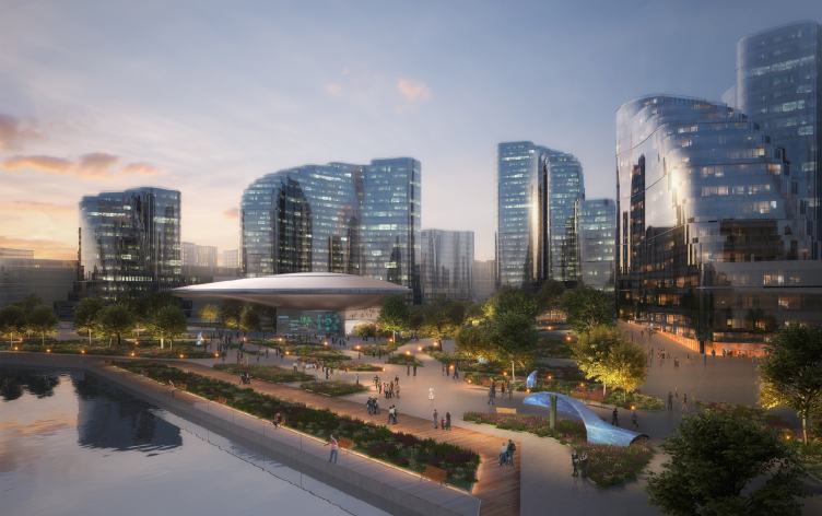
However, the architects do not just limit themselves to a sum total of technical novelties, fine-tuning, and efficiency proposals, trying to emphasize the futuristic character of this area, especially in its central “office” part. Here, the main plaza gets a small building – a streamlined pavilion standing on a stout leg, made of glass, with a sharp nose, and looking like some space age airport control tower. It is called Smart Linked Center and really takes on the functions of a coordination center for the Smart Devices, scattered all over the area, showing time, allowing you to recharge your smartphone, spreading the Wi-Fi signals, and letting the people feel some benign presence of technology that is always ready to come to their rescue. This is one of the widespread motifs in science fiction: some centers, scattered all over the planet, allowing people to feel that they are near civilization even in the deep forest. In this specific case – on the whole territory of the new city. The architects have called this network “smart infrastructure”. It looks like the symbol of Smart City, a conceptual point of sorts, asserting its futuristic essence. On the other hand, these pavilions are, of course, not just the symbol of a smart city but an actual container for its state-of-the-art technologies.

Rublevo-Arkhangelskoe, architectural and town planning concept. The competition winning project
Copyright: © Nikken Sekkei


Environment

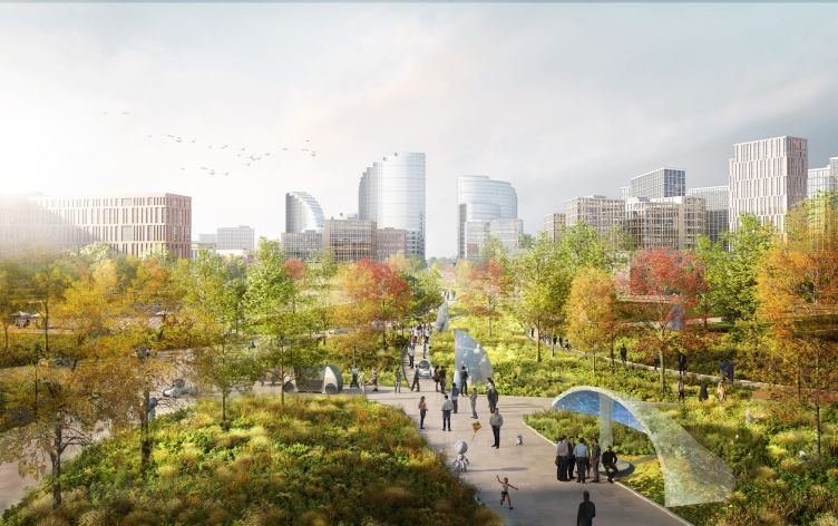
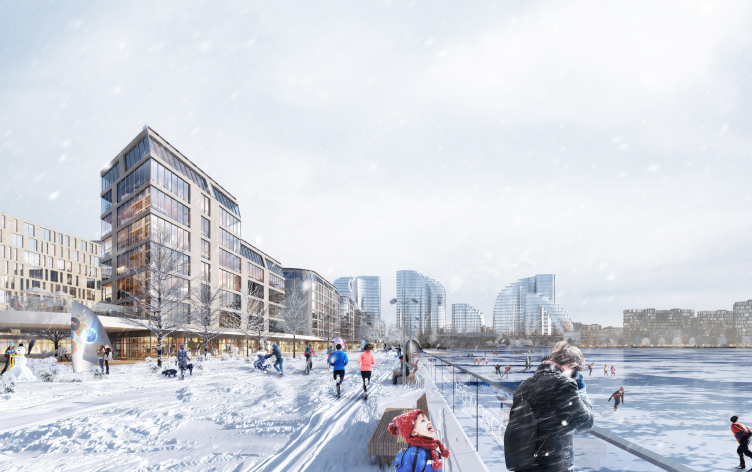
It would have been wrong, of course, to work with a 461-hectare chunk of land and forget to fill it with green zones. The architects unite the concept of greenery, which is to be seen everywhere around here, including the yards of the residential houses with specially approved giant trees, with the theme of being “linked”, the theme of an information network, echoed by the network of human communications, a space for walking and interacting. They are proposing three “parkway corridors” – wide boulevards that will link the central area with the river banks, tying them in with the green waterfronts and lakeside trails, as well as with the smaller-scale roads that run around and inside the city blocks, united, as the architects put it, into a “Nature Passage”. All of these things put together, the authors explain, form a single pedestrian network with hubs that allow people, particularly the elderly and the children, to safely walk around.

Rublevo-Arkhangelskoe, architectural and town planning concept. The competition winning project
Copyright: © Nikken Sekkei / provided by AO “Rublevo-Arkhangelskoe”


Destination Bridge (Russian: “Most Prednaznacheniya”)

Still, there is a difference between the two languages, at least intonation-wise. In Russian, this name sounds truly solemn, even slightly pompous. In English, this name sounds more exact and more down-to-earth: this is a bridge that not only serves as a part of the communication framework but can itself be regarded as a destination; meaning, it is expected that one will be able to come here just for the fun of it, and not just moving from point A to point B.

The bridge over the Moskva River in the southeastern part of the territory, necessary for achieving a better connection with the city and facing the line of the Rublev Highway, is important as a part of the automotive traffic, but the architects are also turning it into a space where people can go for walks. Walking on the opposite bank of the river, between the old villa community Rublevsky and the restricted-access area of the Vodokanal Station is not yet possible. And for this reason, the architects interpret the bridge itself as a place for recreation, which also commands fine river views.

In addition, the bridge is a beautiful thing to look at, and our country still does not have a lot of truly beautiful bridges, although around the world it is the bridges that show the best example of the aesthetics of engineering thought. Here, the arches of the two-span cable-braced bridge that covers the river about 100 meters wide, are made of piped structures that will contain pedestrian and bicycle trails. When walking, people will be able to go out on the balconies that alternate with the protrusions of the adaptive mass dampers necessary for ensuring the construction’s stability. The location of the balconies is defined by the best vantage points. The one that commands the finest views is turned into a lawn that literally hangs over the river.

Glittering Glass and Parametric

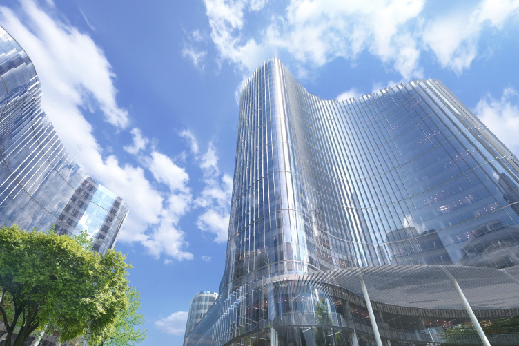
The bridge is an accent on the border of the territory, part of its representation to the city. The main element of the perception scenario, however, is situated in the center of the town and naturally has to do with the transportation hub. Here, alighting from the metro, we, very much like in La Défense de Paris (or in the Moscow City, for that matter), can look up to admire the towering glass-and-concrete giant. This effect is pre-calculated: it is clear at once that we are in the center of innovative business.

Rublevo-Arkhangelskoe, architectural and town planning concept. The competition winning project
Copyright: © Nikken Sekkei


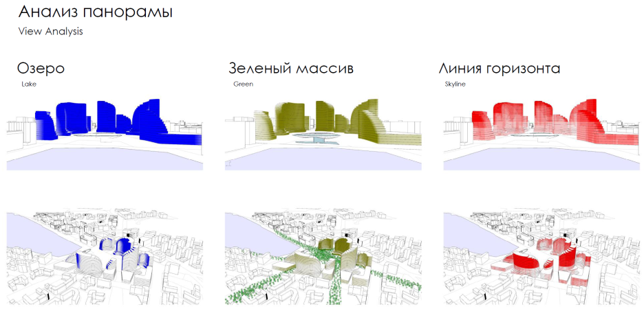
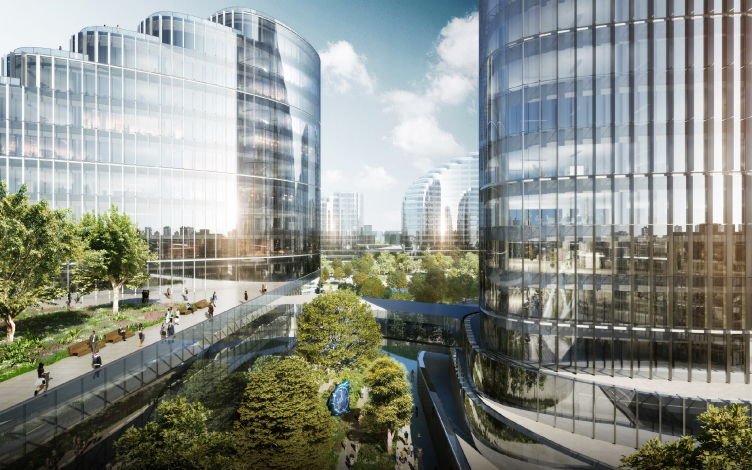
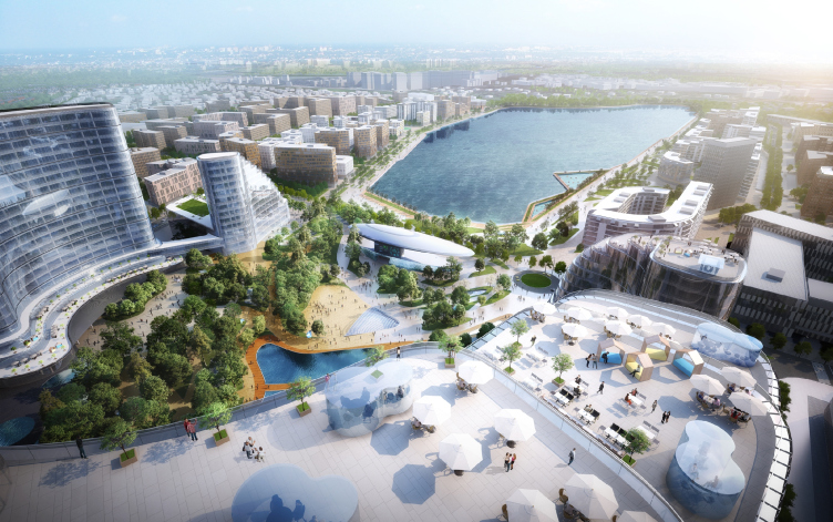
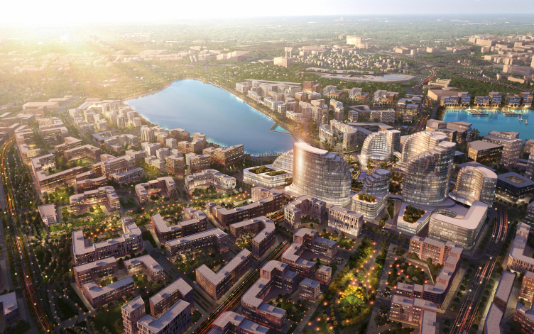
The towers, which are indeed the highest buildings around here, look like peculiar sails made of glass, and are present at all the panoramas of the complex, just like the Moscow City is present in all panoramas of the nation’s capital. The difference is that these towers stand slightly farther away from each other, and they are not as tall – the tallest high-profile one is 130 meters high. The outlines of the buildings look as though they had been molded on a sculptural principle, yet in reality they were defined parametrically – as a result of analyzing the prevailing and dominant winds. The volumes are almost literally “washed” by the streams of wind because they were designed to brush it off – hence the streamlined shapes.

Rublevo-Arkhangelskoe, architectural and town planning concept. The competition winning project
Copyright: © Nikken Sekkei


The ledgy silhouettes, reminiscent of Habitat, helped to place on the operated roofs a lot of terraces commanding fine lake views, with cafés and meeting points – these are supposed to serve both for recreation and for business communication in the vein of “let’s discuss this over a cup of coffee up on the roof”.

Rublevo-Arkhangelskoe, architectural and town planning concept. The competition winning project
Copyright: © Nikken Sekkei


Types of Housing

Still, the residential stock occupies more than two thirds of the multifunctional complex (or should we call it a town, after all?) The façades of the residential houses, unlike the office buildings, are chiefly rectangular, with a prominent grid of windows, often grouped in twos and threes, of mostly vertical proportions.

Rublevo-Arkhangelskoe, architectural and town planning concept. The competition winning project
Copyright: © Nikken Sekkei / provided by AO “Rublevo-Arkhangelskoe”


The architects subdivide the residential houses into a few districts. The eastern one, next to the metro station, is interpreted as the place for the people who actually work downtown, because commuting to Moscow will be easy here. The exit from the metro station is designed as a large heated gallery, mostly transparent, which would allow the people to get to their homes, or stores, or other public places without having to go outside. The district situated to the north of the lake is meant for the up-and-coming millennials; it includes premium-class housing with windows reaching to the floor, and a lakeside promenade nearby. This “young and modern” district contains more glass, even though warm galleries running alongside the buildings are also provided. The south district is treated as a place for families and the elderly – its architecture contains much more “traditional” stone in it, the yards are more private, and, in addition, there are more schools here, which are located close to people’s homes – so that grannies could takes their grandchildren to school easily.

***

Designing cities of the future is a genre that architects and urbanists have been exploring for at least five centuries. As a rule, it is linked to the hopes for something glorious, dynamic, at the same time comfortable, and, of course, smart. Smarter than the way it used to be, and the way it is now. The very genre itself is all about people’s hope for a new life, and belief in a better tomorrow. Possibly, this project will indeed be capable of raising a large chunk of Moscow land and turning it into an economic wonder. Let’s wait and see. This particular project is only a part of a bigger process and futuristic meditation that inevitably accompanies it.

13 September 2019

Headlines now
The Golden Crown
The concept for a dental clinic in Yekaterinburg, developed by CNTR Studio, revolves around the idea of a “mouth full of gold”: pristine white porcelain stoneware walls are complemented by matte brass details. To avoid an overly literal interpretation, the architects focused on the building’s proportions, skillfully navigating between sunlight requirements and fire safety regulations.
Flexibility and Integration
Not long ago, we covered the project for the fourth phase of the ÁLIA residential complex, designed by APEX. Now, we’ve been shown different fence concepts they developed to enclose the complex’s private courtyards, incorporating a variety of public functions. We believe that the sheer fact that the complex’s architects were involved in such a detail as fencing speaks volumes.
A Step Forward
The HIDE residential complex represents a major milestone for ADM architects and their leaders Andrey Romanov and Ekaterina Kuznetsova in their quest for a fresh high-rise aesthetic – one that is flexible and layered, capable of bringing vibrancy to mass and silhouette while shaping form. Over recent years, this approach has become ADM’s “signature style”, with the golden HIDE tower playing a pivotal role in its evolution. Here, we delve into the project’s story, explore the details of the complex’s design, and uncover its core essence.
Gold in the Sands
A new office for a transcontinental company specializing in resource extraction and processing has opened in Dubai. Designed by T+T Architects, masters of creating spaces that are contemporary, diverse, flexible, and original, this project exemplifies their expertise. On the executive floor, a massive brass-clad partition dominates, while layered textures of compressed earth create a contextually resonant backdrop.
Layers and Levels of Flight
This project goes way back – Reserve Union won this architectural competition at the end of 2011, and the building was completed in 2018, so it’s practically “archival”. However, despite being relatively unknown, the building can hardly be considered “dated” and remains a prime example of architectural expression, particularly in the headquarters genre. And it’s especially fitting for an aviation company office. In some ways, it resembles the Aeroflot headquarters at Sheremetyevo but with its own unique identity, following the signature style of Vladimir Plotkin. In this article, we take an in-depth look at the United Aircraft Corporation (UAC) headquarters in the Moscow agglomeration town of Zhukovsky, supplemented by recent photographs from Alexey Naroditsky – a shoot that became only recently possible due to the fact that improvements were finally made in the surrounding area.
Light and Shadow
In this article, we delve into the architectural design of the “Chaika” house by DNK ag architects, which was recently completed in 2023 as part of the collection of signature designs at ZILArt. As is well-known, all the buildings in this complex follow a design code, yet each one is distinct. This particular building stands out not only for its whiteness and minimalism but also for the refined use of a limited number of techniques that, together, create what can confidently be called synergy.
Casus Novae
A master plan was developed for a large residential area with a name of “DNS City”, but now that its implementation began, the plan has been arbitrarily reformatted and replaced with something that, while similar on the surface, is actually quite different. This is not the first time such a thing happens, but it’s always frustrating. With permission from the author, we are sharing Maria Elkina’s post.
Treasure Hunting
The GAFA bureau, in collaboration with Tegola and Arkhitail, organized an expedition to the island of Kilpola in Karelia as part of Moskomarkhitektura’s “Open City” festival. There, amidst moss and rocks, the students sought answers to questions like: what is the sacred, where does it dwell, and what sustains it? Assisting the participants in this quest were landscape engineer Evgeny Levin, artist Nicholas Roerich, a moose, and the lack of cellular connection. Here’s how the story unfolded.
Depths of the Earth, Streams of Water
In the Malaya Okhta district, the Akzent building, designed by Stepan Liphart, was constructed. It follows a classic tripartite structure, yet it’s what you might call “hand-drawn”: each façade is unique in its form and details, some of which aren’t immediately noticeable. In this article, we explore the context and, together with the architect, delve into how the form was developed.
Fir Tree Dynamics
The “Airports of Region” holding is planning to build an airport in Karachay-Cherkessia, aiming to make the Arkhyz and Dombay resorts more accessible to travelers. The project that won in an invitation-only competition, submitted by Sergey Nikeshkin’s KPLN, blends natural imagery inspired by the shape of a conifer seed, open-air waiting spaces, majestic large trees, and a green roof elevated on needle-like columns. The result is both nature-inspired and WOW.
​A Brick Shell
In the process of designing a clubhouse situated among pine trees in a prestigious suburban area near Moscow, the architectural firm “A.Len” did the façade design part. The combination of different types of brick and masonry correlates with the volumetric and plastique solutions, further enhanced by the inclusion of wood-painted fragments and metal “glazing”.
Word Forms
ATRIUM architects love ambitious challenges, and for the firm’s thirtieth anniversary, they boldly play a game of words with an exhibition that dives deep into a self-created vocabulary. They immerse their projects – especially art installations – into this glossary, as if plunging into a current of their own. You feel as if you’re flowing through the veins of pure art, immersed in a universe of vertical cities, educational spaces – of which the architects are true masters – and the cultural codes of various locations. But what truly captivates is the bold statement that Vera Butko and Anton Nadtochy make, both through their work and this exhibition: architecture, above all, is art – the art of working with form and space.
Flexibility and Acuteness of Modernity
Luxurious, fluid, large “kokoshniks” and spiral barrel columns, as if made from colorful chewing gum: there seem to be no other mansion like this in Moscow, designed in the “Neo-Russian-Modern” style. And the “Teremok” on Malaya Kaluzhskaya, previously somewhat obscure, has “come alive with new colors” and gained visibility after its restoration for the office of the “architectural ecosystem” as the architects love to call themselves. It’s evident that Julius Borisov and the architects at UNK put their hearts into finding this new office and bringing it up to date. Let’s delve into the paradoxes of this mansion’s history and its plasticity. Spoiler: two versions of modernity meet here, both balancing on the razor’s edge of “what’s current”.
Yuri Vissarionov: “A modular house does not belong to the land”
It belongs to space, or to the air... It turns out that 3D printing is more effective when combined with a modular approach: the house is built in a workshop and then adapted to the site, including on uneven terrain. Yuri Vissarionov shares his latest experience in designing tourist complexes, both in central Russia and in the south. These include houseboats, homes printed from lightweight concrete using a 3D printer, and, of course, frame houses.
​Moscow’s First
“The quality of education largely depends on the quality of the educational environment”. This principle of the last decade has been realized by Sergey Skuratov in the project for the First Moscow Gymnasium on Rostovskaya Embankment in the Khamovniki district. The building seamlessly integrates into the complex urban landscape, responding both to the pedestrian flow of the city and the quiet alleyways. It skillfully takes advantage of the height differences and aligns with modern trends in educational space design. Let’s take a closer look.
Looking at the Water
The site of Villa Sonata stretches from the road to the water’s edge, offering its own shoreline, pier, and a picturesque river panorama. To reveal these sweeping views, Roman Leonidov “cut” the façade diagonally parallel to the river, thus getting two main axes for the house and, consequently, “two heads”. The internal core – two double-height spaces, a living room and a conservatory, with a “bridge” above them – makes the house both “transparent” and filled with light.
The White Wing
Well, it’s not exactly white. It’s more of a beige, white-stone structure that plays with the color of limestone – smoother surfaces are lighter, while rougher ones are darker. This wing unites various elements: it absorbs and interprets the surrounding themes. It responds to everything, yet maintains a cohesive expression – a challenging task! – while also incorporating recognizable features of its own, such as the dynamic cuts at the bottom, top, and middle.
Urban Dunes
The XSA Ramps team designed and built a three-part sports hub for a park in Rostov-on-Don, welcoming people of all ages and fitness levels. The skate plaza, pump track, and playground are all meticulously crafted with details that attract a diverse range of visitors. The technical execution of the shapes and slopes transforms this space into a kind of sculptural composition.
Proportional Growth
The project for the fourth phase of the ÁLIA residential area has been announced. The buildings are situated on an elongated plot – almost a “ray” that shoots out from the center of the area towards the river. Their layout reflects both a response to Moscow’s architectural preferences over the past 15 years, shifting “from blocks to towers”, and an interpretation of the neighboring business park designed by SOM. Additionally, the best apartments here are not located at the very top but closer to the middle, forming a glowing “waistline”.
The “Staircase” Building
In designing the “Details” residential complex in New Moscow, Rais Baishev spiced up the now-popular Moscow theme of a “courtyard” building with an idea drawn from the surrealist drawings by Maurits Escher. He envisioned the stepped silhouettes and descending slopes as a metaphysical mega-staircase, creating a key void within the courtyard that gave the project an internal “spine”. This concept is felt both in the building’s silhouette and on its façades.
Projection of the Quarter
No one doubted that the building that Vladimir Plotkin designed as part of the “Garden Quarters” would be the most modernist of all. And it turned out just that way: while adhering to the common design code, the building successfully combines brick and white stone, rhythmically responding to the neighboring building designed by Ostozhenka, yet tactfully and persistently making a few statements of its own. This includes the projection of the ideal urban development composition “14–9–6”, which can be found right next door, mathematical calculations, including those for various types of terraces (and perhaps the only reminder of the Soviet past of the Kauchuk rubber factory!), and the white “cross-stitch” pattern of the façade grid.
Domus Aurea
In this issue, we examine the “Tessinsky-1” house, designed by Sergey Skuratov and completed in 2023. Located in the middle of the Serebryanicheskaya Embankment district, at the intersection of its main streets, this house assumes a sort of “nodal” role: it not only responds to everything around it and preserves many memories of the former EMA factory within itself, but it weaves all this into a newly directed pattern, reconciling bright “gold” and dark-colored brick, largely with the help of the new, modern-yet-archaic Columba brick, which, come to think about it, is the most precious element here.
The Chimney of Nikola-Lenivets
In this issue, we are examining the “Obelisk House” designed by KATARSIS and built for the Arkhstoyanie 2023 festival. However, it was only finished later on, and this is why we are examining it now. It seems to us that after the “Obelisk House” appeared in Nikola-Lenivets, a dialogue and a few inner connections appeared between the temporary structures built here. These houses no longer look like “accidental neighbors”, more of which below.
​Periscope by the Bay
The jury awarded the second place in the competition for a public and cultural center in Petropavlovsk-Kamchatsky to the companies GORA (“Mountain”) and M4. In the consortium’s proposal, the building resembles a sperm whale with a calf swimming next to it or a periscope, whose lenses capture the most spectacular views from the surrounding landscape.
From Arcs to Dolmens
While working on the competition project for Petropavlovsk-Kamchatsky, ASADOV Architects prioritized the value of the natural and urban environment, aiming to preserve the balance of the location while minimizing the resemblance of the volume that they designed to a “traditional building”. The task was challenging, and the architects created three versions, one of which having been developed after the competition, where their main proposal took third place. However, the point of interest here is not the competition result but the continuity of creative thinking.
Hide and Seek
The ID Moskovskiy house, designed by Stepan Liphart in St. Petersburg, in the courtyards near Moskovskiy Avenue beyond the Obvodny Canal and recently completed, is notable for several reasons. Firstly, it has been realized with considerable accuracy, which is particularly significant as this is the first building where the architect was responsible not only for the facades but also for the layouts, allowing for better integration between the two. On the other hand, this building is interesting as an example of the “germination” of new architecture in the city: it draws on the best examples from the neighborhood and becomes an improved and developed sum of ideas found by the architect in the surrounding context.
The Big Twelve
Yesterday, the winners of the Moscow Mayor’s Architecture Award were announced and honored. Let’s take a look at what was awarded and, in some cases, even critique this esteemed award. After all, there is always room for improvement, right?
Above the Golden Horn
The residential complex “Philosophy” designed by T+T architects in Vladivostok, is one of the new projects in the “Golubinaya Pad” area, changing its development philosophy (pun intended) from single houses to a comprehensive approach. The buildings are organized along public streets, varying in height and format, with one house even executed in gallery typology, featuring a cantilever leaning on an art object.
Nuanced Alternative
How can you rhyme a square and space? Easily! But to do so, you need to rhyme everything you can possibly think of: weave everything together, like in a tensegrity structure, and find your own optics too. The new exhibition at GES-2 does just that, offering its visitor a new perspective on the history of art spanning 150 years, infused with the hope for endless multiplicity of worlds and art histories. Read on to see how this is achieved and how the exhibition design by Evgeny Ace contributes to it.
Blinds for Ice
An ice arena has been constructed in Domodedovo based on a project by Yuri Vissarionov Architects. To prevent the long façade, a technical requirement for winter sports facilities, from appearing monotonous, the architects proposed the use of suspended structures with multidirectional slats. This design protects the ice from direct sunlight while giving the wall texture and detail.