По-русски

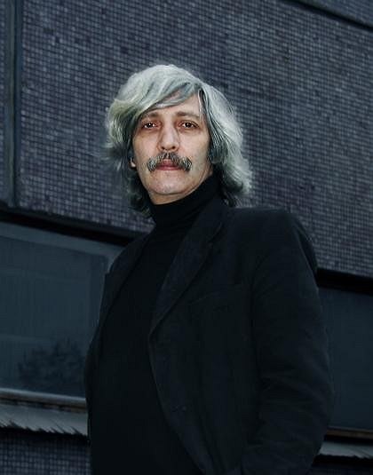
Mikhail Khazanov. Interview by Vladimir Sedov

Mikhail Khazanov is one of the participants of an exposition of Russian pavilion of XI biennial of architecture in Venice

19 August 2008
Report
mainImg
Do you feel yourself to be a Moscow architect?

No, as I see it, the architectural profession today is of no fixed address, has no specific attachment to a particular city. I find it interesting to work all over the world. And the view from outside is no less interesting, I think, than the view from inside. In general, I’m against boundaries – whether of cities or of countries and continents. I think this is all in the past, that we are all citizens of the world; whether we want it or not, we find ourselves in a global space and architecture is a global profession. Yes, we have a superior knowledge of the situation in Moscow; yes, we know our old city by touch, down to the very last stone, but I know Venice and Florence just as well and perhaps even better than today’s Moscow. Because Florence and Venice have long since been conserved, while Moscow is developing furiously and changes every month.

But what about the Moscow school of architecture?

I’m not sure there is a specific Moscow school. Probably, there are just particular strong personalities among our teachers, who at a certain moment in time came together at MARCHI [Moscow Architecture Institute], in Moscow. There are, of course, traditions handed down within families and schools, and I’m aware of such traditions all the time. But architecture nevertheless springs not just from tradition, but from something else as well – something seated deep within us and possibly given us ‘from above’. Although I live in my grandfather’s house and am very conscious of this and love Moscow, I get pleasure from working everywhere where there is an opportunity to perfect something using architecture.

How do you evaluate the part you have played in transforming Moscow?


I have a kind of guilt complex about this, but we were in the presence of enormous pressure from investors, pressure that we could have resisted only by standing together. It’s a pity that we architects were unable to do so… Our lack of unity, the nuances of the situation at the time, and the fact that we, as architects, were objectively ranged on the same side of the barricades as investors, developers, and clients with, against us, those who were trying to protect the city from us – it would have been very difficult to keep running from side to the other. Many of us at the time preferred to keep out of the thick of it and observe the fighting from a nearby hilltop before turning up, ‘dressed all in white’, once the field was clear. To make a proper assessment, more time has to be allowed to pass. But it’s already obvious that for the last 20 years it’s been impossible to implement urban-planning programmes. Architects have had to emigrate to minor jobs, work on a small, local, scale, and have usually stopped thinking on an urban scale, as was the practice in the preceding age.

Can you identify anyone who is working in the same tendency as yourself?

I feel I’m in the mainstream. In the global mainstream, I hope. The current tendency is technology, and it's one in which we Russians have not been too prominent to date. And yet we’re moving in the same direction as the rest of the world, only we lag behind when it comes to construction technology. The present rules of the game allow maximum results to be attained with maximum exploitation of minimal technological capacity. I have often had to work at the very limit of this capacity and even beyond that limit. There are many other architects who can broadly be called my fellow-travellers. We travel the same road and at the same time. You could say we’re in the same rank. We see the breast of a fourth person, but in the same rank, and this new wave includes architects from the West and East.

Does this mean that the present time can be characterized by the transformation of architecture into technology?


As I see it, what’s happened is as follows: with the development of the construction industry, architecture, which was previously perceived as something eternal, began from the 1950s and 60s to be seen as merely temporary. However solidly we build, this architecture is supposed to serve a certain length of time and then be transformed or give way to another architecture and disappear.

Like the architecture of theatre sets?


Theatre sets are altogether short-lived, virtual, whereas this is something different. It’s a matter of being built to last a finite period of time. It would be right to compare modern architecture to airplanes, cars, or ships – when these machines have served their useful life, good examples are measured and recycled and the very best are put in museums or are themselves museums, while all the others are replaced with new stuff that meets contemporary requirements. This does not apply to particular works of architecture which it has been decided to leave unaltered and which future generations will probably recognize as an important contribution to the cultural and historical landscape. I could name a number of works from Soviet and post-Soviet architecture of the 1960s, 70s, 80s, and 90s which will perhaps be preserved for ever as monuments of the age in which they were built.

And which of your own works will be preserved?

I don’t know. Of course, I very much hope that all our built projects will perhaps be kept for future generations. That’s what I would like, but I understand that many of my buildings will probably at some point be demolished or altered. But if even a single building survives, that’s great.

Do you think Moscow architecture is currently under pressure from the West? And if so, will it withstand this pressure?


No. The division into Russian and foreign architecture is artificial. The two are slightly different shades of the same process. Of course, due to various circumstances foreigners in Russia have been treated obsequiously or with enmity or suspicion. But Russian clients have always regarded foreign architects as a kind of ‘brand’. To fight against influence from outside is the same as throwing oneself in front of a train. The world is global – there’s nothing you can do about it. There aren’t, in fact, all that many big-name foreign architects, and clients want architecture that belongs to a famous brand. In the minds of clients, our architects have yet to attain this kind of brand recognition. Clearly, super-stylish and home-grown things cannot exist on the same shelf. There are two paths for us to go down: either we begin to create our own new brands or we are content to perfect our matryoshki, shoulder yokes, and Kokhloma and Vyatka decorative toys, but in the latter case it’s better not to modernize anything but to follow the canons and traditions religiously.

But investment activity and architecture may develop in different ways. There’s Prague and Warsaw, where the pressure of Western big-name architects is not so great but there is plenty of opportunity for doing things and these opportunities are exploited by modest local schools of architecture. And there is Shanghai, where there are plentiful stars but this doesn’t prevent local creations from growing up alongside. What’s going to happen here?

The rapid transition to capitalism has produced a layer of extremely wealthy people, and it’s they who are creating an interest in brands. For them this is, above all, a matter of status. And currently we’re at the peak of this trend: there’s clearly spiralling demand for foreign architects. Of course, it’s sad that our own architects are ignored, but you have to understand that we too have problems: you can’t be secondary, you have to be among the leaders, you have to set the tone, possibly you have to try to exploit the Avant-garde past, the 1920s. But at the same time, you should never be only led, should not take only paths that are well-kept; architecture is always partly a field for experimentation, and if you take no risks, then you’ll never get the best results. So we need more experiments, more innovation at the outer limits of possibility. And we should be grateful to the wandering architectural team that can now be found designing buildings for all over the world, from Dubai to Patagonia, for the fact that the tastes of our boss class, our investors and clients, tastes which were initially shaped during Soviet times, have now taken an abrupt turn ‘to the left’ and have become almost Avant-garde.

And are we going to be able to create something of our own?

Yes, of course. Radio was invented simultaneously in two completely different parts of the world. Approximately the same thing happened with steamships, steam locomotives, and rockets. The age itself sets certain requirements and poses questions that need answers and solutions. Undoubtedly, the traditional handmade line in architecture will remain, and let it flourish. But in my opinion, it’s much more difficult to try to put innovative machine technology in the service of that great art which is architecture. This will be no easy task. We were more or less taught to shape and sculpt and decorate ‘boxes’. But when it comes to finding systematic solutions to enormous urban-planning problems and to working with a scale of a different kind – industrial, gigantic, – that is something that we have to learn from scratch.

Given this kind of technical aesthetic and this kind of scale, is it possible to set one’s sights on creating a masterpiece?

An architect never knows which of his numerous designs will go into the wastepaper basket and which will actually be built. In our workshop it’s the done thing to believe that a design will definitely be built and so we must try to make it as architecturally perfect as possible. But there are many different approaches. There is a moderately commercial line, which is what I see in Moscow. This is very strongly supported by developers and results in excellent, extremely rational packaging for various functions. This is architecture that is convenient, economic, well-built, but it’s as dangerous for the city as the five-storey Khrushchevki [houses erected under Nikita Khrushchev]. Although both types of housing seem to be ways of tackling important and even sometimes noble tasks. Standardized houses did society an honest service, but had a destructive influence on the way cities looked. And today’s ‘characterless’ developer-driven architecture has largely already become a destructive force – due to its anonymous nature, anaemia, and averageness.

What is your method for getting to know modern architecture? Do you read magazines, make trips to look at new buildings abroad, or are you acquainted with one of the leaders of modern architecture?

All three. I know almost all architects whose work appeals to me. If I don’t actually meet them, I at least know what they’re doing. But that’s not the point. The energy that’s needed to create new forms comes from life. From one another, from architects, undoubtedly, too, but this is not the main thing. Like many of my colleagues, I can’t help feeling awkward about other people’s achievements: if someone has already done something, then it’s best to take another route. Although it’s often the case that new ideas, forms, and techniques appear simultaneously. It may be difficult, but you have to try to keep up with the times and outstrip them. Happiness for an architect is being able to turn one’s ideals into reality, and until you’ve done this, there is a feeling of not having said everything, of not having realized everything.

And can you name your ideals?

I believe that architects in any day and age have a chance to change the world for the better, to make it more perfect and more human. Each new generation stands on the shoulders of the previous one, earning at one blow all the experience, both negative and positive, of its predecessors. A highly important factor is the energy, the vital force which should ideally be present in architectural designs.

Is there anything special you would like to design?


I would like to build something in the open countryside and from scratch. Mont Saint Michel…
zooming
zooming


19 August 2008

Headlines now
The Golden Crown
The concept for a dental clinic in Yekaterinburg, developed by CNTR Studio, revolves around the idea of a “mouth full of gold”: pristine white porcelain stoneware walls are complemented by matte brass details. To avoid an overly literal interpretation, the architects focused on the building’s proportions, skillfully navigating between sunlight requirements and fire safety regulations.
Flexibility and Integration
Not long ago, we covered the project for the fourth phase of the ÁLIA residential complex, designed by APEX. Now, we’ve been shown different fence concepts they developed to enclose the complex’s private courtyards, incorporating a variety of public functions. We believe that the sheer fact that the complex’s architects were involved in such a detail as fencing speaks volumes.
A Step Forward
The HIDE residential complex represents a major milestone for ADM architects and their leaders Andrey Romanov and Ekaterina Kuznetsova in their quest for a fresh high-rise aesthetic – one that is flexible and layered, capable of bringing vibrancy to mass and silhouette while shaping form. Over recent years, this approach has become ADM’s “signature style”, with the golden HIDE tower playing a pivotal role in its evolution. Here, we delve into the project’s story, explore the details of the complex’s design, and uncover its core essence.
Gold in the Sands
A new office for a transcontinental company specializing in resource extraction and processing has opened in Dubai. Designed by T+T Architects, masters of creating spaces that are contemporary, diverse, flexible, and original, this project exemplifies their expertise. On the executive floor, a massive brass-clad partition dominates, while layered textures of compressed earth create a contextually resonant backdrop.
Layers and Levels of Flight
This project goes way back – Reserve Union won this architectural competition at the end of 2011, and the building was completed in 2018, so it’s practically “archival”. However, despite being relatively unknown, the building can hardly be considered “dated” and remains a prime example of architectural expression, particularly in the headquarters genre. And it’s especially fitting for an aviation company office. In some ways, it resembles the Aeroflot headquarters at Sheremetyevo but with its own unique identity, following the signature style of Vladimir Plotkin. In this article, we take an in-depth look at the United Aircraft Corporation (UAC) headquarters in the Moscow agglomeration town of Zhukovsky, supplemented by recent photographs from Alexey Naroditsky – a shoot that became only recently possible due to the fact that improvements were finally made in the surrounding area.
Light and Shadow
In this article, we delve into the architectural design of the “Chaika” house by DNK ag architects, which was recently completed in 2023 as part of the collection of signature designs at ZILArt. As is well-known, all the buildings in this complex follow a design code, yet each one is distinct. This particular building stands out not only for its whiteness and minimalism but also for the refined use of a limited number of techniques that, together, create what can confidently be called synergy.
Casus Novae
A master plan was developed for a large residential area with a name of “DNS City”, but now that its implementation began, the plan has been arbitrarily reformatted and replaced with something that, while similar on the surface, is actually quite different. This is not the first time such a thing happens, but it’s always frustrating. With permission from the author, we are sharing Maria Elkina’s post.
Treasure Hunting
The GAFA bureau, in collaboration with Tegola and Arkhitail, organized an expedition to the island of Kilpola in Karelia as part of Moskomarkhitektura’s “Open City” festival. There, amidst moss and rocks, the students sought answers to questions like: what is the sacred, where does it dwell, and what sustains it? Assisting the participants in this quest were landscape engineer Evgeny Levin, artist Nicholas Roerich, a moose, and the lack of cellular connection. Here’s how the story unfolded.
Depths of the Earth, Streams of Water
In the Malaya Okhta district, the Akzent building, designed by Stepan Liphart, was constructed. It follows a classic tripartite structure, yet it’s what you might call “hand-drawn”: each façade is unique in its form and details, some of which aren’t immediately noticeable. In this article, we explore the context and, together with the architect, delve into how the form was developed.
Fir Tree Dynamics
The “Airports of Region” holding is planning to build an airport in Karachay-Cherkessia, aiming to make the Arkhyz and Dombay resorts more accessible to travelers. The project that won in an invitation-only competition, submitted by Sergey Nikeshkin’s KPLN, blends natural imagery inspired by the shape of a conifer seed, open-air waiting spaces, majestic large trees, and a green roof elevated on needle-like columns. The result is both nature-inspired and WOW.
​A Brick Shell
In the process of designing a clubhouse situated among pine trees in a prestigious suburban area near Moscow, the architectural firm “A.Len” did the façade design part. The combination of different types of brick and masonry correlates with the volumetric and plastique solutions, further enhanced by the inclusion of wood-painted fragments and metal “glazing”.
Word Forms
ATRIUM architects love ambitious challenges, and for the firm’s thirtieth anniversary, they boldly play a game of words with an exhibition that dives deep into a self-created vocabulary. They immerse their projects – especially art installations – into this glossary, as if plunging into a current of their own. You feel as if you’re flowing through the veins of pure art, immersed in a universe of vertical cities, educational spaces – of which the architects are true masters – and the cultural codes of various locations. But what truly captivates is the bold statement that Vera Butko and Anton Nadtochy make, both through their work and this exhibition: architecture, above all, is art – the art of working with form and space.
Flexibility and Acuteness of Modernity
Luxurious, fluid, large “kokoshniks” and spiral barrel columns, as if made from colorful chewing gum: there seem to be no other mansion like this in Moscow, designed in the “Neo-Russian-Modern” style. And the “Teremok” on Malaya Kaluzhskaya, previously somewhat obscure, has “come alive with new colors” and gained visibility after its restoration for the office of the “architectural ecosystem” as the architects love to call themselves. It’s evident that Julius Borisov and the architects at UNK put their hearts into finding this new office and bringing it up to date. Let’s delve into the paradoxes of this mansion’s history and its plasticity. Spoiler: two versions of modernity meet here, both balancing on the razor’s edge of “what’s current”.
Yuri Vissarionov: “A modular house does not belong to the land”
It belongs to space, or to the air... It turns out that 3D printing is more effective when combined with a modular approach: the house is built in a workshop and then adapted to the site, including on uneven terrain. Yuri Vissarionov shares his latest experience in designing tourist complexes, both in central Russia and in the south. These include houseboats, homes printed from lightweight concrete using a 3D printer, and, of course, frame houses.
​Moscow’s First
“The quality of education largely depends on the quality of the educational environment”. This principle of the last decade has been realized by Sergey Skuratov in the project for the First Moscow Gymnasium on Rostovskaya Embankment in the Khamovniki district. The building seamlessly integrates into the complex urban landscape, responding both to the pedestrian flow of the city and the quiet alleyways. It skillfully takes advantage of the height differences and aligns with modern trends in educational space design. Let’s take a closer look.
Looking at the Water
The site of Villa Sonata stretches from the road to the water’s edge, offering its own shoreline, pier, and a picturesque river panorama. To reveal these sweeping views, Roman Leonidov “cut” the façade diagonally parallel to the river, thus getting two main axes for the house and, consequently, “two heads”. The internal core – two double-height spaces, a living room and a conservatory, with a “bridge” above them – makes the house both “transparent” and filled with light.
The White Wing
Well, it’s not exactly white. It’s more of a beige, white-stone structure that plays with the color of limestone – smoother surfaces are lighter, while rougher ones are darker. This wing unites various elements: it absorbs and interprets the surrounding themes. It responds to everything, yet maintains a cohesive expression – a challenging task! – while also incorporating recognizable features of its own, such as the dynamic cuts at the bottom, top, and middle.
Urban Dunes
The XSA Ramps team designed and built a three-part sports hub for a park in Rostov-on-Don, welcoming people of all ages and fitness levels. The skate plaza, pump track, and playground are all meticulously crafted with details that attract a diverse range of visitors. The technical execution of the shapes and slopes transforms this space into a kind of sculptural composition.
Proportional Growth
The project for the fourth phase of the ÁLIA residential area has been announced. The buildings are situated on an elongated plot – almost a “ray” that shoots out from the center of the area towards the river. Their layout reflects both a response to Moscow’s architectural preferences over the past 15 years, shifting “from blocks to towers”, and an interpretation of the neighboring business park designed by SOM. Additionally, the best apartments here are not located at the very top but closer to the middle, forming a glowing “waistline”.
The “Staircase” Building
In designing the “Details” residential complex in New Moscow, Rais Baishev spiced up the now-popular Moscow theme of a “courtyard” building with an idea drawn from the surrealist drawings by Maurits Escher. He envisioned the stepped silhouettes and descending slopes as a metaphysical mega-staircase, creating a key void within the courtyard that gave the project an internal “spine”. This concept is felt both in the building’s silhouette and on its façades.
Projection of the Quarter
No one doubted that the building that Vladimir Plotkin designed as part of the “Garden Quarters” would be the most modernist of all. And it turned out just that way: while adhering to the common design code, the building successfully combines brick and white stone, rhythmically responding to the neighboring building designed by Ostozhenka, yet tactfully and persistently making a few statements of its own. This includes the projection of the ideal urban development composition “14–9–6”, which can be found right next door, mathematical calculations, including those for various types of terraces (and perhaps the only reminder of the Soviet past of the Kauchuk rubber factory!), and the white “cross-stitch” pattern of the façade grid.
Domus Aurea
In this issue, we examine the “Tessinsky-1” house, designed by Sergey Skuratov and completed in 2023. Located in the middle of the Serebryanicheskaya Embankment district, at the intersection of its main streets, this house assumes a sort of “nodal” role: it not only responds to everything around it and preserves many memories of the former EMA factory within itself, but it weaves all this into a newly directed pattern, reconciling bright “gold” and dark-colored brick, largely with the help of the new, modern-yet-archaic Columba brick, which, come to think about it, is the most precious element here.
The Chimney of Nikola-Lenivets
In this issue, we are examining the “Obelisk House” designed by KATARSIS and built for the Arkhstoyanie 2023 festival. However, it was only finished later on, and this is why we are examining it now. It seems to us that after the “Obelisk House” appeared in Nikola-Lenivets, a dialogue and a few inner connections appeared between the temporary structures built here. These houses no longer look like “accidental neighbors”, more of which below.
​Periscope by the Bay
The jury awarded the second place in the competition for a public and cultural center in Petropavlovsk-Kamchatsky to the companies GORA (“Mountain”) and M4. In the consortium’s proposal, the building resembles a sperm whale with a calf swimming next to it or a periscope, whose lenses capture the most spectacular views from the surrounding landscape.
From Arcs to Dolmens
While working on the competition project for Petropavlovsk-Kamchatsky, ASADOV Architects prioritized the value of the natural and urban environment, aiming to preserve the balance of the location while minimizing the resemblance of the volume that they designed to a “traditional building”. The task was challenging, and the architects created three versions, one of which having been developed after the competition, where their main proposal took third place. However, the point of interest here is not the competition result but the continuity of creative thinking.
Hide and Seek
The ID Moskovskiy house, designed by Stepan Liphart in St. Petersburg, in the courtyards near Moskovskiy Avenue beyond the Obvodny Canal and recently completed, is notable for several reasons. Firstly, it has been realized with considerable accuracy, which is particularly significant as this is the first building where the architect was responsible not only for the facades but also for the layouts, allowing for better integration between the two. On the other hand, this building is interesting as an example of the “germination” of new architecture in the city: it draws on the best examples from the neighborhood and becomes an improved and developed sum of ideas found by the architect in the surrounding context.
The Big Twelve
Yesterday, the winners of the Moscow Mayor’s Architecture Award were announced and honored. Let’s take a look at what was awarded and, in some cases, even critique this esteemed award. After all, there is always room for improvement, right?
Above the Golden Horn
The residential complex “Philosophy” designed by T+T architects in Vladivostok, is one of the new projects in the “Golubinaya Pad” area, changing its development philosophy (pun intended) from single houses to a comprehensive approach. The buildings are organized along public streets, varying in height and format, with one house even executed in gallery typology, featuring a cantilever leaning on an art object.
Nuanced Alternative
How can you rhyme a square and space? Easily! But to do so, you need to rhyme everything you can possibly think of: weave everything together, like in a tensegrity structure, and find your own optics too. The new exhibition at GES-2 does just that, offering its visitor a new perspective on the history of art spanning 150 years, infused with the hope for endless multiplicity of worlds and art histories. Read on to see how this is achieved and how the exhibition design by Evgeny Ace contributes to it.
Blinds for Ice
An ice arena has been constructed in Domodedovo based on a project by Yuri Vissarionov Architects. To prevent the long façade, a technical requirement for winter sports facilities, from appearing monotonous, the architects proposed the use of suspended structures with multidirectional slats. This design protects the ice from direct sunlight while giving the wall texture and detail.