По-русски

​Fire and Ice: Architecture of Contradictions

The Hotel complex designed by TOTEMENT / PAPER for Kamchatka, reinterprets the nature and the culture of the peninsula, at the same time challenging the cataclysms of the earthquake endangered zone, using the modern technologies to create pure, open, and beautiful architecture.

26 December 2018
Object
mainImg
Petropavlovsk-Kamchatsky – the main and basically the only center of the peninsula, whose remoteness has long since become proverbial, and whose nature attracts fans of exotic tourism from Europe and Asia – hitherto did not have a modern hotel either for tourists or for business partners of the Kamchatka companies, or even for high-ranking statesmen. Such a hotel – memorable architecture, up-to-date services, two restaurants (one of them commanding beautiful views), 4 stars – is now being built by the project of TOTEMENT on the bank of the Kultuchnoe Lake in the center of the city.

The hotel got a land site of an irregular shape, stretching along the bank of the lake, a road, and – on the opposite side – a steep slope that as much as cancelled all the views from the north windows. On top of the hill, there is a couple of standard five-story houses, rather old and shabby. The south side, on the other hand, commands a view of the hills and the lake, landscaping a fragment of whose bank is also a part of the hotel project. The place is complex but not without some certain advantages. In addition to the hotel, it was planned from the very start to place here an office center, a fitness-and-spa center, and a conference hall, whose capacity in the course of work grew up to an impressive figure of 450 seats.

Kamchatka Hotel © TOTEMENT/PAPER


Kamchatka Hotel. Location plan © TOTEMENT/PAPER


The complexity of the land site and the wide range of functions became the reason for a long search for the right concept: the architects kept moving their volumes around, coming up with various shapes and floor plans. However, it must be recognized that the necessity to pack so many functions on such a small site lying on a slope of the mountain into a volumetric figure so much like origami is a task that can best be handled by TOTEMENT / PAPER with their passion for challenging goals that prompt contrastive, sophisticated but thought-out and self-consistent solutions, just as with their love for tectonic solid geometry and the culture of the Far East. These challenges became for them a chance for a detailed research and painstaking work.


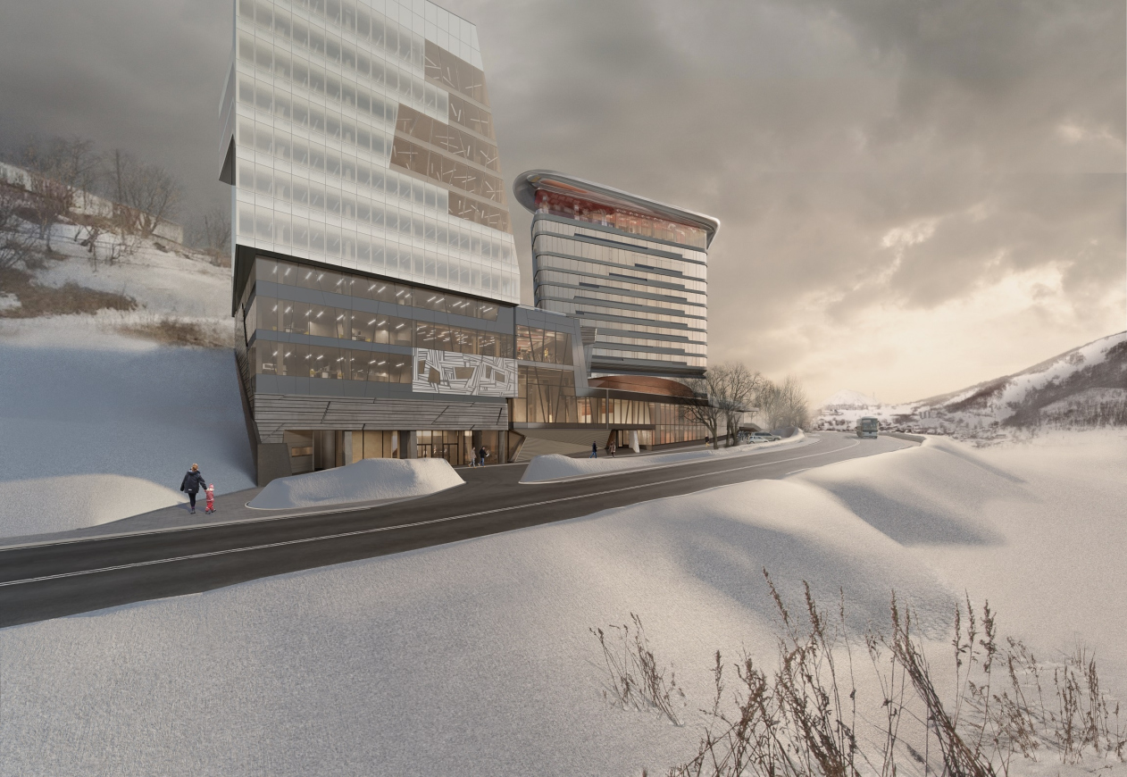
When it turned out that the land site lying to the west of the main one – provided it was cleared from engineering lines – could also be added to the main “trapeze” of the construction blueprint, an opposition of two towers formed: a 15-story hotel tower in the eastern part, and an 11-story office tower in the eastern part. This opposition at once took on an image character: the hotel tower, streamlined and charcoal black, with a glittering drop of the backlit red marquee on top – a veritable volcano with a cloud of smoke on top of it just before the beginning of the eruption. The office tower is made of glass, with facets of broad planes and prominent corners as opposed to the rounded corners of the hotel. The glass is covered with a wealth of white triangles meant to mask the bands of the intermediate floors and partially to protect it from the direct sunlight but first of all to make the volume more integral and more “icy” – a semblance of an icy mountain slightly melted on the corner which is turned southeast in the direction of the Petrovskaya Mount, like a spot of pure glass.

Kamchatka Hotel. Master plan © TOTEMENT/PAPER


Kamchatka Hotel. The sketch of the idea © TOTEMENT/PAPER


Kamchatka Hotel. Axonometric drawing © TOTEMENT/PAPER


Kamchatka Hotel © TOTEMENT/PAPER


The first thing that comes to mind is the “fire and ice” metaphor, and the authors basically agree with that. Therefore, it comes as no surprise that the towers took the extreme left and right positions, the space between them occupied by a glass podium that not only included a few entrance areas, a lobby, a fitness center and a conference hall but also became the space of visual interpretation and the conceptual tension between the two poles. While we have a conditional “fire” in the east and “ice” in the west, between them there is a space that is essentially earth with all of its beauties and controversies.

The fitness-and-spa center is inscribed into the bottom floors of the office block like a volumetric puzzle figure. It has seven pools in it, including a large one with courses of the sportive length of 25 meters, a padding pool for the toddlers and a spa bath; also, there are four small ones, more like large bathtubs, which are part of the Korean bath meant to cater for the visitors from this neighboring country; such baths are quite common here in the Far East, and they enjoy great popularity.

The western wall of the swimming pool is completely white and is dissected with large-stroke graphic ornaments, which, first of all, are based on основан на petroglyphs and the traditional Kamchatka decor, and, second, was designed by the authors as a semblance of broken-ice pattern at the foot of the ice mountain. Routed out to the façade, this “shaman” ornamental wall raises its “head” and starts looking like some kind of a jagged dragon that scans the surroundings with his asymmetric eyes.

Kamchatka Hotel © TOTEMENT/PAPER


Kamchatka Hotel © TOTEMENT/PAPER


Kamchatka Hotel. The swimming pool © TOTEMENT/PAPER


Kamchatka Hotel. The swimming pool © TOTEMENT/PAPER


Kamchatka Hotel. The gym © TOTEMENT/PAPER


Kamchatka Hotel. The interiors © TOTEMENT/PAPER


The conference hall is located more to the east and resembles another totem animal: Levon Airapetov and Valeria Preobrazhenskaya call it a “teddy bear”, not without tenderness. It indeed does look like a bear: a six-angle, yet still streamlined, body of the hall in the second tier, and four large legs of an also streamlined and complex configuration – the legs are volumetric, there are supports hidden within their walls, and inside they will have meeting rooms or maybe cafes. All the volumes – the “legs” and “body” alike – are covered with corrugated metal panels of a copper color, which makes our imaginary bear look like a shaman statuette cut from a figured piece of wood, some kind of northern birch tree. On the inside, the ceiling of the hall is flat, but, in order to provide for a support-free structure, there is a lot of girders above it – their enclosed space also contains the ventilation equipment. On the outside, the space of the girders stands out above the roof of the podium like a flattened dome that looks like the back of the bear or maybe the top of an extinct volcano.

Kamchatka Hotel. The functional diagram © TOTEMENT/PAPER


Kamchatka Hotel. The conference hall © TOTEMENT/PAPER


Kamchatka Hotel. The plan on the -1st level © TOTEMENT/PAPER


Kamchatka Hotel. The plan on the 1st floor © TOTEMENT/PAPER


Kamchatka Hotel. The plan on the 2nd floor © TOTEMENT/PAPER


Kamchatka Hotel. Section view 2-2 © TOTEMENT/PAPER


Kamchatka Hotel. Section view 1-1 © TOTEMENT/PAPER


Kamchatka Hotel. Schemes of laying out the interior © TOTEMENT/PAPER


Kamchatka Hotel. Master plan © TOTEMENT/PAPER


Kamchatka Hotel. The conference hall © TOTEMENT/PAPER


Around the conference hall “spins” the space of the bottom floors: the architects even tried to calculate the scenarios of the visitors’ behavior during the conference break. The starting space is the foyer. There are three main entrances in the building, the foyer uniting two of them: one, which leads to the hotel lobby, and the second one, the central, between the fitness center and the conference hall. In addition, the height difference of the land site is over five meters, and the entrance, which is on the hotel side, leads us by a broad staircase directly to the second tier, to the conference hall entrance, while the central entrance leads to the first floor. The space beneath the supports of the hall is lowered still a little more in order to eliminate the feeling of an oppressive ceiling – from three sides, the descents lead to a rather cozy and interesting space, surrounded by the rounded sides of the “bear’s legs” – the meeting rooms – while overhead we see a lot of bent plates, as the metallic hide were cut crosswise; this motif is continued on the ceiling of the first tier, while at one point this called structure flows down to the floor in a “stalactite” fashion, forming an exotic column.

Kamchatka Hotel. The conference hall © TOTEMENT/PAPER


Kamchatka Hotel. The space above the conference hall © TOTEMENT/PAPER


Kamchatka Hotel. The space of the 1st floor with the supports of the conference hall © TOTEMENT/PAPER


Kamchatka Hotel. The space of the 2nd floor before the conference hall © TOTEMENT/PAPER


Kamchatka Hotel. The conference hall © TOTEMENT/PAPER


Closer to the side of the main façade and the central entrance, the foyer is double-height; further on, it is divided into two tiers by a balcony. The floor and ceiling of the second tier are more sedate, black and white, and geometric. The two types of patterns – the flowing and languid, akin to a volcano with its wisps of ashes and streams of lava, and the icy and jagged – finally meet, the lava flowing below, the ice piling up on top of it – which is basically the case from time to time on Kamchatka.

The fourth tier of the hotel hosts a restaurant that commands a view of the podium’s roof; its supports of parabolic outlines, masking the T-shaped supports are a metaphor of the boats that the Kamchatka fishermen would dry standing them up on end on the shore. The wavy ceiling symbolizes the water.

The Sky Bar on the top floor is covered by a water-drop-shaped curved metallic awning, which is meant to reflect its red floor, forming a semblance of a cloud of smoke above a smoldering volcano. The metallic pillars in this instance are a metaphor of cataclysm, just like the “cracks” of the lamps in the ceiling. But then again, the corrugated geometric “shaman” patterns on the walls stress the “controllability” of the cataclysm, as if saying: yes, we are on top of the volcano but, paradoxically, we are safe here.

Kamchatka Hotel. The lobby © TOTEMENT/PAPER


Kamchatka Hotel. The plan on the 3rd floor © TOTEMENT/PAPER


Kamchatka Hotel. The restaurant © TOTEMENT/PAPER


Kamchatka Hotel. The Sky Bar © TOTEMENT/PAPER


It is obvious enough that the richness of the form and content is combined here with the degree of detailed treatment, which at some points gets close to the point of “total design”. We will stress it again at this point that the project is more than just a concept proposal – TOTEMENT prepared all the working documentation, selected all the decoration materials, mostly from the geographically close Chinese manufacturers.

Kamchatka Hotel. The Sky Bar © TOTEMENT/PAPER


Kamchatka Hotel. The plan of the standard floor © TOTEMENT/PAPER


Kamchatka Hotel. Corridor © TOTEMENT/PAPER


Kamchatka Hotel. The interiors. A standard room © TOTEMENT/PAPER


Kamchatka Hotel. The interiors. A standard room © TOTEMENT/PAPER


Kamchatka Hotel. The interiors. A studio room © TOTEMENT/PAPER


Kamchatka Hotel. The interiors. A suite © TOTEMENT/PAPER


Kamchatka Hotel. The interiors. A suite © TOTEMENT/PAPER


Kamchatka Hotel. VIP Lounge © TOTEMENT/PAPER


Kamchatka Hotel. VIP Lounge © TOTEMENT/PAPER


A single chapter of the story must be written about the work with the regulations of the seismically dangerous zone. “If you are to comply with all of the regulations, you will only be able to build a very small box of hideous proportions, and with tiny windows” – Valeria Preobrazhenskaya confesses. On the territory of the hotel, the architects were required to provide for a possibility of a 9 баллов earthquake, and immediately across the road – up to 10 points. In these circumstances, the architects made all the stability calculations together with the Central Research Institute of Construction Structures, the only institute that seriously explores this topic in this country; they used shielded and seismic supports – simplistically speaking, this technique consists in equipping the numerous basement highs with shock absorbers of rubber and steel, which made it possible to reduce the 9-point limit to an 8-point. The architects also developed and got the required approvals for several special conditions; they also invited to work, in particular, the same fire safety specialists who worked in Zaryadye Park. All of this is a brief summary of some absolutely titanic efforts, which resulted in large stained glass windows of the podium, floor windows in the offices and some of the hotel rooms, an incredible amount of cantilevered structures designed for this place, although quite restrained, since everything was inscribed in real calculations, and passed all necessary approvals.

Some editors-in-chief of well-known industry magazines are in the habit of saying: “Anyone can come up with a cool-looking thing – but can you actually build it?” Speaking on this particular subject, we will say that incredible efforts were invested not only in designing this complex, sophisticated and meaningful form but also in implementing it, starting with complex engineering calculations and ending the detailed layout of all the façade panels in order to make sure that they come together to form a beautiful ornament. As far as I know, the work took about two years, and was done with detailed analysis of every detail. The client considered the design of the hotel rooms on a 1:1 model, comparing it to the proposal by a Korean company. Ultimately, the TOTEMENT proposal was chosen. Today, the framework of the building has been fully cast in concrete.

 
Kamchatka Hotel. VIP Lounge © TOTEMENT/PAPER
Kamchatka Hotel. The facade solutions © TOTEMENT/PAPER


26 December 2018

Headlines now
Resort on the Kama River
Wowhaus has developed a project for the reconstruction of Korabelnaya Roshcha (“Mast Grove”), a wellness resort located on the banks of the Kama River.
Nests in Primorye
The eco-park project “Nests”, designed by Aleksey Polishchuk and the company Power Technologies, received first prize at the Eco-Coast 2025 festival, organized by the Union of Architects of Russia. For a glamping site in Filinskaya Bay, the authors proposed bird-shaped houses, treehouses, and a nest-shaped observation platform, topping it all with an entrance pavilion executed in the shape of an owl.
The Angle of String Tension
The House of Music, designed by Vladimir Plotkin and the architects of TPO Reserve, resembles a harp, and when seen from above, even a bass clef. But if only it were that simple! The architecture of the complex fuses two distinct expressive languages: the lattice-like, transparent, permeable vocabulary of “classical” modernism and the sculptural, ribbon-like volumes so beloved by today’s neo-modernism. How it all works – where the catharsis lies, which compositional axes underpin the design, where the project resembles Zaryadye Concert Hall and where it does not – read in the article below.
How Historic Tobolsk Becomes a Portal to the Future
Over the past decade, the architectural company Wowhaus has developed urban strategies for several Russian cities – Vyksa, Tula, and Nizhnekamsk, to name but a few. Against this backdrop, the Tobolsk master plan stands out both for its scale – the territory under transformation covers more than 220 square kilometers – and for its complexity.
St. Petersburg vs Rome
The center of St. Petersburg is, as we know, sacred – but few people can say with certainty where this “sacred place” actually begins and ends. It’s not about the formal boundaries, “from the Obvodny Canal to the Bolshaya Nevka”, but about the vibe that feels true to the city center. With the Nevskaya Ratusha complex – built to a design that won an international competition – Evgeny Gerasimov and Sergei Tchoban created an “image of the center” within its territory. And not so much the image of St. Petersburg itself, as that of a global metropolis. This is something new, something that hasn’t appeared in the city for a long time. In this article, we study the atmosphere, recall precedents, and even reflect on who and when first called St. Petersburg the “new Rome”. Clearly, the idea is alive for a reason.
On the Wave
The project of transforming the river port and embankment in the city of Cheboksary, developed by the ATRIUM Architects, involves one of the city’s key areas. The Volga embankment is to be turned into a riverside boulevard – a multifunctional, comfortable, and expressive space for work and leisure activities. The authors propose creating a new link with the city’s main Krasnaya (“Red”) Square, as well as erecting several residential towers inspired by the shape of the traditional national women’s headdress – these towers are likely to become striking accents on the Volga panorama.
Valery Kanyashin: “We Were Given a Free Hand”
The Headliner residential complex, the main part of which was recently completed just across from Moscow City, is a kind of neighbor to the MIBC that doesn’t “play along” with it. On the contrary, the new complex is entirely built on contrast: like a city of differently scaled buildings that seems to have emerged naturally over the past 20 years – which is a hugely popular trend nowadays! And yet here – perhaps only here – such a project has been realized to its full potential. Yes, high-rises dominate, but all these slender, delicate profiles, all these exciting perspectives! And most importantly – how everything is mixed and composed together... We spoke with the project’s leader Valery Kanyashin.
​The Keystone
Until quite recently, premium residential and office complexes in Moscow were seen as the exclusive privilege of the city center. Today the situation is changing: high-quality architecture is moving beyond the confines of the Third Ring Road and appearing on the outskirts. The STONE Kaluzhskaya business center is one such example. Projects like this help decentralize the megalopolis, making life and work prestigious in any part of the city.
Perpetuum Mobile
The interior of the headquarters of Natsproektstroy, created by the IND studio team, vividly and effectively reflects the client’s field of activity – it is one of Russia’s largest infrastructure companies, responsible for logistics and transport communications of every kind you can possibly think of.
Water and Light
Church art is full of symbolism, and part of it is truly canonical, while another part is shaped by tradition and is perceived by some as obligatory. Because of this kind of “false conservatism”, contemporary church architecture develops slowly compared to other genres, and rarely looks contemporary. Nevertheless, there are enthusiasts in this field out there: the cemetery church of Archangel Michael in Apatity, designed by Dmitry Ostroumov and Prokhram bureau, combines tradition and experiment. This is not an experiment for its own sake, however – rather, the considered work of a contemporary architect with the symbolism of space, volume, and, above all, light.
Champions’ Cup
At first glance, the Bell skyscraper on 1st Yamskogo Polya Street, 12, appears strict and laconic – though by no means modest. Its economical stereometry is built on a form close to an oval, one of UNK architects’ favorite themes. The streamlined surface of the main volume, clad in metal louvers, is sliced twice with glass incisions that graphically reveal the essence of the original shape: both its simplicity and its complexity. At the same time, dozens of highly complex engineering puzzles have been solved here.
Semi-Digital Environment
In the town of Innopolis, a satellite of Kazan, the first 4-star hotel designed by MAD Architects has opened. The interiors of the hotel combine elegance with irony, and technology with comfort, evoking the atmosphere of a computer game or maybe a sci-fi movie about the near future.
History never ends
The old railway station in Kapan, a city in southern Armenia, has been given new life by the Paris-based design firm Normal Studio. Today, it serves as a TUMO center.
A Deep, Crystal Shine
A new luxury residential development by ADM architects is set to rise in the Patriarch’s Ponds district, not far from Novopushkinsky Square. It will replace three buildings erected in the early 1990s. The project authors, Andrey Romanov and Ekaterina Kuznetsova, have placed their bets on the variety among the three volumes, modern design solutions, and attention to detail: one of the buildings will feature smoothly curved balconies with a ceramic sheen on their undersides, while another will be accented by glass “sculpture” columns.
Grigory Revzin: “What we should do with the architecture of the seventies”
Soviet modernism came in two flavors: the good, author-driven kind, and the bad, standardized kind. The good kind was “on the periphery”, while the bad kind was in the center – geographically, in terms of attention, scale, and everything else. Can we demolish it? “That would be destroying public consensus out of thin air”. So what should we do? Preserve it, but creatively: “Bring architecture into places where it hasn’t yet appeared”. Treat these buildings not as monuments, but as urban landscape. Read our interview with Grigory Revzin on the pressing topic of saving modernism – where he proposes a controversial, yet really intriguing, way of preserving 1970s buildings.
A Roadside Picnic of Urban Planning Theorists
Marina Egorova, head of Empate Architectural Bureau, brought together urban planning theorists – the successors of Alexey Gutnov and Vyacheslav Glazychev – to revive the substance and depth of professional discourse. At the first meeting, much ground was covered: the participants revisited the theoretical foundations, aligned their values, examined a cutting-edge case of the Kazan agglomeration, and concluded with the unfathomable intricacies of Russian land demarcation. Below, we present key takeaways from all the presentations.
Perspective View
CNTR Architects has designed a business center for a new district in Yekaterinburg, aiming to reduce the need for commuting and make the residential environment more diverse. The architectural solutions are equally focused on creating spatial flexibility, comfortable working conditions, and a memorable image that could allow the building to become a spatial landmark of the district.
Malevich and Bathhouses, Nature and High-Tech
The Malevich Bathhouse complex is scheduled to open in the fall of 2025 on the Rublyovo-Uspenskoye Highway. The project, designed by DBA-GROUP under the leadership of Vladislav Andreev, is an example of an unconventional approach to the image of a spa in general and of a bathhouse in particular. Deliberately avoiding any kind of allusion, the architects opted for streamlined forms with characteristic rounded corners, a combination of wood with bent glass, and restrained contemporary shapes – both inside and out. Let’s take a closer look at the project.
Rather, a Tablecloth and a Glass!
After many years, the long-abandoned Horse Guards Department building in St. Petersburg has finally received the attention it deserves: according to a design by Studio 44, the first restoration and adaptation works are scheduled to begin this year. Both the intended function and the general scope of works imply minimal alteration to the complex, which has preserved traces of its three-century history. All solutions are reversible and aimed, above all, at opening the monument to the city and immersing it in a lively social scene – hence the choice of a cultural center scenario with a strong gastronomic component.
​Materialization of Airflows
The Nikolai Kamov International Airport in Tomsk opened at the end of August last year. We have already written about the project – now we are taking a look at the completed building. Its functionality is reinforced by symbolic undertones: the architects at ASADOV sought to reflect local identity in the architecture as fully as possible.
The City as a Narrative
Sergey Skuratov’s approach to large urban plots could best be described as a “total design code”. The architect pays equal attention to the overall composition and the smallest of details, striving to ensure that every aspect is thoroughly thought out and subordinated to the original vision. It’s a Renaissance-like approach, really – a titanic effort demanding remarkable willpower and perseverance. The results are likewise grand – architecture that makes a statement. This article looks at the revived concept for the central section of the Seventh Heaven residential district in Kazan, a composition so thoroughly considered that even the “gradient of visual emphasis” (sic!) across the facades has been carefully worked out. It also touches on the narrative idea behind the project – and even the architect’s own doubts about it.
A Garden of Hope for Freedom
In October, at the Spaso-Evfimiev Monastery in Suzdal, the Prison Yard Garden opened on the site that had served as a prison from the 18th century until the Khrushchev Thaw. The architectural concept was developed by NOῨD Short Film, and the landscape design by the MOX landscape bureau. In fact, there are two gardens here – very different ones. We try to understand whether they evoke the right emotions in visitors, while also showing the beauty of June’s ruderal plants in bloom.
A Laconic Image of Time
The Time Square residential complex, built on the northern edge of St. Petersburg, appears more concise and efficient than its neighbor and predecessor, the New Time complex. Nevertheless, the architect’s hand is clearly felt: themes of “black and white”, “inside and outside”, and most notably, the “lamellar” quality of the facades that seems to visibly “eat away” at the buildings’ mass – everything is played out like a well-written score. One is reminded of both classical modernism and the so-called “post-constructivism”.
The Flower of the Lake
The prototype for the building of the Kamal Theater in Kazan is an ice flower: a rare and fragile natural phenomenon of Lake Kaban “froze” in the large, soaring outlines of the glass screens enclosing the main volume, shaping its silhouette and shielding the stained-glass windows from the sun. The project, led by the Wowhaus consortium and including global architecture “star” Kengo Kuma, won the 2021/2022 competition and was realized close to the original concept in a short – very short – period of time. The theater opened in early 2025. It was Kengo Kuma who proposed the image of an ice flower and the contraposition of cold on the outside and warmth on the inside. Between 2022 and 2024, Wowhaus did everything possible to bring this vision to life, practically living on-site. Now we are taking a closer look at this landmark building and its captivating story.
Peaceful Integration on Mira Avenue
The MIRA residential complex (the word mir means “peace” in Russian), perched above the steep banks of the Yauza River and Mira Avenue, lives up to its name not only technically, but also visually and conceptually. Sleek, high-rise, and glass-clad, it responds both to Zholtovsky’s classicism and to the modernism of the nearby “House on Stilts”. Drawing on features from its neighbors, it reconciles them within a shared architectural language rooted in contemporary façade design. Let’s take a closer look at how this is done.
An Interior for a New Format of Education
The design of the new building for Tyumen State University (TyumSU) was initially developed before the pandemic but later revised to meet new educational requirements. The university has adopted a “2+2+2” system, which eliminates traditional divisions into groups and academic streams in favor of individualized study programs. These changes were implemented swiftly – right at the start of construction. Now that the building is complete, we are taking a closer look.
Penthouses and Kokoshniks
A new residential complex designed by ASADOV Architects for the Krasnaya Roza business district responds to its proximity to 17th-century landmarks – the chambers of the Hamovny Dvor and St. Nicholas Church – as well as to the need to preserve valuable façades of a historic rental house built in the Russian Revival style. The architects proposed a set of buildings of varying heights, whose façades reference ecclesiastical architecture. But we were also able to detect other associations.
Centipede Town
The new school campus designed by ATRIUM Architects, located on the shores of a protected lake in the Imeretian Lowland Ornithological Reserve, represents an important and ambitious undertaking for the team: this is not just a school, but a Presidential Lyceum for the comprehensive development of gifted children – 2,500 students from age 3 through high school. At the same time, it is also envisioned as a new civic hub for the entire Sirius territory. In this article, we unpack the structure and architecture of this “lyceum town”.
Warm Black and White
The second phase of “Quarter 31”, designed by KPLN and built in the Moscow suburb town of Pushkino, reveals a multifaceted character. At first glance, the complex appears to be defined by geometry and a monochrome palette. But a closer look reveals a number of “irregular” details: a gradient of glazing and flared window frames, a hierarchy of façades, volumetric brickwork, and even architectural references to natural phenomena. We explore all the rules – and exceptions – that we were able to discover here.