По-русски

From a Co-mmune House to Co-living

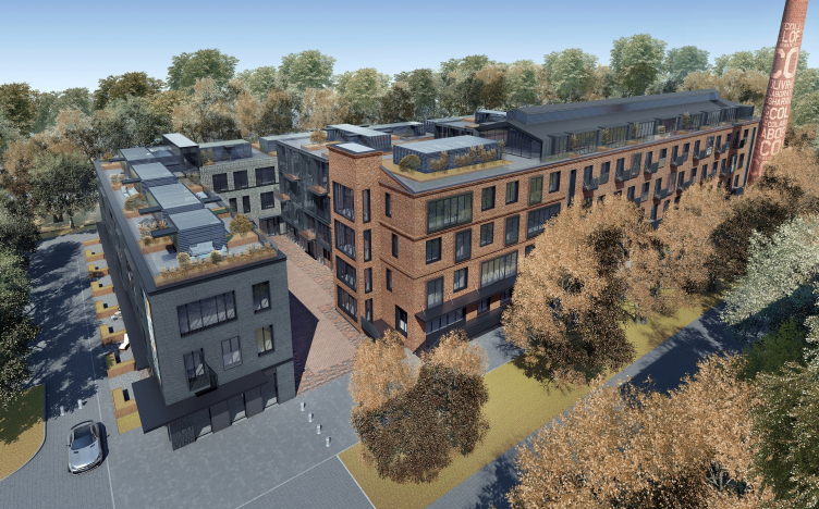
In the apartment complex CO_LOFT, designed by DNK ag, the industrial heritage of the 1930’s is reinterpreted through the ideas of the 1920’s, when the search for new types of housing was one of the main branches of architecture.

17 December 2018
Object
mainImg

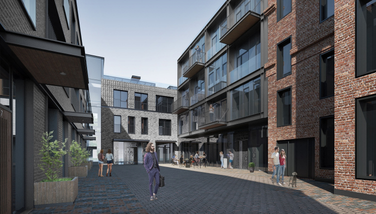
The name of the apartment complex CO_LOFT, situated near the Tulskaya metro station, reflects two paradigms – its former industrial function and the idea of a commune house, which is essentially close to the modern idea of “co-living” that is becoming ever more popular nowadays.

CO_Loft © DNK ag
CO_Loft © COLDY


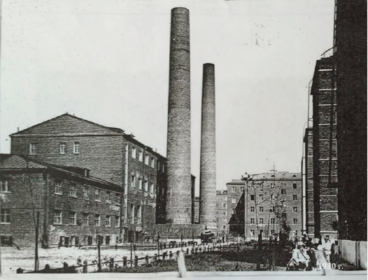
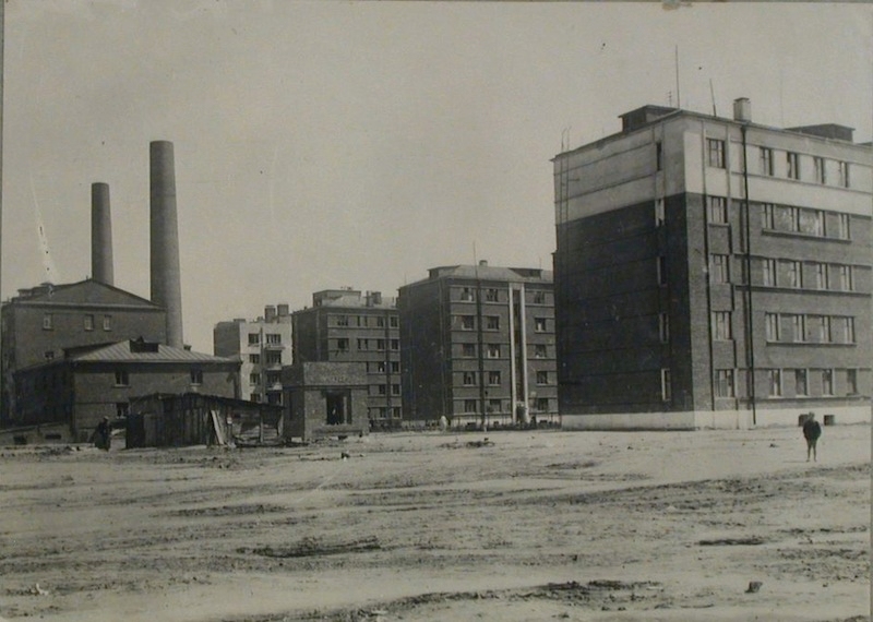
A rather compact land site, which includes 3 and 4-story buildings, is situated near the Serpukhovskoy Val. Until recently, this place hosted the electrical measuring instrument factory, whose history can be traced back to 1935 when the first typewriter and adding machine repair shops were opened here. The first buildings of the complex are known to refer to the break of the 1920-1930’s. There was also a boiler house, the remnant of which is a tall chimney – a peculiar centerpiece of the entire block. Most likely, the boiler house was a part of the housing project designed for the workers of the factory “Novaya Zarya” built in 1928–1930 by the project of the architects Ivan Zvezdin and Mikhail Motylev.

CO_Loft © DNK ag


zooming
An archive photo, 1930. Source: http://theconstructivistproject.com


zooming
An archive photo, 1930. Source: http://theconstructivistproject.com


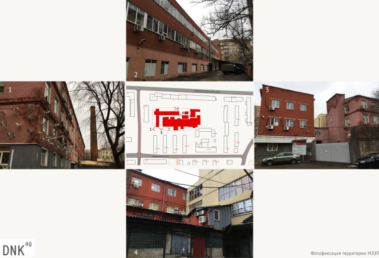
Over the long time of their existence, the workshops expanded, the buildings were reconstructed, and the complex got numerous annexes. This chaotic construction cannot be called an ensemble by any stretch of imagination: the different sizes and colors of the annexes, combination of panels and all kinds of other construction materials make it impossible to speak about any prominent architectural character.

CO_Loft. Photographic evidence of the land site © DNK ag


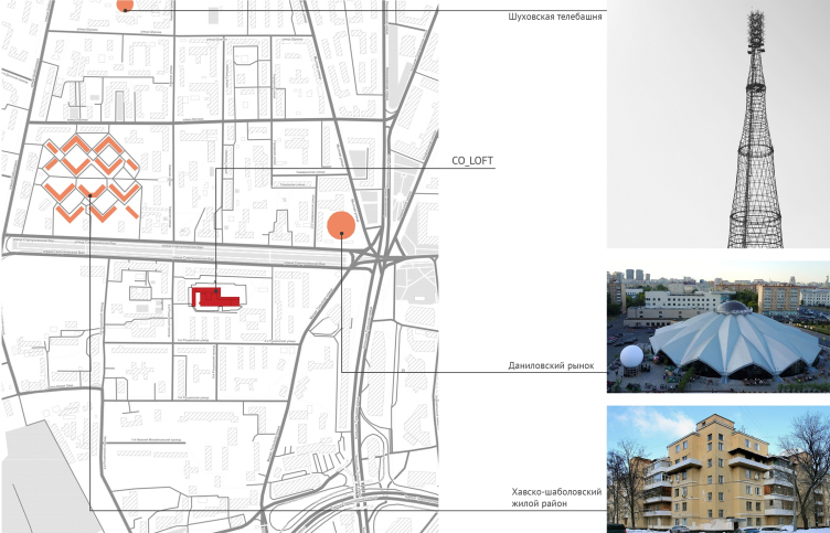
However, it is the history of the place, as well as the constructivist tradition of this area of Moscow, that became for DNK ag one of the sources of inspiration for coming up with the concept of the apartments. The neighboring residential area designed by Zvezdin and Motylev was devised as an ensemble that presupposed the creation of a few housing communities – neighbors connected by common day-to-day interests, working routine, and spending their spare time together. The idea of joint pastime of the residents constituted the basis for the project of redeveloping the industrial factory complex, and to a large extent defined the functional zoning of CO_LOFT, while the rescript of buildings of different characters and ages was turned by the architects into an exciting play of volumes and textures.

CO_Loft. Before the reconstruction © DNK ag


“Working in the conditions of a living urban environment, we wanted to find some theme, some source to draw inspiration from, because these buildings do not really look like they have any visual value or attractiveness – shares the architect Natalia Sidorova – The context, and, specifically, the numerous constructivist projects in this area of the city – the area of the Khavsko-Shabolovsky complex and “Novaya Zarya”, together with the Shukhov Tower – gave us one of the starting points for designing the inner structure of the complex, in which an important part is played by the public function. At the same time, it was important for us reflect today’s identity and the diversity of life. And all of this turned out to be quite resonant with the client’s desire to create something unusual and modern, and at the same time having historical ties”.

A Song About the New Way of Life

The approach towards reinterpreting the industrial territory under the new realities, proposed by DNK ag, allowed the company to win the invitation-only competition, and coincided with the client’s desire to develop the concept of a residential complex with elements of co-living in it, a new housing format, which in many respects resembles the soviet “commune houses” of the 1920’s, the difference being that it offers more comfort and satisfaction of individual needs.

Back in the day, the new “way of life” of the young socialist state required new solutions for the housing construction. The commune houses or “house-communes” with their communal education of children, food preparation, household chores and recreation, whose purpose was “to get rid of the yoke of the household economy’, were essentially a response to the fast-paced industrialization and urbanization: the lack of useful floor space of the housing “cells” was more than outweighed by the “socialized” public spaces – the habitual kitchen gave way to a canteen, and the questions of spending one’s free time were solved by a public library and playrooms for children. Paradoxically, today, almost a hundred years later, the ideas of socialized way of life became relevant again. The technological development, the information revolution, and the global spreading of homesourcing brought some major changes to the public/private ratio. Similar actions performed on one common platform are the sign of modern times.

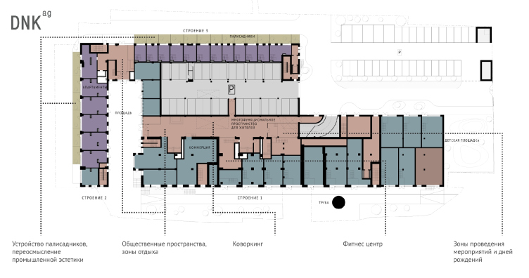
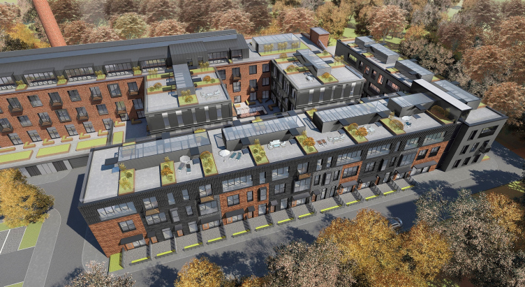
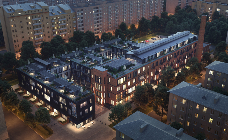
DNK ag are interpreting the theme of a commune house in an extremely graceful way, delicately entwining the platform for joint activities into the fabric of the complex. Caused by a multitude of random factors, the complex configuration of the project resolves into singling out the central nucleus with public spaces and placing the apartments or “housing cells”, as they would have been called a century ago, along the perimeter.

CO_Loft © DNK ag


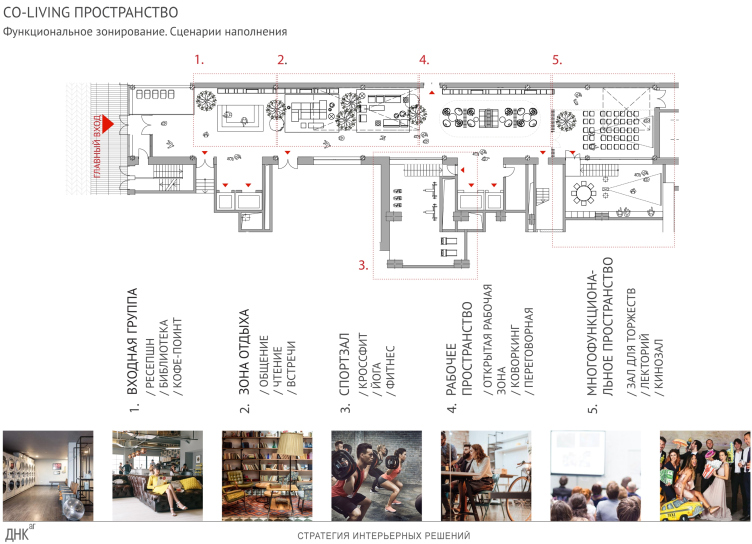
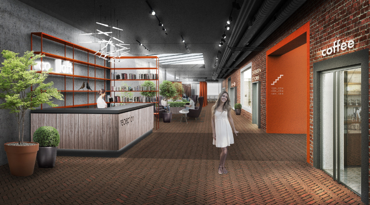
Two historical buildings – one made of prefab panels, the other from brick – come together at a right angle, the third standing away from them. Together, they once formed a semi-open yard, which was filled, already in the 1960’s, with a volume of metallic structures coated with profiled sheeting – they formed a transition block between the buildings. According to the project, now this place hosts a co-working space, a reception, a gym, and a laundromat – everything that one needs for fruitful joint actions. One can get here through the main entrance passing through a little square.

CO_Loft © DNK ag


CO_Loft © DNK ag


The basement floor of the four-story-high building also includes spaces for commercial premises adjacent to the public nucleus. The combination of business and housing functions that you would naturally expect from a loft is viewed in this specific instance as an opportunity to do some kind of business that would unite all of the residents of the complex.

The central nucleus also includes a parking garage with a convenient driving entrance on the first and basement floors. The underground levels of the residential units are also equipped with storage lockers. It is also planned to make the residents’ life more diverse at the expense of various services, the operations of some of which is supervised by the community manager who also acts as a community moderator.

All of the former factory buildings consist of apartments. The architects are preserving the dimensions and the numbers of floors, at the same time modifying the façades in full accordance with their new function.

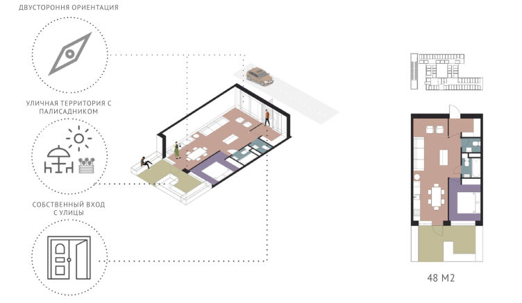
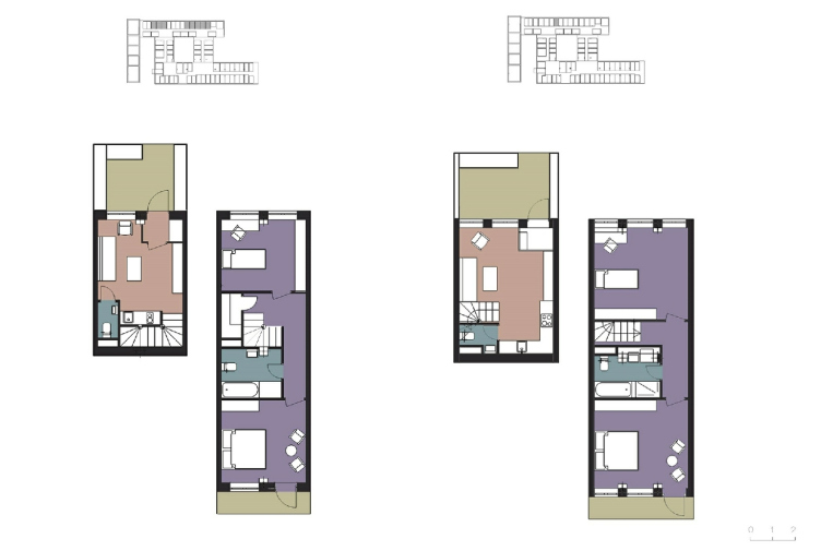
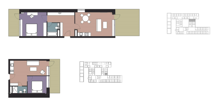
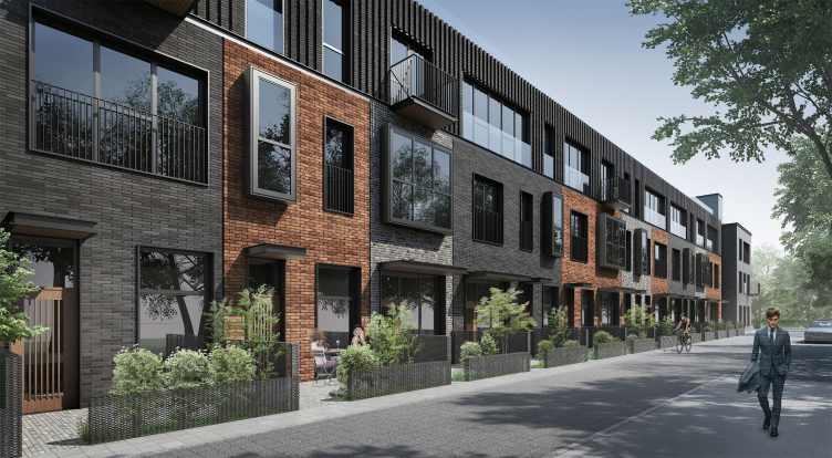
The range of the apartments in the complex is quite diverse; almost each of the apartments is endowed with some unique qualities, which brings us back to experiments of the 1920’s aimed at crash testing various life scenarios in such houses and various arrangements of their premises. The first floor of one of the buildings will include double-side two-level apartments with a cute little garden of their own – a curious analogue of a townhouse. In another building, single level apartments will have patios of their own; these little gardens form something like a street writhing the block.

. The apartments with little gardens. CO_Loft © DNK ag


The two-level apartments CO_Loft © DNK ag


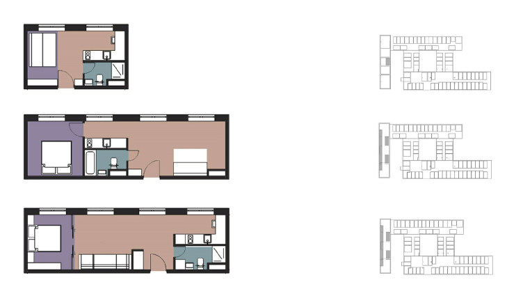
The apartments of the studio type – with a small floor space of 20 square meters – are essentially modular cells that can be joined together within the framework of the bearing structure.

The apartments in the narrow building. CO_Loft © DNK ag


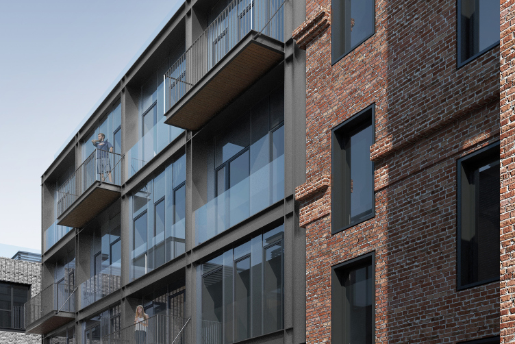
The apartments with an unusually elongated floor plan, whose configuration was conditioned by the width of one of the units, are comparatively small in terms of their floor space but they still have an advantage of numerous windows, which makes it possible to zone the space in different ways, forming a few “rooms”. Most of the apartments have balconies, sometimes of the “French” type, sometimes regular ones.

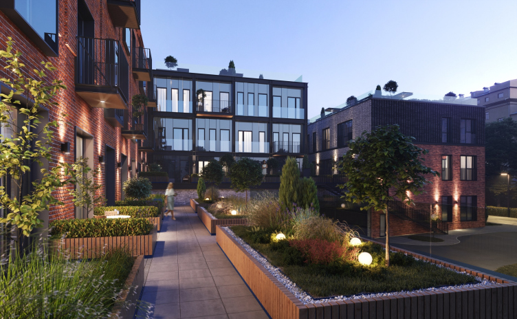
Another feature of the complex is the usable roof of the residential buildings and the underground parking garage. The residents of the upper floors and the apartments adjoining the inner patio are able to walk out on it, thus getting a “hanging garden” of their own.

CO_Loft. Building 1 © DNK ag


CO_Loft © COLDY


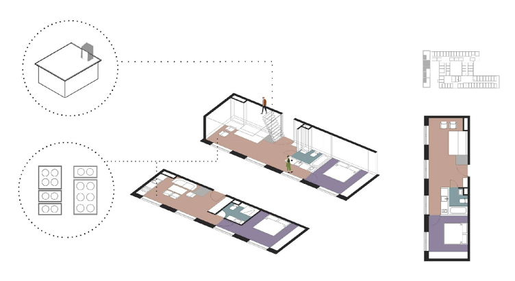
The project is also not without two-level apartments – as we remember, the housing cells of the experimental houses of the 1920’s also oftentimes had two levels, as, for example, the K-type cell in the famous Narkomfin Building. In the modern Moscow design, two-level apartments are a disappearing rarity, and these certainly add the complex’s “typological” charm.

The apartments with an exit to the roof. CO_Loft © DNK ag


The New Look of Factory Clothes

The subsequent layers of time also got reflected in the coating textures, as well as the materials of the outside walls. The most “recent” block of metallic structures – the heritage of the recent soviet past – got glass façades, which serve as a link between the two “more material” brick buildings.

CO_Loft © DNK ag


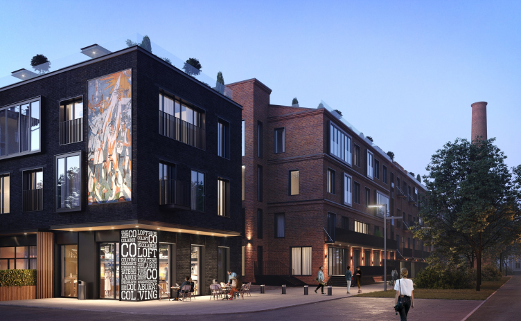
The four-story building, the oldest in the complex, whose first floor hosts various businesses, is the brightest reminder of the industrial past of this place. Its red-brick walls will be cleared up, while the new residential function is signified by the balconies and bay windows. The tall chimney of the boiler-house is turned into an artifact, also reminding us of the original function of this place.

CO_Loft © DNK ag


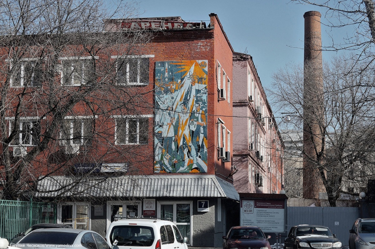
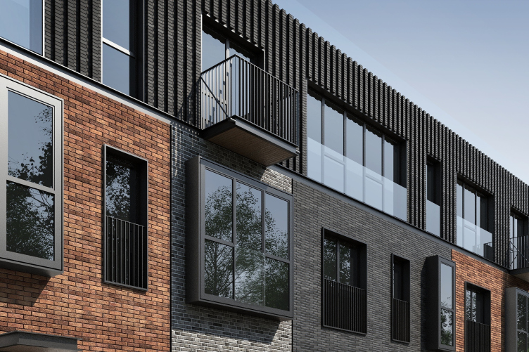
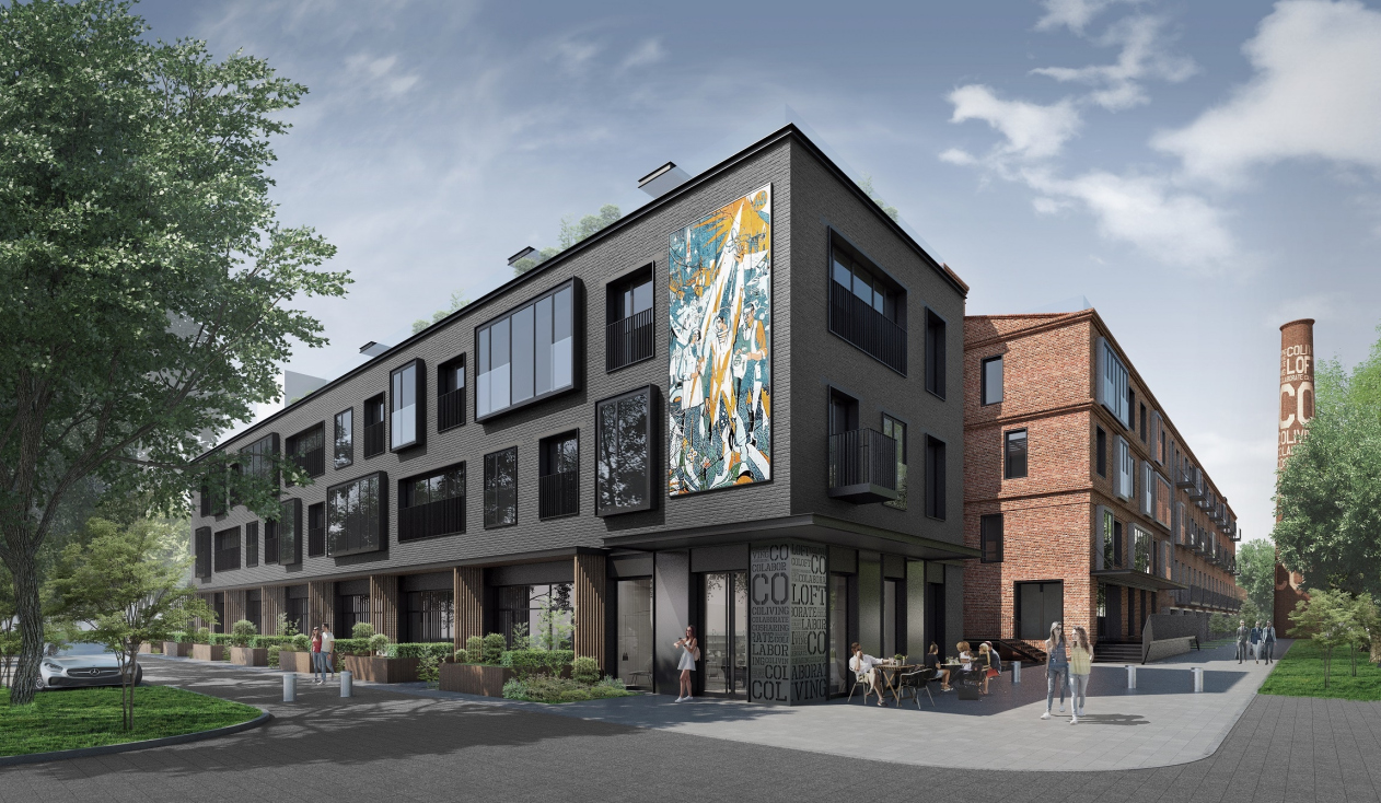
The small brick building with little gardens is decorated in dark-gray colors. The architects added low window sills and glass bay windows with sideshift slide frames of various proportions that came together to form a rhythmic composition defining the individual character of each of the cells. The main peculiar feature of this unit is a mosaic panel picture that survived from the times when this building hosted the electrical devices factory. This is the heritage of another period in the life of the complex – the epoch of modernism.

Amazingly, the subject matter of the picture – innovative technologies, a community of people of different professions – is resonant with today’s way of life and the concept of the project.

CO_Loft. facade, Building 2 © DNK ag


CO_Loft © DNK ag


The third building, alongside of which also stretches an array of little gardens, has original façades that highlight its original structure. According to the project, it panels are to be dismantled altogether to be replaced by brick.

The two-level apartments stand out thanks to the different color of their bricks; the flat-surface solution is diluted by windows or different width and bay windows.

The third level with single-story apartments and a corridor that unites them inside (and on the façade) is designed as a single-cut one, which gives it a mansard character, strengthened thanks to the use of the terrain – the vertical rhythm of the brick ribs visually stretches this level up.

CO_Loft © DNK ag


CO_Loft © DNK ag


CO_Loft © DNK ag


“What we wanted to do was preserve in this complex its history that has been naturally formed – says Natalia Sidorova – It was very important for us not only to gracefully introduce the new functions but also highlight the legacy and historical individuality not just through preserving the artifacts – the chimneys and the mosaic panels that we, of course, regard as important elements of implementing our idea – but also by demonstrating the architectural layers of many year”.
CO_Loft © DNK ag © COLDY, ttp://coloft.ru/gallery/

17 December 2018

Headlines now
The Golden Crown
The concept for a dental clinic in Yekaterinburg, developed by CNTR Studio, revolves around the idea of a “mouth full of gold”: pristine white porcelain stoneware walls are complemented by matte brass details. To avoid an overly literal interpretation, the architects focused on the building’s proportions, skillfully navigating between sunlight requirements and fire safety regulations.
Flexibility and Integration
Not long ago, we covered the project for the fourth phase of the ÁLIA residential complex, designed by APEX. Now, we’ve been shown different fence concepts they developed to enclose the complex’s private courtyards, incorporating a variety of public functions. We believe that the sheer fact that the complex’s architects were involved in such a detail as fencing speaks volumes.
A Step Forward
The HIDE residential complex represents a major milestone for ADM architects and their leaders Andrey Romanov and Ekaterina Kuznetsova in their quest for a fresh high-rise aesthetic – one that is flexible and layered, capable of bringing vibrancy to mass and silhouette while shaping form. Over recent years, this approach has become ADM’s “signature style”, with the golden HIDE tower playing a pivotal role in its evolution. Here, we delve into the project’s story, explore the details of the complex’s design, and uncover its core essence.
Gold in the Sands
A new office for a transcontinental company specializing in resource extraction and processing has opened in Dubai. Designed by T+T Architects, masters of creating spaces that are contemporary, diverse, flexible, and original, this project exemplifies their expertise. On the executive floor, a massive brass-clad partition dominates, while layered textures of compressed earth create a contextually resonant backdrop.
Layers and Levels of Flight
This project goes way back – Reserve Union won this architectural competition at the end of 2011, and the building was completed in 2018, so it’s practically “archival”. However, despite being relatively unknown, the building can hardly be considered “dated” and remains a prime example of architectural expression, particularly in the headquarters genre. And it’s especially fitting for an aviation company office. In some ways, it resembles the Aeroflot headquarters at Sheremetyevo but with its own unique identity, following the signature style of Vladimir Plotkin. In this article, we take an in-depth look at the United Aircraft Corporation (UAC) headquarters in the Moscow agglomeration town of Zhukovsky, supplemented by recent photographs from Alexey Naroditsky – a shoot that became only recently possible due to the fact that improvements were finally made in the surrounding area.
Light and Shadow
In this article, we delve into the architectural design of the “Chaika” house by DNK ag architects, which was recently completed in 2023 as part of the collection of signature designs at ZILArt. As is well-known, all the buildings in this complex follow a design code, yet each one is distinct. This particular building stands out not only for its whiteness and minimalism but also for the refined use of a limited number of techniques that, together, create what can confidently be called synergy.
Casus Novae
A master plan was developed for a large residential area with a name of “DNS City”, but now that its implementation began, the plan has been arbitrarily reformatted and replaced with something that, while similar on the surface, is actually quite different. This is not the first time such a thing happens, but it’s always frustrating. With permission from the author, we are sharing Maria Elkina’s post.
Treasure Hunting
The GAFA bureau, in collaboration with Tegola and Arkhitail, organized an expedition to the island of Kilpola in Karelia as part of Moskomarkhitektura’s “Open City” festival. There, amidst moss and rocks, the students sought answers to questions like: what is the sacred, where does it dwell, and what sustains it? Assisting the participants in this quest were landscape engineer Evgeny Levin, artist Nicholas Roerich, a moose, and the lack of cellular connection. Here’s how the story unfolded.
Depths of the Earth, Streams of Water
In the Malaya Okhta district, the Akzent building, designed by Stepan Liphart, was constructed. It follows a classic tripartite structure, yet it’s what you might call “hand-drawn”: each façade is unique in its form and details, some of which aren’t immediately noticeable. In this article, we explore the context and, together with the architect, delve into how the form was developed.
Fir Tree Dynamics
The “Airports of Region” holding is planning to build an airport in Karachay-Cherkessia, aiming to make the Arkhyz and Dombay resorts more accessible to travelers. The project that won in an invitation-only competition, submitted by Sergey Nikeshkin’s KPLN, blends natural imagery inspired by the shape of a conifer seed, open-air waiting spaces, majestic large trees, and a green roof elevated on needle-like columns. The result is both nature-inspired and WOW.
​A Brick Shell
In the process of designing a clubhouse situated among pine trees in a prestigious suburban area near Moscow, the architectural firm “A.Len” did the façade design part. The combination of different types of brick and masonry correlates with the volumetric and plastique solutions, further enhanced by the inclusion of wood-painted fragments and metal “glazing”.
Word Forms
ATRIUM architects love ambitious challenges, and for the firm’s thirtieth anniversary, they boldly play a game of words with an exhibition that dives deep into a self-created vocabulary. They immerse their projects – especially art installations – into this glossary, as if plunging into a current of their own. You feel as if you’re flowing through the veins of pure art, immersed in a universe of vertical cities, educational spaces – of which the architects are true masters – and the cultural codes of various locations. But what truly captivates is the bold statement that Vera Butko and Anton Nadtochy make, both through their work and this exhibition: architecture, above all, is art – the art of working with form and space.
Flexibility and Acuteness of Modernity
Luxurious, fluid, large “kokoshniks” and spiral barrel columns, as if made from colorful chewing gum: there seem to be no other mansion like this in Moscow, designed in the “Neo-Russian-Modern” style. And the “Teremok” on Malaya Kaluzhskaya, previously somewhat obscure, has “come alive with new colors” and gained visibility after its restoration for the office of the “architectural ecosystem” as the architects love to call themselves. It’s evident that Julius Borisov and the architects at UNK put their hearts into finding this new office and bringing it up to date. Let’s delve into the paradoxes of this mansion’s history and its plasticity. Spoiler: two versions of modernity meet here, both balancing on the razor’s edge of “what’s current”.
Yuri Vissarionov: “A modular house does not belong to the land”
It belongs to space, or to the air... It turns out that 3D printing is more effective when combined with a modular approach: the house is built in a workshop and then adapted to the site, including on uneven terrain. Yuri Vissarionov shares his latest experience in designing tourist complexes, both in central Russia and in the south. These include houseboats, homes printed from lightweight concrete using a 3D printer, and, of course, frame houses.
​Moscow’s First
“The quality of education largely depends on the quality of the educational environment”. This principle of the last decade has been realized by Sergey Skuratov in the project for the First Moscow Gymnasium on Rostovskaya Embankment in the Khamovniki district. The building seamlessly integrates into the complex urban landscape, responding both to the pedestrian flow of the city and the quiet alleyways. It skillfully takes advantage of the height differences and aligns with modern trends in educational space design. Let’s take a closer look.
Looking at the Water
The site of Villa Sonata stretches from the road to the water’s edge, offering its own shoreline, pier, and a picturesque river panorama. To reveal these sweeping views, Roman Leonidov “cut” the façade diagonally parallel to the river, thus getting two main axes for the house and, consequently, “two heads”. The internal core – two double-height spaces, a living room and a conservatory, with a “bridge” above them – makes the house both “transparent” and filled with light.
The White Wing
Well, it’s not exactly white. It’s more of a beige, white-stone structure that plays with the color of limestone – smoother surfaces are lighter, while rougher ones are darker. This wing unites various elements: it absorbs and interprets the surrounding themes. It responds to everything, yet maintains a cohesive expression – a challenging task! – while also incorporating recognizable features of its own, such as the dynamic cuts at the bottom, top, and middle.
Urban Dunes
The XSA Ramps team designed and built a three-part sports hub for a park in Rostov-on-Don, welcoming people of all ages and fitness levels. The skate plaza, pump track, and playground are all meticulously crafted with details that attract a diverse range of visitors. The technical execution of the shapes and slopes transforms this space into a kind of sculptural composition.
Proportional Growth
The project for the fourth phase of the ÁLIA residential area has been announced. The buildings are situated on an elongated plot – almost a “ray” that shoots out from the center of the area towards the river. Their layout reflects both a response to Moscow’s architectural preferences over the past 15 years, shifting “from blocks to towers”, and an interpretation of the neighboring business park designed by SOM. Additionally, the best apartments here are not located at the very top but closer to the middle, forming a glowing “waistline”.
The “Staircase” Building
In designing the “Details” residential complex in New Moscow, Rais Baishev spiced up the now-popular Moscow theme of a “courtyard” building with an idea drawn from the surrealist drawings by Maurits Escher. He envisioned the stepped silhouettes and descending slopes as a metaphysical mega-staircase, creating a key void within the courtyard that gave the project an internal “spine”. This concept is felt both in the building’s silhouette and on its façades.
Projection of the Quarter
No one doubted that the building that Vladimir Plotkin designed as part of the “Garden Quarters” would be the most modernist of all. And it turned out just that way: while adhering to the common design code, the building successfully combines brick and white stone, rhythmically responding to the neighboring building designed by Ostozhenka, yet tactfully and persistently making a few statements of its own. This includes the projection of the ideal urban development composition “14–9–6”, which can be found right next door, mathematical calculations, including those for various types of terraces (and perhaps the only reminder of the Soviet past of the Kauchuk rubber factory!), and the white “cross-stitch” pattern of the façade grid.
Domus Aurea
In this issue, we examine the “Tessinsky-1” house, designed by Sergey Skuratov and completed in 2023. Located in the middle of the Serebryanicheskaya Embankment district, at the intersection of its main streets, this house assumes a sort of “nodal” role: it not only responds to everything around it and preserves many memories of the former EMA factory within itself, but it weaves all this into a newly directed pattern, reconciling bright “gold” and dark-colored brick, largely with the help of the new, modern-yet-archaic Columba brick, which, come to think about it, is the most precious element here.
The Chimney of Nikola-Lenivets
In this issue, we are examining the “Obelisk House” designed by KATARSIS and built for the Arkhstoyanie 2023 festival. However, it was only finished later on, and this is why we are examining it now. It seems to us that after the “Obelisk House” appeared in Nikola-Lenivets, a dialogue and a few inner connections appeared between the temporary structures built here. These houses no longer look like “accidental neighbors”, more of which below.
​Periscope by the Bay
The jury awarded the second place in the competition for a public and cultural center in Petropavlovsk-Kamchatsky to the companies GORA (“Mountain”) and M4. In the consortium’s proposal, the building resembles a sperm whale with a calf swimming next to it or a periscope, whose lenses capture the most spectacular views from the surrounding landscape.
From Arcs to Dolmens
While working on the competition project for Petropavlovsk-Kamchatsky, ASADOV Architects prioritized the value of the natural and urban environment, aiming to preserve the balance of the location while minimizing the resemblance of the volume that they designed to a “traditional building”. The task was challenging, and the architects created three versions, one of which having been developed after the competition, where their main proposal took third place. However, the point of interest here is not the competition result but the continuity of creative thinking.
Hide and Seek
The ID Moskovskiy house, designed by Stepan Liphart in St. Petersburg, in the courtyards near Moskovskiy Avenue beyond the Obvodny Canal and recently completed, is notable for several reasons. Firstly, it has been realized with considerable accuracy, which is particularly significant as this is the first building where the architect was responsible not only for the facades but also for the layouts, allowing for better integration between the two. On the other hand, this building is interesting as an example of the “germination” of new architecture in the city: it draws on the best examples from the neighborhood and becomes an improved and developed sum of ideas found by the architect in the surrounding context.
The Big Twelve
Yesterday, the winners of the Moscow Mayor’s Architecture Award were announced and honored. Let’s take a look at what was awarded and, in some cases, even critique this esteemed award. After all, there is always room for improvement, right?
Above the Golden Horn
The residential complex “Philosophy” designed by T+T architects in Vladivostok, is one of the new projects in the “Golubinaya Pad” area, changing its development philosophy (pun intended) from single houses to a comprehensive approach. The buildings are organized along public streets, varying in height and format, with one house even executed in gallery typology, featuring a cantilever leaning on an art object.
Nuanced Alternative
How can you rhyme a square and space? Easily! But to do so, you need to rhyme everything you can possibly think of: weave everything together, like in a tensegrity structure, and find your own optics too. The new exhibition at GES-2 does just that, offering its visitor a new perspective on the history of art spanning 150 years, infused with the hope for endless multiplicity of worlds and art histories. Read on to see how this is achieved and how the exhibition design by Evgeny Ace contributes to it.
Blinds for Ice
An ice arena has been constructed in Domodedovo based on a project by Yuri Vissarionov Architects. To prevent the long façade, a technical requirement for winter sports facilities, from appearing monotonous, the architects proposed the use of suspended structures with multidirectional slats. This design protects the ice from direct sunlight while giving the wall texture and detail.