По-русски

​The Headquarters of “Garage”

In this issue, we are publishing one of the chapters of the book dedicated to the reconstruction of the headquarters of the “Garage” museum in Gorky Park, and to the research of this multilayered building. The reconstruction project was developed by FORM.

22 November 2018
Book
mainImg

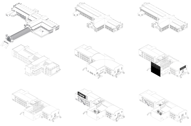
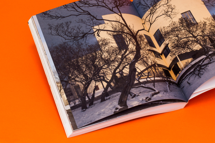
The building standing at the edge of Gorky Park next to the Krymsky Bridge, to the right of the main entrance to the park (or to the left of the minor entrance on the embankment side) does not attract any particular attention; at some moment, when the reconstruction of the park had only just begun, they even planned to tear it down altogether to make room for expanding the Garden Ring. Meanwhile, after the building was turned into the headquarters of the museum of modern art “Garage”, which moved in here from the Bakhmetyevsky Garage, the museum, in turn, invited FORM to develop the reconstruction project, and they started doing a research of the building, it turned out that it was a sophisticated multilayered structure with approximately nine periods of development. The building appeared in the end of XIX century as a part of the Bromley dockyard, was later on remodeled to become a pavilion of the All-Union agricultural exhibition, then served as the GOZNAK convention center, then one of the first sound movie theaters, then a public bathhouse, and then a sanitary ware store.

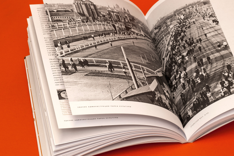
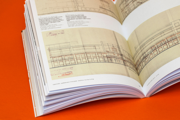
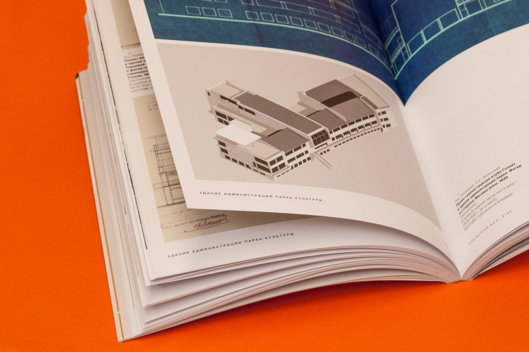
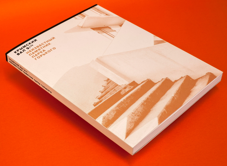
Krymsky Val 9/45. The Unknown Monument of Gorky Park. Moscow, 2018 © ABCdesign
Historical transformations of the building. The "Garage" headquarters in Gorky Park © FORM


With the support from the museum, the architects not only turned some of the building into an office of “Garage” but also thoroughly researched it – their work was shown a year and a half ago at Arch Moscow 2017. Parallel to doing the research and design, they were writing a book fully dedicated to the building standing at Krymsky Val, 9/45. Below we are publishing one of the chapters of this book written by the architects of FORM, historians Marianna Evstratova and Sergey Koluzakov, ABCdesign publishers, Kuchkovo Pole publishers, and the team of the museum of modern art “Garage”. More about the book (in Russian).

Krymsky Val 9/45. The Unknown Monument of Gorky Park. Moscow, 2018 © ABCdesign


Krymsky Val 9/45. The Unknown Monument of Gorky Park. Moscow, 2018
Olga Treivas, Vera Odyn, Polina Patimova, Polina Litvinenko, Alina Yaroshenko, Kristina Timchuk, Idris Suliman, Svetlana Dudina, Konstantin Kim, Mikhail Mikadze.


Chapter 7. The Park Management. Office of the Museum of Modern Art “Garage”. Architectural firm FORM.

“In 2011, Sergey Kapkov was appointed the Director of Gorky Park. From that moment on, the park underwent profound changes that caused heated controversy. Within the first half a year, all the outlaw structures were removed, and almost all of the amusement rides were dismantled – this caused a negative reaction from the visitors and the owners of the park cafés alike but the changes were still enforced.

During the same period of time, Sergey Kapkov was speaking about demolishing the office wing next to the Krymsky Bridge. It was proposed to make a road junction there and solve the problem of traffic jams inevitably forming near Gorky Park, but seeing how unpromising the whole idea was, they soon gave up on it altogether. 

In 2012, the Museum of Contemporary Art “Garage” was preparing to moving to Gorky Park and needed a place for its headquarters. The management of Gorky Park offered the museum to be headquartered in the left half of the building next to the Krymsky Bridge – the one that hitherto hosted the sanitary ware store. As the architects of this project, The director of “Garage” invited FORM as the architects of this project.

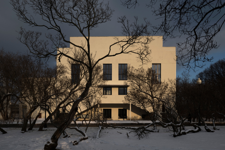
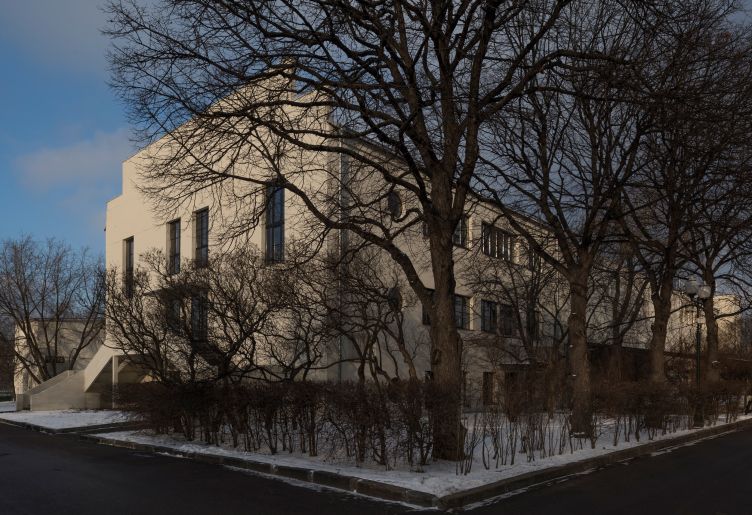
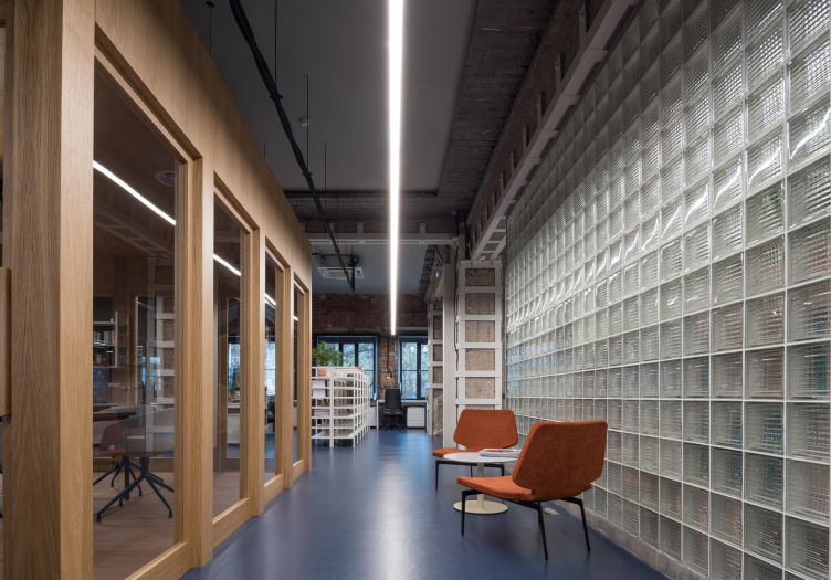
The "Garage" headquarters in Gorky Park. FORM. Photograph © Yuri Palmin


The "Garage" headquarters in Gorky Park. FORM. Photograph © Yuri Palmin


Krymsky Val 9/45. The Unknown Monument of Gorky Park. Moscow, 2018 © ABCdesign


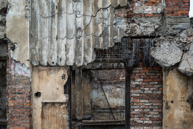
The first acquaintance with the building, and especially with its interior, was not particularly inspiring: clapboard walls, mosaic panel pictures, and even a jacuzzi bowl that was inherited from the sanitary ware store. The whole place was cluttered with tiny rooms, one of the staircases being completely blocked for yielding more office space. It was hard to imagine that all this mess actually concealed a surprisingly spacious house full of sunlight. However, after the architects studied the Bureau of Technical Inventory documents, it became obvious to them that the building had a clear-cut and interesting structure that is hard to discern behind the renovations of the 1980‒2000’s.

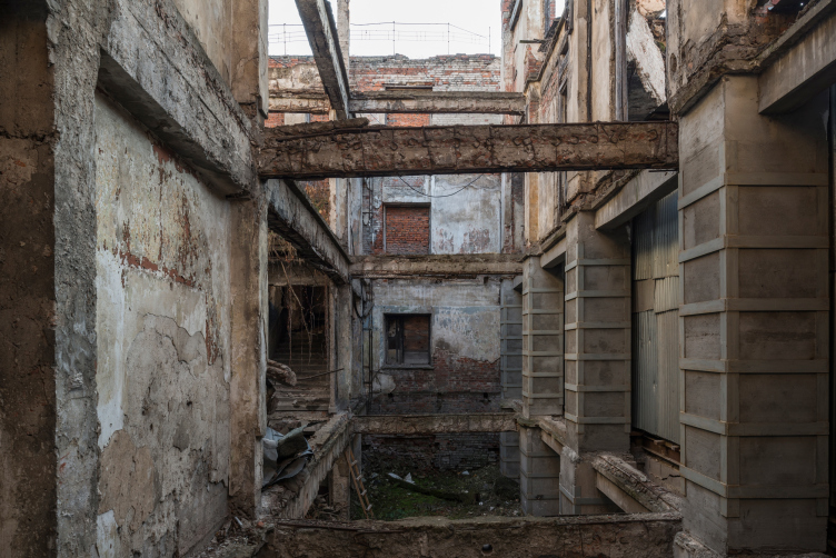
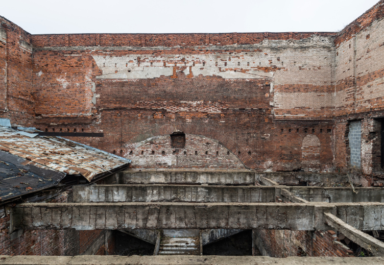
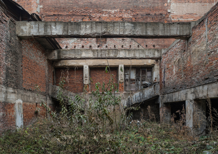
In spite of the fact that from the outside the management building looks rather coherent, for more than half a century it has been existing as two separate volumes with a ruin of the movie theater in the middle. The ruin can only be seen from the inside of the building – it is separated from the city by two blind façades. The reinforced concrete pillars and beams of the movie theater that survived a Nazi bombing, are exposed to the blue sky up to this day. Upon the initiative of “Garage”, the trees, which appeared inside the ruin over the fifty years, were made sparser but were still preserved.

The "Garage" headquarters in Gorky Park. The ruin of the movie theater in the middle of the building. Photograph © Yuri Palmin


The "Garage" headquarters in Gorky Park. The ruin of the movie theater in the middle of the building. Photograph © Yuri Palmin


The "Garage" headquarters in Gorky Park. The ruin of the movie theater in the middle of the building. Photograph © Yuri Palmin


The "Garage" headquarters in Gorky Park. The ruin of the movie theater in the middle of the building. Photograph © Yuri Palmin


Working with the building, the FORM architects decided to bring out the best in it by clearing it from whatever later additions were there, and adjust the floor plan of the movie theater for the museum headquarters, exposing the historical brickwork.

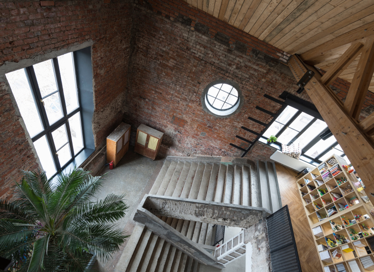
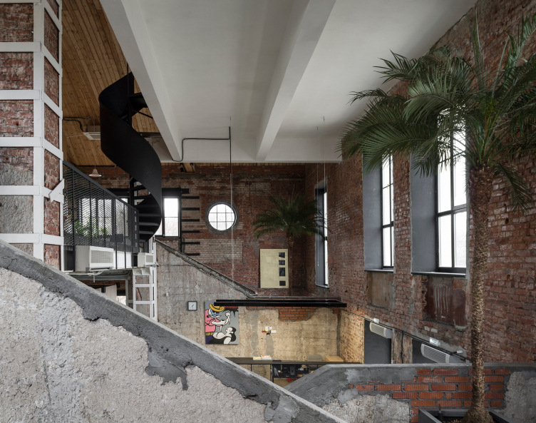
The technical audit showed that the bearing structures were significantly damaged, and the brick columns inside the building and some of the apertures were reinforced by metal staples. The roof of the building was assembled anew: the original wooden beams were not single-cut, they consisted of pieces of wood of different sizes, and were deformed; in addition, one of the beams got badly burned during the bombing in the Second World War. The new beams, the shape of which is identical to that of the original ones, are made of glued timber. The new heat-retaining roof made it possible to use the space directly underneath it as an extra story: the two new lofts are connected to the other space with two new staircases, a straight and a spiral one. During the work, two blocked windows were restored on the façade that overlooks the park, and a few small windows of the bull’s eye type.

The "Garage" headquarters in Gorky Park. FORM. Photograph © Yuri Palmin


The "Garage" headquarters in Gorky Park. FORM. Photograph © Yuri Palmin


The "Garage" headquarters in Gorky Park. FORM. Photograph © Yuri Palmin


The four floors of the headquarters are plainly visible: several working spaces are situated at different levels.

With the coming of “Garage” museum, the building aroused a lot of public interest. This is the place that guests of honor are invited to, and a place, to which creative people from all over the world come, including many famous artists and architects.

Krymsky Val 9/45. The Unknown Monument of Gorky Park. Moscow, 2018 © ABCdesign


Krymsky Val 9/45. The Unknown Monument of Gorky Park. Moscow, 2018 © ABCdesign


The fate of the ruin is a story that is yet to be continued. Possibly, the destroyed fragment of the building will take on a new independent function or it will be annexed by one of the functioning parts. Several Moscow-based architectural firms proposed their concepts trying to make out just what you can turn this ruin into but so far none of them has been implemented.

The serious research done by the authors of this book allows the architects to continue their work using the extensive knowledge about the historical context and the place that this unique building occupies in it”.

22 November 2018

Headlines now
The Golden Crown
The concept for a dental clinic in Yekaterinburg, developed by CNTR Studio, revolves around the idea of a “mouth full of gold”: pristine white porcelain stoneware walls are complemented by matte brass details. To avoid an overly literal interpretation, the architects focused on the building’s proportions, skillfully navigating between sunlight requirements and fire safety regulations.
Flexibility and Integration
Not long ago, we covered the project for the fourth phase of the ÁLIA residential complex, designed by APEX. Now, we’ve been shown different fence concepts they developed to enclose the complex’s private courtyards, incorporating a variety of public functions. We believe that the sheer fact that the complex’s architects were involved in such a detail as fencing speaks volumes.
A Step Forward
The HIDE residential complex represents a major milestone for ADM architects and their leaders Andrey Romanov and Ekaterina Kuznetsova in their quest for a fresh high-rise aesthetic – one that is flexible and layered, capable of bringing vibrancy to mass and silhouette while shaping form. Over recent years, this approach has become ADM’s “signature style”, with the golden HIDE tower playing a pivotal role in its evolution. Here, we delve into the project’s story, explore the details of the complex’s design, and uncover its core essence.
Gold in the Sands
A new office for a transcontinental company specializing in resource extraction and processing has opened in Dubai. Designed by T+T Architects, masters of creating spaces that are contemporary, diverse, flexible, and original, this project exemplifies their expertise. On the executive floor, a massive brass-clad partition dominates, while layered textures of compressed earth create a contextually resonant backdrop.
Layers and Levels of Flight
This project goes way back – Reserve Union won this architectural competition at the end of 2011, and the building was completed in 2018, so it’s practically “archival”. However, despite being relatively unknown, the building can hardly be considered “dated” and remains a prime example of architectural expression, particularly in the headquarters genre. And it’s especially fitting for an aviation company office. In some ways, it resembles the Aeroflot headquarters at Sheremetyevo but with its own unique identity, following the signature style of Vladimir Plotkin. In this article, we take an in-depth look at the United Aircraft Corporation (UAC) headquarters in the Moscow agglomeration town of Zhukovsky, supplemented by recent photographs from Alexey Naroditsky – a shoot that became only recently possible due to the fact that improvements were finally made in the surrounding area.
Light and Shadow
In this article, we delve into the architectural design of the “Chaika” house by DNK ag architects, which was recently completed in 2023 as part of the collection of signature designs at ZILArt. As is well-known, all the buildings in this complex follow a design code, yet each one is distinct. This particular building stands out not only for its whiteness and minimalism but also for the refined use of a limited number of techniques that, together, create what can confidently be called synergy.
Casus Novae
A master plan was developed for a large residential area with a name of “DNS City”, but now that its implementation began, the plan has been arbitrarily reformatted and replaced with something that, while similar on the surface, is actually quite different. This is not the first time such a thing happens, but it’s always frustrating. With permission from the author, we are sharing Maria Elkina’s post.
Treasure Hunting
The GAFA bureau, in collaboration with Tegola and Arkhitail, organized an expedition to the island of Kilpola in Karelia as part of Moskomarkhitektura’s “Open City” festival. There, amidst moss and rocks, the students sought answers to questions like: what is the sacred, where does it dwell, and what sustains it? Assisting the participants in this quest were landscape engineer Evgeny Levin, artist Nicholas Roerich, a moose, and the lack of cellular connection. Here’s how the story unfolded.
Depths of the Earth, Streams of Water
In the Malaya Okhta district, the Akzent building, designed by Stepan Liphart, was constructed. It follows a classic tripartite structure, yet it’s what you might call “hand-drawn”: each façade is unique in its form and details, some of which aren’t immediately noticeable. In this article, we explore the context and, together with the architect, delve into how the form was developed.
Fir Tree Dynamics
The “Airports of Region” holding is planning to build an airport in Karachay-Cherkessia, aiming to make the Arkhyz and Dombay resorts more accessible to travelers. The project that won in an invitation-only competition, submitted by Sergey Nikeshkin’s KPLN, blends natural imagery inspired by the shape of a conifer seed, open-air waiting spaces, majestic large trees, and a green roof elevated on needle-like columns. The result is both nature-inspired and WOW.
​A Brick Shell
In the process of designing a clubhouse situated among pine trees in a prestigious suburban area near Moscow, the architectural firm “A.Len” did the façade design part. The combination of different types of brick and masonry correlates with the volumetric and plastique solutions, further enhanced by the inclusion of wood-painted fragments and metal “glazing”.
Word Forms
ATRIUM architects love ambitious challenges, and for the firm’s thirtieth anniversary, they boldly play a game of words with an exhibition that dives deep into a self-created vocabulary. They immerse their projects – especially art installations – into this glossary, as if plunging into a current of their own. You feel as if you’re flowing through the veins of pure art, immersed in a universe of vertical cities, educational spaces – of which the architects are true masters – and the cultural codes of various locations. But what truly captivates is the bold statement that Vera Butko and Anton Nadtochy make, both through their work and this exhibition: architecture, above all, is art – the art of working with form and space.
Flexibility and Acuteness of Modernity
Luxurious, fluid, large “kokoshniks” and spiral barrel columns, as if made from colorful chewing gum: there seem to be no other mansion like this in Moscow, designed in the “Neo-Russian-Modern” style. And the “Teremok” on Malaya Kaluzhskaya, previously somewhat obscure, has “come alive with new colors” and gained visibility after its restoration for the office of the “architectural ecosystem” as the architects love to call themselves. It’s evident that Julius Borisov and the architects at UNK put their hearts into finding this new office and bringing it up to date. Let’s delve into the paradoxes of this mansion’s history and its plasticity. Spoiler: two versions of modernity meet here, both balancing on the razor’s edge of “what’s current”.
Yuri Vissarionov: “A modular house does not belong to the land”
It belongs to space, or to the air... It turns out that 3D printing is more effective when combined with a modular approach: the house is built in a workshop and then adapted to the site, including on uneven terrain. Yuri Vissarionov shares his latest experience in designing tourist complexes, both in central Russia and in the south. These include houseboats, homes printed from lightweight concrete using a 3D printer, and, of course, frame houses.
​Moscow’s First
“The quality of education largely depends on the quality of the educational environment”. This principle of the last decade has been realized by Sergey Skuratov in the project for the First Moscow Gymnasium on Rostovskaya Embankment in the Khamovniki district. The building seamlessly integrates into the complex urban landscape, responding both to the pedestrian flow of the city and the quiet alleyways. It skillfully takes advantage of the height differences and aligns with modern trends in educational space design. Let’s take a closer look.
Looking at the Water
The site of Villa Sonata stretches from the road to the water’s edge, offering its own shoreline, pier, and a picturesque river panorama. To reveal these sweeping views, Roman Leonidov “cut” the façade diagonally parallel to the river, thus getting two main axes for the house and, consequently, “two heads”. The internal core – two double-height spaces, a living room and a conservatory, with a “bridge” above them – makes the house both “transparent” and filled with light.
The White Wing
Well, it’s not exactly white. It’s more of a beige, white-stone structure that plays with the color of limestone – smoother surfaces are lighter, while rougher ones are darker. This wing unites various elements: it absorbs and interprets the surrounding themes. It responds to everything, yet maintains a cohesive expression – a challenging task! – while also incorporating recognizable features of its own, such as the dynamic cuts at the bottom, top, and middle.
Urban Dunes
The XSA Ramps team designed and built a three-part sports hub for a park in Rostov-on-Don, welcoming people of all ages and fitness levels. The skate plaza, pump track, and playground are all meticulously crafted with details that attract a diverse range of visitors. The technical execution of the shapes and slopes transforms this space into a kind of sculptural composition.
Proportional Growth
The project for the fourth phase of the ÁLIA residential area has been announced. The buildings are situated on an elongated plot – almost a “ray” that shoots out from the center of the area towards the river. Their layout reflects both a response to Moscow’s architectural preferences over the past 15 years, shifting “from blocks to towers”, and an interpretation of the neighboring business park designed by SOM. Additionally, the best apartments here are not located at the very top but closer to the middle, forming a glowing “waistline”.
The “Staircase” Building
In designing the “Details” residential complex in New Moscow, Rais Baishev spiced up the now-popular Moscow theme of a “courtyard” building with an idea drawn from the surrealist drawings by Maurits Escher. He envisioned the stepped silhouettes and descending slopes as a metaphysical mega-staircase, creating a key void within the courtyard that gave the project an internal “spine”. This concept is felt both in the building’s silhouette and on its façades.
Projection of the Quarter
No one doubted that the building that Vladimir Plotkin designed as part of the “Garden Quarters” would be the most modernist of all. And it turned out just that way: while adhering to the common design code, the building successfully combines brick and white stone, rhythmically responding to the neighboring building designed by Ostozhenka, yet tactfully and persistently making a few statements of its own. This includes the projection of the ideal urban development composition “14–9–6”, which can be found right next door, mathematical calculations, including those for various types of terraces (and perhaps the only reminder of the Soviet past of the Kauchuk rubber factory!), and the white “cross-stitch” pattern of the façade grid.
Domus Aurea
In this issue, we examine the “Tessinsky-1” house, designed by Sergey Skuratov and completed in 2023. Located in the middle of the Serebryanicheskaya Embankment district, at the intersection of its main streets, this house assumes a sort of “nodal” role: it not only responds to everything around it and preserves many memories of the former EMA factory within itself, but it weaves all this into a newly directed pattern, reconciling bright “gold” and dark-colored brick, largely with the help of the new, modern-yet-archaic Columba brick, which, come to think about it, is the most precious element here.
The Chimney of Nikola-Lenivets
In this issue, we are examining the “Obelisk House” designed by KATARSIS and built for the Arkhstoyanie 2023 festival. However, it was only finished later on, and this is why we are examining it now. It seems to us that after the “Obelisk House” appeared in Nikola-Lenivets, a dialogue and a few inner connections appeared between the temporary structures built here. These houses no longer look like “accidental neighbors”, more of which below.
​Periscope by the Bay
The jury awarded the second place in the competition for a public and cultural center in Petropavlovsk-Kamchatsky to the companies GORA (“Mountain”) and M4. In the consortium’s proposal, the building resembles a sperm whale with a calf swimming next to it or a periscope, whose lenses capture the most spectacular views from the surrounding landscape.
From Arcs to Dolmens
While working on the competition project for Petropavlovsk-Kamchatsky, ASADOV Architects prioritized the value of the natural and urban environment, aiming to preserve the balance of the location while minimizing the resemblance of the volume that they designed to a “traditional building”. The task was challenging, and the architects created three versions, one of which having been developed after the competition, where their main proposal took third place. However, the point of interest here is not the competition result but the continuity of creative thinking.
Hide and Seek
The ID Moskovskiy house, designed by Stepan Liphart in St. Petersburg, in the courtyards near Moskovskiy Avenue beyond the Obvodny Canal and recently completed, is notable for several reasons. Firstly, it has been realized with considerable accuracy, which is particularly significant as this is the first building where the architect was responsible not only for the facades but also for the layouts, allowing for better integration between the two. On the other hand, this building is interesting as an example of the “germination” of new architecture in the city: it draws on the best examples from the neighborhood and becomes an improved and developed sum of ideas found by the architect in the surrounding context.
The Big Twelve
Yesterday, the winners of the Moscow Mayor’s Architecture Award were announced and honored. Let’s take a look at what was awarded and, in some cases, even critique this esteemed award. After all, there is always room for improvement, right?
Above the Golden Horn
The residential complex “Philosophy” designed by T+T architects in Vladivostok, is one of the new projects in the “Golubinaya Pad” area, changing its development philosophy (pun intended) from single houses to a comprehensive approach. The buildings are organized along public streets, varying in height and format, with one house even executed in gallery typology, featuring a cantilever leaning on an art object.
Nuanced Alternative
How can you rhyme a square and space? Easily! But to do so, you need to rhyme everything you can possibly think of: weave everything together, like in a tensegrity structure, and find your own optics too. The new exhibition at GES-2 does just that, offering its visitor a new perspective on the history of art spanning 150 years, infused with the hope for endless multiplicity of worlds and art histories. Read on to see how this is achieved and how the exhibition design by Evgeny Ace contributes to it.
Blinds for Ice
An ice arena has been constructed in Domodedovo based on a project by Yuri Vissarionov Architects. To prevent the long façade, a technical requirement for winter sports facilities, from appearing monotonous, the architects proposed the use of suspended structures with multidirectional slats. This design protects the ice from direct sunlight while giving the wall texture and detail.