По-русски

Sports and Organics

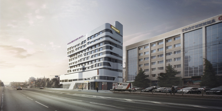
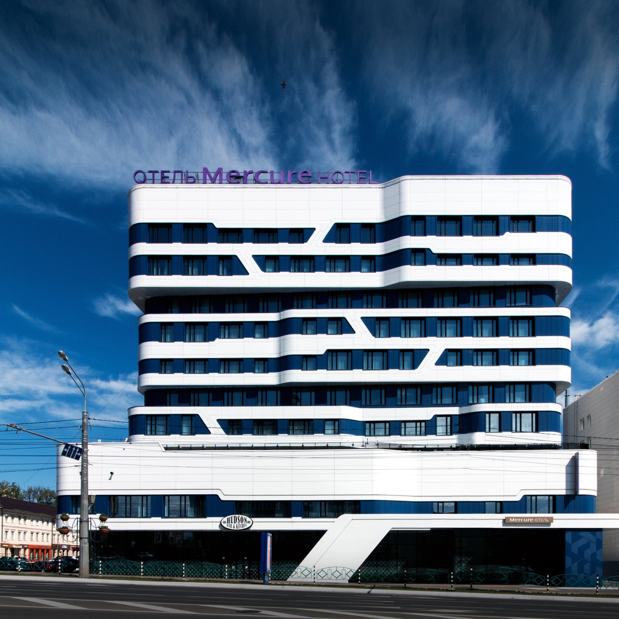
The smoothly flowing façade outlines of the Mercure Hotel in the center of Saransk, designed, among other things, to accommodate for sports teams, became the result of long discussions and searching for the right form, originally based on the architects’ desire to reinterpret the Mordovia national motifs.

10 April 2019
Object
mainImg
Architect:
Sergey Oreshkin
Firm:
A-Len
Object:
Mercure Hotel
Russia, Saransk

2014 — 2015 / 2015 — 2018

The Mercure Hotel was built in the capital of Mordovia upon the initiative of Vladimir Gribanov, the President of KS Bank and also the Vice President of the Figure Skating Federation of Russia: he wanted to make a gift to the city that welcomes not only many tourists but also many athletes, this gift being a modern hotel capable of accommodating for guest teams with an appropriate level of hotel service. While the client and the architect were still trying to come to terms, discussing what the future hotel would look like, it turned out that Russia, and Saransk, among others cities, would be hosting the World Soccer Championship. This took the project to a whole new level: it aroused the interest of the head of the republic, a vacant land site for construction was found in the center of the city, an agreement was achieved with the hotel operator Accor Hotels and consultants from Arup company were invited.

Thanks to the initiative of the Arup experts, the architects were faced with a new task that they did not get to deal with for the entire 27-year period of their company’s existence – the building was engineered to maintain itself for a certain period of time in the case of a breakdown of all the main utility lines. “We installed a diesel generator that will make it possible to light and heat the hotel rooms for three days – the architects share – There is also a small stock of drinking water – 10 cubic meters”. Of course, this cannot ensure totally independent operation of the hotel like a space station but it sure can handle unexpected breakdowns of city infrastructure.

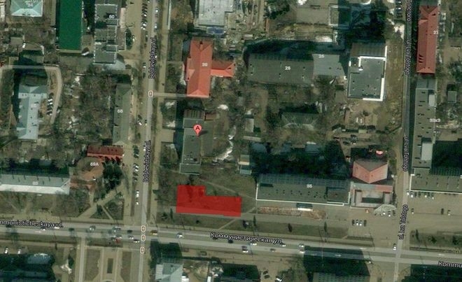
Mercure is situated in the very center of the city, at the crossing of Bolshevistskaya and Kommunisticheskaya streets, at an equal distance of 330 meters from the Church of Admiral Fedor Ushakov (who was canonized in 2000) and the bright-colored red-and-white sports complex Saransk Arena built in 2012. The hotel is surrounded on all sides by the city sites and buildings belonging to different architectural styles and epochs: the deep reddish-blue building of the music theater, the main post office with cathedral ambitions, and the building of Mordovia State University that looks very much like Moscow’s, but executed in alucobond. Headed eastward, the Kommunisticheskaya Street leads to yet another sports complex, the gigantic Mordovia Arena, built behind the Ansar River for the World Soccer Championship 2018. Therefore, for the guest athletes that come to town, the location of Mercure must be very convenient.

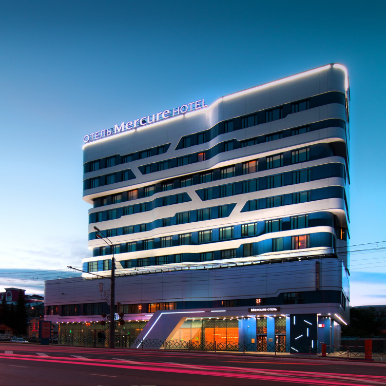
Mercure Hotel. Photograph
Copyright: © Alexander Shemetov
Mercure Hotel. Project 2014-2015
Copyright: © A.Len


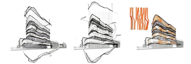
Considering the diversity, not to say garishness, of the city context, the architects made a decision to refrain from responding to the surroundings – “no matter how hard you try, you just cannot please everyone”. At the same time, though, “according to their corporate rules, Mercure hotels must reflect the culture and history of their locations” – Sergey Oreshkin shares. Therefore, the search for the right set of images, based on meditation on the national motifs of Mordovia, was hard and took quite a long time, even though the idea of a wavy façade, as we can see from the sketches, came very early on.

Mercure Hotel
Copyright: © A.Len


Mercure Hotel
Copyright: © A.Len


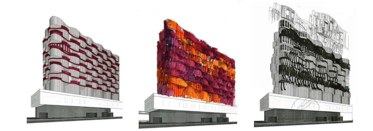
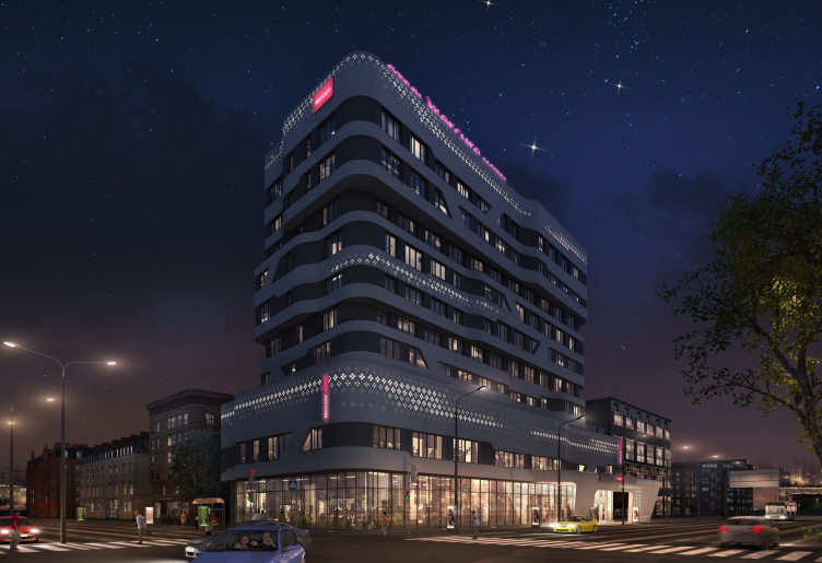
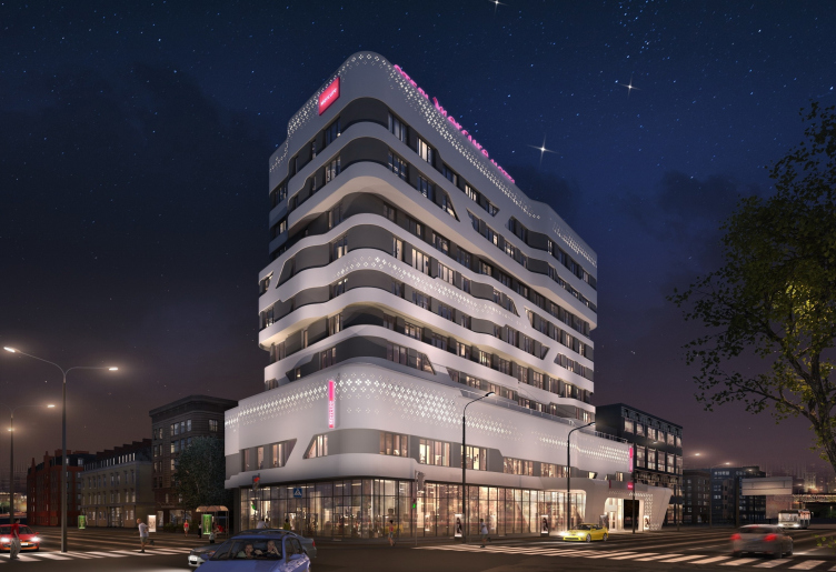
From some of the sketches, one can see that the façade could have ended up looking like a piece of red-and-white cross-stitching work or a bright smooth surface but at the board meetings with the head of republic they asked the architects to reduce the expressiveness a little.

Mercure Hotel. Project.
Copyright: © A.Len


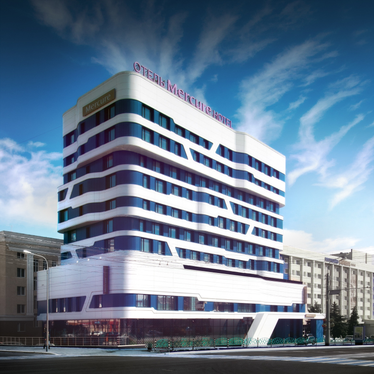
The black-and-white version did not satisfy the client either, and the architects ultimately settled on a combination of blue and white – the blue color reflecting, even if in a richer manner, the postmodernist building of the post office across the street, which still can be interpreted as a way of contextual reaction to the surroundings. The two buildings took on the role of propylaea of sorts, even though, apart from the blue color and similar height (a little under 50 meters, which is the allowed maximum for this location) they do not have anything in common – in fact, they belong to two completely different architectural styles and epochs.

Anyway, after numerous board meetings and revisions of the project, the motif of the traditional Mordovia ornaments transformed into small-sized diagonal streaks running between white horizontals. The ornamental mesh, which was supposed to be applied over the white surfaces, turned out to be prohibitively expensive and also had to go. A similar technique was successfully used by A.Len in the Russian Center of Science and Culture in Kabul, only in that case the architects covered the aluminum façades with ornaments characteristic for the white-stone Russian architecture.

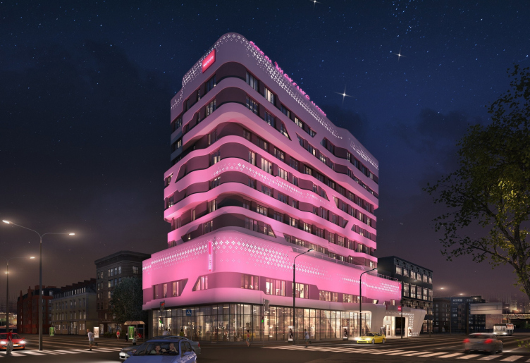
Which, by the way, is a pity because the national pattern of rhythmically grouped quatrefoils would have made the façades multidimensional, both in terms of plastique and meaning, which is quite noticeable, for example, in the pictures of night backlights that display the lights of the ornaments running over the façade strips and looking like some modern electronic characters but based on a repetition of the traditional motif.

Mercure Hotel. Project. The first version of backlighting from “Martin Light”
Copyright: © A.Len


Mercure Hotel. Project. The second version of backlighting from “Martin Light”
Copyright: © A.Len


Mercure Hotel. Project. The second version of backlighting from “Martin Light”
Copyright: © A.Len


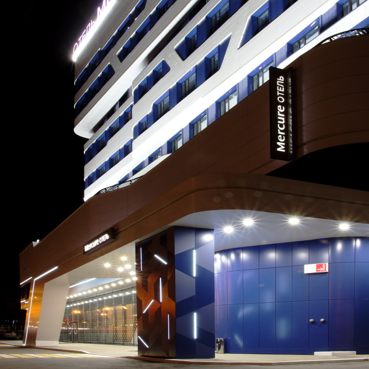
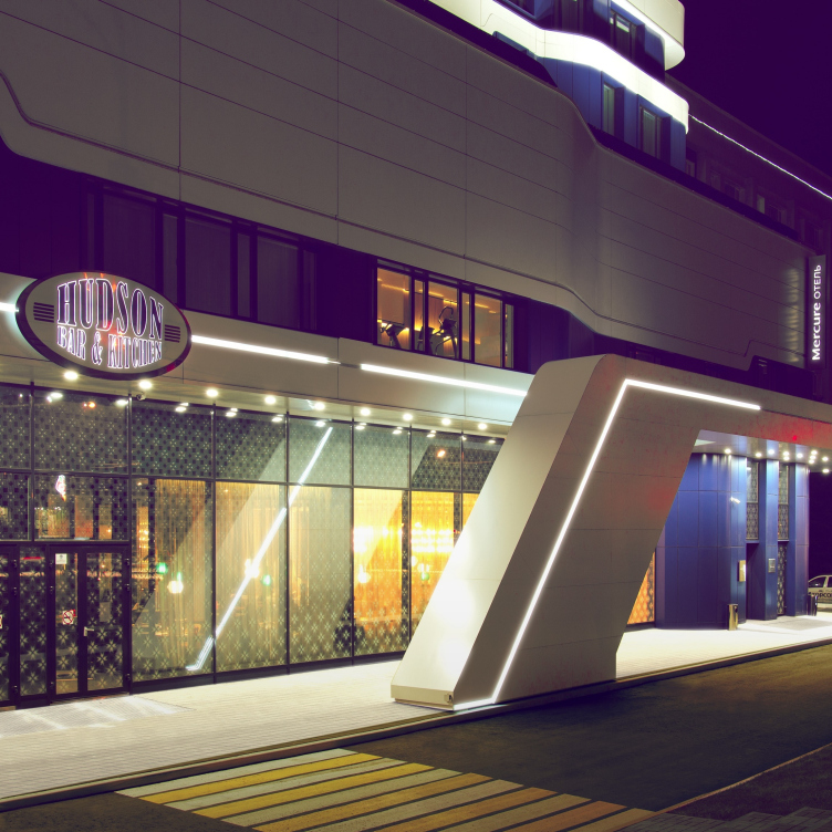
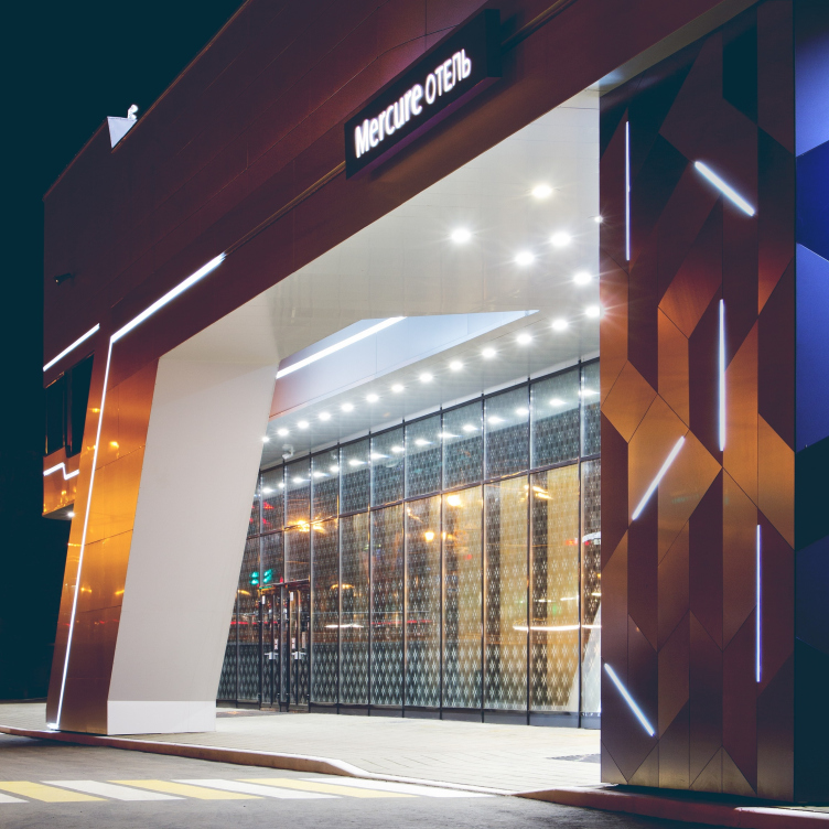
But then again, in the case of the Mercure building, the architects were able to keep the ornaments on the level of more localized and individual perception of the pedestrian or the guest’s: now we are seeing the ornaments on the pylon of the entrance group and in the print of the windows of the first floor.

Mercure Hotel. Photograph
Copyright: © Alexander Shemetov


Mercure Hotel
Copyright: © A.Len


Mercure Hotel
Copyright: © A.Len


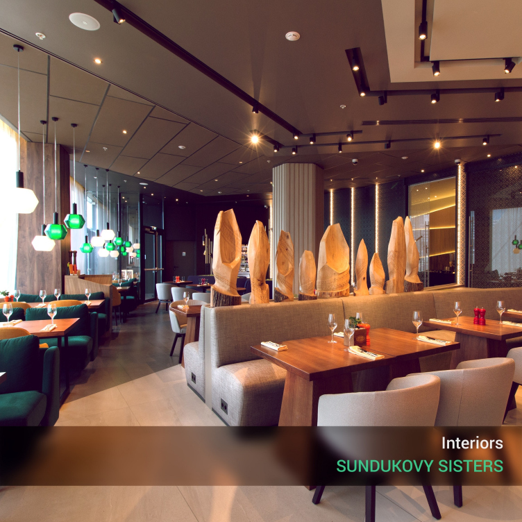
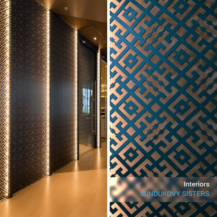
On the other hand, the national decorative theme got reflected in the interiors of the hotel’s public spaces designed by Sundukovy Sisters, Russia’s only design studio that has a license for doing interior design for the Accor chain. The architects say that their chief source of inspiration was the museum of the Mordovian sculptor Stepan Erzya, also situated two steps away from Mercure. The design and decor have a lot of wood in them, the main colors being green and brown, just like the museum’s. The foyer is decorated with wooden structures of the local artisans and the pictures from the Mordovian mythology.

Mercure Hotel, interior design
Copyright: © Sundukovy sisters. Photo courtesy by A.Len


Mercure Hotel, interior design
Copyright: © Sundukovy sisters. Photo courtesy by A.Len


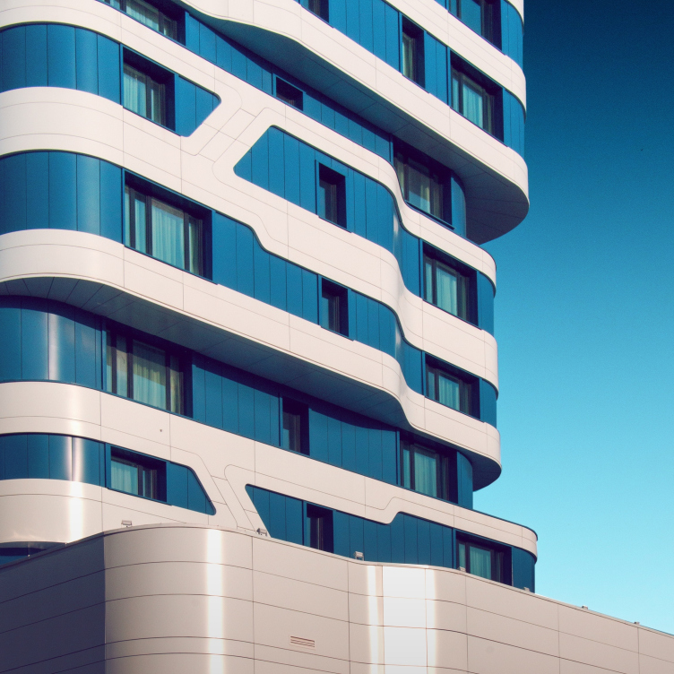
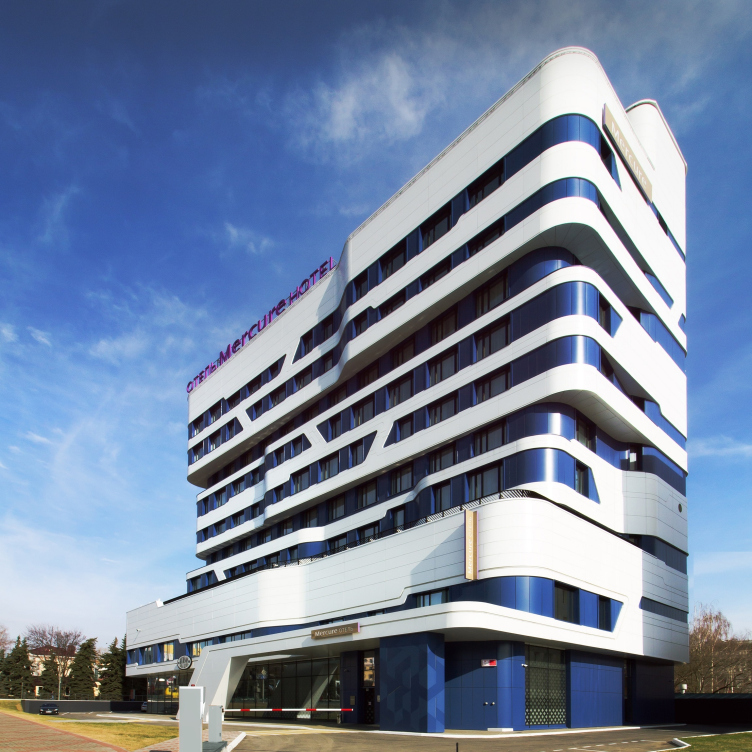
As for the façades of the building that are visible from a distance, what is left of the national Mordovian motifs in them is only the slim diagonal lintels between the corbel courses. Together they form a flexible framework whose sturdy curves outline the volume, rounding the corners and forming wave-shaped transitions.

For a person who is familiar with the context of modern architecture, Saransk’s Mercure will immediately bring up associations with Moscow’s famous Dominion tower, designed by Zaha Hadid. There are lots of similarities there, just as there are differences. What makes the two buildings look similar is the pattern of white stripes that is generally inherent in the modernist architecture, and the diagonals. But let us remember at this point that the search for the imagery of Saransk’s Mercure started with the “pleated” wavy stripes of the floors. The hotel design by Sergey Oreshkin is more compact, more vertical, and its outline is molded as being denser. The references to the business center designed by Zaha Hadid are pretty obvious yet they lie in the realm of the overall trend and the architects' urge to create a highly contemporary nonlinear shape. “Yes, I wanted to build here in the middle of Saransk a piece of bionic architecture, noticeable and completely belonging with our time” – Sergey Oreshkin says. 

The agile sculptured form is by no means cast in concrete but is realized by the wireframe and monolith method, with brick filling and aluminum sheet coating from a Russian-made composite material. At night, the building’s “power lines” are highlighted by diode backlights.

Mercure Hotel. Photograph
Copyright: © Alexander Shemetov


Mercure Hotel. Photograph
Copyright: © Alexander Shemetov


Mercure Hotel. Photograph
Copyright: © Alexander Shemetov


Mercure Hotel. Photograph
Copyright: © Alexander Shemetov


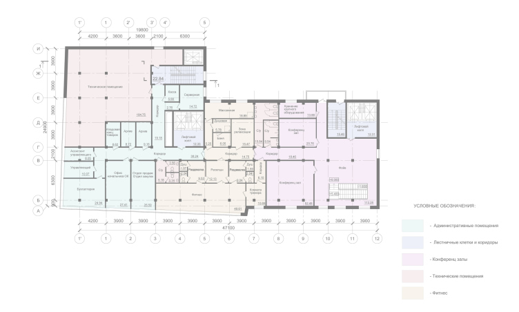
The building’s podium, which is marked by a diagonal white stela next to the entrance, is perceived as a large and broad pedestal that the building rests upon. It hosts a lobby, a restaurant and a bar, as well as a conference hall, a fitness center with a small spa, and the hotel management offices. The hotel’s seven floors are grouped into three layers separated by two dividing strips and slightly shifted in different directions – they serve as a metaphor for the three steps of the winner pedestal. The outstanding parts of the “band” host the premium-class suites – and the volumetric structure of the building reflects rather accurately its inner structure.


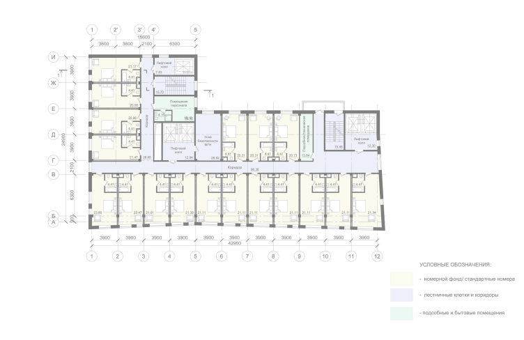
The hotel has 115 rooms in it, and, thanks to the nuances of the outlines of the outside walls and the differently sized windows, the floor plans are also pretty different: each room got an individual design of its own, also with “flowing” elements: “the work table flows into the head of the bed, which bleeds into part of the wall with a built-in bedside light” – Sergey Oreshkin explains. The smoothly flowing lines make a sharp contrast with the ornaments of triangles, squares, and hexagons on the floor, walls, and tiles. The hotel is a four-star one: it lacks two formal properties to become 5 stars: a swimming pool and a more capacious conference hall. 

According to Sergey Oreshkin, the end result is very close to the original 3D renders, and the architect is satisfied with his working with the client and with the end result as well: “We ended up getting noticeable architecture that is hot on Instagram and Pinterest, and people even ask, surprised: is this really Russia? We have three such projects – the Badminton Sports Complex, the SKA Hockey Arena and now Mercure – the brightest hotel we ever designed and built”.
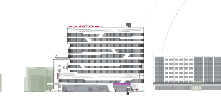
Mercure Hotel. Facade
Copyright: © A.Len
Mercure Hotel
Copyright: © A.Len
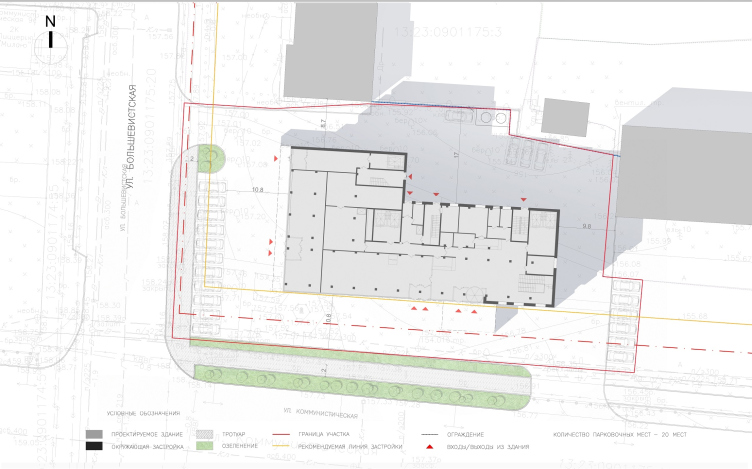
Mercure Hotel. Master plan
Copyright: © A.Len
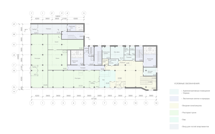
Mercure Hotel. Plan of the 1st floor
Copyright: © A.Len
Mercure Hotel. Plan of the 2nd floor
Copyright: © A.Len
Mercure Hotel. Plan of the 3-9 floor
Copyright: © A.Len
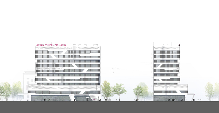
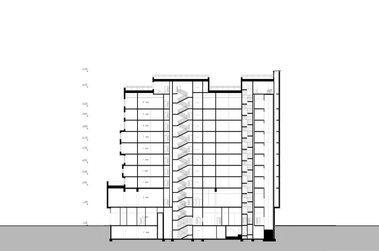
Mercure Hotel. Section view 2
Copyright: © A.Len
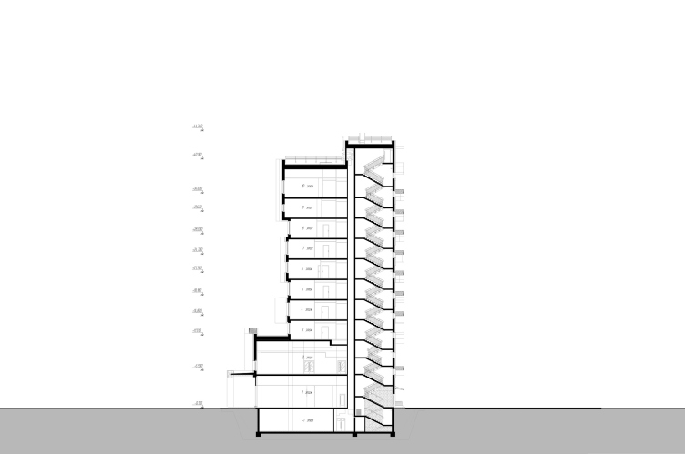
Mercure Hotel. Section view 1
Copyright: © A.Len

Architect:
Sergey Oreshkin
Firm:
A-Len
Object:
Mercure Hotel
Russia, Saransk

2014 — 2015 / 2015 — 2018

10 April 2019

Headlines now
Gold in the Sands
A new office for a transcontinental company specializing in resource extraction and processing has opened in Dubai. Designed by T+T Architects, masters of creating spaces that are contemporary, diverse, flexible, and original, this project exemplifies their expertise. On the executive floor, a massive brass-clad partition dominates, while layered textures of compressed earth create a contextually resonant backdrop.
Layers and Levels of Flight
This project goes way back – Reserve Union won this architectural competition at the end of 2011, and the building was completed in 2018, so it’s practically “archival”. However, despite being relatively unknown, the building can hardly be considered “dated” and remains a prime example of architectural expression, particularly in the headquarters genre. And it’s especially fitting for an aviation company office. In some ways, it resembles the Aeroflot headquarters at Sheremetyevo but with its own unique identity, following the signature style of Vladimir Plotkin. In this article, we take an in-depth look at the United Aircraft Corporation (UAC) headquarters in the Moscow agglomeration town of Zhukovsky, supplemented by recent photographs from Alexey Naroditsky – a shoot that became only recently possible due to the fact that improvements were finally made in the surrounding area.
Light and Shadow
In this article, we delve into the architectural design of the “Chaika” house by DNK ag architects, which was recently completed in 2023 as part of the collection of signature designs at ZILArt. As is well-known, all the buildings in this complex follow a design code, yet each one is distinct. This particular building stands out not only for its whiteness and minimalism but also for the refined use of a limited number of techniques that, together, create what can confidently be called synergy.
Casus Novae
A master plan was developed for a large residential area with a name of “DNS City”, but now that its implementation began, the plan has been arbitrarily reformatted and replaced with something that, while similar on the surface, is actually quite different. This is not the first time such a thing happens, but it’s always frustrating. With permission from the author, we are sharing Maria Elkina’s post.
Treasure Hunting
The GAFA bureau, in collaboration with Tegola and Arkhitail, organized an expedition to the island of Kilpola in Karelia as part of Moskomarkhitektura’s “Open City” festival. There, amidst moss and rocks, the students sought answers to questions like: what is the sacred, where does it dwell, and what sustains it? Assisting the participants in this quest were landscape engineer Evgeny Levin, artist Nicholas Roerich, a moose, and the lack of cellular connection. Here’s how the story unfolded.
Depths of the Earth, Streams of Water
In the Malaya Okhta district, the Akzent building, designed by Stepan Liphart, was constructed. It follows a classic tripartite structure, yet it’s what you might call “hand-drawn”: each façade is unique in its form and details, some of which aren’t immediately noticeable. In this article, we explore the context and, together with the architect, delve into how the form was developed.
Fir Tree Dynamics
The “Airports of Region” holding is planning to build an airport in Karachay-Cherkessia, aiming to make the Arkhyz and Dombay resorts more accessible to travelers. The project that won in an invitation-only competition, submitted by Sergey Nikeshkin’s KPLN, blends natural imagery inspired by the shape of a conifer seed, open-air waiting spaces, majestic large trees, and a green roof elevated on needle-like columns. The result is both nature-inspired and WOW.
​A Brick Shell
In the process of designing a clubhouse situated among pine trees in a prestigious suburban area near Moscow, the architectural firm “A.Len” did the façade design part. The combination of different types of brick and masonry correlates with the volumetric and plastique solutions, further enhanced by the inclusion of wood-painted fragments and metal “glazing”.
Word Forms
ATRIUM architects love ambitious challenges, and for the firm’s thirtieth anniversary, they boldly play a game of words with an exhibition that dives deep into a self-created vocabulary. They immerse their projects – especially art installations – into this glossary, as if plunging into a current of their own. You feel as if you’re flowing through the veins of pure art, immersed in a universe of vertical cities, educational spaces – of which the architects are true masters – and the cultural codes of various locations. But what truly captivates is the bold statement that Vera Butko and Anton Nadtochy make, both through their work and this exhibition: architecture, above all, is art – the art of working with form and space.
Flexibility and Acuteness of Modernity
Luxurious, fluid, large “kokoshniks” and spiral barrel columns, as if made from colorful chewing gum: there seem to be no other mansion like this in Moscow, designed in the “Neo-Russian-Modern” style. And the “Teremok” on Malaya Kaluzhskaya, previously somewhat obscure, has “come alive with new colors” and gained visibility after its restoration for the office of the “architectural ecosystem” as the architects love to call themselves. It’s evident that Julius Borisov and the architects at UNK put their hearts into finding this new office and bringing it up to date. Let’s delve into the paradoxes of this mansion’s history and its plasticity. Spoiler: two versions of modernity meet here, both balancing on the razor’s edge of “what’s current”.
Yuri Vissarionov: “A modular house does not belong to the land”
It belongs to space, or to the air... It turns out that 3D printing is more effective when combined with a modular approach: the house is built in a workshop and then adapted to the site, including on uneven terrain. Yuri Vissarionov shares his latest experience in designing tourist complexes, both in central Russia and in the south. These include houseboats, homes printed from lightweight concrete using a 3D printer, and, of course, frame houses.
​Moscow’s First
“The quality of education largely depends on the quality of the educational environment”. This principle of the last decade has been realized by Sergey Skuratov in the project for the First Moscow Gymnasium on Rostovskaya Embankment in the Khamovniki district. The building seamlessly integrates into the complex urban landscape, responding both to the pedestrian flow of the city and the quiet alleyways. It skillfully takes advantage of the height differences and aligns with modern trends in educational space design. Let’s take a closer look.
Looking at the Water
The site of Villa Sonata stretches from the road to the water’s edge, offering its own shoreline, pier, and a picturesque river panorama. To reveal these sweeping views, Roman Leonidov “cut” the façade diagonally parallel to the river, thus getting two main axes for the house and, consequently, “two heads”. The internal core – two double-height spaces, a living room and a conservatory, with a “bridge” above them – makes the house both “transparent” and filled with light.
The White Wing
Well, it’s not exactly white. It’s more of a beige, white-stone structure that plays with the color of limestone – smoother surfaces are lighter, while rougher ones are darker. This wing unites various elements: it absorbs and interprets the surrounding themes. It responds to everything, yet maintains a cohesive expression – a challenging task! – while also incorporating recognizable features of its own, such as the dynamic cuts at the bottom, top, and middle.
Urban Dunes
The XSA Ramps team designed and built a three-part sports hub for a park in Rostov-on-Don, welcoming people of all ages and fitness levels. The skate plaza, pump track, and playground are all meticulously crafted with details that attract a diverse range of visitors. The technical execution of the shapes and slopes transforms this space into a kind of sculptural composition.
Proportional Growth
The project for the fourth phase of the ÁLIA residential area has been announced. The buildings are situated on an elongated plot – almost a “ray” that shoots out from the center of the area towards the river. Their layout reflects both a response to Moscow’s architectural preferences over the past 15 years, shifting “from blocks to towers”, and an interpretation of the neighboring business park designed by SOM. Additionally, the best apartments here are not located at the very top but closer to the middle, forming a glowing “waistline”.
The “Staircase” Building
In designing the “Details” residential complex in New Moscow, Rais Baishev spiced up the now-popular Moscow theme of a “courtyard” building with an idea drawn from the surrealist drawings by Maurits Escher. He envisioned the stepped silhouettes and descending slopes as a metaphysical mega-staircase, creating a key void within the courtyard that gave the project an internal “spine”. This concept is felt both in the building’s silhouette and on its façades.
Projection of the Quarter
No one doubted that the building that Vladimir Plotkin designed as part of the “Garden Quarters” would be the most modernist of all. And it turned out just that way: while adhering to the common design code, the building successfully combines brick and white stone, rhythmically responding to the neighboring building designed by Ostozhenka, yet tactfully and persistently making a few statements of its own. This includes the projection of the ideal urban development composition “14–9–6”, which can be found right next door, mathematical calculations, including those for various types of terraces (and perhaps the only reminder of the Soviet past of the Kauchuk rubber factory!), and the white “cross-stitch” pattern of the façade grid.
Domus Aurea
In this issue, we examine the “Tessinsky-1” house, designed by Sergey Skuratov and completed in 2023. Located in the middle of the Serebryanicheskaya Embankment district, at the intersection of its main streets, this house assumes a sort of “nodal” role: it not only responds to everything around it and preserves many memories of the former EMA factory within itself, but it weaves all this into a newly directed pattern, reconciling bright “gold” and dark-colored brick, largely with the help of the new, modern-yet-archaic Columba brick, which, come to think about it, is the most precious element here.
The Chimney of Nikola-Lenivets
In this issue, we are examining the “Obelisk House” designed by KATARSIS and built for the Arkhstoyanie 2023 festival. However, it was only finished later on, and this is why we are examining it now. It seems to us that after the “Obelisk House” appeared in Nikola-Lenivets, a dialogue and a few inner connections appeared between the temporary structures built here. These houses no longer look like “accidental neighbors”, more of which below.
​Periscope by the Bay
The jury awarded the second place in the competition for a public and cultural center in Petropavlovsk-Kamchatsky to the companies GORA (“Mountain”) and M4. In the consortium’s proposal, the building resembles a sperm whale with a calf swimming next to it or a periscope, whose lenses capture the most spectacular views from the surrounding landscape.
From Arcs to Dolmens
While working on the competition project for Petropavlovsk-Kamchatsky, ASADOV Architects prioritized the value of the natural and urban environment, aiming to preserve the balance of the location while minimizing the resemblance of the volume that they designed to a “traditional building”. The task was challenging, and the architects created three versions, one of which having been developed after the competition, where their main proposal took third place. However, the point of interest here is not the competition result but the continuity of creative thinking.
Hide and Seek
The ID Moskovskiy house, designed by Stepan Liphart in St. Petersburg, in the courtyards near Moskovskiy Avenue beyond the Obvodny Canal and recently completed, is notable for several reasons. Firstly, it has been realized with considerable accuracy, which is particularly significant as this is the first building where the architect was responsible not only for the facades but also for the layouts, allowing for better integration between the two. On the other hand, this building is interesting as an example of the “germination” of new architecture in the city: it draws on the best examples from the neighborhood and becomes an improved and developed sum of ideas found by the architect in the surrounding context.
The Big Twelve
Yesterday, the winners of the Moscow Mayor’s Architecture Award were announced and honored. Let’s take a look at what was awarded and, in some cases, even critique this esteemed award. After all, there is always room for improvement, right?
Above the Golden Horn
The residential complex “Philosophy” designed by T+T architects in Vladivostok, is one of the new projects in the “Golubinaya Pad” area, changing its development philosophy (pun intended) from single houses to a comprehensive approach. The buildings are organized along public streets, varying in height and format, with one house even executed in gallery typology, featuring a cantilever leaning on an art object.
Nuanced Alternative
How can you rhyme a square and space? Easily! But to do so, you need to rhyme everything you can possibly think of: weave everything together, like in a tensegrity structure, and find your own optics too. The new exhibition at GES-2 does just that, offering its visitor a new perspective on the history of art spanning 150 years, infused with the hope for endless multiplicity of worlds and art histories. Read on to see how this is achieved and how the exhibition design by Evgeny Ace contributes to it.
Blinds for Ice
An ice arena has been constructed in Domodedovo based on a project by Yuri Vissarionov Architects. To prevent the long façade, a technical requirement for winter sports facilities, from appearing monotonous, the architects proposed the use of suspended structures with multidirectional slats. This design protects the ice from direct sunlight while giving the wall texture and detail.
Frozen Magma
A competition for the creation of a public and cultural center was held in Petropavlovsk-Kamchatsky. Three architectural companies made it to the final, and we consider it important to share about the work of each. Let’s start with the winner – the consortium led by Wowhaus.
Campus within a Day
In this article, we talk about what the participants of Genplan Institute of Moscow’s hackathon were doing at the MosComArchitecture booth at the “ArchMoscow” exhibition. We also discuss who won the prize and why, and what can be done with the territory of a small university on the outskirts of Moscow.
Vertical Civilization
Genpro considered the development of the vertical city concept and made it the theme of their pavilion at the “ArchMoscow” exhibition.