По-русски

​Invisible Cities

How do the architects see the perfect cities of the future, and what must be done to achieve that ideal? Below is a report from the exhibition called “Ideal and Norm” and a conference that accompanied its opening with the participation of Scandinavian architects.

13 August 2018
Report
mainImg

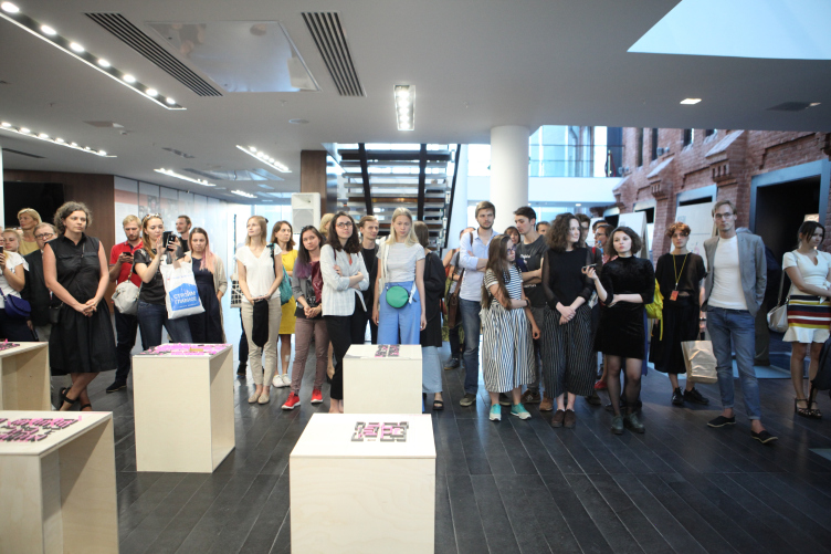
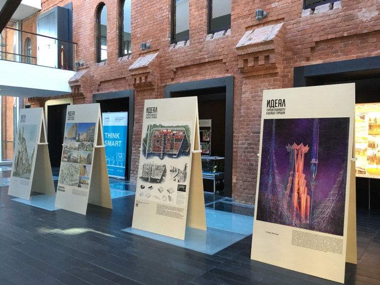
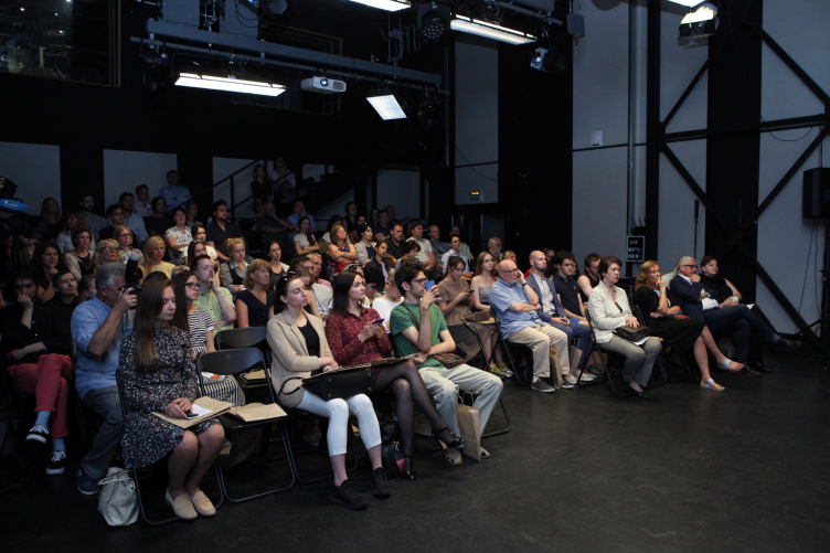
The exhibition is taking place within the framework of the annual festival called “Cities of the Future / Future of the Cities” organized by “Project Baltia” magazine in collaboration with Committee for Urban Development and Architecture of Saint-Petersburg. The festival’s venue alone – the new stage of the Alexandinsky Theater – is enough of a reason for visiting this exhibition: its light-colored hall, where the old and the new kinds of architecture meet, is the perfect place for such small-scale events. But then again, it is only the exhibition that can be considered “small-scale” – six wooden stands, one side of each displaying an image of the ideal, the other – the norm, the routine, something that we all get to deal with today. As for the conference, the media lounge did not have enough room for housing it – the audience would stand, sit on the stairs and folding chairs, just like they would at a lecture of some acclaimed professor in Sorbonne. After the first few presentations, though, one could definitely feel that it became easier to breathe, but still, such a surge of interest to the urbanist futurology is nothing but remarkable.

"Ideal and Norm" exhibition © photo by Alisa Gil


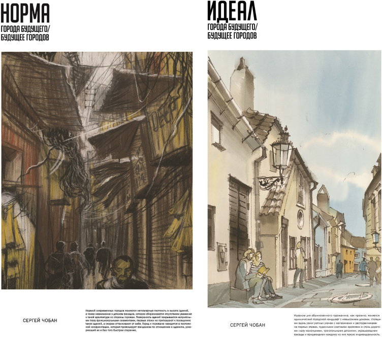
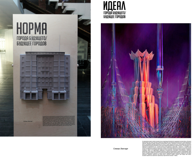
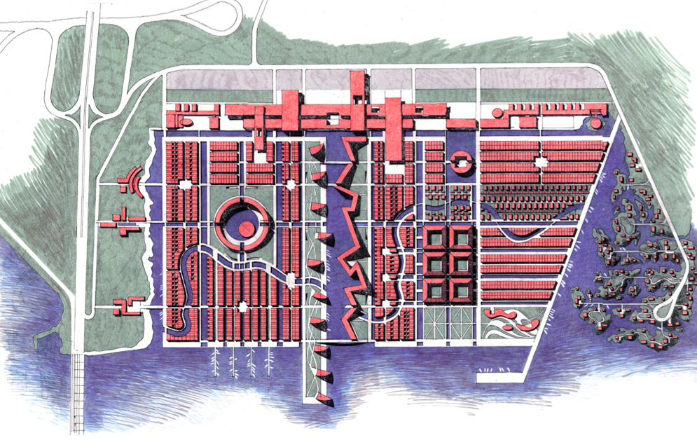
The ideas presented on the stands vary from down-to-earth and familiar things to the starry-eyed search for the absolute good. For example, Sergey Tchoban presented a pair of opposites – modern versus traditional city – showcased in the form of architectural graphics. Stepan Lipgart, on the other hand, presents the antithesis of the down-to-earth city as soaring space structures in the spirit of Kalatrava, which were shown at the conference to the accompaniment of The Poem of Ecstasy by Scriabin.

The sketch-board for the "Ideal and Norm" exhibition © Sergey Tchoban. Image courtesy by the "Project Baltia" magazine


The sketch-board for the "Ideal and Norm" exhibition © Stepan Lipgart. Reshooting the sketch-board by Alena Kuznetsova


Between them, there are more specific questions: the perfect plan of a city, a district, or a house.

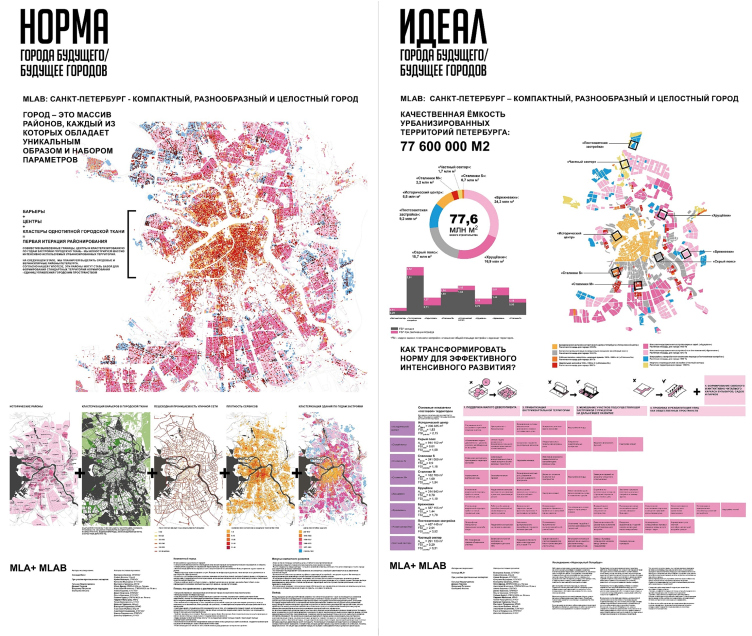
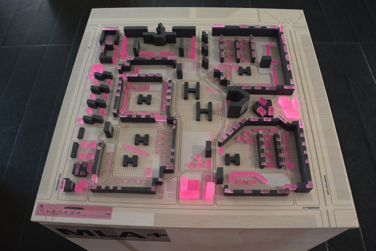
The sketch-board and the presentation by the architects of the Saint-Petersburg office of MLA+ caused a lot of controversy: they proposed that a city should be made as dense as possible. 
According to their estimates, today’s urban environment of Saint-Petersburg is quite capable of housing about 77 millions of apartments, which will make it possible to refrain from expanding the city boundaries for another decade.

“Urban densification”, however, is not quite the appropriate term. Rather, what we should speak about here is making the existing environment healthier at the expense of pinpoint introduction of multifunctional buildings that will help to form new streets and blocks and generally make a more efficient use of this or that city neighborhood.

The sketch-board for the "Ideal and Norm" exhibition © MLA +


The city was broken down into districts (about 300), and the construction was subdivided into morph types: the historical center, the gray belt, Stalin-time houses type M, Stalin-time houses type S, Khrushchev-time houses, Brezhnev-time houses, post-Soviet construction, and small privately owned cottages. The Stalin-time houses, the architects believe, almost do not need to be densified at all – they are a comfortable place to live as it is, and it is Important to keep it that way. And as for the gray belt, Khrushchev and Brezhnev-time houses, these are definitely in need of being densified because in those areas the land use efficiency index can be raised from 1.44 to 2. The problem of the absence of large vacant chunks of land is easily solved – by grinding down the typology of the “injections”. The authors studied their predecessors (от Christopher Alexander to Alexander Vysokovsky) and created something very much like a manual for working with each of the morph types.

The sketch-board for the "Ideal and Norm" exhibition © MLA +


“Studio 44” showcased their project of an ideal micro town that, regretfully, was to remain on paper – it is a housing project situated on the alluvial land next to the settlement of Gorskaya, “a model of New Amsterdam”, that Peter the Great once tried to create. One can get here by boat as well as by car, the diverse types of construction – from high-rises to low-rise residential houses and villas – creating a vibrant living environment conducive to establishing new social ties. According to Nikita Yavein, this project breaks all of the existing regulations but this is exactly the type of city to live in. In addition, “the real estate possibilities are virtually endless”, but “there is no implementing the idea proposed by Peter the Great without Peter the Great around”.

zooming
Project for the alluvial territory near Gorskaya Settlement © Studio 44


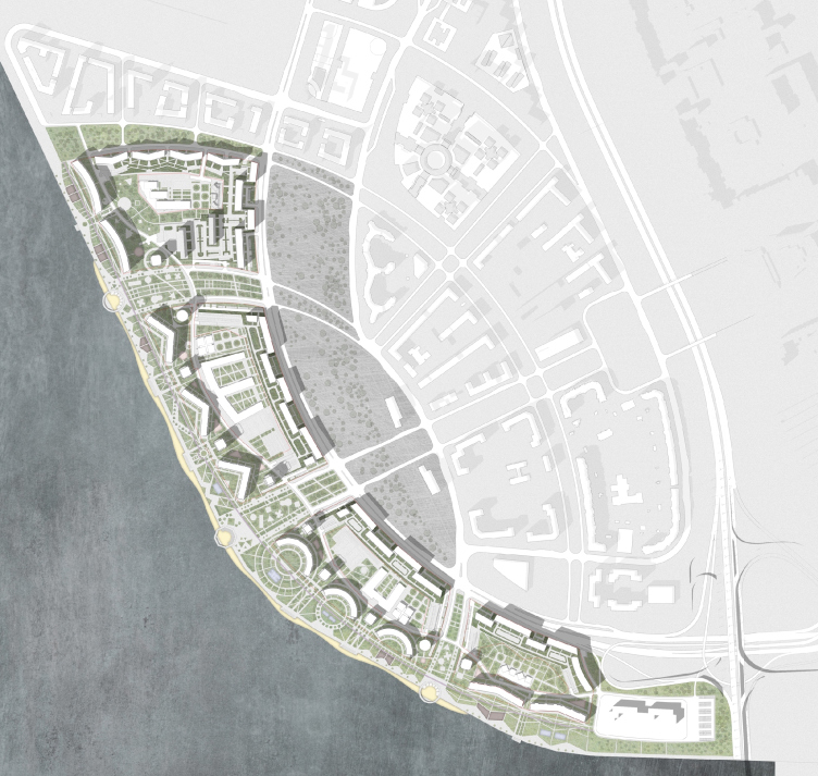
The reality is represented by the housing project situated on the alluvial waterfront of the Vasilyevsky Island, where the city-approved project of land demarcation and various rules and requirements that the architects were to meet “left no room for planning maneuvers”, while the architects’ work ended up turning into an “endless mathematical hassle”. At the same time, meeting the requirements does not at all guarantee a great result – most of the time, it’s the other way around: for example, the preceding project complied to all the norms and specifications but, instead of a park, the waterfront got a four-lane highway running through it.

The concept for building on the alluvial lands in the west prt of the Vasilyevsky Island © Studio 44


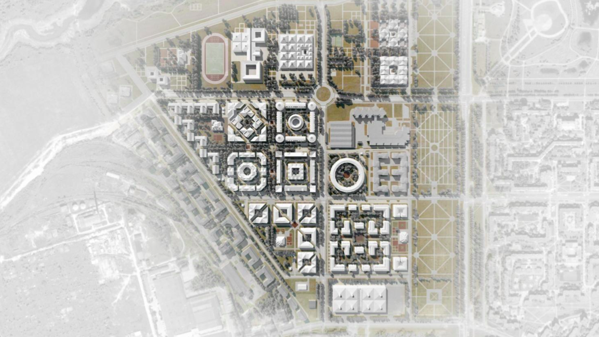
At the conference, Nikita Yavein also showed the project of a “micro district” in the town of Pushkin, located in the Saint Petersburg area, that was inspired by the “coppiced layout” of a regular park – which is essentially a “compromise between normal city blocks and the existing rules and regulations”.

zooming
Master plan. A residential area in Pushkin © Studio 44


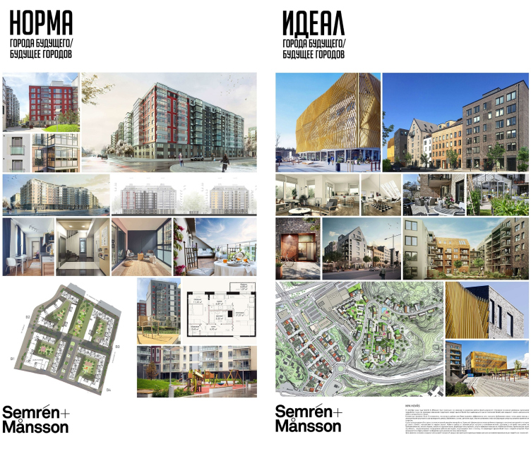
At the stand of the Swedish office Semrén & Månsson, the pair “ideal/norm” turned out slightly offensive to this country: the ideal was essentially presented by a housing project in Goteborg, while the norm – by Skandy Klubb, recently built in Saint Petersburg. On the other hand, it’s certainly a relief to know that the principles of Swedish housing architecture have long since become “the norm” in this country: the detailed and diverse façades, the hierarchy of private and public spaces, as well as the multifunctional character of the latter. The owner of the firm, Magnus Monsson, admitted that, although a conflict with the Russian norms did take place, the architects still were able to implement everything that they intended to. Construction norms, he says, are mandatory to comply with, albeit they are by definition doomed to always lag behind the real life.

The sketch-board for the "Ideal and Norm" exhibition © Semrén & Månsson. Image courtesy by the "Project Baltia" magazine


zooming
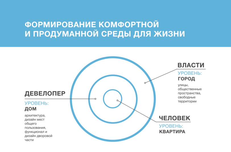
The sketch-board for the "Ideal and Norm" exhibition © Committee for City Planning and Architecture. Image courtesy by the "Project Baltia" magazine


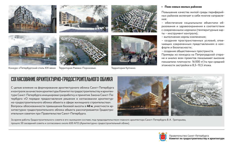
A little apart stands the stand of the Committee for City Planning and Architecture that displays its achievements: a program of preserving the historical center of the city and reforming its “gray belt”, coordinating the issues of maintaining the architectural image of the new buildings and improving their quality, and a program of integrated development of Saint Petersburg and the Leningrad region. Judging by this project, all one has to do in order to achieve the ideal is to impose the appropriate regulations upon the height of the construction, thus “repairing the omissions in the city’s silhouette”.

zooming
Part of the presentation of LEGENDA Intelligent Development for the "Ideal and Norm" exhibition © LEGENDA Intelligent Development. Image courtesy by the "Project Baltia" magazine


The theme set by the exhibition was also explored by the guest expert speakers.

The marketing director of LEGENDA Intelligent Development, Vsevolod Glazunov, claimed that we all would get closer to the ideal once the standards of the municipal environment get closer to those of advanced developer companies. What we are getting most of the time is “city turned inside out” – there are plenty of examples of great urban environment but all too often they are inaccessible to city people, being of a resident-only quality. Currently, the developers cannot even begin to design the non-barrier environment because by the beginning of the construction the city cannot do so much as specify the height of the level of the future streets.

zooming
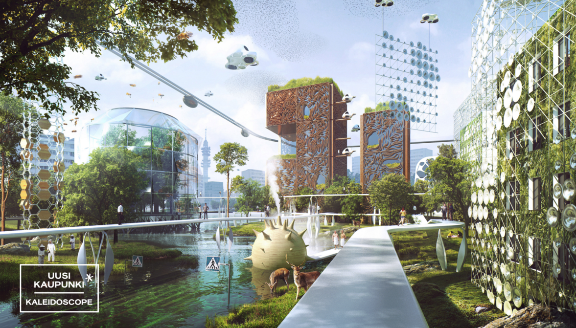
Helsinki 2000. Part of the presentation of Uusikaupunki for the "Ideal and Norm" exhibition © Uusikaupunki. Image courtesy by the "Project Baltia" magazine


The architect Miia-Liina Tommila, who works for three offices at once: Tommila Architects, Kaleidoscope, and Uusikaupunki, shared about the project of the perfect residential areas of 2100 that her team did in collaboration with futurology scientists for the municipality of Helsinki. What they ultimately got was a utopia that ruled out just about any threat or difficulty – just as the client wanted.

The city of the future consists of flexible “branded” districts: people who now have more free time on their hands, and whose work is not tied to any specific point in space, can now choose the district that best fits their tastes and lifestyle. The central square is covered by a “cloud” bubble of nanoparticles that maintains a healthy climate. All the new buildings are living organisms that exist in symbiosis with their users. They react to environment changes, control the water and power consumption, can independently “grow” a balcony on them should such need arise, and even prompt an elderly person where to find company. The traffic is predominantly vertical, the elderly people move around on hover boards, while reindeer roam the now-unused parking lots.

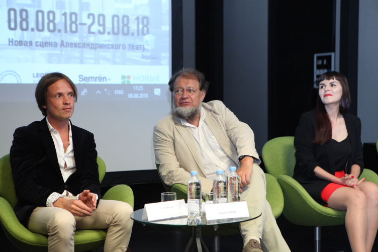
"Ideal and Norm" exhibition: Stepan Lipgart, Nikita yavein, Alina Chereiskaya © photo by Alisa Gil


In reality, the Uusikaupunki architects are practicing “design sprints”, i.e. intensive workshops, to which they invite experts and active citizens who are related to the future construction in one way or another. After the discussions, the architects create visualizations, giving shape to the ideas in question. In this process, the ideal is molded by the city people themselves, the architects getting a great chance to “get out of the ivory tower”.

Resonant to these ideas was the presentation by the editor in chief of RBC Saint Petersburg, Elena Krom: a city of common sense must welcome the opinion of active citizens (or the “perfect” citizens, for that matter, like Alexander Karpov), on whose behalf the architects can manage the city. The public opinion forms the demand, and the developers form the offer.

The architect and partner of SA Lab Alina Chereiskaya presented a concept of an adaptive city, in which the architecture is also sensitive to the information inflow. According to the architect, there is no more need to build “for ages to come” – the buildings must learn to quickly react to people’s needs: grow bigger or “shrink” without affecting the landscape, changing their image or even function.

zooming
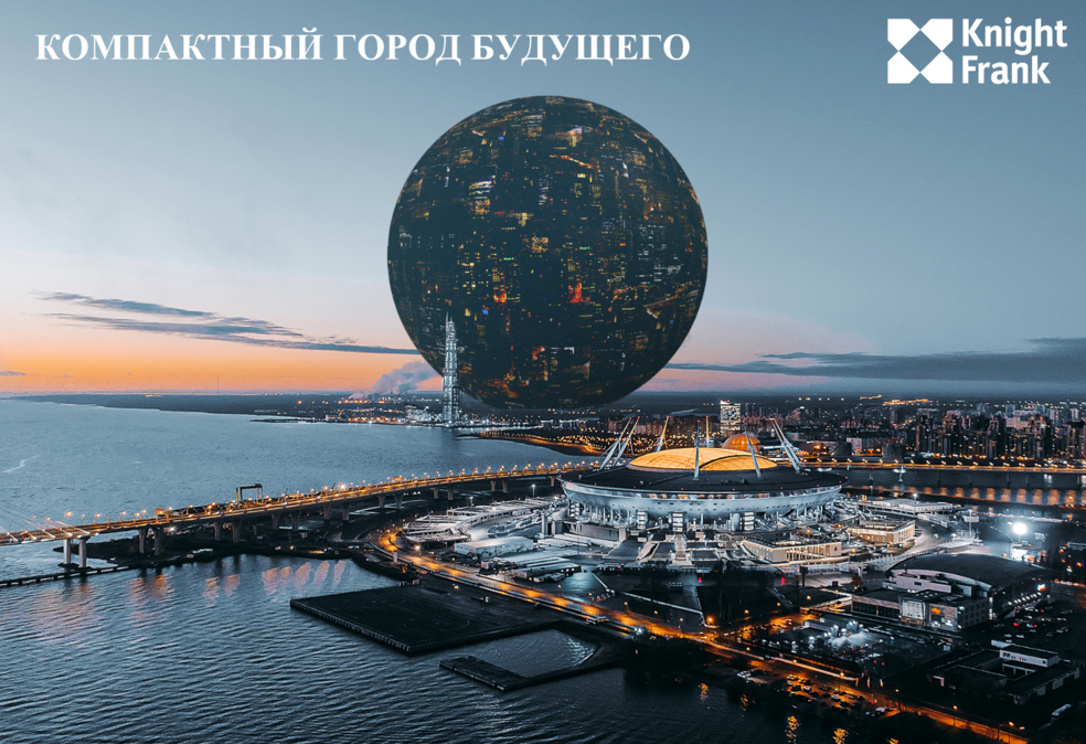
Part of the presentation of Knight Frank for the "Ideal and Norm" exhibition © Knight Frank. Image courtesy by the "Project Baltia" magazine


For solving the problem of extensiveness of the modern cities, the General Director of Knight Frank, Nikolai Pashkov, proposed “radical architectural futurism”, as the moderator of the conference Vladimir Frolov termed it: a huge ball with a 1.5 kilometer diameter. It is capable of hosting virtually everything, and it will only have one point of connection with the surface.

"Ideal and Norm" exhibition © photo by Alisa Gil


The director of the ECOM expertise center Alexander Karpov was surprised that all of the speakers presented their version of the perfect city that was all about human beings but none of the projects provided for either waste disposal or any industrial facilities. To him, an eco-friendly city is the one that consumes little resources and occupies little territory. Meaning – compact and so comfortable that people will not want to go beyond its confines and infringe upon nature, which in his project exists independently as a biological shell that supports the existence of the human beings.

“Ideal and Norm” exhibition © photo by Alena Kuznetsova


There was only one speaker who spoke in favor of all the norms and standards unreservedly, and that was the chief architect of Saint-Petersburg, Vladimir Grigoryev: “Ideal and norm are not at odds with each other, when the norm serves as the basis – skillful hands will turn anything into ideal”

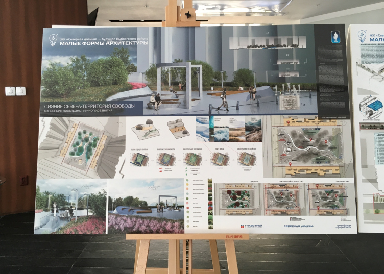
A separate part of the exposition displays the best land improvement projects prepared for the competition of young architects named “North Valley – the Future of the Vyborg District”, organized by the magazine “Project Baltia” and the company “Glavstroy SPB”.


13 August 2018

Headlines now
The Golden Crown
The concept for a dental clinic in Yekaterinburg, developed by CNTR Studio, revolves around the idea of a “mouth full of gold”: pristine white porcelain stoneware walls are complemented by matte brass details. To avoid an overly literal interpretation, the architects focused on the building’s proportions, skillfully navigating between sunlight requirements and fire safety regulations.
Flexibility and Integration
Not long ago, we covered the project for the fourth phase of the ÁLIA residential complex, designed by APEX. Now, we’ve been shown different fence concepts they developed to enclose the complex’s private courtyards, incorporating a variety of public functions. We believe that the sheer fact that the complex’s architects were involved in such a detail as fencing speaks volumes.
A Step Forward
The HIDE residential complex represents a major milestone for ADM architects and their leaders Andrey Romanov and Ekaterina Kuznetsova in their quest for a fresh high-rise aesthetic – one that is flexible and layered, capable of bringing vibrancy to mass and silhouette while shaping form. Over recent years, this approach has become ADM’s “signature style”, with the golden HIDE tower playing a pivotal role in its evolution. Here, we delve into the project’s story, explore the details of the complex’s design, and uncover its core essence.
Gold in the Sands
A new office for a transcontinental company specializing in resource extraction and processing has opened in Dubai. Designed by T+T Architects, masters of creating spaces that are contemporary, diverse, flexible, and original, this project exemplifies their expertise. On the executive floor, a massive brass-clad partition dominates, while layered textures of compressed earth create a contextually resonant backdrop.
Layers and Levels of Flight
This project goes way back – Reserve Union won this architectural competition at the end of 2011, and the building was completed in 2018, so it’s practically “archival”. However, despite being relatively unknown, the building can hardly be considered “dated” and remains a prime example of architectural expression, particularly in the headquarters genre. And it’s especially fitting for an aviation company office. In some ways, it resembles the Aeroflot headquarters at Sheremetyevo but with its own unique identity, following the signature style of Vladimir Plotkin. In this article, we take an in-depth look at the United Aircraft Corporation (UAC) headquarters in the Moscow agglomeration town of Zhukovsky, supplemented by recent photographs from Alexey Naroditsky – a shoot that became only recently possible due to the fact that improvements were finally made in the surrounding area.
Light and Shadow
In this article, we delve into the architectural design of the “Chaika” house by DNK ag architects, which was recently completed in 2023 as part of the collection of signature designs at ZILArt. As is well-known, all the buildings in this complex follow a design code, yet each one is distinct. This particular building stands out not only for its whiteness and minimalism but also for the refined use of a limited number of techniques that, together, create what can confidently be called synergy.
Casus Novae
A master plan was developed for a large residential area with a name of “DNS City”, but now that its implementation began, the plan has been arbitrarily reformatted and replaced with something that, while similar on the surface, is actually quite different. This is not the first time such a thing happens, but it’s always frustrating. With permission from the author, we are sharing Maria Elkina’s post.
Treasure Hunting
The GAFA bureau, in collaboration with Tegola and Arkhitail, organized an expedition to the island of Kilpola in Karelia as part of Moskomarkhitektura’s “Open City” festival. There, amidst moss and rocks, the students sought answers to questions like: what is the sacred, where does it dwell, and what sustains it? Assisting the participants in this quest were landscape engineer Evgeny Levin, artist Nicholas Roerich, a moose, and the lack of cellular connection. Here’s how the story unfolded.
Depths of the Earth, Streams of Water
In the Malaya Okhta district, the Akzent building, designed by Stepan Liphart, was constructed. It follows a classic tripartite structure, yet it’s what you might call “hand-drawn”: each façade is unique in its form and details, some of which aren’t immediately noticeable. In this article, we explore the context and, together with the architect, delve into how the form was developed.
Fir Tree Dynamics
The “Airports of Region” holding is planning to build an airport in Karachay-Cherkessia, aiming to make the Arkhyz and Dombay resorts more accessible to travelers. The project that won in an invitation-only competition, submitted by Sergey Nikeshkin’s KPLN, blends natural imagery inspired by the shape of a conifer seed, open-air waiting spaces, majestic large trees, and a green roof elevated on needle-like columns. The result is both nature-inspired and WOW.
​A Brick Shell
In the process of designing a clubhouse situated among pine trees in a prestigious suburban area near Moscow, the architectural firm “A.Len” did the façade design part. The combination of different types of brick and masonry correlates with the volumetric and plastique solutions, further enhanced by the inclusion of wood-painted fragments and metal “glazing”.
Word Forms
ATRIUM architects love ambitious challenges, and for the firm’s thirtieth anniversary, they boldly play a game of words with an exhibition that dives deep into a self-created vocabulary. They immerse their projects – especially art installations – into this glossary, as if plunging into a current of their own. You feel as if you’re flowing through the veins of pure art, immersed in a universe of vertical cities, educational spaces – of which the architects are true masters – and the cultural codes of various locations. But what truly captivates is the bold statement that Vera Butko and Anton Nadtochy make, both through their work and this exhibition: architecture, above all, is art – the art of working with form and space.
Flexibility and Acuteness of Modernity
Luxurious, fluid, large “kokoshniks” and spiral barrel columns, as if made from colorful chewing gum: there seem to be no other mansion like this in Moscow, designed in the “Neo-Russian-Modern” style. And the “Teremok” on Malaya Kaluzhskaya, previously somewhat obscure, has “come alive with new colors” and gained visibility after its restoration for the office of the “architectural ecosystem” as the architects love to call themselves. It’s evident that Julius Borisov and the architects at UNK put their hearts into finding this new office and bringing it up to date. Let’s delve into the paradoxes of this mansion’s history and its plasticity. Spoiler: two versions of modernity meet here, both balancing on the razor’s edge of “what’s current”.
Yuri Vissarionov: “A modular house does not belong to the land”
It belongs to space, or to the air... It turns out that 3D printing is more effective when combined with a modular approach: the house is built in a workshop and then adapted to the site, including on uneven terrain. Yuri Vissarionov shares his latest experience in designing tourist complexes, both in central Russia and in the south. These include houseboats, homes printed from lightweight concrete using a 3D printer, and, of course, frame houses.
​Moscow’s First
“The quality of education largely depends on the quality of the educational environment”. This principle of the last decade has been realized by Sergey Skuratov in the project for the First Moscow Gymnasium on Rostovskaya Embankment in the Khamovniki district. The building seamlessly integrates into the complex urban landscape, responding both to the pedestrian flow of the city and the quiet alleyways. It skillfully takes advantage of the height differences and aligns with modern trends in educational space design. Let’s take a closer look.
Looking at the Water
The site of Villa Sonata stretches from the road to the water’s edge, offering its own shoreline, pier, and a picturesque river panorama. To reveal these sweeping views, Roman Leonidov “cut” the façade diagonally parallel to the river, thus getting two main axes for the house and, consequently, “two heads”. The internal core – two double-height spaces, a living room and a conservatory, with a “bridge” above them – makes the house both “transparent” and filled with light.
The White Wing
Well, it’s not exactly white. It’s more of a beige, white-stone structure that plays with the color of limestone – smoother surfaces are lighter, while rougher ones are darker. This wing unites various elements: it absorbs and interprets the surrounding themes. It responds to everything, yet maintains a cohesive expression – a challenging task! – while also incorporating recognizable features of its own, such as the dynamic cuts at the bottom, top, and middle.
Urban Dunes
The XSA Ramps team designed and built a three-part sports hub for a park in Rostov-on-Don, welcoming people of all ages and fitness levels. The skate plaza, pump track, and playground are all meticulously crafted with details that attract a diverse range of visitors. The technical execution of the shapes and slopes transforms this space into a kind of sculptural composition.
Proportional Growth
The project for the fourth phase of the ÁLIA residential area has been announced. The buildings are situated on an elongated plot – almost a “ray” that shoots out from the center of the area towards the river. Their layout reflects both a response to Moscow’s architectural preferences over the past 15 years, shifting “from blocks to towers”, and an interpretation of the neighboring business park designed by SOM. Additionally, the best apartments here are not located at the very top but closer to the middle, forming a glowing “waistline”.
The “Staircase” Building
In designing the “Details” residential complex in New Moscow, Rais Baishev spiced up the now-popular Moscow theme of a “courtyard” building with an idea drawn from the surrealist drawings by Maurits Escher. He envisioned the stepped silhouettes and descending slopes as a metaphysical mega-staircase, creating a key void within the courtyard that gave the project an internal “spine”. This concept is felt both in the building’s silhouette and on its façades.
Projection of the Quarter
No one doubted that the building that Vladimir Plotkin designed as part of the “Garden Quarters” would be the most modernist of all. And it turned out just that way: while adhering to the common design code, the building successfully combines brick and white stone, rhythmically responding to the neighboring building designed by Ostozhenka, yet tactfully and persistently making a few statements of its own. This includes the projection of the ideal urban development composition “14–9–6”, which can be found right next door, mathematical calculations, including those for various types of terraces (and perhaps the only reminder of the Soviet past of the Kauchuk rubber factory!), and the white “cross-stitch” pattern of the façade grid.
Domus Aurea
In this issue, we examine the “Tessinsky-1” house, designed by Sergey Skuratov and completed in 2023. Located in the middle of the Serebryanicheskaya Embankment district, at the intersection of its main streets, this house assumes a sort of “nodal” role: it not only responds to everything around it and preserves many memories of the former EMA factory within itself, but it weaves all this into a newly directed pattern, reconciling bright “gold” and dark-colored brick, largely with the help of the new, modern-yet-archaic Columba brick, which, come to think about it, is the most precious element here.
The Chimney of Nikola-Lenivets
In this issue, we are examining the “Obelisk House” designed by KATARSIS and built for the Arkhstoyanie 2023 festival. However, it was only finished later on, and this is why we are examining it now. It seems to us that after the “Obelisk House” appeared in Nikola-Lenivets, a dialogue and a few inner connections appeared between the temporary structures built here. These houses no longer look like “accidental neighbors”, more of which below.
​Periscope by the Bay
The jury awarded the second place in the competition for a public and cultural center in Petropavlovsk-Kamchatsky to the companies GORA (“Mountain”) and M4. In the consortium’s proposal, the building resembles a sperm whale with a calf swimming next to it or a periscope, whose lenses capture the most spectacular views from the surrounding landscape.
From Arcs to Dolmens
While working on the competition project for Petropavlovsk-Kamchatsky, ASADOV Architects prioritized the value of the natural and urban environment, aiming to preserve the balance of the location while minimizing the resemblance of the volume that they designed to a “traditional building”. The task was challenging, and the architects created three versions, one of which having been developed after the competition, where their main proposal took third place. However, the point of interest here is not the competition result but the continuity of creative thinking.
Hide and Seek
The ID Moskovskiy house, designed by Stepan Liphart in St. Petersburg, in the courtyards near Moskovskiy Avenue beyond the Obvodny Canal and recently completed, is notable for several reasons. Firstly, it has been realized with considerable accuracy, which is particularly significant as this is the first building where the architect was responsible not only for the facades but also for the layouts, allowing for better integration between the two. On the other hand, this building is interesting as an example of the “germination” of new architecture in the city: it draws on the best examples from the neighborhood and becomes an improved and developed sum of ideas found by the architect in the surrounding context.
The Big Twelve
Yesterday, the winners of the Moscow Mayor’s Architecture Award were announced and honored. Let’s take a look at what was awarded and, in some cases, even critique this esteemed award. After all, there is always room for improvement, right?
Above the Golden Horn
The residential complex “Philosophy” designed by T+T architects in Vladivostok, is one of the new projects in the “Golubinaya Pad” area, changing its development philosophy (pun intended) from single houses to a comprehensive approach. The buildings are organized along public streets, varying in height and format, with one house even executed in gallery typology, featuring a cantilever leaning on an art object.
Nuanced Alternative
How can you rhyme a square and space? Easily! But to do so, you need to rhyme everything you can possibly think of: weave everything together, like in a tensegrity structure, and find your own optics too. The new exhibition at GES-2 does just that, offering its visitor a new perspective on the history of art spanning 150 years, infused with the hope for endless multiplicity of worlds and art histories. Read on to see how this is achieved and how the exhibition design by Evgeny Ace contributes to it.
Blinds for Ice
An ice arena has been constructed in Domodedovo based on a project by Yuri Vissarionov Architects. To prevent the long façade, a technical requirement for winter sports facilities, from appearing monotonous, the architects proposed the use of suspended structures with multidirectional slats. This design protects the ice from direct sunlight while giving the wall texture and detail.