По-русски

​Theater Town

The second stage of Boris Eifman Dance Academy is constructed around a theater building, its space “spinning” around the architectural scenery of the “little town” of the atrium. The result looks like a Russian Matryoshka doll: a theater within a city, and then a little town within a theater, all of this forming a dance school – a very effective way of organizing the space.

05 June 2019
Object
mainImg

Out of all the Russian architectural companies, Studio 44 alone has been able so far to score victories in the contests of WAF international architecture festival; in 2015, the architects got this prestigious award for the project of Boris Eifman Dance Academy on the Lisa Chaikina Street in Saint Petersburg. Currently, Studio 44 is finishing the second stage of the campus of the Dance Academy.

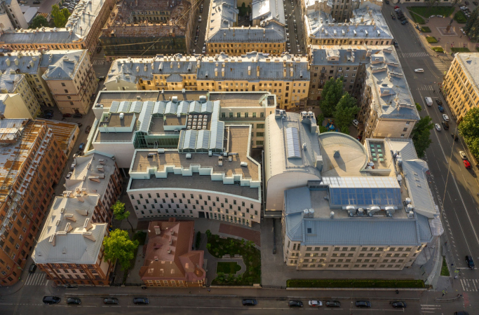
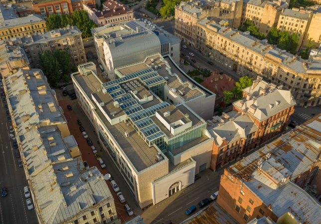
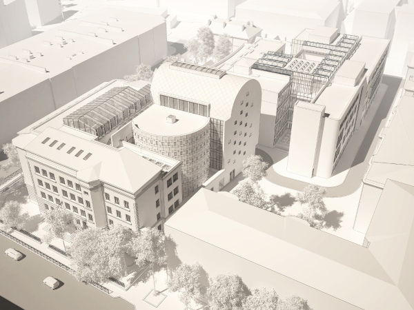
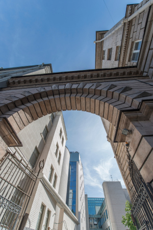
The campus is situated on the Petrograd Side, next to the crossing of Lisa Chaikina and the Bolshaya Pushkarskaya streets, where the space for new construction is rather limited. Its northwest border is constituted by a string of tenement houses plus one “Stalin” building at Bolshaya Pushkarskaya, 14. There is also the surviving mansion of Julia Dobbert, a fine example of wooden modernist architecture, which neighbors on a brick pseudo-gothic tenement house that she also owned. The first stage of the Dance Academy, built in 2011-2013, lies almost completely in the yard, only a small reconstructed fragment peeking out to the Lisa Chaikina Street – a neo empire exedra, a reminder of the cinematography of the early XX century. Its background – a wall with brick QR codes that contain famous quotes about ballet, the side end of an elongated building stretching into the depth of the block, whose atrium is a tall beautiful-looking “ravine” that seems to be calling you up and forward – has scored numerous professional awards. To the right, in the very middle of the yard, the rehearsal building gets wider, joined by the student dormitory.

Boris Eifman Dance Academy, 2nd stage. Foyer
Copyright: Photograph © Margarita Yavein
  • zooming
    1 / 3
    Boris Eifman Dance Academy, 2nd stage
    Copyright: Photograph © Alexander Medvedkov
  • zooming
    2 / 3
    Boris Eifman Dance Academy, 2nd stage. Project
    Copyright: Photograph © Margarita Yavein
  • zooming
    3 / 3
    Boris Eifman Dance Academy, 2nd stage. Project
    Copyright: Photograph © Margarita Yavein


The Academy opened in 2013, and already next year the city handed over to it yet another building standing on the territory of the same block – School №91 standing at the crossing of the Vvedenskaya and Bolshaya Pushkarskaya streets. The school itself was then accommodated at the Sytninskaya Square, and Studio 44 got down to the project of the second stage of the complex, within the framework of which the Academy was to get a renovated building for general education program with modern classrooms and a large stage supporting fully-fledged theater performances with an auditorium for 400 people – essentially, a real theater, which, we must admit, is only natural for such a professional educational institution as Boris Eifman Dance Academy.

Boris Eifman Dance Academy, 2nd stage. Plan
Copyright: © Studio 44


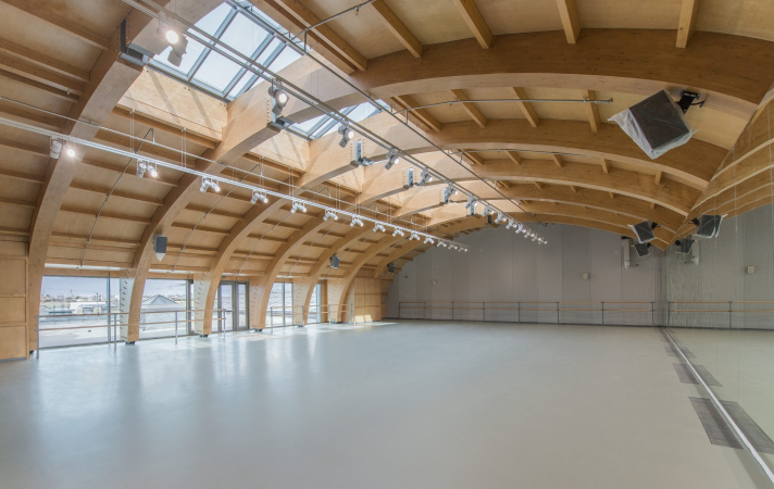
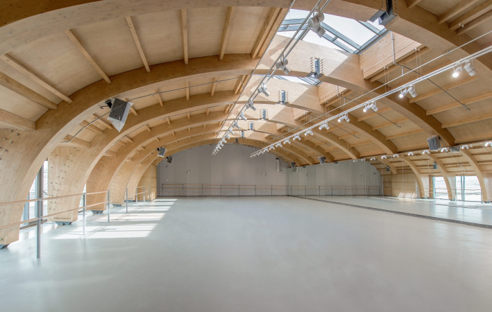
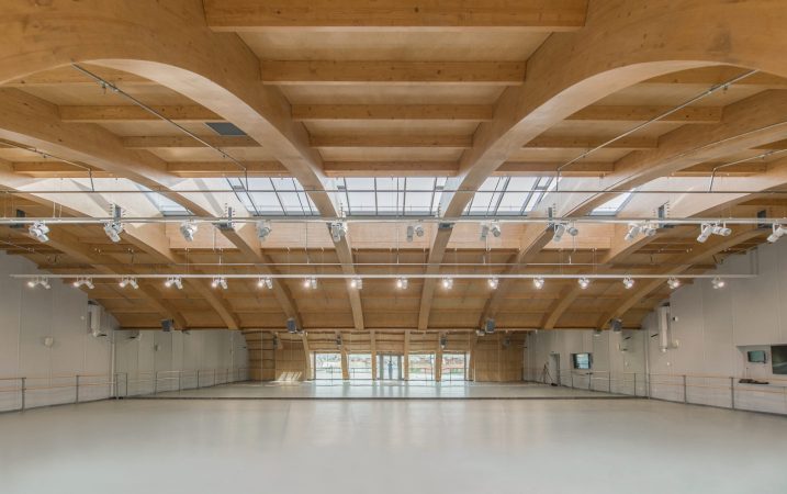
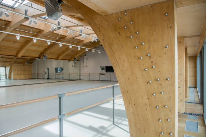
In the course of the design process, the volume of the theater, responding to the requests from its founder and all-time leader, grew very much like the proverbial “little doggie” – ultimately, the stage got a totally “fully-fledged” size with all the ensuing technical possibilities. Its parallelepiped, hovering with a cantilevered structure above the passage to the yard, almost joined the dormitory building, which, by the way, also stands out with a cantilever – the two buildings look as if they were “reaching out” towards one another, leaving between their side ends a ravine about three meters wide. This solution comes as no surprise for the historical city that always seems to be out of its wits for space, and is even predictable: we will remind you at this point that already during the design of the first stage the architects were confronted with a catastrophic lack of space, and had to do a lot of creative thinking trying to figure out how to reconcile all the required fictions and square meters. On the roof of the stage, there is a rehearsal hall – unsupported mansard space, covered with bent glued-wood beams that form a gently sloping rounded silhouette.

  • zooming
    1 / 4
    Boris Eifman Dance Academy, 2nd stage. Rehearsal Hall
    Copyright: Photograph © Margarita Yavein
  • zooming
    2 / 4
    Boris Eifman Dance Academy, 2nd stage. Project. Rehearsal Hall
    Copyright: Photograph © Margarita Yavein
  • zooming
    3 / 4
    Boris Eifman Dance Academy, 2nd stage. Project. Rehearsal Hall
    Copyright: Photograph © Margarita Yavein
  • zooming
    4 / 4
    Boris Eifman Dance Academy, 2nd stage. Project. Rehearsal Hall
    Copyright: Photograph © Margarita Yavein


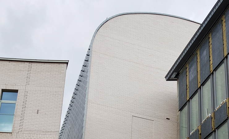
The surface of the roof is covered with rhombus-shaped RHEINZINK sheets of titanium/zinc that form a glittering “hide” that smoothly “flows down” on the side end of the wall. From a certain viewing angle, from the side of Bolshaya Pushkarskaya, this technique of decorating this “urban ravine”, appearing in the center of the yard, looks pretty romantic, and even picks up the modernist notes played by the nearby Julia Dobbert buildings – the south side of the stage looks like a spine of some fairy tale Roerich serpent.

  • zooming
    1 / 5
    Boris Eifman Dance Academy, 2nd stage
    Copyright: Photograph © Margarita Yavein
  • zooming
    2 / 5
    Boris Eifman Dance Academy, 2nd stage
    Copyright: Photograph © Margarita Yavein
  • zooming
    3 / 5
    Boris Eifman Dance Academy, 2nd stage
    Copyright: Photograph © Margarita Yavein
  • zooming
    4 / 5
    To the left: facade of the student dormitory. To the right: the outer facade of the stage. Boris Eifman Dance Academy
    Copyright: Photograph © Julia Tarabarina, Archi.ru
  • zooming
    5 / 5
    Boris Eifman Dance Academy, 2nd stage
    Copyright: Photograph © Margarita Yavein


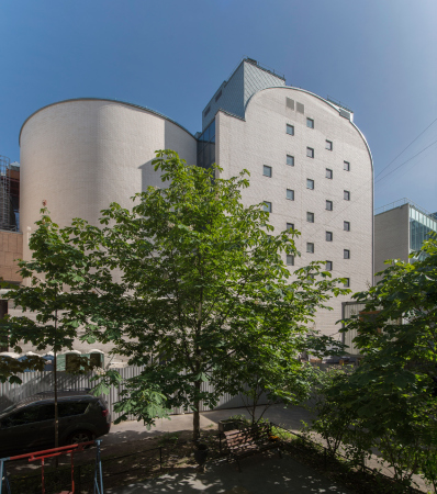
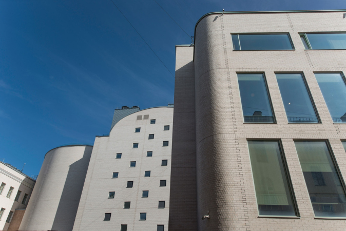
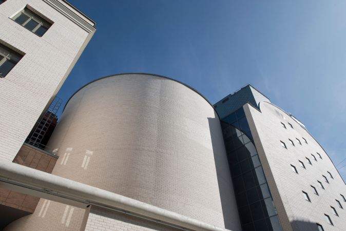
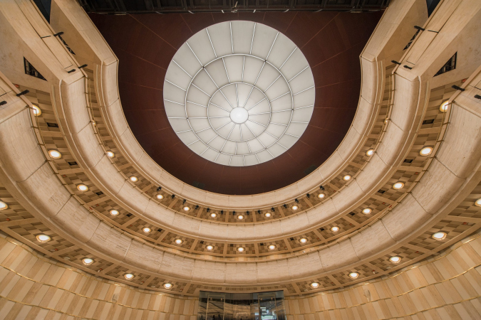
The volume or the auditorium – a clear-cut cylindrical tower of tight proportions – joins the stage from northeast, and it must be said that everything here spins around it. The rounded side is turned to the residential buildings and the little pedestrian street inside; it is coated with the “signature” light-beige bricks, selected back in the day for the recreated façade of the former cinema. The cylinder is as laconic as, let’s say, the tower of the St Anthony’s Monastery in Veliky Novgorod, and also becomes an attractive volumetric highlight, a sculptural surprise for somebody who accidentally turns this corner. As for the corner of the building, it got extended, which added a few extra square meters of useful floor space to the school; the finished part is coated with bricks, and is visibly different from the stuccoed façades of the 1930’s building.

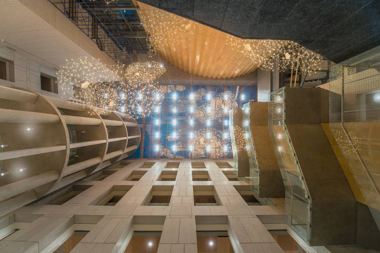
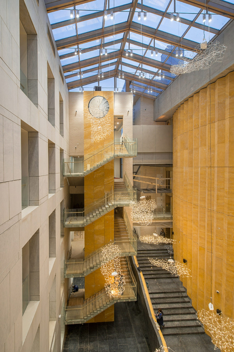
The second half of the cylindrical volume cuts into the atrium. Actually, the atrium is the main highlight of the project and the new building of the Academy. Covered with a glass roof resting on an unusually slender wooden framework, comparatively small in its area, and tall as a classic Saint Petersburg yard, it both joins and at the same time separates the two different parts of the school, serving both as a roofed schoolyard and a beautiful-looking theater foyer. Here is the thing, though!

The atrium occupies the inside corner of the L-shaped building of the school – to be more exact, the part of the yard that lies south of the auditorium cylinder. The narrow vertical space is limited by the circular volume of the auditorium, two school walls, and a staircase that allows the student actors to get from the school directly to the stage. However, this solution alone would not be enough, this would be too obvious and at the same time cramped, and the architects take a paradoxical path – what they do is they cramp up the space even more, filling it with accents and meanings, making the density of the matter reach its critical point – and, as a consequence, making it look eventful and interesting.

In the east corner, the cylinder of the auditorium is echoed by a much more reserved tower of the school lounge. It is formed by round concrete pillars that alternate with narrow trapeze-shaped piers from single-piece white marble. The apertures of the first floor are fully glazed; higher up – only 1.2 meters from the bottom. The glass generally performs a safety function here but it also allows the students to look down at the atrium from any of the floors. As for the tower, it at once brings up associations with just as “openwork” staircases that we can see in the yards of gothic palaces, such as Palazzo Contarini del Bovolo. The cavity between the auditorium and the school wall contains a brick-covered protrusion with a round window, which is essentially a signature technique of Studio 44’s: “in all of our projects, there is such a window hidden somewhere” – Anton Yar-Skryabin explains.

Boris Eifman Dance Academy, 2nd stage. Foyer
Copyright: Photograph © Margarita Yavein


On the opposite side, there is a string of staircases with clocks, almost like you would expect in Hogwarts; just like the circular tower, they will be also glazed and opened in the direction of the atrium. The two school walls, which form the background, are coated with white marble that sports a highlighted “rock-face” pattern, very sophisticated, in the spirit of “neo-Greek” style or Saint Petersburg architecture of the 1930’s – more expensive and carefully drawn version of the historical façades of the same school.

Boris Eifman Dance Academy, 2nd stage. Foyer
Copyright: Photograph © Margarita Yavein


The side wall of the stage is covered with zigzagging folds of travertine, rich beige and golden, yet porous and with streaks. This type of stone is called just like that – “Gold”.

Travertine Gold (closeup). Boris Eifman Dance Academy, 2nd stage.
Copyright: Photograph © Julia Tarabarina, Archi.ru


The end result looks, of course, very much like a theater curtain – silk or maybe velvet; a big pleated curtain that covers the theater building. It goes without saying that its fragments also show up in the space of the staircase, implementing the principle of mutual penetration of volumes and textures, and giving the viewer an opportunity to feel the integrity of the cylindrical volume of the auditorium. It turns out that the two atrium walls look like the walls of city buildings; the staircase and the balcony tower are more open and become the points of revelation and meditation, while the “curtain” wall, on the other hand, clearly shows that we are already inside the theater, the only question being where exactly inside the theater – on the spectator seats or on stage, where the curtain is about to go up, and we will soon have to perform, let’s say, some scene from “Romeo and Juliette” (luckily, the balcony is already there at our disposal).

On the other hand, the regularity of the stone folds looks just as much like a gear – and then the auditorium becomes a cylindrical shaft, the axis part of the theatrical mechanism that brings everything in motion here. And again: let’s imagine that the rotation of the giant machine has started, and the whole atrium has moved on stage, the school studies and classrooms following suit. The comparison is, of course, conditional, but modern architecture is generally in the habit of impersonating a frozen mechanism, and this, as a rule, says something to the viewer. For example – metaphorically, of course – here it is meant to say that here everything spins around the theater life, the school, the rehearsals, and the theater props, including the architectural ones, arrested in mid-motion.

Boris Eifman Dance Academy, 2nd stage.
Copyright: Photograph © Margarita Yavein


Each viewing angle has a narrative and function of its own – this is a version of static stage design, which is not subject to change but which is ready to be filled with various concepts and meanings, and saturated in a theatrical way. In a regular situation this would have been excessive but in this specific instance, next to the stage, it is quite appropriate – the atrium becomes a model of a city square (a circumstance that is specifically nailed down by the clock above the staircase) – the traditional place of street performances. A stage that could fit almost any, but above all, the classic Italian theater: what you see here is a window, walls with windows, and a string of balconies hanging on the vertical axis of the lounge tower. The atrium became sort of a projection of basic theater elements, and in this sense, the perfect foyer. Which, on the other hand, thanks to the multitude of emotions that are programmed here, is equally suitable for the schoolyard as well, offering impressions to children. Its proximity to the school and the fact that they even “grow” into one another, will allow the students to get imbued with theater atmosphere, constantly feeling as a part of it. The theme is further supported by round lamps that look like a flock of soap bubbles and a “cloud” of fireflies soaring from the bottom floors towards the ceiling.

Boris Eifman Dance Academy, 2nd stage. Foyer
Copyright: Photograph © Margarita Yavein


The original plan, according to which the visitors coming in from the city outside would suddenly find themselves amidst a theater decoration, was suddenly thwarted by the intrusion of the… client. Initially, it was planned that the entrance to the merged buildings of the school and the theater would be organized from the yard: coming through the passage between the school building and the wooden mansion, the spectators would get into a small yard, and from there – immediately downstairs, to the underground cloakroom, then they would exit upstairs by a broad staircase in the center of the atrium city growing in front of them; them a staircase, just as wide, would take them to the pit stalls. However, Boris Eifman thought it imperative that the theater have a portico that would identify it as a “temple of fine arts”. The architects resisted this idea as much as they could and drew about a dozen versions because the idea proposed by the founder and producer of the Academy – namely, that of adding a portico asymmetrically on the facade of the school building from the side of the Vvedenskaya Street – was perceived by them as being a poor one, grounded neither in the town-planning logic nor in the logic of the inner space of the project. Here is how it all ended up, though: the contractor, who turned out to be more amenable to that idea, slapped the portico on top of the architects’ drafts. The chief architect of the city had to accept that. Here is a fine example of “the role of the customer in the history of architecture”. Both Nikita Yavein and Anton Yar-Skryabin are still outraged by what happened, even though they shouldn’t be. The building is still full of other interesting solutions, and as for the portico – well, somebody could slap it on a decade latter anyway, because history has known such examples.

Meanwhile, the visitors’ path became different than was originally planned. Now the spectators will have to pass through a small “anteroom” lobby of the school building, which, during time of the performances and the arrival of the spectators will be isolated for security reasons. Which, again, is not really convenient for the school, and distorts the original “as if on cue” sequence of immersing the spectator into the theater space; the path becomes too whimsical: the narrow “anteroom”, the atrium, the staircase leading to the cloakroom (and, to cap it all, reverted with its back to the entrance – the architects complain), the atrium again, and finally the pit stalls. On the one hand, seemingly, there seems to be nothing radically wrong with this sequence but, on the other hand, the first, or, better yet, the zero instance of being exposed to the theater will be to a large extent dissolved in the hassle of the locomotion. In order to see in the atrium a scene from an “Italian” town with a tower, the spectators will have to make an extra effort, turn their heads or step further away towards the south wall, the entrance in which has become an emergency exit now. But then again, it’s useful for the spectators to do some heads turning.

Boris Eifman Dance Academy, 2nd stage. The cloakroom area.
Copyright: Photograph © Margarita Yavein


The school, hosted in the hereditary building of the 1930’s, is designed in a rather traditional way: the first two floors for the junior high, and the third and fourth for the senior high. The classrooms are well equipped and painted soft colors, one of the walls in each of the classrooms being painted a different tone, which makes it possible to easily identify the classroom or study. The corridors, turned on to the atrium with their glass barriers, are equipped with fire shutter, just like the staircases are. The issues of safety, including fire safety, have been given a lot of attention: the auditorium is coated with stone and fireproof panels which complies with KM0 fire safety class.

Boris Eifman Dance Academy, 2nd stage. Section view
Copyright: © Studio 44


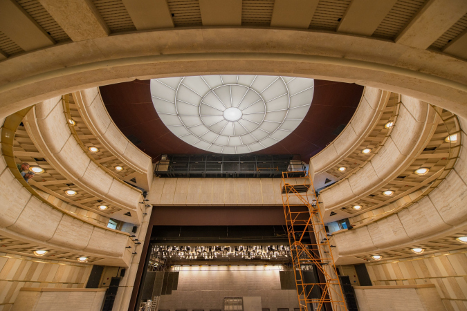
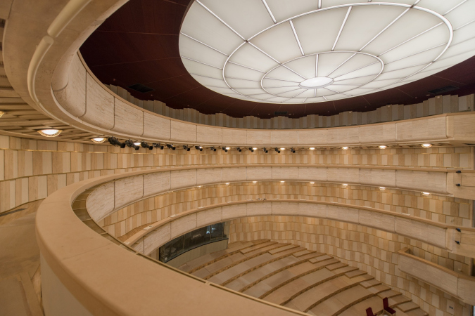
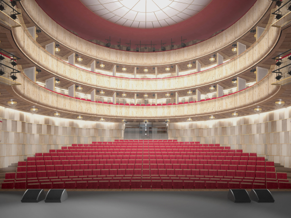
About other technical details – we will remind you that the stage and the auditorium kept growing in the design process, and the stage reached a maximum allowed size for such a land site, ultimately getting a professional size and all the technical equipment necessary not only for “student” but also for professional theater productions. Beneath the floor of the pit stalls, there is an air supply box, a ventilation system that is smaller and quieter than a regular one, which made it possible to place beneath the stage a semi-floor with dressing rooms, prop storage facility, and a costume storage. Increasing the height of the stage, and measuring the geometry of the roof, the architects got the space for the girders. In the auditorium, besides the pit stalls, there are two spectator tiers and a technical one.

  • zooming
    1 / 4
    Boris Eifman Dance Academy, 2nd stage. Auditorium
    Copyright: Photograph © Margarita Yavein
  • zooming
    2 / 4
    Boris Eifman Dance Academy, 2nd stage. Auditorium
    Copyright: Photograph © Margarita Yavein
  • zooming
    3 / 4
    Boris Eifman Dance Academy, 2nd stage. Auditorium
    Copyright: Photograph © Margarita Yavein
  • zooming
    4 / 4
    Boris Eifman Dance Academy, 2nd stage. Project
    Copyright: Photograph © Margarita Yavein


The school and theater have completed the ensemble of the Dance Academy – now its buildings occupy nearly the entire block, providing the educational process with everything it might possibly need, including the real theater that, as we remember, grew by leaps and bounds in the design process, the nucleus and the purpose of the rehearsals, so critical for ballet and its students to perfect their skills on a daily basis. The buildings not just came together visually but they are also connected by a heated underpass – so one can get from school to academy for some big model lesson. In addition, the numerous ways of working with the architectural legacy – restoration of a wooden mansion, a revived fragment of a movie theater, renovation of a school building – are intertwined within the framework of this creative city block with architecture that is dense, variable, sometimes ostentatiously laconic, sometimes of a theatrical nature but inevitably modern. All of this – the painstaking work with the function, packed by the architects very much like a snail in its shell, that is, constantly discovering hidden reserves of space, within the tight limits of the historical context. The result is a “city within a city”, a comfortable haven for the lovers of professional dance.

05 June 2019

Headlines now
The Golden Crown
The concept for a dental clinic in Yekaterinburg, developed by CNTR Studio, revolves around the idea of a “mouth full of gold”: pristine white porcelain stoneware walls are complemented by matte brass details. To avoid an overly literal interpretation, the architects focused on the building’s proportions, skillfully navigating between sunlight requirements and fire safety regulations.
Flexibility and Integration
Not long ago, we covered the project for the fourth phase of the ÁLIA residential complex, designed by APEX. Now, we’ve been shown different fence concepts they developed to enclose the complex’s private courtyards, incorporating a variety of public functions. We believe that the sheer fact that the complex’s architects were involved in such a detail as fencing speaks volumes.
A Step Forward
The HIDE residential complex represents a major milestone for ADM architects and their leaders Andrey Romanov and Ekaterina Kuznetsova in their quest for a fresh high-rise aesthetic – one that is flexible and layered, capable of bringing vibrancy to mass and silhouette while shaping form. Over recent years, this approach has become ADM’s “signature style”, with the golden HIDE tower playing a pivotal role in its evolution. Here, we delve into the project’s story, explore the details of the complex’s design, and uncover its core essence.
Gold in the Sands
A new office for a transcontinental company specializing in resource extraction and processing has opened in Dubai. Designed by T+T Architects, masters of creating spaces that are contemporary, diverse, flexible, and original, this project exemplifies their expertise. On the executive floor, a massive brass-clad partition dominates, while layered textures of compressed earth create a contextually resonant backdrop.
Layers and Levels of Flight
This project goes way back – Reserve Union won this architectural competition at the end of 2011, and the building was completed in 2018, so it’s practically “archival”. However, despite being relatively unknown, the building can hardly be considered “dated” and remains a prime example of architectural expression, particularly in the headquarters genre. And it’s especially fitting for an aviation company office. In some ways, it resembles the Aeroflot headquarters at Sheremetyevo but with its own unique identity, following the signature style of Vladimir Plotkin. In this article, we take an in-depth look at the United Aircraft Corporation (UAC) headquarters in the Moscow agglomeration town of Zhukovsky, supplemented by recent photographs from Alexey Naroditsky – a shoot that became only recently possible due to the fact that improvements were finally made in the surrounding area.
Light and Shadow
In this article, we delve into the architectural design of the “Chaika” house by DNK ag architects, which was recently completed in 2023 as part of the collection of signature designs at ZILArt. As is well-known, all the buildings in this complex follow a design code, yet each one is distinct. This particular building stands out not only for its whiteness and minimalism but also for the refined use of a limited number of techniques that, together, create what can confidently be called synergy.
Casus Novae
A master plan was developed for a large residential area with a name of “DNS City”, but now that its implementation began, the plan has been arbitrarily reformatted and replaced with something that, while similar on the surface, is actually quite different. This is not the first time such a thing happens, but it’s always frustrating. With permission from the author, we are sharing Maria Elkina’s post.
Treasure Hunting
The GAFA bureau, in collaboration with Tegola and Arkhitail, organized an expedition to the island of Kilpola in Karelia as part of Moskomarkhitektura’s “Open City” festival. There, amidst moss and rocks, the students sought answers to questions like: what is the sacred, where does it dwell, and what sustains it? Assisting the participants in this quest were landscape engineer Evgeny Levin, artist Nicholas Roerich, a moose, and the lack of cellular connection. Here’s how the story unfolded.
Depths of the Earth, Streams of Water
In the Malaya Okhta district, the Akzent building, designed by Stepan Liphart, was constructed. It follows a classic tripartite structure, yet it’s what you might call “hand-drawn”: each façade is unique in its form and details, some of which aren’t immediately noticeable. In this article, we explore the context and, together with the architect, delve into how the form was developed.
Fir Tree Dynamics
The “Airports of Region” holding is planning to build an airport in Karachay-Cherkessia, aiming to make the Arkhyz and Dombay resorts more accessible to travelers. The project that won in an invitation-only competition, submitted by Sergey Nikeshkin’s KPLN, blends natural imagery inspired by the shape of a conifer seed, open-air waiting spaces, majestic large trees, and a green roof elevated on needle-like columns. The result is both nature-inspired and WOW.
​A Brick Shell
In the process of designing a clubhouse situated among pine trees in a prestigious suburban area near Moscow, the architectural firm “A.Len” did the façade design part. The combination of different types of brick and masonry correlates with the volumetric and plastique solutions, further enhanced by the inclusion of wood-painted fragments and metal “glazing”.
Word Forms
ATRIUM architects love ambitious challenges, and for the firm’s thirtieth anniversary, they boldly play a game of words with an exhibition that dives deep into a self-created vocabulary. They immerse their projects – especially art installations – into this glossary, as if plunging into a current of their own. You feel as if you’re flowing through the veins of pure art, immersed in a universe of vertical cities, educational spaces – of which the architects are true masters – and the cultural codes of various locations. But what truly captivates is the bold statement that Vera Butko and Anton Nadtochy make, both through their work and this exhibition: architecture, above all, is art – the art of working with form and space.
Flexibility and Acuteness of Modernity
Luxurious, fluid, large “kokoshniks” and spiral barrel columns, as if made from colorful chewing gum: there seem to be no other mansion like this in Moscow, designed in the “Neo-Russian-Modern” style. And the “Teremok” on Malaya Kaluzhskaya, previously somewhat obscure, has “come alive with new colors” and gained visibility after its restoration for the office of the “architectural ecosystem” as the architects love to call themselves. It’s evident that Julius Borisov and the architects at UNK put their hearts into finding this new office and bringing it up to date. Let’s delve into the paradoxes of this mansion’s history and its plasticity. Spoiler: two versions of modernity meet here, both balancing on the razor’s edge of “what’s current”.
Yuri Vissarionov: “A modular house does not belong to the land”
It belongs to space, or to the air... It turns out that 3D printing is more effective when combined with a modular approach: the house is built in a workshop and then adapted to the site, including on uneven terrain. Yuri Vissarionov shares his latest experience in designing tourist complexes, both in central Russia and in the south. These include houseboats, homes printed from lightweight concrete using a 3D printer, and, of course, frame houses.
​Moscow’s First
“The quality of education largely depends on the quality of the educational environment”. This principle of the last decade has been realized by Sergey Skuratov in the project for the First Moscow Gymnasium on Rostovskaya Embankment in the Khamovniki district. The building seamlessly integrates into the complex urban landscape, responding both to the pedestrian flow of the city and the quiet alleyways. It skillfully takes advantage of the height differences and aligns with modern trends in educational space design. Let’s take a closer look.
Looking at the Water
The site of Villa Sonata stretches from the road to the water’s edge, offering its own shoreline, pier, and a picturesque river panorama. To reveal these sweeping views, Roman Leonidov “cut” the façade diagonally parallel to the river, thus getting two main axes for the house and, consequently, “two heads”. The internal core – two double-height spaces, a living room and a conservatory, with a “bridge” above them – makes the house both “transparent” and filled with light.
The White Wing
Well, it’s not exactly white. It’s more of a beige, white-stone structure that plays with the color of limestone – smoother surfaces are lighter, while rougher ones are darker. This wing unites various elements: it absorbs and interprets the surrounding themes. It responds to everything, yet maintains a cohesive expression – a challenging task! – while also incorporating recognizable features of its own, such as the dynamic cuts at the bottom, top, and middle.
Urban Dunes
The XSA Ramps team designed and built a three-part sports hub for a park in Rostov-on-Don, welcoming people of all ages and fitness levels. The skate plaza, pump track, and playground are all meticulously crafted with details that attract a diverse range of visitors. The technical execution of the shapes and slopes transforms this space into a kind of sculptural composition.
Proportional Growth
The project for the fourth phase of the ÁLIA residential area has been announced. The buildings are situated on an elongated plot – almost a “ray” that shoots out from the center of the area towards the river. Their layout reflects both a response to Moscow’s architectural preferences over the past 15 years, shifting “from blocks to towers”, and an interpretation of the neighboring business park designed by SOM. Additionally, the best apartments here are not located at the very top but closer to the middle, forming a glowing “waistline”.
The “Staircase” Building
In designing the “Details” residential complex in New Moscow, Rais Baishev spiced up the now-popular Moscow theme of a “courtyard” building with an idea drawn from the surrealist drawings by Maurits Escher. He envisioned the stepped silhouettes and descending slopes as a metaphysical mega-staircase, creating a key void within the courtyard that gave the project an internal “spine”. This concept is felt both in the building’s silhouette and on its façades.
Projection of the Quarter
No one doubted that the building that Vladimir Plotkin designed as part of the “Garden Quarters” would be the most modernist of all. And it turned out just that way: while adhering to the common design code, the building successfully combines brick and white stone, rhythmically responding to the neighboring building designed by Ostozhenka, yet tactfully and persistently making a few statements of its own. This includes the projection of the ideal urban development composition “14–9–6”, which can be found right next door, mathematical calculations, including those for various types of terraces (and perhaps the only reminder of the Soviet past of the Kauchuk rubber factory!), and the white “cross-stitch” pattern of the façade grid.
Domus Aurea
In this issue, we examine the “Tessinsky-1” house, designed by Sergey Skuratov and completed in 2023. Located in the middle of the Serebryanicheskaya Embankment district, at the intersection of its main streets, this house assumes a sort of “nodal” role: it not only responds to everything around it and preserves many memories of the former EMA factory within itself, but it weaves all this into a newly directed pattern, reconciling bright “gold” and dark-colored brick, largely with the help of the new, modern-yet-archaic Columba brick, which, come to think about it, is the most precious element here.
The Chimney of Nikola-Lenivets
In this issue, we are examining the “Obelisk House” designed by KATARSIS and built for the Arkhstoyanie 2023 festival. However, it was only finished later on, and this is why we are examining it now. It seems to us that after the “Obelisk House” appeared in Nikola-Lenivets, a dialogue and a few inner connections appeared between the temporary structures built here. These houses no longer look like “accidental neighbors”, more of which below.
​Periscope by the Bay
The jury awarded the second place in the competition for a public and cultural center in Petropavlovsk-Kamchatsky to the companies GORA (“Mountain”) and M4. In the consortium’s proposal, the building resembles a sperm whale with a calf swimming next to it or a periscope, whose lenses capture the most spectacular views from the surrounding landscape.
From Arcs to Dolmens
While working on the competition project for Petropavlovsk-Kamchatsky, ASADOV Architects prioritized the value of the natural and urban environment, aiming to preserve the balance of the location while minimizing the resemblance of the volume that they designed to a “traditional building”. The task was challenging, and the architects created three versions, one of which having been developed after the competition, where their main proposal took third place. However, the point of interest here is not the competition result but the continuity of creative thinking.
Hide and Seek
The ID Moskovskiy house, designed by Stepan Liphart in St. Petersburg, in the courtyards near Moskovskiy Avenue beyond the Obvodny Canal and recently completed, is notable for several reasons. Firstly, it has been realized with considerable accuracy, which is particularly significant as this is the first building where the architect was responsible not only for the facades but also for the layouts, allowing for better integration between the two. On the other hand, this building is interesting as an example of the “germination” of new architecture in the city: it draws on the best examples from the neighborhood and becomes an improved and developed sum of ideas found by the architect in the surrounding context.
The Big Twelve
Yesterday, the winners of the Moscow Mayor’s Architecture Award were announced and honored. Let’s take a look at what was awarded and, in some cases, even critique this esteemed award. After all, there is always room for improvement, right?
Above the Golden Horn
The residential complex “Philosophy” designed by T+T architects in Vladivostok, is one of the new projects in the “Golubinaya Pad” area, changing its development philosophy (pun intended) from single houses to a comprehensive approach. The buildings are organized along public streets, varying in height and format, with one house even executed in gallery typology, featuring a cantilever leaning on an art object.
Nuanced Alternative
How can you rhyme a square and space? Easily! But to do so, you need to rhyme everything you can possibly think of: weave everything together, like in a tensegrity structure, and find your own optics too. The new exhibition at GES-2 does just that, offering its visitor a new perspective on the history of art spanning 150 years, infused with the hope for endless multiplicity of worlds and art histories. Read on to see how this is achieved and how the exhibition design by Evgeny Ace contributes to it.
Blinds for Ice
An ice arena has been constructed in Domodedovo based on a project by Yuri Vissarionov Architects. To prevent the long façade, a technical requirement for winter sports facilities, from appearing monotonous, the architects proposed the use of suspended structures with multidirectional slats. This design protects the ice from direct sunlight while giving the wall texture and detail.