Uninspiring Place
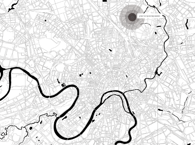
Moscow has a lot of places in it, finding yourself in which you would hardly believe that you are in a city full of architectural and cultural heritage sites. These places bear a uniquely rank-and-file, chaotic and bleak look. Most often, these “lost” places are filled with all sorts of prefab housing projects, long-abandoned industrial parks, and a whole collection of typological monsters, which, for reasons unexplained, occupy the square footage whose price rivals that of the world’s most expensive megalopolises. Such places are mostly to be found in a broad belt between the Third Transport Ring and Moscow Central Circle. Driving there without a navigator app is next to impossible, basically what you want most of all in such places is get out of them as soon as possible, and most of the streets have not only a name but also a number.
These places were on the developers’ hit parades neither in the 2000’s, when there were plenty of more prestigious locations to build upon, nor in the 2010’s when the economic crisis shifted the priorities in the direction of the Moscow area fields. Currently, the objective shortage of places for construction, coupled with the city’s town planning policy and the launch of Moscow Central Circle, gave a green thoroughfare to the projects of reforming the “lost neighborhoods” into something that is more up to date, efficient and comfortable.
"Egodom" housing complex © Sergey Skuratov ARCHITECTS
"Egodom" housing complex © Sergey Skuratov ARCHITECTS
One of such areas that are currently undergoing a radical transformation is situated between the Mira Avenue and the Yaroslavl-bound railroad tracks, behind which the Sokolniki Park spreads out. The beautiful “parade” houses standing along the Mira Avenue are shielding all sorts of shabby housing projects squeezed in between the “reservations” of semi-abandoned industrial parks, large and small. In their place, multifunctional complexes are being actively built – for example, SPEECH is building here the housing complex “Serebryany Fontan” (“Silver Fountain”), and not far away from it ADM is finishing the housing complex under the name of “1147”.
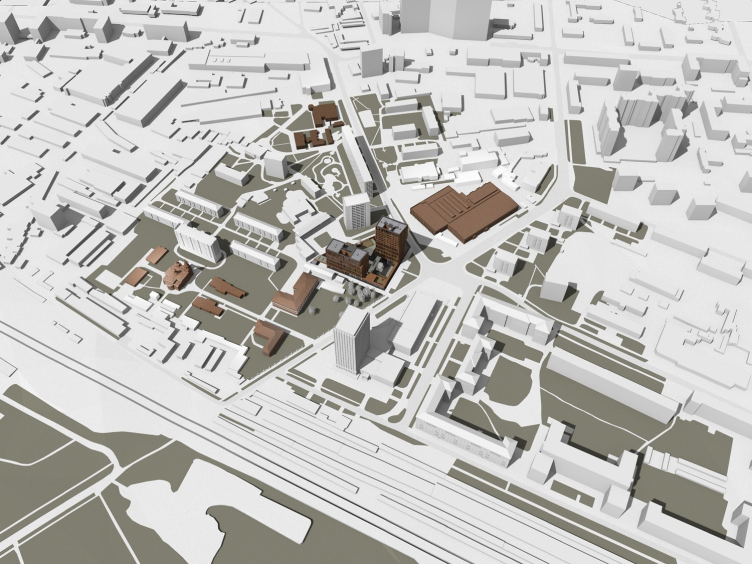
"Egodom" housing complex. Visualization of the surrounding buildings with historical sites highlighted © Sergey Skuratov ARCHITECTS
Practically in the same location, at the crossing of Novoalekseevskaya and Malomoskovskaya streets, two “1st Rizhsky Alleys” and the Pavla Korchagina Street, which all together form a small square (probably, the closest term), in 2012, the developer company “Turman” invited Sergey Skuratov to design this housing complex (the coverage of his project is available here).
“Before I began working on the initial concept, I visited this location several times – the architect reminisces – And every time I would have to chase away a treacherous thought: “Uh, maybe we should give up on the idea of building here anything altogether, whatever it is?” – so unattractive and chaotic the surroundings were. I could not tell if it was at all possible to bring this place to any kind of order, in terms either of style or composition. We were to come up with a solution that would “pull” the whole neighborhood out of this town planning bog, just like Baron Munchausen pulled himself and the horse on which he was sitting out of a swamp by his own hair. So we decided to repeat this heroic feat by introducing into this all but dead environment, lying in a coma state, some bright and flashy accept that would make it come alive”.
The Dominance Concept
In the place of the future complex, there was a gas station, dilapidated buildings of a bus depot, and locksmith’s workshops. The only exception consisted in a few prefabricated residential houses and a tall (also prefabricated) tower of the GIPROSTROYMOST institute, joined by the former community center now turned into an evangelist church.
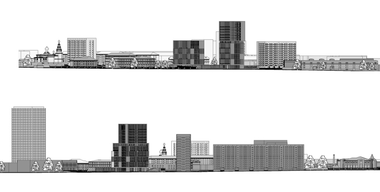
"Egodom" housing complex. Development drawings along the main axes © Sergey Skuratov ARCHITECTS
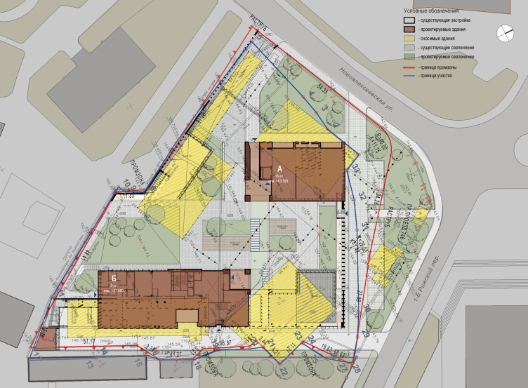
"Egodom" housing complex. The master plan in which the demolished buildings are marked © Sergey Skuratov ARCHITECTS
The only treasures of the neighborhood were a few surviving red-brick houses of the pseudo-Russian style on the late XIX century – the Bakhrushiny Brothers orphanage and the Alekseevskaya pumping station, most of whose territory is being filled with the buildings of the “Silver Fountain” housing complex. The charisma of the old brick houses with their characteristic white details on the red-brown façades is barely holding out against the prevailing panel and galvanized grayness, which is growing larger by the year. However, it was their presence that inspired Sergey Skuratov to actively use brick as a radical means of fighting the inertia and chaos of the surrounding environment.
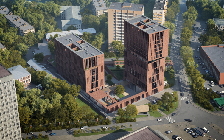
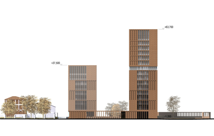
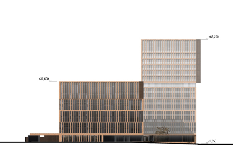
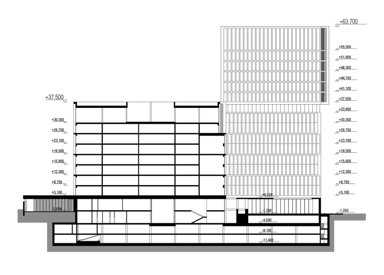
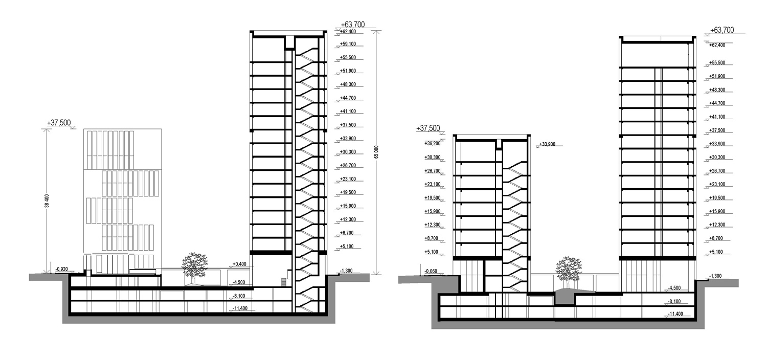
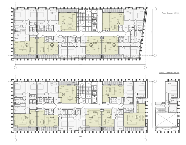
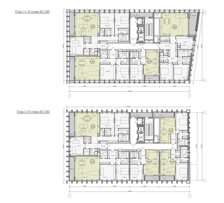
Besides the material accent, the complex was in a desperate need of a just as bright territory organization solution. The main parameters of the complex were known in advance: the place was to get two tower 64 and 37 meters high (17 and 8 floors respectively). The main compositional question was how, by using the two volumes alone (these volumes being lower in height than their neighbors, especially the institute building), to pull together and organize the territory around the crossroads.
"Egodom" housing complex © Sergey Skuratov ARCHITECTS
Out of the many “coordinate systems” present on the square, whose shape reminded a lopsided star, the authors chose, as the most accentuated one, the axis of the Pavla Korchagina Street, placing their complex parallel to it and parallel to the institute building, and leaving vacant the triangular space in front of the main façade of the taller building. Similar lacunes were left in front of the other buildings facing the square. Thanks to the sheer distance between them, the interdependence between the new housing complex and the institute tower is felt rather on the subconscious level than as a part of some clear-cut coordinate system. The ensemble does not add up – the elements that stand here side by side are too different in their style and value. However, thanks to a clear-cut composition, imposing volume, a powerful color design solution, and the tense inner dramaturgy, Egodom plays the part of the missing link that ties in and organizes everything around it.
"Egodom" housing complex © Sergey Skuratov ARCHITECTS
The paired composition of the building is based on the classic pattern of complementing and contrasting. According to Sergey Skuratov, “what is used here is a clear architectural technique: two volumes, one vertical and one horizontal, work as the driving and the driven ones, starting a “spacial” dialogue with each other. The arising tension is enough to guarantee the complex a status of a town-planning accent that organizes the city space around it and takes the square lying in front of it to a whole new level”.
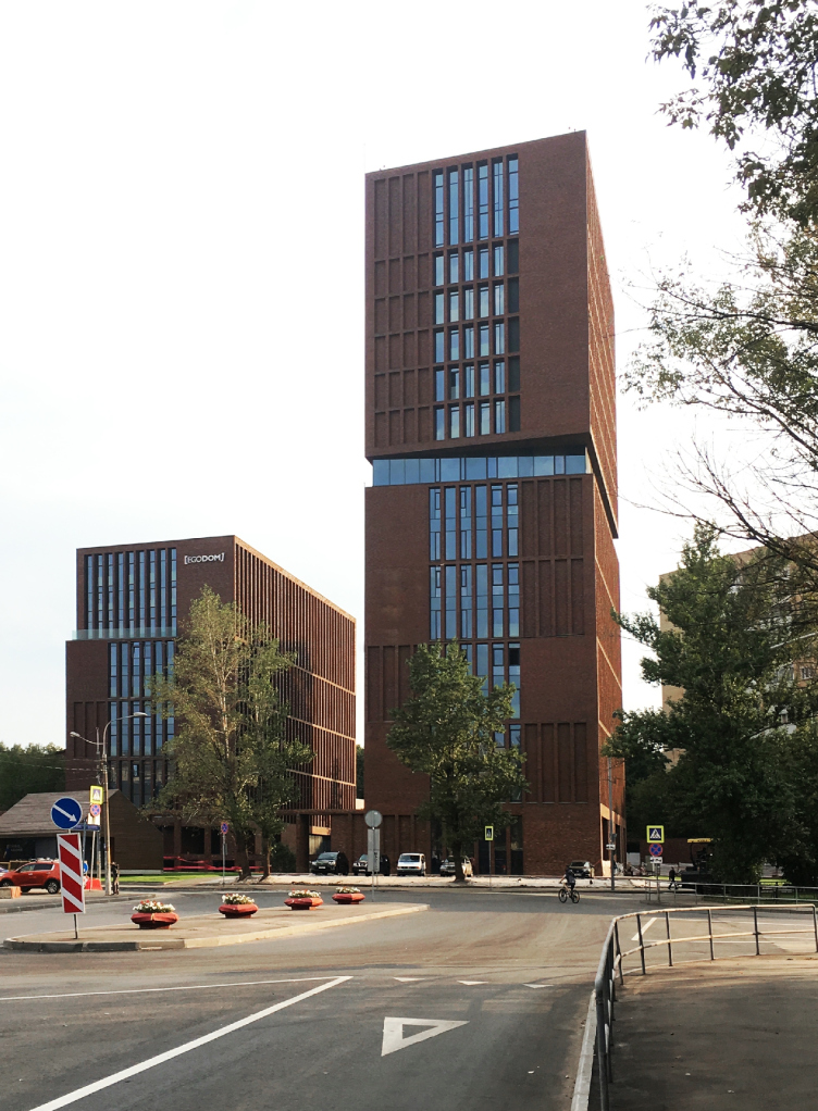
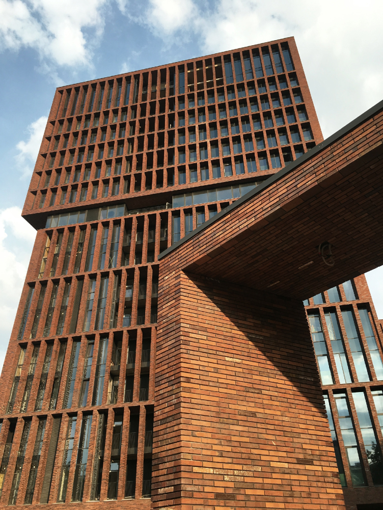
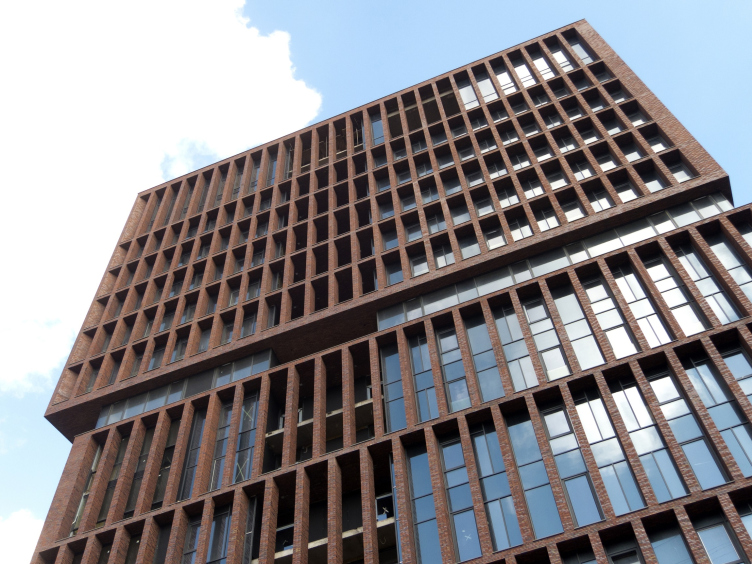
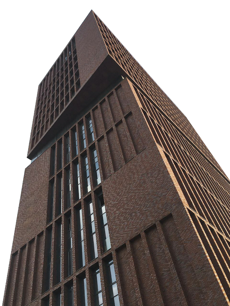
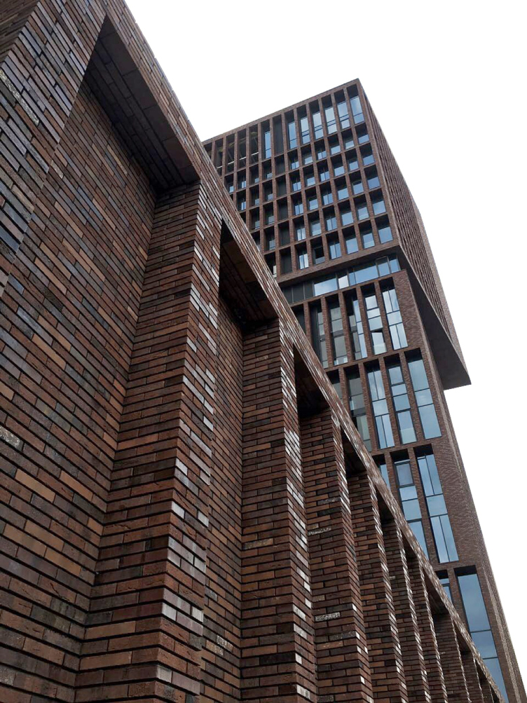
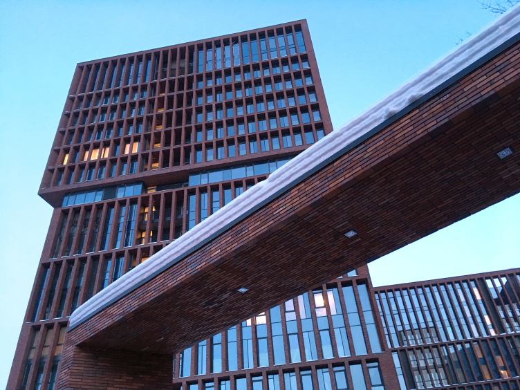
The plastic solution of each building exactly matches its role in the paired composition. The first building, the high and dominating one, in addition to its sheer size is notable for its accentuated dynamic and visual emotion. The inset in the middle of its height breaks the monotony of the even parallelepiped that grows up from the compound structure on the level of the first floor, which is part of the inner yard of the complex. The stained glass belt, slightly sunken into the “brick body”, is perceived as an air layer, above which the upper part of the building hovers as if supported by a magnet pillow. And, as if drawn by magnet flows, the other half of the building slightly pivots on its axis, putting its skewed corner in the direction of the ill-started square. This slight, but fleeting deviation from the parallel lines turns out to be enough to give a lot of extra dynamics to the entire composition.
"Egodom" housing complex © Sergey Skuratov ARCHITECTS
The second building has to settle for a secondary role – its reserved plastique echoes that of the “big brother” but does not always repeat its techniques. For example, while the triangular overhang of the first volume steps outside, creating a flashy play of light and shade on the main façade, the second’s three-story part of the “rotating” section is sunken in, which can be regarded as a means to minimize the conflict with the outside environment and make the silhouette still more picturesque.
"Egodom" housing complex © Sergey Skuratov ARCHITECTS
The Brick and Glass Casing
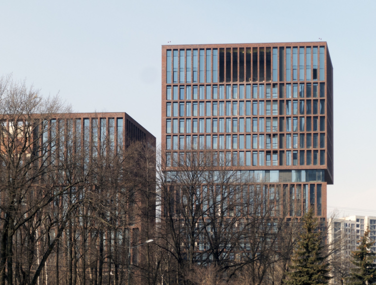
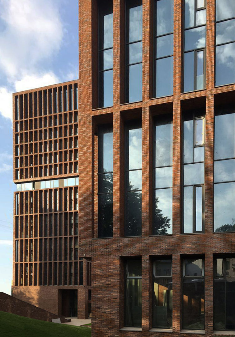
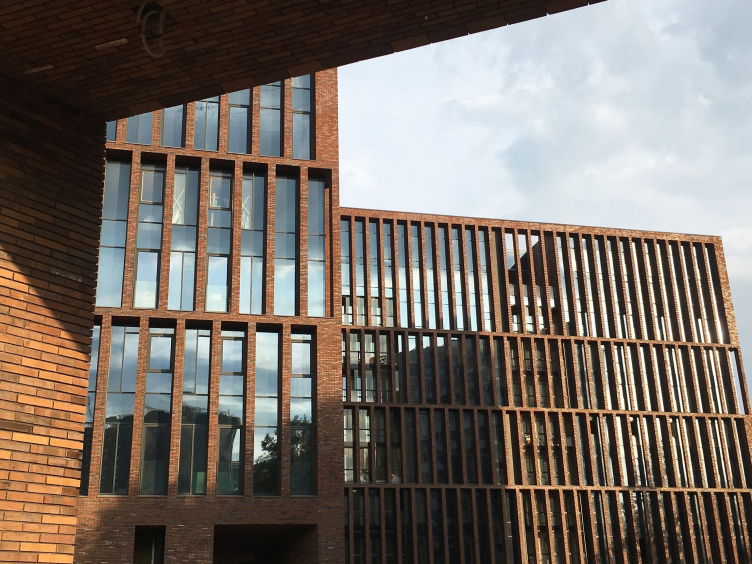
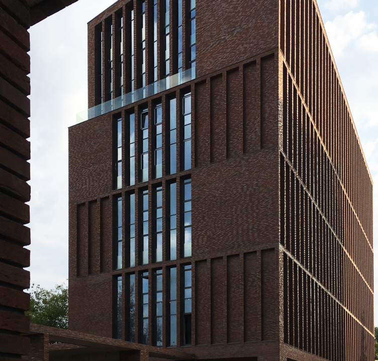
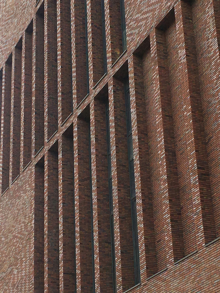
At a first glance, the façade design of the complex looks pretty simple. The material, characteristic for many projects by Sergey Skuratov – the hand-molded brick of a rich red-brown color, with its picturesqueness, materialism, and warmth – in combination with the laconic volumes of Egodom, yields a powerful impact that enhances all of the successful solutions of the spacial and volumetric composition, and at the same time shows the author’s respectful attitude towards the nearby red brick buildings, demonstrating the continuity of the tradition that they set.
"Egodom" housing complex © Sergey Skuratov ARCHITECTS
“We wanted to find the right balance between the static and the dynamic components of the façade’s structure – says Sergey Skuratov – We wanted to make something that would excite. On the one hand, it shocks and provokes the surrounding space; on the other hand, it creates an effect of respectable stability that inspires confidence in people, confidence in the power of this building. As a result, we got a house that is impressive without being pompous; it is orderly but still agile”.
"Egodom" housing complex © Sergey Skuratov ARCHITECTS
The brick façades develop a subtle (and sometimes even ironic) opposition of static and dynamic components, as well as volumetric and flat elements. The architects set some certain rules of the façade play and at once break them – yet they do it so tactfully that only by studying the draughts and then checking them against the real thing one can make out why originally something was meant to be this way and was ultimately altered.
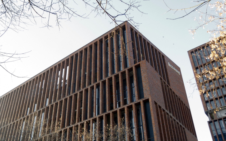
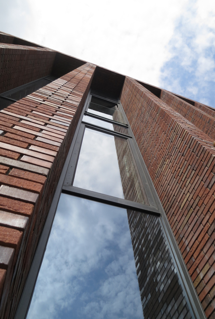
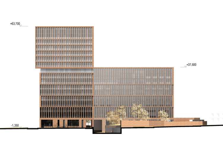
The side façades are designed in a different way. The latter is essentially a clear-cut structure of vertical columns and horizontal lintels, coated with bricks, behind which a stained glass window glitters, reflecting the Moscow sky, sometimes blue, and sometimes gray, like a piece of old silverware. An interesting detail: on the side façade of the lower building and in the bottom part of the taller building, the vertical stands, row after row, go with a half-step shift. Because of the rather narrow space between the stands, one’s eye is slow to see this “geometric catch”, thanks to which on the subconscious level the façade looks more agile and alive. A significant role in achieving this optical effect is played by the narrow stanzas situated behind the brick stands. Their depth gradually wears out, giving way to mini bay windows, placed up against the brick frame.
"Egodom" housing complex © Sergey Skuratov ARCHITECTS
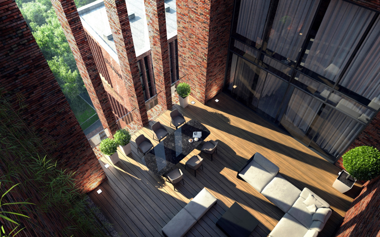
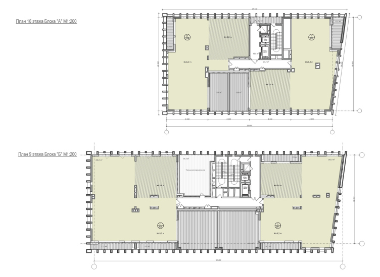
The height of the horizontal rows also varies: from two stories in the lower part of the complex to a single story in the upper part with an overpass to the height of the attic floor (increased 2.5 times), which conceals behind the slender brick frame prestigious penthouses and spacious brick terraces, which in the future can be glazed or left as they are if the owners want to not only enjoy the surrounding views but also enjoy a breath of fresh air.
"Egodom" housing complex. The terrace of the penthouse © Sergey Skuratov ARCHITECTS
"Egodom" housing complex © Sergey Skuratov ARCHITECTS
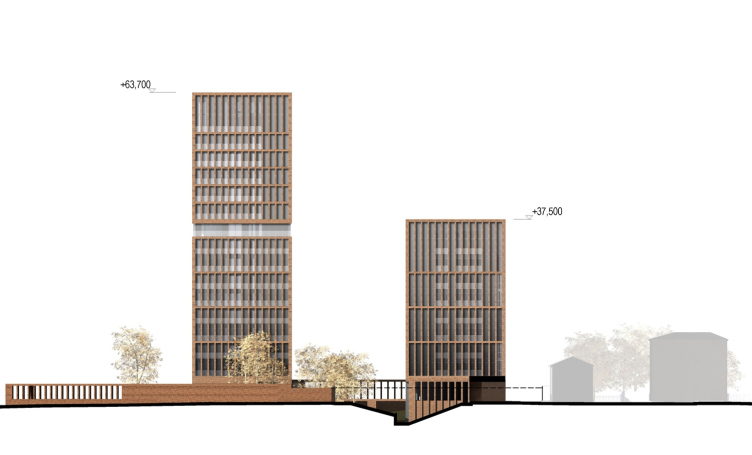
The lateral façades, which play the role of the “outposts” of the composition, the metric rhythm is more complex. Only the narrow vertical of the central part is designed similarly to the side façades – as a brick frame against a stained glass backdrop. On either side of them, in staggered order, alternate even surfaces of the brickwork and sections of the blind “grille”.
"Egodom" housing complex © Sergey Skuratov ARCHITECTS
The Moscow sunshine is sure to please the city people with a lively play of light and shade, but all they could squeeze out of it, using the limited set of techniques of working with structural frameworks, stained glass windows, color and texture of the brickwork, the architects demonstrate of the façades of Egodom.
"Egodom" housing complex © Sergey Skuratov ARCHITECTS
"Egodom" housing complex © Sergey Skuratov ARCHITECTS
"Egodom" housing complex © Sergey Skuratov ARCHITECTS
"Egodom" housing complex © Sergey Skuratov ARCHITECTS
The Inside World
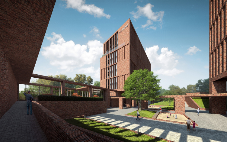
The two buildings of different height stand parallel to each other with a shift exactly the width of the “tower” in order to avoid the undesirable “window-to-window” effect. On the level of the first floor, the buildings are connected by a brick fence that protects the yard of the complex from the unwanted contact with the outside world and its inhabitants. The pillars of the brick fence were to follow the rhythm of the brick imposts on the façade, but for economic reasons the span of the columns was doubled, which made the intended juxtaposition hardly readable, but readable nonetheless.
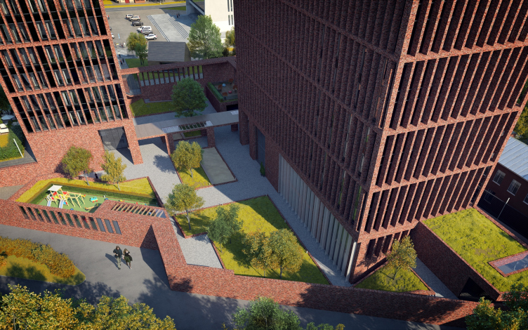
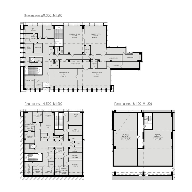
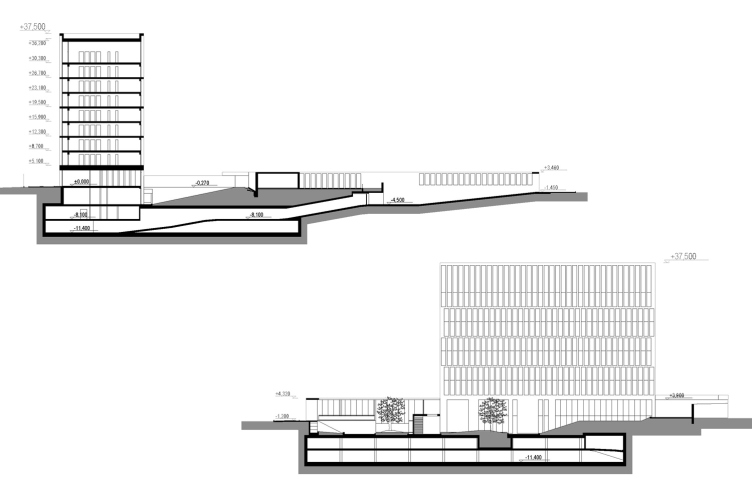
An extra obstacle is created by the level difference – the territory of the inside yard is lowered three meters. This solution, already successfully utilized by the team of Sergey Skuratov’s team in the “Garden Quarters”, allows the architects to ensure the yard’s privacy and effectively structure it at the same time. The sunken-in yard is divided into a few terraces, some of which, accessible to all of the residents of the complex, are connected by staircases, and some, which are meant to accommodate for the walks of the children groups from the local kindergarten, are accessed by a special pass. According to the architects, such solution is far more preferable than a yard elevated to the roof of the podium where the residents still do not feel secure.
"Egodom" housing complex. The inner yard 3D visualization © Sergey Skuratov ARCHITECTS
"Egodom" housing complex. The inner yard 3D visualization © Sergey Skuratov ARCHITECTS
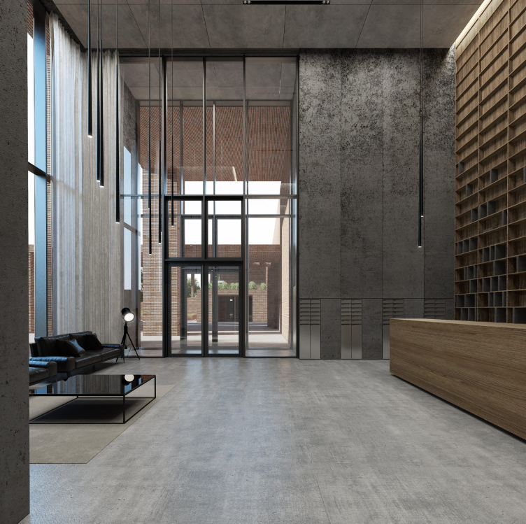
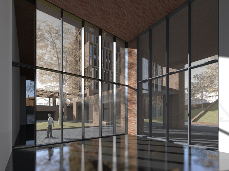
Yet another important argument for sinking the yard below the ground level was the architects’ desire to make double-height lobbies nine meters high. Such a space at the building’s entrance creates quite a different atmosphere and raises the status of the complex. At the “entrance” minus first floor, there are also cafés and a few premises for rent.
"Egodom" housing complex © Sergey Skuratov ARCHITECTS
"Egodom" housing complex © Sergey Skuratov ARCHITECTS
"Egodom" housing complex. The lobby interior © Sergey Skuratov ARCHITECTS
Underneath the whole land site, there is a two-level underground parking garage, the entrance to which is from the side of the Novoalekseevskaya Street through a large brick arch, one of the most photogenic details of the complex that, in conjunction with the opening view of the brick-and-glass buildings that look as if they were frozen in some sort of slow dance, unambiguously says to each incoming driver: “You are entering a world created by Sergey Skuratov”.
"Egodom" housing complex. Photo © Elena Petukhova
The Appropriate Bravery
At the website of the housing complex Egodom, there is a quote from Sergey Skuratov, in which he says that he regrets the fact that the Moscow architecture has very little and at the same time appropriate architecture about it. At a first glance, these two qualities should cancel each other out. One can describe as “brave” the kind of architecture that is very author-generated, architecture of a gesture, which claims dominance in the city environment. Appropriateness, on the other hand, is the kind of quality that is usually expected from a background or landscaping architecture, which is all about the tactful and delicate treatment of the already existing city environment. How can you combine these two qualities in one and the same project? This is like trying to achieve some sort of “fashionable traditionalism” or “sophisticated simplicity”. Therefore, it should be no surprise that buildings possessing two these qualities at once are few and far between. It is strange that they are there at all. Their list predictably includes buildings designed by the author of the paradoxical quote. Sergey Skuratov architecture is seemingly always about the author’s gesture – recognizable, flashy, and provocative. Nonetheless, his architecture is always appropriate. Take his “Danilovsky Fort”, for example: the bravery of the “living” plastic form and at the same time amazing adequacy to the surrounding houses of the waterfront. The same can be said about “Berkley Plaza” on the Prechistenskaya Embankment, Art-House, or the house on the Burdenko Street.
The new house on the Novoalekseevskaya Street has every right to be on this list. In this project, the author again found an optimum balance between the radical, the accentuated (the iconic), and the appropriate, as if the house is actually a part of the local architectural ensemble.
For Sergey Skuratov himself, such contrastive combinations are an integral part of his work and intrinsic part of his creations. His desire to combine things looks so natural that it isn’t even perceived as some sort of special technique or method. Therefore, it comes as no surprise that all the attempts to “put harmony to algebraic test” are cut short by Sergey Skuratov: “One doesn’t have to try to see in each of our projects some sort of rigorous methodology – it’s just not there. There are compositional principles, subjective preferences, and there is, let’s say, the author’s signature style that runs through all of my projects and constitutes the backbone of my creative personality, making my projects recognizable. What makes them different – and I deliberately try to achieve that effect – is some certain integrity, even simplicity, but just in the amount that does not render my buildings monotonous and lifeless”.
"Egodom" housing complex. The main facade © Sergey Skuratov ARCHITECTS
"Egodom" housing complex. The side facade © Sergey Skuratov ARCHITECTS
"Egodom" housing complex. The lateral facade © Sergey Skuratov ARCHITECTS
"Egodom" housing complex. The side facade © Sergey Skuratov ARCHITECTS
"Egodom" housing complex © Sergey Skuratov ARCHITECTS
"Egodom" housing complex © Sergey Skuratov ARCHITECTS
"Egodom" housing complex © Sergey Skuratov ARCHITECTS
"Egodom" housing complex © Sergey Skuratov ARCHITECTS
"Egodom" housing complex © Sergey Skuratov ARCHITECTS


