The pilot site of the Vernadskogo Avenue
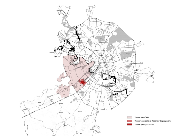
Located in the prestigious and expensive Moscow’s southwest, the renovation site of about 125 hectares and consisting of four soviet-era “micro-districts” 32-35, starts at the “Prospect Vernadskogo” metro station and stretches along straddling both sides of the avenue down to the Lobachevskogo Street. The “sphere of influence” of this area includes the green territory of the Moscow State University of Foreign Affairs, the 50th Victory Anniversary Park and the “Udaltsovskie Ponds”. In addition the boundaries of the site also contain the park of the “Southwest” ponds near the affluent of the Samorodinka River.
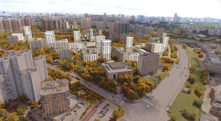
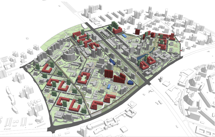
Concept of reorganizing City Blocks 32-33 and 34-35 in the area of the Vernadskogo Avenue. Photofixation of the designed construction © Ginsburg Architects + Mosproject
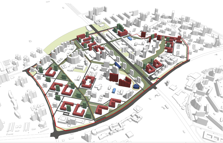
Concept of reorganizing City Blocks 32-33 and 34-35 in the area of the Vernadskogo Avenue. Location plan © Ginsburg Architects + Mosproject
In 1962, this micro-district (consisting of standard I-515 five-story buildings) was built on a windswept field between the village of Nikolskoe and the manor estate of Vorontsovo – the aerial footage shows the city spilling over the boundaries of the “Stalin” city blocks standing on the Marii Ulyanovoi Street (these had been built but two years earlier). Back in those days, the Vernadskogo Avenue was only roughly marked on the city plan, and finished in a dead end; the main thoroughfares of the nation’s capital being the Leninsky Avenue and the Borovskoe Highway that was still functioning back then. Today’s renovation site takes up about a half of the micro-district’s territory the way it was in 1962-1963: back then, six city blocks were built, currently three and a half are being considered for renovation, the two situated behind the Leninsky Avenue having been torn down and rebuilt still under the Mayor Luzhkov.
It must be said at this point that they started adding extra buildings almost as soon as the micro-district was built – these were 12-story houses. The 2000’s and 2010’s saw the appearance of towers standing along the banks of the ponds, a wall of 25-story buildings built along the edge of the park, and a few more houses 20-plus stories high, part of them meant today to accommodate for the first wave of repopulation.
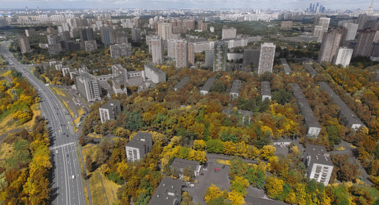
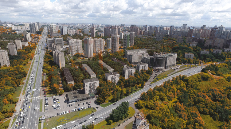
It must also be said that today the panoramas of the area demonstrate a rather vivid contrast between the five-story affairs and the 25-story giants.
Concept of reorganizing City Blocks 32-33 and 34-35 in the area of the Vernadskogo Avenue. Photofixation. The current situation © Ginsburg Architects + Mosproject
Concept of reorganizing City Blocks 32-33 and 34-35 in the area of the Vernadskogo Avenue. Photofixation. The current situation © Ginsburg Architects + Mosproject
The Footprint Magnet
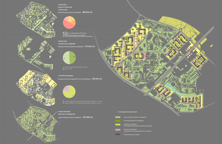
The main distinctive feature of the proposal by Aleksey Ginsburg and Mosproject is the fact that the architects are treating the existing architectural situation with utmost care; at the exhibition, their project was one of the most contextually respectful ones – even if at the expense of sacrificing some flashiness of the presentation. The architects retain the planning layouts and proceed from the outlines of the five-story buildings in order to avoid cutting the trees – according to estimates it will be possible to retain as much as 77% of the existing vegetation on the renovated site.
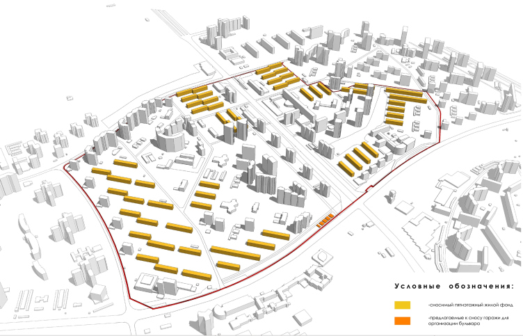
Concept of reorganizing City Blocks 32-33 and 34-35 in the area of the Vernadskogo Avenue. Plan of the old housing stock to be demolished © Ginsburg Architects + Mosproject
Concept of reorganizing City Blocks 32-33 and 34-35 in the area of the Vernadskogo Avenue. Comparative analysis of greenery © Ginsburg Architects + Mosproject
And the local residents liked that. During the public hearings, one of the local residents, worried by some issues in the projects by other authors (an automobile road running directly beneath her windows, to name but one) described the Aleksey Ginsburg project as being “more therapeutic”, because it provides for the most delicate treatment of the existing situation. And I cannot blame the local residents either because I lived for two years on the Vernadskogo Avenue in the five-story house right behind the “Zvezdny” movie theater. The trees are truly magnificent there, and another proof of that is a record number of bullfinches in winter and cats in summer (the latter would just crawl into my window on the first floor). I even had a drawing by the artist Andrew Yagubsky depicting these bullfinches and cats, made expressly for the purpose of immortalizing this peculiar urban ecosystem.
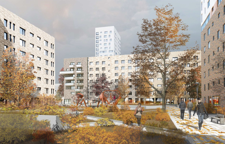
Nevertheless, the architects’ proposal does not merely boil down to building within the blueprints of the demolished houses – rather, the model that they propose can be called a hybrid one: where two five-story houses used to stand parallel to one another, seven-story houses of a shorter length appear, while between them arises a lintel of the same height that forms a semi-open urban block. The distance between the five-story houses ranged from 45 to 80 meters, the length of the block being from 60 to 90 meters, and the authors “mine” from this permanent module city blocks of different sizes: sometimes they are small, with “classic” (as might be expected for a seven-story house) yards about 50x70 meters, and sometimes they are large, encompassing not two but four five-story buildings, the latter being contextually grouped closer to the Marii Ulyanovoi Street, where “Stalin” layouts with large yards prevail.
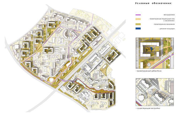
Concept of reorganizing City Blocks 32-33 and 34-35 in the area of the Vernadskogo Avenue. Landscaping plan © Ginsburg Architects + Mosproject
Concept of reorganizing City Blocks 32-33 and 34-35 in the area of the Vernadskogo Avenue. Photofixation. Schematic construction plan © Ginsburg Architects + Mosproject
On the corners of the city block towers appear, 14 to 18 stories high, which close the contour, although not completely. Thus, in the stead of the open “stitches” of the micro-districts, placed at different angles, the new housing appears, tied to its vectors, but this time of the city block type, yet spaced out with towers. The city blocks interpret the stitches of the five-story houses; the towers follow the “infill” construction, which, as we remember, started here, mostly on the perimeter, back in the 1970’s. The two systems overlap and form a complex form of mutual subjugation: not all of the towers belong to the city blocks at the same time belonging to the stitches running along the streets. Aleksey Ginsburg describes the end solution as “something in the middle” between historical perimeter-type planning and the open modernist type.
Concept of reorganizing City Blocks 32-33 and 34-35 in the area of the Vernadskogo Avenue. Architectural and space-planning design © Ginsburg Architects + Mosproject
Streets, squares, parks, and functions
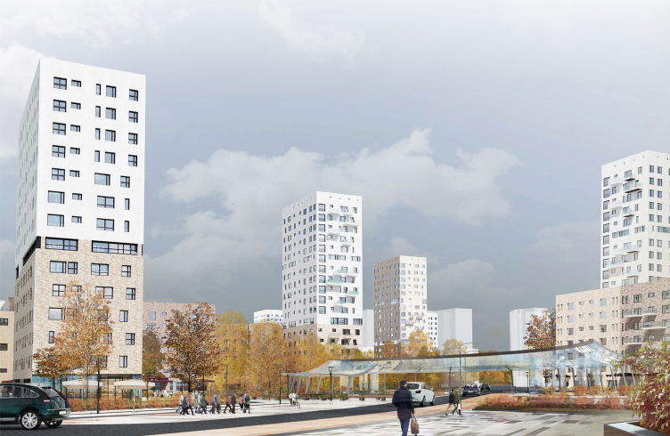
In the northwest part of the site, along the fragment of the former Borovskoe Highway, the architects built a number of towers that mark exactly the side ends of the former five-story houses. They face the street with their corners, creating (instead of the construction front that you would expect to see here) a zigzag of little triangular parks: two of them stretch northwest as small promenades, and one becomes the main square – it joins a diagonal driveway, through which it will be possible to walk from the metro station to the Moscow State University of Foreign Affairs, bypassing the busy thoroughfares. The other triangular “ledges” also play the role of mini-squares. All of the ledges have arcs or circles marked on them that bear a distant resemblance with the Catherine the Great squares of Tver and are directly resonant with a large arc-shaped “repopulation” house built on the other side of the former Borovskoe Highway.
Concept of reorganizing City Blocks 32-33 and 34-35 in the area of the Vernadskogo Avenue. Plan of the Boulevard Ring © Ginsburg Architects + Mosproject
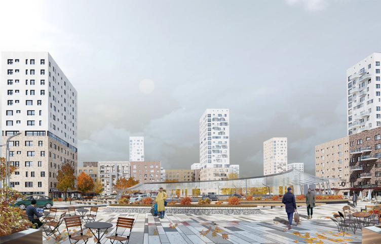
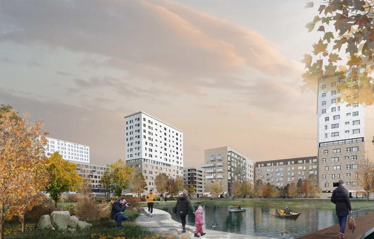
Concept of reorganizing City Blocks 32-33 and 34-35 in the area of the Vernadskogo Avenue. Visualization. View of the square © Ginsburg Architects + Mosproject
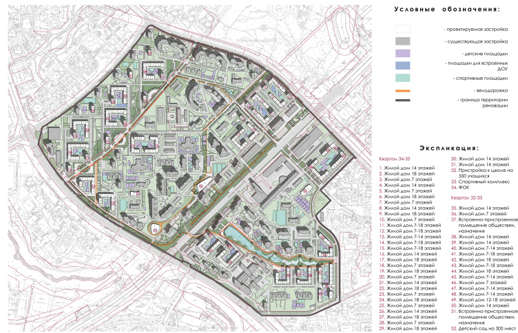
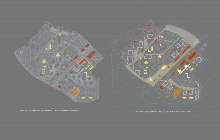
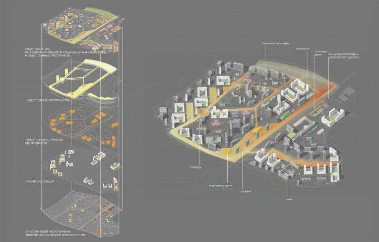
Concept of reorganizing City Blocks 32-33 and 34-35 in the area of the Vernadskogo Avenue. Social infrastructure projects © Ginsburg Architects + Mosproject
This way, the former highway is turned into a boulevard with little parks and squares, the main public urban space, lending itself to romantic walks and cafe visits. From its south part, it borders on the narrow park stretching along the Lobachevskogo Street, and this park is in turn continued by a sports boulevard around the residential towers on the Vernadskogo Avenue – here, behind the thin array of the residential buildings, the authors of the project find room for a fitness center. What the whole thing ends up looking like is a peculiar “horseshoe” of green public spaces with different specialization. They are continued by a park spreading around the ponds on the other side of the avenue – the most peaceful place, almost a full-fledged park. However, in order to tie this whole functionally diverse framework into a single system, the architects had to improve the connection between two major parts of this area.
Concept of reorganizing City Blocks 32-33 and 34-35 in the area of the Vernadskogo Avenue. Social activity © Ginsburg Architects + Mosproject
Building Bridges
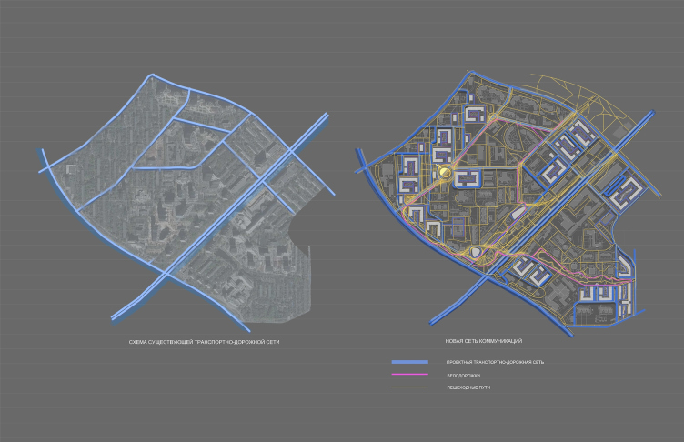
In order to do that, the architects propose to replace the overland pedestrian crossing in the south part of the avenue with a bridge equipped with elevators – it must serve the purpose of connecting the sports boulevard with the mini-park spreading around the ponds by forming two interconnected loops of pedestrian and bicycle routes.
Concept of reorganizing City Blocks 32-33 and 34-35 in the area of the Vernadskogo Avenue. Transport diagram © Ginsburg Architects + Mosproject
Solving the problem of the low transparency of the district so far seems unrealistic: too many fences have been built over the last twenty years, and “opening them up” could be quite a chore. At the same time, speaking to the local residents, the authors of the project came to a conclusion that for the elderly people who live here, the opportunity to reach some important places on foot is extremely important. That’s why they accentuated and strengthened all of the available pedestrian connections, adding, of course, driveways around the new houses.
Architecture of Moderation
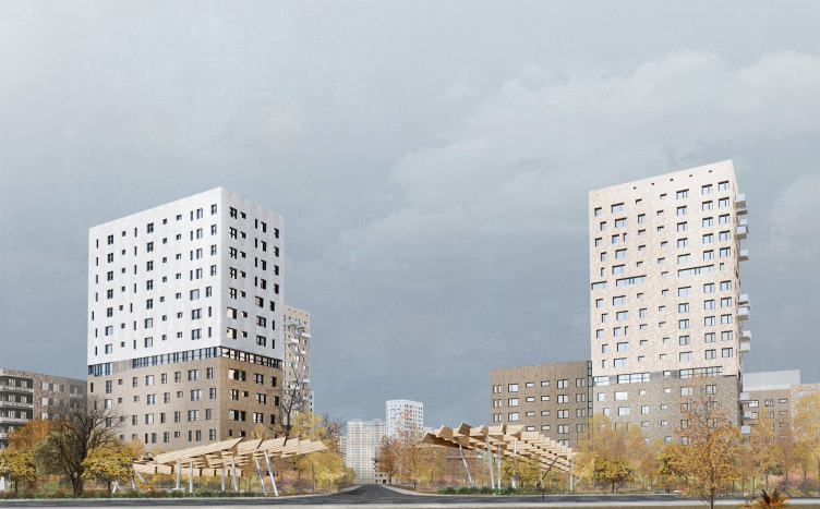
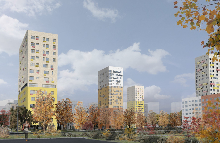
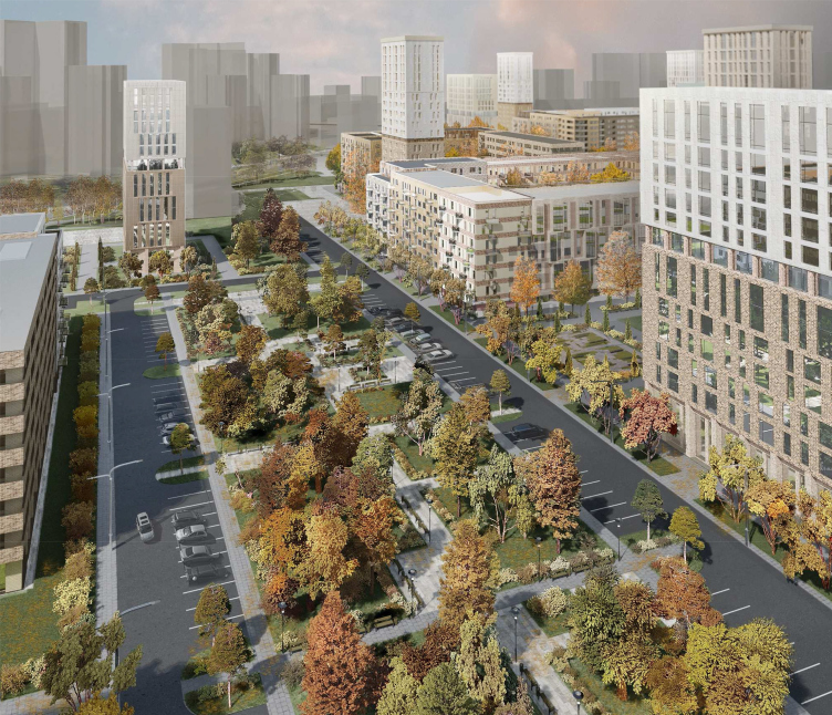
As for the architecture of this project as such, the authors describe it as “deliberately conditional”; the houses neutrally look like one another, and there isn’t much of fashionable glass, either. The basic height is seven floors, which is the arithmetic average between the five-story buildings and the nearest “Stalin” houses 9-10 stories high – the latter are obviously addressed by the brownish color of the 7-story sections; it also correlates fairly well with the brick Soviet towers. The height of the towers is one third of the infill construction of recent years, which also brings the contrast to a certain average norm. The top parts of the towers are “cut away” by a glass floor; they sport the “above-clouds” white color – a psychological technique meant to make the urban giant look smaller. Underneath all the new buildings, there is a tier of an underground parking garage.
Concept of reorganizing City Blocks 32-33 and 34-35 in the area of the Vernadskogo Avenue. Visualization. View of the city block © Ginsburg Architects + Mosproject
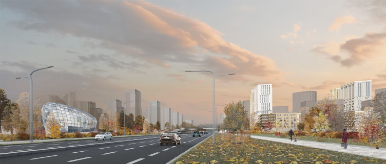
Concept of reorganizing City Blocks 32-33 and 34-35 in the area of the Vernadskogo Avenue. Visualization. View of the boulevard © Ginsburg Architects + Mosproject
Concept of reorganizing City Blocks 32-33 and 34-35 in the area of the Vernadskogo Avenue. Visualization. View of the park © Ginsburg Architects + Mosproject
Concept of reorganizing City Blocks 32-33 and 34-35 in the area of the Vernadskogo Avenue. Visualization. View of the city block © Ginsburg Architects + Mosproject
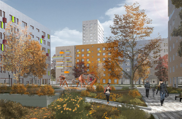
Concept of reorganizing City Blocks 32-33 and 34-35 in the area of the Vernadskogo Avenue. Visualization. View of the yard © Ginsburg Architects + Mosproject
Concept of reorganizing City Blocks 32-33 and 34-35 in the area of the Vernadskogo Avenue. Visualization. View of the yard © Ginsburg Architects + Mosproject
Concept of reorganizing City Blocks 32-33 and 34-35 in the area of the Vernadskogo Avenue. Visualization. View of the little park © Ginsburg Architects + Mosproject
Concept of reorganizing City Blocks 32-33 and 34-35 in the area of the Vernadskogo Avenue. Visualization. View of the Vernadskogo Avenue © Ginsburg Architects + Mosproject
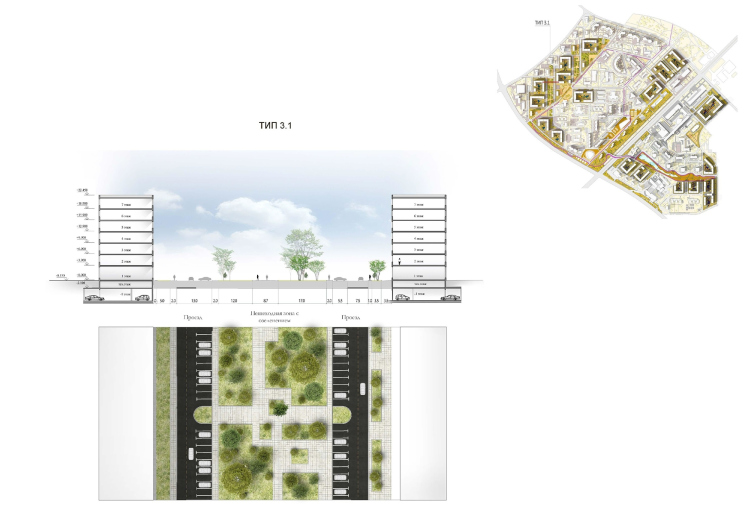
Concept of reorganizing City Blocks 32-33 and 34-35 in the area of the Vernadskogo Avenue. Section view of the territory. Height marks and road profiles. 3. The in-block driveways between the urban blocks © Ginsburg Architects + Mosproject
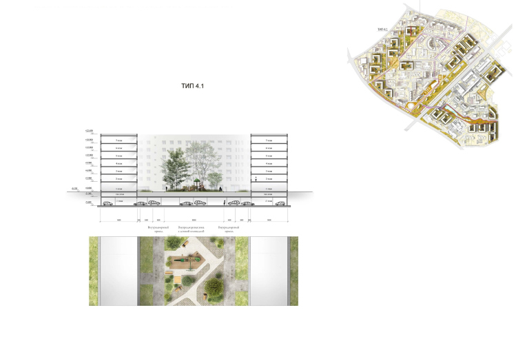
Concept of reorganizing City Blocks 32-33 and 34-35 in the area of the Vernadskogo Avenue. Section view of the territory. Height marks and road profiles. 4. The urban blocks © Ginsburg Architects + Mosproject
Stages
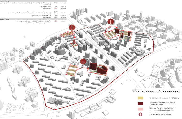
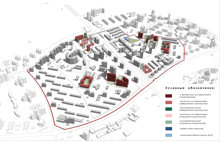
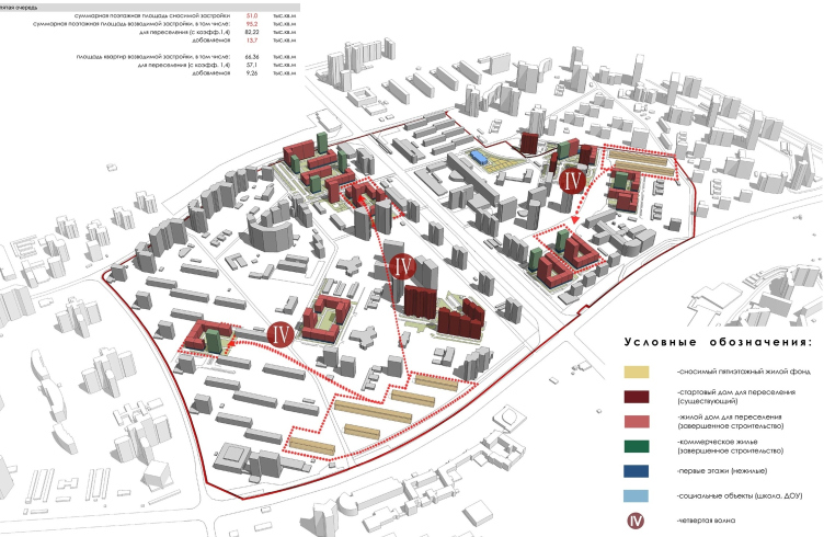
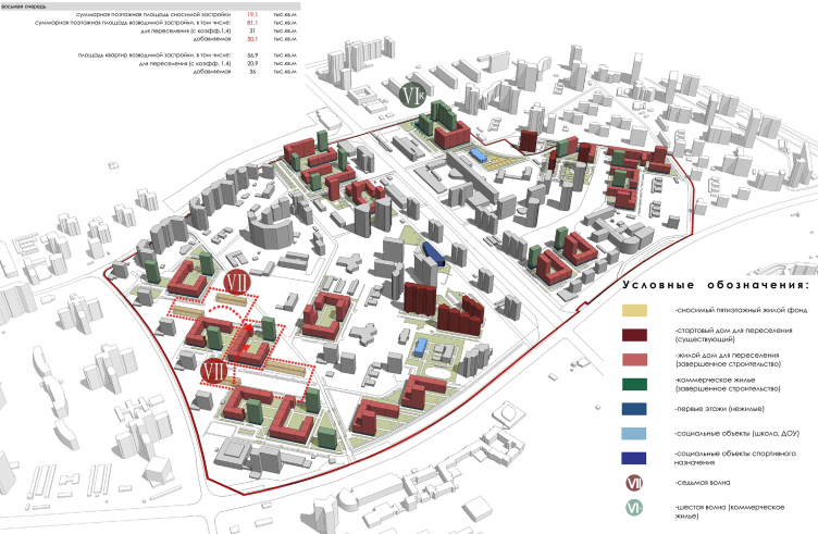
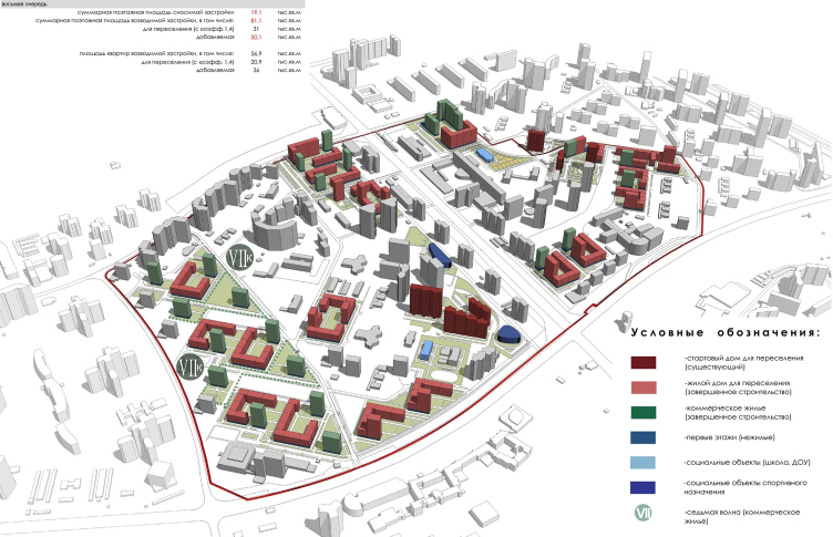
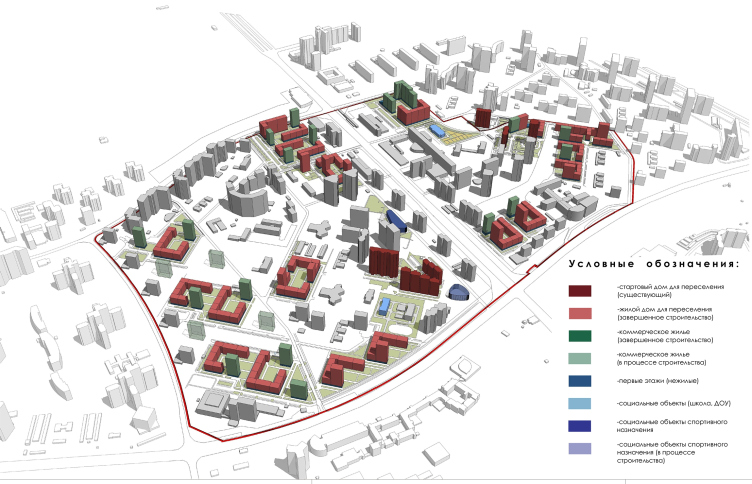
Part of the contest specifications was the requirement for calculating the period of implementation and the logic of repopulation. Seven repopulation waves are anticipated. The first wave uses the already-built “starting” houses and it will “wash away” the old housing stock in the center of the two halves of the district. The second wave is the five-story houses next to the “Zvezdny” movie theater, the ones next to Clinic 31, and so on. The residents are relocated to the nearest houses in such a way that they do not even have to change the right side of the avenue to the left side and vice versa. We will note here that the housing to be sold is chiefly situated in the separately standing towers distributed all over the area, some closer to the metro station, some farther away from it, but still, in a pretty smooth fashion. Possibly, such division of volumes into migratory and commercial type must simply the task selling the housing stock; according to the plan, the commercial housing towers will be the last to be built.
Concept of reorganizing City Blocks 32-33 and 34-35 in the area of the Vernadskogo Avenue. Wave migration © Ginsburg Architects + Mosproject
Concept of reorganizing City Blocks 32-33 and 34-35 in the area of the Vernadskogo Avenue. Wave migration. The second stage of building the third wave © Ginsburg Architects + Mosproject
Concept of reorganizing City Blocks 32-33 and 34-35 in the area of the Vernadskogo Avenue. Wave migration. The fourth wave © Ginsburg Architects + Mosproject
Concept of reorganizing City Blocks 32-33 and 34-35 in the area of the Vernadskogo Avenue. Wave migration. The seventh wave © Ginsburg Architects + Mosproject
Concept of reorganizing City Blocks 32-33 and 34-35 in the area of the Vernadskogo Avenue. Wave migration. The final stage of construction © Ginsburg Architects + Mosproject
Concept of reorganizing City Blocks 32-33 and 34-35 in the area of the Vernadskogo Avenue. Wave migration. The stage of building the commercial housing stock © Ginsburg Architects + Mosproject
Therapy as a Principle
The Soviet town planning tradition was notable for its “surgical” approach to designing the urban environment; it was not for nothing that some of its results were aptly called “a set of false teeth”: explosions, incisions, and intrusions. Then, in the 1980’s, this approach was finally discarded, and (theoretically) the interest to context prevailed – the desire to research, respond, reflect, and fit in with the surroundings. This approach is most common in a historic city but here it is applied to a modernist heritage, which feels slightly paradoxical: the footprints of those “standardized” houses that once marched these fields are not immortalized by the tactful architects. Figuratively speaking, instead of a “second surgery”, the architects are proposing the “first therapy” of the space, built only some 55 years ago and now falling into some sort of decay. It is easy to notice that the architecture that arises in this project is essentially a cross between five-story houses and... twenty-five story houses not only in terms of planning but also in terms of their height and volume. It probably claims the part of the perfect connecting tissue because it possesses a number of features of “this” and “that” side, which accounts for its immanent winsome look, not seen at a first glance.
Just as tactfully as they did with the trees and the planning structure of the area, the architects are treating its economic realities and functions, trying not to overburden the project with anything supernatural, expensive, all-to-complex, or even potentially unpopular.
“Everything that we did together with the architects Dmitry Aleksandrov and Aleksey Bavykin as part of the expert group is based on the economic and technical calculations – shares Aleksey Ginsburg – No castles in the air, nothing fancy, just solving specific tasks: to create a public space, to keep intact the trees and the scale of construction, and to connect the two parts of the area through the Vernadskogo Avenue. Our proposal takes into account the opinion of many people living in this area. We talked to these people even before the public hearings were organized. The very fact that these people came to the public hearings and said: “Yes, you built it exactly the way we wanted” is for us a great reward in itself”.
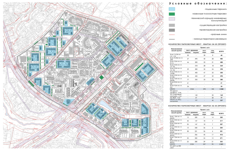
Concept of reorganizing City Blocks 32-33 and 34-35 in the area of the Vernadskogo Avenue. The parking lots © Ginsburg Architects + Mosproject
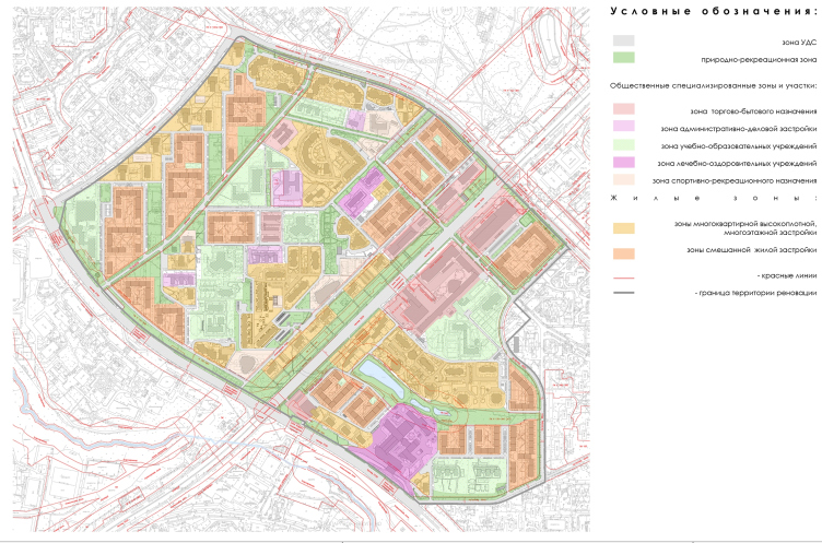
Concept of reorganizing City Blocks 32-33 and 34-35 in the area of the Vernadskogo Avenue. Planning structure elements © Ginsburg Architects + Mosproject
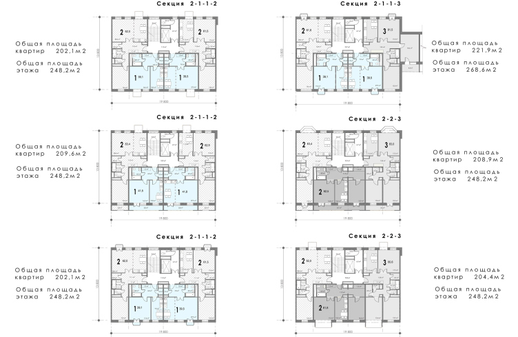
Concept of reorganizing City Blocks 32-33 and 34-35 in the area of the Vernadskogo Avenue. Plans of the standard floors of the linear sections © Ginsburg Architects + Mosproject
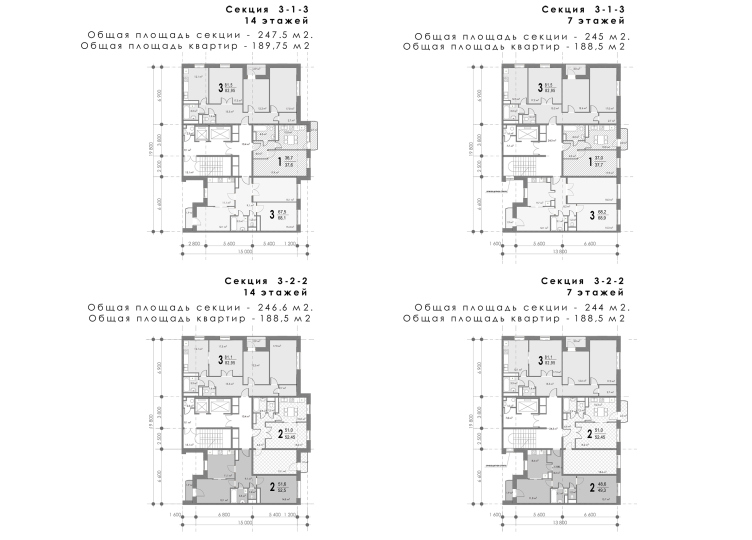
Concept of reorganizing City Blocks 32-33 and 34-35 in the area of the Vernadskogo Avenue. Plans of the standard floors of the corner sections © Ginsburg Architects + Mosproject
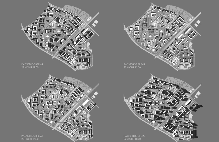
Concept of reorganizing City Blocks 32-33 and 34-35 in the area of the Vernadskogo Avenue. Shadow map © Ginsburg Architects + Mosproject


