По-русски

​City Block of High Culture

In this issue, we are showcasing the four projects which took part in the competition that was held in the beginning of 2017 and was dedicated to renovating the complex of buildings of the former Sytin printing house into a residential complex.

11 December 2017
Contest Results
mainImg
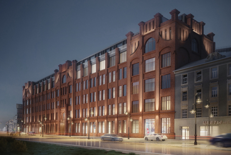
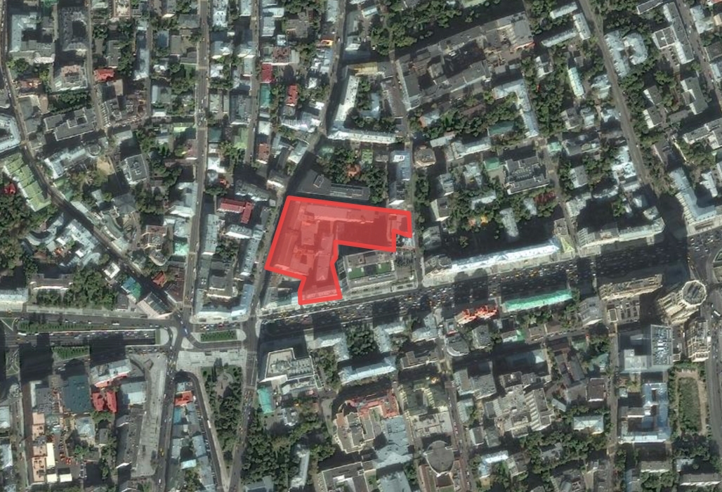
The construction territory is essentially a city block delineated by the Pyatnitskaya and Valovaya Streets, and the 2nd and 3rd Monetchikovsky alleys, for the exception of the building standing on the corner of the Pyatnitskaya Street and the Garden Ring and the Lighthouse business center. Currently, this is the property of the “First Exemplary Printing Works”, the heir of the once-famous Sytin’s printing company. This very part of the Zamoskvorechye district is one of Moscow’s most “prayed-in” spots: suffice it to say that long before the printing house was built here, this was the place where the playwright Alexander Ostrovsky lived; as for the buildings themselves, they witnessed many historic moments, including the bloody ones – it was here that the Moscow strike of 1905 started, during which the place was almost burned down to the ground. Its role as a cultural heritage site is just as important: this printing house printed nearly a quarter of all the Russian publications, and was visited at one time or another by all the key figures of the Silver Age of the Russian literature. The complex that was supposed to be renovated into a premium class residential city block consists of three buildings erected at the brink of XIX-XX centuries, one building that was built in the 1930’s, and a few minor ones of no historical value, in whose stead new construction was going to take place. The main building – 71, Pyatnitskaya Street, with a gothic entrance and figured attics, an acclaimed masterpiece of Moscow’s Art Nouveau style, built in 1903 – was originally designed by the architect Adolph Erichson and the engineer Vladimir Shukhov; in the soviet time, its fourth floor got a buildup that significantly distorted the authors’ original idea. These two people also designed the red-brick Building 3 which stands inside the yard – it appeared in 1912 and housed the apartments of the employees of the company; the building that stands along the Valovaya Street was built by the architects Rybinsky and Voskresensky a little bit earlier, in 1888, and originally functioned as a tenement house. All the historical buildings were to be renovated with full reconstruction of their inside space into residential premises; the construction of mansards and penthouses was also planned. The building of soviet origin was to be renovated; its framework to be kept intact. All the later structures were to be replaced by new buildings.

Four Moscow-based architectural firms took part in the competition: Kleinewelt, ABV, DNK, and Wall. The competition was won by Kleinewelt Architekten. Then the construction was canceled.

Kleinewelt

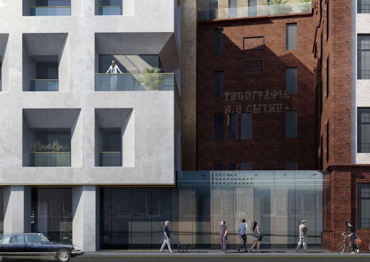
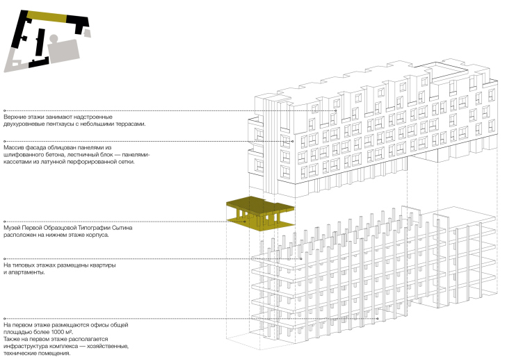
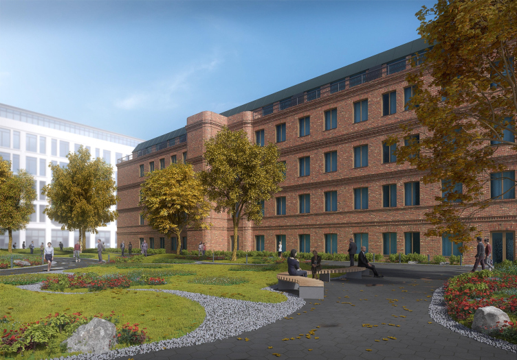
Competition project for renovating the Sytin Printworks into a premium-class apartment and housing complex. Sytin Printworks Museum © Kleinewelt Architekten


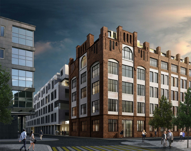
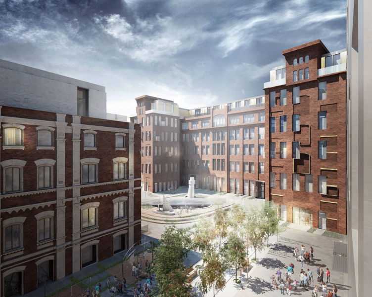
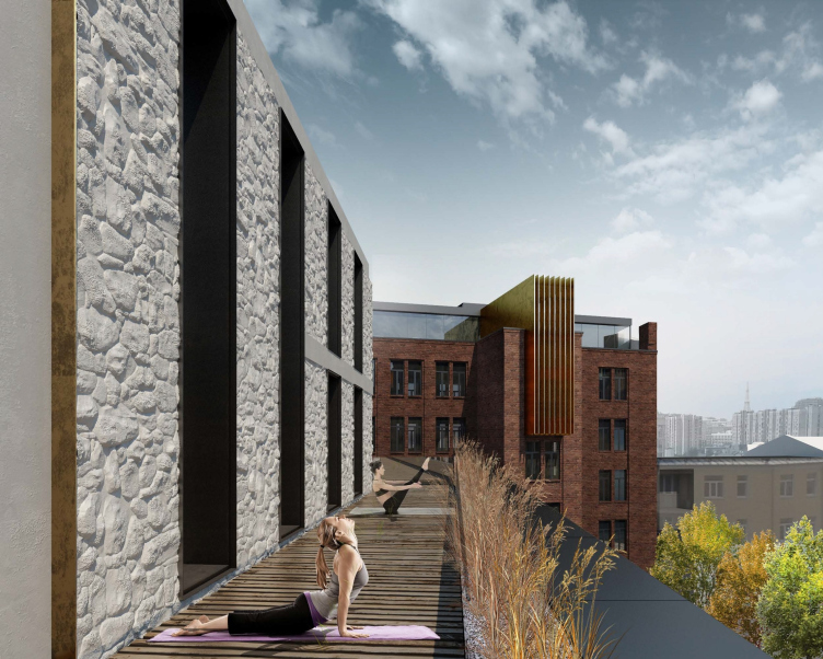
The concept of this literature-oriented project is built upon the combination of different imagery systems based on the creative works of five Russia’s greatest men of letters – Tolstoy, Gogol, Esenin, Mayakovsky, and Blok – within the framework of a single city block. According to the authors’ idea, such saturated cultural content must take the complex to a whole new level, as far as its premium quality is concerned, which proceeds from the interpretation of material and emotional comfort, and the possibility for each of the potential clients to choose the kind of atmosphere that appeals personally to him. Based on serious scientific research, the restoration of the historical façades is tactfully augmented by laconic buildups of penthouses; the authors design the plastique of the new buildings in broad strokes, putting together large cubes with sunken-in recessions, or hefty stone slabs that symbolize the new epoch and new artistic statement. As for the center of public life of this city block, it must become the yard space devoted to Diaghilev Russian Seasons.

More on the project by Kleinewelt Architekten

Competition project for renovating the Sytin Printworks into a premium-class apartment and housing complex. Layout. Tolstoy building © Kleinewelt Architekten


Competition project for renovating the Sytin Printworks into a premium-class apartment and housing complex. Layout. Mayakovski building © Kleinewelt Architekten


Competition project for renovating the Sytin Printworks into a premium-class apartment and housing complex. Gogol against the background of Tolstoy © Kleinewelt Architekten


Competition project for renovating the Sytin Printworks into a premium-class apartment and housing complex. Layout. Gogol building © Kleinewelt Architekten


Competition project for renovating the Sytin Printworks into a premium-class apartment and housing complex. Gogol building. Penthouse © Kleinewelt Architekten
***

ABV

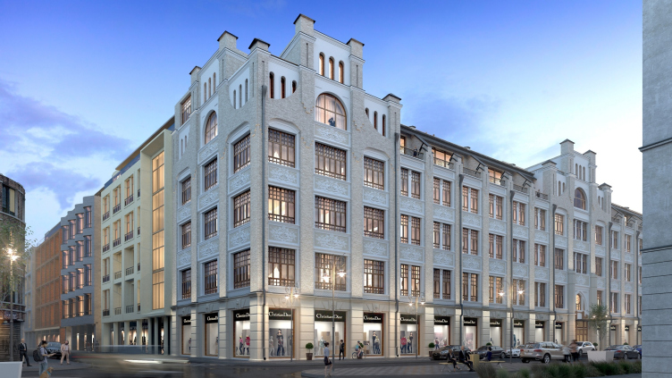
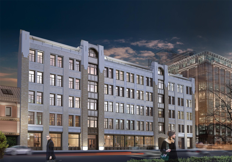
Contest project of renovating the First Exemplary Printing Works. Building 1 © ABV Group


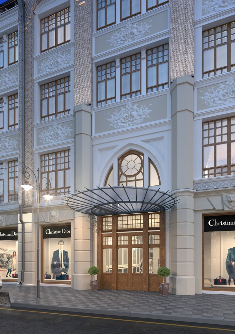
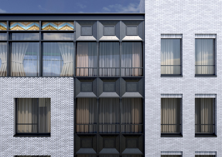
Together with restoring the appearance of the historical buildings, the authors of the project laid stress on developing a diverse range of apartments. As for the difficult charade formed by the Shukhov columns, Erichson windows, vaulted ceilings, and modern requirements for residential property, the architects were only able to solve it by stepping away from the technical specifications. The architects brought the silhouette of the main building back to its original outline by shifting the mansard inwards; the façade was designed in gray and beige tones with intricate sculptured decor. The extended façade of the building standing on the 2nd Monetchikovsky Alley was divided into four parts that can be visually perceived as independent buildings; the new building on the corner of the block, quite new in its architecture, is decorated with colorful Art Nouveau ornaments which refer us to the epoch when the historic buildings of the complex were built.

More on the project by ABV

Contest project of renovating the First Exemplary Printing Works. Building 1 © ABV Group


Contest project of renovating the First Exemplary Printing Works. Building 2 © ABV Group


Contest project of renovating the First Exemplary Printing Works. Building 3 © ABV Group


Contest project of renovating the First Exemplary Printing Works. Building 4 © ABV Group


Contest project of renovating the First Exemplary Printing Works. Building 6 © ABV Group


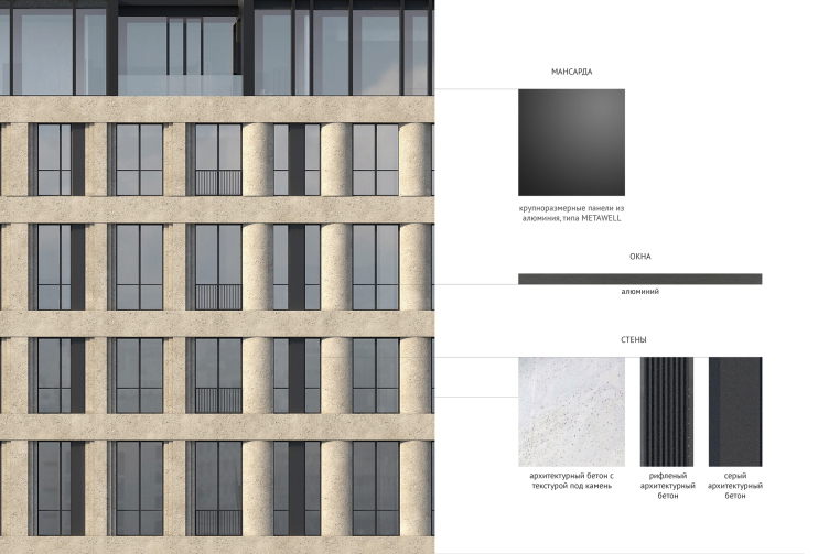
Contest project of renovating the First Exemplary Printing Works. Building 6. Facade fragment © ABV Group
***

DNK ag

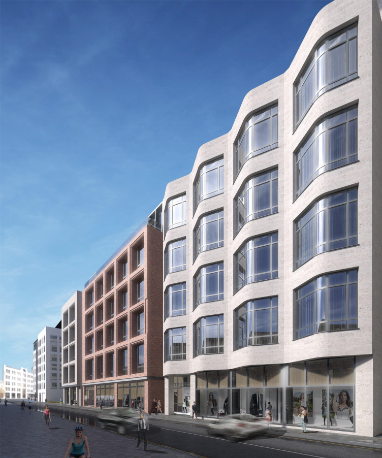
Contest project of renovating the First Exemplary Printing Works. View from the Pyatnitskaya Street © DNK ag


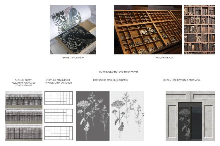
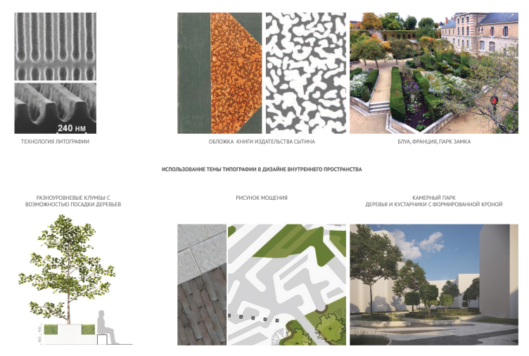
The imagery of the project is based on the theme of a printing house in its most direct meaning – a place where books are printed. The relief as the basis of book printing, the structure of a letter case, fragments of engraved plates and ornaments – all these attributes of book-printing business turned into architectural and decorative techniques that unite the historical and newly-built buildings of the complex into a single whole. The building which stands on the 2nd Monetchikovsky Alley embodies the link of time: the framework that the authors keep intact looks as though it “breaks through” the new façade that has been dressed upon it. In order to make sure that the building is not perceived as a monotonous one, the architects proposed three different versions of arranging the coffers on the façade, while on the mansard level the building’s silhouette is broken into three parts by the cutaways of the terraces. As for the building that stands inside the yard, the authors propose to build it up with a mansard of ostentatiously modern shape with a jagged line of the façade, which would thematically connect this city block to the neighboring buildings, while the yard landscaping is graced with elements of castle architecture.

More on the project by DNK ag

Contest project of renovating the First Exemplary Printing Works. The concept © DNK ag


Contest project of renovating the First Exemplary Printing Works. Concept of landscaping the yards © DNK ag


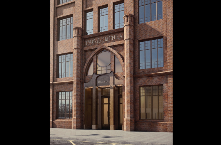
Contest project of renovating the First Exemplary Printing Works. Main entrance from the Pyatnitskaya Street © DNK ag


Contest project of renovating the First Exemplary Printing Works. Fragment of the facade of Building 2 standing along the 3rd Monetchikovsky Alley. Version 1 © DNK ag


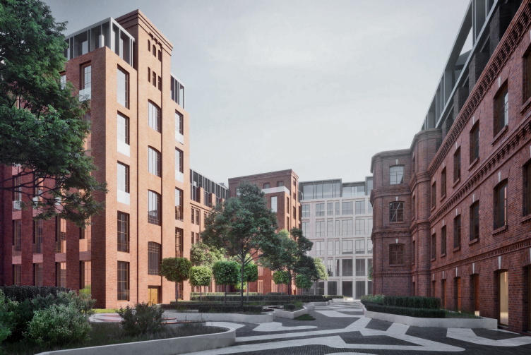
Contest project of renovating the First Exemplary Printing Works. View of the old yard © DNK ag


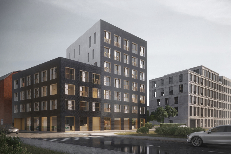
Contest project of renovating the First Exemplary Printing Works. New building on the 3rd Monetchikovsky Alley © DNK ag
***

Wall

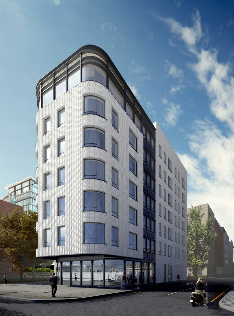
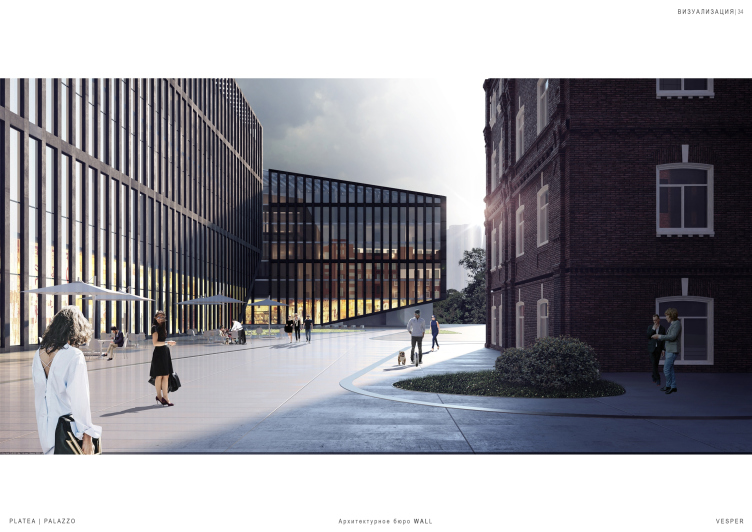
Contest concept of renovating the First Exemplary Printing Works. © Wall


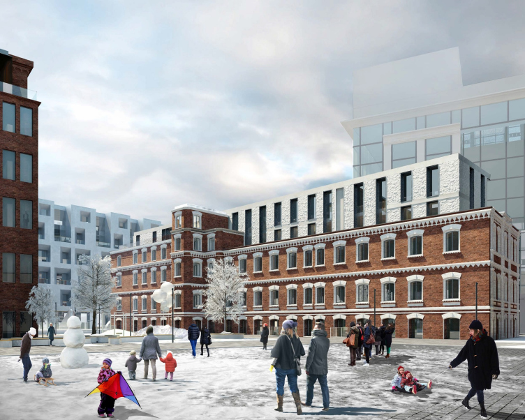
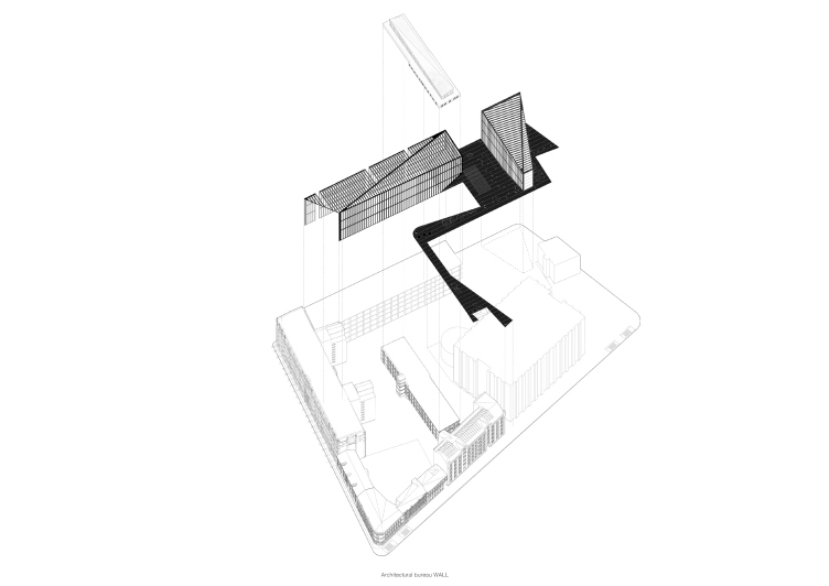
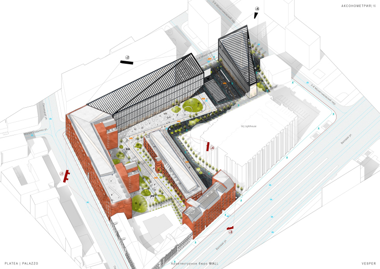
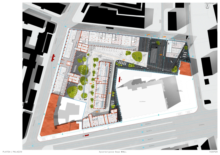
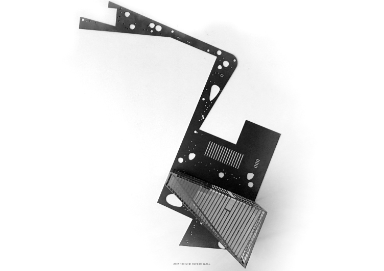
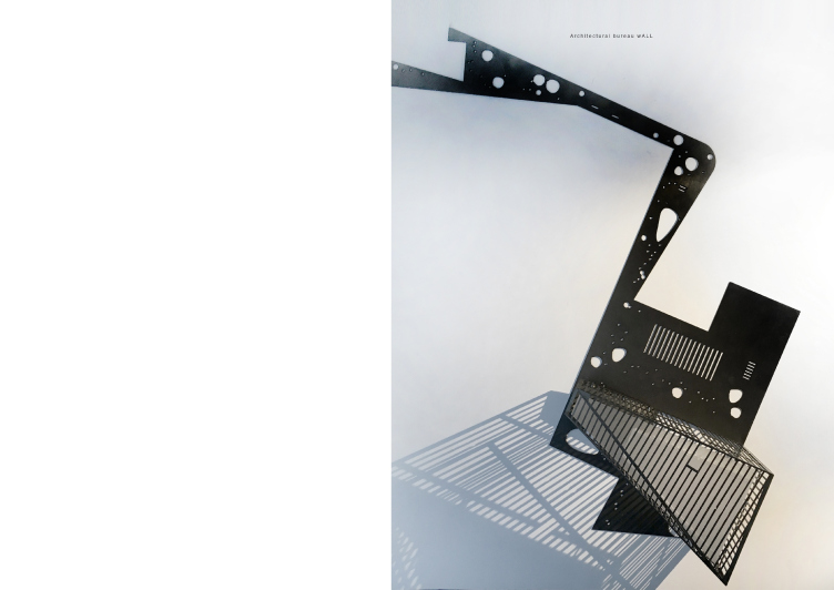
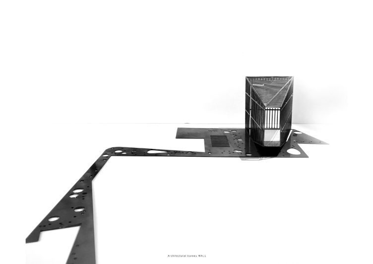
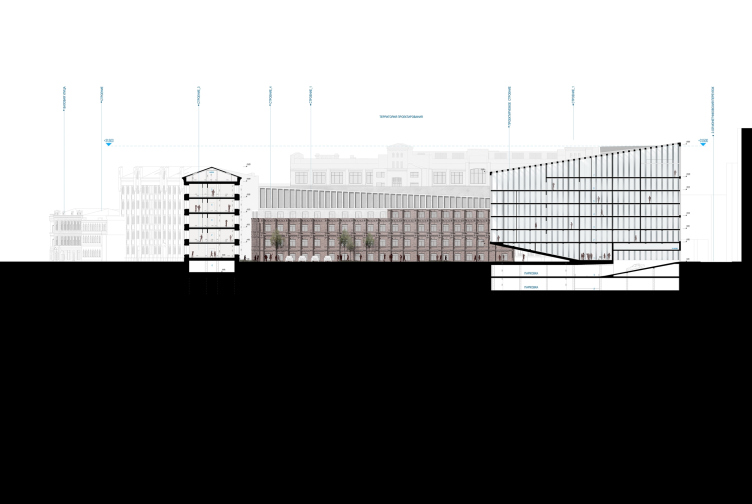
The authors of the project propose to use such a new by Moscow standards technique as “semi-private space”. Leaving part of the yard in full power of the residents of the complex, they turn the rest of the territory into the so-called “black path”, marked by contrastive paving. Starting from the Garden Ring, it leads to a newly-built sculpture of a building that the architects treat as the cornerstone of this city block defining its identity. This is a trapeze-plan glass volume with a slanting roof, dissected into slender verticals by black pylons. The same kind of plastique is applied to the façades of the renovated “soviet” building on the 2nd Monetchikovsky Alley. As far as the historical buildings are concerned, the architects are planning to restrict themselves to maximum preservation and restoration of the aesthetics of the existing construction.

Contest concept of renovating the First Exemplary Printing Works. © Wall


Contest concept of renovating the First Exemplary Printing Works. © Wall


Contest concept of renovating the First Exemplary Printing Works. © Wall


Contest concept of renovating the First Exemplary Printing Works. © Wall


Contest concept of renovating the First Exemplary Printing Works. © Wall


Contest concept of renovating the First Exemplary Printing Works. © Wall


Contest concept of renovating the First Exemplary Printing Works. © Wall

***
 

11 December 2017

Headlines now
The Golden Crown
The concept for a dental clinic in Yekaterinburg, developed by CNTR Studio, revolves around the idea of a “mouth full of gold”: pristine white porcelain stoneware walls are complemented by matte brass details. To avoid an overly literal interpretation, the architects focused on the building’s proportions, skillfully navigating between sunlight requirements and fire safety regulations.
Flexibility and Integration
Not long ago, we covered the project for the fourth phase of the ÁLIA residential complex, designed by APEX. Now, we’ve been shown different fence concepts they developed to enclose the complex’s private courtyards, incorporating a variety of public functions. We believe that the sheer fact that the complex’s architects were involved in such a detail as fencing speaks volumes.
A Step Forward
The HIDE residential complex represents a major milestone for ADM architects and their leaders Andrey Romanov and Ekaterina Kuznetsova in their quest for a fresh high-rise aesthetic – one that is flexible and layered, capable of bringing vibrancy to mass and silhouette while shaping form. Over recent years, this approach has become ADM’s “signature style”, with the golden HIDE tower playing a pivotal role in its evolution. Here, we delve into the project’s story, explore the details of the complex’s design, and uncover its core essence.
Gold in the Sands
A new office for a transcontinental company specializing in resource extraction and processing has opened in Dubai. Designed by T+T Architects, masters of creating spaces that are contemporary, diverse, flexible, and original, this project exemplifies their expertise. On the executive floor, a massive brass-clad partition dominates, while layered textures of compressed earth create a contextually resonant backdrop.
Layers and Levels of Flight
This project goes way back – Reserve Union won this architectural competition at the end of 2011, and the building was completed in 2018, so it’s practically “archival”. However, despite being relatively unknown, the building can hardly be considered “dated” and remains a prime example of architectural expression, particularly in the headquarters genre. And it’s especially fitting for an aviation company office. In some ways, it resembles the Aeroflot headquarters at Sheremetyevo but with its own unique identity, following the signature style of Vladimir Plotkin. In this article, we take an in-depth look at the United Aircraft Corporation (UAC) headquarters in the Moscow agglomeration town of Zhukovsky, supplemented by recent photographs from Alexey Naroditsky – a shoot that became only recently possible due to the fact that improvements were finally made in the surrounding area.
Light and Shadow
In this article, we delve into the architectural design of the “Chaika” house by DNK ag architects, which was recently completed in 2023 as part of the collection of signature designs at ZILArt. As is well-known, all the buildings in this complex follow a design code, yet each one is distinct. This particular building stands out not only for its whiteness and minimalism but also for the refined use of a limited number of techniques that, together, create what can confidently be called synergy.
Casus Novae
A master plan was developed for a large residential area with a name of “DNS City”, but now that its implementation began, the plan has been arbitrarily reformatted and replaced with something that, while similar on the surface, is actually quite different. This is not the first time such a thing happens, but it’s always frustrating. With permission from the author, we are sharing Maria Elkina’s post.
Treasure Hunting
The GAFA bureau, in collaboration with Tegola and Arkhitail, organized an expedition to the island of Kilpola in Karelia as part of Moskomarkhitektura’s “Open City” festival. There, amidst moss and rocks, the students sought answers to questions like: what is the sacred, where does it dwell, and what sustains it? Assisting the participants in this quest were landscape engineer Evgeny Levin, artist Nicholas Roerich, a moose, and the lack of cellular connection. Here’s how the story unfolded.
Depths of the Earth, Streams of Water
In the Malaya Okhta district, the Akzent building, designed by Stepan Liphart, was constructed. It follows a classic tripartite structure, yet it’s what you might call “hand-drawn”: each façade is unique in its form and details, some of which aren’t immediately noticeable. In this article, we explore the context and, together with the architect, delve into how the form was developed.
Fir Tree Dynamics
The “Airports of Region” holding is planning to build an airport in Karachay-Cherkessia, aiming to make the Arkhyz and Dombay resorts more accessible to travelers. The project that won in an invitation-only competition, submitted by Sergey Nikeshkin’s KPLN, blends natural imagery inspired by the shape of a conifer seed, open-air waiting spaces, majestic large trees, and a green roof elevated on needle-like columns. The result is both nature-inspired and WOW.
​A Brick Shell
In the process of designing a clubhouse situated among pine trees in a prestigious suburban area near Moscow, the architectural firm “A.Len” did the façade design part. The combination of different types of brick and masonry correlates with the volumetric and plastique solutions, further enhanced by the inclusion of wood-painted fragments and metal “glazing”.
Word Forms
ATRIUM architects love ambitious challenges, and for the firm’s thirtieth anniversary, they boldly play a game of words with an exhibition that dives deep into a self-created vocabulary. They immerse their projects – especially art installations – into this glossary, as if plunging into a current of their own. You feel as if you’re flowing through the veins of pure art, immersed in a universe of vertical cities, educational spaces – of which the architects are true masters – and the cultural codes of various locations. But what truly captivates is the bold statement that Vera Butko and Anton Nadtochy make, both through their work and this exhibition: architecture, above all, is art – the art of working with form and space.
Flexibility and Acuteness of Modernity
Luxurious, fluid, large “kokoshniks” and spiral barrel columns, as if made from colorful chewing gum: there seem to be no other mansion like this in Moscow, designed in the “Neo-Russian-Modern” style. And the “Teremok” on Malaya Kaluzhskaya, previously somewhat obscure, has “come alive with new colors” and gained visibility after its restoration for the office of the “architectural ecosystem” as the architects love to call themselves. It’s evident that Julius Borisov and the architects at UNK put their hearts into finding this new office and bringing it up to date. Let’s delve into the paradoxes of this mansion’s history and its plasticity. Spoiler: two versions of modernity meet here, both balancing on the razor’s edge of “what’s current”.
Yuri Vissarionov: “A modular house does not belong to the land”
It belongs to space, or to the air... It turns out that 3D printing is more effective when combined with a modular approach: the house is built in a workshop and then adapted to the site, including on uneven terrain. Yuri Vissarionov shares his latest experience in designing tourist complexes, both in central Russia and in the south. These include houseboats, homes printed from lightweight concrete using a 3D printer, and, of course, frame houses.
​Moscow’s First
“The quality of education largely depends on the quality of the educational environment”. This principle of the last decade has been realized by Sergey Skuratov in the project for the First Moscow Gymnasium on Rostovskaya Embankment in the Khamovniki district. The building seamlessly integrates into the complex urban landscape, responding both to the pedestrian flow of the city and the quiet alleyways. It skillfully takes advantage of the height differences and aligns with modern trends in educational space design. Let’s take a closer look.
Looking at the Water
The site of Villa Sonata stretches from the road to the water’s edge, offering its own shoreline, pier, and a picturesque river panorama. To reveal these sweeping views, Roman Leonidov “cut” the façade diagonally parallel to the river, thus getting two main axes for the house and, consequently, “two heads”. The internal core – two double-height spaces, a living room and a conservatory, with a “bridge” above them – makes the house both “transparent” and filled with light.
The White Wing
Well, it’s not exactly white. It’s more of a beige, white-stone structure that plays with the color of limestone – smoother surfaces are lighter, while rougher ones are darker. This wing unites various elements: it absorbs and interprets the surrounding themes. It responds to everything, yet maintains a cohesive expression – a challenging task! – while also incorporating recognizable features of its own, such as the dynamic cuts at the bottom, top, and middle.
Urban Dunes
The XSA Ramps team designed and built a three-part sports hub for a park in Rostov-on-Don, welcoming people of all ages and fitness levels. The skate plaza, pump track, and playground are all meticulously crafted with details that attract a diverse range of visitors. The technical execution of the shapes and slopes transforms this space into a kind of sculptural composition.
Proportional Growth
The project for the fourth phase of the ÁLIA residential area has been announced. The buildings are situated on an elongated plot – almost a “ray” that shoots out from the center of the area towards the river. Their layout reflects both a response to Moscow’s architectural preferences over the past 15 years, shifting “from blocks to towers”, and an interpretation of the neighboring business park designed by SOM. Additionally, the best apartments here are not located at the very top but closer to the middle, forming a glowing “waistline”.
The “Staircase” Building
In designing the “Details” residential complex in New Moscow, Rais Baishev spiced up the now-popular Moscow theme of a “courtyard” building with an idea drawn from the surrealist drawings by Maurits Escher. He envisioned the stepped silhouettes and descending slopes as a metaphysical mega-staircase, creating a key void within the courtyard that gave the project an internal “spine”. This concept is felt both in the building’s silhouette and on its façades.
Projection of the Quarter
No one doubted that the building that Vladimir Plotkin designed as part of the “Garden Quarters” would be the most modernist of all. And it turned out just that way: while adhering to the common design code, the building successfully combines brick and white stone, rhythmically responding to the neighboring building designed by Ostozhenka, yet tactfully and persistently making a few statements of its own. This includes the projection of the ideal urban development composition “14–9–6”, which can be found right next door, mathematical calculations, including those for various types of terraces (and perhaps the only reminder of the Soviet past of the Kauchuk rubber factory!), and the white “cross-stitch” pattern of the façade grid.
Domus Aurea
In this issue, we examine the “Tessinsky-1” house, designed by Sergey Skuratov and completed in 2023. Located in the middle of the Serebryanicheskaya Embankment district, at the intersection of its main streets, this house assumes a sort of “nodal” role: it not only responds to everything around it and preserves many memories of the former EMA factory within itself, but it weaves all this into a newly directed pattern, reconciling bright “gold” and dark-colored brick, largely with the help of the new, modern-yet-archaic Columba brick, which, come to think about it, is the most precious element here.
The Chimney of Nikola-Lenivets
In this issue, we are examining the “Obelisk House” designed by KATARSIS and built for the Arkhstoyanie 2023 festival. However, it was only finished later on, and this is why we are examining it now. It seems to us that after the “Obelisk House” appeared in Nikola-Lenivets, a dialogue and a few inner connections appeared between the temporary structures built here. These houses no longer look like “accidental neighbors”, more of which below.
​Periscope by the Bay
The jury awarded the second place in the competition for a public and cultural center in Petropavlovsk-Kamchatsky to the companies GORA (“Mountain”) and M4. In the consortium’s proposal, the building resembles a sperm whale with a calf swimming next to it or a periscope, whose lenses capture the most spectacular views from the surrounding landscape.
From Arcs to Dolmens
While working on the competition project for Petropavlovsk-Kamchatsky, ASADOV Architects prioritized the value of the natural and urban environment, aiming to preserve the balance of the location while minimizing the resemblance of the volume that they designed to a “traditional building”. The task was challenging, and the architects created three versions, one of which having been developed after the competition, where their main proposal took third place. However, the point of interest here is not the competition result but the continuity of creative thinking.
Hide and Seek
The ID Moskovskiy house, designed by Stepan Liphart in St. Petersburg, in the courtyards near Moskovskiy Avenue beyond the Obvodny Canal and recently completed, is notable for several reasons. Firstly, it has been realized with considerable accuracy, which is particularly significant as this is the first building where the architect was responsible not only for the facades but also for the layouts, allowing for better integration between the two. On the other hand, this building is interesting as an example of the “germination” of new architecture in the city: it draws on the best examples from the neighborhood and becomes an improved and developed sum of ideas found by the architect in the surrounding context.
The Big Twelve
Yesterday, the winners of the Moscow Mayor’s Architecture Award were announced and honored. Let’s take a look at what was awarded and, in some cases, even critique this esteemed award. After all, there is always room for improvement, right?
Above the Golden Horn
The residential complex “Philosophy” designed by T+T architects in Vladivostok, is one of the new projects in the “Golubinaya Pad” area, changing its development philosophy (pun intended) from single houses to a comprehensive approach. The buildings are organized along public streets, varying in height and format, with one house even executed in gallery typology, featuring a cantilever leaning on an art object.
Nuanced Alternative
How can you rhyme a square and space? Easily! But to do so, you need to rhyme everything you can possibly think of: weave everything together, like in a tensegrity structure, and find your own optics too. The new exhibition at GES-2 does just that, offering its visitor a new perspective on the history of art spanning 150 years, infused with the hope for endless multiplicity of worlds and art histories. Read on to see how this is achieved and how the exhibition design by Evgeny Ace contributes to it.
Blinds for Ice
An ice arena has been constructed in Domodedovo based on a project by Yuri Vissarionov Architects. To prevent the long façade, a technical requirement for winter sports facilities, from appearing monotonous, the architects proposed the use of suspended structures with multidirectional slats. This design protects the ice from direct sunlight while giving the wall texture and detail.