По-русски

​Pencils of Malevich

Ekaterinburg’s high-rise residential complex “Malevich” forms around itself a semblance of a comfortable oasis amidst a harsh industrial city. Viewable from virtually every conceivable angle, the self-sufficient architecture designed by “OSA” was able to tackle all the hereditary problems of this place and make a huge deal of positive difference.

26 October 2017
Object
mainImg

The land site which was hitherto occupied by a bus storage facility was far from being the perfect place for residential construction for a number of reasons: its surroundings include the local railroad station, the Transsib pipeline, a large tram hub with a depot, and the traffic-overloaded Kosmonavtov Avenue that connects Ekaterinburg’s downtown area with the Uralmash district. All around, there are industrial parks, warehouses, and a water main that runs through the whole area from end to end. It seemed at first that meeting all the noise requirements and creating a comfortable lining environment in such surroundings was downright impossible. However, the proximity to the historical center of the city and the developed transportation infrastructure were enough to make the developer go through with the project and look for ways to solve the multiple issues. “Initially, we were very surprised ourselves just why our client would want to build a housing complex in such a place – it seemed to us that nobody would want to live here – shares the leader of the project, Evgeny Volkov – And now this place really came alive and even many of the employees of our firm bought apartments in the “Malevic” complex. And we would like to believe that to a large extent we deserve some credit for that”.

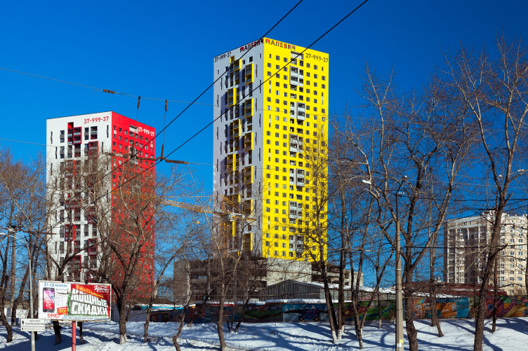
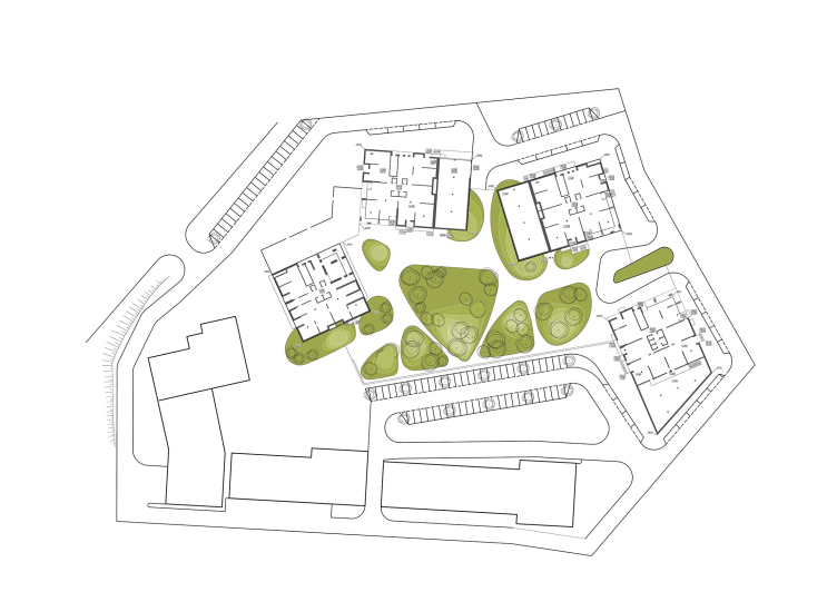
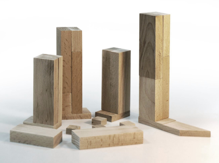
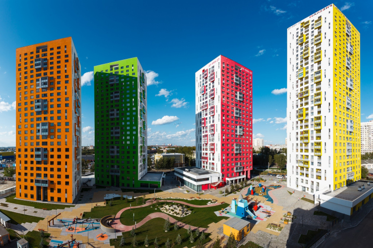
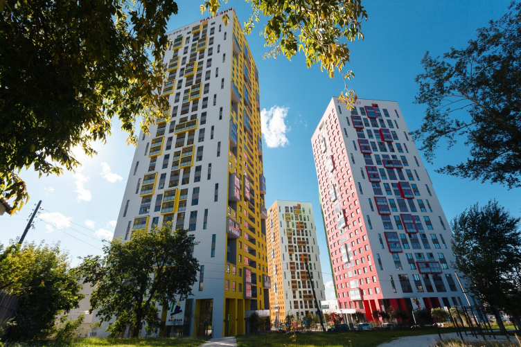
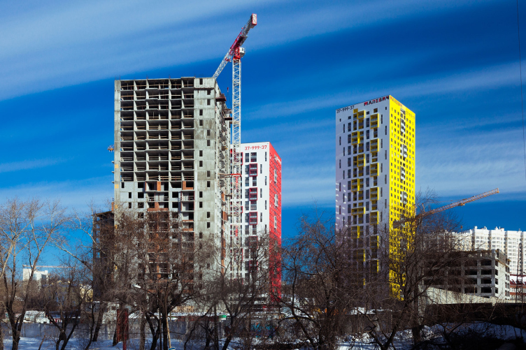
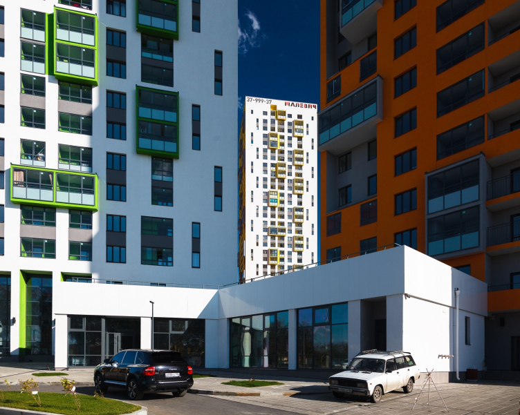
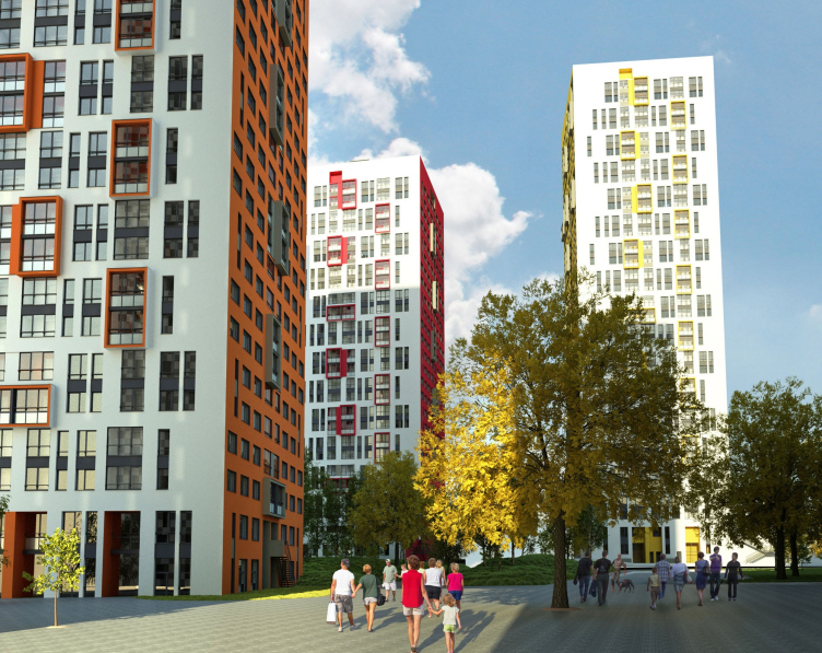
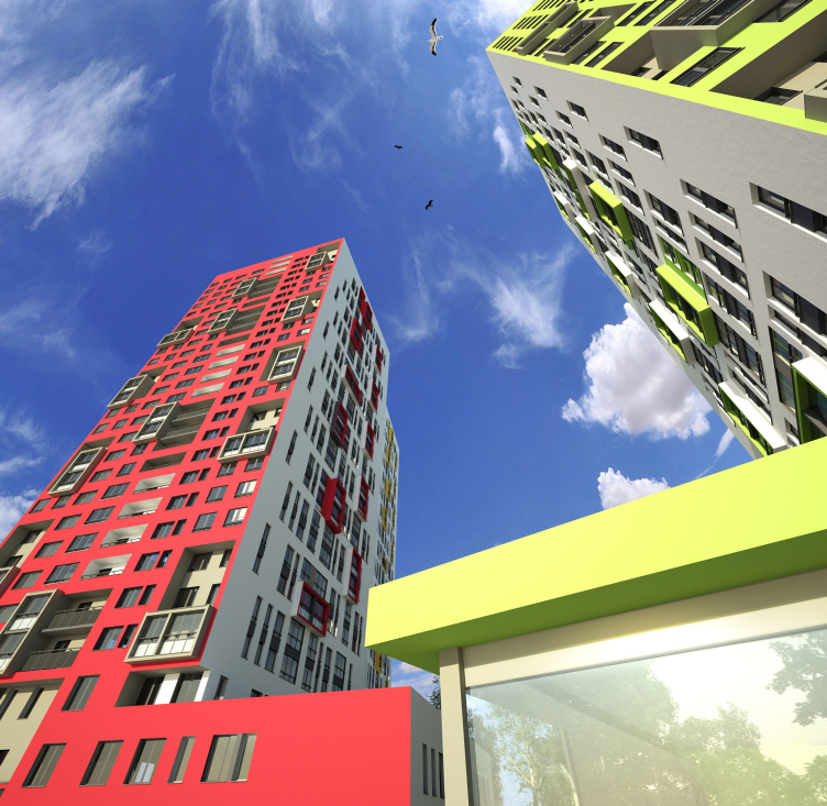
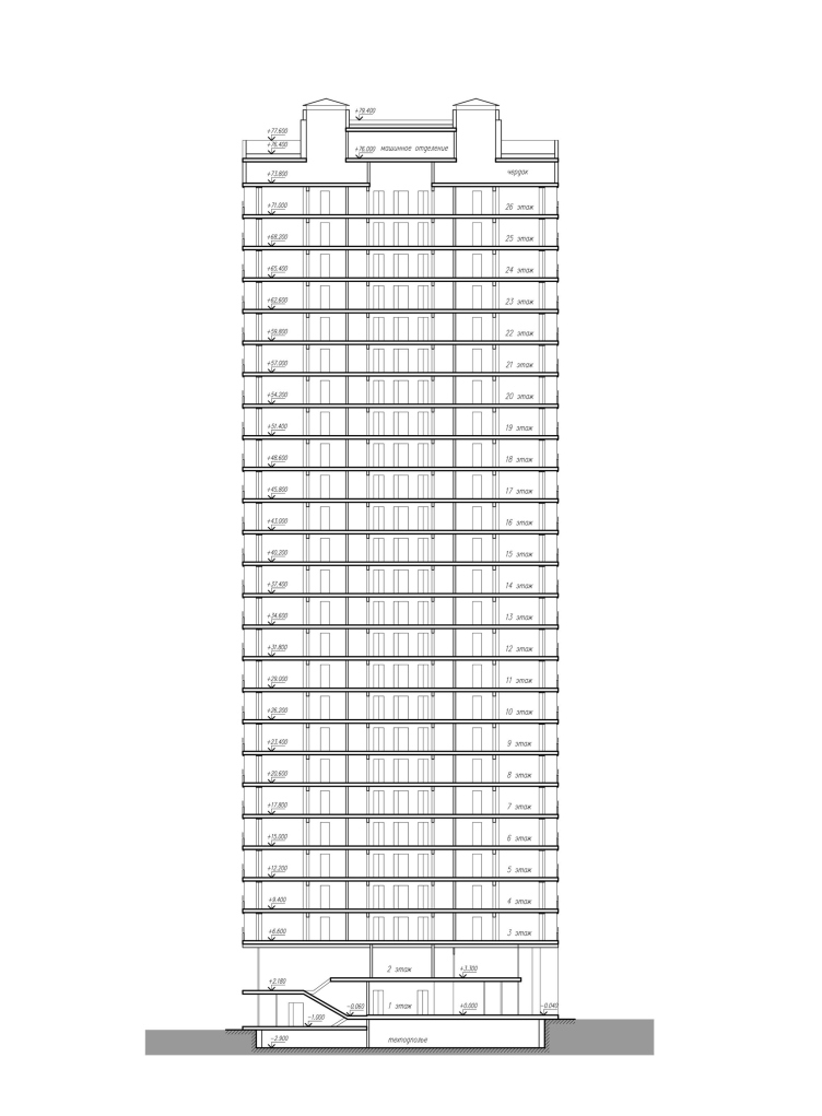
In order to address all the challenges, the architects quite unexpectedly refrained from implementing the closed-circuit layout, which almost became a cliché nowadays, and designed four “pencil” towers (one of them 33 stories high, the other 26 each), placing them in a loose manner in respect to one another. By doing that, the architects were able to solve the insolation issues, and avoid the impression of a “closed circuit” – the sky can be now seen from virtually any vantage point. At the same time, from the side of the railroad, the territory is fenced off by two parking lots. Plus – the broad podiums of the towers, which house the public spaces, shops, a fitness center, and even the office of the PRINZIP developers – all this put together helps to form a cozy vehicle-free yard, with greenery and a modern children’s playground.

"Malevich" housing complex. OSA. Photograph © Maxim Loskutov
"Malevich" housing complex © OSA architects


"Malevich" housing complex. Model © OSA architects


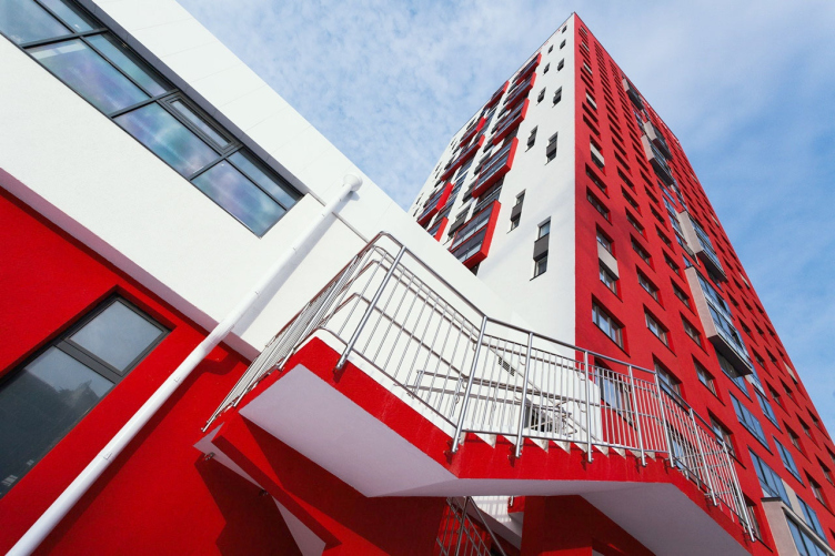
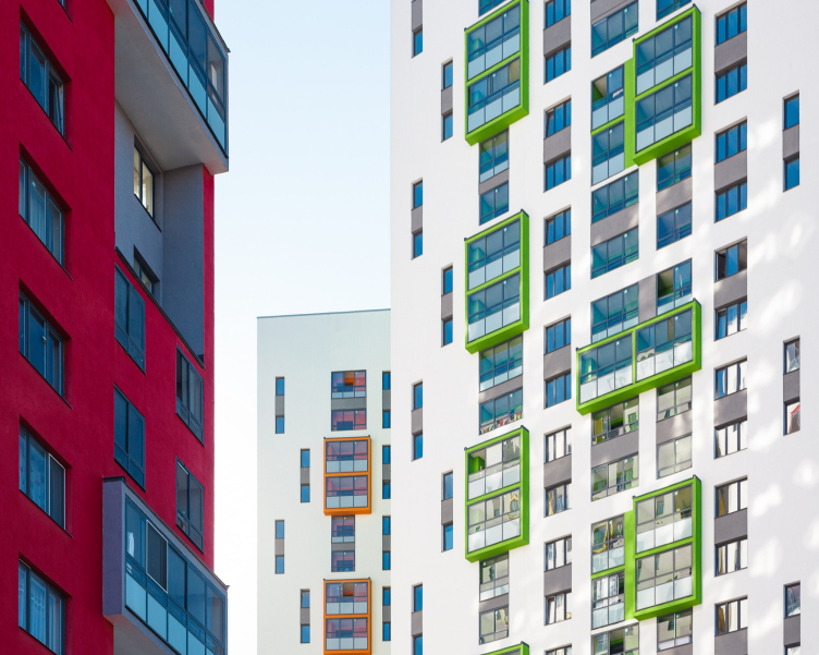
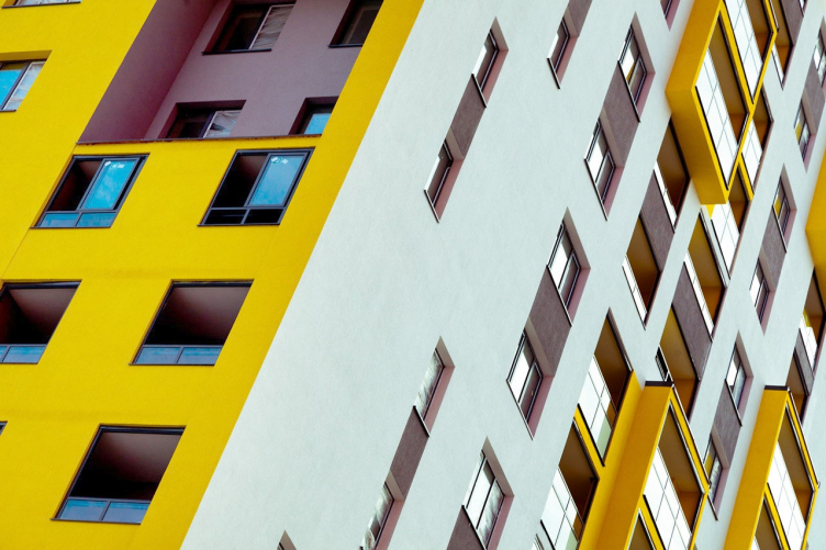
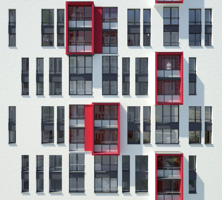
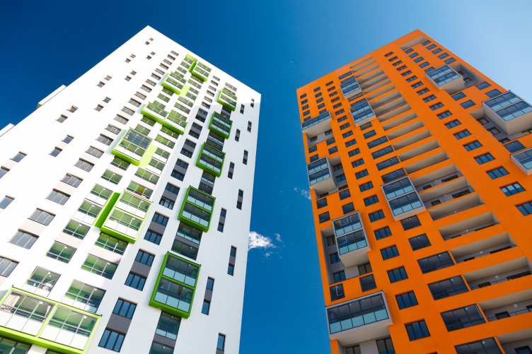
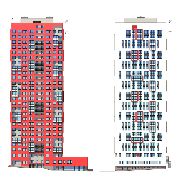
The contrastive and bright color solution based on alternation of white and colored façades sets the complex apart against the background of its rather bleak surroundings, and turns it into a town-planning accent clearly viewable from the railroad station side. The colored facets, turned differently in respect to the cardinal points, help to better perceive each of the volumes and make the composition more dynamic because it constantly changes depending on the position of the sun, ambient light, and the weather. The plastique of the façades is also created by the play of colors: at the red, yellow, green, and orange sides, some of the window apertures are grouped in twos and are highlighted in white; on the white sides it’s the other way around. Picturesquely scattered, there vertical and horizontal ledges and cutaways bring maximum diversity to the image of the complex, supporting the freedom of the overall composition and really put one in the mind of suprematist paintings. And even the balconies (and here each apartment has one) avoided the fate of being placed in a vertical row like the habitual boring “thermometer” pattern on the façade. At some places they turn out to be on a level with the main surface of the wall, and are virtually invisible from the outside, in some places they are sunken in, and at some places they actively protrude, enhancing the plastique play. And only the open overpass stanzas set the rigorous verticals on the north façades.

"Malevich" housing complex. OSA. Photograph © Maxim Loskutov


"Malevich" housing complex. OSA. Photograph © Maxim Loskutov


"Malevich" housing complex. OSA. Photograph © Maxim Loskutov


"Malevich" housing complex. OSA. Photograph © Maxim Loskutov


"Malevich" housing complex. OSA. Photograph © Maxim Loskutov


"Malevich" housing complex. OSA. Photograph © Maxim Loskutov


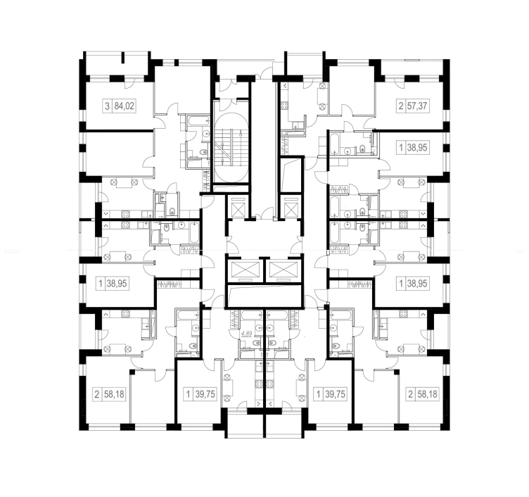
“Malevich” from the very start was marketed as a relatively inexpensive and accessible housing complex, hence the choice of the cost-efficient technology of a “wet façade” and smart slicing of the floors into relatively small apartments. On the plan, every tower is essentially an equilateral square, which, as the architects share, is rather an exception than a rule by Ekaterinburg’s standards. “For some reason, this city has always been fond of round houses, and, even if the house did have a square plan, it inevitably had rounded corners, balconies, or something like that – Evgeny Volkov explains – The thing is that in such “pinpoint” buildings as ours, when you have to slice the floor into small-sized apartments, you often run into difficulties with making your corner rooms accessible: in order to get to one, you need either a long corridor or a pass-through room. Either of the two solutions is unpopular with the customers, and this is why the designers usually try to increase the area of the lateral apartments and decrease the area of the corner ones, hence the “melted” rounded plan of the building. Our four “pencils”, however, do not have a single curve in them – only straight lines and right angles – and all the planning issues are solved by more subtle “nonlinear” planning ideas and smart inside zoning”. Meanwhile, the layout of the standard floor is truly effective: a compressed stairway nucleus, small corridors left and right of the elevator with emergency evacuation through the elevator hall, and the smartly configured residential cells, which, like pieces of a jigsaw puzzle, come together to form the desired perfect square.

"Malevich" housing complex. Floor plan © OSA architects


“We were simultaneously working on two similar-type housing complexes “Kamenny Ruchei” (“Stone Creek”) and “Malevich” – says the managing director of “OSA”, Stanislav Belykh – But the similar tasks that we had were handled by us in completely different manners: in the former case we did it by using a rigid orthogonal composition and a maximally reserved color solution, while in the latter case we did it in a more dramatic manner, with “scattered” high-rise volumes, and color as the key player in the composition. Such a versatile approach to one and the same problem is often applied in our company because it allows us to delve deeper into the situation and better satisfy the needs of the developer and the end consumer”.
"Malevich" housing complex. OSA. Photograph © Maxim Loskutov
"Malevich" housing complex © OSA architects

26 October 2017

Headlines now
Living in the Architecture of One’s Own Making
Do architects design houses for themselves? You bet! In this article, we are examining a new book by TATLIN publishing house. This book – unprecedented for Russia – features 52 private homes designed and built by contemporary architects for themselves. It includes houses that are famous, even iconic, as well as lesser-known ones; large and small, stylish and eccentric. To some extent, the book reflects the history of Russian architecture over the past 30 years.
A City Block Isoline
Another competition project for a residential complex on the banks of the Volga in Nizhny Novgorod has been prepared by Studio 44. A team of architects led by Ivan Kozhin concluded that using a regular block layout in such a location would be inappropriate and developed a “custom design” approach: a chain of parceled multi-section buildings stretching along the entire embankment. Let’s explore the features and advantages of this unconventional method.
Competition: The Price of Creativity?
Any day now, we’re expecting the results of a competition held by the “Samolet” development group for a plot in Kommunarka. In the meantime, we share the impressions of Editor-in-Chief Julia Tarabarina, who managed to conduct a public talk. Though technically focused on the interaction between developers and architects, the public talk turned into a discussion about the pros and cons of architectural competitions.
Terraced Design
The “River Park” residential complex has confidently and securely shaped the Nagatinsky Backwater shoreline. Featuring a public embankment, elevated courtyards connected by pedestrian bridges, and brick façades, the development invites exploration of its nuanced response to the surrounding context, as well as hints of the architects’ megalithic design thinking.
A Kremlin’s Core and Meteorite Fragments
We continue our coverage of the competition projects for the residential district that the development company GloraX plans to build along the embankment of the Rowing Channel in Nizhny Novgorod. ASADOV Architects approached the concept through a deep dive into local identity, using storytelling to pinpoint a central idea for the design: the master plan and composition are imagined as if a meteorite had struck a “proto-Kremlin”. Sounds weird? Find more details below!
The Volga Regatta
GloraX plans to develop a residential complex spanning 14 hectares along the Volga River in Nizhny Novgorod. The winning design in a closed-door competition, created by GORA Architects, features housing typologies ranging from townhouses to terraced high-rise slabs, a balance of functions, diverse ways of engaging with the water, and even a dedicated island (no less!) for the city residents.
A New Track
We took a thorough look at D_Station, a railcar repair depot dating back to 1906, recently reconstructed while preserving its century-old industrial structure, upon the project by Sergey Trukhanov and T+T Architects. Though work on the interiors – set to house restaurants and public spaces – is still underway, the building’s exterior already offers plenty to see. Visitors can explore the blend of old and new brickwork, appreciate the architect’s unique interpretation of ruin aesthetics, and enjoy the newly built pedestrian route that connects the Citydel Business Center’s arches to Kazakova Street.
Four Different Surveys
The “Explore the City” competition, organized this year by the Genplan Institute of Moscow, stands out as a pretty unconventional one for the architectural field but aligns perfectly well with the character of urban planning work. The winning project analyzed contemporary residential complexes, combining urban planning insights with a realtor’s perspective to propose a hybrid approach. Other entries explored public centers, motivations for car ownership, and housing vacancy rates. A fifth participant withdrew. Here’s a closer look at the four completed works.
Scheduled Evolution
ASADOV Architects unveiled the EvyCenter pavilion, a microcultural hub for fostering personal growth, organizing workshops, and doing gymnastics. Additionally, this pavilion serves as a prototype for a scalable country house, drawing inspiration from the “Loskutok” project, and constructed from CLT panels in a factory. This marks the beginning of a developer project initiated by the architectural firm (sic!), which is seeking partners to expand both small Evy settlements and even larger Evy cities, which are, according to Andrey Asadov, aimed at fostering the “evolutionary” development of the people who will inhabit them.
The Golden Crown
The concept for a dental clinic in Yekaterinburg, developed by CNTR Studio, revolves around the idea of a “mouth full of gold”: pristine white porcelain stoneware walls are complemented by matte brass details. To avoid an overly literal interpretation, the architects focused on the building’s proportions, skillfully navigating between sunlight requirements and fire safety regulations.
Flexibility and Integration
Not long ago, we covered the project for the fourth phase of the ÁLIA residential complex, designed by APEX. Now, we’ve been shown different fence concepts they developed to enclose the complex’s private courtyards, incorporating a variety of public functions. We believe that the sheer fact that the complex’s architects were involved in such a detail as fencing speaks volumes.
A Step Forward
The HIDE residential complex represents a major milestone for ADM architects and their leaders Andrey Romanov and Ekaterina Kuznetsova in their quest for a fresh high-rise aesthetic – one that is flexible and layered, capable of bringing vibrancy to mass and silhouette while shaping form. Over recent years, this approach has become ADM’s “signature style”, with the golden HIDE tower playing a pivotal role in its evolution. Here, we delve into the project’s story, explore the details of the complex’s design, and uncover its core essence.
Gold in the Sands
A new office for a transcontinental company specializing in resource extraction and processing has opened in Dubai. Designed by T+T Architects, masters of creating spaces that are contemporary, diverse, flexible, and original, this project exemplifies their expertise. On the executive floor, a massive brass-clad partition dominates, while layered textures of compressed earth create a contextually resonant backdrop.
Layers and Levels of Flight
This project goes way back – Reserve Union won this architectural competition at the end of 2011, and the building was completed in 2018, so it’s practically “archival”. However, despite being relatively unknown, the building can hardly be considered “dated” and remains a prime example of architectural expression, particularly in the headquarters genre. And it’s especially fitting for an aviation company office. In some ways, it resembles the Aeroflot headquarters at Sheremetyevo but with its own unique identity, following the signature style of Vladimir Plotkin. In this article, we take an in-depth look at the United Aircraft Corporation (UAC) headquarters in the Moscow agglomeration town of Zhukovsky, supplemented by recent photographs from Alexey Naroditsky – a shoot that became only recently possible due to the fact that improvements were finally made in the surrounding area.
Light and Shadow
In this article, we delve into the architectural design of the “Chaika” house by DNK ag architects, which was recently completed in 2023 as part of the collection of signature designs at ZILArt. As is well-known, all the buildings in this complex follow a design code, yet each one is distinct. This particular building stands out not only for its whiteness and minimalism but also for the refined use of a limited number of techniques that, together, create what can confidently be called synergy.
Casus Novae
A master plan was developed for a large residential area with a name of “DNS City”, but now that its implementation began, the plan has been arbitrarily reformatted and replaced with something that, while similar on the surface, is actually quite different. This is not the first time such a thing happens, but it’s always frustrating. With permission from the author, we are sharing Maria Elkina’s post.
Treasure Hunting
The GAFA bureau, in collaboration with Tegola and Arkhitail, organized an expedition to the island of Kilpola in Karelia as part of Moskomarkhitektura’s “Open City” festival. There, amidst moss and rocks, the students sought answers to questions like: what is the sacred, where does it dwell, and what sustains it? Assisting the participants in this quest were landscape engineer Evgeny Levin, artist Nicholas Roerich, a moose, and the lack of cellular connection. Here’s how the story unfolded.
Depths of the Earth, Streams of Water
In the Malaya Okhta district, the Akzent building, designed by Stepan Liphart, was constructed. It follows a classic tripartite structure, yet it’s what you might call “hand-drawn”: each façade is unique in its form and details, some of which aren’t immediately noticeable. In this article, we explore the context and, together with the architect, delve into how the form was developed.
Fir Tree Dynamics
The “Airports of Region” holding is planning to build an airport in Karachay-Cherkessia, aiming to make the Arkhyz and Dombay resorts more accessible to travelers. The project that won in an invitation-only competition, submitted by Sergey Nikeshkin’s KPLN, blends natural imagery inspired by the shape of a conifer seed, open-air waiting spaces, majestic large trees, and a green roof elevated on needle-like columns. The result is both nature-inspired and WOW.
​A Brick Shell
In the process of designing a clubhouse situated among pine trees in a prestigious suburban area near Moscow, the architectural firm “A.Len” did the façade design part. The combination of different types of brick and masonry correlates with the volumetric and plastique solutions, further enhanced by the inclusion of wood-painted fragments and metal “glazing”.
Word Forms
ATRIUM architects love ambitious challenges, and for the firm’s thirtieth anniversary, they boldly play a game of words with an exhibition that dives deep into a self-created vocabulary. They immerse their projects – especially art installations – into this glossary, as if plunging into a current of their own. You feel as if you’re flowing through the veins of pure art, immersed in a universe of vertical cities, educational spaces – of which the architects are true masters – and the cultural codes of various locations. But what truly captivates is the bold statement that Vera Butko and Anton Nadtochy make, both through their work and this exhibition: architecture, above all, is art – the art of working with form and space.
Flexibility and Acuteness of Modernity
Luxurious, fluid, large “kokoshniks” and spiral barrel columns, as if made from colorful chewing gum: there seem to be no other mansion like this in Moscow, designed in the “Neo-Russian-Modern” style. And the “Teremok” on Malaya Kaluzhskaya, previously somewhat obscure, has “come alive with new colors” and gained visibility after its restoration for the office of the “architectural ecosystem” as the architects love to call themselves. It’s evident that Julius Borisov and the architects at UNK put their hearts into finding this new office and bringing it up to date. Let’s delve into the paradoxes of this mansion’s history and its plasticity. Spoiler: two versions of modernity meet here, both balancing on the razor’s edge of “what’s current”.
Yuri Vissarionov: “A modular house does not belong to the land”
It belongs to space, or to the air... It turns out that 3D printing is more effective when combined with a modular approach: the house is built in a workshop and then adapted to the site, including on uneven terrain. Yuri Vissarionov shares his latest experience in designing tourist complexes, both in central Russia and in the south. These include houseboats, homes printed from lightweight concrete using a 3D printer, and, of course, frame houses.
​Moscow’s First
“The quality of education largely depends on the quality of the educational environment”. This principle of the last decade has been realized by Sergey Skuratov in the project for the First Moscow Gymnasium on Rostovskaya Embankment in the Khamovniki district. The building seamlessly integrates into the complex urban landscape, responding both to the pedestrian flow of the city and the quiet alleyways. It skillfully takes advantage of the height differences and aligns with modern trends in educational space design. Let’s take a closer look.
Looking at the Water
The site of Villa Sonata stretches from the road to the water’s edge, offering its own shoreline, pier, and a picturesque river panorama. To reveal these sweeping views, Roman Leonidov “cut” the façade diagonally parallel to the river, thus getting two main axes for the house and, consequently, “two heads”. The internal core – two double-height spaces, a living room and a conservatory, with a “bridge” above them – makes the house both “transparent” and filled with light.
The White Wing
Well, it’s not exactly white. It’s more of a beige, white-stone structure that plays with the color of limestone – smoother surfaces are lighter, while rougher ones are darker. This wing unites various elements: it absorbs and interprets the surrounding themes. It responds to everything, yet maintains a cohesive expression – a challenging task! – while also incorporating recognizable features of its own, such as the dynamic cuts at the bottom, top, and middle.
Urban Dunes
The XSA Ramps team designed and built a three-part sports hub for a park in Rostov-on-Don, welcoming people of all ages and fitness levels. The skate plaza, pump track, and playground are all meticulously crafted with details that attract a diverse range of visitors. The technical execution of the shapes and slopes transforms this space into a kind of sculptural composition.
Proportional Growth
The project for the fourth phase of the ÁLIA residential area has been announced. The buildings are situated on an elongated plot – almost a “ray” that shoots out from the center of the area towards the river. Their layout reflects both a response to Moscow’s architectural preferences over the past 15 years, shifting “from blocks to towers”, and an interpretation of the neighboring business park designed by SOM. Additionally, the best apartments here are not located at the very top but closer to the middle, forming a glowing “waistline”.
The “Staircase” Building
In designing the “Details” residential complex in New Moscow, Rais Baishev spiced up the now-popular Moscow theme of a “courtyard” building with an idea drawn from the surrealist drawings by Maurits Escher. He envisioned the stepped silhouettes and descending slopes as a metaphysical mega-staircase, creating a key void within the courtyard that gave the project an internal “spine”. This concept is felt both in the building’s silhouette and on its façades.
Projection of the Quarter
No one doubted that the building that Vladimir Plotkin designed as part of the “Garden Quarters” would be the most modernist of all. And it turned out just that way: while adhering to the common design code, the building successfully combines brick and white stone, rhythmically responding to the neighboring building designed by Ostozhenka, yet tactfully and persistently making a few statements of its own. This includes the projection of the ideal urban development composition “14–9–6”, which can be found right next door, mathematical calculations, including those for various types of terraces (and perhaps the only reminder of the Soviet past of the Kauchuk rubber factory!), and the white “cross-stitch” pattern of the façade grid.