По-русски

​Julius Borisov: “The next generation will change their apartments like gadgets”

At the panel discussion “For whom and how do we build our housing projects?” held within the framework of the urban forum named “Sreda dlya Zhizni” (translated as “Living Environment”), the head of UNK Project spoke about how the housing will look for “Generation Z”. We asked Julius Borisov to share in more detail about how in his opinion the criteria of evaluating the quality of housing and the architect’s work will change in the future.

09 June 2017
Interview
mainImg
Architect:
Yuliy Borisov
Archi.ru
– Why at all did the necessity arise to think about the needs of future generations?

Julius Borisov:
– The physical lifetime of a building is generally rather long, and the housing that people buy today will be most likely used by the next generation. This is why it is important that the housing not only stays strong but does not grow obsolete, so that it will be comfortable and convenient for the buyer’s children and grandchildren to live in. And what I did was make an attempt to find out just what these children and grandchildren will possibly need.

– Your presentation at the panel discussion was dedicated to “housing for generations X, Y, and Z”. What is this classification system based upon?

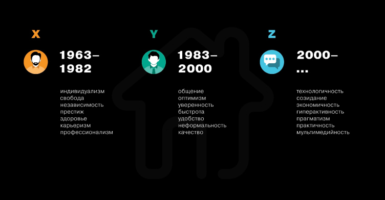
– It has to do not so much with the age as with the mental paradigm. Different generations have different behavioral patterns and different aspirations – and housing is, of course, part of that paradigm. For example, my grandfather would build a house for himself with his own hands, and he would build it “for ages to come”, to hand it down to his children and grandchildren. Under socialism, my parents would get a state-sponsored apartment for free but they had nothing to choose from – take it or leave it. Today it’s different again: we buy our apartments from the developers; for us, it’s an investment, and we are looking to pay less hoping that the price of our apartment will go up when the infrastructure of this residential area is fully developed. The next generation will chiefly rent their housing, changing their apartments like we change our gadgets today. Whether or not you have housing of your own, will, most likely, no longer matter: you have money – you rent an apartment in London, you run out of money – you move someplace else where the rent is cheaper. That is, people of the future will pay not for the right to own the place but for the time they spend there, and not only in the apartment but in the neighborhood and the city where it is situated. Accordingly, the requirements for the housing and its evaluation criteria will also change, and the housing will be different.

Priorities of Generations X, Y, and Z. A slide from the Julius Borisov presentation © UNK Project


– Such as?

– First of all, the changes will have to do with the growing mobility of the population. People will want to get not just an apartment or a house with a basic decoration but the kind that had everything in it – including kitchen utensils, forks and spoons. The kind that you can move in – like you move into a hotel – and just live there! I know, this sounds pretty sci-fi, but in ten-fifteen years this may become a standard.
 
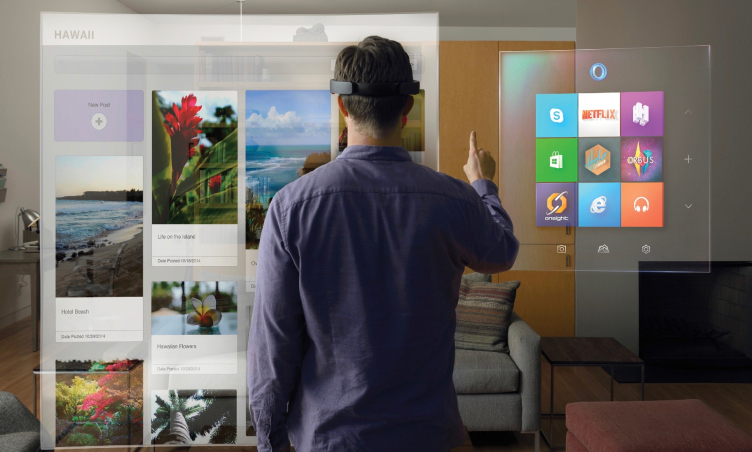
Second, the possibility of quick and easy customization of your housing with the use of modern technology. For example, you press the button and the design of the apartment instantly changes. The building will turn into a smart combination of software and hardware (hardware being the building itself). Your geographic location will no longer matter – you can be in Moscow or in Astana, and you just take the settings from one apartment and apply them to another, and you get your customized housing wherever you may find yourself at any given moment.

Customization of housing. A slide from the Julius Borisov presentation © UNK Project


Third, the housing will be very flexible, not unlike the office spaces of today. Companies used to build their projects in accordance with plans carved in stone – they nearly designed special furniture for every single project. It’s enough to remember the Chrysler Building or the classic Soviet ministry buildings. Today, an office building is like a whatnot: the company moves in, remodels the premises to their liking, works for two years, then they’re gone; next tenants come along – and they again remodel the office to make it fit their needs. Furniture used to be something that you inherited – now you can go to IKEA, buy everything you need and then throw it all away.
The same thing will happen to housing: its main value will consist not so much in the “shell” of the building as in the environment that surrounds it, its location and social ties. Meaning – the value of the house will rather lie in the fact that it’s inhabited by, let’s say, young architects or musicians, and not in the marble floors or fancy façades.

– In other words, the criterion that we know as “durability, utility and beauty” will soon cease to exist? 

– This triad will not go away by any means. The question, however, will be, just what is beauty, what is durability, and what is utility. It is not the essence but the manifestation that will be changing – because the technology is changing.

Priorities of Generation Z. A slide from the Julius Borisov presentation © UNK Project


– How will the fundamentals of an architect’s work look in this case?

– In the XVIII century, an architect’s work came down to drawing a nice façade – they did not even care about interior planning that much. Conditionally speaking, this was something like a flat-surface solution, like 2D design of those days. Then the constructivists came along and added another dimension, making the buildings voluminous, I would say.

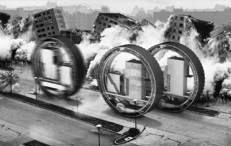
Still later on, in the 1970’s, they started to study the processes that went on around the buildings. And today, we have a multitude of these “dimensions”. You need to take into account how people will live in the future, what processes will take place, how the social aspects will change, and, just as importantly, what will be the most efficient way to take down this building and dispose of its remains ecologically. At the end of the day, you come up with a tremendous multidimensional model – but the architect must still be in control of the entire process. He is still the conductor of this orchestra but, instead of a simple set of a violin, a cello, and cymbals, he now has to deal with a whole bunch of sophisticated and expensive synthesizers. He is in command of sociologists and brand managers, he communicates with social activists, he consults psychologists, and so on. Digesting all this and turning it into a set of project drafts and cost sheets is something that can only be accomplished by a person that is capable of system thinking. Everything is getting ever more complex, and the requirements for the architectural education must change accordingly. Taking space, time, and money, sociological data, and turning them into project drafts and floor plans – this is what architecture of the future will be about. The knowledge of the State Construction Rules and Regulations alone is no longer enough.

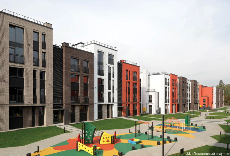
"Dutch Quarter" housing complex © UNK Project


– This new-type housing for Generation Z – is it already being built anywhere in Russia?

– Currently, we are following the paradigm that is defined by the developers, and they are responding to the needs of today. So, for now, we are seeing quite a conservative approach. But we have to think big, and we have to be visionaries. We can get closer to this new paradigm via conferences and meetings of experts from various fields; such events will give us an opportunity to peek into the future not only through our own eyes but also through the eyes of smart colleagues and smart competitors.

– And how soon will such a global shift of housing notions take place?

– There is no magic pill here, this whole transition process is very gradual. Already today, the state and Housing Mortgage Lending Agencies are thinking about the future and try to come up with some options for rental housing. Developers make social experiments on creating communities and forming the appropriate environment.
Architecture is important – you will hardly find an architect who will tell you otherwise – but the quality of the environment is just as important. Sometimes it happens that good neighbors or good parents of you children’s classmates are more important than all the architectural novelties in the world. Of course, this is all very sad for the architect – we are moving more and more in the direction of, let’s say, industrial design. But what can you do? There’s a shift of priorities going on, and that’s objective reality to me.


Architect:
Yuliy Borisov

09 June 2017

Headlines now
The Golden Crown
The concept for a dental clinic in Yekaterinburg, developed by CNTR Studio, revolves around the idea of a “mouth full of gold”: pristine white porcelain stoneware walls are complemented by matte brass details. To avoid an overly literal interpretation, the architects focused on the building’s proportions, skillfully navigating between sunlight requirements and fire safety regulations.
Flexibility and Integration
Not long ago, we covered the project for the fourth phase of the ÁLIA residential complex, designed by APEX. Now, we’ve been shown different fence concepts they developed to enclose the complex’s private courtyards, incorporating a variety of public functions. We believe that the sheer fact that the complex’s architects were involved in such a detail as fencing speaks volumes.
A Step Forward
The HIDE residential complex represents a major milestone for ADM architects and their leaders Andrey Romanov and Ekaterina Kuznetsova in their quest for a fresh high-rise aesthetic – one that is flexible and layered, capable of bringing vibrancy to mass and silhouette while shaping form. Over recent years, this approach has become ADM’s “signature style”, with the golden HIDE tower playing a pivotal role in its evolution. Here, we delve into the project’s story, explore the details of the complex’s design, and uncover its core essence.
Gold in the Sands
A new office for a transcontinental company specializing in resource extraction and processing has opened in Dubai. Designed by T+T Architects, masters of creating spaces that are contemporary, diverse, flexible, and original, this project exemplifies their expertise. On the executive floor, a massive brass-clad partition dominates, while layered textures of compressed earth create a contextually resonant backdrop.
Layers and Levels of Flight
This project goes way back – Reserve Union won this architectural competition at the end of 2011, and the building was completed in 2018, so it’s practically “archival”. However, despite being relatively unknown, the building can hardly be considered “dated” and remains a prime example of architectural expression, particularly in the headquarters genre. And it’s especially fitting for an aviation company office. In some ways, it resembles the Aeroflot headquarters at Sheremetyevo but with its own unique identity, following the signature style of Vladimir Plotkin. In this article, we take an in-depth look at the United Aircraft Corporation (UAC) headquarters in the Moscow agglomeration town of Zhukovsky, supplemented by recent photographs from Alexey Naroditsky – a shoot that became only recently possible due to the fact that improvements were finally made in the surrounding area.
Light and Shadow
In this article, we delve into the architectural design of the “Chaika” house by DNK ag architects, which was recently completed in 2023 as part of the collection of signature designs at ZILArt. As is well-known, all the buildings in this complex follow a design code, yet each one is distinct. This particular building stands out not only for its whiteness and minimalism but also for the refined use of a limited number of techniques that, together, create what can confidently be called synergy.
Casus Novae
A master plan was developed for a large residential area with a name of “DNS City”, but now that its implementation began, the plan has been arbitrarily reformatted and replaced with something that, while similar on the surface, is actually quite different. This is not the first time such a thing happens, but it’s always frustrating. With permission from the author, we are sharing Maria Elkina’s post.
Treasure Hunting
The GAFA bureau, in collaboration with Tegola and Arkhitail, organized an expedition to the island of Kilpola in Karelia as part of Moskomarkhitektura’s “Open City” festival. There, amidst moss and rocks, the students sought answers to questions like: what is the sacred, where does it dwell, and what sustains it? Assisting the participants in this quest were landscape engineer Evgeny Levin, artist Nicholas Roerich, a moose, and the lack of cellular connection. Here’s how the story unfolded.
Depths of the Earth, Streams of Water
In the Malaya Okhta district, the Akzent building, designed by Stepan Liphart, was constructed. It follows a classic tripartite structure, yet it’s what you might call “hand-drawn”: each façade is unique in its form and details, some of which aren’t immediately noticeable. In this article, we explore the context and, together with the architect, delve into how the form was developed.
Fir Tree Dynamics
The “Airports of Region” holding is planning to build an airport in Karachay-Cherkessia, aiming to make the Arkhyz and Dombay resorts more accessible to travelers. The project that won in an invitation-only competition, submitted by Sergey Nikeshkin’s KPLN, blends natural imagery inspired by the shape of a conifer seed, open-air waiting spaces, majestic large trees, and a green roof elevated on needle-like columns. The result is both nature-inspired and WOW.
​A Brick Shell
In the process of designing a clubhouse situated among pine trees in a prestigious suburban area near Moscow, the architectural firm “A.Len” did the façade design part. The combination of different types of brick and masonry correlates with the volumetric and plastique solutions, further enhanced by the inclusion of wood-painted fragments and metal “glazing”.
Word Forms
ATRIUM architects love ambitious challenges, and for the firm’s thirtieth anniversary, they boldly play a game of words with an exhibition that dives deep into a self-created vocabulary. They immerse their projects – especially art installations – into this glossary, as if plunging into a current of their own. You feel as if you’re flowing through the veins of pure art, immersed in a universe of vertical cities, educational spaces – of which the architects are true masters – and the cultural codes of various locations. But what truly captivates is the bold statement that Vera Butko and Anton Nadtochy make, both through their work and this exhibition: architecture, above all, is art – the art of working with form and space.
Flexibility and Acuteness of Modernity
Luxurious, fluid, large “kokoshniks” and spiral barrel columns, as if made from colorful chewing gum: there seem to be no other mansion like this in Moscow, designed in the “Neo-Russian-Modern” style. And the “Teremok” on Malaya Kaluzhskaya, previously somewhat obscure, has “come alive with new colors” and gained visibility after its restoration for the office of the “architectural ecosystem” as the architects love to call themselves. It’s evident that Julius Borisov and the architects at UNK put their hearts into finding this new office and bringing it up to date. Let’s delve into the paradoxes of this mansion’s history and its plasticity. Spoiler: two versions of modernity meet here, both balancing on the razor’s edge of “what’s current”.
Yuri Vissarionov: “A modular house does not belong to the land”
It belongs to space, or to the air... It turns out that 3D printing is more effective when combined with a modular approach: the house is built in a workshop and then adapted to the site, including on uneven terrain. Yuri Vissarionov shares his latest experience in designing tourist complexes, both in central Russia and in the south. These include houseboats, homes printed from lightweight concrete using a 3D printer, and, of course, frame houses.
​Moscow’s First
“The quality of education largely depends on the quality of the educational environment”. This principle of the last decade has been realized by Sergey Skuratov in the project for the First Moscow Gymnasium on Rostovskaya Embankment in the Khamovniki district. The building seamlessly integrates into the complex urban landscape, responding both to the pedestrian flow of the city and the quiet alleyways. It skillfully takes advantage of the height differences and aligns with modern trends in educational space design. Let’s take a closer look.
Looking at the Water
The site of Villa Sonata stretches from the road to the water’s edge, offering its own shoreline, pier, and a picturesque river panorama. To reveal these sweeping views, Roman Leonidov “cut” the façade diagonally parallel to the river, thus getting two main axes for the house and, consequently, “two heads”. The internal core – two double-height spaces, a living room and a conservatory, with a “bridge” above them – makes the house both “transparent” and filled with light.
The White Wing
Well, it’s not exactly white. It’s more of a beige, white-stone structure that plays with the color of limestone – smoother surfaces are lighter, while rougher ones are darker. This wing unites various elements: it absorbs and interprets the surrounding themes. It responds to everything, yet maintains a cohesive expression – a challenging task! – while also incorporating recognizable features of its own, such as the dynamic cuts at the bottom, top, and middle.
Urban Dunes
The XSA Ramps team designed and built a three-part sports hub for a park in Rostov-on-Don, welcoming people of all ages and fitness levels. The skate plaza, pump track, and playground are all meticulously crafted with details that attract a diverse range of visitors. The technical execution of the shapes and slopes transforms this space into a kind of sculptural composition.
Proportional Growth
The project for the fourth phase of the ÁLIA residential area has been announced. The buildings are situated on an elongated plot – almost a “ray” that shoots out from the center of the area towards the river. Their layout reflects both a response to Moscow’s architectural preferences over the past 15 years, shifting “from blocks to towers”, and an interpretation of the neighboring business park designed by SOM. Additionally, the best apartments here are not located at the very top but closer to the middle, forming a glowing “waistline”.
The “Staircase” Building
In designing the “Details” residential complex in New Moscow, Rais Baishev spiced up the now-popular Moscow theme of a “courtyard” building with an idea drawn from the surrealist drawings by Maurits Escher. He envisioned the stepped silhouettes and descending slopes as a metaphysical mega-staircase, creating a key void within the courtyard that gave the project an internal “spine”. This concept is felt both in the building’s silhouette and on its façades.
Projection of the Quarter
No one doubted that the building that Vladimir Plotkin designed as part of the “Garden Quarters” would be the most modernist of all. And it turned out just that way: while adhering to the common design code, the building successfully combines brick and white stone, rhythmically responding to the neighboring building designed by Ostozhenka, yet tactfully and persistently making a few statements of its own. This includes the projection of the ideal urban development composition “14–9–6”, which can be found right next door, mathematical calculations, including those for various types of terraces (and perhaps the only reminder of the Soviet past of the Kauchuk rubber factory!), and the white “cross-stitch” pattern of the façade grid.
Domus Aurea
In this issue, we examine the “Tessinsky-1” house, designed by Sergey Skuratov and completed in 2023. Located in the middle of the Serebryanicheskaya Embankment district, at the intersection of its main streets, this house assumes a sort of “nodal” role: it not only responds to everything around it and preserves many memories of the former EMA factory within itself, but it weaves all this into a newly directed pattern, reconciling bright “gold” and dark-colored brick, largely with the help of the new, modern-yet-archaic Columba brick, which, come to think about it, is the most precious element here.
The Chimney of Nikola-Lenivets
In this issue, we are examining the “Obelisk House” designed by KATARSIS and built for the Arkhstoyanie 2023 festival. However, it was only finished later on, and this is why we are examining it now. It seems to us that after the “Obelisk House” appeared in Nikola-Lenivets, a dialogue and a few inner connections appeared between the temporary structures built here. These houses no longer look like “accidental neighbors”, more of which below.
​Periscope by the Bay
The jury awarded the second place in the competition for a public and cultural center in Petropavlovsk-Kamchatsky to the companies GORA (“Mountain”) and M4. In the consortium’s proposal, the building resembles a sperm whale with a calf swimming next to it or a periscope, whose lenses capture the most spectacular views from the surrounding landscape.
From Arcs to Dolmens
While working on the competition project for Petropavlovsk-Kamchatsky, ASADOV Architects prioritized the value of the natural and urban environment, aiming to preserve the balance of the location while minimizing the resemblance of the volume that they designed to a “traditional building”. The task was challenging, and the architects created three versions, one of which having been developed after the competition, where their main proposal took third place. However, the point of interest here is not the competition result but the continuity of creative thinking.
Hide and Seek
The ID Moskovskiy house, designed by Stepan Liphart in St. Petersburg, in the courtyards near Moskovskiy Avenue beyond the Obvodny Canal and recently completed, is notable for several reasons. Firstly, it has been realized with considerable accuracy, which is particularly significant as this is the first building where the architect was responsible not only for the facades but also for the layouts, allowing for better integration between the two. On the other hand, this building is interesting as an example of the “germination” of new architecture in the city: it draws on the best examples from the neighborhood and becomes an improved and developed sum of ideas found by the architect in the surrounding context.
The Big Twelve
Yesterday, the winners of the Moscow Mayor’s Architecture Award were announced and honored. Let’s take a look at what was awarded and, in some cases, even critique this esteemed award. After all, there is always room for improvement, right?
Above the Golden Horn
The residential complex “Philosophy” designed by T+T architects in Vladivostok, is one of the new projects in the “Golubinaya Pad” area, changing its development philosophy (pun intended) from single houses to a comprehensive approach. The buildings are organized along public streets, varying in height and format, with one house even executed in gallery typology, featuring a cantilever leaning on an art object.
Nuanced Alternative
How can you rhyme a square and space? Easily! But to do so, you need to rhyme everything you can possibly think of: weave everything together, like in a tensegrity structure, and find your own optics too. The new exhibition at GES-2 does just that, offering its visitor a new perspective on the history of art spanning 150 years, infused with the hope for endless multiplicity of worlds and art histories. Read on to see how this is achieved and how the exhibition design by Evgeny Ace contributes to it.
Blinds for Ice
An ice arena has been constructed in Domodedovo based on a project by Yuri Vissarionov Architects. To prevent the long façade, a technical requirement for winter sports facilities, from appearing monotonous, the architects proposed the use of suspended structures with multidirectional slats. This design protects the ice from direct sunlight while giving the wall texture and detail.