Archi.ru:
– Why did you decide to go back to the Narkomfin Building renovation project? You did give up on it back in the day, didn’t you?
Aleksey Ginsburg:
– I didn’t exactly give up on it. I stopped working on it because I realized that nothing was happening except conversation. There were outlaw repairs going on, and they kept smuggling authentic elements out of the building. To make things worse, prospects of building annexes that would serve as garages or fitness centers were seriously discussed. Then I made a decision to distance myself as much as possible from that project.
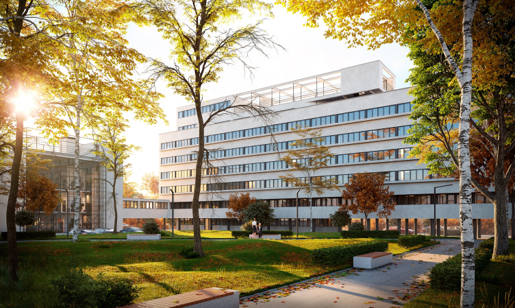
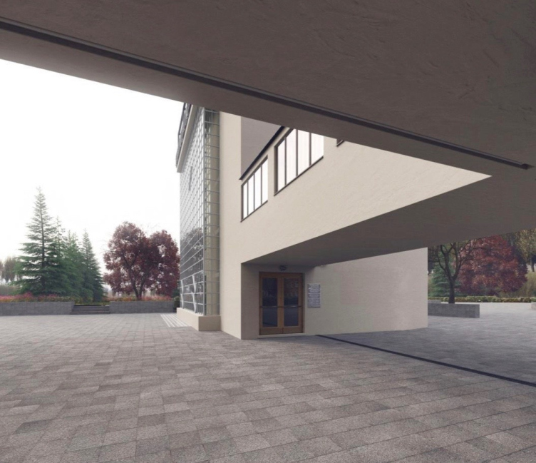
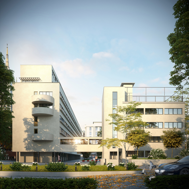
Project of restoration and adaptation of the cultural heritage site "Narkomfin Building" (2015-2017) © Ginsburg Architects
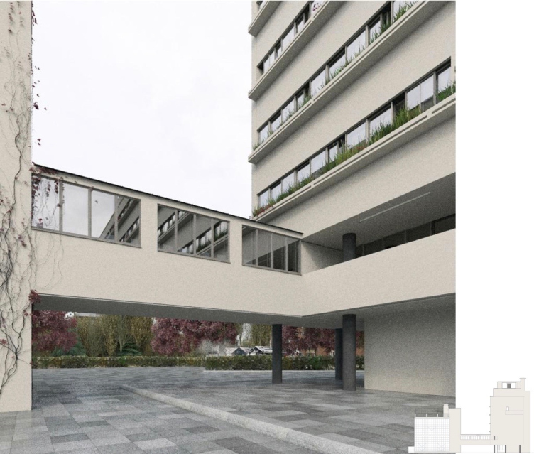
Project of restoration and adaptation of the cultural heritage site "Narkomfin Building" (2015-2017) © Ginsburg Architects
– And when and from what did the new stage of renovation begin?
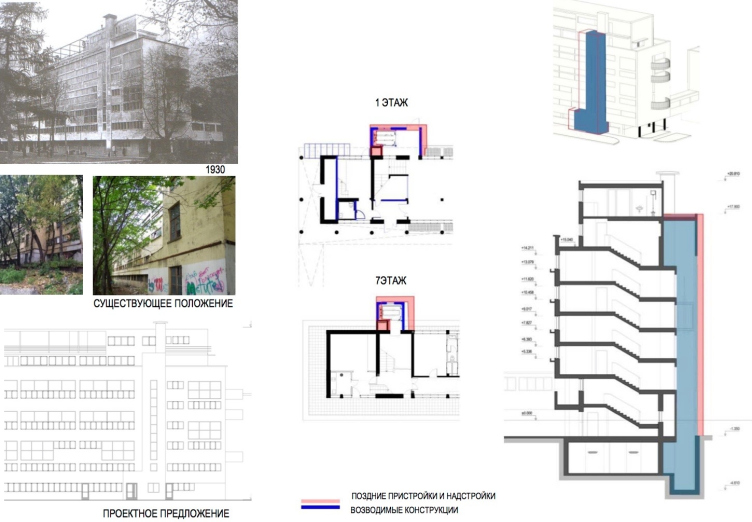
– The new stage began in the end of 2015 when the building got a new owner, the company “Liga Prav” (“League of Rights”). It was able to do something that nobody else could do in the last twenty years. It consolidated all the property in the building by simply buying out at an auction the entire building that used to be municipally owned. Mind, these premises are far from attractive – they include corridors and the ground floor that is to be chiefly dismantled. And they also bought out the communal unit, whose top level is also to be dismantled. This company didn’t have any lofty matters or some noble purpose in mind. But if they hadn’t bought it out, no renovation actions would have been possible now.
Once the building got a single owner that has the authority to work with all of its engineering lines and can act as developer and contractor from the legal standpoint, we got the permission to begin our work. I don’t want to name the exact dates because there are other forces at play but the implementation of the project is due to begin in the nearest future. Of course, we will do everything step by step, starting from those parts of the building that are tenant-free.
– And how many people live their currently? Are all the apartments occupied?
– Most of the apartments in that building are rented out, just like they always were. Currently, they have vacated the first two sections for us but, of course, we will work with all the apartments later on.
– What makes the new renovation project different from the old one?
– This building is really very complex. It has lots of places that I was only able to visit last year, after the building got bought out. And it was only last year that we started doing a survey of these zones. For this survey and design of engineering structures they invited PF “Grado”, while we were invited for the renovation and adaptation in the area of architecture and interior design.
Together we developed the renovation and adaptation project, and the working documents, some parts of it still being issued by us. And we also continue doing some survey. Some minor technological details are still being discussed but generally the project was raised to a whole new level. It’s a lot more elaborate this time.
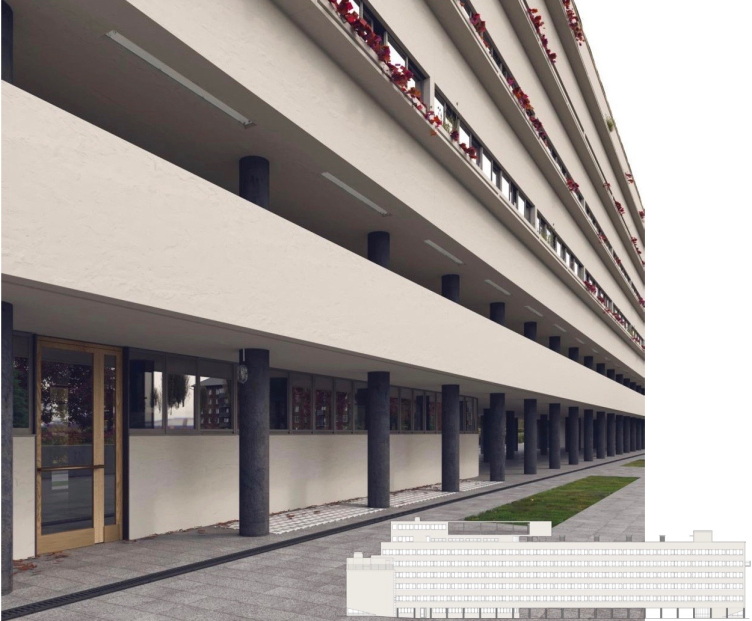
Project of restoration and adaptation of the cultural heritage site "Narkomfin Building" (2015-2017) © Ginsburg Architects
Project of restoration and adaptation of the cultural heritage site "Narkomfin Building" (2015-2017) © Ginsburg Architects
– In what order will you do the work? Do you have any specific plan for this?
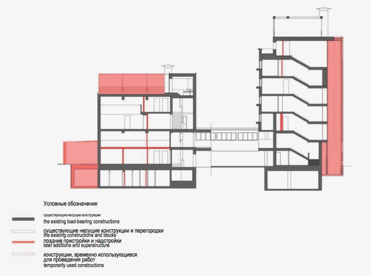
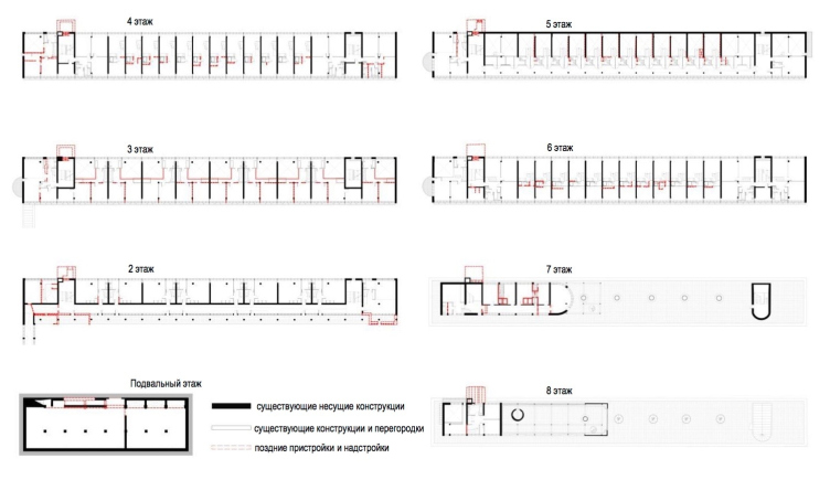
– First, we will do a deconstruction of all these later additions and annexes. I am referring to the communal unit and the first floor. When that is done, we will be able to work with the communal unit in its entirety, and with the north part of the building as well. We want to do our work incrementally. I used to think that this was a wrong thing to do and that a house must be done as a whole. But a deep and detailed survey of the building brought me to a conclusion that it is better to start working with structures and engineering systems in a part of the building in order to field-test many of the methods that we included into the project and the working documents. Because to say that we did the architectural part of the project means to say nothing at all! We explained to the engineers just how the engineering systems in the building were wired because without thinking them out you cannot keep the structure of the building. And we consider keeping the structure of the building intact to be of paramount importance.
– Meaning, keeping the whole engineering structure intact is part of the project? And just what is the condition that these engineering systems are in?
– You cannot just go ahead and renovate the Narkomfin Building. In all the other constructivist buildings you can ultimately settle for as little as keeping the façade intact. But here is the thing – it is the inside structure that makes the Narkomfin Building what it is. It has so many subtleties to it that if you start making changes you will risk ruining it altogether. And our goal is to create a model case – or we will be faced with a prospect of losing the building.
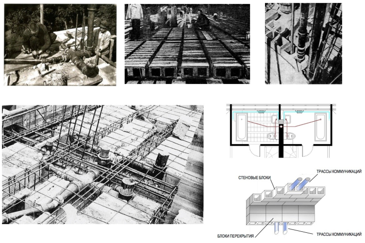
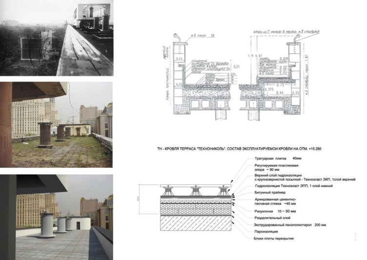
Most of these engineering systems, of course, need to be replaced. For example, the house has inside steel water pipes that are rotten through. But our project provides for solutions that exactly correspond to historical routing. And we insist on that. This historical routing is far from simple. It is at odds with the modern construction rules and regulations.
Project of restoration and adaptation of the cultural heritage site "Narkomfin Building" (2015-2017) © Ginsburg Architects
Project of restoration and adaptation of the cultural heritage site "Narkomfin Building" (2015-2017) © Ginsburg Architects
For example, the sewage in that building was done in this way: there were horizontal sections installed between the third and fourth floors inside the slab casts lying over precast joists.
– Why did they do it like this, anyway?
– There was a water riser that exactly followed the structure of the building. In the spots where the apartments of the “F” type gave way to larger increments of the “K” type it was necessary to switch the horizontal sections – simply because the lower apartments were bigger.
Actually, the inside structure is rather difficult to understand. Some renovators had this straightforward approach: “We’re going to go ahead and just make new risers, and that’s that!” And how exactly are you going to make them? At some places they will run right through the center of the apartment, which, of course, is not an option. You can only run them through the hollow-bodied blocks on the wall or in the same slab casts we spoke about.
Then I had to explain to the engineers that some of the columns of that ground floor were actually quite thick. You can see that in the old photos. Both indoor sanitation and water pipes ran through them. Nobody believed that this could be the case – they would roam around the building looking for the remains of the water pipes. They did everything short of wandering around with water search sticks.
– And what about roof water disposal then? How this was organized?
– An internal downpipe. It’s a totally modernist narrative. It got clogged up, and nobody cared to unstop it. They made some sort of bypasses which would leak constantly, and the water would ultimately get inside the house. Today’s condition of the building is the logical result of how it was kept all these years.
– But what about the outside walls? They are made of reed pressboard, aren’t they?
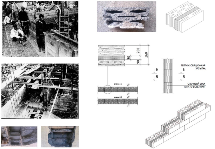
– Alright, let’s speak about the reed pressboard. I had this idea to entertain the people by leaving some fragments of the reed pressboard under glass inside the laundry unit for which we already have the work permit and have the working documents ready – after the renovation it will be turned into a cafe. As a matter of fact, reed pressboard is the precursor of rock wool. This building has many ideas in it that were to become modern construction technologies. And this is what makes it innovative – not just its architecture or organization of space. Reed pressboard served as the thermal insulant or a “heat retainer” between the cip beams of the side walls. Wherever they would come up close to the façade surface, these small spots were filled with it.
– Are these the only places where reed pressboard is to be found?
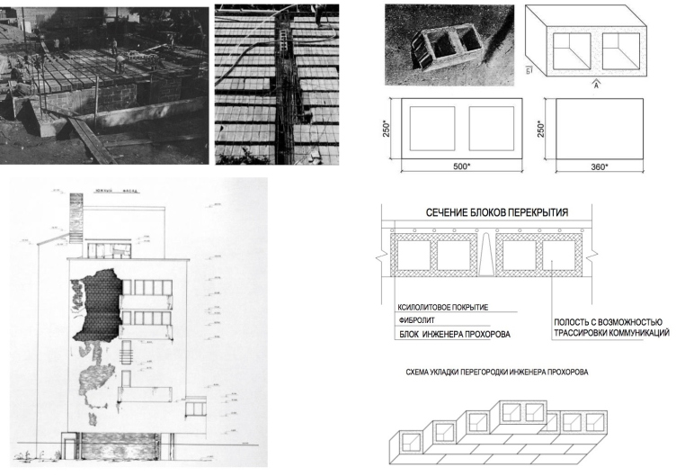
– Yes, the only places. The house is built from concrete blocks that were cast directly on the construction site. These blocks were of two types. The first type was “Prokhorov blocks” – they looked very much like the ones that were used in the construction of Bauhaus. They were for the inside walls, and they only had two hollows. And it was these hollows that were used for laying the engineering lines.
"Peasant type" brickwork. Project of restoration and adaptation of the cultural heritage site "Narkomfin Building" (2015-2017) © Ginsburg Architects
The other type was called “peasant type”. They were used for the construction of the outside walls. The combination looked as follows: block – setting in broken stone as heat retainer – half-block – stucco – paint. This was the composition of the first three-layer wall.
– And what are you planning to do with the walls?
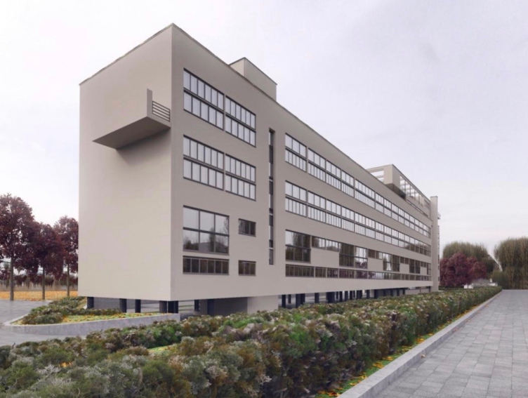
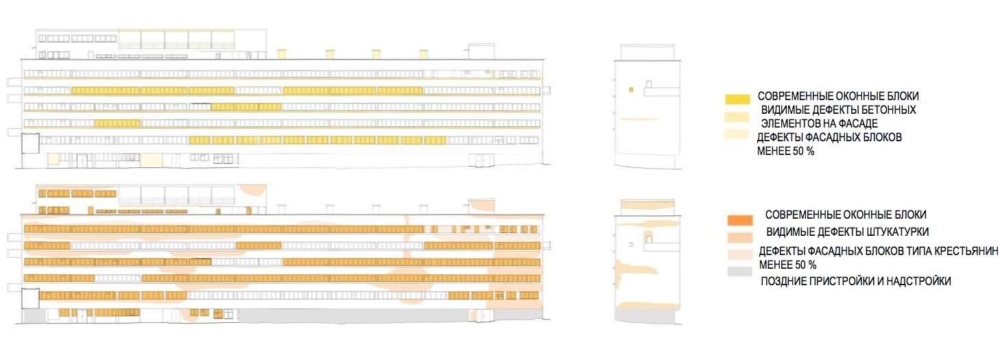
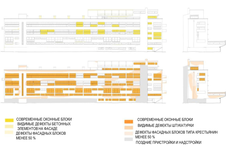
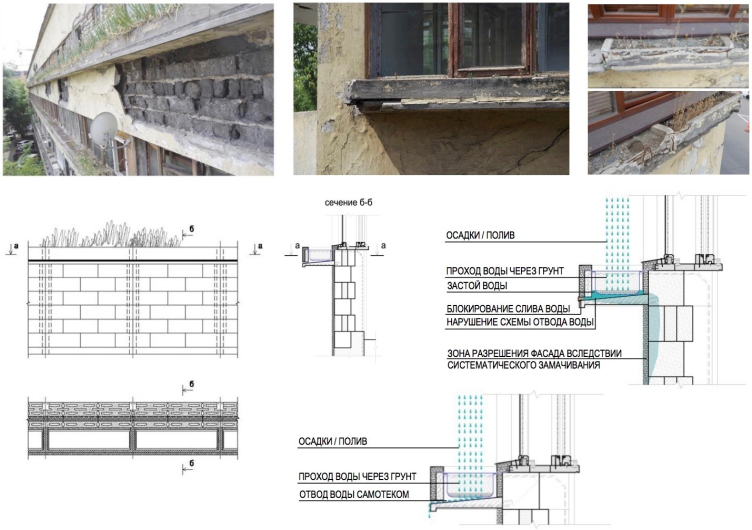
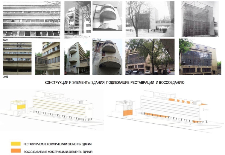
– This is one of the most controversial issues. At some places the walls are ruined, at some places they have been re-laid, and at some places they are in a great condition. Basically, all the damage has to do with water. For example, the east façade is a nightmare to look at. It has hanging flowerbeds upon it, and originally they had openings in them to let the water out. At some point – most likely, after the war – these openings were stopped. There weren’t any cache-pots inside – just soil and plants. So, when it rained, dirty water spilled over and leaked into the cracks between the stucco and the blocks. And if we take the walls of the communal unit or the west façade, they are in a great condition and don’t really need much renovating. But there are the north and south side walls, and these pieces of the east façade that will need to be partially redone.
Blocks designed by the engineer Prokhorov. Project of restoration and adaptation of the cultural heritage site "Narkomfin Building" (2015-2017) © Ginsburg Architects
East facade, preservation chart. Project of restoration and adaptation of the cultural heritage site "Narkomfin Building" (2015-2017) © Ginsburg Architects
As for the percentage of losses, we indicated it as a first approximation: only during the process, going from axis to axis and studying each one, we will be able to come up with a more exact figure. Still, though, we will relay the walls with the same blocks. We will make copies of these blocks, and we will recreate the brickwork. There were people who proposed to use breeze blocks or air-bricks but I made and showed them two hand drawings that clearly showed that this would be impossible for purely technical reasons, and not even because of some aesthetic or renovation considerations.
West facade, preservation chart. Project of restoration and adaptation of the cultural heritage site "Narkomfin Building" (2015-2017) © Ginsburg Architects
– And why would that be impossible?
– Simply because every material has its size and measurements. Other measurements will change the inside space of the building, and, because it’s pretty compact on the inside, one thing will lead to another. Other materials have a different bulk density that these floors are simply not design to bear.
– Will the façade show in any way, in accordance with the Venice Charter, which part is the authentic one and which is the one that’s been renovated? Or is it still too early to talk about that?
– I like it very much how they renovated Neues Museum in Berlin in accordance with the charter. This is one of my favorite buildings. But when I look at it, what I see is rather a story of a bombed-down museum than a restored one. This memory of destroyed Berlin is an important part of the historical memory of the Germans.
Do I think that in our case we need to indicate precisely that this square meter is original and this square meter has been renovated? Meaning – do we want our façade look like some kind of skin disease? This is a big question for me.
When I saw the renovated Bauhaus in Dessau, I didn’t notice anything of the kind. All the decoration was executed in a single style, and there was no old-and-new differentiation. On the Izvestia Building I refrained from showing where the old and where the new stained glass windows are. Otherwise the façade would look like some sort of kaleidoscope, and I wanted the building to produce an integral impression. This is a very serious question to me – choosing just which was I should go. I thought about it a lot, and I’m still thinking about it.
Diagram of water affecting the facade. Project of restoration and adaptation of the cultural heritage site "Narkomfin Building" (2015-2017) © Ginsburg Architects
– You are saying a lot of things were researched for the first time. Did you discover anything entirely new?
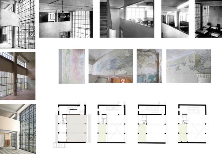
– Yes, there were things that became a revelation to me. For example, the stained glass window of the communal unit. I always thought that it was dark, the kind that I did on the Izvestia Building. But it turned out to be light-colored, almost white, both on the outside and on the inside. Oh, and, by the way, the building itself wasn’t white, the way they usually portray constructivist architecture. Its original color was different and we are sure to uncover it in the long run. We have already started this research, and we will keep on probing. In addition, we found horizontal “window wells” or “air shafts” that were very fashionable back in the early twentieth century. They are now piled up by some junk, but, of course, we will restore them.
– And what will happen to the interiors?
– I have a dream. I want to convince the developer to sell apartments in this building as coming with their interior design. If not with the furniture then at least with the ready-made kitchens and bathrooms! It is important for me to show that not a single element in this building appeared by chance, that there was no “design for design’s sake” or “architecture for architecture’s sake”. Every detail mattered, and every detail had a very clear functional meaning. This holds true even for the wall paint.
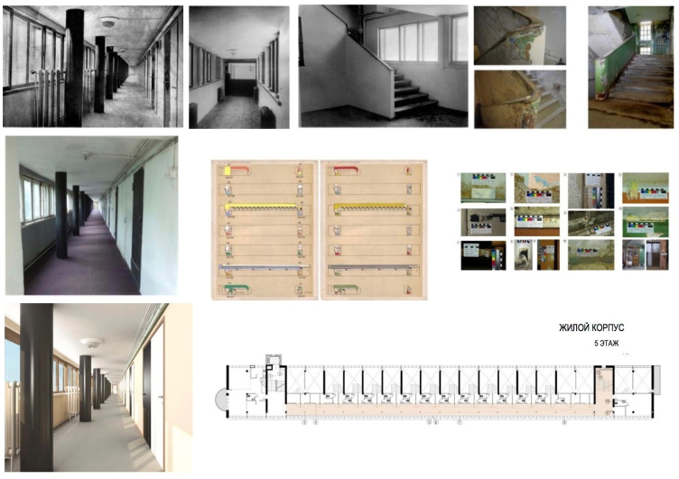
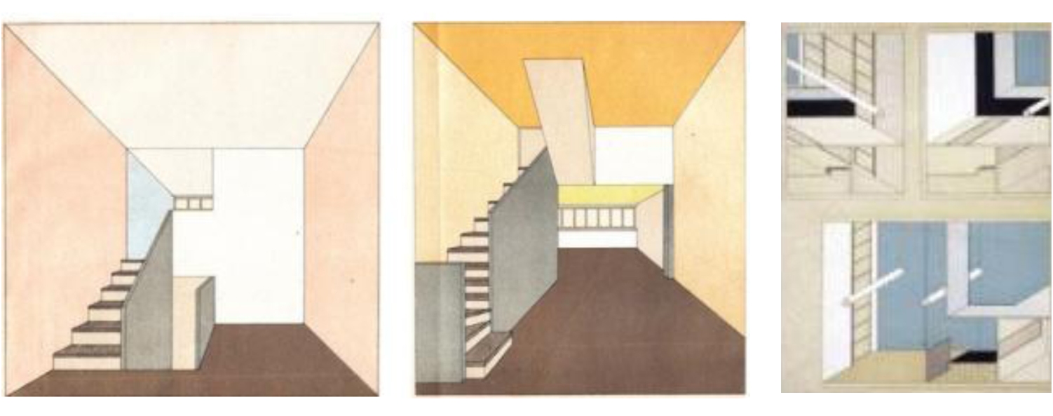
All the repairs that were done there completely ruined the original decor. We have already taken 49 probes of wall paint from two apartments. Different walls were painted different colors. The “Sovremennaya Arkhitektura” (“Modern Architecture”) magazine published an article by Moisey Ginsburg about how you should go about painting walls; there were two sets of colors there – warm and cold, and then there was this Sheper’s color chart. Now we will analyze these colors and test them against this chart.
West facade, preservation chart. Project of restoration and adaptation of the cultural heritage site "Narkomfin Building" (2015-2017) © Ginsburg Architects
Project of recreation the color solutions of the interior designs. Project of restoration and adaptation of the cultural heritage site "Narkomfin Building" (2015-2017) © Ginsburg Architects
– Does this mean that the shade of color effectively depended upon the cell type?
– I don’t know. And nobody will tell you, either. We don’t have any information. We won’t find out anything if we don’t go around with a scalpel and a drill, and our technologist doesn’t research the probes in the laboratory. In the first two apartments that we researched we already ran into the primary and secondary layers of paint. I am very curious myself to find out if all the apartments were painted different colors or the same. Solving this task will be a real treat to me. I am ready to do each apartment individually only to find original colors.
Project of recreation the color solutions of the interior designs © Ginsburg Architects
What else? The developer wants us to make wooden floors. It’s understood that all the xylolite floors were replaced by practically all the tenants with wooden ones, for the exception of, perhaps, Milyutin. He laid carpets on this xylolite. Yes, am OK with making parquet floors but painting the walls original colors is a point of honor to me.
– And what about the Milyutin apartment? Have you already had a chance to get down to his “villa”?
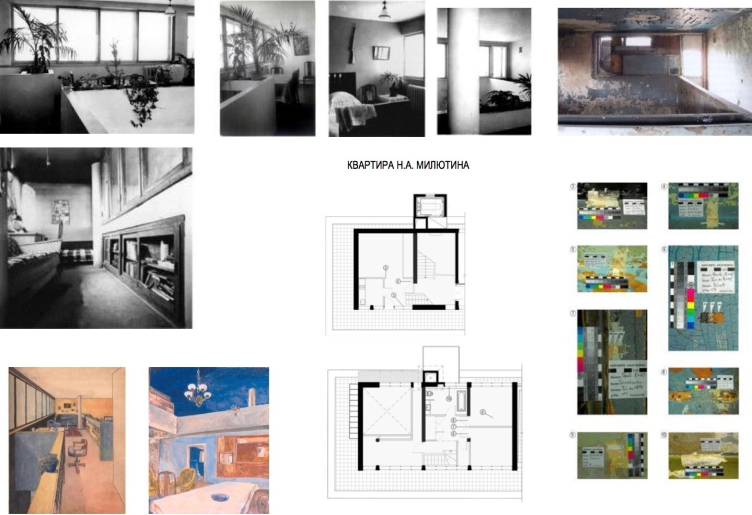
– Oh, come on, what kind of villa is that? I am ready to share with everyone how the Milyutin apartment came about. It is my firm belief that historical truth must not be lost. Let's start with the humble fact that the Milyutin apartment was not even in the original project. The only reason why it appeared later is because they did not have the money to install a draft ventilation system. But the air handling plant was already there on the roof. And Milyutin decided to make himself an apartment there. They had a quarrel with Ginsburg, and Milyutin said that he would design his apartment himself. He took a cell of Type K, tied it to this volume, and painted it blue. I was there still before they remodeled it and drew the Simpsons on the wall. Now they’ve been painted over but it looked atrocious in any case. We, of course, will recreate the original wall paint. Everything will be done the same way as it is in the other apartments. It’s no different than the other ones. This was basically a funny surreal story: a top statesman got himself a penthouse in the air handling plant next to four rooms of a worker dormitory. Well, he had a right to do as he pleased.
Left and center: color setting of Cell F. Right: color setting of Cell K / from the Moisey Ginsburg textbook "Zhilishche"
– Before the building changed the owner, one of the last scandals had to do with the fact that millwork was being carried out of the corridors. Was anything left there in the long run?
– A little, but, yes, there was. At least we have something to go on in terms of restoration. We will still try to renovate some small percentage of the windows. Still, we’ve got the drafts, and it’s clear how to do that.
– And what about the kitchen shutters that we read so much about in our textbooks – is there anything left of them?
– I have a growing suspicion that they were never there in the first place.
– How can this be possible? And what about the draft that we all saw?
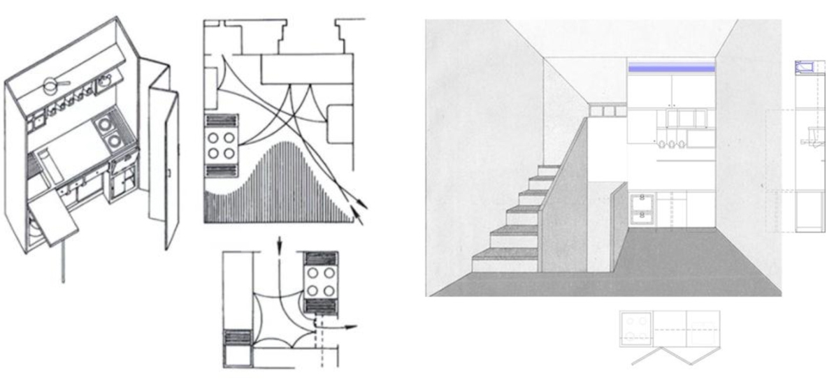
– The drawing that you are referring to is from the “Zhilishche” (“Housing”) textbook, and I love it myself. But I never saw a single photograph of them. Not a single confirmation of their existence! I am not sure they were ultimately installed. When I visited that place as a kid, in spots, where, according to the Ginsburg project, kitchens were supposed to be, there were gas stoves in most of the apartments. In those apartments that I chanced to set my foot in, anyway! Meaning, the place of the “kitchen element” in Cells F was filled with something related to cooking. My dream is to make kitchenettes by the “Zhilishche” sketches, with that corrugated thing; but, of course, we won’t have gas stoves there.
Milyutin's apartment. Project of restoration and adaptation of the cultural heritage site "Narkomfin Building" (2015-2017) © Ginsburg Architects
– What else is there in your restoration plans?
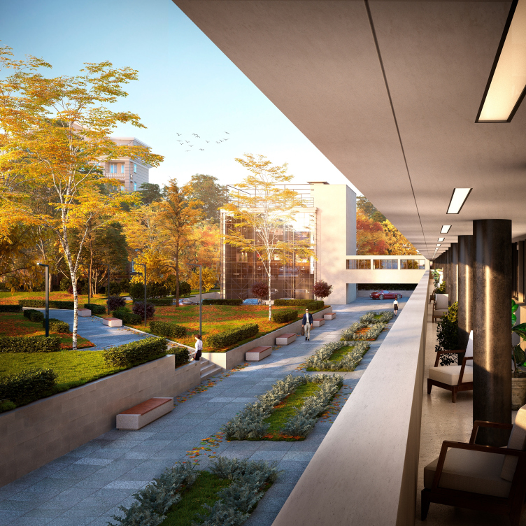
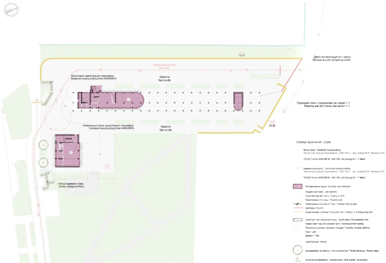
– We want to lower the ground level. Back then, the level of the floor was about 30 centimeters lower than today’s ground level. This is like a restoration program within a restoration program – there have always been a lot of talk how important it was to uncover the first floor. But nobody bothered to analyze just how much must be done in order to uncover it. Meaning, the first challenge that we needed to solve was figure out what to do with the water because the building stands in the lowlands! Currently, water is leaking in from just about everywhere, including the parking lot before “Novinsky Passage”. We did a project for that, did the master plan, got the approvals from Administration for Service to the Diplomatic Corps and the American embassy. Our client got the technical specifications for plugging in to the surface water drain. Only this solution made this whole thing possible. Currently, by the way, we are in the stage of getting an approval from the local police. But, besides all this, there are engineering networks there that we will probably have to sink down even lower. This will also require obtaining technical specifications, extra work, and extra expenses.
Mini-kitchen in Cell F / from the Moisey Ginsburg textbook "Zhilishche"
Project of restoration and adaptation of the cultural heritage site "Narkomfin Building" (2015-2017) © Ginsburg Architects
– Meaning, the project provides for organization of the territory?
– I want to make a single vehicle-free territory stretching from the American embassy to the park, with an underpass running beneath the building. It’s understood that historically there was earth there, and now it is concrete but I proposed to use the granite paving system that is already accepted in Moscow, just for the sake of uniformity.
– Are there any plans for making a museum in the Narkomfin building?
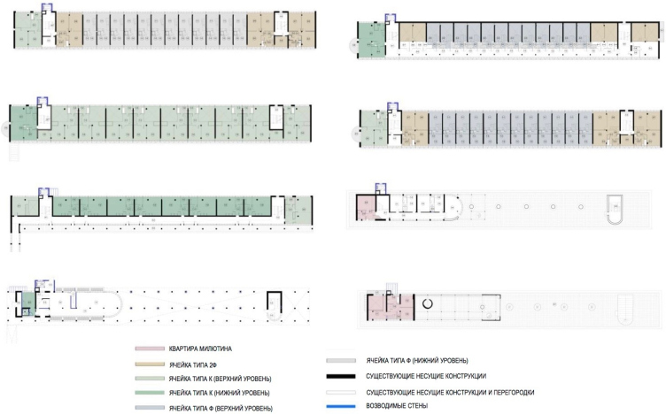
– We are discussing this question with the client. We are absolutely sure that it’s very important to turn one cell into a museum.
Project of restoration and adaptation of the cultural heritage site "Narkomfin Building" (2015-2017) © Ginsburg Architects
Project of restoration and adaptation of the cultural heritage site "Narkomfin Building" (2015-2017) © Ginsburg Architects
Project of restoration and adaptation of the cultural heritage site "Narkomfin Building" (2015-2017) © Ginsburg Architects
Project of restoration and adaptation of the cultural heritage site "Narkomfin Building" (2015-2017) © Ginsburg Architects
Project of restoration and adaptation of the cultural heritage site "Narkomfin Building" (2015-2017) © Ginsburg Architects
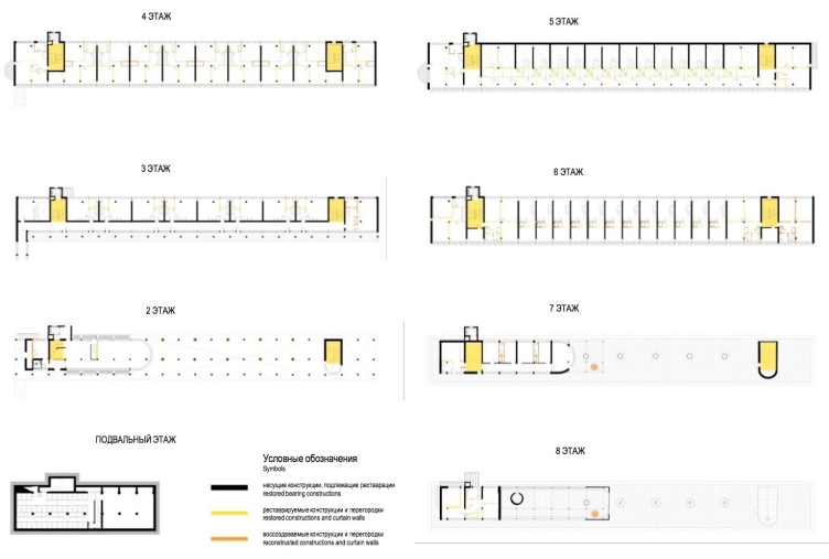
Structures and elements of the building to be renovated. Project of restoration and adaptation of the cultural heritage site "Narkomfin Building" (2015-2017) © Ginsburg Architects
Later additions and annexes. Project of restoration and adaptation of the cultural heritage site "Narkomfin Building" (2015-2017) © Ginsburg Architects
Project of restoration and adaptation of the cultural heritage site "Narkomfin Building" (2015-2017) © Ginsburg Architects
Project of restoration and adaptation of the cultural heritage site "Narkomfin Building" (2015-2017) © Ginsburg Architects


