По-русски

Perpendicular Reality

The giant complex of Moscow City that appeared on the map of Moscow a few years ago makes one wonder about a lot of various aspects of architectural typology of high-rise buildings. The phenomenon of a "vertical city" and solutions proportionate to it were discussed in our conversation with Sergey Estrin – the author of a whole number of bright projects of public and residential interiors in Moscow's high-rises.

14 September 2016
Interview
mainImg

Archi.ru:
– What do you think is the niche that the complex of Moscow City now occupies in the nation's capital structure? 

Sergey Estrin:
– A traditional city – which Moscow definitely is – is a horizontal one. It has a historical center, shopping streets, industrial and residential areas; it can also have in it, let's say, ethnic or entertainment quarters. This is a city that we all are used to, a city we can easily find our way around in, and know what to expect from. But once this habitual paradigm gets such a perpendicular structure as this skyscraper complex, this, of course, becomes quite a noticeable phenomenon, both from the town-planning standpoint and in terms of how the people that live and work in it perceive the world around them. This is a totally different business model: not just a new quarter but a building that can be seen from virtually every part of the city; not just a house or a street but a set of individual addresses – the Eurasia tower, the Mercury tower, and so on. Which, of course, goes a long way to boost the popularity of such housing.

- Meaning, first of all, this is a whole new level of prestige? 

– This is a whole new city format that is laden – and this is ever so important – with a totally different emotional content. The breathtaking panoramas, the sunrises and sunsets, the clouds drifting over and around you, the roofs that are "the fifth façade" of the city, and this is about the only way for you to take a good look at them, and they are beyond beautiful! And what about the night views? When viewed from the fiftieth floor, even the trivial traffic jams turn into an art object: when the city is dissected with glowing lines, red and yellow, you involuntarily start perceiving the geography of Moscow in a different way, with all of its boulevards and highways. Not everyone, by the way, will feel comfortable at such a great height, but if a person is psychologically ready for it, once they've felt the adrenaline rush, they will probably want to experience that feeling again. The very idea of the tower always teetering a little bit – at its highest point, the amplitude can reach a whole meter!

– What else does this format yield, besides the emotional experience? 

– A skyscraper, as a rule, is a building that is multifunctional and one that is divided into zones: offices, a residential part, a retail part, and so on. Oftentimes, swimming pools and fitness centers are added, as well as conservatories, movie theaters, restaurants, and art galleries. Meaning – without ever leaving the building you can get virtually everything that a modern megalopolis has to offer. And I think it's not even about saving you the trouble of traveling around the city – I can hardly imagine somebody staying indoors for days – this restaurant and this garden will soon feel monotonous to him or her. But the very feeling of finding yourself in such a densely packed and saturated environment, as if a whole city stood up on end – is attractive for many people. You see, there is this type of country housing – the rural solitude, nature, sky, landscapes. And there is a city, bustling, full of life and mobility. And now a new format has come – when you are sort of in the city but at the same time a hundred meters above it, and it's also just as quiet, and you can admire the sunrises and the sunsets, the only difference being that you don't have to wait in traffic jams to finally get there. Of course, I am not speaking of people for whom this is their first or only residence – these will hardly ever opt for apartments in a skyscraper. But for those who maybe already has an apartment in the city, and a house in the country, this skyscraper residence may become an intriguing alternative.  

– Obviously, this new urban environment calls for new architectural solutions, including the interior design ones?

– Absolutely! Of course, you might be tempted to go ahead and multiply manifold your time-tested techniques, scaling them five or ten meters up – and there you are! And this is, of course, something that many architects do, by the way. The result, however, looks rather stilted and monotonous. It is my opinion that an architectural stylistic device has to match the magnitude of the volume it is applied to. Take the entrance group, for example – this is a high-responsibility element that actually is the beginning of this new and exciting city environment for everyone who enters it. It must be perceived accordingly from the outside, and on the inside it must match the premises that will ensue, careful attention to detail being also absolutely necessary for the designer, no matter how grand the scale of the building might be. And these details must look great from every conceivable angle so that they will not look dull or monotonous. Such approach will let the interior live a long life and every time a person that enters it will be put in the mood that corresponds to a certain emotional state that this grand building deserves. 

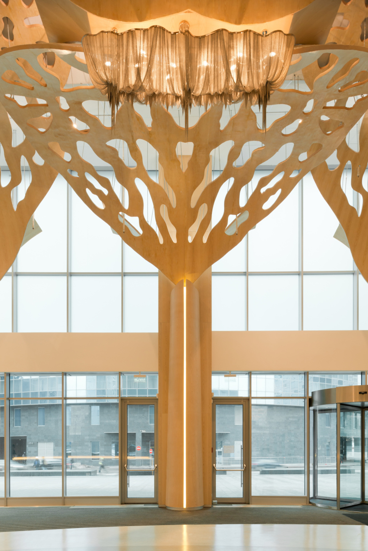
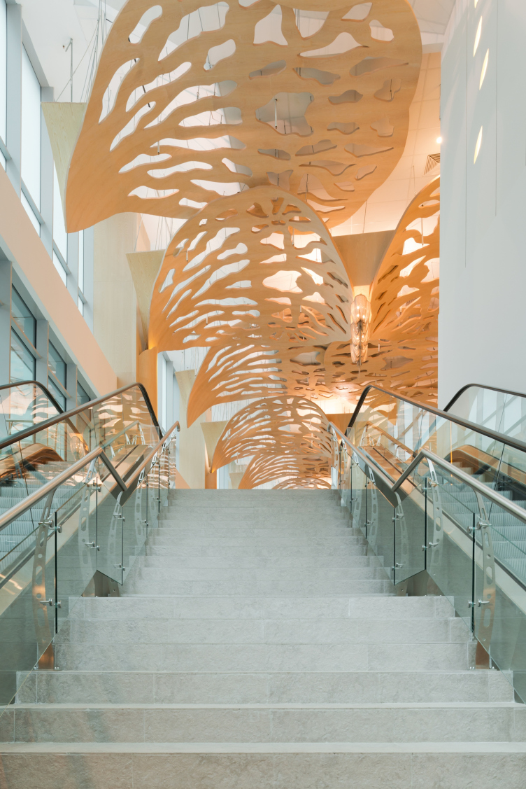
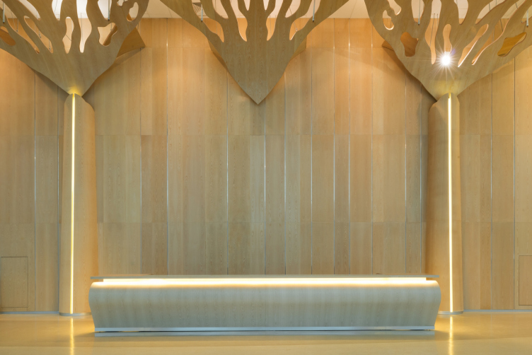
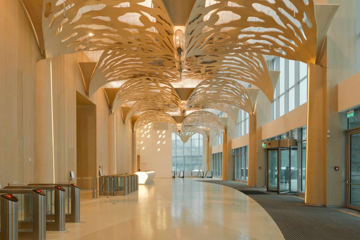
When we were thinking out the public spaces for the Eurasia Tower, we chose "Forest Symphony" as the leitmotif. The entrance group of the office area is decorated with stylized tropical trees – powerful trunks and wide crowns. Upon a closer look, however, one will find that there is a lot of details, every single one of which is unique. The slits in the wooden panels of the leaves are of various configurations, the veneer sheet is indeed made of wood, even if it covers a thirty-meter-wide wall; the "spots of light" that show through the foliage are the result of a sophisticated lighting system...

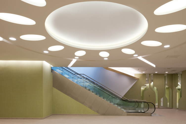
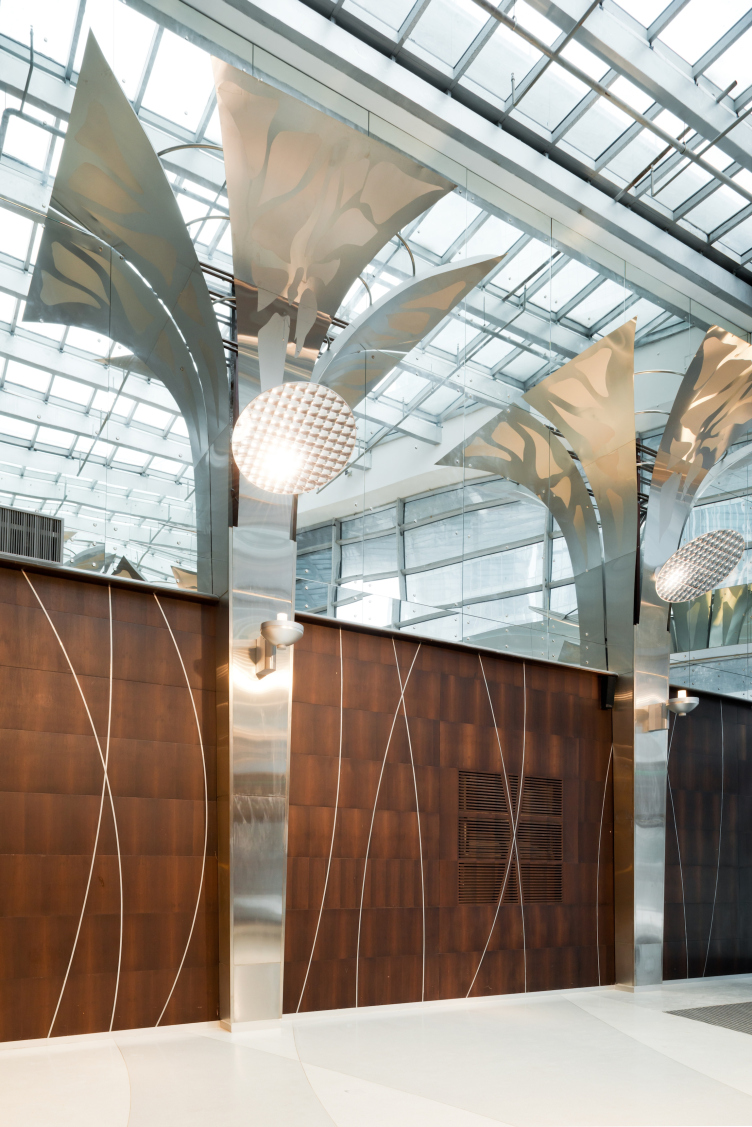
Public areas in the "Eurasia" Tower in the complex of "Moscow City". Implementation, 2014 © Sergey Estrin Architects


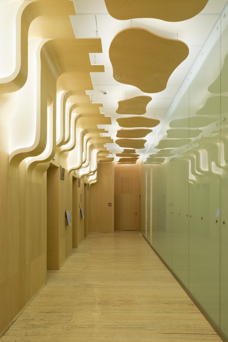
Public areas in the "Eurasia" Tower in the complex of "Moscow City". Implementation, 2014 © Sergey Estrin Architects


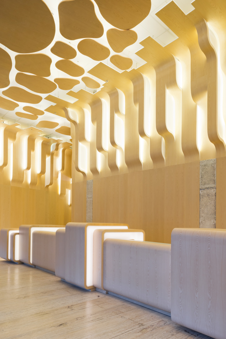
Public areas in the "Eurasia" Tower in the complex of "Moscow City". Implementation, 2014 © Sergey Estrin Architects


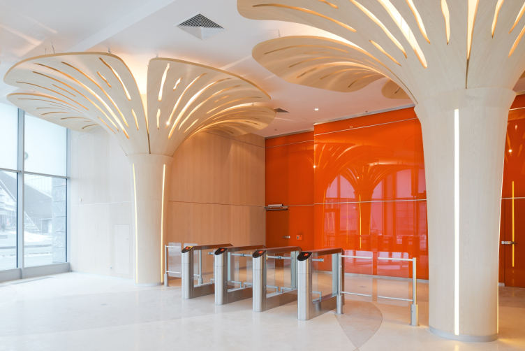
Public areas in the "Eurasia" Tower in the complex of "Moscow City". Implementation, 2014 © Sergey Estrin Architects


For "Eurasia", we did the public interiors of all the seventy floors, starting with the ascent from the underground level where the visitor was to already get a feeling of being in a different world, before they ever reached the elevator lobby.  

The entrance to the residential part – situated on the ground level – is also designed in the vein of this "forest" theme: again, large elements are there, but these are not as large as in the office group – all due to the fact that hall space is smaller in itself, just as the part that follows it. All the lights are of the hidden type – it was important for us that it should not be concentrated on any specific detail but glow out of nowhere, as if oozing through the leaves like rays of sunlight.

Public areas in the "Eurasia" Tower in the complex of "Moscow City". Implementation, 2014 © Sergey Estrin Architects


Public areas in the "Eurasia" Tower in the complex of "Moscow City". Implementation, 2014 © Sergey Estrin Architects


Public areas in the "Eurasia" Tower in the complex of "Moscow City". Implementation, 2014 © Sergey Estrin Architects


Public areas in the "Eurasia" Tower in the complex of "Moscow City". Implementation, 2014 © Sergey Estrin Architects
 

– We've been speaking about the entrance groups. And what about the interiors of the upper floors and penthouses? 

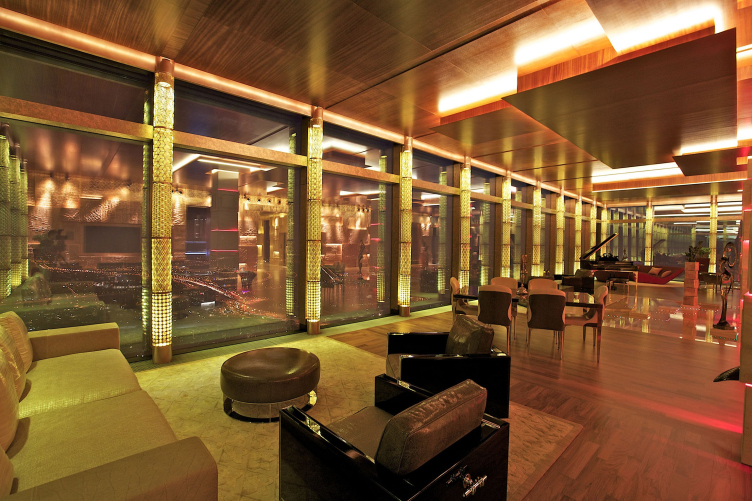
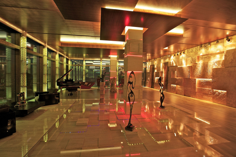
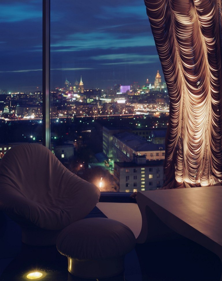
– Well, what really makes them different is the sheer fact that the city panorama outside the window is such a powerful sight to see that you cannot really compete with it, and you needn't, either. However, you still want to achieve the effect that when a person turns away from the window he sees something that deserves to be there next to this magnificent view. Designing a penthouse at the 76th floor of one of the Moscow City towers, we put really a lot of time and effort into a living room wall trying to achieve a certain proportional correlation with a wildly beautiful view. It was a wall about twenty meters long, and we designed it as a stack of cubes covered with leaf copper that looks like exposed reinforcing bars are showing through it - and we shined glowing rays of light over it, like over a theater curtain.

Penthouse in "Moscow City". Implementation, 2011 © Sergey Estrin Architects


Penthouse in "Moscow City". Implementation, 2011 © Sergey Estrin Architects


– Doesn't sound like a piece of living space in its traditional meaning...

– Exactly! And this is where I came in – that such a penthouse is probably not the only apartment that the owner has. Of course, this place includes comfortable bedrooms, and a kitchen, and everything that you might ever need to live a normal life – but you can still hardly fancy a family with three kids in such an interior, these kids jumping around and you having a hard time trying to figure out how to stop them from hurting themselves. Our point, however, is this: if Moscow has gotten a whole new different architectural environment, it must also look different.

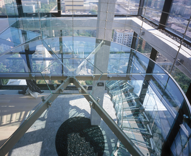
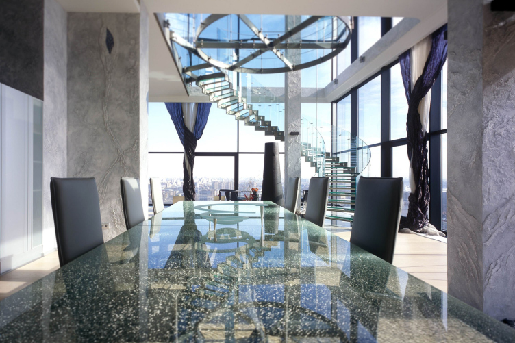
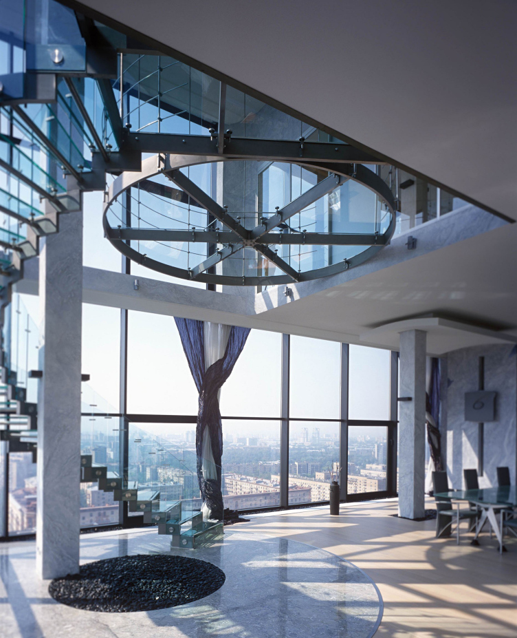
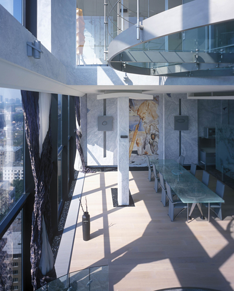
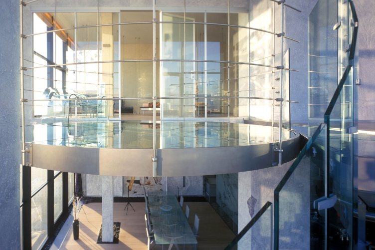
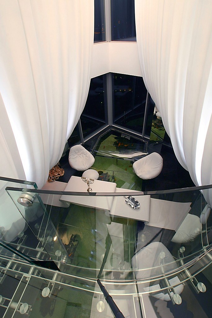
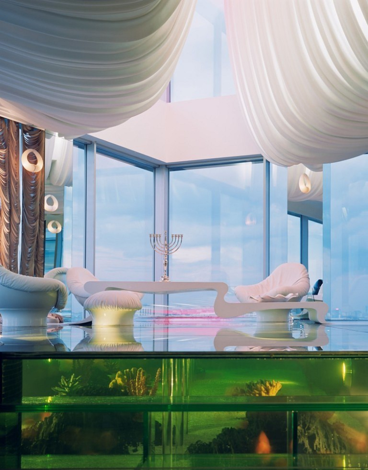
For example, in "Sokolinoe Gnezdo" ("Hawk's Nest") housing complex we "suspended" a glass island on the second level of the penthouse - this island is only accessible by a glass stairway, and you get a complete sensation of hovering over the city. 

Two-level penthouse in "Sokolinoe Gnezdo". Implementation, 2003 © Sergey Estrin Architects


Two-level penthouse in "Sokolinoe Gnezdo". Implementation, 2003 © Sergey Estrin Architects


Two-level penthouse in "Sokolinoe Gnezdo". Implementation, 2003 © Sergey Estrin Architects


Two-level penthouse in "Sokolinoe Gnezdo". Implementation, 2003 © Sergey Estrin Architects


Two-level penthouse in "Sokolinoe Gnezdo". Implementation, 2003 © Sergey Estrin Architects


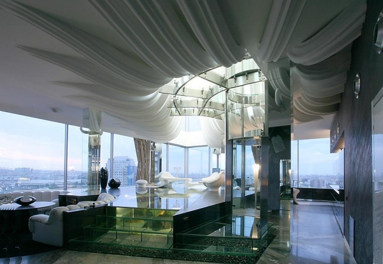
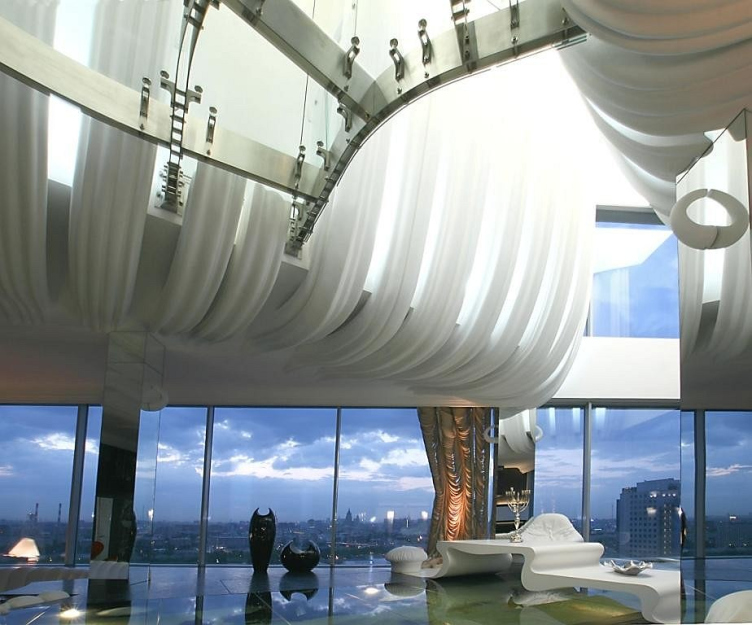
And in the penthouse of one of the Constellation towers that's on the Shabolovka Street, we decorated the ceiling curvilinear plaster panels that looked like clouds, while some of the rooms were designed in a futuristic "cosmic" style.

Penthouse on the Shabolovka Street. Implementation, 2007 © Sergey Estrin Architects


Penthouse on the Shabolovka Street. Implementation, 2007 © Sergey Estrin Architects
 

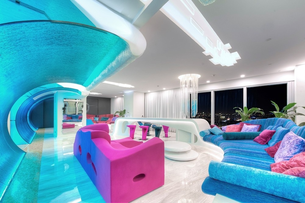
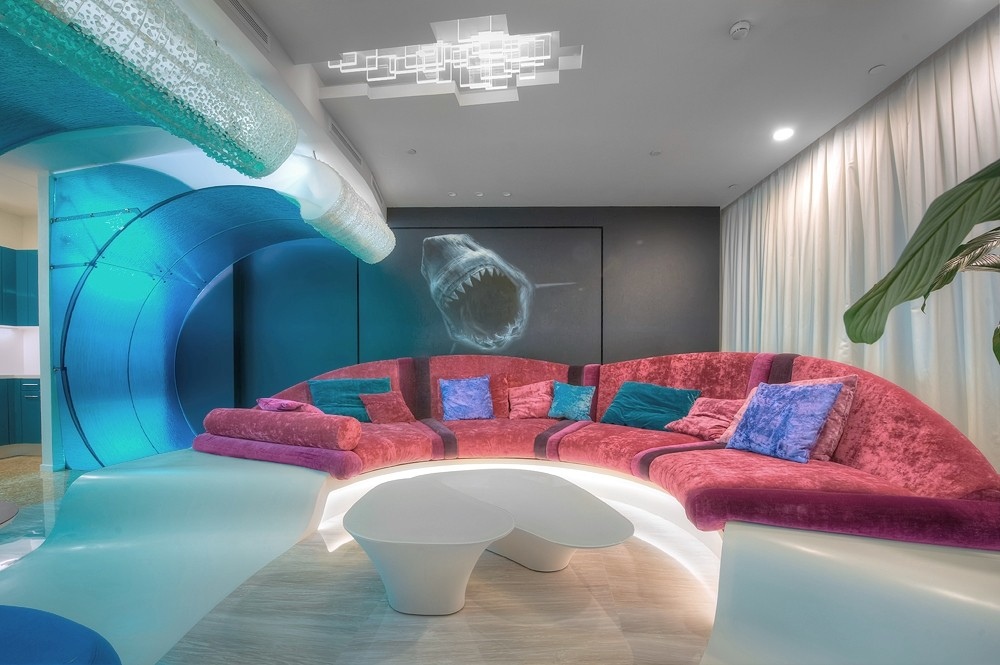
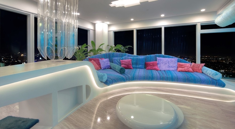
There was also one apartment in the Moscow Tower that had nothing nebulous to it – instead, we used another "striking" element, a huge azure wave with a lacy edge of sea foam. What's interesting about this apartment is the fact that its ceilings are not really high, almost like in a regular house, but the usual interior, neatly stuccoed, with wooden skirting boards and plywood door panes is the last thing you want to do on the fortieth floor with such panoramas! 

zooming
Interiors of the penthouse of Mr.Sh in "Moscow City". Implementation, 2012 © Sergey Estrin Architects


zooming
Interiors of the penthouse of Mr.Sh in "Moscow City". Implementation, 2012 © Sergey Estrin Architects


zooming
Interiors of the penthouse of Mr.Sh in "Moscow City". Implementation, 2012 © Sergey Estrin Architects


– So, do you want to say that classic interior elements simply cannot fit in such living space? 

– Again, if you take a certain technique, you don't want to use it verbatim – you need to revise it in reference to the current situation. Take such a seemingly trivial thing as curtains – each time we had to reinvent them over again! In this case, they don't perform their usual utilitarian function of shading the window - it is clear that with such breathtaking views you won't ever want to draw the curtains. Rather, you need them to compositionally link the ceiling and the floor. In the Shabolovka project, for example, each curtain is in fact an art object made of several kilometers of vertical Venetian blinds that, when backlit from below, look like a wooden sculpture. This is just the right example of a large-scale solution that it took us a long time to find because traditional techniques and materials were totally misplaced here.

Penthouse on the Shabolovka Street. Implementation, 2007 © Sergey Estrin Architects


Penthouse on the Shabolovka Street. Implementation, 2007 © Sergey Estrin Architects


The light has also its own specifics here. Generally, what you want to do most often with the light in this case is just turn it off, so you don't want to lay any particular stress on the lights. At the same time, you need to have a sufficient number of spotlights and you need to provide for different lighting scenarios. In the City, for example, we hid the lights into laser-engraved columns – they visually organize the place, and they are pretty decorative themselves. And in the Shabolovka project we hid the lights above the "clouds" on the ceiling, thus getting a kind of light that's very close to the ambient light behind the windows. 

Penthouse on the Shabolovka Street. Implementation, 2007 © Sergey Estrin Architects


And as for the classic you asked me about... Well, of course, in such an interior you cannot run plasterwork over the cornice and you cannot use columns from a ready-made plaster items catalogue. But if we are to take, say, the base of some classic column, and make its shaft just stop dead at the ceiling – well, it didn't exactly match the ceiling height here – and place the column's head somewhere on the hundredth floor – this would be a very powerful thing to do. And, again, this will be a solution of a whole new level corresponding and proportionate to the new space paradigm.

14 September 2016

Headlines now
The Golden Crown
The concept for a dental clinic in Yekaterinburg, developed by CNTR Studio, revolves around the idea of a “mouth full of gold”: pristine white porcelain stoneware walls are complemented by matte brass details. To avoid an overly literal interpretation, the architects focused on the building’s proportions, skillfully navigating between sunlight requirements and fire safety regulations.
Flexibility and Integration
Not long ago, we covered the project for the fourth phase of the ÁLIA residential complex, designed by APEX. Now, we’ve been shown different fence concepts they developed to enclose the complex’s private courtyards, incorporating a variety of public functions. We believe that the sheer fact that the complex’s architects were involved in such a detail as fencing speaks volumes.
A Step Forward
The HIDE residential complex represents a major milestone for ADM architects and their leaders Andrey Romanov and Ekaterina Kuznetsova in their quest for a fresh high-rise aesthetic – one that is flexible and layered, capable of bringing vibrancy to mass and silhouette while shaping form. Over recent years, this approach has become ADM’s “signature style”, with the golden HIDE tower playing a pivotal role in its evolution. Here, we delve into the project’s story, explore the details of the complex’s design, and uncover its core essence.
Gold in the Sands
A new office for a transcontinental company specializing in resource extraction and processing has opened in Dubai. Designed by T+T Architects, masters of creating spaces that are contemporary, diverse, flexible, and original, this project exemplifies their expertise. On the executive floor, a massive brass-clad partition dominates, while layered textures of compressed earth create a contextually resonant backdrop.
Layers and Levels of Flight
This project goes way back – Reserve Union won this architectural competition at the end of 2011, and the building was completed in 2018, so it’s practically “archival”. However, despite being relatively unknown, the building can hardly be considered “dated” and remains a prime example of architectural expression, particularly in the headquarters genre. And it’s especially fitting for an aviation company office. In some ways, it resembles the Aeroflot headquarters at Sheremetyevo but with its own unique identity, following the signature style of Vladimir Plotkin. In this article, we take an in-depth look at the United Aircraft Corporation (UAC) headquarters in the Moscow agglomeration town of Zhukovsky, supplemented by recent photographs from Alexey Naroditsky – a shoot that became only recently possible due to the fact that improvements were finally made in the surrounding area.
Light and Shadow
In this article, we delve into the architectural design of the “Chaika” house by DNK ag architects, which was recently completed in 2023 as part of the collection of signature designs at ZILArt. As is well-known, all the buildings in this complex follow a design code, yet each one is distinct. This particular building stands out not only for its whiteness and minimalism but also for the refined use of a limited number of techniques that, together, create what can confidently be called synergy.
Casus Novae
A master plan was developed for a large residential area with a name of “DNS City”, but now that its implementation began, the plan has been arbitrarily reformatted and replaced with something that, while similar on the surface, is actually quite different. This is not the first time such a thing happens, but it’s always frustrating. With permission from the author, we are sharing Maria Elkina’s post.
Treasure Hunting
The GAFA bureau, in collaboration with Tegola and Arkhitail, organized an expedition to the island of Kilpola in Karelia as part of Moskomarkhitektura’s “Open City” festival. There, amidst moss and rocks, the students sought answers to questions like: what is the sacred, where does it dwell, and what sustains it? Assisting the participants in this quest were landscape engineer Evgeny Levin, artist Nicholas Roerich, a moose, and the lack of cellular connection. Here’s how the story unfolded.
Depths of the Earth, Streams of Water
In the Malaya Okhta district, the Akzent building, designed by Stepan Liphart, was constructed. It follows a classic tripartite structure, yet it’s what you might call “hand-drawn”: each façade is unique in its form and details, some of which aren’t immediately noticeable. In this article, we explore the context and, together with the architect, delve into how the form was developed.
Fir Tree Dynamics
The “Airports of Region” holding is planning to build an airport in Karachay-Cherkessia, aiming to make the Arkhyz and Dombay resorts more accessible to travelers. The project that won in an invitation-only competition, submitted by Sergey Nikeshkin’s KPLN, blends natural imagery inspired by the shape of a conifer seed, open-air waiting spaces, majestic large trees, and a green roof elevated on needle-like columns. The result is both nature-inspired and WOW.
​A Brick Shell
In the process of designing a clubhouse situated among pine trees in a prestigious suburban area near Moscow, the architectural firm “A.Len” did the façade design part. The combination of different types of brick and masonry correlates with the volumetric and plastique solutions, further enhanced by the inclusion of wood-painted fragments and metal “glazing”.
Word Forms
ATRIUM architects love ambitious challenges, and for the firm’s thirtieth anniversary, they boldly play a game of words with an exhibition that dives deep into a self-created vocabulary. They immerse their projects – especially art installations – into this glossary, as if plunging into a current of their own. You feel as if you’re flowing through the veins of pure art, immersed in a universe of vertical cities, educational spaces – of which the architects are true masters – and the cultural codes of various locations. But what truly captivates is the bold statement that Vera Butko and Anton Nadtochy make, both through their work and this exhibition: architecture, above all, is art – the art of working with form and space.
Flexibility and Acuteness of Modernity
Luxurious, fluid, large “kokoshniks” and spiral barrel columns, as if made from colorful chewing gum: there seem to be no other mansion like this in Moscow, designed in the “Neo-Russian-Modern” style. And the “Teremok” on Malaya Kaluzhskaya, previously somewhat obscure, has “come alive with new colors” and gained visibility after its restoration for the office of the “architectural ecosystem” as the architects love to call themselves. It’s evident that Julius Borisov and the architects at UNK put their hearts into finding this new office and bringing it up to date. Let’s delve into the paradoxes of this mansion’s history and its plasticity. Spoiler: two versions of modernity meet here, both balancing on the razor’s edge of “what’s current”.
Yuri Vissarionov: “A modular house does not belong to the land”
It belongs to space, or to the air... It turns out that 3D printing is more effective when combined with a modular approach: the house is built in a workshop and then adapted to the site, including on uneven terrain. Yuri Vissarionov shares his latest experience in designing tourist complexes, both in central Russia and in the south. These include houseboats, homes printed from lightweight concrete using a 3D printer, and, of course, frame houses.
​Moscow’s First
“The quality of education largely depends on the quality of the educational environment”. This principle of the last decade has been realized by Sergey Skuratov in the project for the First Moscow Gymnasium on Rostovskaya Embankment in the Khamovniki district. The building seamlessly integrates into the complex urban landscape, responding both to the pedestrian flow of the city and the quiet alleyways. It skillfully takes advantage of the height differences and aligns with modern trends in educational space design. Let’s take a closer look.
Looking at the Water
The site of Villa Sonata stretches from the road to the water’s edge, offering its own shoreline, pier, and a picturesque river panorama. To reveal these sweeping views, Roman Leonidov “cut” the façade diagonally parallel to the river, thus getting two main axes for the house and, consequently, “two heads”. The internal core – two double-height spaces, a living room and a conservatory, with a “bridge” above them – makes the house both “transparent” and filled with light.
The White Wing
Well, it’s not exactly white. It’s more of a beige, white-stone structure that plays with the color of limestone – smoother surfaces are lighter, while rougher ones are darker. This wing unites various elements: it absorbs and interprets the surrounding themes. It responds to everything, yet maintains a cohesive expression – a challenging task! – while also incorporating recognizable features of its own, such as the dynamic cuts at the bottom, top, and middle.
Urban Dunes
The XSA Ramps team designed and built a three-part sports hub for a park in Rostov-on-Don, welcoming people of all ages and fitness levels. The skate plaza, pump track, and playground are all meticulously crafted with details that attract a diverse range of visitors. The technical execution of the shapes and slopes transforms this space into a kind of sculptural composition.
Proportional Growth
The project for the fourth phase of the ÁLIA residential area has been announced. The buildings are situated on an elongated plot – almost a “ray” that shoots out from the center of the area towards the river. Their layout reflects both a response to Moscow’s architectural preferences over the past 15 years, shifting “from blocks to towers”, and an interpretation of the neighboring business park designed by SOM. Additionally, the best apartments here are not located at the very top but closer to the middle, forming a glowing “waistline”.
The “Staircase” Building
In designing the “Details” residential complex in New Moscow, Rais Baishev spiced up the now-popular Moscow theme of a “courtyard” building with an idea drawn from the surrealist drawings by Maurits Escher. He envisioned the stepped silhouettes and descending slopes as a metaphysical mega-staircase, creating a key void within the courtyard that gave the project an internal “spine”. This concept is felt both in the building’s silhouette and on its façades.
Projection of the Quarter
No one doubted that the building that Vladimir Plotkin designed as part of the “Garden Quarters” would be the most modernist of all. And it turned out just that way: while adhering to the common design code, the building successfully combines brick and white stone, rhythmically responding to the neighboring building designed by Ostozhenka, yet tactfully and persistently making a few statements of its own. This includes the projection of the ideal urban development composition “14–9–6”, which can be found right next door, mathematical calculations, including those for various types of terraces (and perhaps the only reminder of the Soviet past of the Kauchuk rubber factory!), and the white “cross-stitch” pattern of the façade grid.
Domus Aurea
In this issue, we examine the “Tessinsky-1” house, designed by Sergey Skuratov and completed in 2023. Located in the middle of the Serebryanicheskaya Embankment district, at the intersection of its main streets, this house assumes a sort of “nodal” role: it not only responds to everything around it and preserves many memories of the former EMA factory within itself, but it weaves all this into a newly directed pattern, reconciling bright “gold” and dark-colored brick, largely with the help of the new, modern-yet-archaic Columba brick, which, come to think about it, is the most precious element here.
The Chimney of Nikola-Lenivets
In this issue, we are examining the “Obelisk House” designed by KATARSIS and built for the Arkhstoyanie 2023 festival. However, it was only finished later on, and this is why we are examining it now. It seems to us that after the “Obelisk House” appeared in Nikola-Lenivets, a dialogue and a few inner connections appeared between the temporary structures built here. These houses no longer look like “accidental neighbors”, more of which below.
​Periscope by the Bay
The jury awarded the second place in the competition for a public and cultural center in Petropavlovsk-Kamchatsky to the companies GORA (“Mountain”) and M4. In the consortium’s proposal, the building resembles a sperm whale with a calf swimming next to it or a periscope, whose lenses capture the most spectacular views from the surrounding landscape.
From Arcs to Dolmens
While working on the competition project for Petropavlovsk-Kamchatsky, ASADOV Architects prioritized the value of the natural and urban environment, aiming to preserve the balance of the location while minimizing the resemblance of the volume that they designed to a “traditional building”. The task was challenging, and the architects created three versions, one of which having been developed after the competition, where their main proposal took third place. However, the point of interest here is not the competition result but the continuity of creative thinking.
Hide and Seek
The ID Moskovskiy house, designed by Stepan Liphart in St. Petersburg, in the courtyards near Moskovskiy Avenue beyond the Obvodny Canal and recently completed, is notable for several reasons. Firstly, it has been realized with considerable accuracy, which is particularly significant as this is the first building where the architect was responsible not only for the facades but also for the layouts, allowing for better integration between the two. On the other hand, this building is interesting as an example of the “germination” of new architecture in the city: it draws on the best examples from the neighborhood and becomes an improved and developed sum of ideas found by the architect in the surrounding context.
The Big Twelve
Yesterday, the winners of the Moscow Mayor’s Architecture Award were announced and honored. Let’s take a look at what was awarded and, in some cases, even critique this esteemed award. After all, there is always room for improvement, right?
Above the Golden Horn
The residential complex “Philosophy” designed by T+T architects in Vladivostok, is one of the new projects in the “Golubinaya Pad” area, changing its development philosophy (pun intended) from single houses to a comprehensive approach. The buildings are organized along public streets, varying in height and format, with one house even executed in gallery typology, featuring a cantilever leaning on an art object.
Nuanced Alternative
How can you rhyme a square and space? Easily! But to do so, you need to rhyme everything you can possibly think of: weave everything together, like in a tensegrity structure, and find your own optics too. The new exhibition at GES-2 does just that, offering its visitor a new perspective on the history of art spanning 150 years, infused with the hope for endless multiplicity of worlds and art histories. Read on to see how this is achieved and how the exhibition design by Evgeny Ace contributes to it.
Blinds for Ice
An ice arena has been constructed in Domodedovo based on a project by Yuri Vissarionov Architects. To prevent the long façade, a technical requirement for winter sports facilities, from appearing monotonous, the architects proposed the use of suspended structures with multidirectional slats. This design protects the ice from direct sunlight while giving the wall texture and detail.