По-русски

A City of Light

Based on the norms of insolation and the technical assignment, the architects of Sergey Estrin’s Architects have created an imagery and many-sided concept of a residential development in one of Moscow’s green areas.

23 June 2016
Object
mainImg

Difficulties stimulate creative thought, and the most interesting solutions are born in particularly difficult situations – probably every practicing architect is familiar with these postulates. A residential complex, designed by Sergey Estrin Architects within a closed competition for one of the quiet districts of Moscow, presents wonderful proof of these facts. The task was to build a block of flats to be populated rather densely, on a small lot of a bit less than half a hectare, densely surrounded on all sides with five-story buildings – the client expected to place 8 000 m2 of residential space here, plus rental areas on the ground floor. Perhaps, if it were to be implemented in the middle of nowhere, even on such a small land plot, the architects would “get off easy” by building a tower or a rectangular volume along the perimeter of the allotted land. But then there would be no unique sculpturesque image, developed by the project authors. It was not about the necessity of visual compliance with the context – it was the technical standards that made the authors go along the path of most resistance, and first of all provision of the necessary insolation level both for the new construction, and the neighboring houses, according to the current SanPiNs. Any building, which would rise higher, than three floors, would overshadow the existing houses around the lot. The client provided the authors with an insolation map, which they checked with while planning.

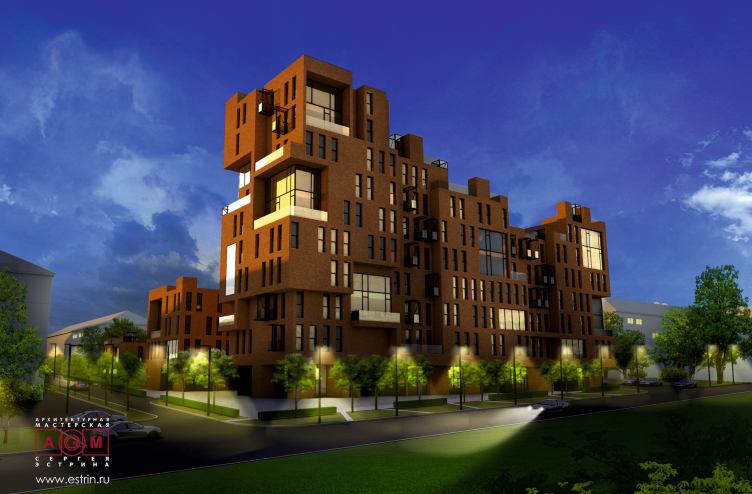
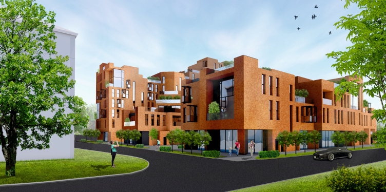
Concept of the residential development in Moscow. Project, 2016 © Sergey Estrin Architects
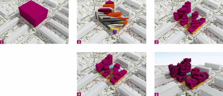
Concept of the residential development in Moscow. Development of the forms. Project, 2016 © Sergey Estrin Architects


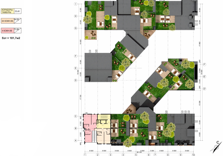
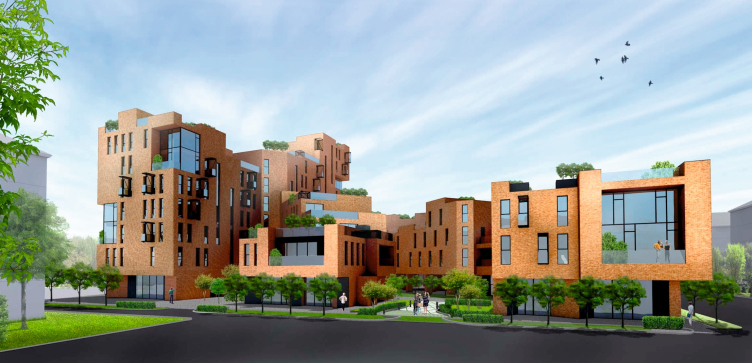
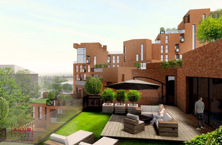
The way the volume was born can be seen in the infographics: having chosen the optimal height of the object as the starting point, the authors started changing the minimal height based on the shadow, cast by each separate segment on the near houses in different hours. The same applies to the insolation of the building itself. Calculations were made practically for every apartment during the planning process. What they achieved, was that during the daylight hours, at a certain time each apartment obtains maximum sunlight. Interchangeably, the house is lit from all the four sides as the sun moves. As a result, it formed a complex volume with multiple cuts along its height. It was divided into two buildings with a narrow street between them. Both buildings have special diagonal offshoots in plan – it can be seen clearly when looking at the complex from the height. The cut-offs are functional roofs with terraces.        

Due to the fact that the insolation conditions turned out to be different for each of the four sides, the residential complex itself came off very diverse. It reminds a gigantic art-object: if you go round it, each step will open a new view. The smallest number of stories is two, the largest – ten. Interestingly, the inner facades of the complex – the facades of those very off-shoots – are placed at a shallow angle, in order to avoid a window-to-window look.

Concept of the residential development in Moscow. Project, 2016 © Sergey Estrin Architects


Concept of the residential development in Moscow. Plan of the 10th floor. Project, 2016 © Sergey Estrin Architects


Concept of the residential development in Moscow. Project, 2016 © Sergey Estrin Architects


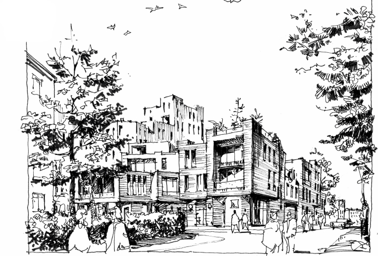
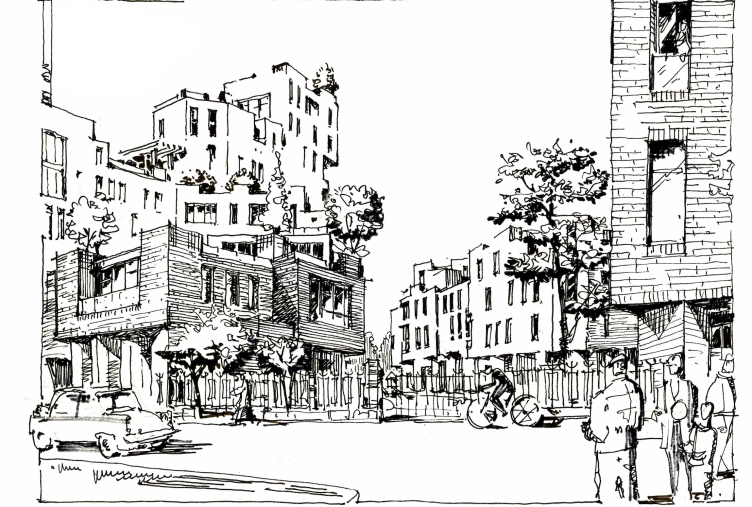
The final image of the house was created on the basis of Sergey Estrin’s graphic sketches. They remind the outlines of houses growing on the mountain slopes. Indeed, the uneven volumes, which the complex is formed of, could make such an impression. The cuts, shelves, multiple levels and terraces – all of them are attributes of compact settlements somewhere on the outskirts of Amalfi or on the Ligurian Coast. The author, however, assures that while planning the complex, he imagined a silhouette of a tiger, lying with its head up, and another, smaller tiger, lying at the feet of the first one – the cause for such associations was the embassy of one of the Far-Eastern countries near the construction site. For that matter, this complex is special exactly for that reason that its figurativeness has multiple meanings and can awaken all kinds of associations – from faint symbolic to very concrete ones. In the end, everyone chooses what is closer.

Concept of the residential development in Moscow. View from the school. Sketch. Project, 2016 © Sergey Estrin Architects


Concept of the residential development in Moscow. View from House 19. Project, 2016 © Sergey Estrin Architects


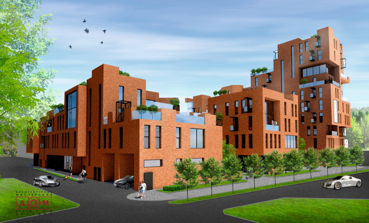
The buildings look especially dynamic thanks to the irregularly arranged, multiformat windows – mostly rather narrow and outstretched, but in some places – on the contrary – horizontally oriented, and in both cases reminding loopholes. An important accenting role is played by the large floor-to-ceiling screen windows, covering two floors at a time, sometimes with balconies (even though behind them are not duplexes, but ordinary apartments, separated with ceilings). Seaming randomness of placement and irregularity – these devices awaken various associations with a spontaneous, historically forming development, though at the same time we understand that the complex has been designed and built at one time. But the architects definitely managed to achieve an image of a psychologically and physically comfortable man-proportionate environment.

Concept of the residential development in Moscow. Project, 2016 © Sergey Estrin Architects


Concept of the residential development in Moscow. Project, 2016 © Sergey Estrin Architects

  
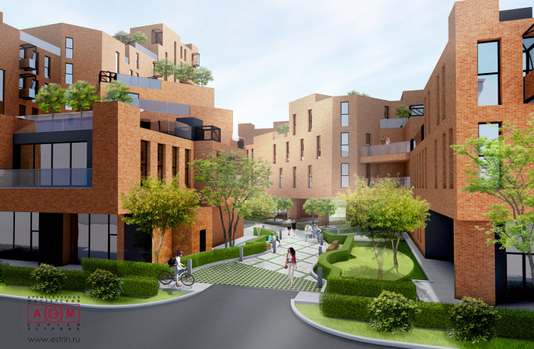
At the same time, the authors of the project did not want to exaggerate the effect of spontaneousness, and did not aim to create an impression, that the complex looks like a group of different volumes closely put together. That is why the architects underlined the unity of the elements: all the facades are faced with red brick. Suspended ventilated facades of solid brick fit wonderfully with the surrounding red-brick five-story houses. The complex is visually perceived as a whole, but does not seem a monolith, it does not suppress the view. It conveys the feeling of a comfortable urban environment, and not only in the yard, but also on the upper terraces of the apartments – they are small squares of a medieval city, surrounded by approaching three- and four-story houses, that are in fact – the walls of upper floors.

Concept of the residential development in Moscow. Project, 2016 © Sergey Estrin Architects


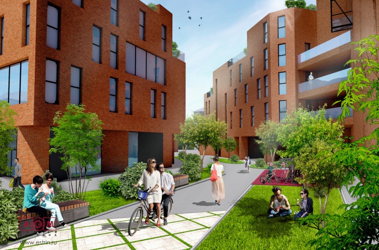
The authors have created a cozy environment on the inner territory. It was founded on the principles of space arrangement, applied in small European towns and proven over centuries. There is a winding narrow street here, passing among the sections, with planters, green lawns, trees, benches, places for rest and communication. There are also two small inner courtyards, connected with the narrow street and the outer streets-passages on the ground floor level. Basically, it is an urban mini-system made of cozy inner courtyards and a lane with roofed passages between them.

Concept of the residential development in Moscow. Project, 2016 © Sergey Estrin Architects


Besides the roofed passages to the inner territory, there are rental rooms for retail, services, a children’s club and a fitness center on the ground floor of both buildings. Underneath this territory is an underground garage with an entrance from the main street.

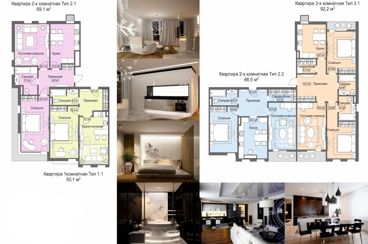
Both buildings are arranged according to a section-based principle: each section has its own entrance, bank of lifts and a minimum number of apartments per floor. According to the technical assignment, each floor has from 4 to 5 apartments. The floor plan consists of small units, as the market situation requires. Here are studio apartments of about 50 m2, two-room apartments of 65 – 70 m2 and three-room apartments of about 90 m2. Many apartments have exits to the functional roof with a terrace. Proportions of the rooms are about 1 to 1.5. There are duplexes on the top floors.

Concept of the residential development in Moscow. Examples of the apartment layouts. Project, 2016 © Sergey Estrin Architects


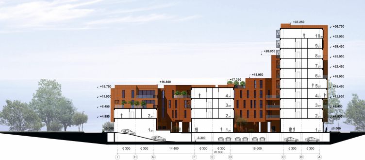
Concept of the residential development in Moscow. Section view. Project, 2016 © Sergey Estrin Architects
   

Any technical assignment is just a number of figures and technical data; and standards are also figures and requirements. So, by reading them, it is impossible to assume, what the creative solutions of the project authors would be. And even though the project of Sergey Estrin’s bureau did not win the contest, for the authors it has become an example to elaborate their approaches to planning in constrained conditions: a small land lot, surrounded with long formed dense development, is a place to expect the simplest and most plain answers, but the authors worked carefully with the volumes and architectural forms, and found an unusual image, however without overlooking the whole calculated background and the pragmatic side of the project. 

23 June 2016

Headlines now
The Golden Crown
The concept for a dental clinic in Yekaterinburg, developed by CNTR Studio, revolves around the idea of a “mouth full of gold”: pristine white porcelain stoneware walls are complemented by matte brass details. To avoid an overly literal interpretation, the architects focused on the building’s proportions, skillfully navigating between sunlight requirements and fire safety regulations.
Flexibility and Integration
Not long ago, we covered the project for the fourth phase of the ÁLIA residential complex, designed by APEX. Now, we’ve been shown different fence concepts they developed to enclose the complex’s private courtyards, incorporating a variety of public functions. We believe that the sheer fact that the complex’s architects were involved in such a detail as fencing speaks volumes.
A Step Forward
The HIDE residential complex represents a major milestone for ADM architects and their leaders Andrey Romanov and Ekaterina Kuznetsova in their quest for a fresh high-rise aesthetic – one that is flexible and layered, capable of bringing vibrancy to mass and silhouette while shaping form. Over recent years, this approach has become ADM’s “signature style”, with the golden HIDE tower playing a pivotal role in its evolution. Here, we delve into the project’s story, explore the details of the complex’s design, and uncover its core essence.
Gold in the Sands
A new office for a transcontinental company specializing in resource extraction and processing has opened in Dubai. Designed by T+T Architects, masters of creating spaces that are contemporary, diverse, flexible, and original, this project exemplifies their expertise. On the executive floor, a massive brass-clad partition dominates, while layered textures of compressed earth create a contextually resonant backdrop.
Layers and Levels of Flight
This project goes way back – Reserve Union won this architectural competition at the end of 2011, and the building was completed in 2018, so it’s practically “archival”. However, despite being relatively unknown, the building can hardly be considered “dated” and remains a prime example of architectural expression, particularly in the headquarters genre. And it’s especially fitting for an aviation company office. In some ways, it resembles the Aeroflot headquarters at Sheremetyevo but with its own unique identity, following the signature style of Vladimir Plotkin. In this article, we take an in-depth look at the United Aircraft Corporation (UAC) headquarters in the Moscow agglomeration town of Zhukovsky, supplemented by recent photographs from Alexey Naroditsky – a shoot that became only recently possible due to the fact that improvements were finally made in the surrounding area.
Light and Shadow
In this article, we delve into the architectural design of the “Chaika” house by DNK ag architects, which was recently completed in 2023 as part of the collection of signature designs at ZILArt. As is well-known, all the buildings in this complex follow a design code, yet each one is distinct. This particular building stands out not only for its whiteness and minimalism but also for the refined use of a limited number of techniques that, together, create what can confidently be called synergy.
Casus Novae
A master plan was developed for a large residential area with a name of “DNS City”, but now that its implementation began, the plan has been arbitrarily reformatted and replaced with something that, while similar on the surface, is actually quite different. This is not the first time such a thing happens, but it’s always frustrating. With permission from the author, we are sharing Maria Elkina’s post.
Treasure Hunting
The GAFA bureau, in collaboration with Tegola and Arkhitail, organized an expedition to the island of Kilpola in Karelia as part of Moskomarkhitektura’s “Open City” festival. There, amidst moss and rocks, the students sought answers to questions like: what is the sacred, where does it dwell, and what sustains it? Assisting the participants in this quest were landscape engineer Evgeny Levin, artist Nicholas Roerich, a moose, and the lack of cellular connection. Here’s how the story unfolded.
Depths of the Earth, Streams of Water
In the Malaya Okhta district, the Akzent building, designed by Stepan Liphart, was constructed. It follows a classic tripartite structure, yet it’s what you might call “hand-drawn”: each façade is unique in its form and details, some of which aren’t immediately noticeable. In this article, we explore the context and, together with the architect, delve into how the form was developed.
Fir Tree Dynamics
The “Airports of Region” holding is planning to build an airport in Karachay-Cherkessia, aiming to make the Arkhyz and Dombay resorts more accessible to travelers. The project that won in an invitation-only competition, submitted by Sergey Nikeshkin’s KPLN, blends natural imagery inspired by the shape of a conifer seed, open-air waiting spaces, majestic large trees, and a green roof elevated on needle-like columns. The result is both nature-inspired and WOW.
​A Brick Shell
In the process of designing a clubhouse situated among pine trees in a prestigious suburban area near Moscow, the architectural firm “A.Len” did the façade design part. The combination of different types of brick and masonry correlates with the volumetric and plastique solutions, further enhanced by the inclusion of wood-painted fragments and metal “glazing”.
Word Forms
ATRIUM architects love ambitious challenges, and for the firm’s thirtieth anniversary, they boldly play a game of words with an exhibition that dives deep into a self-created vocabulary. They immerse their projects – especially art installations – into this glossary, as if plunging into a current of their own. You feel as if you’re flowing through the veins of pure art, immersed in a universe of vertical cities, educational spaces – of which the architects are true masters – and the cultural codes of various locations. But what truly captivates is the bold statement that Vera Butko and Anton Nadtochy make, both through their work and this exhibition: architecture, above all, is art – the art of working with form and space.
Flexibility and Acuteness of Modernity
Luxurious, fluid, large “kokoshniks” and spiral barrel columns, as if made from colorful chewing gum: there seem to be no other mansion like this in Moscow, designed in the “Neo-Russian-Modern” style. And the “Teremok” on Malaya Kaluzhskaya, previously somewhat obscure, has “come alive with new colors” and gained visibility after its restoration for the office of the “architectural ecosystem” as the architects love to call themselves. It’s evident that Julius Borisov and the architects at UNK put their hearts into finding this new office and bringing it up to date. Let’s delve into the paradoxes of this mansion’s history and its plasticity. Spoiler: two versions of modernity meet here, both balancing on the razor’s edge of “what’s current”.
Yuri Vissarionov: “A modular house does not belong to the land”
It belongs to space, or to the air... It turns out that 3D printing is more effective when combined with a modular approach: the house is built in a workshop and then adapted to the site, including on uneven terrain. Yuri Vissarionov shares his latest experience in designing tourist complexes, both in central Russia and in the south. These include houseboats, homes printed from lightweight concrete using a 3D printer, and, of course, frame houses.
​Moscow’s First
“The quality of education largely depends on the quality of the educational environment”. This principle of the last decade has been realized by Sergey Skuratov in the project for the First Moscow Gymnasium on Rostovskaya Embankment in the Khamovniki district. The building seamlessly integrates into the complex urban landscape, responding both to the pedestrian flow of the city and the quiet alleyways. It skillfully takes advantage of the height differences and aligns with modern trends in educational space design. Let’s take a closer look.
Looking at the Water
The site of Villa Sonata stretches from the road to the water’s edge, offering its own shoreline, pier, and a picturesque river panorama. To reveal these sweeping views, Roman Leonidov “cut” the façade diagonally parallel to the river, thus getting two main axes for the house and, consequently, “two heads”. The internal core – two double-height spaces, a living room and a conservatory, with a “bridge” above them – makes the house both “transparent” and filled with light.
The White Wing
Well, it’s not exactly white. It’s more of a beige, white-stone structure that plays with the color of limestone – smoother surfaces are lighter, while rougher ones are darker. This wing unites various elements: it absorbs and interprets the surrounding themes. It responds to everything, yet maintains a cohesive expression – a challenging task! – while also incorporating recognizable features of its own, such as the dynamic cuts at the bottom, top, and middle.
Urban Dunes
The XSA Ramps team designed and built a three-part sports hub for a park in Rostov-on-Don, welcoming people of all ages and fitness levels. The skate plaza, pump track, and playground are all meticulously crafted with details that attract a diverse range of visitors. The technical execution of the shapes and slopes transforms this space into a kind of sculptural composition.
Proportional Growth
The project for the fourth phase of the ÁLIA residential area has been announced. The buildings are situated on an elongated plot – almost a “ray” that shoots out from the center of the area towards the river. Their layout reflects both a response to Moscow’s architectural preferences over the past 15 years, shifting “from blocks to towers”, and an interpretation of the neighboring business park designed by SOM. Additionally, the best apartments here are not located at the very top but closer to the middle, forming a glowing “waistline”.
The “Staircase” Building
In designing the “Details” residential complex in New Moscow, Rais Baishev spiced up the now-popular Moscow theme of a “courtyard” building with an idea drawn from the surrealist drawings by Maurits Escher. He envisioned the stepped silhouettes and descending slopes as a metaphysical mega-staircase, creating a key void within the courtyard that gave the project an internal “spine”. This concept is felt both in the building’s silhouette and on its façades.
Projection of the Quarter
No one doubted that the building that Vladimir Plotkin designed as part of the “Garden Quarters” would be the most modernist of all. And it turned out just that way: while adhering to the common design code, the building successfully combines brick and white stone, rhythmically responding to the neighboring building designed by Ostozhenka, yet tactfully and persistently making a few statements of its own. This includes the projection of the ideal urban development composition “14–9–6”, which can be found right next door, mathematical calculations, including those for various types of terraces (and perhaps the only reminder of the Soviet past of the Kauchuk rubber factory!), and the white “cross-stitch” pattern of the façade grid.
Domus Aurea
In this issue, we examine the “Tessinsky-1” house, designed by Sergey Skuratov and completed in 2023. Located in the middle of the Serebryanicheskaya Embankment district, at the intersection of its main streets, this house assumes a sort of “nodal” role: it not only responds to everything around it and preserves many memories of the former EMA factory within itself, but it weaves all this into a newly directed pattern, reconciling bright “gold” and dark-colored brick, largely with the help of the new, modern-yet-archaic Columba brick, which, come to think about it, is the most precious element here.
The Chimney of Nikola-Lenivets
In this issue, we are examining the “Obelisk House” designed by KATARSIS and built for the Arkhstoyanie 2023 festival. However, it was only finished later on, and this is why we are examining it now. It seems to us that after the “Obelisk House” appeared in Nikola-Lenivets, a dialogue and a few inner connections appeared between the temporary structures built here. These houses no longer look like “accidental neighbors”, more of which below.
​Periscope by the Bay
The jury awarded the second place in the competition for a public and cultural center in Petropavlovsk-Kamchatsky to the companies GORA (“Mountain”) and M4. In the consortium’s proposal, the building resembles a sperm whale with a calf swimming next to it or a periscope, whose lenses capture the most spectacular views from the surrounding landscape.
From Arcs to Dolmens
While working on the competition project for Petropavlovsk-Kamchatsky, ASADOV Architects prioritized the value of the natural and urban environment, aiming to preserve the balance of the location while minimizing the resemblance of the volume that they designed to a “traditional building”. The task was challenging, and the architects created three versions, one of which having been developed after the competition, where their main proposal took third place. However, the point of interest here is not the competition result but the continuity of creative thinking.
Hide and Seek
The ID Moskovskiy house, designed by Stepan Liphart in St. Petersburg, in the courtyards near Moskovskiy Avenue beyond the Obvodny Canal and recently completed, is notable for several reasons. Firstly, it has been realized with considerable accuracy, which is particularly significant as this is the first building where the architect was responsible not only for the facades but also for the layouts, allowing for better integration between the two. On the other hand, this building is interesting as an example of the “germination” of new architecture in the city: it draws on the best examples from the neighborhood and becomes an improved and developed sum of ideas found by the architect in the surrounding context.
The Big Twelve
Yesterday, the winners of the Moscow Mayor’s Architecture Award were announced and honored. Let’s take a look at what was awarded and, in some cases, even critique this esteemed award. After all, there is always room for improvement, right?
Above the Golden Horn
The residential complex “Philosophy” designed by T+T architects in Vladivostok, is one of the new projects in the “Golubinaya Pad” area, changing its development philosophy (pun intended) from single houses to a comprehensive approach. The buildings are organized along public streets, varying in height and format, with one house even executed in gallery typology, featuring a cantilever leaning on an art object.
Nuanced Alternative
How can you rhyme a square and space? Easily! But to do so, you need to rhyme everything you can possibly think of: weave everything together, like in a tensegrity structure, and find your own optics too. The new exhibition at GES-2 does just that, offering its visitor a new perspective on the history of art spanning 150 years, infused with the hope for endless multiplicity of worlds and art histories. Read on to see how this is achieved and how the exhibition design by Evgeny Ace contributes to it.
Blinds for Ice
An ice arena has been constructed in Domodedovo based on a project by Yuri Vissarionov Architects. To prevent the long façade, a technical requirement for winter sports facilities, from appearing monotonous, the architects proposed the use of suspended structures with multidirectional slats. This design protects the ice from direct sunlight while giving the wall texture and detail.