Aleksey Ginsburg is a descendant of several architectural families at once: on the one side, he is a grandson of Moses Ginsburg, the author of "Narkomfin House", on the other side, he is a grand grandson of Gregory Barkhin, the author of the building of "Izvestia" Newspaper. Meanwhile, he is able to deliver quite independent, thought-out, and carefully designed architecture, and, what's more, he seems to be constantly improving in several directions: from the small scale such as interior design of a small apartment or the monument on the Borodino Field to grand-scale public and housing projects, town-planning concepts, and, on top of it all, restoration of historical buildings as an extra specialty. Most of the time, the industry journalists ask Aleksey about the fate of "Narkomfin House" that he had been studying the history of and been restoring ever since 1995. As for us, we are more interested in his individual work and his attitude towards today's architecture.
Archi.ru:
In the spring of 2015, your project of a multifunctional center on the Zemlyanoi Val Street won the "Golden Section" award. Please share a bit more about it.
Aleksey Ginsburg:
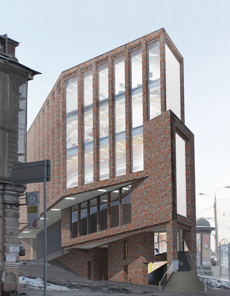
- We've been working on it ever since 2007, and over this time we've done a huge number of its versions. The land site is located at a place that is complex context-wise and is also pretty important from the town-planning standpoint. It is surrounded by buildings that belong to different historical epochs, and our complex was not to contradict a single one of them.
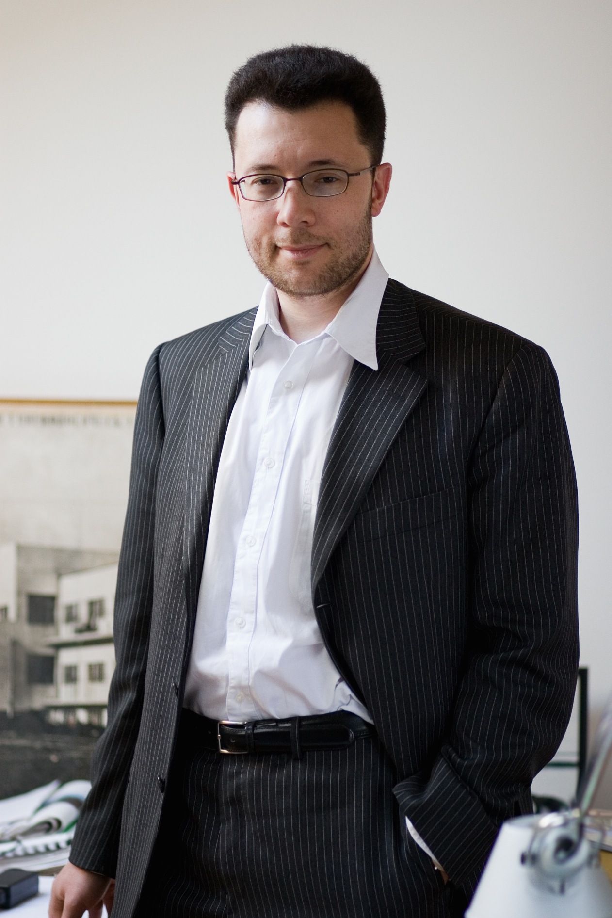
Aleksey Ginsburg. Photo courtesy by Ginsburg Architects
Multifunctional complex on the Zemlyanoi Val Street. Project, 2014 © Ginsburg Architects
There is this new building of the Taganka Theater standing right across from it. How did you address its proximity?
- We kept this building in mind from the very start because we realized all along that our complex was to be part of a harmonious ensemble it would make together with the theater building. This was all about a thought-out architectural dialogue in which each epoch retains its unique identity. I consider the Taganka Theater to be one of the finest specimens of the soviet modernist architecture. I was first exposed to it about thirty years ago when my grandmother Elena Novikova (architect and teacher, professor at Moscow Institute of Architecture - editorial note) was doing a book on public spaces. There were no computers back then, and I, then a student, did a part-time job of drawing "transparent" axonometric drawings for her. The Taganka Theater was one of the examples of "how to" for me back then. Drawing its perspective views on paper I appreciated the power of this architecture and let it inside of me. Today, doing this Multifunctional Center project, I used those young impressions for defining the volume and space solutions for the new building, as well as the materials and colors of its façade. The last thing I wanted to do was building a massive volume that would overshadow the surrounding buildings - but fracturing the building into a series of small units or blocks was not an option either. Such contrast with the theater would have defeated the ensemble situated at the entrance to the Taganskaya Square that functions as propylaea of sorts as a contrastive pair of our transparent rhythmic complex and the massive wall of the theater building. This project means a great deal to me - I dedicated my entire time to it until I made absolutely sure that the building was coming out exactly the way I wanted to build it.
Multifunctional complex on the Zemlyanoi Val Street. photo montage. Project, 2014 © Ginsburg Architects
What other interesting projects are in the making?
- I've got two other projects going, although not too large by Moscow standards - 7 to 15 thousand square meters, but, in my opinion, they are really interesting because they include a lot of elements that had to be carefully thought out. In addition, we are now doing an integrated housing project next to the "Ulitsa Podbelskogo" metro station (recently renamed into "Rokossovsky Boulevard" - editorial note). This is about low-cost housing, and we do not have the luxury of using sophisticated solutions or expensive materials, but it is extremely interesting from the town-planning standpoint: in addition to the houses as such, we also develop the public territories creating a whole new system of interaction between the complex and the city.
So you are into town-planning as well?
- Yes, and I've been for a while now. But my real professional break happened when I took part in the contest for the concept of developing Moscow agglomeration in the consortium headed by Andrew Chernikhov. This was like yet another postgraduate course for me.
What functions did your company perform in this consortium, and what was the most important thing to you as you worked on this concept?
- Andrew Chernikhov was able to gather a great team of both Russian and foreign experts, including geographers, sociologists, and logistic specialists. We processed a huge chunk of information, and, based on our analysis, came up with a development concept. Particularly exciting was seeing and evaluating presentations submitted by other contestants. Some approaches did not impress me at all, and there were ideas that I just fell in love at first sight with.
A few years ago we took part in the contest organized by Russian Railways for the best architectural proposal of a railroad fragment in the Gorky Region. We did this project based on our vision of its diachronic development, with detailed phasing, calculating the entrance points to the territory based on our vision of the appearance of natural connections. This is the way people should work who know just what urban planning is all about, instead of just painting beautiful pictures. Still, the judging panel opted for the impressive master plan, while our project turned out to be the last in line - which even kind of inspired me because our ideology was diametrically opposite to what the judging panel wanted to see.
Since the term "urban planning" came up, I just cannot help asking - what is your attitude towards urban landscaping projects, so popular these days? Do you do landscaping projects yourself?
- Landscaping is an inherent part of any grand-scale project, be it a public or a housing one. The forward-looking developers are interested in quality landscaping because it, along with the façade design, is one of the key factors that influence the end customer's decision on whether to buy or rent property here or not.
Urban landscaping is a bit different. It must be democratic and it must reflect the spirit of the city. You know the story of how the Arbat Street was renovated, don't you? It was initially based on the genius concept of pedestrian streets developed by Aleksey Gutnov - but its implementation distorted it beyond recognition. Arbat started looking like the Jomas Street in Latvia's Jurmala - the street lights, the pavement stones... This is not Moscow! The good idea was distorted because of the limited possibilities of the soviet building industry. But it's all different now! The range of solutions grew wider, just as the choice of materials and technologies; the industry is ruled by higher standards. So, today's landscaping campaign is something that may make a real positive difference, I think.
But then again, strictly speaking, the idea of landscaping the urban territories has been around for quite some time. It was still Elena Novikova who taught me that a city was not just about its houses but also the spaces between them. And now, as we work on our projects, especially downtown, we first try to analyze the city territory, feel it, and try to convey its uniqueness and identity, along with the spirit of the city.
And how would you describe the specifics of Moscow? What is its "spirit of the city" about?
- To me, Moscow is a sophisticated multilayered city, and each layer can be perceived successively, as if you are going through the process of backwash, like the archaeologists that uncover cultural levels one after another.
Moscow is like a layered pancake, and I am sure that the creators of each level were cursed in their time because it was "them" who destroyed the "good old Moscow" and built a "new Babylon" in its place. Ultimately, what we've got now is a layered pie of tremendous complexity that must be handled with extreme care. Because you never know what layer will come up at which spot - you need to dig it up bit by bit and assess what survived and what didn't, and what reflects the spirit of the place best of all. Moscow is not Saint Petersburg and not Ekaterinburg - it is a growing, and not a "project" city. This is her challenge, and this is something that I love this city for. There is no "average" spirit in Moscow. Working here means feeling the layers of this pie.
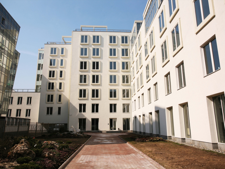
Housing project on the Gilyarovskogo Street. Construction, 2008-2009 © Ginsburg Architects
Is it difficult struggling with a customer that, say, wants to destroy the bottom layers? Or do you avoid working with such customers altogether?
- Architects work with different customers, and this is also where your professionalism shows. There are certain strategies for resolving difficult situations but the most important thing is still your ability to find a connection with the customer. And this is something that many architects are, regretfully, not capable of. This is just not taught anywhere. I read a course for the graduate students at Moscow Institute of Architecture, and I try to get across to them how important it is to defend your project by explaining what and why you are doing this way and not the other. An architect must be trained to communicate professionally with the city authorities and with his customer - meaning, with the person or company that is buying his services, with the city people, and, last but not least, with the journalists and reporters. We work in the crossfire of different information flows and we perform the functions of guides, translators, and interpreters. The power of conviction, the ability to prove that your solution is the best and the only possible one is one of the most important skills that an architect must have. The developers - meaning, the commercial clients that we get to deal with most of the time - they build in order to sell, and who will blame them for that? And if you are able to explain to them just how exactly your ideas will increase the market value of the product and the end customer's demand for it, you really become allies, and you achieve the goal that you originally set - to promote your architecture and your solutions.
You said "promote your solution". What is your attitude towards the idea that architecture must form people's new lifestyle? Gregory Revzin recently shared with me about an essay done at MARCH school where the students when they answered the question why they had decided to become architects in the first place wrote that they "wanted to make a difference". And, in his opinion, there is a dark side to this desire as well, and this is actually the reason why architects aren't really loved much in this country.
- There was a modernist paradigm according to which the architect perceived himself as a mentor who tries to form a new lifestyle. And this is exactly the reason why people disliked architects just like they would any other mentor who talks down to them - and not only in this country alone. Nevertheless, this new epoch objectively requires that we change our ways, and the architects became those few who was actually ready to propose something meaningful. Today, what seemed to be futurism back in the 1920's, has long since become a reality. A hundred years ago people lived in quite a different way.
The way I see it, if a person answers the question of why he decided to become an architect by saying that he wants to make a difference, this answer is a very honest and righteous one. And it's great to hear that these young people know their minds so well. The architect creates an environment that indeed makes a difference to people's lives. The modernist architecture is also subject to evolution - today's methods are different from the ones that were there in the 1920's or after the war or in the 1970's. To me, these periods are the stages of development of a major style described by Moses Ginsburg in his book "Style and Epoch" that appeared as the epoch and society changed. And as for understanding the fact that we change the environment, yes, I agree that this is hardly something to boast about - this is rather a huge responsibility. But this is still part of our profession.
Could you please share the story of your company: how it was founded and how it developed?
- The first two years after I founded my company were the most valuable and important to me. I started my work with my father, Vladimir Ginsburg, and I learned from him. In Moscow Institute of Architecture, the people that educated me most were my mother, Tatiana Barkhina, my grandmother, and yet another grandfather, Boris Barkhin, who was also my teacher. Working with my dad, I could compare various teaching methods - this was a really exciting time and I am sorry that it only lasted for two years.
When I found myself alone in 1997, the old customers were gone. But I could not just go ahead and give up on the thing that me and my dad started together. At that point, there was no work at all, what's more, there was this feeling of total isolation. This was a very difficult time for me, and I am really grateful to the people who helped me, quite a young man, then. I was really lucky that it was my wife Natalia Shilova that became my main assistant and partner around the studio. I finally got an opportunity to dedicate myself to work knowing that I was backed up by this wonderful person. We would risk taking up projects nobody else would. There were most sophisticated reconstruction jobs of little volume and lots of headache. Usually, these were not monuments of architecture but soviet buildings that the customer wanted renovated. Some of these projects got indeed implemented, and I learned a lot during those days.
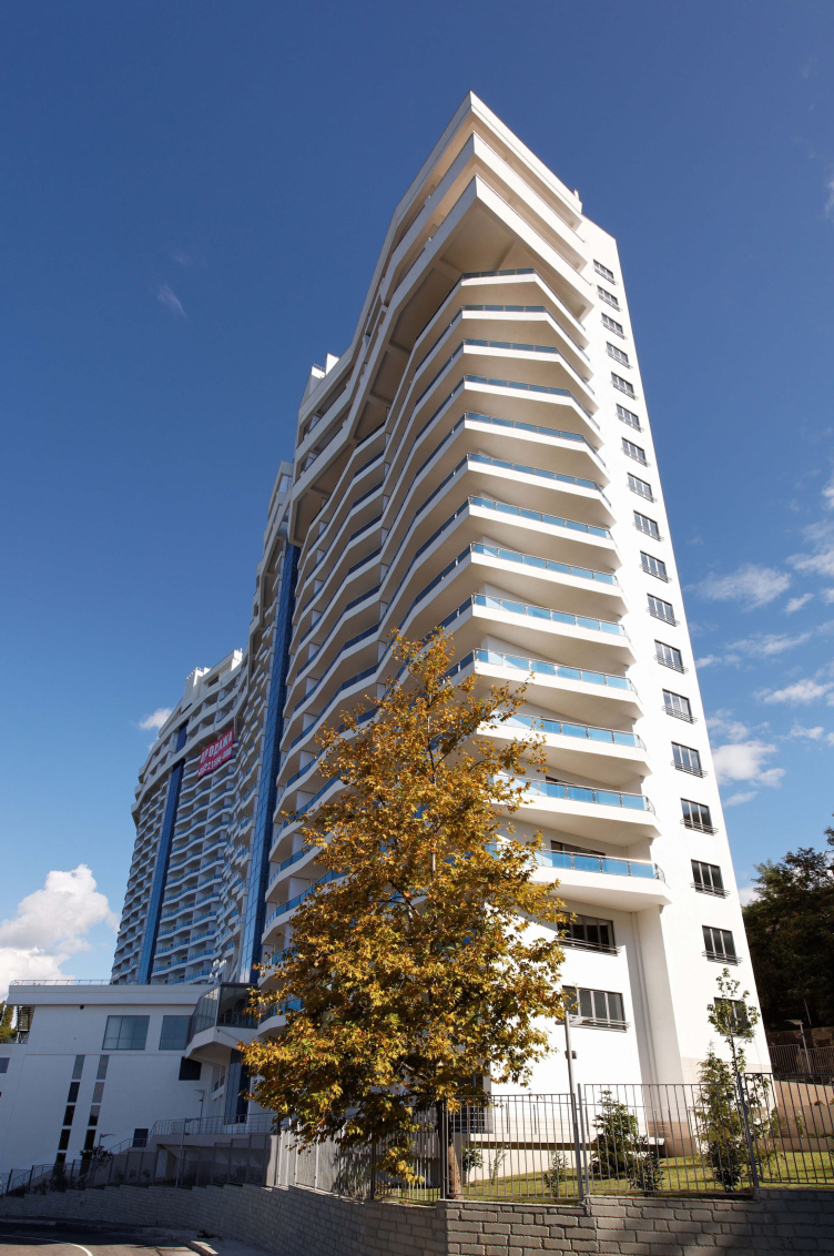
With time, larger and more interesting projects started coming our way: the shopping center at the Abelmanovskaya Zastava that posed serious contextual and planning tasks; the integrated hosing project in the town of Zhukovka in the late nineties, where we already had the task of creating a fully-fledged environment. The next stage of the development of our company was about a series of projects that we designed for the southern regions. In 2003–2005, we were approached by a group of customers who owned four land plots in Sochi; on one of them we built a house - probably the most challenging project of all I've ever done because the elevation gain of that plot was 25 meters, the seismic figure being 9 points. We had to drive in more than two thousand piles under the building. This was the classic "southern" house of the gallery type. And we were able to make apartments on the top floor by analogy to the F-cells of Narkomfin House. The only thing that we were unable to implement because of the economic recession was the Venetian blinds walls of the double wooden façade - they would have been the icing on the cake, really.
This was the first time that we ever went beyond the border of the Moscow region, and we found ourselves in a world of southern architecture with a different ideology, logic, context, and people. We worked in Sochi, Anapa, Novorossiysk, and Gelendzhik. Then we did a number of projects for Montenegro and Croatia. We developed something like a "southern specialty". I even find it funny - Moses Ginsburg would build soviet seaside resorts, and now history is repeating itself.
Multifunctional residential building "Ideal House". Construction, 2004-2008 © Ginsburg Architects
The most interesting aspect of that work was the opportunity to expand the range of my professional competence in form development, planning, working with the terrain, etc. This was a whole new level of complexity and a whole new thinking level.
Which of your other projects could you distinguish, and why?
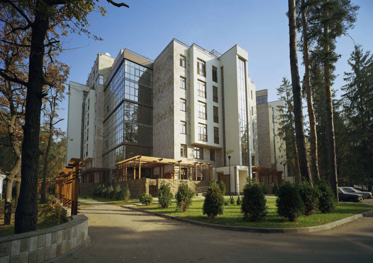
- First of all, this is the residential multi-apartment building in Zhukovka. We tried to inscribe as gracefully as possible an up-to-date building into the existing natural environment. We took into consideration even the positions of the trees on the land site, and used only natural materials for the façade finishes.
Housing project in Zhukovka. Construction, 2004 © Ginsburg Architects
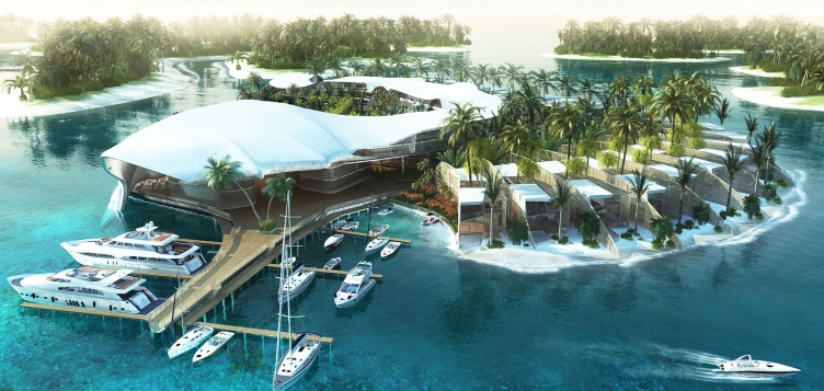
I would also like to mention the project of a recreational complex on an alluvial island in Dubai. This was an experience not quite typical for us - it was about creating a piece of architecture that was rather on the associative side, partially postmodernist, with a vivid memorable image. This was the only possible approach. We took part in the contest for the world-famous man-made island that was designed by the Americans in the shape of the map of the world. Architects from different countries were requested to come up with some symbols that would immediately bring associations with this or that nation or part of the world. The Italians on the Italian island recreated Venice, the Egyptians did the pyramid. And we got to do Sri Lanka. As the main analogue, we used a shell from the Indian Ocean, interpreting its shape as a multifunctional structure with villas standing on pillars above the water, a lagoon in the center, and a whole bunch of other interesting ideas. And we won the contest. Unfortunately, the world economic crisis got in the way but we still hope that this project will be implemented one day.
"Sri Lanka" Island. Project, 2007 © Ginsburg Architects
I should give a special mention to the interior design of our studio in the old "Artplay" building on the Frunze Street. All the work lay down on Natalia's shoulders then. We had quite a lot of projects on our hands, and she had to work as an architect, and as a technologist as well. And - she pulled off a miracle! She was able to take that loft, all pierced by massive wooden studs, pillars, and crossbeams, and inscribe into it an office layout that was absolutely functional and convenient. What we ultimately got was a really sleek office that our whole company had a great time working in - until the day that the building itself was torn down. I also had an interesting experience of designing Jewish community centers - one in Sochi, and yet another in Moscow. For each, we came up with lots of versions, searching, together with our clients, for the optimum balance of the traditional and the contemporary. And I think we quite succeeded in that.
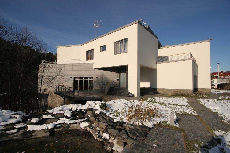
On the eve of the summer holidays season, we did an interesting terrain-based project in the Moscow area. We built a country house directly on the brink of a steep ravine, so it looks as if half of the building hangs over the edge. We decided to capitalize as much as possible on this terrain theme both inside and outside that house making several levels of different height, building an artificial brook and a hovering terrace.
Private residence "Over the Ravine". Construction, 2004 © Ginsburg Architects
Still, I cannot help but ask you to touch upon the subject of Narkomfin House, the project of restoration of which you've been doing for a long time. What's the current situation?
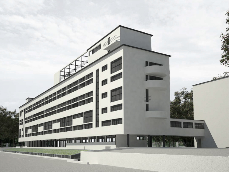
- This has always been like a family duty to me. All these years, ever since the late nineties, we kept in touch with the owners of the building, discussing the issues of the reconstruction, the necessity of using special technologies, different approaches, and so on. In the recent time, however, after we got the information about a swimming pool being built right next to it, as well as an underground parking garage, and incorrect processes used there - making changes to the building's plan, double glazed units, and unauthorized remodeling - I slightly detached myself from this story. But I inwardly hope that ultimately we shall be able to resolve all the issues and give the building its original look.
Project of restoration and adaptation of the cultural and architectural monument "Narkomfin House". Project, 1995-2007 © Ginsburg Architects
Project of restoration and adaptation of the cultural and architectural monument "Narkomfin House". Project, 1995-2007 © Ginsburg Architects
And the project of restoring the laundry - is it also yours?
- Yes, it was done by our company. Initially, the laundry was a part of the single complex of the community house, and it offered the most advanced automated laundry services by the standards of those days. Today, the former laundry building is in a hazardous state, and it legally belongs to a different company. Our reconstruction project proposes to test an entire technology of conserving and then restoring the building materials that Ginsburg and other constructivists experimented with.
Including reed-fiber board?
- Reed-fiber board or "reed pressboard" - call it whatever you like - was used in the laundry building as well, as the precursor of the modern thermal insulation materials. That material was experimental at that point, and, in fact, little was known about it. So it is not surprising that it turned out to be slightly unstable. All the more so, because the laundry has stood unheated for the last twenty years. We will by all means include the reed-fiber board in some place as a museum - but, to preserve as many original elements as possible, onsite experiments with conservation materials must be conducted.
Your interest for restoration has to do first of all with the legacy of constructivism and the works done by your ancestors, isn't it?
- I became a renovator and I keep on mastering this exciting craft predominantly busying myself with the monuments of avant-garde - because experienced renovators in this genre are few and far between. In fact, my dad and me created this studio specifically for the restoration project of Narkomfin House. The fully-fledged scientific restoration is something that I came to not so long ago, about five or so years back - because I realized that some kinds of work required a true and unique professional, for example, a narrow expert in the field of restoration materials and technologies, and some things are still better done when you do them yourself fully controlling the end result.
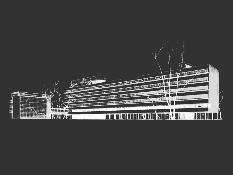
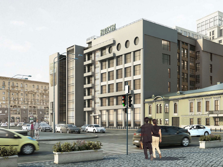
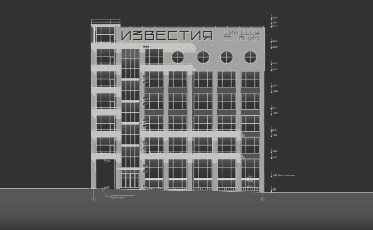
There are lots of things that you only realize when already in the construction stage. No matter how many probings you make, when the process starts, you are in for a lot of surprises and you need to be able to make decisions quickly. This is exactly the case with the restoration of the building of "Izvestia" Newspaper. It's got a lot of details about it that are extremely important both from the architectural and historical standpoint. I am planning to do a book about the revival of this building designed by my grand grandfather Gregory Barkhin. The restoration project is now in the completion stage: the façade is already to be seen but there is still a lot of work to do on the inside. Right now, we are restoring the grand staircase - for which we have to find the experts that are knowledgeable about the old technologies and capable of performing such work.
Restoration of the building of "Izvestiya" Newspaper. Restoration, 2014-2015 © Ginsburg Architects
Restoration of the building of "Izvestiya" Newspaper. Restoration, 2014-2015 © Ginsburg Architects
As for me, this experience of working not only as an architect but as a renovator goes a long way to help me understand architecture better. There is a common opinion that the approaches of an architect and a renovator are incompatible. Granted, they are pointed in different directions indeed. But you still can balance them out of you do understand what and how must be preserved, and where you can add new stuff.
Your company is definitely not just any company - judging at least by the span of your specialties: modernist architecture, urban planning, restoration... Recently, I saw on the AD Magazine website an apartment that you designed. Do you still keep on doing interior designs? For what?
- Interior design is a special genre that is interesting not so much from the commercial standpoint as from the creative one. It takes up a lot of time, and you do not always get the satisfaction that you expected from the end result. But it gives you a special understanding of the space, its proportion in respect to the human beings, and their needs. It is interesting to change the scale of your projects - from an apartment to a megalopolis agglomeration, from an economy class housing project to a luxury mansion. This gives you flexibility and elasticity - you are no longer locked in the cage of the typology that you once chose to work on.
I was always attracted to people that felt at home with various fields. Not even speaking about the Renaissance, I will give you a much more contemporary example. Andrew Burov, my grandmother's teacher, was a great architect but at the same time he was into chemistry, anisotropic crystals, and wrote books on other topics. I try to employ this approach as much as possible.
Speaking of versatility, I can give you yet another example - an unexpected one - from my recent practice. We were approached by a person whose ancestor commanded the Imperial Guard Cuirassier Regiment on the Borodino Field (the decisive battle of the Napoleon war of 1812) and asked us to erect a monument. The time constraints were really tight. But the very task was so interesting and inspiring that we did the whole job within two months, and by the 200th anniversary of the battle the monument was already there on the field. Natalia found a great chunk of light-gray Vorkuta granite that we gave a shape of a natural boulder. The monument fit in handsomely with the array of the monuments erected in the honor of cavalry regiments - standing out against the background of green trees in summer or dark trees in winter.
Meaning - you deliberately cultivate in you versatility and professional flexibility?
- Absolutely deliberately! How can it be otherwise? You've got to be in control of your perception of magnitude of each project and the set of the professional tools that you use to accomplish this or that task. The architect's profession is something that is historically versatile. And, although today urbanists, renovators, and interior designers are trained at different departments, we still appreciate that our education, particularly the kind that we got at Moscow Institute of Architecture, gives you great freedom of creative expression and self-improvement. I am not sure if versatility is a teachable or a natural skill but I try cultivate it in me.

