По-русски

From a Bird's Eye View

A complicated land site in the south district of the nation's capital: Nikita Biryukov designs a residential complex consisting of four almost New-York-style skyscrapers that still pay respect to the realities of Moscow.

28 April 2016
Object
mainImg

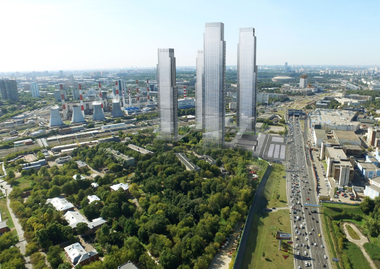
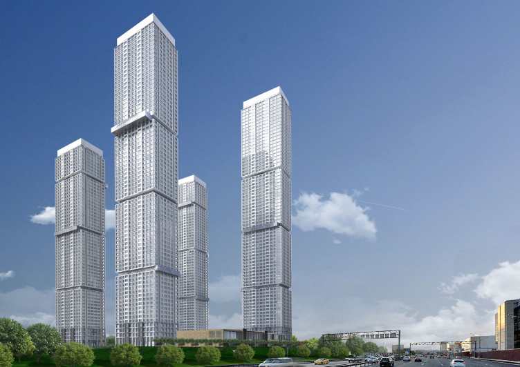
The project of four residential skyscrapers whose height rivals that of the giant towers of the Moscow City was created by the architects of Nikita Biryukov's "ABV Group" at the commission of "Northstar Development" for the land site lying between the Third Transport Ring and the Kanatchikovsky Proezd in the Donskoy District. The land site has no height restrictions whatsoever, so the buildings could rise as tall as the the architects pleased. On the other hand, the customer was very specific about the types of the apartment layouts: first of all, the architects were to figure out how to provide the top-quality views from the apartments and strike the people that would live here with the city panoramas - because the immediate surroundings of the complex cannot be called picturesque by any stretch of the imagination. 

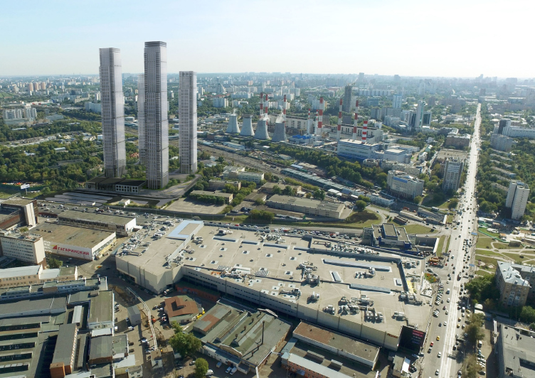
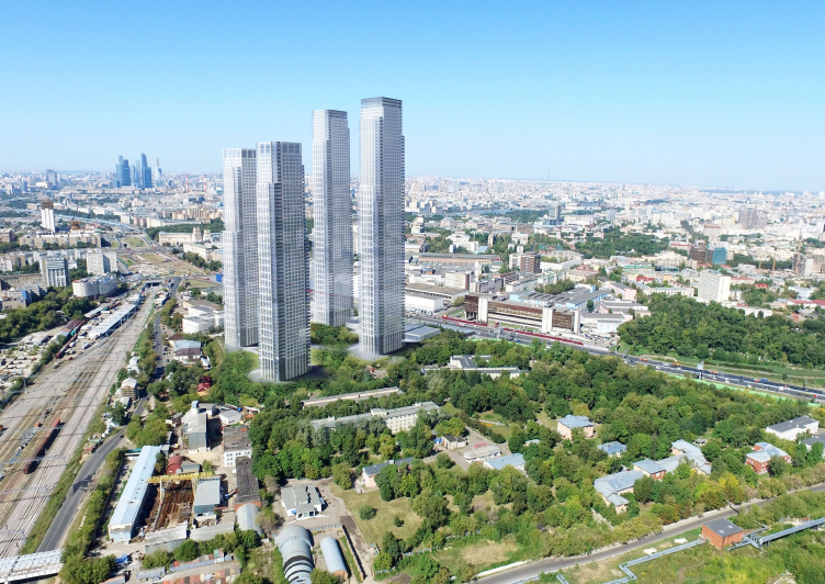
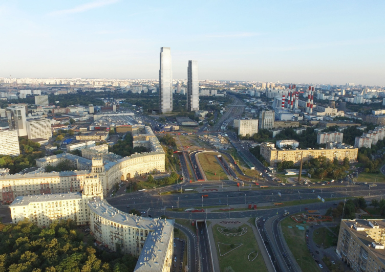
Under the former Moscow government, the trapeze-shaped site with an area of some five hectares and encompassing estates 21 and 22, Unit 6, along the 5th Donskoy Proezd, was supposed to get built with retail stores and hotels but later on the city changed that function to become a residential one, reasoning that yet another shopping center would "complicate the already difficult" transport situation in this part of the Third Transport Ring. The few low-rise buildings that are there on the land site today will be demolished, people living in them today getting new housing - but still no beautiful things are expected to appear on the site anyway: quite near, there is a huge bulk of the power plant, an industrial park, and railroad warehouses - the only thing that the architects has left to do, as Nikita Biryukov puts it, was "selling the the views". And, in order to organize these panoramic views as efficiently as possible, the designers even went as far as renting a drone so as to get bird's eye views well ahead of getting down to actually designing the complex; thus, the views of the power plant were minimized as much as possible while still in the pre-design stage.

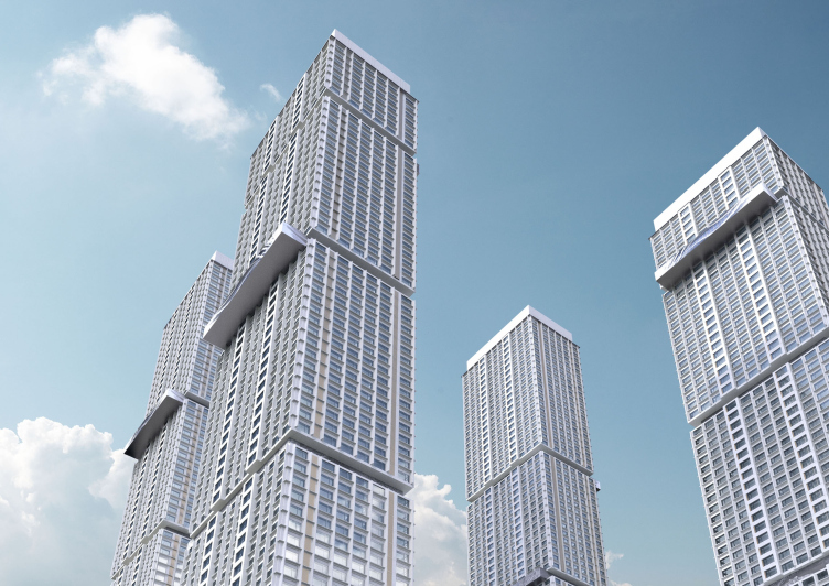
Multifunctional residential complex on the 5th Donskoy Proezd. 4 towers. Version 1 © ABV Group
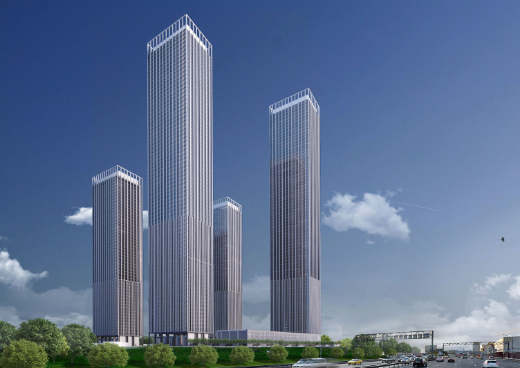
Multifunctional residential complex on the 5th Donskoy Proezd. 4 towers. View from the Third Transport Ring. Project, 2015 © ABV Group


Multifunctional residential complex on the 5th Donskoy Proezd. 4 towers. View from the hospital side. Project, 2015 © ABV Group


Multifunctional residential complex on the 5th Donskoy Proezd. 4 towers. View from the power plant. Project, 2015 © ABV Group


The architects drew inspiration from the source of the super-tall skyscraper 432 Park Avenue in New York, the construction of which have been recently completed on Manhattan. This "perfect model" was in fact proposed to Nikita Biryukov by the customer but the architect had nothing against it: he is a huge fan of the immaculate shape of the 426-meter tower designed by Rafael Vignoli that its author himself proudly calls "an architectural breath of fresh air amidst the raunchy Manhattan skyscrapers". While the quadrant is the purest of all geometric shapes, the Vignoli project, let's say, pulls it up to become a cube: along the perimeter of each floor (square on the plan), there are twenty-four square 3x3 meter windows commanding the panoramas of New-York.

Of course, from the "ambition" standpoint, the "ABV Group" did not even hope to stand up to the level of the tallest condominium of the Eastern hemisphere: while 432 Park Avenue with its proverbially expensive apartments became the symbol of sky-high luxury way before its construction was ever completed, the complex on the 5th Donskoy Proezd was designed in the realities of the not-so-advantageous financial situation, and the economic conditions did play a part. So, nobody was speaking about making any embellishments to its shape due to the purely economic reasons which, in fact, matches the aesthetic credo of Nikita Biryukov who prefers "pure" architecture without any unnecessary "pop" additions. 

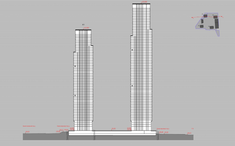
Multifunctional residential complex on the 5th Donskoy Proezd. 4 towers. Section view. Project, 2015 © ABV Group


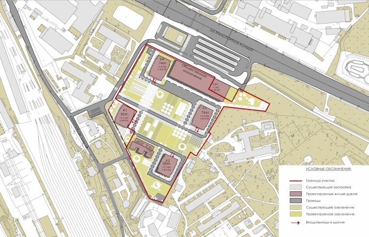
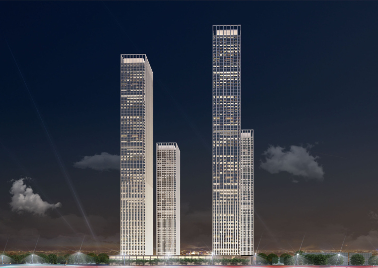
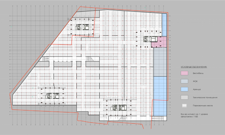
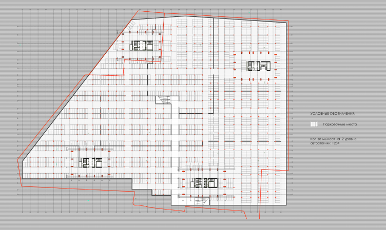
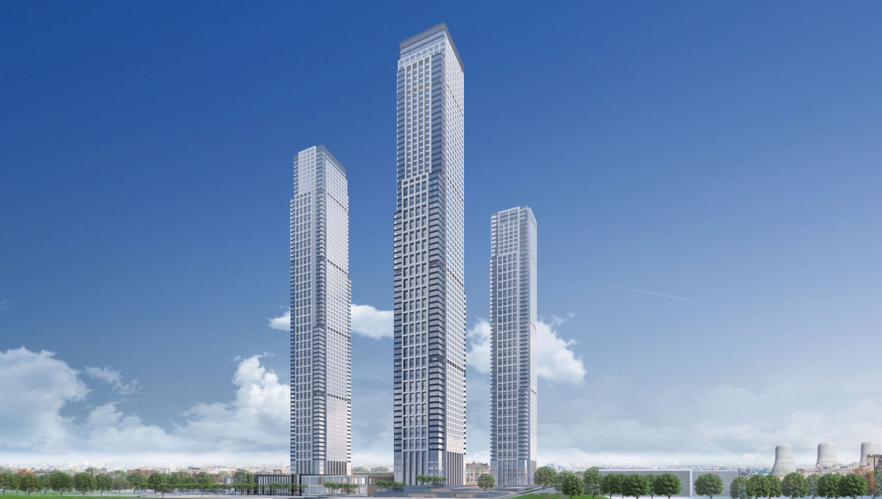
In the course of the work, the company came up with eighteen versions of the project. Ultimately, with full approval from the customer, the architects settled on a set of four towers, two of them being 58 floors high, and another two - 74. Apart from the number of floors, the buildings are completely identical; such unification was also one of the original specifications. Rectangular on the plan, the towers are situated on the perimeter of the territory and perpendicular to the power plant and the Third Transport Ring (again, this was done in order to improve the sightseeing properties), framing the inside yard. The stylobate, the way we know it - a two-story volume occupied by retail stores - is only present on the Third Transport Ring side and functions as a buffer that separates the complex territory from the grime and the noise of the highway. Further on, in the direction of the center of the complex, at the expense of the height difference, the stylobate dives underground. It is planned that the underground part will contain everything that is necessary for the functioning of giant buildings: a two-level parking lot, technical and maintenance premises, as well as a spa complex and a medical center. In addition, there will be a separately standing nursery school in the yard.

Multifunctional residential complex on the 5th Donskoy Proezd. 4 towers. Master plan. Project, 2015 © ABV Group


Multifunctional residential complex on the 5th Donskoy Proezd. 4 towers. Version 2. Project, 2015 © ABV Group


Multifunctional residential complex on the 5th Donskoy Proezd. 4 towers. Version 2. Project, 2015 © ABV Group


Multifunctional residential complex on the 5th Donskoy Proezd. Plan of the 1st floor. Project, 2015 © ABV Group


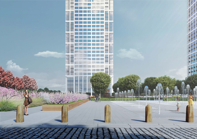
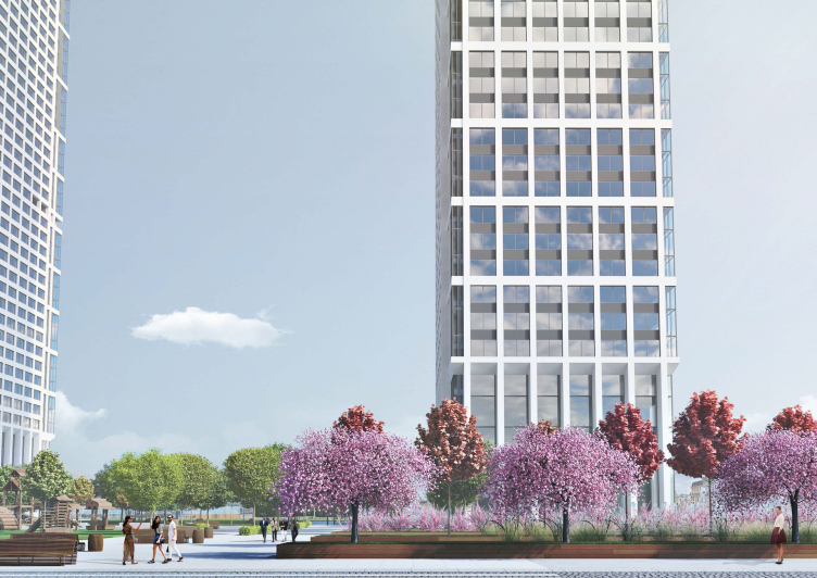
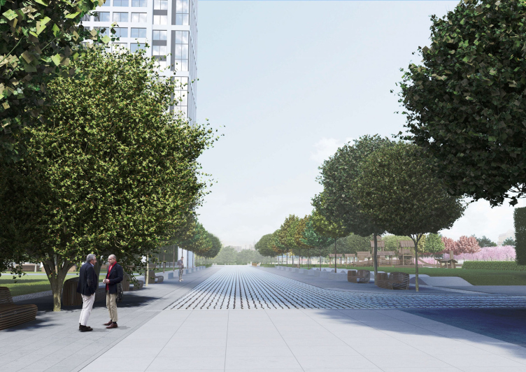
The plastic solution of the towers is rather laconic. The silhouette of the soaring parallelepiped (the height of the 58-floor buildings reaches 217 meters, the 74-floor ones - 273 meters) only breaks away from the vertical line in two instances - it widens on the level of the fifth floors forming a cantilever, barely perceptible in the overall scale of the building, and then narrows in steps towards the top, these steps being situated on opposite sides of the building and at a different height as they go up. Such a solution, almost without making the shape of the building more complicated, visually takes the extra weight off the top of the skyscraper, making it look more dramatic without adding any unnecessary architectural details. According to Nikita Biryukov, "the main thing in this project was its floor plan that to a great extent conditioned the outlines of the building, while the façades were secondary to it". Nevertheless, the design of the façades, for the decoration of which the architects propose to use coating stone and decorative composite panels, manifests the authors' love of pure shapes in full effect. The combination of glass and panels of light and very light shades, the impeccable geometry of the rectangular window apertures, gathered into horizontal groups on the sides of the facade, and vertical groups on the side walls, the vertical elongated stained glass windows on the first floors - all this gives the impression of lightness, enhancing the soaring look of the towers. As far as more "down-to-earth" task are concerned - namely, organizing the spacious inner yard - here "ABV Group" also stayed true to itself and planned a comfortable yet laconic territory that is dissected into ostentatiously geometric zones. The yard is open on all sides for the exception, as was mentioned above, the side adjoining the Third Transport Ring: as Nikita Biryukov says, "the last thing the architects wanted to do was make a fortress out of it".

Multifunctional residential complex on the 5th Donskoy Proezd. 4 towers. Version 3. Project, 2015 © ABV Group


Multifunctional residential complex on the 5th Donskoy Proezd. 4 towers. Version 3. Project, 2015 © ABV Group


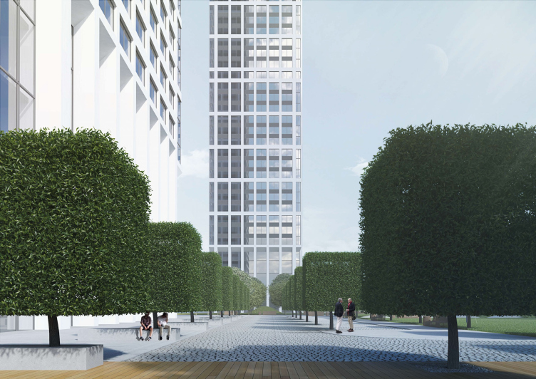
Multifunctional residential complex on the 5th Donskoy Proezd. 4 towers. Landscaping. Project, 2015 © ABV Group


Multifunctional residential complex on the 5th Donskoy Proezd. 4 towers. Landscaping. Project, 2015 © ABV Group


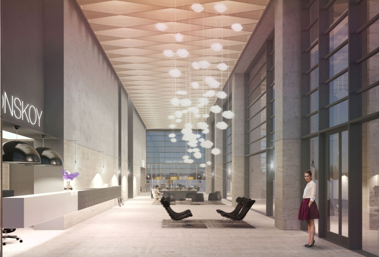
Multifunctional residential complex on the 5th Donskoy Proezd. 4 towers. Interior. Project, 2015 © ABV Group


zooming
Multifunctional residential complex on the 5th Donskoy Proezd. 4 towers. Interior. Project, 2015 © ABV Group


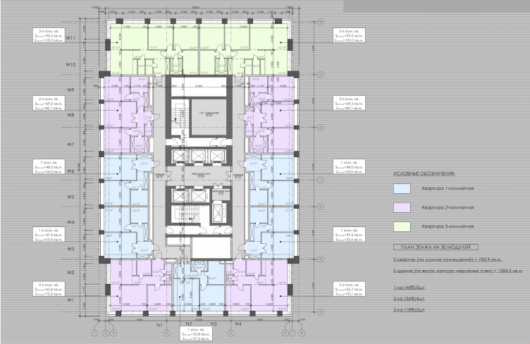
Multifunctional residential complex on the 5th Donskoy Proezd. Plan of the typical floor. Project, 2015 © ABV Group


If one is to look at the project, for example, from a bird's eye view, or, rather, through the lenses of the drone rented by the architects, he will be able to trace Nikita Biryukov's elegant towers enter into a dialogue with the not-so-remote skyscrapers of the Moscow City, watch the nearby high-rises get lost against their mighty background, and watch the power plant chimneys timidly cringe into the ground (there are also four of them, by the way). In spite of the numerous intermediate approvals that the authors got, the project of "ABV Group" will not be implemented. "Well - Nikita Biryukov shrugs - we, of course, are not Ivan Leonidov with his Narkomtyazhprom high-rise on the Red Square but let's say that now we will also have an incomplete skyscraper of our own!"


Multifunctional residential complex on the 5th Donskoy Proezd. 4 towers. View from the Gagarin Square. Project, 2015 © ABV Group
Multifunctional residential complex on the 5th Donskoy Proezd. 4 towers. Landscaping. Project, 2015 © ABV Group
Multifunctional residential complex on the 5th Donskoy Proezd. Plan of the second floor. Project, 2015 © ABV Group

28 April 2016

Headlines now
Gold in the Sands
A new office for a transcontinental company specializing in resource extraction and processing has opened in Dubai. Designed by T+T Architects, masters of creating spaces that are contemporary, diverse, flexible, and original, this project exemplifies their expertise. On the executive floor, a massive brass-clad partition dominates, while layered textures of compressed earth create a contextually resonant backdrop.
Layers and Levels of Flight
This project goes way back – Reserve Union won this architectural competition at the end of 2011, and the building was completed in 2018, so it’s practically “archival”. However, despite being relatively unknown, the building can hardly be considered “dated” and remains a prime example of architectural expression, particularly in the headquarters genre. And it’s especially fitting for an aviation company office. In some ways, it resembles the Aeroflot headquarters at Sheremetyevo but with its own unique identity, following the signature style of Vladimir Plotkin. In this article, we take an in-depth look at the United Aircraft Corporation (UAC) headquarters in the Moscow agglomeration town of Zhukovsky, supplemented by recent photographs from Alexey Naroditsky – a shoot that became only recently possible due to the fact that improvements were finally made in the surrounding area.
Light and Shadow
In this article, we delve into the architectural design of the “Chaika” house by DNK ag architects, which was recently completed in 2023 as part of the collection of signature designs at ZILArt. As is well-known, all the buildings in this complex follow a design code, yet each one is distinct. This particular building stands out not only for its whiteness and minimalism but also for the refined use of a limited number of techniques that, together, create what can confidently be called synergy.
Casus Novae
A master plan was developed for a large residential area with a name of “DNS City”, but now that its implementation began, the plan has been arbitrarily reformatted and replaced with something that, while similar on the surface, is actually quite different. This is not the first time such a thing happens, but it’s always frustrating. With permission from the author, we are sharing Maria Elkina’s post.
Treasure Hunting
The GAFA bureau, in collaboration with Tegola and Arkhitail, organized an expedition to the island of Kilpola in Karelia as part of Moskomarkhitektura’s “Open City” festival. There, amidst moss and rocks, the students sought answers to questions like: what is the sacred, where does it dwell, and what sustains it? Assisting the participants in this quest were landscape engineer Evgeny Levin, artist Nicholas Roerich, a moose, and the lack of cellular connection. Here’s how the story unfolded.
Depths of the Earth, Streams of Water
In the Malaya Okhta district, the Akzent building, designed by Stepan Liphart, was constructed. It follows a classic tripartite structure, yet it’s what you might call “hand-drawn”: each façade is unique in its form and details, some of which aren’t immediately noticeable. In this article, we explore the context and, together with the architect, delve into how the form was developed.
Fir Tree Dynamics
The “Airports of Region” holding is planning to build an airport in Karachay-Cherkessia, aiming to make the Arkhyz and Dombay resorts more accessible to travelers. The project that won in an invitation-only competition, submitted by Sergey Nikeshkin’s KPLN, blends natural imagery inspired by the shape of a conifer seed, open-air waiting spaces, majestic large trees, and a green roof elevated on needle-like columns. The result is both nature-inspired and WOW.
​A Brick Shell
In the process of designing a clubhouse situated among pine trees in a prestigious suburban area near Moscow, the architectural firm “A.Len” did the façade design part. The combination of different types of brick and masonry correlates with the volumetric and plastique solutions, further enhanced by the inclusion of wood-painted fragments and metal “glazing”.
Word Forms
ATRIUM architects love ambitious challenges, and for the firm’s thirtieth anniversary, they boldly play a game of words with an exhibition that dives deep into a self-created vocabulary. They immerse their projects – especially art installations – into this glossary, as if plunging into a current of their own. You feel as if you’re flowing through the veins of pure art, immersed in a universe of vertical cities, educational spaces – of which the architects are true masters – and the cultural codes of various locations. But what truly captivates is the bold statement that Vera Butko and Anton Nadtochy make, both through their work and this exhibition: architecture, above all, is art – the art of working with form and space.
Flexibility and Acuteness of Modernity
Luxurious, fluid, large “kokoshniks” and spiral barrel columns, as if made from colorful chewing gum: there seem to be no other mansion like this in Moscow, designed in the “Neo-Russian-Modern” style. And the “Teremok” on Malaya Kaluzhskaya, previously somewhat obscure, has “come alive with new colors” and gained visibility after its restoration for the office of the “architectural ecosystem” as the architects love to call themselves. It’s evident that Julius Borisov and the architects at UNK put their hearts into finding this new office and bringing it up to date. Let’s delve into the paradoxes of this mansion’s history and its plasticity. Spoiler: two versions of modernity meet here, both balancing on the razor’s edge of “what’s current”.
Yuri Vissarionov: “A modular house does not belong to the land”
It belongs to space, or to the air... It turns out that 3D printing is more effective when combined with a modular approach: the house is built in a workshop and then adapted to the site, including on uneven terrain. Yuri Vissarionov shares his latest experience in designing tourist complexes, both in central Russia and in the south. These include houseboats, homes printed from lightweight concrete using a 3D printer, and, of course, frame houses.
​Moscow’s First
“The quality of education largely depends on the quality of the educational environment”. This principle of the last decade has been realized by Sergey Skuratov in the project for the First Moscow Gymnasium on Rostovskaya Embankment in the Khamovniki district. The building seamlessly integrates into the complex urban landscape, responding both to the pedestrian flow of the city and the quiet alleyways. It skillfully takes advantage of the height differences and aligns with modern trends in educational space design. Let’s take a closer look.
Looking at the Water
The site of Villa Sonata stretches from the road to the water’s edge, offering its own shoreline, pier, and a picturesque river panorama. To reveal these sweeping views, Roman Leonidov “cut” the façade diagonally parallel to the river, thus getting two main axes for the house and, consequently, “two heads”. The internal core – two double-height spaces, a living room and a conservatory, with a “bridge” above them – makes the house both “transparent” and filled with light.
The White Wing
Well, it’s not exactly white. It’s more of a beige, white-stone structure that plays with the color of limestone – smoother surfaces are lighter, while rougher ones are darker. This wing unites various elements: it absorbs and interprets the surrounding themes. It responds to everything, yet maintains a cohesive expression – a challenging task! – while also incorporating recognizable features of its own, such as the dynamic cuts at the bottom, top, and middle.
Urban Dunes
The XSA Ramps team designed and built a three-part sports hub for a park in Rostov-on-Don, welcoming people of all ages and fitness levels. The skate plaza, pump track, and playground are all meticulously crafted with details that attract a diverse range of visitors. The technical execution of the shapes and slopes transforms this space into a kind of sculptural composition.
Proportional Growth
The project for the fourth phase of the ÁLIA residential area has been announced. The buildings are situated on an elongated plot – almost a “ray” that shoots out from the center of the area towards the river. Their layout reflects both a response to Moscow’s architectural preferences over the past 15 years, shifting “from blocks to towers”, and an interpretation of the neighboring business park designed by SOM. Additionally, the best apartments here are not located at the very top but closer to the middle, forming a glowing “waistline”.
The “Staircase” Building
In designing the “Details” residential complex in New Moscow, Rais Baishev spiced up the now-popular Moscow theme of a “courtyard” building with an idea drawn from the surrealist drawings by Maurits Escher. He envisioned the stepped silhouettes and descending slopes as a metaphysical mega-staircase, creating a key void within the courtyard that gave the project an internal “spine”. This concept is felt both in the building’s silhouette and on its façades.
Projection of the Quarter
No one doubted that the building that Vladimir Plotkin designed as part of the “Garden Quarters” would be the most modernist of all. And it turned out just that way: while adhering to the common design code, the building successfully combines brick and white stone, rhythmically responding to the neighboring building designed by Ostozhenka, yet tactfully and persistently making a few statements of its own. This includes the projection of the ideal urban development composition “14–9–6”, which can be found right next door, mathematical calculations, including those for various types of terraces (and perhaps the only reminder of the Soviet past of the Kauchuk rubber factory!), and the white “cross-stitch” pattern of the façade grid.
Domus Aurea
In this issue, we examine the “Tessinsky-1” house, designed by Sergey Skuratov and completed in 2023. Located in the middle of the Serebryanicheskaya Embankment district, at the intersection of its main streets, this house assumes a sort of “nodal” role: it not only responds to everything around it and preserves many memories of the former EMA factory within itself, but it weaves all this into a newly directed pattern, reconciling bright “gold” and dark-colored brick, largely with the help of the new, modern-yet-archaic Columba brick, which, come to think about it, is the most precious element here.
The Chimney of Nikola-Lenivets
In this issue, we are examining the “Obelisk House” designed by KATARSIS and built for the Arkhstoyanie 2023 festival. However, it was only finished later on, and this is why we are examining it now. It seems to us that after the “Obelisk House” appeared in Nikola-Lenivets, a dialogue and a few inner connections appeared between the temporary structures built here. These houses no longer look like “accidental neighbors”, more of which below.
​Periscope by the Bay
The jury awarded the second place in the competition for a public and cultural center in Petropavlovsk-Kamchatsky to the companies GORA (“Mountain”) and M4. In the consortium’s proposal, the building resembles a sperm whale with a calf swimming next to it or a periscope, whose lenses capture the most spectacular views from the surrounding landscape.
From Arcs to Dolmens
While working on the competition project for Petropavlovsk-Kamchatsky, ASADOV Architects prioritized the value of the natural and urban environment, aiming to preserve the balance of the location while minimizing the resemblance of the volume that they designed to a “traditional building”. The task was challenging, and the architects created three versions, one of which having been developed after the competition, where their main proposal took third place. However, the point of interest here is not the competition result but the continuity of creative thinking.
Hide and Seek
The ID Moskovskiy house, designed by Stepan Liphart in St. Petersburg, in the courtyards near Moskovskiy Avenue beyond the Obvodny Canal and recently completed, is notable for several reasons. Firstly, it has been realized with considerable accuracy, which is particularly significant as this is the first building where the architect was responsible not only for the facades but also for the layouts, allowing for better integration between the two. On the other hand, this building is interesting as an example of the “germination” of new architecture in the city: it draws on the best examples from the neighborhood and becomes an improved and developed sum of ideas found by the architect in the surrounding context.
The Big Twelve
Yesterday, the winners of the Moscow Mayor’s Architecture Award were announced and honored. Let’s take a look at what was awarded and, in some cases, even critique this esteemed award. After all, there is always room for improvement, right?
Above the Golden Horn
The residential complex “Philosophy” designed by T+T architects in Vladivostok, is one of the new projects in the “Golubinaya Pad” area, changing its development philosophy (pun intended) from single houses to a comprehensive approach. The buildings are organized along public streets, varying in height and format, with one house even executed in gallery typology, featuring a cantilever leaning on an art object.
Nuanced Alternative
How can you rhyme a square and space? Easily! But to do so, you need to rhyme everything you can possibly think of: weave everything together, like in a tensegrity structure, and find your own optics too. The new exhibition at GES-2 does just that, offering its visitor a new perspective on the history of art spanning 150 years, infused with the hope for endless multiplicity of worlds and art histories. Read on to see how this is achieved and how the exhibition design by Evgeny Ace contributes to it.
Blinds for Ice
An ice arena has been constructed in Domodedovo based on a project by Yuri Vissarionov Architects. To prevent the long façade, a technical requirement for winter sports facilities, from appearing monotonous, the architects proposed the use of suspended structures with multidirectional slats. This design protects the ice from direct sunlight while giving the wall texture and detail.
Frozen Magma
A competition for the creation of a public and cultural center was held in Petropavlovsk-Kamchatsky. Three architectural companies made it to the final, and we consider it important to share about the work of each. Let’s start with the winner – the consortium led by Wowhaus.
Campus within a Day
In this article, we talk about what the participants of Genplan Institute of Moscow’s hackathon were doing at the MosComArchitecture booth at the “ArchMoscow” exhibition. We also discuss who won the prize and why, and what can be done with the territory of a small university on the outskirts of Moscow.
Vertical Civilization
Genpro considered the development of the vertical city concept and made it the theme of their pavilion at the “ArchMoscow” exhibition.