Urban development projects have created great disputes this September. But while magazines and bloggers are discussing Triumfalnaya Square comparing it to Krymskaya Embankment, the architects of WOWhaus bureau – pioneers in the field of transformation of Moscow public areas – have opened the first stage of their “Urban Farm” built in the previous summer. The project is typologically completely new for Moscow (although similar parks can be found in Podmoskovye). The farm is located in the far end of the exhibition center – near Likhoborskiy proezd and Selskohozyaystvennaya street, not far from the Botanical Garden metro station.
Not far from here, the Kamenka river that feeds a cascade of ponds coming down from Botanichesky Sad to the all-Russia exhibition center flows into the Yauza river forming a small pond behind the last dam – the 5th Kamensky pond. To the right, south of the pond, there used to be the “Hunting” pavilion that burnt in 2005 – it had a mini-zoo behind an arched façade, and now only two statues remain: “The Hunter” and “The Fox Breeder”. In the two last decades, this territory, as well as the whole northern part of VDNKh, has become a real back yard, a place of private residences, migrating barbecue stalls, saunas and restaurants that stock the ponds with fish offering the clients to catch the kill themselves for it to be cooked in the kitchen. One of such restaurants “The Trout River” used to be by the 5th Kamensky pond (the pond and the river-bed are separated here – it creates a double amusement). The administration of VDNKh closed the restaurant in 2014 and then invited the WOWhaus architects to discuss the territory.
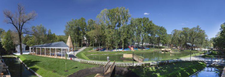
Panorama. Urban farm at VDNKh, 1st phase. WOWhaus Bureau. Photograph © Dmitry Chebanenko
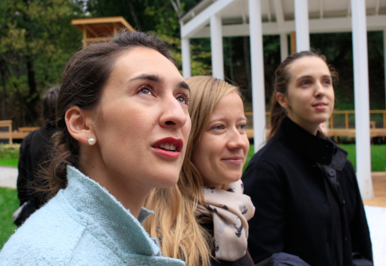
Left to right: Alena Zaitseva, the chief architect of the project; Daria Listopad, architect of the project; Maria Selten, the commecrial director of the "Urban Farm" at VDNKh - giving a guided tour for the press. Photograph © Julia Tarabarina, Archi.ru
Having studied the location and surroundings the architects soon came to a conclusion that this part of VDNKh – unlike the center with its pavilions of republics and space – is sooner devoted to agriculture. They thought of the zoo in the Hunting pavilion and suggested making a farm – a kind of zoo where children could see domestic animals and learn to take care of them at various workshops. Such farms are common in Europe, but – as the architects say – though they are beautiful and natural, usually they are not interesting from the architectural point of view – and WOWhaus decided to create an “ideal farm”, clean, vast, convenient and cozy – exemplary, “like the whole VDNKh”. Which was done after the pre-draft and marketing research, carried out by the territorial transformation specialists of bureau KB23.
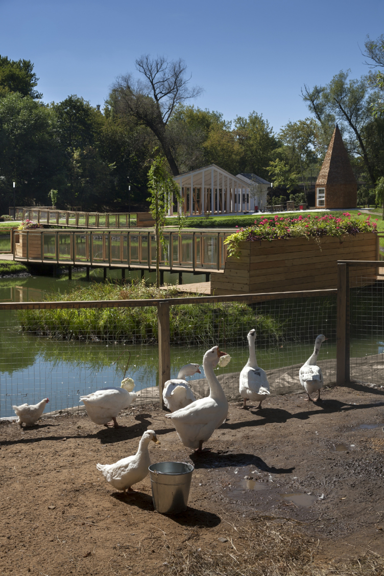
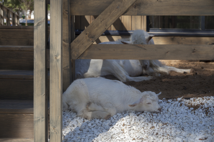
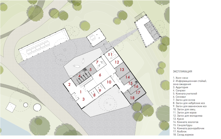
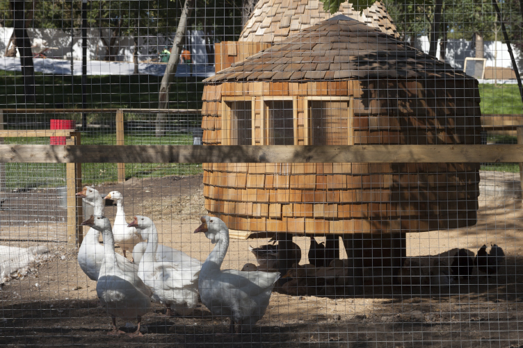
The main theme of the project is in fact the farm; it has become the core of the first stage and is almost built and inhabited: only the pigeons have not yet arrived at the pigeon-loft. But the goats, sheep, donkeys and miniature cows are already getting used to the warm cow-shed; the rabbits breed in the rabbit-warren; pedigree chicks, geese with aquiline noses and ducks with pretty topknots on their heads are swimming in the pond and breed in poultry houses. Near the pond, there is a big playground similar with the one that WOWhaus built in the Bauman Garden on Basmannaya street – it is equipped for children with health limitations, and is grouped along the axial ramp without ladders. The completed first stage of the farm has taken up a big northern part of the territory around the pond and the river. By the river, there supposed to be a “fishing zone” – a tribute to the memory of this place. Today you can get inside into the already opened Urban Farm through a small entrance pavilion on the side of the “Rabbit Breeding” pavilion (one ticket costs 200 roubles, and as the organizers say, the farm has got its first regular visitors).
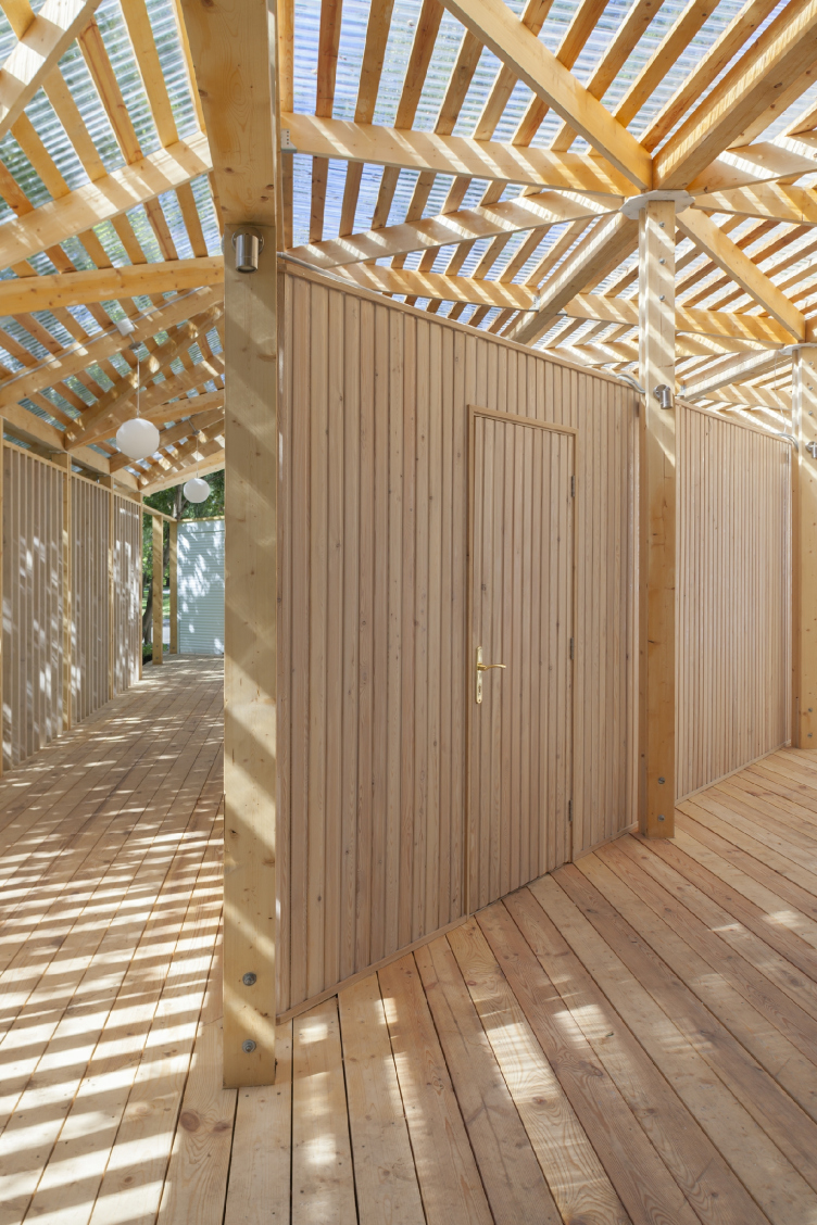
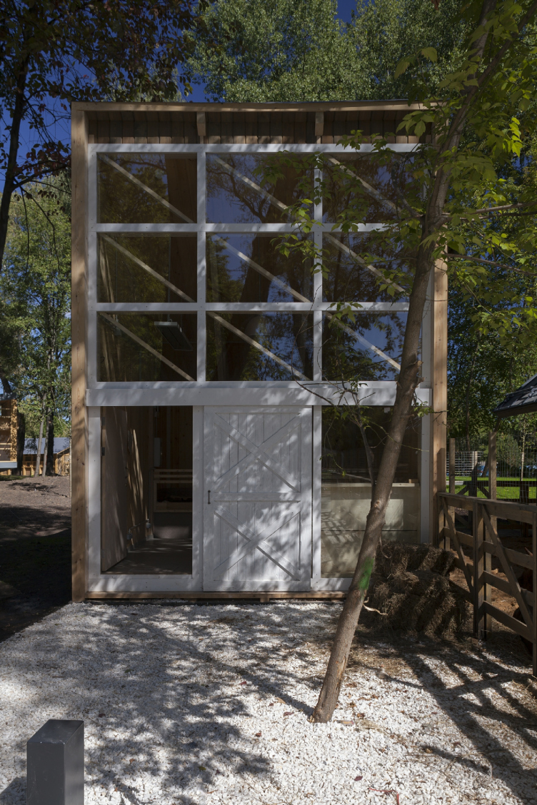
The house for master classes. Urban farm at VDNKh, 1st phase. WOWhaus Bureau. Photograph © Dmitry Chebanenko
The house for master classes. Urban farm at VDNKh, 1st phase. WOWhaus Bureau. Photograph © Dmitry Chebanenko
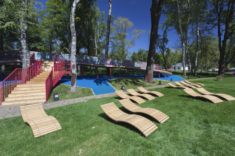
Children playground and deck-chairs before the creek. Urban farm at VDNKh, 1st phase. WOWhaus Bureau. Photograph © Dmitry Chebanenko
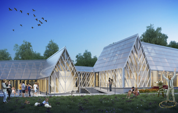
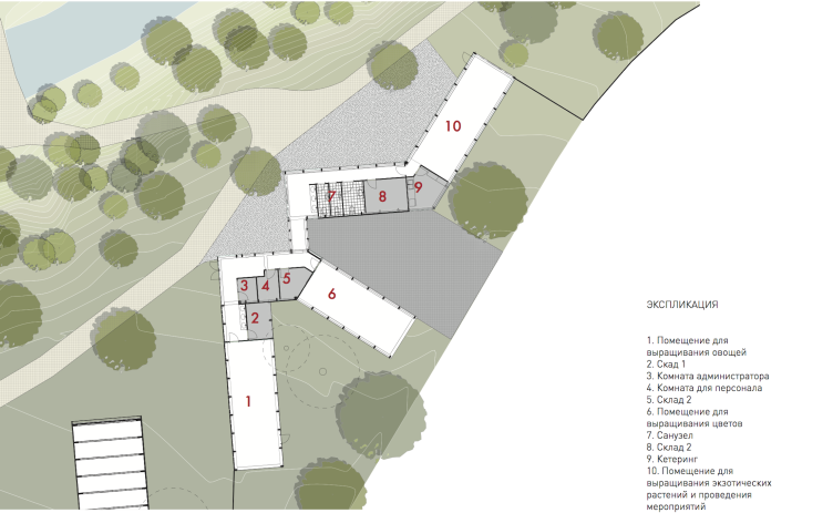
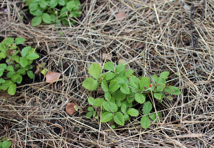
The second stage – in the southern part of the territory with the future main entrance near the statues – is planned to be fully or partially implemented by December. This will be the place where functions completing the farm are to be grouped and that already echo with their miniature representatives in the completed part: a big café planned by the main entrance resembles the snack stand and the tent over some tables built on the bank of the pond; a green-house of the second stage – made up of three parts, with hydroponic cultures, flowers, exotic plants and with latticed facades reminding pineapple skin (as the authors say) – is assotiated with the mini kitchen-garden in the northern part, where fall rye, radish and strawberry sarments are already growing on the tall garden-beds. The future workshop zone with woodworking machines in the southern part is aligned with the “construction-site” playground where you can struck with a hammer or cut something out with a saw – it is planned to be opened soon. The authors of the project deliberately divided all the functions among the two construction stages, so that the first stage would be as full, varying and exciting as possible right now.
DIY area. Urban farm at VDNKh, 2nd phase. WOWhaus Bureau. Photograph © Dmitry Chebanenko
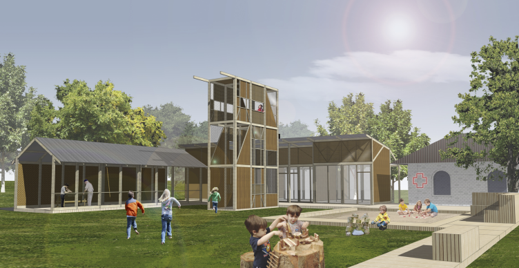
Workshops. Urban farm at VDNKh, 2nd phase, project © WOWhaus
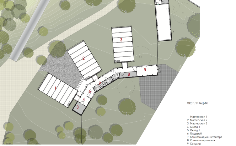
Workshops, plan. Urban farm at VDNKh, 2nd phase, project © WOWhaus
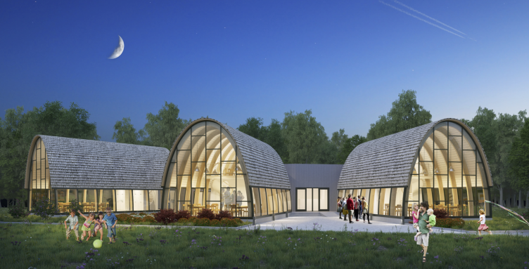
Conservatory. Urban farm at VDNKh, 2nd phase, project © WOWhaus
Conservatory, plan. Urban farm at VDNKh, 2nd phase. WOWhaus Bureau. Photograph © WOWhaus
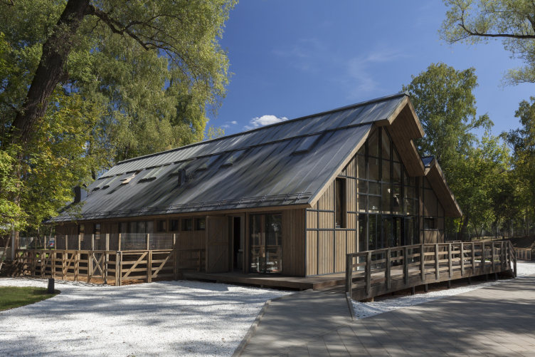
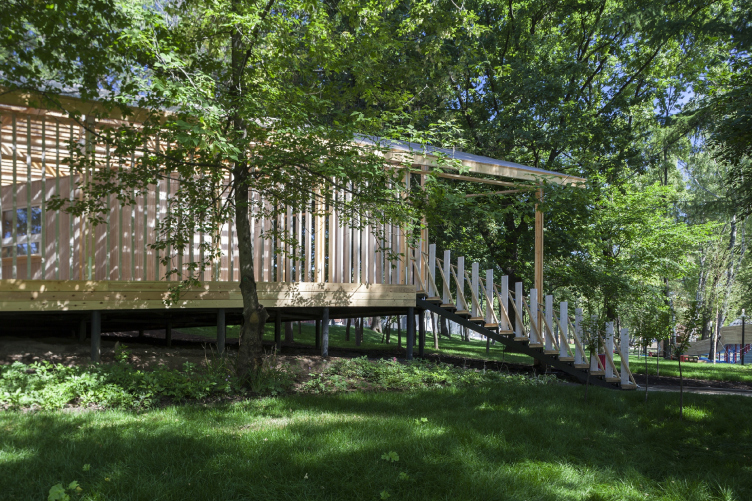
But let us return to the impressions from the constructed part. The small park takes up about one and a half hectares now, and its central part (excepting the warehousing area on the periphery of the lot) – even less, perhaps about a hectare, something in between a park and a garden. However, the level difference (one has to go down the stairs after the entrance), the pond and the river make the mini-park very diverse. The architecture of the pavilions is also designed to bolster the impressions: the pavilions designed by different architects of the bureau are all wooden but all – very different. During their demonstration to the journalists, the authors even talked about the difference of the houses built by men and women. There actually is a difference: one can feel the distinct “touches” and tricks joined by one material, but also however, the authorship of WOWhaus on the whole.
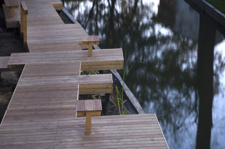
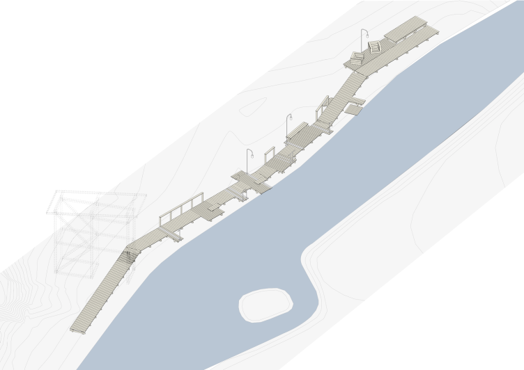
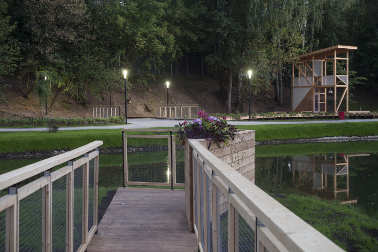
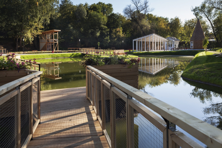
There is no symmetry and fanciness. All the constructions – even the most fundamental and weatherproof cow-shed and rabbit-warren – remain within the concept of light pavilion architecture. The concrete paths alternate with spots of bright white gravel, wooden bridges with benches are thrown to the two small islands in the pond, and the wooden planking lifted on supports and running across the river is densely equipped with rectangular projections – small docks that are apparently meant for fishing in the future. Everything is spread around the lot, permeable and latticed, the roofs are asymmetrical, the buildings tend to “dissolve” into space projecting forward terraces, roofs and bearers. The architecture poises on the edge of the pure esthetics of festival art, like “Goroda” and “Archstoyanie” – and the pavilion-park type construction that is more capital and of higher quality but still setting no boundaries and allowing to play on contrasts.
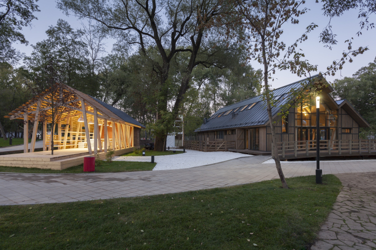
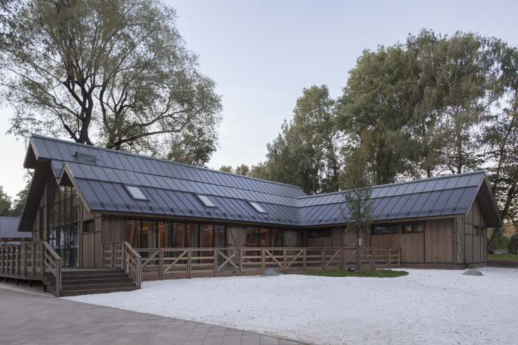
The house for master classes (left) and the cowshed(right). Urban farm at VDNKh, 1st phase. WOWhaus Bureau. Photograph © Dmitry Chebanenko
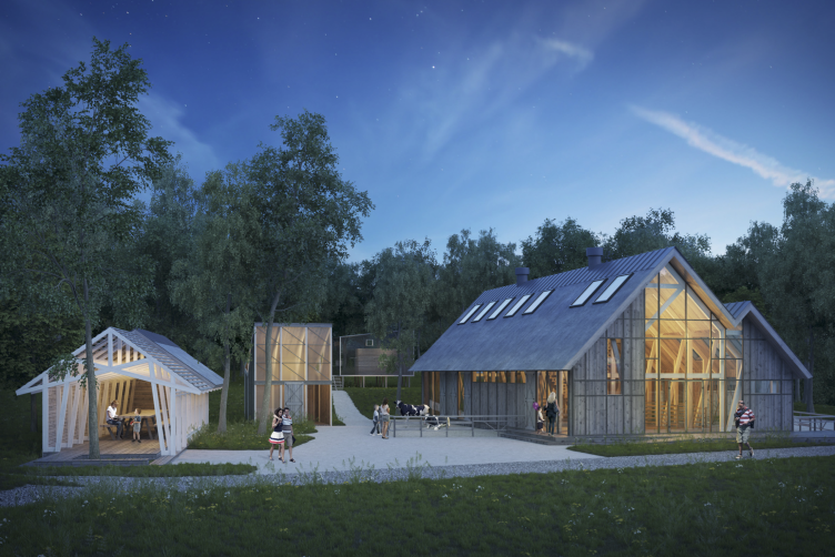
Urban farm at VDNKh. Overview. 1st phase, project. WOWhaus Bureau. Photograph © WOWhaus
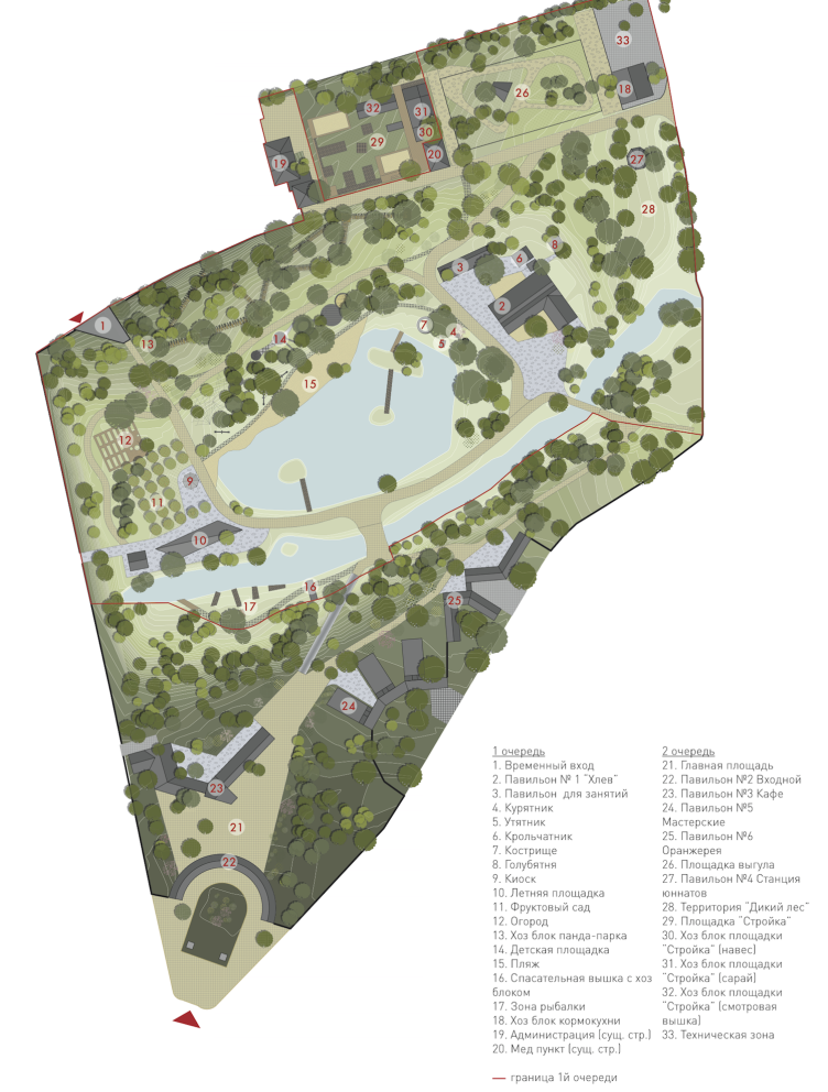
Urban farm at VDNKh, plan of the farm © WOWhaus
The wooden flooring along the river in the "fishing area". Urban farm at VDNKh, 1st phase. WOWhaus Bureau. Photograph © Dmitry Chebanenko
Fishing area, overview. Urban farm at VDNKh, 1st phase © WOWhaus
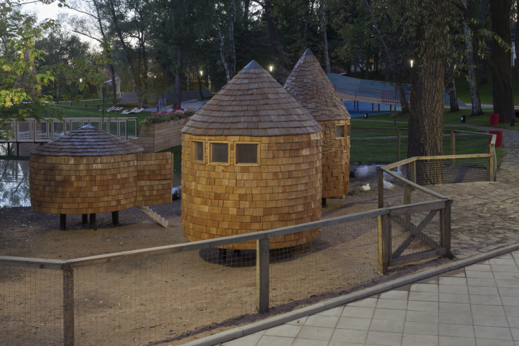
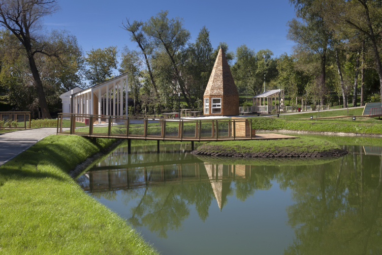
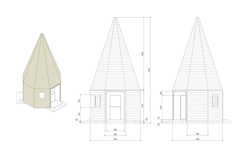
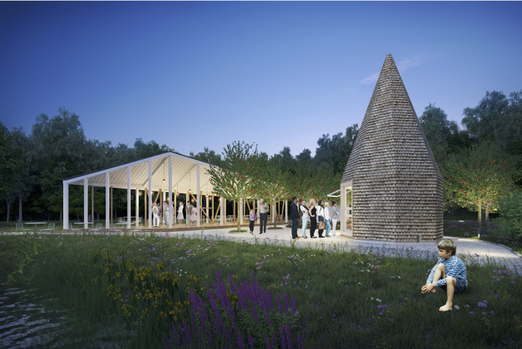
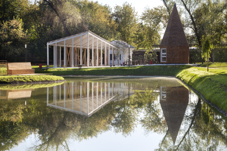
It is a pleasure to be in this thematic garden – and at the same time, it evokes multiple associations. The first one is figuratively the oldest – ideas of parks from the 18thcentury sentimentalism. Many people know that Marie Antoinette had her own farm in the Versailles park where she used to milk cows still wearing a crinoline. Goat milking for children at 1:45 pm at the urban farm is something similar: an attempt to bring people that are basically far from village life closer to farming. The urban farms in Europe actually originate from those ideas of the encyclopedists era, and the farm in Moscow indirectly inherits them. But still, they have a lot in common: on the one hand, there is the emphasized focus on naturalness and subdued colors – in particular – though for the City Day the ground was covered with roll out lawns – the authors say that there are clover and grass seeds under them, that will come up by next year and everything will look more natural. Some wooden constructions – such as the cow-shed and a small pavilion for workshops – are toned with taupe, and some spots of wood are left as they are; but then again, the authors hope that next year they will turn silvery grey. Now the authors call larch shingle and lath their favorite materials. They make up the cover of the peaked snack café that the workers call the “pencil” – and it does remind it, especially from a distance. The poultry-houses on the other bank of the pond have the same shape and finishing – echoing each other. The materials are preferred for their texture, warmth and natural character. They are also supposed to turn grey from rain-water. It makes us think of village houses – even though it is not straw, the lath is special here – it bears a powerful pastoral spirit and the figural essence of a farm.
The house for master classes. Urban farm at VDNKh, 1st phase. WOWhaus Bureau. Photograph © Dmitry Chebanenko
Poultry houses. The house for master classes. Urban farm at VDNKh, 1st phase. WOWhaus Bureau. Photograph © Dmitry Chebanenko
Poultry houses. The house for master classes. Urban farm at VDNKh, 1st phase. WOWhaus Bureau. Photograph © Dmitry Chebanenko
On the other hand, no farm built in the wave a sentimental initiation of city-dwellers in nature looks like a real one. Which the authors also understand, directly admitting that familiarizing children with the cattle breeding industry is traumatizing and inhumane. Think about chicks on a conveyor belt – compared to them, the chickens and geese here are swans on Patriarshiye ponds. The farm looks more like a thematic mini-zoo; donkeys are being combed out every day. The miniature African cows with humps (just like camels have), give practically no milk but they look small and exotic. There is almost no smell – the ventilation is well conceived, nothing like the “Pig Breeding” pavilion that was such a shock for me when I was a child. In short, now that one of the main tasks of a city child about to go to school is to learn domestic animals and realize that there is also such cattle from a farmstead besides the cat, the hedgehog and the turtle – the farm gets to be very useful.
If, for a moment, we forget about Marie Antoinette’s proto-farm then the second most vivid association would be the EXPO world fair, still being held in Milan. This year it is dedicated to production of food – so basically to the same topic as the urban farm of WOWhaus. The similarities between the kitchen-garden here and the Slow Food project of Herzog and de Meuron are quite evident: starting from the strawberry and radish, shape of garden-beds – tall or hung up or built into the walls – and up to distinctive form of the bearers beaming upwards from one point. Yet, though there are plenty of greens at the EXPO in Milan, animals are only present on pictures.
Strawberries on the beds of Urban Farm at VDNKh. Photograph © Julia Tarabarina, Archi.ru
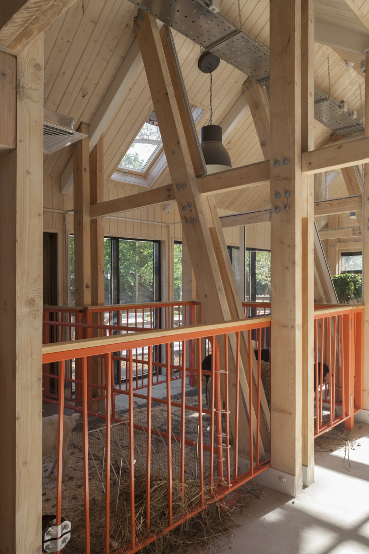
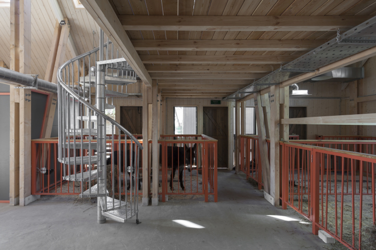
Cow-shed, the orange rails of the pens. Urban farm at VDNKh, 1st phase. WOWhaus Bureau. Photograph © Dmitry Chebanenko
The house for master classes. Urban farm at VDNKh, 1st phase. WOWhaus Bureau. Photograph © Dmitry Chebanenko
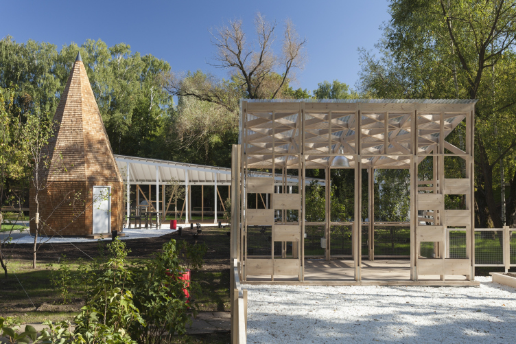
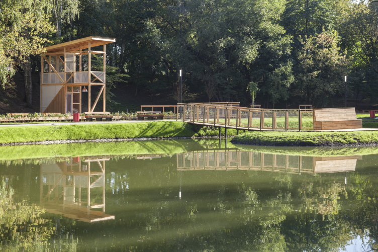
World fairs –whose last theme partially matches the theme of the farm so well – were the prototype of Soviet exhibition of handicraft and industry, and here we appear to be directly influenced by the Moscow context. It is easy to notice that the “Urban farm” resembles a miniature copy of the agricultural part of VDNKh in many ways – leaving out the national pavilions but preserving the “handicraft” element, with cafes and entertainment. If you look carefully from the side of the cow-shed at the other side of the pond, you will see that the “pencil” is similar to a rocket, and the lifeguard stand is its launch tower pulled off to the other side of the river: here “we’ve got” one of the familiar symbols of Soviet achievements exhibition, but it is made of wood – like Polissky’s hadron collider as the image of an industrial symbol purposefully made of an inapt material.
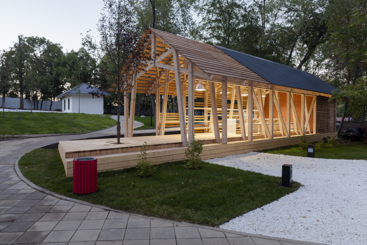
Cafe, "pencil", and awning. Urban farm at VDNKh, 1st phase. WOWhaus Bureau. Photograph © Dmitry Chebanenko
Kiosk. Facades and axonometry. Urban farm at VDNKh. Overview. 1st phase. Photograph © WOWhaus
Cafe, "pencil", and awning. Urban farm at VDNKh, 1st phase © WOWhaus
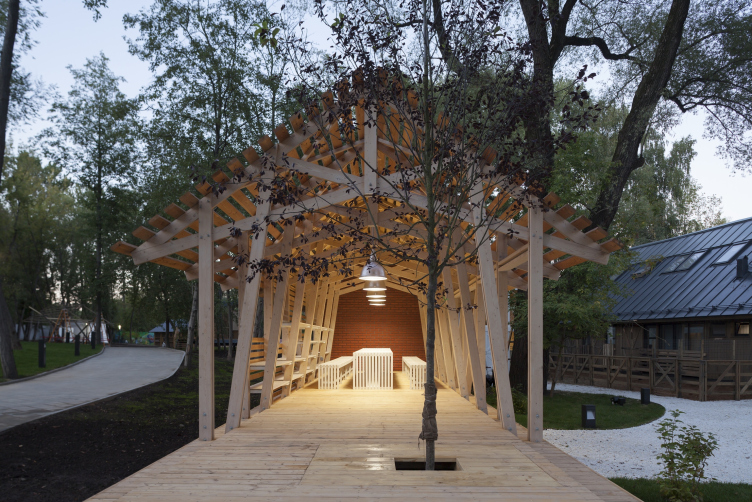
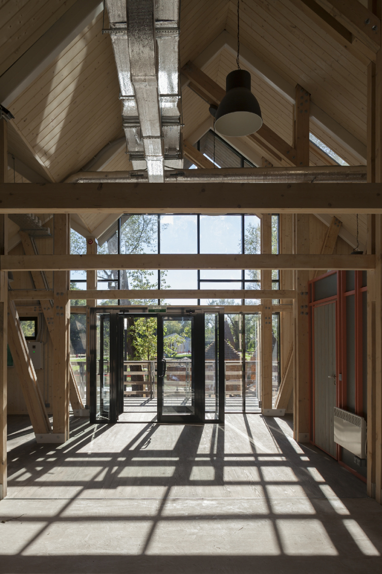
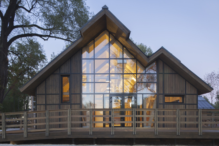
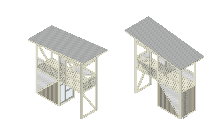
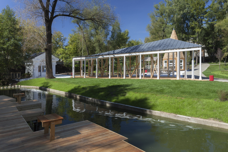
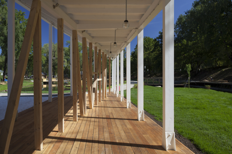
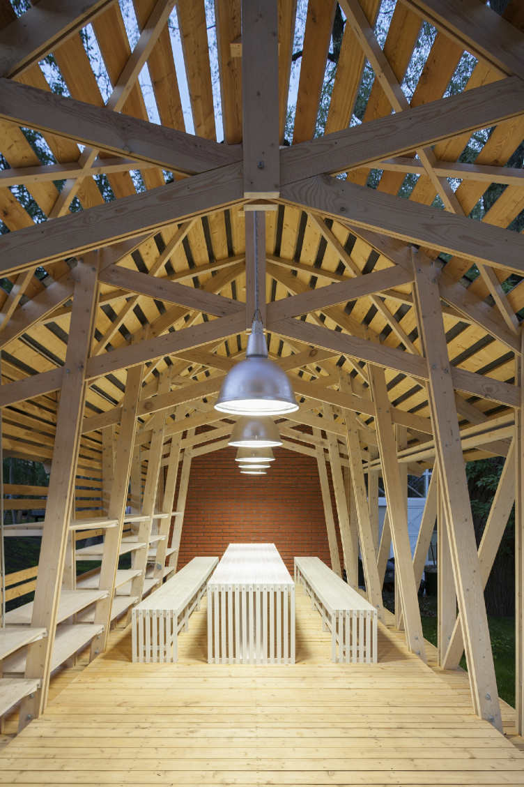
But resemblance with the mini-VDNKh does not exclude another prototype – the wooden constructions of the farm remind the first exhibition of handicraft and industry, the All-Union Agricultural Exhibition, held in the place of Gorky Park (into which development WOWhaus has also put a great deal of effort which is also significant). A lot of things are recognizable: the tend to latticed constructions and studwork (or something of the kind), the variety of the authors’ styles and a kind of very conventional wooden classicism. The inevitably festive cow-shed – the biggest and warmest room with two asymmetrical gables and metal winding stairs leading to the balcony – reminds a basilica. The lifeguard stand reminds the “Makhorka” pavilion. The rhombic shed over the café looks like a Chipperfield peripter from the side of the river (this theme is quite popular in parks and WOWhaus has already had an experience in building such constructions), and from the side of the pond, due to the high lifted corner of the roof – reminds a portico reflected in water, almost completely classical, but at the same time very much in the spirit of VDNKh and the All-Union Exhibition – you can see it only from one angle, and moving forward you see it disappear, dispart. But the white color of the outer contour of the bearers in combination with natural wood helps to accent the classical theme – together it looks like a sort of wooden marble. The Stalin-time converter cubicle, also painted white and standing by the actual – unlike the café shed – doric columns also makes its contribution to the effect.
Cow-shed. Urban farm at VDNKh, 1st phase. WOWhaus Bureau. Photograph © Dmitry Chebanenko
Cow-shed. House for master classes. Urban farm at VDNKh, 1st phase. WOWhaus Bureau. Photograph © Dmitry Chebanenko
Cow-shed. House for master classes. Urban farm at VDNKh, 1st phase. WOWhaus Bureau. Photograph © Dmitry Chebanenko
Cow-shed. House for master classes. Urban farm at VDNKh, 1st phase. WOWhaus Bureau. Photograph © Dmitry Chebanenko
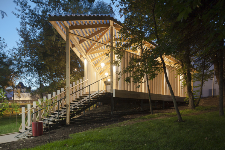
Rescuers' tower. Urban farm at VDNKh, 1st phase. WOWhaus Bureau. Photograph © Dmitry Chebanenko
Rescuers' tower. Axonometry. Urban farm at VDNKh. © WOWhaus
The awning of the cafe. Urban farm at VDNKh, 1st phase. WOWhaus Bureau. Photograph © Dmitry Chebanenko
The view of the cafe. Awning and pencil-kiosk. Urban farm at VDNKh, 1st phase. WOWhaus Bureau. Photograph © Dmitry Chebanenko
The kiosk awning. Axonometry. Urban farm at VDNKh. © WOWhaus
The kiosk awning. Plan and facade. Urban farm at VDNKh. © WOWhaus
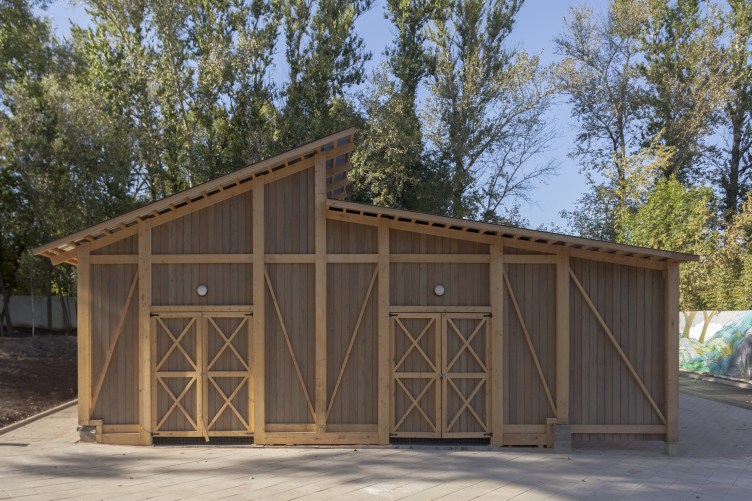
The shed for forage and machinery. Urban farm at VDNKh, 1st phase. WOWhaus Bureau. Photograph © Dmitry Chebanenk
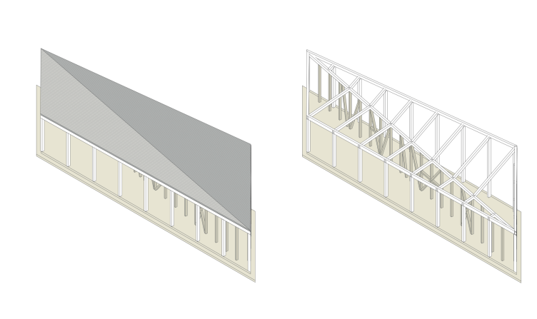
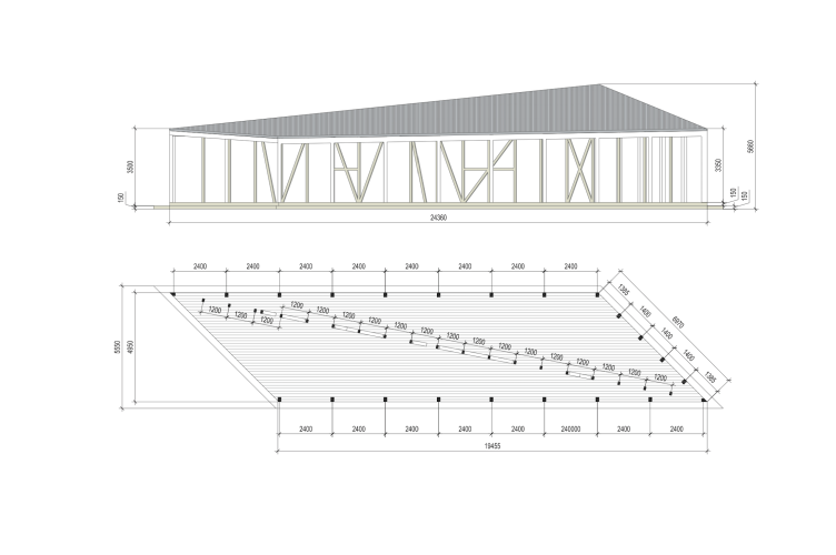
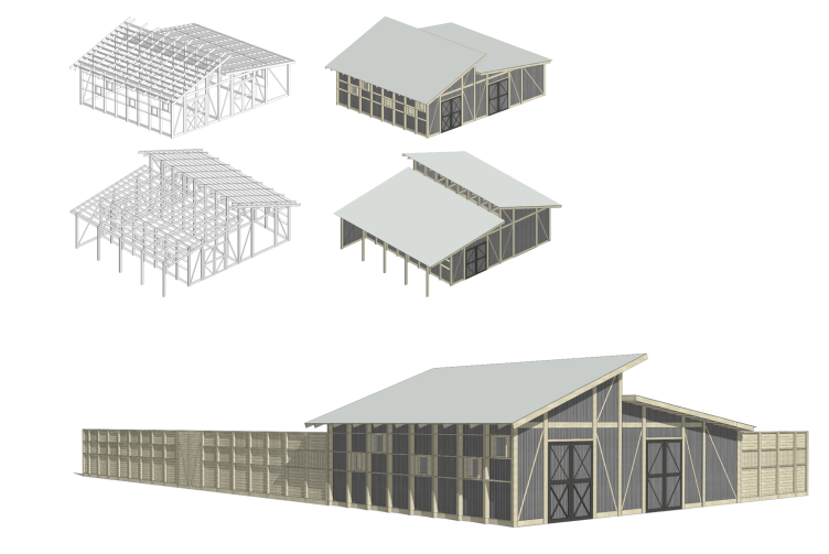
The shed for forage and machinery.Axonometry and overview. Urban farm at VDNKh, 1st phase © WOWhaus
The whole view turns out to be not only exhibitional but also conventionally grange-like, especially thanks to the pond and islands. The portico of the shed is a mansion house, the pencil is an obelisk. Flowers in planters – placed in the bench backs at eye level like in the British Pavilion at EXPO – also have this country air, large and bright, not lavender and the popular grain varieties. The idea is captured – we really are in an urban village. The imagery, however, does not go beyond the limits. It does not turn into a stylization of either avant-garde, or something else. It remains within the frame of modern park stylistics.
Urban farm at VDNKh, 1st phase. WOWhaus Bureau. Photograph © Dmitry Chebanenko
View over the creek on the cafe. Urban farm at VDNKh, 1st phase. WOWhaus Bureau. Photograph © Dmitry Chebanenko
So a farm has turned out to be a very sense bearing idea. That is, full of meanings that line up in a sequence starting from Marie Antoinette’s cows to the farming accents of the Soviet Expo – and then to the modern urban farms, educational amusement for children and to the eco-searches of our time presented in Milan. The idea is many times on trend. From the architectural point of view, the authors bring the somewhat pompous image of VDNKh to its wooden, half-avant-garde, half-neoclassical historical prototype – the All-Union Agricultural Exhibition, simultaneously adding their significant works in Moscow to this line. You can even look at it like this: the first exhibition of 1923 was held in the nepman and agricultural country, there was wood and laughter, almost like a fair; at those times most of the children came from rural areas. Then came the workers’ children, the children of the JRFs, children of white collars… And so, the exhibition moved and became more showy and pompous having shifted the “agricultural part” to the back yard and later having forgotten it altogether. “The Urban Farm” – a vaccination of the theme in the format of urban entertainment – wraps up the story in a playful fashion. Then again, luckily we do not know how the story will end yet. But it is nice to have a walk here. And in the evening everything lights up beautifully.
Cafe awning. Urban farm at VDNKh, 1st phase. WOWhaus Bureau. Photograph © Dmitry Chebanenko
The entrance pavilion of the norther part. Urban farm at VDNKh, 1st phase. WOWhaus Bureau. Photograph © Dmitry Chebanenko
The entrance pavilion of the norther part. Urban farm at VDNKh, 1st phase. WOWhaus Bureau. Photograph © Dmitry Chebanenko
The entrance pavilion of the norther part. Urban farm at VDNKh, 1st phase. WOWhaus Bureau. Photograph © Dmitry Chebanenko
Cow-shed. House for master classes. Urban farm at VDNKh, 1st phase. WOWhaus Bureau. Photograph © Dmitry Chebanenko
House for master classes. Urban farm at VDNKh, 1st phase. WOWhaus Bureau. Photograph © Dmitry Chebanenko
House for master classes. Urban farm at VDNKh, 1st phase. WOWhaus Bureau. Photograph © Dmitry Chebanenko
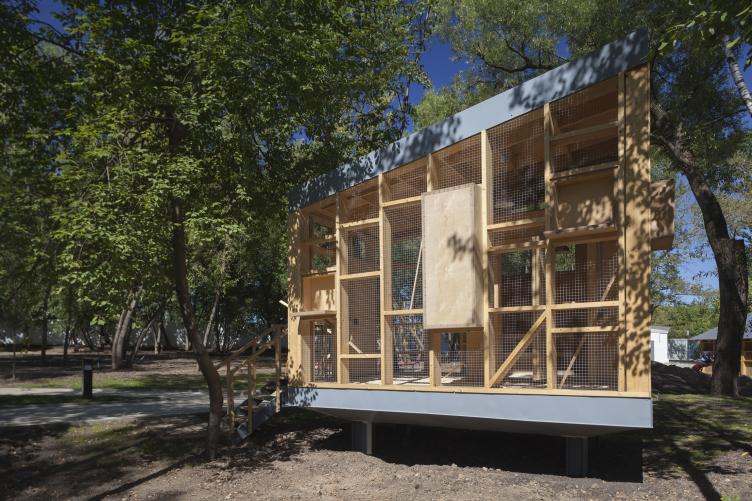
Rabbit-warren. Urban farm at VDNKh, 1st phase. WOWhaus Bureau. Photograph © Dmitry Chebanenko
Pigeon-loft.Urban farm at VDNKh, 1st phase. WOWhaus Bureau. Photograph © Dmitry Chebanenko
Urban farm at VDNKh. Master plan © WOWhaus


