По-русски

Anton Nadtochiy: "The quality of an architectural experiment can only be judged by professionals".

Marina Ignatushko is speaking to one of the leaders of "Atrium" Bureau that won several prizes at Nizhniy Novgorod's "Archnovation" this summer.

03 September 2015
Interview
mainImg

Today, there are a lot of numerous architectural contests organized in this country, diverse in the geography of their participants and the lineups of the judging panels. Them-based showcases are a rarity these days, and this is why we paid special attention to "Archnovation", a comparatively young contest organized by Nizhniy Novgorod gallery of Sergey Tumanin. And the reason for the conversation with Anton Nadtochiy was his already second Grand Prix at "Archnovation" that took place for the third time around. 

- Anton, congratulations! "Archnovation" contest is all about steady growth, hence the first question: to what degree are you able to address these issues in your projects? Are these your personal priorities or is this a byproduct that inevitably just appears whenever you design a high-quality building? 

- For "Atrium", following the basic principles of steady growth is the indispensable feature of today's professional product. However, hyping up this idea too much turns it into a set of clichés and makes it overly populist, substituting the original architectural quality. Because a project can indeed be perfect from the energy efficiency, recycling, and СО2 control standpoints but it can be at the same time hideous if we are to speak of architecture as an art of creating the environment for people to live in. Yes, technologically the buildings grow better and better every year - this is a natural and objective process that has actually little to do with the architect's will or creativity. Technologies develop, construction norms change, the requirements are getting more and more exacting, and this is normal. What makes "Archnovation" different is the fact that it first of all appreciates the architectural experiment, while steady growth is only viewed as part of this comprehensive process. It was really exciting for us to design "Barkli Park" in accordance with the requirements of LEED golden certificate. We are happy that our project got a few awards in the field of "green construction" over the years. But I repeat: the mere fact of our project meeting the technical and ecological requirements and standards has nothing to do with architecture. 

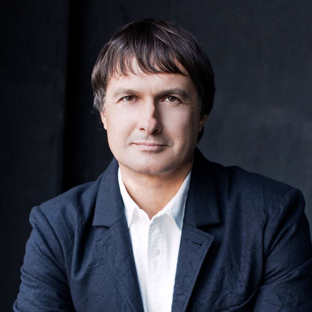
Anton Nadtochiy, 2015. Photo courtesy by "Atrium"
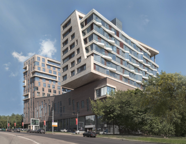
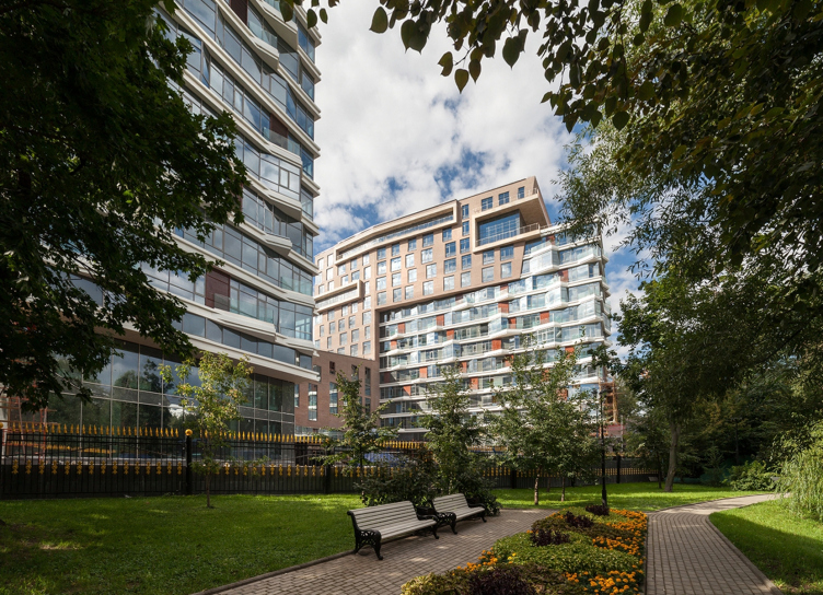
Glance from south to north, from the Sovietskoy Armii Street. Barkli Park © "Atrium"


- So what do you think the notion of "architectural innovation" is all about? 

- To us, innovation in architecture means breaking away from the stereotypes and creating new sensations and new values while working on space and architectural form. Innovation per se is not necessarily something that architecture always needs and is by no means a goal in itself - simply because a building is created first of all as a consumer product. But if you are at the same time able to overcome the pressure of the typology limitations and create a unique and recognizable building, if you are able to find a reasonable balance and at the same time get added value both for your customer and for the end consumer, if your building is perceived not only as a purely utilitarian object but can also bring aesthetic and intellectual enjoyment, i.e. can be perceived as a work of art - that in my book is innovation. Furthermore, a building's architecture must broadcast the fundamental values of its time, and, better yet, anticipate the values that are yet to come, that have not become commonplace. From our point of view, each building, each territory must have an identity of its own, must be artistically unique, and custom-designed for this specific place and this specific task. It must grow from the contest and it must create inside of it fundamentally new and organic relationships and environment. Only by doing this you can make a stand against the facelessness, globalization, and the consequences of industrialization. 

- And what about your green certificates? Are they just a marketing twist?

- Yes and no. On the surface, there is a necessity of the developers selling your product to the end consumer under the banner of eco-friendliness. This is both a marketing tool, and a means of expanding the market, and for a lot of countries, these green technologies are an economic necessity - which does not work in Russia so far. And if we are to delve deeper into the matter, then we will see that the holistic approach and the ideas of steady growth have already taken roots in the public mind.

As for obtaining the certificate, it is basically a procedure that you pay for. Today, this is a huge developing transnational business that involves product manufacturers, trading companies, and even governments. And there is a lot of competition on this market, many different structures from different countries are struggling to get their share. Not long ago, Russia got its own Green Construction board, as well as a green standard of its own. What's funny though is the fact that you will never be able to hype up the most clever and thought-out of construction rules and regulations so much - simply because they are free of charge, official, mandatory, and because they are a "common standard". The current Russian rules and regulations are pretty tough when it comes to the conservation issues so if you make sure that you abide by these rules this will mean that you will certainly get if not golden then the silver certificate. However, this eco-certification thing is presented as something elite and exclusive, as a competitive edge or something. 

- Sounds like a "status" posh acquisition...

- Insomuch as this status is presented by the brand, yes, definitely so! For this very reason, the green standards always try to differ from the existing norms and cover a range of issues that is "broader" than the "narrow" construction rules and regulations, constantly forming extra criteria, having more extended evaluation grids and generally presenting the process of obtaining such certificate as some kind of a competition. Generally speaking, these are, of course, positive processes improving the operational and technical qualities of the buildings but, as I already said, often making a negative effect on the quality if architecture as such. 

- What is the specific reason for your attention to Archnovation?

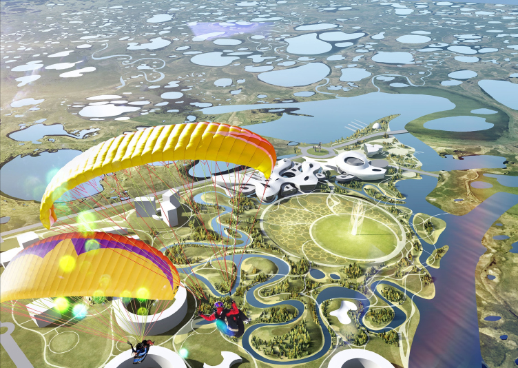
- The name of the prize speaks for itself. The ability to create not just a quality product around you but bring in something new, the courage to make an author's stand and the courage to experiment is one of the key criteria of evaluation and appreciation of somebody's mastery. Without this, architecture is doomed to stagnate. It was interesting to us to submit our works to our colleagues' judgment and see just how they would evaluate them from these particular standpoints. This year, apart from Grand Prix, we also got the golden diploma in "town planning" nomination for our contest project in the city of Yakutsk and the silver diploma for the interiors of Yandex HQ. Because in our work we consider the architectural experiment to be one of the main criteria, getting this "Archnovation" prize was particularly great for us. 

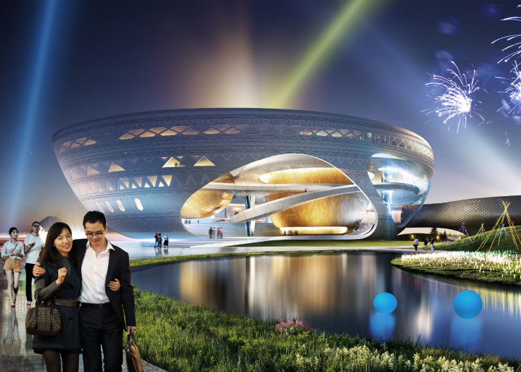
The project of the complex "Olonkho Land" in Yakutia © "Atrium"


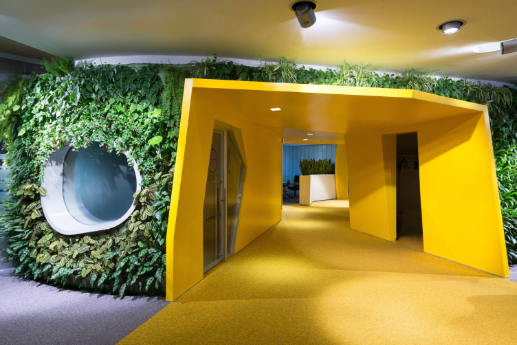
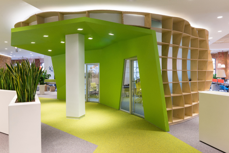
Yandex HQ on Leo Tolstoy Street (second stage). Finish in the form of a living plant wall © "Atrium" Architectural Bureau


- Your Barkli Park is indeed unconventional. How did this project develop? 

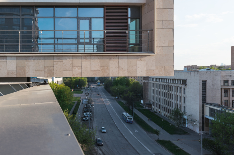
- This project did meet with a few difficulties along the way, and it actually took up five years of our time. At first an office center was designed but later on the customer switched over to the residential function. This land site has special requirements on the ratio of the green territories versus the construction blueprint, and our concept actually started with the desire to come up with something that would meet these requirements. In this project, we used a lot of custom-designed solutions, for example, there are green halls and conservatories on the floors, as well as a lot of usable terraces - public and private. As for the main special feature of this building, it is about the fact that the building houses a center of sports technologies in it. The necessity of funding room for a jogging track about eighty meters long and a 25-meter swimming pool made us use design solutions that are unconventional for residential buildings - with spans of about 20 meters and 6-meter long cantilevers. As a result, the residential block of glass and Jurassic stone literally overhangs above the brick volume of the sports center. This allowed for the customer to get the necessary number of apartments and keep the number of floors of the southern building at a minimum at the same time. At the stage of developing the working documents, the customer decided to make the class of the house more upmarket by increasing the floor height, using more expensive facade materials and inviting to design the sample apartments and lobbies Philip Starck. At this project, we performed the functions of the master designer and we were the architects as well. We designed everything - from the general concept to the working documents of the interiors and the landscape. This was not an easy but still a very productive and exciting process of working with our customers, contractors, and builders.

Nevertheless, the correct viewpoint from the park entrance restores the building in its "green" reputation. Barkli Park at the Sovietskoy Armii Street © "Atrium"


A view of the cantilever of the southern building from the gym roof, from north to south. Barkli Park at the Sovietskoy Armii Street © "Atrium"


- You've been watching "Archnovation" for years now. What do you think must be changed, added or improved? Me, for example, I am dubious about its "corporate exclusiveness": architects judge architects. 

- I have already said that I like the professional focus of this prize where architects judge architects - everything you need and nothing you don't. This is vastly different from other contests and prizes where oftentimes numerical values come into play or the winners are defined by the sum total of their previous victories and sometimes even by public voting! Such approaches can also exist of course, they give you the idea of the industry's public opinion - but against this background "Archnovation" really stands out for its unique specifics. The quality of an architectural experiment can only be judged by professionals.

In spite of its regional status, this contest has long since acquired a regional importance. I wish it to become more and more popular and gather projects of better and better quality. This prize must become the driver of architectural innovation and it must promote the development of education and architectural technologies and experiments in Russia. In this respect, there is room for development, to say the least. What we must do is take Russian architecture to the world-class level - which will require hard work from many people. The fact if there being such a prize is a powerful incentive for moving in that direction. 

- Judging by the information on your website, "Atrium" actively participates in other contests as well? What does this activity give you? 

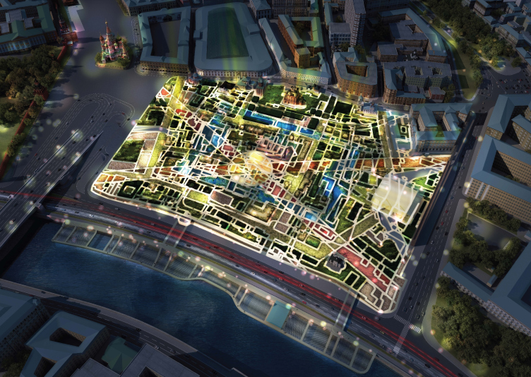
- An incentive for developing. Our company is 21 years old already, it has a staff of about sixty people, and we are a serious market player. One thing that we cannot afford, though, is being passive. Besides, today, participating in contests indirectly helps you to get more commissions. For example, even though we didn't win the contest for Zaryadye Park and the Yakutsk contest, we still developed a lot of new ideas in our portfolio and the interest of the potential customers. This is a way to see yourself from aside; this gives you an experience of working with international teams, and a reason fro experiment that we love so much - because the organizers by default want to get an unconventional product.

Top view by night. "Zaryadye" Park. Project © Consortium MVRDV. Photo courtesy by "Atrium"


The project of the complex "Olonkho Land" in Yakutia © "Atrium"


- With such a workload, as yours, how do you find the time to be in the loop of the latest trends in architecture? How does the new information influence your work?

- We still remember the nineties when any brochure/catalog was literally worth its weight in gold. Me and Vera, we would visit every industry trade show in Milan, Paris, Munich, and Venice to get those precious catalogues and brochures. Now that the information hunger has been satisfied, there is the reverse problem: you need to be very discreet. But we still keep on visiting international fairs, subscribe to magazines, actively use the Internet and do a lot of traveling over the landmark objects of the world architecture. When we develop our concepts we always do a research on how a similar task was handled before us. This helps us lean on the world expertise and come up with a strategy of our own, try to make yet another step forward. As for books, we only buy the fundamental books now or ones that are really hot in the industry at the moment. Learning is a continuous process. 

- The next "Archnovation" will be held in two years. Do you have enough ideas in your portfolio for the upcoming creative contests? 

- I think we do. Currently, a few projects are in the construction stage, this year a few projects are entering the active design phase, and there are new interesting concepts still in the making. 

- Which works by the winners of Archnovation impressed you most? 

- One of the Grand Prix's, Russian pavilion at Shanghai expo done by our friends, Totement Paper. We were in Shanghai, we saw this building, and it was one of the best pavilions at the show, looking particularly striking with the night backlight. A self-sufficient, meaningful, and, I would say, philosophical work of architecture. I would also mention the art school building designed by "Studio 44" in Kazakhstan: interesting space arrangement. In my opinion, Archnovation gathers very decent projects. 

- And what do you think is the situation with architectural innovation in this country? 

- Around the world, a lot of money, time, and efforts are invested, educational and research organizations are at work, new design and construction technologies are developed. Parametric architecture, 3D printers, automated production, new materials, and so on… And we will have a hard time trying to compete in this particular area. But not always architectural innovation has to do with technologies. Predominantly, it is still about the unique artistic vision, and in this sense Russia still has a huge potential. The architectural experiment as the evaluation criterion must be more actively supported both at the level of contest practice and architectural education, by popularizing the profession - and then the technologies will follow suit. Only experimenting and search for identity for each of our architectural projects will let us give individuality to our every commercial product. 
Yandex HQ on Leo Tolstoy Street (second stage). © "Atrium" Architectural Bureau


03 September 2015

Headlines now
The Golden Crown
The concept for a dental clinic in Yekaterinburg, developed by CNTR Studio, revolves around the idea of a “mouth full of gold”: pristine white porcelain stoneware walls are complemented by matte brass details. To avoid an overly literal interpretation, the architects focused on the building’s proportions, skillfully navigating between sunlight requirements and fire safety regulations.
Flexibility and Integration
Not long ago, we covered the project for the fourth phase of the ÁLIA residential complex, designed by APEX. Now, we’ve been shown different fence concepts they developed to enclose the complex’s private courtyards, incorporating a variety of public functions. We believe that the sheer fact that the complex’s architects were involved in such a detail as fencing speaks volumes.
A Step Forward
The HIDE residential complex represents a major milestone for ADM architects and their leaders Andrey Romanov and Ekaterina Kuznetsova in their quest for a fresh high-rise aesthetic – one that is flexible and layered, capable of bringing vibrancy to mass and silhouette while shaping form. Over recent years, this approach has become ADM’s “signature style”, with the golden HIDE tower playing a pivotal role in its evolution. Here, we delve into the project’s story, explore the details of the complex’s design, and uncover its core essence.
Gold in the Sands
A new office for a transcontinental company specializing in resource extraction and processing has opened in Dubai. Designed by T+T Architects, masters of creating spaces that are contemporary, diverse, flexible, and original, this project exemplifies their expertise. On the executive floor, a massive brass-clad partition dominates, while layered textures of compressed earth create a contextually resonant backdrop.
Layers and Levels of Flight
This project goes way back – Reserve Union won this architectural competition at the end of 2011, and the building was completed in 2018, so it’s practically “archival”. However, despite being relatively unknown, the building can hardly be considered “dated” and remains a prime example of architectural expression, particularly in the headquarters genre. And it’s especially fitting for an aviation company office. In some ways, it resembles the Aeroflot headquarters at Sheremetyevo but with its own unique identity, following the signature style of Vladimir Plotkin. In this article, we take an in-depth look at the United Aircraft Corporation (UAC) headquarters in the Moscow agglomeration town of Zhukovsky, supplemented by recent photographs from Alexey Naroditsky – a shoot that became only recently possible due to the fact that improvements were finally made in the surrounding area.
Light and Shadow
In this article, we delve into the architectural design of the “Chaika” house by DNK ag architects, which was recently completed in 2023 as part of the collection of signature designs at ZILArt. As is well-known, all the buildings in this complex follow a design code, yet each one is distinct. This particular building stands out not only for its whiteness and minimalism but also for the refined use of a limited number of techniques that, together, create what can confidently be called synergy.
Casus Novae
A master plan was developed for a large residential area with a name of “DNS City”, but now that its implementation began, the plan has been arbitrarily reformatted and replaced with something that, while similar on the surface, is actually quite different. This is not the first time such a thing happens, but it’s always frustrating. With permission from the author, we are sharing Maria Elkina’s post.
Treasure Hunting
The GAFA bureau, in collaboration with Tegola and Arkhitail, organized an expedition to the island of Kilpola in Karelia as part of Moskomarkhitektura’s “Open City” festival. There, amidst moss and rocks, the students sought answers to questions like: what is the sacred, where does it dwell, and what sustains it? Assisting the participants in this quest were landscape engineer Evgeny Levin, artist Nicholas Roerich, a moose, and the lack of cellular connection. Here’s how the story unfolded.
Depths of the Earth, Streams of Water
In the Malaya Okhta district, the Akzent building, designed by Stepan Liphart, was constructed. It follows a classic tripartite structure, yet it’s what you might call “hand-drawn”: each façade is unique in its form and details, some of which aren’t immediately noticeable. In this article, we explore the context and, together with the architect, delve into how the form was developed.
Fir Tree Dynamics
The “Airports of Region” holding is planning to build an airport in Karachay-Cherkessia, aiming to make the Arkhyz and Dombay resorts more accessible to travelers. The project that won in an invitation-only competition, submitted by Sergey Nikeshkin’s KPLN, blends natural imagery inspired by the shape of a conifer seed, open-air waiting spaces, majestic large trees, and a green roof elevated on needle-like columns. The result is both nature-inspired and WOW.
​A Brick Shell
In the process of designing a clubhouse situated among pine trees in a prestigious suburban area near Moscow, the architectural firm “A.Len” did the façade design part. The combination of different types of brick and masonry correlates with the volumetric and plastique solutions, further enhanced by the inclusion of wood-painted fragments and metal “glazing”.
Word Forms
ATRIUM architects love ambitious challenges, and for the firm’s thirtieth anniversary, they boldly play a game of words with an exhibition that dives deep into a self-created vocabulary. They immerse their projects – especially art installations – into this glossary, as if plunging into a current of their own. You feel as if you’re flowing through the veins of pure art, immersed in a universe of vertical cities, educational spaces – of which the architects are true masters – and the cultural codes of various locations. But what truly captivates is the bold statement that Vera Butko and Anton Nadtochy make, both through their work and this exhibition: architecture, above all, is art – the art of working with form and space.
Flexibility and Acuteness of Modernity
Luxurious, fluid, large “kokoshniks” and spiral barrel columns, as if made from colorful chewing gum: there seem to be no other mansion like this in Moscow, designed in the “Neo-Russian-Modern” style. And the “Teremok” on Malaya Kaluzhskaya, previously somewhat obscure, has “come alive with new colors” and gained visibility after its restoration for the office of the “architectural ecosystem” as the architects love to call themselves. It’s evident that Julius Borisov and the architects at UNK put their hearts into finding this new office and bringing it up to date. Let’s delve into the paradoxes of this mansion’s history and its plasticity. Spoiler: two versions of modernity meet here, both balancing on the razor’s edge of “what’s current”.
Yuri Vissarionov: “A modular house does not belong to the land”
It belongs to space, or to the air... It turns out that 3D printing is more effective when combined with a modular approach: the house is built in a workshop and then adapted to the site, including on uneven terrain. Yuri Vissarionov shares his latest experience in designing tourist complexes, both in central Russia and in the south. These include houseboats, homes printed from lightweight concrete using a 3D printer, and, of course, frame houses.
​Moscow’s First
“The quality of education largely depends on the quality of the educational environment”. This principle of the last decade has been realized by Sergey Skuratov in the project for the First Moscow Gymnasium on Rostovskaya Embankment in the Khamovniki district. The building seamlessly integrates into the complex urban landscape, responding both to the pedestrian flow of the city and the quiet alleyways. It skillfully takes advantage of the height differences and aligns with modern trends in educational space design. Let’s take a closer look.
Looking at the Water
The site of Villa Sonata stretches from the road to the water’s edge, offering its own shoreline, pier, and a picturesque river panorama. To reveal these sweeping views, Roman Leonidov “cut” the façade diagonally parallel to the river, thus getting two main axes for the house and, consequently, “two heads”. The internal core – two double-height spaces, a living room and a conservatory, with a “bridge” above them – makes the house both “transparent” and filled with light.
The White Wing
Well, it’s not exactly white. It’s more of a beige, white-stone structure that plays with the color of limestone – smoother surfaces are lighter, while rougher ones are darker. This wing unites various elements: it absorbs and interprets the surrounding themes. It responds to everything, yet maintains a cohesive expression – a challenging task! – while also incorporating recognizable features of its own, such as the dynamic cuts at the bottom, top, and middle.
Urban Dunes
The XSA Ramps team designed and built a three-part sports hub for a park in Rostov-on-Don, welcoming people of all ages and fitness levels. The skate plaza, pump track, and playground are all meticulously crafted with details that attract a diverse range of visitors. The technical execution of the shapes and slopes transforms this space into a kind of sculptural composition.
Proportional Growth
The project for the fourth phase of the ÁLIA residential area has been announced. The buildings are situated on an elongated plot – almost a “ray” that shoots out from the center of the area towards the river. Their layout reflects both a response to Moscow’s architectural preferences over the past 15 years, shifting “from blocks to towers”, and an interpretation of the neighboring business park designed by SOM. Additionally, the best apartments here are not located at the very top but closer to the middle, forming a glowing “waistline”.
The “Staircase” Building
In designing the “Details” residential complex in New Moscow, Rais Baishev spiced up the now-popular Moscow theme of a “courtyard” building with an idea drawn from the surrealist drawings by Maurits Escher. He envisioned the stepped silhouettes and descending slopes as a metaphysical mega-staircase, creating a key void within the courtyard that gave the project an internal “spine”. This concept is felt both in the building’s silhouette and on its façades.
Projection of the Quarter
No one doubted that the building that Vladimir Plotkin designed as part of the “Garden Quarters” would be the most modernist of all. And it turned out just that way: while adhering to the common design code, the building successfully combines brick and white stone, rhythmically responding to the neighboring building designed by Ostozhenka, yet tactfully and persistently making a few statements of its own. This includes the projection of the ideal urban development composition “14–9–6”, which can be found right next door, mathematical calculations, including those for various types of terraces (and perhaps the only reminder of the Soviet past of the Kauchuk rubber factory!), and the white “cross-stitch” pattern of the façade grid.
Domus Aurea
In this issue, we examine the “Tessinsky-1” house, designed by Sergey Skuratov and completed in 2023. Located in the middle of the Serebryanicheskaya Embankment district, at the intersection of its main streets, this house assumes a sort of “nodal” role: it not only responds to everything around it and preserves many memories of the former EMA factory within itself, but it weaves all this into a newly directed pattern, reconciling bright “gold” and dark-colored brick, largely with the help of the new, modern-yet-archaic Columba brick, which, come to think about it, is the most precious element here.
The Chimney of Nikola-Lenivets
In this issue, we are examining the “Obelisk House” designed by KATARSIS and built for the Arkhstoyanie 2023 festival. However, it was only finished later on, and this is why we are examining it now. It seems to us that after the “Obelisk House” appeared in Nikola-Lenivets, a dialogue and a few inner connections appeared between the temporary structures built here. These houses no longer look like “accidental neighbors”, more of which below.
​Periscope by the Bay
The jury awarded the second place in the competition for a public and cultural center in Petropavlovsk-Kamchatsky to the companies GORA (“Mountain”) and M4. In the consortium’s proposal, the building resembles a sperm whale with a calf swimming next to it or a periscope, whose lenses capture the most spectacular views from the surrounding landscape.
From Arcs to Dolmens
While working on the competition project for Petropavlovsk-Kamchatsky, ASADOV Architects prioritized the value of the natural and urban environment, aiming to preserve the balance of the location while minimizing the resemblance of the volume that they designed to a “traditional building”. The task was challenging, and the architects created three versions, one of which having been developed after the competition, where their main proposal took third place. However, the point of interest here is not the competition result but the continuity of creative thinking.
Hide and Seek
The ID Moskovskiy house, designed by Stepan Liphart in St. Petersburg, in the courtyards near Moskovskiy Avenue beyond the Obvodny Canal and recently completed, is notable for several reasons. Firstly, it has been realized with considerable accuracy, which is particularly significant as this is the first building where the architect was responsible not only for the facades but also for the layouts, allowing for better integration between the two. On the other hand, this building is interesting as an example of the “germination” of new architecture in the city: it draws on the best examples from the neighborhood and becomes an improved and developed sum of ideas found by the architect in the surrounding context.
The Big Twelve
Yesterday, the winners of the Moscow Mayor’s Architecture Award were announced and honored. Let’s take a look at what was awarded and, in some cases, even critique this esteemed award. After all, there is always room for improvement, right?
Above the Golden Horn
The residential complex “Philosophy” designed by T+T architects in Vladivostok, is one of the new projects in the “Golubinaya Pad” area, changing its development philosophy (pun intended) from single houses to a comprehensive approach. The buildings are organized along public streets, varying in height and format, with one house even executed in gallery typology, featuring a cantilever leaning on an art object.
Nuanced Alternative
How can you rhyme a square and space? Easily! But to do so, you need to rhyme everything you can possibly think of: weave everything together, like in a tensegrity structure, and find your own optics too. The new exhibition at GES-2 does just that, offering its visitor a new perspective on the history of art spanning 150 years, infused with the hope for endless multiplicity of worlds and art histories. Read on to see how this is achieved and how the exhibition design by Evgeny Ace contributes to it.
Blinds for Ice
An ice arena has been constructed in Domodedovo based on a project by Yuri Vissarionov Architects. To prevent the long façade, a technical requirement for winter sports facilities, from appearing monotonous, the architects proposed the use of suspended structures with multidirectional slats. This design protects the ice from direct sunlight while giving the wall texture and detail.