По-русски

Ecological Tetris

The construction of three residential districts in “Technopark” District D2 in Skolkovo innovation center is coming to an end. One of them – the tenth one – is being constructed according to the draft of UNK project that won an open tender in 2012.

25 August 2015
Object
mainImg

Three years ago the draft of UNK project became one of ten winners of the open tender for residential housing of District D2 in “Technopark” in the innovation center “Skolkovo”. Today the buildings are almost done. The assignment given to the architects contained two it would seem mutually exclusive directives: on the one hand, they had to use the selected lot most efficiently and provide for high construction density; on the other – use large glazed areas, and in general – reach maximal permeability of the inner space. An unexpected approach to spatial arrangement helped to achieve sufficient privacy and – at the same time – save the integrity of the whole residential micro district. It nominally entitled “the Tetris Principle”. The computer game that appeared in mid 80s was incredibly popular then and became a kind of symbol of scientific and technological progress of the country. Curiously, today it helps to create media for new ideas and developments – even though very relatively. It is even more interesting, that the collegues of UNK project working on neighboring 9th and 11th sites – “BRT RUS” bureau and Agence d`Architecture A. Bechu – also remembered this nearly forgotten game in their designs. All the three districts are special, but conceptually and ideologically close.  

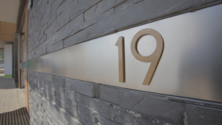
"Skolkovo. Technopark" Innovation Center. Residential area №10 © UNK project
     

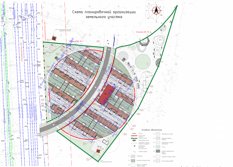
The micro district 10 is intended for construction of townhouses for in total 204 people. The center of the round lot divided by a street in two unequal parts is the place where the whole infrastructure is concentrated: a shop, a security station, public transport stop and a public center with a playground. In the felicitous words of the Chief Architect and founder of UNK project Yuliy Borisov: they have “managed to use the land twice”. The artificial drop of the relief allowed clear division public and private functions. The drive aisles are located on the ground level, and green terraces screened from view are situated on the upper one. Such arrangement of the micro district is the safest one and simultaneously allows a high level of interaction inside small groups of the neighboring ten houses. “Usually, residents of townhouses only know their neighbors on the right and left. Such place is extremely boring to live in. There can be no talk of a stimulating environment and exchange of ideas. For us it was really important to build up an actual alliance of creative, thinking people” – says Yuliy Borisov.    

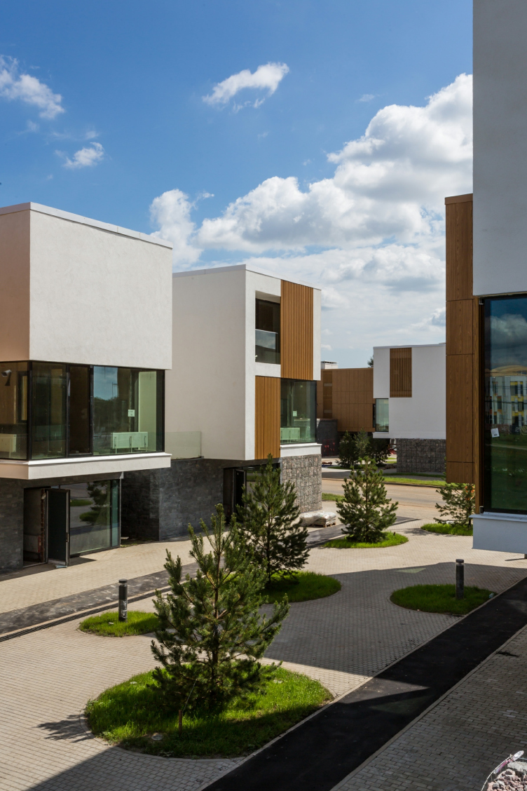
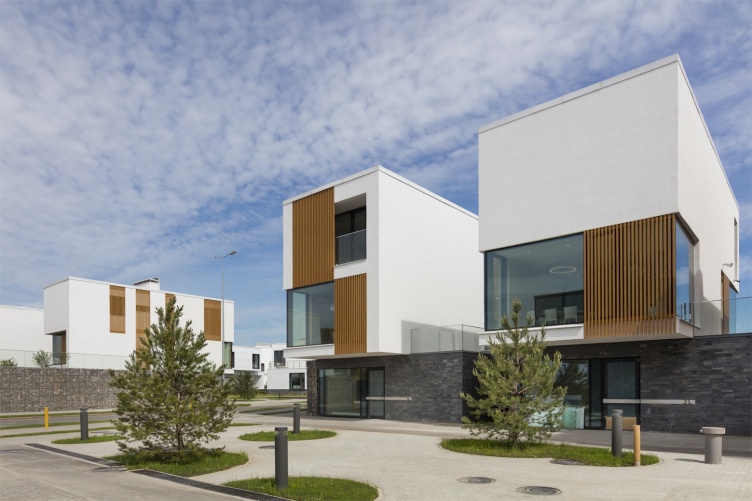
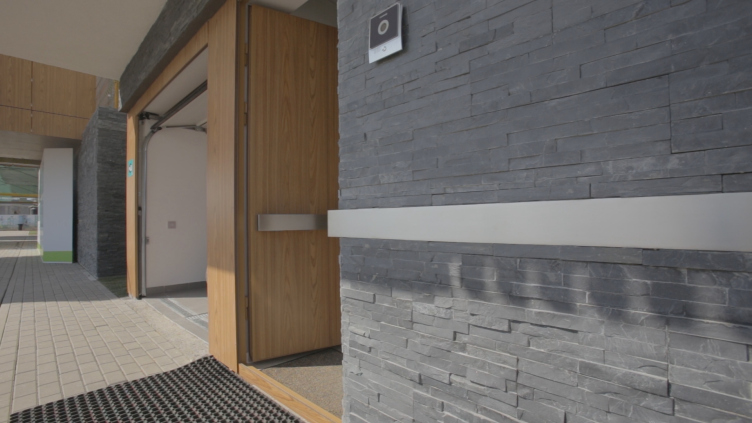
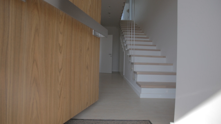
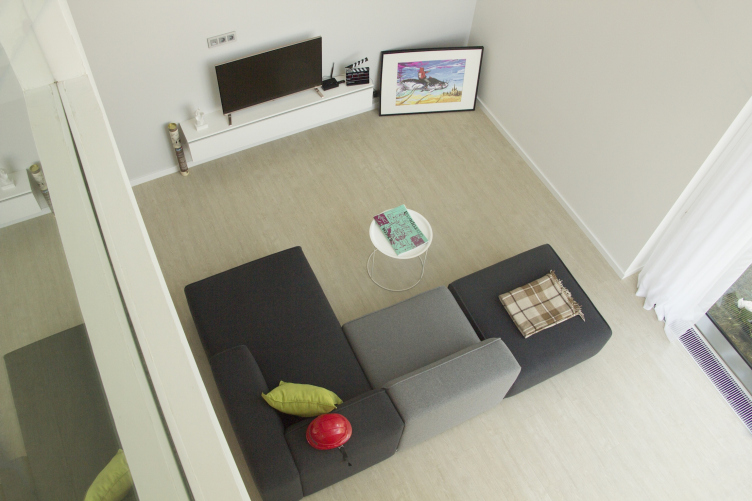
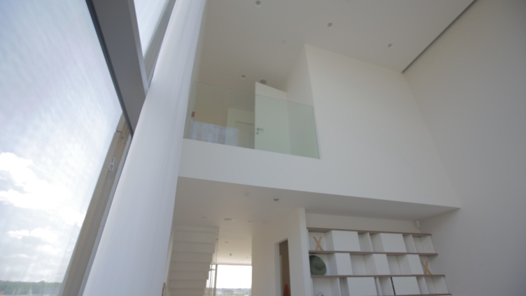
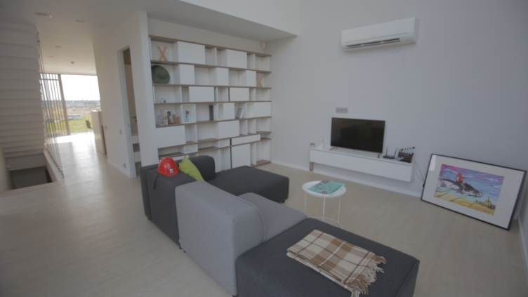
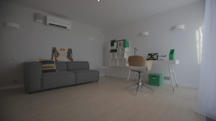
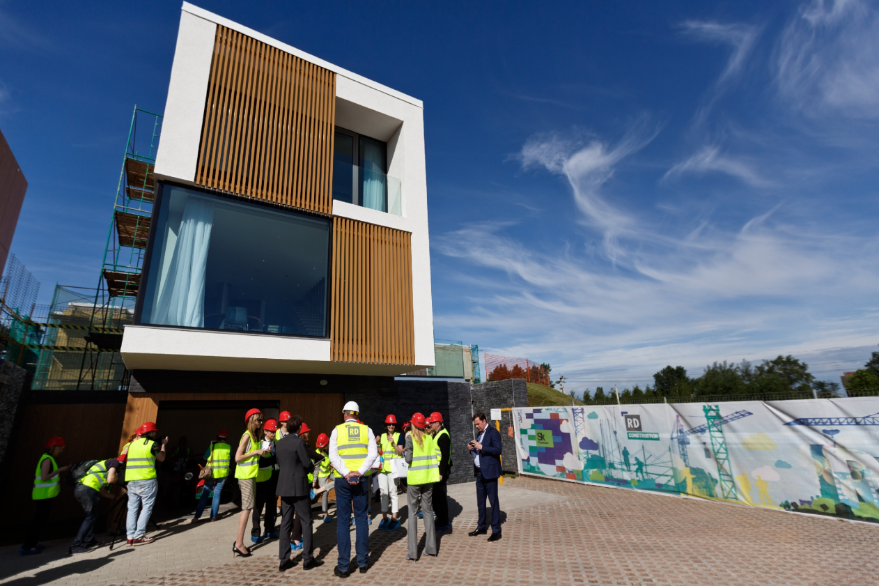
Simple and clear cubic volumes of the buildings do remind neatly placed “Tetris blocks” of different shapes. Four types of planning have been developed within the layout of houses: for family couples, for parents with one or two children and for co-residence with elderly parents. The total area of each such unit varies from 2045 ft2 to 2346 ft2. Every ground floor is allocated for a parking lot and a study, and the main living quarters take up the overhanging first and second floors. At that, the two less dense plan types have obtained a double-height central area. And finally, every house has its own open terrace of 376-419ft2. This is the planning system that allowed to make floor-to-ceiling glazing 20 feet long and avoid the unpleasant “window to window” effect. And still in some places the glass is protected by metal grate masked in form a tree. They do not hinder the image inside the residential zone and serve as additional screening from view. Besides, the grates help to regulate the sunlight and protect the rooms from overheating and also, from the authors’ perspective, make the place more psychologically comfortable.      

"Skolkovo. Technopark" Innovation Center. Residential area №10 © UNK project


"Skolkovo. Technopark" Innovation Center. Residential area №10. Master plan © UNK project


"Skolkovo. Technopark" Innovation Center. Residential area №10 © UNK project

 
The authors have chosen simple, reliable, eco-friendly and mainly recyclable materials: concrete, plaster, glass, metal, stone, ecological laminate panels imitating the texture of wood. The architects have renounced the idea of using natural wood counting on durability, simplicity and economy. At that, they have developed a single logic of material application: the bottom parts are coated either with slate (residential rooms) or granite gabions (bearing structures) – heavy and emphasizing closeness to earth through materials. The next level can be called “man-made” and it is defined by panels imitating wood and plastered surfaces of concrete walls. And the panoramic windows reflecting the clouds symbolize the top “sky level”. But the proportions of colors and textures of the facades is constantly changing providing for stylistic unity of the settlement on the one hand, and on the other – lending the necessary variety to the project. “We have managed to create quite expressive and emotional architecture that looks “expensive”. At the same time, we are using standard construction technologies and working with simple and comprehensive cubical forms. Thanks to this, the construction is rather low priced and quick” – says Yuliy Borisov.       

"Skolkovo. Technopark" Innovation Center. Residential area №10 © UNK project


"Skolkovo. Technopark" Innovation Center. Residential area №10 © UNK project


Strange as it may seem, the term “typical” is very suitable for many solutions applied in the whole innovation center Skolkovo and the 10th micro district in particular. The architects had to unify the environment that they created, and on all levels: starting from city-planning solutions up to the interiors of different townhouses. The lack of unique, individualized solutions together with the use of BIM planning technology (it was a pilot draft of UNK project made in this technology) was exactly what helped to remain within a rather modest budget and cut back the length of construction without compromising on quality. But “unified” by no means equals “commonplace” or “average”.    

Such environment could never become a real “home” for people thinking outside the box. As a matter of fact, the irregularity of the task consisted in successful search of the thin line between “typological” and “individual”. Indeed, all the micro districts under construction possess their own distinctive architectural pattern, but they are very close ideologically. Then the facades of different volume and finishing solutions appear inside of the micro district forming a single creative atmosphere. The planning of the cottages is also typical on the one hand, and fulfills the individual requirements of the lodgers on the other.       

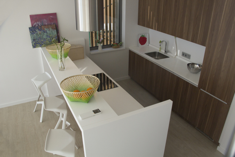
As for the interior design, the architects of UNK project have even developed a special brand book for the whole innovation center Skolkovo, thus giving the future lodgers the right to easily adjust the interior to themselves by, for example, changing the decorative finish of the walls. “In a way it reminds setting an interface of your PC: there is one operational system, but you can choose you own desktop image, set a screensaver or change the color scheme” – says Yuliy Borisov describing the idea.  

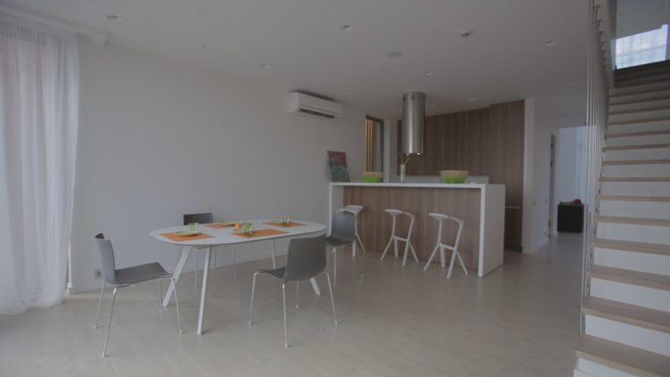
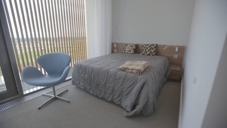
"Skolkovo. Technopark" Innovation Center. Residential area №10 © UNK project


"Skolkovo. Technopark" Innovation Center. Residential area №10 © UNK project


"Skolkovo. Technopark" Innovation Center. Residential area №10 © UNK project


It is obvious that the principles of sustainable “green” construction must become the foundation of all the components of the large project of the innovation center. It is possibly the first time that they have been applied so fully and in such variety of ways. After the construction is completed the micro district will aspire to a prestige ecological certificate LEED. First of all, all the soil taken from the place of groundwork and communication lines was reused for creating artificial relief. Secondly, all the buildings are very energy-efficient: loss of heat has been minimized, for example, the glass is covered with a special protecting spray; LEDs, motion sensors and a lighting control system are actively made use of and there are also water saving bathroom fitments. Rain water and the so-called “grey water” is collected, treated and reused. The authors provide for large green areas, including drained green parking lots. And finally, every house is provided with an opportunity of installing solar panels.            

For now the architects consider this technology not as efficient in the Russian context, but they are hoping that within the next five years the situation will change and then one would only have to install the panels and connect to the integrated system.

The main contractor of the three simultaneous district constructions (9, 10, 11) is RD Construction company. “Skolkovo” makes “green” construction fashionable in Russia. And for our company that specializes in complex, highly technological construction it is a significant and for sure principal project for today – notices Oleg Zhukov, the general director of RD Construction. – I would like to underline the fact that LEED standard imposes high requirements not only to the materials, but to the quality of work and the qualification of the employees. Today 60 of our top-qualified engineers are working in “Skolkovo”, and the total number of RD Construction employees engaged in the project exceeds 1000”.      

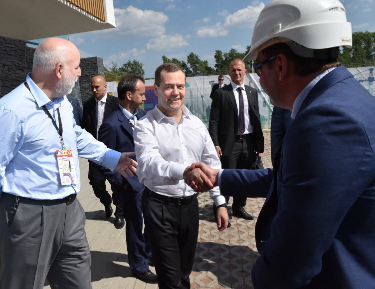
The construction on site 10 is planned to be finished in the last quarter of 2015. For now RD Construction has in only 21 day built and decorated a demonstration townhouse. Its inauguration was visited by the Prime Minister of Russia – Dmitriy Medvedev.  

“The work on this project gave us an absolutely unique opportunity to look several decades ahead with the help of architectural instruments and comprehend the very meaning of the “future architecture” – says Yuliy Borisov. “I am sure that the notorious innovativeness is really not the highly modern technologies – although you cannot do without them – and not the fanciful futuristic forms. It is rejection of the old stereotypes of planning. People’s lifestyle is changing and we must find a suitable environment, express these changes in spatial and plastic solutions. It was exciting to try to create a city for people that are much more advanced than we are. I really hope that we managed to do it.”
"Skolkovo. Technopark" Innovation Center. Residential area №10 © UNK project

25 August 2015

Headlines now
Scheduled Evolution
ASADOV Architects unveiled the EvyCenter pavilion, a microcultural hub for fostering personal growth, organizing workshops, and doing gymnastics. Additionally, this pavilion serves as a prototype for a scalable country house, drawing inspiration from the “Loskutok” project, and constructed from CLT panels in a factory. This marks the beginning of a developer project initiated by the architectural firm (sic!), which is seeking partners to expand both small Evy settlements and even larger Evy cities, which are, according to Andrey Asadov, aimed at fostering the “evolutionary” development of the people who will inhabit them.
The Golden Crown
The concept for a dental clinic in Yekaterinburg, developed by CNTR Studio, revolves around the idea of a “mouth full of gold”: pristine white porcelain stoneware walls are complemented by matte brass details. To avoid an overly literal interpretation, the architects focused on the building’s proportions, skillfully navigating between sunlight requirements and fire safety regulations.
Flexibility and Integration
Not long ago, we covered the project for the fourth phase of the ÁLIA residential complex, designed by APEX. Now, we’ve been shown different fence concepts they developed to enclose the complex’s private courtyards, incorporating a variety of public functions. We believe that the sheer fact that the complex’s architects were involved in such a detail as fencing speaks volumes.
A Step Forward
The HIDE residential complex represents a major milestone for ADM architects and their leaders Andrey Romanov and Ekaterina Kuznetsova in their quest for a fresh high-rise aesthetic – one that is flexible and layered, capable of bringing vibrancy to mass and silhouette while shaping form. Over recent years, this approach has become ADM’s “signature style”, with the golden HIDE tower playing a pivotal role in its evolution. Here, we delve into the project’s story, explore the details of the complex’s design, and uncover its core essence.
Gold in the Sands
A new office for a transcontinental company specializing in resource extraction and processing has opened in Dubai. Designed by T+T Architects, masters of creating spaces that are contemporary, diverse, flexible, and original, this project exemplifies their expertise. On the executive floor, a massive brass-clad partition dominates, while layered textures of compressed earth create a contextually resonant backdrop.
Layers and Levels of Flight
This project goes way back – Reserve Union won this architectural competition at the end of 2011, and the building was completed in 2018, so it’s practically “archival”. However, despite being relatively unknown, the building can hardly be considered “dated” and remains a prime example of architectural expression, particularly in the headquarters genre. And it’s especially fitting for an aviation company office. In some ways, it resembles the Aeroflot headquarters at Sheremetyevo but with its own unique identity, following the signature style of Vladimir Plotkin. In this article, we take an in-depth look at the United Aircraft Corporation (UAC) headquarters in the Moscow agglomeration town of Zhukovsky, supplemented by recent photographs from Alexey Naroditsky – a shoot that became only recently possible due to the fact that improvements were finally made in the surrounding area.
Light and Shadow
In this article, we delve into the architectural design of the “Chaika” house by DNK ag architects, which was recently completed in 2023 as part of the collection of signature designs at ZILArt. As is well-known, all the buildings in this complex follow a design code, yet each one is distinct. This particular building stands out not only for its whiteness and minimalism but also for the refined use of a limited number of techniques that, together, create what can confidently be called synergy.
Casus Novae
A master plan was developed for a large residential area with a name of “DNS City”, but now that its implementation began, the plan has been arbitrarily reformatted and replaced with something that, while similar on the surface, is actually quite different. This is not the first time such a thing happens, but it’s always frustrating. With permission from the author, we are sharing Maria Elkina’s post.
Treasure Hunting
The GAFA bureau, in collaboration with Tegola and Arkhitail, organized an expedition to the island of Kilpola in Karelia as part of Moskomarkhitektura’s “Open City” festival. There, amidst moss and rocks, the students sought answers to questions like: what is the sacred, where does it dwell, and what sustains it? Assisting the participants in this quest were landscape engineer Evgeny Levin, artist Nicholas Roerich, a moose, and the lack of cellular connection. Here’s how the story unfolded.
Depths of the Earth, Streams of Water
In the Malaya Okhta district, the Akzent building, designed by Stepan Liphart, was constructed. It follows a classic tripartite structure, yet it’s what you might call “hand-drawn”: each façade is unique in its form and details, some of which aren’t immediately noticeable. In this article, we explore the context and, together with the architect, delve into how the form was developed.
Fir Tree Dynamics
The “Airports of Region” holding is planning to build an airport in Karachay-Cherkessia, aiming to make the Arkhyz and Dombay resorts more accessible to travelers. The project that won in an invitation-only competition, submitted by Sergey Nikeshkin’s KPLN, blends natural imagery inspired by the shape of a conifer seed, open-air waiting spaces, majestic large trees, and a green roof elevated on needle-like columns. The result is both nature-inspired and WOW.
​A Brick Shell
In the process of designing a clubhouse situated among pine trees in a prestigious suburban area near Moscow, the architectural firm “A.Len” did the façade design part. The combination of different types of brick and masonry correlates with the volumetric and plastique solutions, further enhanced by the inclusion of wood-painted fragments and metal “glazing”.
Word Forms
ATRIUM architects love ambitious challenges, and for the firm’s thirtieth anniversary, they boldly play a game of words with an exhibition that dives deep into a self-created vocabulary. They immerse their projects – especially art installations – into this glossary, as if plunging into a current of their own. You feel as if you’re flowing through the veins of pure art, immersed in a universe of vertical cities, educational spaces – of which the architects are true masters – and the cultural codes of various locations. But what truly captivates is the bold statement that Vera Butko and Anton Nadtochy make, both through their work and this exhibition: architecture, above all, is art – the art of working with form and space.
Flexibility and Acuteness of Modernity
Luxurious, fluid, large “kokoshniks” and spiral barrel columns, as if made from colorful chewing gum: there seem to be no other mansion like this in Moscow, designed in the “Neo-Russian-Modern” style. And the “Teremok” on Malaya Kaluzhskaya, previously somewhat obscure, has “come alive with new colors” and gained visibility after its restoration for the office of the “architectural ecosystem” as the architects love to call themselves. It’s evident that Julius Borisov and the architects at UNK put their hearts into finding this new office and bringing it up to date. Let’s delve into the paradoxes of this mansion’s history and its plasticity. Spoiler: two versions of modernity meet here, both balancing on the razor’s edge of “what’s current”.
Yuri Vissarionov: “A modular house does not belong to the land”
It belongs to space, or to the air... It turns out that 3D printing is more effective when combined with a modular approach: the house is built in a workshop and then adapted to the site, including on uneven terrain. Yuri Vissarionov shares his latest experience in designing tourist complexes, both in central Russia and in the south. These include houseboats, homes printed from lightweight concrete using a 3D printer, and, of course, frame houses.
​Moscow’s First
“The quality of education largely depends on the quality of the educational environment”. This principle of the last decade has been realized by Sergey Skuratov in the project for the First Moscow Gymnasium on Rostovskaya Embankment in the Khamovniki district. The building seamlessly integrates into the complex urban landscape, responding both to the pedestrian flow of the city and the quiet alleyways. It skillfully takes advantage of the height differences and aligns with modern trends in educational space design. Let’s take a closer look.
Looking at the Water
The site of Villa Sonata stretches from the road to the water’s edge, offering its own shoreline, pier, and a picturesque river panorama. To reveal these sweeping views, Roman Leonidov “cut” the façade diagonally parallel to the river, thus getting two main axes for the house and, consequently, “two heads”. The internal core – two double-height spaces, a living room and a conservatory, with a “bridge” above them – makes the house both “transparent” and filled with light.
The White Wing
Well, it’s not exactly white. It’s more of a beige, white-stone structure that plays with the color of limestone – smoother surfaces are lighter, while rougher ones are darker. This wing unites various elements: it absorbs and interprets the surrounding themes. It responds to everything, yet maintains a cohesive expression – a challenging task! – while also incorporating recognizable features of its own, such as the dynamic cuts at the bottom, top, and middle.
Urban Dunes
The XSA Ramps team designed and built a three-part sports hub for a park in Rostov-on-Don, welcoming people of all ages and fitness levels. The skate plaza, pump track, and playground are all meticulously crafted with details that attract a diverse range of visitors. The technical execution of the shapes and slopes transforms this space into a kind of sculptural composition.
Proportional Growth
The project for the fourth phase of the ÁLIA residential area has been announced. The buildings are situated on an elongated plot – almost a “ray” that shoots out from the center of the area towards the river. Their layout reflects both a response to Moscow’s architectural preferences over the past 15 years, shifting “from blocks to towers”, and an interpretation of the neighboring business park designed by SOM. Additionally, the best apartments here are not located at the very top but closer to the middle, forming a glowing “waistline”.
The “Staircase” Building
In designing the “Details” residential complex in New Moscow, Rais Baishev spiced up the now-popular Moscow theme of a “courtyard” building with an idea drawn from the surrealist drawings by Maurits Escher. He envisioned the stepped silhouettes and descending slopes as a metaphysical mega-staircase, creating a key void within the courtyard that gave the project an internal “spine”. This concept is felt both in the building’s silhouette and on its façades.
Projection of the Quarter
No one doubted that the building that Vladimir Plotkin designed as part of the “Garden Quarters” would be the most modernist of all. And it turned out just that way: while adhering to the common design code, the building successfully combines brick and white stone, rhythmically responding to the neighboring building designed by Ostozhenka, yet tactfully and persistently making a few statements of its own. This includes the projection of the ideal urban development composition “14–9–6”, which can be found right next door, mathematical calculations, including those for various types of terraces (and perhaps the only reminder of the Soviet past of the Kauchuk rubber factory!), and the white “cross-stitch” pattern of the façade grid.
Domus Aurea
In this issue, we examine the “Tessinsky-1” house, designed by Sergey Skuratov and completed in 2023. Located in the middle of the Serebryanicheskaya Embankment district, at the intersection of its main streets, this house assumes a sort of “nodal” role: it not only responds to everything around it and preserves many memories of the former EMA factory within itself, but it weaves all this into a newly directed pattern, reconciling bright “gold” and dark-colored brick, largely with the help of the new, modern-yet-archaic Columba brick, which, come to think about it, is the most precious element here.
The Chimney of Nikola-Lenivets
In this issue, we are examining the “Obelisk House” designed by KATARSIS and built for the Arkhstoyanie 2023 festival. However, it was only finished later on, and this is why we are examining it now. It seems to us that after the “Obelisk House” appeared in Nikola-Lenivets, a dialogue and a few inner connections appeared between the temporary structures built here. These houses no longer look like “accidental neighbors”, more of which below.
​Periscope by the Bay
The jury awarded the second place in the competition for a public and cultural center in Petropavlovsk-Kamchatsky to the companies GORA (“Mountain”) and M4. In the consortium’s proposal, the building resembles a sperm whale with a calf swimming next to it or a periscope, whose lenses capture the most spectacular views from the surrounding landscape.
From Arcs to Dolmens
While working on the competition project for Petropavlovsk-Kamchatsky, ASADOV Architects prioritized the value of the natural and urban environment, aiming to preserve the balance of the location while minimizing the resemblance of the volume that they designed to a “traditional building”. The task was challenging, and the architects created three versions, one of which having been developed after the competition, where their main proposal took third place. However, the point of interest here is not the competition result but the continuity of creative thinking.
Hide and Seek
The ID Moskovskiy house, designed by Stepan Liphart in St. Petersburg, in the courtyards near Moskovskiy Avenue beyond the Obvodny Canal and recently completed, is notable for several reasons. Firstly, it has been realized with considerable accuracy, which is particularly significant as this is the first building where the architect was responsible not only for the facades but also for the layouts, allowing for better integration between the two. On the other hand, this building is interesting as an example of the “germination” of new architecture in the city: it draws on the best examples from the neighborhood and becomes an improved and developed sum of ideas found by the architect in the surrounding context.
The Big Twelve
Yesterday, the winners of the Moscow Mayor’s Architecture Award were announced and honored. Let’s take a look at what was awarded and, in some cases, even critique this esteemed award. After all, there is always room for improvement, right?
Above the Golden Horn
The residential complex “Philosophy” designed by T+T architects in Vladivostok, is one of the new projects in the “Golubinaya Pad” area, changing its development philosophy (pun intended) from single houses to a comprehensive approach. The buildings are organized along public streets, varying in height and format, with one house even executed in gallery typology, featuring a cantilever leaning on an art object.
Nuanced Alternative
How can you rhyme a square and space? Easily! But to do so, you need to rhyme everything you can possibly think of: weave everything together, like in a tensegrity structure, and find your own optics too. The new exhibition at GES-2 does just that, offering its visitor a new perspective on the history of art spanning 150 years, infused with the hope for endless multiplicity of worlds and art histories. Read on to see how this is achieved and how the exhibition design by Evgeny Ace contributes to it.