По-русски

Town Planning Responsibility

Exclusively for Archi.ru, Sergey Tchoban made a guided tour of his new projects built in Berlin.

20 November 2015
Object
mainImg
Our first stop is the area of East Haven or "Osthafen" as it is called in Germany's capital. This former dock area, unlike its Westhafen brother, never had a closed water area but was in fact a giant moor that stretched for a kilometer and a half down the river along which warehouses and grain depots still stand. It was these particular buildings that the city decided to breathe a new life into back in the 2000's by initiating here a creation of cultural and media cluster that got a self-explanatory name of Media-Spree. A contest for the best master plan was organized - and nps tchoban voss won it in 2003.

"Our proposal was, first of all, about keeping the scale of the houses that were there before us - Sergey Tchoban explains - Specifically, the size and other parameters of the blocks newly built on this embankment are in exact correspondence with the neighboring historical buildings, while the spaces between these buildings allow the people that live on the "second line" to see the river". After the master plan got the approval, nps tchoban voss got several construction sites on the territory of Osthafen to build upon. 

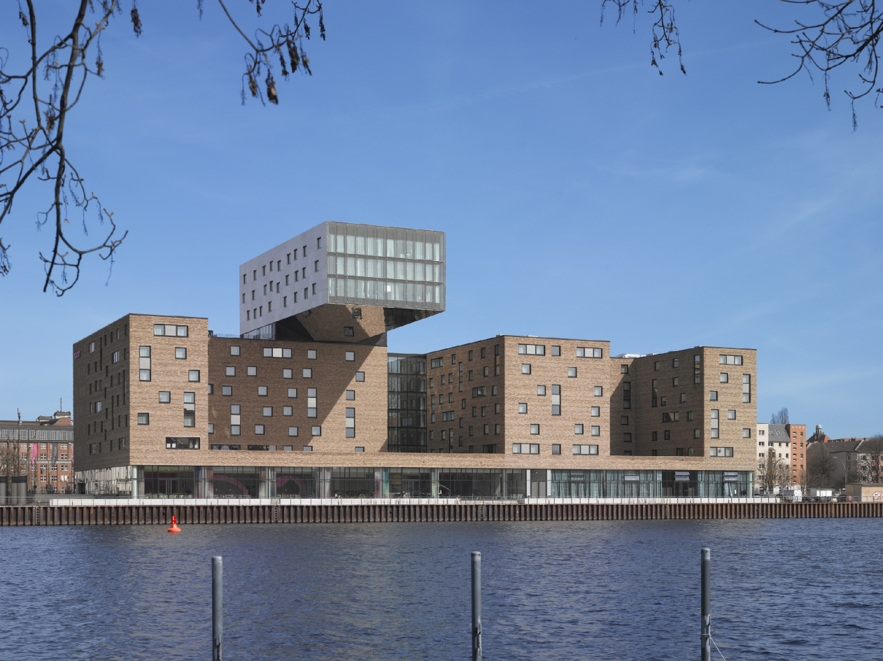
The bureau's first project here was NHow Hotel. Launched into operation in 2011, it collected a host of professional awards and won a reputation of one of the most famous modern buildings in this part of Berlin. The complex consists in fact of two seven-story buildings turned to the river, with plans looking like "L" and double "L", and connected by a transparent overpass. The common basement floor is also fully glazed, while higher up the buildings are coated with Flemish brick, the architects using bricks of varying thickness which gives extra texture to the facades. The dynamic composition of this volume is also supported by the square windows that are placed over the facades in an ostentatiously asymmetric way. The main "icon" of the hotel, however, is the buildup protruding cool 21 meters beyond its base. Coated with metal, this cantilever, according to the architect's idea, is meant to bear a resemblance to a ship building crane, paying homage to the "port" origin of the building. What is remarkable is the fact that it's side facades are clad into opaque steel with that recognizable dull shine that is so characteristic of the heavy machinery, while the "land" is met by a polished mirror surface that reflects the roof of the stylobate and the buildings as well, and thus makes the whole structure look as if it hovers above the main volume - a technique that many of us saw in the Russian pavilion at "EXPO-2015" in Milan.

nhow Hotel © nps tchoban voss


zooming
nhow Hotel © nps tchoban voss


nhow Hotel. Photo © Roland Halbe


nhow Hotel. Photo © Roland Halbe


nhow Hotel. Photo © Roland Halbe


nhow Hotel. Photo © Roland Halbe


nhow Hotel. Photo © Roland Halbe
 

Four years later, on the neighboring site, nps tchoban voss built an office building that later on became the HQ of Coca-Cola Company. Yes, this IS the rare occasion when it was not a project that was designed specifically for such a large company but it was the company that chose the building that turned out to be exactly in the company's spirit. "Just as in the case with the hotel, the design code here was about working with the terra-cotta tones that are pretty much a standard for the entire territory of the former port but this time around, instead of using the bricks, we decided to "retell" their story in a contemporary way" - Sergey Tchoban explains. For the facade decoration, the architect used rectangular panels of five different shades of red, from faded pink to dark crimson, some of the panels glossy, some opaque - which gave the surface a look both bright and textured. Such "pixelated" facades are turned to the streets and the side driveways, while the river is commanded by panoramic windows. And, because this is the south side, on top of the glass the architects placed stationary blinds of the same shades of red: the slender horizontal lamellae make the color literally stream alongside the facade, the effect being manifold enhanced by the slightly concave form of the sun-shielding elements. Terminally simple in its shape, this building, specifically thanks to its memorable "clothes", turned into a recognizable color accent of the renewed Osthafen. And it, indeed, matches the corporate colors of Coca-Cola so perfectly that all the company had left to do was place its bright red logo above the main entrance. 

Coca-Cola HQ © nps tchoban voss


Coca-Cola HQ. Photo © Claus Graubner


Coca-Cola HQ. Photo © Claus Graubner


Coca-Cola HQ. Photo © Claus Graubner


Coca-Cola HQ. Photo © Claus Graubner


Coca-Cola HQ © nps tchoban voss


And, finally, still a little further down the embankment, nps tchoban voss is building a residential complex named "White Cube". As one can figure out from the name of the project, in this particular case, the architects stepped away from the color code that they had once proposed. "By using a different color, we wanted, first of all, to highlight the residential function - new for Osthafen" - Sergey Tchoban says. This "new" color is dazzling white - to make it "sound", one does not need a textured surface, and in this case the architects only work with form alone, giving to it more active and willful plastics than its neighbors have. On the plan, this residential complex has a trapeze shape all corners of which are slightly rounded. Just as rounded will be the balconies, the project having three types of them: on the side that faces the river, the apartments will get imposing open-air terraces; on the opposite side - meaning, facing the street - there are cute little corner balconies; and, as for the side facades, they are adorned by the triangular "captain's bridges" that stand out just as much as to give the people an opportunity to catch a glimpse of the water area. On each of the floors, there are three such balconies, and, lined up, thanks to their elongated and at the same time rounded shape they remind a foamy crest of the wave - entering into an active dialogue not only with the surrounding buildings but with the Spree as well. 

White Cube residential complex. Location plan © nps tchoban voss


White Cube residential complex © nps tchoban voss


White Cube residential complex © nps tchoban voss


White Cube residential complex © nps tchoban voss


White Cube residential complex © nps tchoban voss
***

Hotel next to the Central Station 

Our next stop is Berlin Central Station. In its immediate vicinity, there is a construction site where Sergey's Berlin office is finishing the construction of a large hotel complex that will be run by two operators at once - the more "budget" Ibis and the more "deluxe" Amano. "This land site has behind it a very long professional discussion that went on in the city: the scale of the station itself, its style, just as the architecture of the government buildings on the opposite bank of the Spree, seemingly, were the prerequisites for the appearance of quite different, just as conspicuous, objects. However, in actuality, on the land sites that surround Hauptbahnhof, nothing was happening - shares the architect - Finally, Berlin's chief architect Regula Luesche announced several construction contests at once for the land sites, one of which was to bear a hotel". Nps tchoban voss won this contest by proposing a solution that was both stylish and graceful. 

Amano and Ibis hotels next to Berlin Central Station. Photograph © Martin Tervoort


Amano and Ibis hotels next to Berlin Central Station. Photograph © Martin Tervoort


Amano and Ibis hotels next to Berlin Central Station. Photograph © Martin Tervoort


The complex that will exist in the body of a giant construction of glass and steel was initially designed as a project that would be, on the one hand, terminally material, and, on the other hand, ostentatiously environmental. Its facade is made of bricks whose color palette varies within a range of gray, greenish, and ochre tones, thanks to which from a distance the brickwork looks like maybe like a roughly curried hide. The textured look is enhanced by the stone blinds that the authors invented: the architects accentuate every window aperture with the help of special vertical inserts approximately the size of the window itself. Interesting is the fact that on one of the sides there are two such inserts, one of them sunken in, the other, conversely, standing out - which creates for the glass a seemingly simple but still a multidimensional framework. And, thanks to the fact that the architects are constantly changing the arrangement of the double inserts, the windows are moving over the facade, picking up and developing on the macro-level the theme of light and dark bricks alternating in the brickwork.

Amano and Ibis hotels next to Berlin Central Station. Photograph © Martin Tervoort


Amano and Ibis hotels next to Berlin Central Station. Photograph © Martin Tervoort


The place where the two hotels come together is shown by the broken line of the roof and the joint of light-colored concrete. What is interesting is the fact that this detail was originally there in the project submitted for the contest but the customer decided not to implement it. And the company made a rash step investing its own money in order to implement the building the way it was originally designed and approved. "This, if you want to put it this way, is what our responsibility before this city is all about - we must implement the project the way the city chose and approved it. Besides, when you work with architecture that has few details about it, the level of execution of each of these few details must be paid utmost attention, otherwise you're running a great risk of falling into facelessness and creating a surface that simply has nothing on it to catch the eye" - says Sergey Tchoban, deeply convinced that it is the ability to make high-quality environmental buildings that defines the professionalism and, ultimately, the success of the modern architect. 

Amano and Ibis hotels next to Berlin Central Station. Photograph © Martin Tervoort


Amano and Ibis hotels next to Berlin Central Station. Photograph © Martin Tervoort


Amano and Ibis hotels next to Berlin Central Station. Photograph © Martin Tervoort


White tower on the Spree River 

Making a round of the city, we get back to East Haven - only approach it from a different direction this time. The buildings that we have already examined are soon left behind, and the perspective of Muelenstrasse is completed by the famous Berlin TV tower with a sphere above the spear. In the area of just as famous East Side Gallery, this view is flanked by two high-rises - Mercedes HQ and the residential complex "Living Levels" the construction of which has just been completed. It is this complex that is our last stop for today. 

Residential building "Living Levels" – East Side Tower © nps tchoban voss


Residential building "Living Levels" – East Side Tower. Photo © Roland Halbe


The 14-story tower stand on the Spree's bank, only separated from the water by a landscaped embankment. Advantageous in all respects, this land site was once part of a large-scale master plan on the development of the embankment in the proximity of the Berlin Wall, this plan providing for the construction of several high-rises. Later on, the city reconsidered the height regulations and lowered the maximum allowed height but by that moment one centerpiece was already approved, and Berlin has not known a single case when the already issued construction permits would be revoked. But then again, the appearance of a high-rise with a dramatic silhouette in this place did not cause anybody any doubts - after the tower of "Mercedes" automotive giant was built here by Gewers & Pudewill, the panorama of this area was literally asking for another vertical to offset it. In a sense, the color of the second high-rise was also predetermined: the "automobile" tower was executed from black glass, and adding yet another black centerpiece would mean blacking out the area's whole color palette. The perfect solution was found in metallic panels painted white - the snow-white gloss not only makes the building look neat but also quite unambiguously points to the highest class of the housing offered here.

Residential building "Living Levels" – East Side Tower. Photo © Roland Halbe


Residential building "Living Levels" – East Side Tower. Photo © Roland Halbe


Residential building "Living Levels" – East Side Tower. Photo © Roland Halbe


And, indeed, the housing in Living Levels meets the highest standards and makes the most out of its location: each apartment here is oriented to at least two cardinal points. Actually, it was the architects' desire to provide the people with as many as possible interesting views from their windows that to a large extent defined the architectural and engineering solution of the high-rise. All the apartments are situated along the outside perimeter of the residential floor and are glazed as much as possible but that's not all - each apartment is "pulled out" from the main volume, getting, at the expense of the cantilevers, extra viewing perspectives. The cantilevers (out of structural reasons and in order to avoid visually fracturing the facade too much, the architects joined the apartments into two-story blocks) appear on all the three facades that have a visual contact with the water area, and these multiple "little shifts" form, in fact, the tectonics of the building. It looks like a firewood stack whose rhythmic order is enhanced with the help of the horizontals of the intermediate floors and the blind vertical inserts that visually separate the blocks from one another. What is remarkable is the fact that the corner on the side of Muelenstrasse is fully coated with metal but the key "shifting" theme is to be read here as well: the narrow verticals of the staircase block are also positioned on the facade with a slight shift in respect to one another, while the cantilevers are perfectly readable "in profile" thus giving the snow-white tower an elegantly exquisite but at the same time dynamic silhouette. 
Residential building "Living Levels" – East Side Tower. Photo © Roland Halbe
zooming
Residential building "Living Levels" – East Side Tower © nps tchoban voss


20 November 2015

Headlines now
“Strangers” in the City
We asked Alexander Skokan for a comment on the results of 2025 – and he sent us a whole article, moreover one devoted to the discussion we recently began on the “appropriateness of high-rises” – or, more broadly speaking, “contrasting insertions into the urban fabric”. The result is a text that is essentially a question: why here? Why like this?
Dmitry Ostroumov: “To use the language of alchemy, we are involved in the process of “transmutation...
What we ended up having was an extremely unusual conversation with Dmitry Ostroumov. Why? At the very least, because he is not just an architect specializing in the construction of Orthodox churches. And not just – which is an extreme rarity – a proponent of developing contemporary stylistics within this still highly conservative field. Dmitry Ostroumov is a Master of Theology. So in addition to the history and specifics of the company, we speak about the very concept of the temple, about canon and tradition, about the living and the eternal, and even about the Russian Logos.
A Glazed Figurine
In searching for an image for a residential building near the Novodevichy Convent, GAFA architects turned to their own perception of the place: it evoked associations with antiquity, plein-air painting, and vintage artifacts. The two towers will be entirely clad in volumetric glazed ceramic – at present, there are no other buildings like this in Russia. The complex will also stand out thanks to its metabolic bay-window cells, streamlined surfaces, a ceremonial “hotel-style” driveway, and a lobby overlooking a lush garden.
A Knight’s Move via the Cour d’Honneur
Intercolumnium Architects presented to the City Planning Council a residential complex project that is set to replace the Aquatoria business center on Vyborgskaya Embankment. Experts praised the overall quality of the work, but expressed reservations about the three cour d’honneurs and suggested softening the contrast between the facades facing the embankment and the Kantemirovsky Bridge.
A Small Country
Mezonproekt is developing a long-term master plan for the MEPhI campus in Obninsk. Over the next ten years, an enclave territory of about 100 hectares, located in a forest on the northern edge of the city, is set to transform into a modern center for the development of the nuclear energy sector. The plan envisions attracting international students and specialists, as well as comprehensive territorial development: both through the contemporary realization of “frozen” plans from the 1980s and through the introduction of new trends – public spaces, an aquapark, a food court, a school, and even a nuclear medicine center. Public and sports facilities are intended to be accessible to city residents as well, and the campus is to be physically and functionally connected to Obninsk.
Pearl Divers
GAFA has designed an apartment complex for Derbent intended to switch people from a work mode to a resort mindset – and to give the surrounding area a much-needed jolt. The building offers two distinct faces: restrained and laconic on the city side, and a lushly ornate façade facing the sea. At the heart of the complex, a hidden pearl lies – an open-air pool with an arch, offering views of a starry sky, and providing direct access to the beach.
A Satellite Island
The Genplan Institute of Moscow has prepared a master plan for the development of the Sarpinsky and Golodny island system, located within the administrative boundaries of Volgograd and considered among the largest river islands in Russia. By 2045, the plan envisions the implementation of 15 large-scale investment projects, including sports and educational clusters, a congress center with a “Volgonarium”, a film production cluster, and twenty-one theme parks. We explain which engineering, environmental, and transportation challenges must be addressed to turn this vision into reality. The master plan solutions have already been approved and incorporated into the city’s general development plan.
The Amber Gate
The Amber City residential complex is one of the redevelopment projects in the former industrial area located beyond Moscow’s Third Ring Road near Begovaya metro station. Alexey Ilyin’s studio proposed an original master plan that transformed two clusters of towers into ceremonial propylaea, gave the complex a recognizable silhouette, and established visual connections with new high-rise developments on both right and left – thus integrating it into the scale of the growing metropolis. It is also marked by its own futuristic stylistic language, based on a reinterpreted streamline aesthetic.
A Theater Triangle
The architectural company “Chetvertoe Izmerenie” (“Fourth Dimension”) has developed the design for a new stage of the Magnitogorsk Musical Theater, rethinking not only theater architecture but also the role of the theater in the contemporary city.
Aleksei Ilyin: “I approach every task with genuine interest”
Aleksei Ilyin has been working on major urban projects for more than 30 years. He has all the necessary skills for high-rise construction in Moscow – yet he believes it’s essential to maintain variety in the typologies and scales represented in his portfolio. He is passionate about drawing – but only from life, and also in the process of working on a project. We talk about the structure and optimal size of an office, about his past and current projects, large and small tasks, and about creative priorities.
​A Golden Sunbeam
A compact brick-and-metal building in the growing Shukhov Park in Vyksa seems to absorb sunlight, transform it into yellow accents inside, and in the evening “give it back” as a warm golden glow streaming from its windows. It is, frankly, a very attractive building: both material and lightweight at the same time, with lightness inside and materiality outside. Its form is shaped by function – laconic, yet far from simple. Let’s take a closer look.
Architecton Awards
In 2025, the jury of the Architecton festival reviewed the finalist projects through live, open presentations held right in the exhibition hall – a rather engaging performance, and something rarely seen among Russian awards. It would be great if “Zodchestvo” adopted this format. Below, we present all the winning projects, including four special nominations.
Garden of Knowledge
UNK architects and UNK design created the interiors of the Letovo Junior campus, working together with NF Studio, which was responsible for developing the educational technology that takes into account the needs and perception of younger and middle school children.
The Silver Skates
The STONE Kaluzhskaya office quarter is accompanied by two residential towers, making the complex – for it is indeed a single ensemble – well balanced in functional terms. The architects at Kleinewelt gave the residential buildings a silvery finish to match the office blocks. How they are similar, how they differ, and what “Silver Skates” has to do with it – we explore in this article.
On the Dynastic Trail
The houses and townhouses of the “Tsarskaya Tropа” (“Czar’s Trail”) complex are being built in the village of Gaspra in Crimea – to the west and east of the palaces of the former grand-ducal residence “Ai-Todor”. One of the main challenges for the architects at KPLN, who developed the project, was to respond appropriately to this significant neighboring heritage. How this influenced the massing, the façades, and the way the authors work with the terrain is explored in our article.
A New Path
The main feature of the Yar Park project, designed by Sergey Skuratov for Kazan, is that it is organized along the “spine” of a multifunctional mall with an impressive multi-height atrium space in its middle. The entire site, both on the city side and the Kazanka River embankment, is open to the public. The complex is intended not to become “yet another fenced enclave” but, as urban planners say, a “polycenter” – a new point of attraction for the whole of Kazan, especially its northern part, made up of residential districts that until now have lacked such a vibrant public space. It represents a new urban planning approach to a high-density mixed-use development situated in the city center – in a sense, an “anti-quarter”. Even Moscow, one might say, doesn’t yet have anything quite like it. Well, lucky Kazan!
Beneath the Azure Sky
A depository designed by Studio 44 will soon be built in Kenozersky National Park to preserve and display the so-called “heavens” – ceiling structures characteristic of wooden churches in the Russian North, painted with biblical scenes. For each of these “heavens”, the architects created a volume corresponding in scale and dimensions to the original church interior. The result is a honeycomb-like composition, with modules derived directly from the historic monuments themselves, allowing visitors to view the icons from the historically accurate angle – from below, looking upward. How exactly this works is the subject of our story.
​The Power of Lines
The building at the very beginning of New Arbat is the result of long deliberations over how to replace the former House of Communication. Contemporary, dynamic, and even somewhat zoomorphic in character, it is structured around a large diagonal grid. The building has become a striking accent both in the perspective of the former Kalinin Avenue and in the panorama of Arbat Square. Yet, unfortunately, the original concept was not fully realized. In 2020, the Moscow ArchCouncil approved a design featuring an exoskeleton – an external load-bearing structure, which eventually turned into a purely decorative element. Still, the power of the supergraphic “holds” the building, giving it the qualities of a new urban landmark with iconic potential. How this concept took shape, what unexpected associations might underlie the grid’s form, and why the exoskeleton was never built – all this is explored in our article.
Resort on the Kama River
Wowhaus has developed a project for the reconstruction of Korabelnaya Roshcha (“Mast Grove”), a wellness resort located on the banks of the Kama River.
Nests in Primorye
The eco-park project “Nests”, designed by Aleksey Polishchuk and the company Power Technologies, received first prize at the Eco-Coast 2025 festival, organized by the Union of Architects of Russia. For a glamping site in Filinskaya Bay, the authors proposed bird-shaped houses, treehouses, and a nest-shaped observation platform, topping it all with an entrance pavilion executed in the shape of an owl.
The Angle of String Tension
The House of Music, designed by Vladimir Plotkin and the architects of TPO Reserve, resembles a harp, and when seen from above, even a bass clef. But if only it were that simple! The architecture of the complex fuses two distinct expressive languages: the lattice-like, transparent, permeable vocabulary of “classical” modernism and the sculptural, ribbon-like volumes so beloved by today’s neo-modernism. How it all works – where the catharsis lies, which compositional axes underpin the design, where the project resembles Zaryadye Concert Hall and where it does not – read in the article below.
How Historic Tobolsk Becomes a Portal to the Future
Over the past decade, the architectural company Wowhaus has developed urban strategies for several Russian cities – Vyksa, Tula, and Nizhnekamsk, to name but a few. Against this backdrop, the Tobolsk master plan stands out both for its scale – the territory under transformation covers more than 220 square kilometers – and for its complexity.
St. Petersburg vs Rome
The center of St. Petersburg is, as we know, sacred – but few people can say with certainty where this “sacred place” actually begins and ends. It’s not about the formal boundaries, “from the Obvodny Canal to the Bolshaya Nevka”, but about the vibe that feels true to the city center. With the Nevskaya Ratusha complex – built to a design that won an international competition – Evgeny Gerasimov and Sergei Tchoban created an “image of the center” within its territory. And not so much the image of St. Petersburg itself, as that of a global metropolis. This is something new, something that hasn’t appeared in the city for a long time. In this article, we study the atmosphere, recall precedents, and even reflect on who and when first called St. Petersburg the “new Rome”. Clearly, the idea is alive for a reason.
On the Wave
The project of transforming the river port and embankment in the city of Cheboksary, developed by the ATRIUM Architects, involves one of the city’s key areas. The Volga embankment is to be turned into a riverside boulevard – a multifunctional, comfortable, and expressive space for work and leisure activities. The authors propose creating a new link with the city’s main Krasnaya (“Red”) Square, as well as erecting several residential towers inspired by the shape of the traditional national women’s headdress – these towers are likely to become striking accents on the Volga panorama.
Valery Kanyashin: “We Were Given a Free Hand”
The Headliner residential complex, the main part of which was recently completed just across from Moscow City, is a kind of neighbor to the MIBC that doesn’t “play along” with it. On the contrary, the new complex is entirely built on contrast: like a city of differently scaled buildings that seems to have emerged naturally over the past 20 years – which is a hugely popular trend nowadays! And yet here – perhaps only here – such a project has been realized to its full potential. Yes, high-rises dominate, but all these slender, delicate profiles, all these exciting perspectives! And most importantly – how everything is mixed and composed together... We spoke with the project’s leader Valery Kanyashin.
​The Keystone
Until quite recently, premium residential and office complexes in Moscow were seen as the exclusive privilege of the city center. Today the situation is changing: high-quality architecture is moving beyond the confines of the Third Ring Road and appearing on the outskirts. The STONE Kaluzhskaya business center is one such example. Projects like this help decentralize the megalopolis, making life and work prestigious in any part of the city.
Perpetuum Mobile
The interior of the headquarters of Natsproektstroy, created by the IND studio team, vividly and effectively reflects the client’s field of activity – it is one of Russia’s largest infrastructure companies, responsible for logistics and transport communications of every kind you can possibly think of.
Water and Light
Church art is full of symbolism, and part of it is truly canonical, while another part is shaped by tradition and is perceived by some as obligatory. Because of this kind of “false conservatism”, contemporary church architecture develops slowly compared to other genres, and rarely looks contemporary. Nevertheless, there are enthusiasts in this field out there: the cemetery church of Archangel Michael in Apatity, designed by Dmitry Ostroumov and Prokhram bureau, combines tradition and experiment. This is not an experiment for its own sake, however – rather, the considered work of a contemporary architect with the symbolism of space, volume, and, above all, light.