По-русски

Urban Reconstruction

The project of reconstructing Saint Petersburg’s Gostiny Dvor is meant to bring the plan and the outward appearance of the building back to the beginning of the XX century, while its yard is meant to get a subtle combination of the Versailles spirit and the ideals of modern urbanism that is all about comfortable living in a bustling megalopolis.

17 June 2015
Object
mainImg

The city of Saint Petersburg is planning to reconstruct Gostiny Dvor upon the project of Nikita Yavein's "Studio 44". Last year in December, the project was approved by Saint Petersburg's Committee on State Control, Use and Protection of Historical and Cultural Landmarks, and, as the industry media reports, by 88% of the customer company's board of directors. According to the project, "Gostinka" is going to turn, from a post-soviet shopping center, into a multifunctional complex with a highly developed public area, museums and restaurants of its own, an underground parking garage, and a one-hectare public park. Inside Gostiny Dvor, now already - also upon the project of "Studio 44" - the reconstruction of Unit B is being completed, the so-called "Brest Fortress", for Elena Obraztsova Music Academy; in the future it must become an integral part of the cultural space inside the shopping complex.

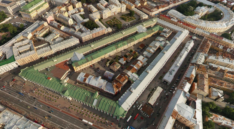
It must be recognized here that Saint Petersburg's Gostiny Dvor is indeed a landmark building: this is the city's first stone "guest house" of the European type that came to change the medieval shopping arcades, being different from them in its order and magnitude. After the appearance of Saint Petersburg's main Gostiny Dvor, the shopping arcades started to get rebuilt in many other areas of Saint Petersburg as well as in Moscow and in many other Russian cities, first of all, standing along the Volga River. In a word, the building that stands on the Nevsky Prospect is not just chronologically the first project that was started in the empire's capital in the classicism style at the will of Catherine the Great, and not only the creation of Jean-Baptiste Vallin de la Mothe who used parts of Rastrelli's original plan who, in turn, proceeded from Rinaldi's project, all of them being the world's top architects of those days, which speaks for itself as it is - Gostiny Dvor is just as much of a symbol of Saint Petersburg as the very Nevsky Prospect. Over the decades, the building was significantly rebuilt, though: being hit by a Nazi bomb during the war, it suffered from a fire, and, after it was restored in the sixties, upon the project of Oleg Lyalin, its inside structure was changed: the walls of the "shops", hitherto "see-throng", i.e. isolated from one another but opened both ways for entering and exiting, were now "punched through" and strung onto the inside enfilade - this was meant to turn the "bourgeois" shopping arcades into a decent "soviet" department store. The acute angle of the irregular for-square at the crossing of Nevsky Prospect and the Sadovaya Street got a subway exit. Then the yard started to get overbuilt with utility facilities, and there appeared the rough-looking passages between the units. 

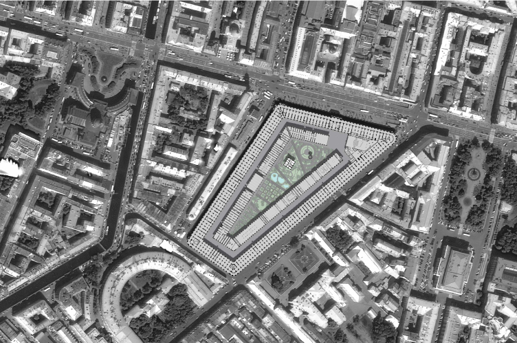
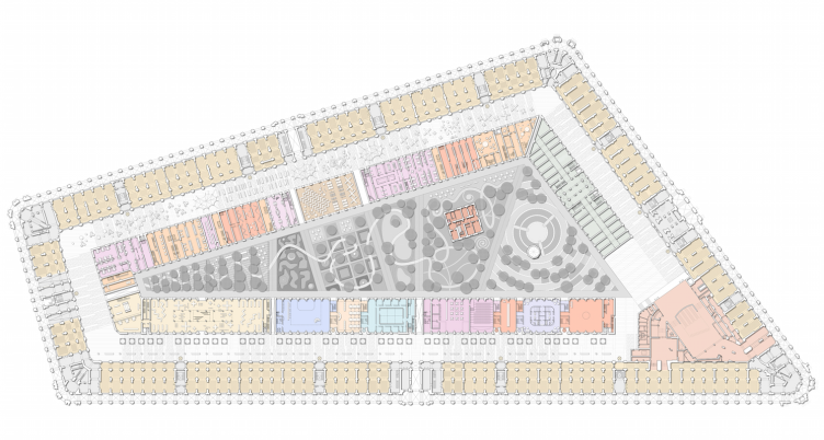
It must also be mentioned at this point that Saint Petersburg's Gostiny Dvor that neatly "belts up" its land site along the perimeter of some five-hectare area, has an inner contour of buildings inside of it, standing back some ten meters from the outer one: presently, the inner buildings are used as warehouses and most of the visitors do not even have a clue about their existence. The buildings of the inner circle, in turn, belt up the triangular courtyard - when designing, in the mid XVIII century, his version of shopping arcades looking a lot like the winter palace, Rastrelli conceived them as having a park and a pond in their yard - but the expensiveness of the "lush" project was opposed by the merchants themselves because they were actually the ones who financed the construction. The classicist project by Vallin de la Mothe turned out to be the more rational one; the yard even got the intended pond, but of a strictly fire-safety nature: in spite of the ban imposed on using the candles, there was always something on fire in Gostiny Dvor back in those days. The yard took on a purely utilitarian character: Gostiny Dvor always required more space for storing rather than selling, and even now but 17% of the entire area are used for actual shopping, the other 83% being used for the utility purposes. The project of "Studio 44", at the expense of streamlining the costs, will increase the shopping area by some 10-15%.

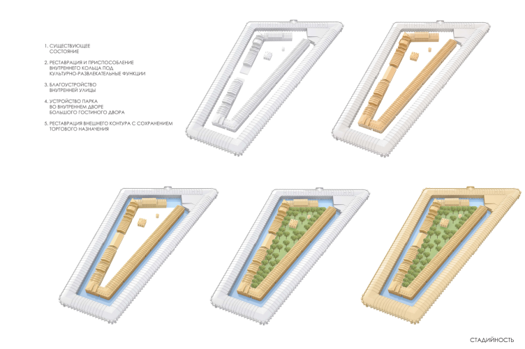
Thus, Nikita Yavein proposed, first of all, to clear the building from the layers of the soviet time, and bring it back to the state of approximately 1917, restoring, among other things, the fractions of Art Nouveau and the "order-less" classicism of the yard buildings. Further on - and this is one of the most important things about restoring Gostiny Dvor back to the "pre-revolution" status - the walls of the shops, earlier punctured by the enfilade of the department store, are also restored to their original configuration, while the building on the whole get back its "pre-revolution" structure. In some cases, however, some neighboring premises will be united because today's stores do require more space. The shop entrances will be opened up into the street as well as into the passage between the building's inner and outer contours.

The current state © Studio 44
Location Plan © Studio 44


The stages © Studio 44


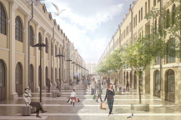
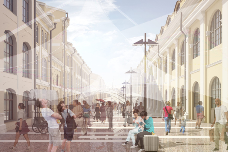
As this "inner" passage is concerned, the architects are planning to clear it completely from the later-on additions and turn it into a pedestrian city street easily accessible from any of the shops or from the subway - with efficient landscaping, paving, trees in tubs, benches, but still open-air, without the glass roof overhead. "What we are now doing is we are creating pedestrian streets in this city, making then car-free and getting still more problems with the city traffic because of this. Here, however, we've got at our disposal the part of the city that has never been open to the automotive traffic, and, by making it pedestrian-only, we do not intrude into the existing structure but only develop and enrich it" - Nikita Yavein comments.

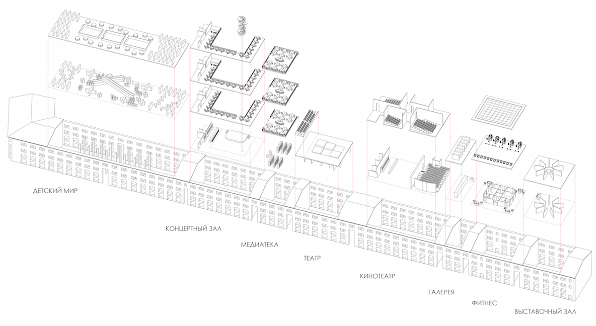
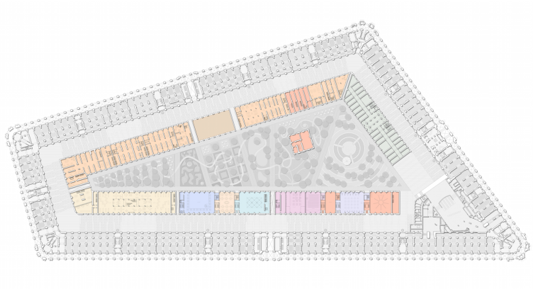
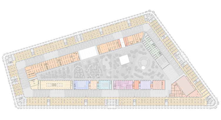
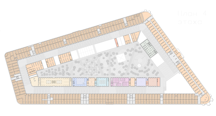
The result looks like a cross between a passage and a city street designed in the vein of historical and tourist centers of the European cities so much loved by the Russians due to the sheer absence of such scenery in this country. All the more so, because trading will take place on this street not from all sides: the buildings of the inner circle will be used for cultural purposes, they will house, among other things, the museum of Russian Merchants, art galleries, a fitness club, a concert hall, a theater, a movie theater, "Children's Paradise", and other cultural and entertainment establishments. The western part of the outer contour of Gostiny Dvor along the Perinnaya Street will be given to restaurants.

zooming
The new functions of the inside buildings © Studio 44


Gostiny Dvor. Inside streets, the Sadovaya Line © Studio 44


Gostiny Dvor. Inside streets, the Pevcheskaya Line © Studio 44


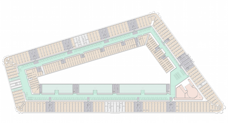
Under the inner pedestrian street, the architects placed one tier of the underground parking garage, while under the southwest line of the inside buildings - four tiers. Together, they will yield 700 car stalls, while the driving entrance is designed in the farther end, opposite to Nevsky Prospect, near the Lomonosovskaya Street.  

Plan of the first floor © Studio 44


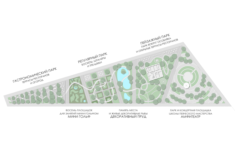
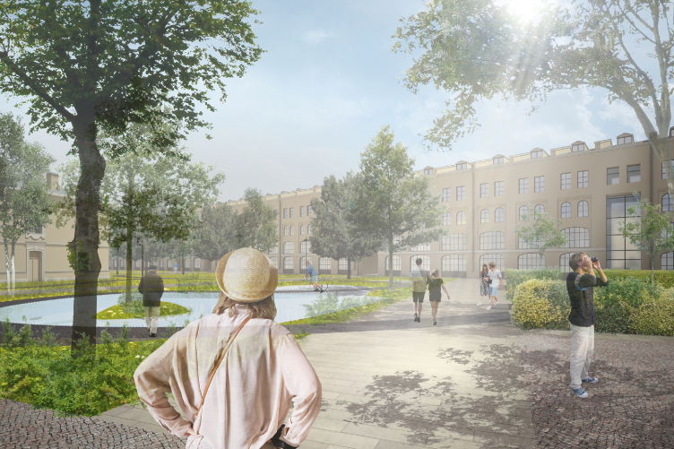
And, finally, the main theme of the "reformed" Gostiny Dvor, a climax of sorts, is the park with a pond that the architects, following Rastrelli's idea, actually make in the yard. The sharp triangle of the plan widens in the direction of Nevsky Prospect organizing the space in a perspective fashion, putting one in the mind of the enfilade in the Joint Staff building but in this case the resemblance is accidental because there are many such triangular plans in Saint Petersburg, conditioned by the sheer density of the buildings. 

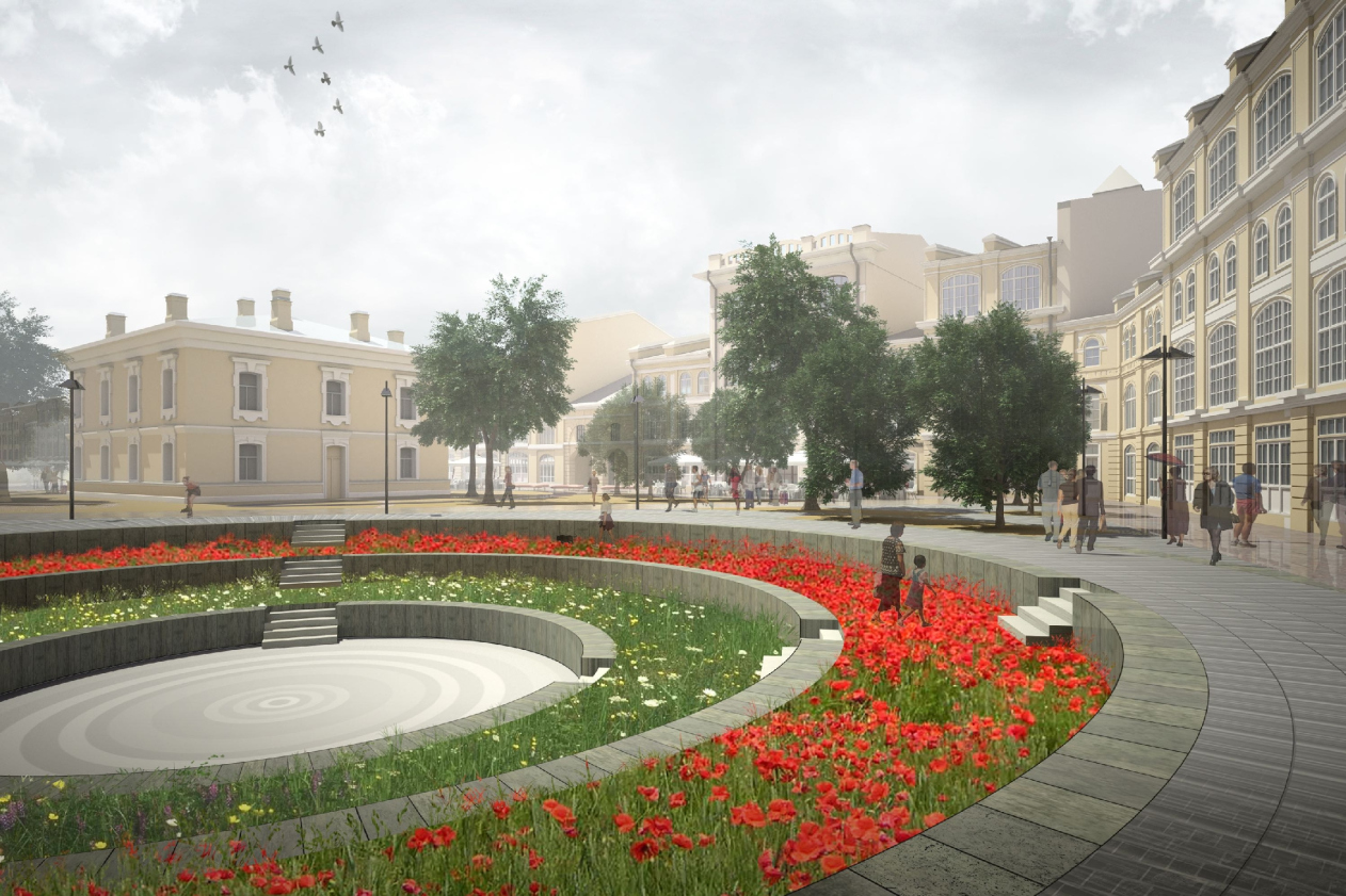
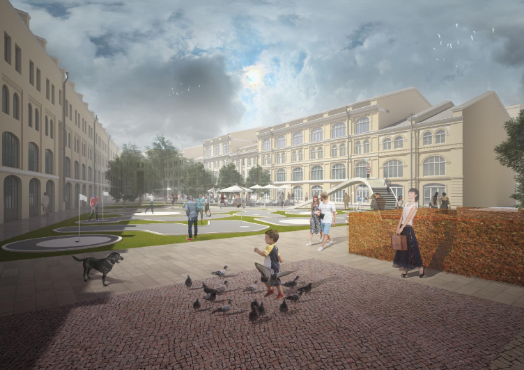
But then again, however, what the architects get inside looks rather like a cross between English and French park based on today's techniques of contemporary urban landscaping. On getting out of the metro, we see a circular amphitheater lawn, even a micro-Coliseum, covered with flowers and containing the round shaft of the metro air conditioning - meant, among other things, for the concerts of the local singing school. This small square is a public place convenient for organizing various events. Further on, the park is dissected with diagonal slashes into five more different parts connected with a willfully winding trail. Behind the amphitheater, there is an English park, of the "conditionally landscape" type, due to the fact that the space is limited, the park has in it the management committee of Gostiny Dvor, finished with neo-empire rock face and slashed with pseudo-baroque windows - but the first glance at such project graphics puts one in the mind of Saint Petersburg's Summer Garden. The house, it must be said, has already been renovated and it is also going to house the Museum of Russian Merchants. Still further on, there is the decorative pond that is, according to the authors' idea, "responsible for the memory of the place" - meaning, is reminiscent both of the old fire protection pond and about Rastrelli's concept, or, maybe, even about the swamp that once was there where now the Perinny Ryad is, the one that Elizabeth the Empress ordered so many times to dry in vain. In the center of the park one will see the climax of the reminiscences of the XVIII century: the "boskets, espaliers, and trellises" dissected into chessboard fields - soon replaced, however, by the quite contemporary entertainment of mini-golf, while the sharp end of the triangle presents a true nosh-up: the open-air terraces of the restaurant's alternate here with the wedges of the kitchen garden. Incidentally, this same empress Elizabeth liked it when the parks of her residences had currants growing in them - during her walks she loved nipping the berries off the bushes. 

Plan of the first floor © Studio 44


Map of the inside park © Studio 44


Gostiny Dvor. Inside park, ponds © Studio 44


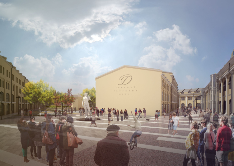
Gostiny Dvor. Inner square © Studio 44


Gostiny Dvor. Amphitheater © Studio 44


Gostiny Dvor. Courtyard, mini-golf fields © Studio 44


In a word, what we ultimately have here is not even a store but some "king's walk". The image of the modern trade, with its necessary twist of glamour, music, and the inevitable "American" smiles of the shop assistants, the inevitable movie theater and food court is superimposed here on the just-as-settled theme of the center of this great historical city: the pedestrian street, the museums and theaters, the open-air amphitheater, the terraces of the restaurants... This is all, of course, suggested by the names of the emperors and the empresses, and the architects who left their mark at this place. Only as far as the "quiet corner of the historical city" is concerned, the architects find it in a place where it never actually existed: nowadays, ultimately, located on Nevsky Prospect and between two metro stations, Gostiny Dvor is a pretty busy, bustling, and, come right down to it, dusty place. Its courtyard is in fact a loading bay, the seamy side of the trading process. And this all gets transformed, becomes well-kept and tidy, cool and pleasant, especially by contrast with Nevsky Prospect. Following the laws of the city's historical center, this version of Gostiny Dvor connects the time-tested laws of shopping management and the rules of urban planning, so vital for the city people nowadays. So, what it all comes down to is that Gostiny Dvor, the architectural monument of, let us say, early capitalism, adapts to the realities of the postindustrial era with its hipsters, yuppies, or whatever. This might sound weird but, from the structural standpoint, what we have here is a project of redevelopment of an industrial park, only a really old one, connected with trade, and because of that very special; the essence of the process is similar, even though Mothe's colums make it a little bit more refined.

This, however, is not the only project of reconstructing Gostiny Dvor. "Studio 44" has been doing this project for more than ten years now. Back in 2005, the project looked a bit different, and now observing its transformations is a rather curios thing to do. On the one hand, the original version was more careful of the historical monument than it was the case with the reconstruction of Quarenghi's Gostiny Dvor in Moscow covered by a glass dome upon the project of Nodar Kancheli. As early as in 2005, the yard was meant to get a regular park and the stairways, in front of which the building of the Management Committee stood exactly like Trianon. In front of the metro exit, there appeared a rotunda, a two-level parking garage occupied the whole space under the yard, the inner streets were fully glazed passages, and a glass pavilion appeared on the "sharp" corner of the park, where now the kitchen garden is meant to be. It is already clearly seen from the description that the reviewed version of 2014 is far more tactful, especially when it comes to the underground parking garages and the glazing part. But then again, as Nikita Yavein says, he cannot entirely rule out the possibility that the glazing of the inside streets will have to stay: the cold and windy Saint Petersburg gives plenty of reasons for that.

There is also yet another project about which the industry media writes as about the one proposed by a minority stakeholder of about 10% of the shares of today's Gostiny Dvor, affiliated with a famous Saint Petersburg developer: that project provides for making a quick four-year reconstruction, covering Gostiny Dvor with a glass dome, digging underground floors, increasing the shopping area by five times, and the overall turnover - by twenty times (this project has been known at least since 2013). This story is reminiscent of Moscow's Gostiny Dvor and "Children's Paradise" on the Lubyanka Street - but it's still at its very beginning. Incidentally, not long ago at Moscow Urban Forum in Samara was finally publicly discussed the fact that building large shopping malls in the center of the city is a bad idea (in Samara the situation is still worse because they are building a large shopping mall exactly in the center of the city there). Against this background, one feels that the project, approved by the Committee on State Control, Use and Protection of Historical and Cultural Landmarks and by the board of directors, the project by "Studio 44" cultivates the new trends of interacting with the city, is careful of the legacy of the past, and in this sense "belongs to the future". All that we've got to do now is figure out where our future and where our past is.
Plan of the second floor © Studio 44
Plan of the third floor © Studio 44
Plan of the fourth floor © Studio 44
zooming
Section views © Studio 44

17 June 2015

Headlines now
The Golden Crown
The concept for a dental clinic in Yekaterinburg, developed by CNTR Studio, revolves around the idea of a “mouth full of gold”: pristine white porcelain stoneware walls are complemented by matte brass details. To avoid an overly literal interpretation, the architects focused on the building’s proportions, skillfully navigating between sunlight requirements and fire safety regulations.
Flexibility and Integration
Not long ago, we covered the project for the fourth phase of the ÁLIA residential complex, designed by APEX. Now, we’ve been shown different fence concepts they developed to enclose the complex’s private courtyards, incorporating a variety of public functions. We believe that the sheer fact that the complex’s architects were involved in such a detail as fencing speaks volumes.
A Step Forward
The HIDE residential complex represents a major milestone for ADM architects and their leaders Andrey Romanov and Ekaterina Kuznetsova in their quest for a fresh high-rise aesthetic – one that is flexible and layered, capable of bringing vibrancy to mass and silhouette while shaping form. Over recent years, this approach has become ADM’s “signature style”, with the golden HIDE tower playing a pivotal role in its evolution. Here, we delve into the project’s story, explore the details of the complex’s design, and uncover its core essence.
Gold in the Sands
A new office for a transcontinental company specializing in resource extraction and processing has opened in Dubai. Designed by T+T Architects, masters of creating spaces that are contemporary, diverse, flexible, and original, this project exemplifies their expertise. On the executive floor, a massive brass-clad partition dominates, while layered textures of compressed earth create a contextually resonant backdrop.
Layers and Levels of Flight
This project goes way back – Reserve Union won this architectural competition at the end of 2011, and the building was completed in 2018, so it’s practically “archival”. However, despite being relatively unknown, the building can hardly be considered “dated” and remains a prime example of architectural expression, particularly in the headquarters genre. And it’s especially fitting for an aviation company office. In some ways, it resembles the Aeroflot headquarters at Sheremetyevo but with its own unique identity, following the signature style of Vladimir Plotkin. In this article, we take an in-depth look at the United Aircraft Corporation (UAC) headquarters in the Moscow agglomeration town of Zhukovsky, supplemented by recent photographs from Alexey Naroditsky – a shoot that became only recently possible due to the fact that improvements were finally made in the surrounding area.
Light and Shadow
In this article, we delve into the architectural design of the “Chaika” house by DNK ag architects, which was recently completed in 2023 as part of the collection of signature designs at ZILArt. As is well-known, all the buildings in this complex follow a design code, yet each one is distinct. This particular building stands out not only for its whiteness and minimalism but also for the refined use of a limited number of techniques that, together, create what can confidently be called synergy.
Casus Novae
A master plan was developed for a large residential area with a name of “DNS City”, but now that its implementation began, the plan has been arbitrarily reformatted and replaced with something that, while similar on the surface, is actually quite different. This is not the first time such a thing happens, but it’s always frustrating. With permission from the author, we are sharing Maria Elkina’s post.
Treasure Hunting
The GAFA bureau, in collaboration with Tegola and Arkhitail, organized an expedition to the island of Kilpola in Karelia as part of Moskomarkhitektura’s “Open City” festival. There, amidst moss and rocks, the students sought answers to questions like: what is the sacred, where does it dwell, and what sustains it? Assisting the participants in this quest were landscape engineer Evgeny Levin, artist Nicholas Roerich, a moose, and the lack of cellular connection. Here’s how the story unfolded.
Depths of the Earth, Streams of Water
In the Malaya Okhta district, the Akzent building, designed by Stepan Liphart, was constructed. It follows a classic tripartite structure, yet it’s what you might call “hand-drawn”: each façade is unique in its form and details, some of which aren’t immediately noticeable. In this article, we explore the context and, together with the architect, delve into how the form was developed.
Fir Tree Dynamics
The “Airports of Region” holding is planning to build an airport in Karachay-Cherkessia, aiming to make the Arkhyz and Dombay resorts more accessible to travelers. The project that won in an invitation-only competition, submitted by Sergey Nikeshkin’s KPLN, blends natural imagery inspired by the shape of a conifer seed, open-air waiting spaces, majestic large trees, and a green roof elevated on needle-like columns. The result is both nature-inspired and WOW.
​A Brick Shell
In the process of designing a clubhouse situated among pine trees in a prestigious suburban area near Moscow, the architectural firm “A.Len” did the façade design part. The combination of different types of brick and masonry correlates with the volumetric and plastique solutions, further enhanced by the inclusion of wood-painted fragments and metal “glazing”.
Word Forms
ATRIUM architects love ambitious challenges, and for the firm’s thirtieth anniversary, they boldly play a game of words with an exhibition that dives deep into a self-created vocabulary. They immerse their projects – especially art installations – into this glossary, as if plunging into a current of their own. You feel as if you’re flowing through the veins of pure art, immersed in a universe of vertical cities, educational spaces – of which the architects are true masters – and the cultural codes of various locations. But what truly captivates is the bold statement that Vera Butko and Anton Nadtochy make, both through their work and this exhibition: architecture, above all, is art – the art of working with form and space.
Flexibility and Acuteness of Modernity
Luxurious, fluid, large “kokoshniks” and spiral barrel columns, as if made from colorful chewing gum: there seem to be no other mansion like this in Moscow, designed in the “Neo-Russian-Modern” style. And the “Teremok” on Malaya Kaluzhskaya, previously somewhat obscure, has “come alive with new colors” and gained visibility after its restoration for the office of the “architectural ecosystem” as the architects love to call themselves. It’s evident that Julius Borisov and the architects at UNK put their hearts into finding this new office and bringing it up to date. Let’s delve into the paradoxes of this mansion’s history and its plasticity. Spoiler: two versions of modernity meet here, both balancing on the razor’s edge of “what’s current”.
Yuri Vissarionov: “A modular house does not belong to the land”
It belongs to space, or to the air... It turns out that 3D printing is more effective when combined with a modular approach: the house is built in a workshop and then adapted to the site, including on uneven terrain. Yuri Vissarionov shares his latest experience in designing tourist complexes, both in central Russia and in the south. These include houseboats, homes printed from lightweight concrete using a 3D printer, and, of course, frame houses.
​Moscow’s First
“The quality of education largely depends on the quality of the educational environment”. This principle of the last decade has been realized by Sergey Skuratov in the project for the First Moscow Gymnasium on Rostovskaya Embankment in the Khamovniki district. The building seamlessly integrates into the complex urban landscape, responding both to the pedestrian flow of the city and the quiet alleyways. It skillfully takes advantage of the height differences and aligns with modern trends in educational space design. Let’s take a closer look.
Looking at the Water
The site of Villa Sonata stretches from the road to the water’s edge, offering its own shoreline, pier, and a picturesque river panorama. To reveal these sweeping views, Roman Leonidov “cut” the façade diagonally parallel to the river, thus getting two main axes for the house and, consequently, “two heads”. The internal core – two double-height spaces, a living room and a conservatory, with a “bridge” above them – makes the house both “transparent” and filled with light.
The White Wing
Well, it’s not exactly white. It’s more of a beige, white-stone structure that plays with the color of limestone – smoother surfaces are lighter, while rougher ones are darker. This wing unites various elements: it absorbs and interprets the surrounding themes. It responds to everything, yet maintains a cohesive expression – a challenging task! – while also incorporating recognizable features of its own, such as the dynamic cuts at the bottom, top, and middle.
Urban Dunes
The XSA Ramps team designed and built a three-part sports hub for a park in Rostov-on-Don, welcoming people of all ages and fitness levels. The skate plaza, pump track, and playground are all meticulously crafted with details that attract a diverse range of visitors. The technical execution of the shapes and slopes transforms this space into a kind of sculptural composition.
Proportional Growth
The project for the fourth phase of the ÁLIA residential area has been announced. The buildings are situated on an elongated plot – almost a “ray” that shoots out from the center of the area towards the river. Their layout reflects both a response to Moscow’s architectural preferences over the past 15 years, shifting “from blocks to towers”, and an interpretation of the neighboring business park designed by SOM. Additionally, the best apartments here are not located at the very top but closer to the middle, forming a glowing “waistline”.
The “Staircase” Building
In designing the “Details” residential complex in New Moscow, Rais Baishev spiced up the now-popular Moscow theme of a “courtyard” building with an idea drawn from the surrealist drawings by Maurits Escher. He envisioned the stepped silhouettes and descending slopes as a metaphysical mega-staircase, creating a key void within the courtyard that gave the project an internal “spine”. This concept is felt both in the building’s silhouette and on its façades.
Projection of the Quarter
No one doubted that the building that Vladimir Plotkin designed as part of the “Garden Quarters” would be the most modernist of all. And it turned out just that way: while adhering to the common design code, the building successfully combines brick and white stone, rhythmically responding to the neighboring building designed by Ostozhenka, yet tactfully and persistently making a few statements of its own. This includes the projection of the ideal urban development composition “14–9–6”, which can be found right next door, mathematical calculations, including those for various types of terraces (and perhaps the only reminder of the Soviet past of the Kauchuk rubber factory!), and the white “cross-stitch” pattern of the façade grid.
Domus Aurea
In this issue, we examine the “Tessinsky-1” house, designed by Sergey Skuratov and completed in 2023. Located in the middle of the Serebryanicheskaya Embankment district, at the intersection of its main streets, this house assumes a sort of “nodal” role: it not only responds to everything around it and preserves many memories of the former EMA factory within itself, but it weaves all this into a newly directed pattern, reconciling bright “gold” and dark-colored brick, largely with the help of the new, modern-yet-archaic Columba brick, which, come to think about it, is the most precious element here.
The Chimney of Nikola-Lenivets
In this issue, we are examining the “Obelisk House” designed by KATARSIS and built for the Arkhstoyanie 2023 festival. However, it was only finished later on, and this is why we are examining it now. It seems to us that after the “Obelisk House” appeared in Nikola-Lenivets, a dialogue and a few inner connections appeared between the temporary structures built here. These houses no longer look like “accidental neighbors”, more of which below.
​Periscope by the Bay
The jury awarded the second place in the competition for a public and cultural center in Petropavlovsk-Kamchatsky to the companies GORA (“Mountain”) and M4. In the consortium’s proposal, the building resembles a sperm whale with a calf swimming next to it or a periscope, whose lenses capture the most spectacular views from the surrounding landscape.
From Arcs to Dolmens
While working on the competition project for Petropavlovsk-Kamchatsky, ASADOV Architects prioritized the value of the natural and urban environment, aiming to preserve the balance of the location while minimizing the resemblance of the volume that they designed to a “traditional building”. The task was challenging, and the architects created three versions, one of which having been developed after the competition, where their main proposal took third place. However, the point of interest here is not the competition result but the continuity of creative thinking.
Hide and Seek
The ID Moskovskiy house, designed by Stepan Liphart in St. Petersburg, in the courtyards near Moskovskiy Avenue beyond the Obvodny Canal and recently completed, is notable for several reasons. Firstly, it has been realized with considerable accuracy, which is particularly significant as this is the first building where the architect was responsible not only for the facades but also for the layouts, allowing for better integration between the two. On the other hand, this building is interesting as an example of the “germination” of new architecture in the city: it draws on the best examples from the neighborhood and becomes an improved and developed sum of ideas found by the architect in the surrounding context.
The Big Twelve
Yesterday, the winners of the Moscow Mayor’s Architecture Award were announced and honored. Let’s take a look at what was awarded and, in some cases, even critique this esteemed award. After all, there is always room for improvement, right?
Above the Golden Horn
The residential complex “Philosophy” designed by T+T architects in Vladivostok, is one of the new projects in the “Golubinaya Pad” area, changing its development philosophy (pun intended) from single houses to a comprehensive approach. The buildings are organized along public streets, varying in height and format, with one house even executed in gallery typology, featuring a cantilever leaning on an art object.
Nuanced Alternative
How can you rhyme a square and space? Easily! But to do so, you need to rhyme everything you can possibly think of: weave everything together, like in a tensegrity structure, and find your own optics too. The new exhibition at GES-2 does just that, offering its visitor a new perspective on the history of art spanning 150 years, infused with the hope for endless multiplicity of worlds and art histories. Read on to see how this is achieved and how the exhibition design by Evgeny Ace contributes to it.
Blinds for Ice
An ice arena has been constructed in Domodedovo based on a project by Yuri Vissarionov Architects. To prevent the long façade, a technical requirement for winter sports facilities, from appearing monotonous, the architects proposed the use of suspended structures with multidirectional slats. This design protects the ice from direct sunlight while giving the wall texture and detail.