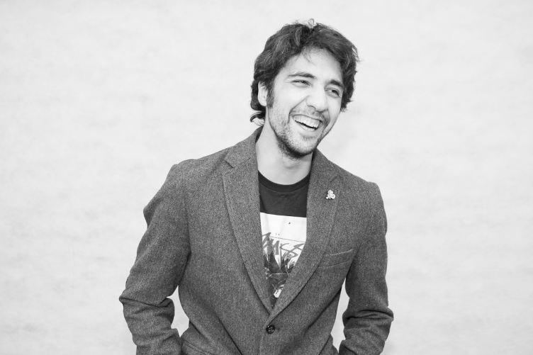
Sergey Trukhanov. "T+T Architects". Photo: Andrew Kardelyanu
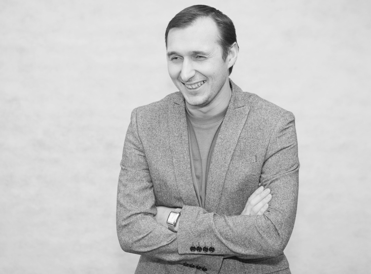
Alexander Brovkin. "T+T Architects". Photo: Andrew Kardelyanu
Archi.ru:
Your portfolio seems to include a lot of projects having to do with redeveloping former industrial buildings. Could you please share how this branch became one of your main ones?
Sergey Trukhanov:
Today, reconstruction is the field where the young architects can easily make a statement and establish themselves. When our company was only beginning its professional practice, the theme of redevelopment was comparatively new both for the developers and for the "established" practicing architects. At first, few people understood just how to go about it and what demand it would ultimately be in. For this very reason, the customers, fearing to lose their money and trying to save up, often turned to small unknown start-up companies. Besides, the young and energetic designers could now and then come up with an unconventional approach that is sometimes an absolute must in this area.
To be quite frank, yes, we did hope to occupy this niche. After the restrictions were imposed on new construction in the center of Moscow, the former industrial areas became all but the only territorial reserve that this city had left. And, of course, when our company got the first order of such kind, we just rolled up our sleeves and got down to it.
How did it all start? What was the first project that you did?
Sergey Trukhanov:
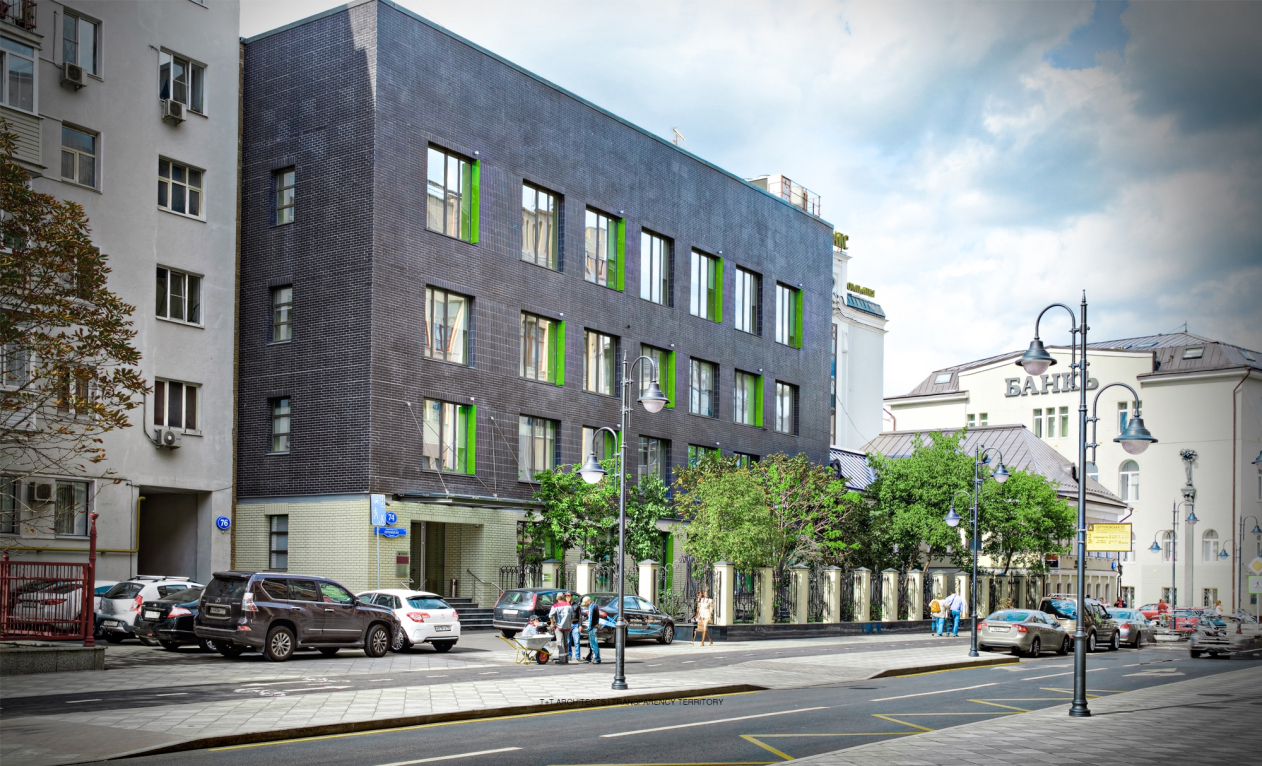
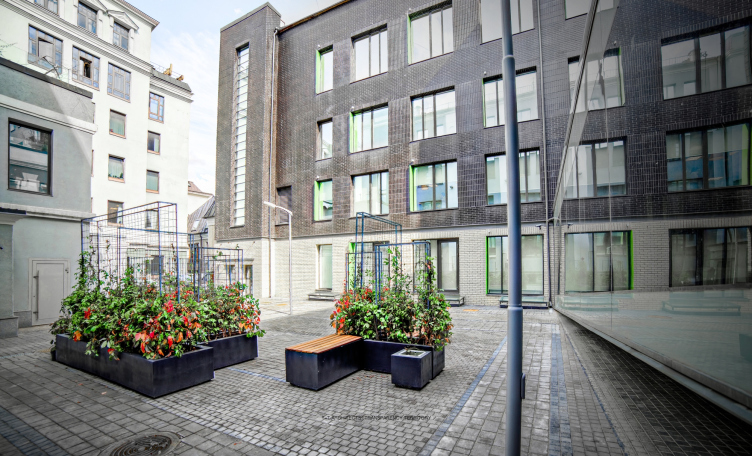
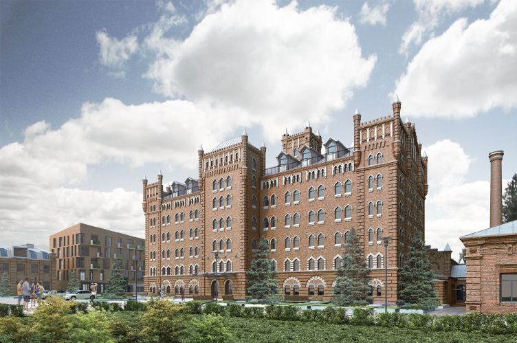
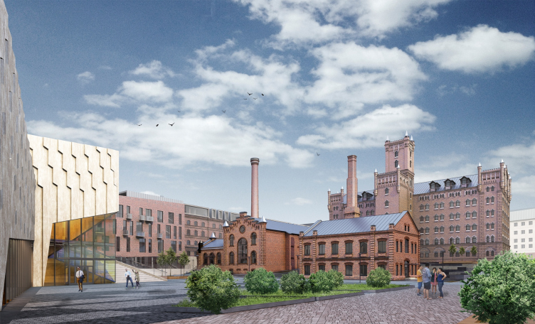
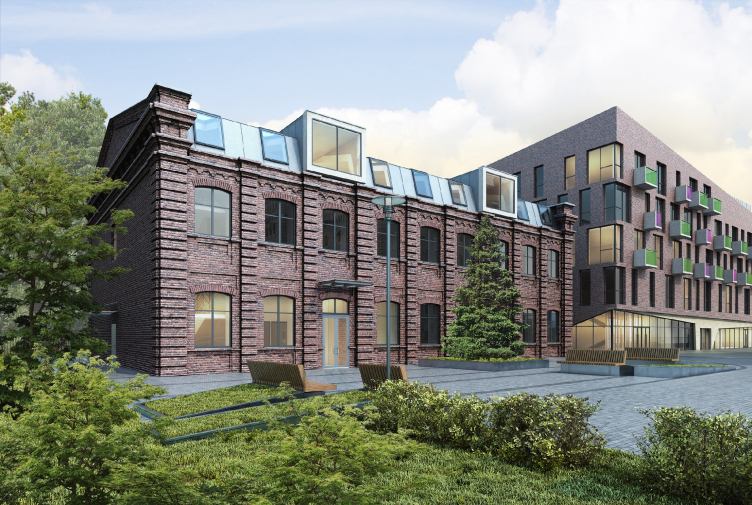
It all started in 2010 with the reconstruction of Merchant Zaryvny Windmill Loft in the city of Orenburg - we were remodeling it into an office center. After that, we were searching for the solutions for the renovation of the administrative building on Malaya Gruzinskaya Street in Moscow. Still before we got down to the actual design work our company, together with KR Properties did a survey of this territory trying to evaluate the potential of its development. The scenarios that we came up with for exploring this territory were most diverse - from reconstructing the existing objects and adjusting them to become a hotel complex or an office center to complete or partial deconstruction that ultimately presupposed the construction of new buildings. In a word, we did serious analytical work, and prepared detailed plans, diagrams and rationale. These "exercises" resulted in the fact that we got the opportunity to take part in other projects organized by this developer. To us, yet another small but still heart-warming redevelopment project and one that we saw to its very end is the renovation of a small territory of the yard of the Danilovskaya Factory. Presently, this project is in the implementation stage. The first large-scale implementation is "Domino" Business Park. Its initial concept was developed by a different architectural bureau. Our task was to adapt the project proposal and issue the working documents. In spite of the fact that we treated the original author's idea with all due respect, and tried to stick to the ideology of our colleagues, we still had to make a lot of changes - in view of the customer's requirements, new circumstances or the sheer impossibility to actually implement this or that idea.
"Domino" business quarter © T+T Architects
"Domino" business quarter © T+T Architects
Alexander Brovkin:
We invested a lot of effort and a lot of creative ideas into this project but we consciously refrained from pushing the limits of the original idea of our predecessors. "Domino" became for us the first work of such scale. We started it in 2011, and the implementation took more than three years. This, however, was a really serious experience that became the starting point for our many other redevelopment projects.
How important was it for you to keep the history and the aesthetics of the place in this and other projects?
Sergey Trukhanov:
In the case of "Domino", it was the place which it was important for us to breathe a new life into, based on the esthetics of the historically formed surroundings. From Pyatnitskaya to Bolshaya Ordynka, there stretched an old semi-derelict quarter of administrative buildings. In the new project, the construction blueprints were kept intact but we had to do some serious work with the buildings' facades and the inside territory, however small, but still pretty important for this project. The old mansion that is there on the territory of that quarter also got restored - we recreated its historical image.
Alexander Brovkin:
When we came to the land site the mansion was in a deplorable state. Changing its rotting wooden framework with a new metal one, we left the walls totally intact, tried to keep the entire decor, and, most importantly, the very spirit of the building.
What is your attitude towards the practice of adjusting the former industrial buildings to become residential ones? Can you specifically mention some projects of this kind done by your company?
Sergey Trukhanov:
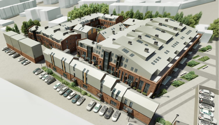
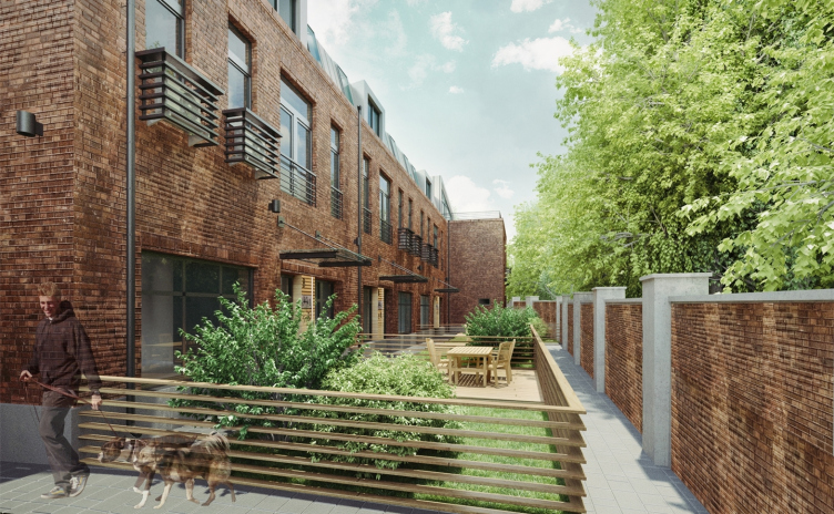
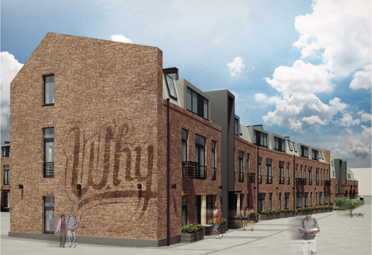
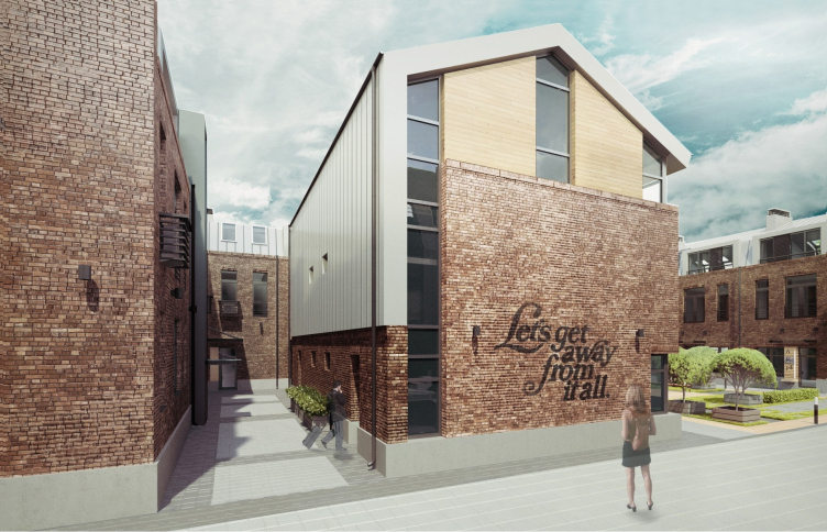
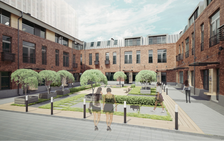
To me, the most "explosive" project was the Loft Quarter "Studio #8". This was an area as industrial as it could possibly get, and we had to turn it into a residential apartment quarter! The district where this land site is located is famous for its character and history, and it also has a huge economic potential - great location in the city, next to the already-existing large residential skyscraper named "Triumph Palace". Apart from the initially interesting task that the situation and the surroundings set before us, this project was interesting to us because of the very approach that the customer had to it. This was the period when he formulated the concept of "live and work". The idea of concentrating, within one district, the residential buildings and the workplaces appealed to the developer very much and he started to actively implement it. The loft style and the industrial past of the venue added particular romanticism to this place. The project started to be positioned as the place for the upwardly mobile people - artists, musicians, and other creative minds.
Remodelling the industrial park into the loft quarter "Studio #8" © T+T Architects
Remodelling the industrial park into the loft quarter "Studio #8" © T+T Architects
Remodelling the industrial park into the loft quarter "Studio #8" © T+T Architects
To me, all these factors put together predetermined the success of the project: the right specifications and the right concept set by the customer, the right understanding of the spirit of the place, interesting legend for the potential buyers, and, of course, the high standards of execution. In spite of its openness - and the complex is predominantly devoid of any fences - each house has a cozy yard of its own, protected from the city noise, has its own identity. As a result, more than 70% of residential area was bought out when still in the design stage. In this situation, most of the purchases had to be "fine-tuned" to fit the needs of its specific buyer. The square meters were selling like hotdogs not only horizontally but also vertically - because of which we had to redo and adapt the planning solutions on a balls-to-the wall schedule. Presently, the complex is almost ready; it is only the landscaping work that is left to be done.
Remodelling the industrial park into the loft quarter "Studio #8" © T+T Architects
Remodelling the industrial park into the loft quarter "Studio #8" © T+T Architects
Could we please speak a little about those of your projects that provided not only and not so much for architecture per se as the organization of the territory in general?
Sergey Trukhanov:
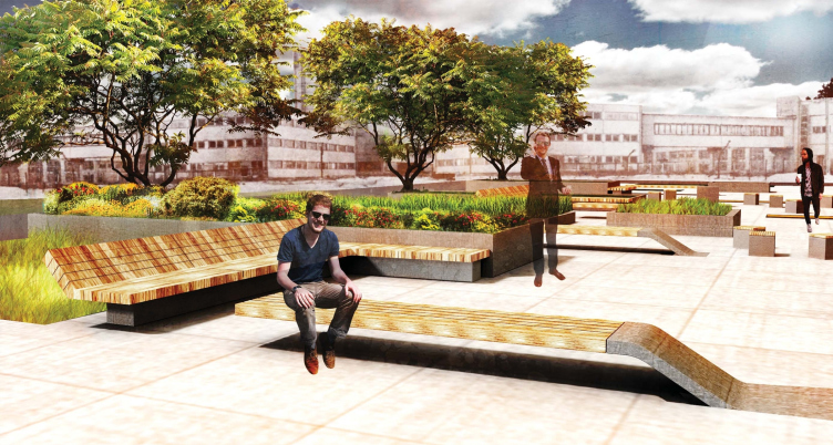
One of such projects that we recently implemented is the territory of the first stage of "Savelovsky City" business center. We put a lot of work into this project. And we began specifically with the territory. As a matter of fact, renovation is first of all about the territory, and the buildings are secondary. This implies a great deal of work on zoning the territory, thinking out its logistics, creating the right accents, and many other things. Seemingly, in the case of "Savelovsky City" it was all about the new construction work but still at the same time we had to constantly check if we were considering the positions of the objects and their functions. At the expense of working with the territory, we had to make the right decisions how to plan the offices, the apartments, and the social functions that were actually located in the immediate proximity of one another. And we had to come up with the landscaping scenarios as well.
The square opposite the grand entrance. Concept of organizing the territory of the business and office center "Savelovsky City" © T+T Architects
Alexander Brovkin:
In this project, the architectural part was done by SPEECH company. Our bureau was responsible for the territory. The construction of such a large complex boosted the development of the entire area - a place devoid of any particularly beautiful views; let us put it this way. The new object started interacting with its surroundings; new pedestrian and automotive communications appeared. The large companies neighboring on this land site followed our example and opened up their territories for the city people. Thus, the boundaries of the design were pushed by themselves with the city getting a top-quality public territory.
In "Savelovsky City", you did the interior design of the entrance group. Could you please share about them?
Sergey Trukhanov:
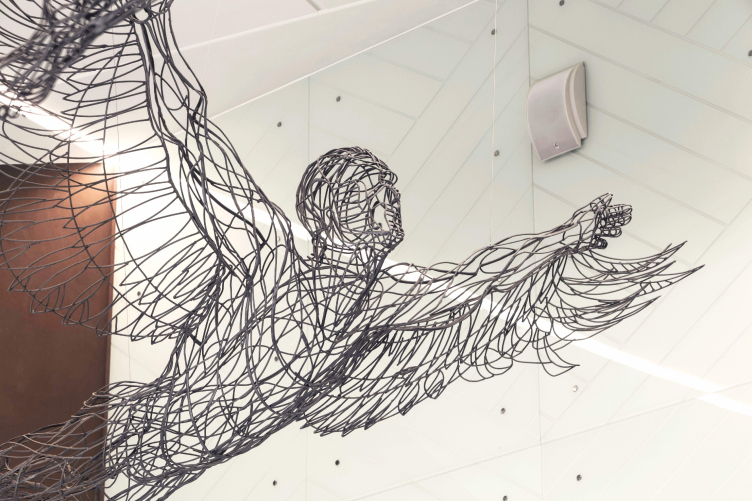
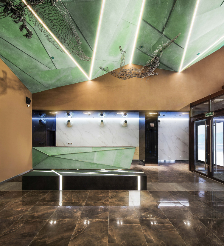
We were asked to design the interior of a small lobby, about 150 square meters, too small for its function. Reconciling ourselves with the fact that we could not do anything about the size of that room, we decided that we had to come up with some brilliant and bright idea. All the space around it had to be organized in such a way as to produce an immediate wow-effect. And at this point I want to say thank you to our customer who went ahead and backed us up in our most daring creative ideas. For example, the composition is centered on flying art objects thanks to which the lobby turned into a small art gallery.
The entrance group of the multifunctional complex "Savelovsky City" © T+T Architects
But, apart from the art objects, that space is also formed by a very unusual combination of colors, and you also used interesting materials there...
Sergey Trukhanov:
Yes, we wanted to create this dynamic feel inside. And we decided to only use very characteristic materials that are valuable and self-sufficient in themselves. For example, copper is a very tactile and grand-looking material. At the same time, you don't see it in just any lobby. All the solutions here are "on the brink". We balanced on the verge of histrionics trying at the same time not to stoop down to the point of stage props. I think we did a great job there.
The entrance group of the multifunctional complex "Savelovsky City". The first tower © T+T Architects
In spite of the fact that your company is still comparatively young, we have been speaking a lot about actual implementations. Is it difficult implementing such projects? And how often does your concept becomes a reality?
Sergey Trukhanov:
Most of our projects get implemented - to this or that degree. It is clear that when you are working with some already existing architectural context you run into more difficulties than when you are designing something from scratch. Every day you can run into some kind of snag. And the important thing is not to downgrade to recreating verbatim what used to be here in this place when you have to mix the old and the new buildings. In the city of Saratov, for example, we did a renovation project for the old factory building "Saratov Muka". Some of the objects that were considered architectural monuments were to be kept intact but at the same time they had to be included into the new complex. I can say right off that we are against stylization in any manner, shape or form. It is my deepest conviction that building new honest buildings next to architectural monuments is totally alright. At the same time, it's important to make sure that the new construction does not conflict with the historical context and does not violate the historically formed ties. This is the main challenge.
Architectural and town-planning concept of reconstruction and renovation of the territory of "Saratov Muka" Factory © T+T Architects
Copyright: © T+T architects
You mentioned your Saratov project - how is it getting along now?
Alexander Brovkin:
Presently, the second phase is being implemented that is mostly about restoring the old buildings. This project covers a huge territory six hectares of which are situated at a shoreline with an elevation gain of up to 25 meters; it is planned that this territory will be developed until 2025. We hope that in the nearest future at least two or three stages will be implemented.
Architectural and town-planning concept of reconstruction and renovation of the territory of “Saratov Muka” Factory
Copyright: © T+T architects
You worked not only in Saratov but also in Orenburg, Ekaterinburg, and other cities of this country. How vital do you think is the idea of redeveloping the former factories in the regions?
Sergey Trukhanov:
As a matter of fact, in the regions such resources as industrial parks are much more numerous than they are in Moscow. A Moscow developer usually has a clear vision of how such territories must be developed, and at the same time he is pretty tight with his money. A regional customer, as a rule, does have the money but he lacks the drive and the courage to experiment. Nevertheless, now and then truly interesting projects get implemented in the regions. However they are still few and far between because the general approach in the regions is that taking down an old building is easier than renovating it.
You shared about the challenges that working with industrial parks entails. What are the benefits then? Why is it so interesting for you working with such architecture?
Sergey Trukhanov:
Working with the buildings that have a historical value is by default an exciting experience. They all have a soul in them. This is not some emotionless space - quite the opposite, it is full of life. And every time you are faced with something new, make a discovery. When we were working in Orenburg, we found the old underground tunnels that connected various buildings on the territory of the milling plant, different artifacts of old staircases, and huge chain-driven window blinds, to name but two.
Architectural and town-planning concept of reconstruction and renovation of the territory of "Saratov Muka" Factory © T+T Architects
Alexander Brovkin:
This was like finding some vintage things and breathing new life into them. It is the same way with buildings. After the reconstruction they get a new function and pretty much a new life getting reborn. In Saratov, again, for example, restoring the old and forgotten buildings, we as much as reinvented them for the city. The mill house had long since stopped being used to its original purpose. For a long time, it stood derelict. In the recent years, it housed part of the Saratov flour plant. Over this time, the buildings were many times repainted and got hideous annexes. One of the facades disappeared completely after a grain elevator was built right next to it and all the windows were clogged up. In fact, this building died for the city. Removing all the later-on layers we gave it back to the city breathing new life into it. Now it is sure to stand another two hundred years or so.
Do the specifics of working with already-existing buildings limit your creative freedom?
Sergey Trukhanov:
Quite the opposite! Here is the thing - creative freedom is something that can hardly be limited. It's not that reconstruction opens up more opportunities for realizing your potential - it's a lot more complex here. You are faced with a situation with an insane number of restrictions, nuances, and aspects. And, at the same time, you get to deal not with some faceless matter but with living history, with artifacts that you need to keep intact and fill with meaning.
Do you consider reconstruction and renovation to be promising branches for you?
Sergey Trukhanov:
Yes, we keep on actively working in the sphere of renovating industrial objects and organizing the territories. Among our high-profile objects I can note the reconstruction of "Belgrade" Hotel - it is a very complex and multilayered project that we are now putting a lot of effort into. This branch proved to be very interesting for us. I must admit we never even expected that.
Can you give examples of redevelopment from the world's practice that are really close to you?
Alexander Brovkin:
I like the district of Hafen City in Hamburg thanks to which it was possible to enlarge the city territory by 220 hectares by way of redeveloping the port territory. One can see there the examples of extremely successful reconstruction of the old buildings next to the new projects designed by renowned western architectural bureaus (the most famous of them being Elbphilarmonie Concert Hall by Herzog & de Meuron Architekten - editorial note).
Sergey Trukhanov:
There are lots of successful examples of this in today's world practice. To me, I would single out projects that are different in their original tasks and different in their approaches. First of all, this is the milestone Liverpool project of reconstruction of Albert Dock. Presently, this district unites a lot of museums, including the Beatles museum, and a lot of hotels, entertainment and shopping centers (the total area being 320 hectares, the reconstruction started as early back as in 1981 and lasted 22 years - editorial note). This place became the new city center - it is in such great demand that new city houses are being built around it. I also cannot help mentioning the district of Docklands in London that is interesting first of all from the town-planning standpoint. This is practically London's only residential area populated by the direct owners of the flats - while most of the residential stock in the city center is actually rented out. The whole stock consists of the former warehouses and workshops; there are practically no new buildings there. However, the project that I like the most is the district of Shoreditch. This is a different version of redevelopment that is different in its "chaotic" nature. People themselves transform this place. This place is mostly populated by creative minds that once came to this industrial district and turned it into a real artistic Mecca. All the walls in Shoreditch are declared free for graffiti, thanks to which you can see the most brilliant example of street design and street art there. Speaking of which, recently there took place a contest for the best renovation project of Shoreditch tube station where our company got shortlisted. This project makes it possible to tie in by means of using quick-mounting structures two neighborhoods separated by a railroad line.
And could mention something similar here in Russia?
Sergey Trukhanov:
I would mention the Artplay building of the period before it actually got renovated, when it stood on the Timura Frunze street. This was one of the most "soulful" places in Moscow. Other Russian redevelopment projects are mostly over-commercialized. This applies for "Red Rose" and "Luch" business quarter where the "loft" style is really sold at an expensive price. As far as the quality of the redevelopment is concerned, I would note the Stanislavsky Factory. From the "visual effect" standpoint, this is one of the best projects in Moscow.
And what about your decision to place your studio on the territory of an industrial park - was this by coincidence or by design?
Alexander Brovkin:
This is just a coincidence. And, although we often deal with transforming such territories, we, living inside this beauty, sincerely hope that the developers will not get their hands on it too soon.

