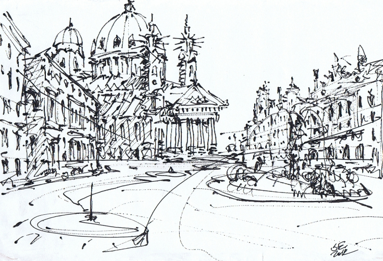
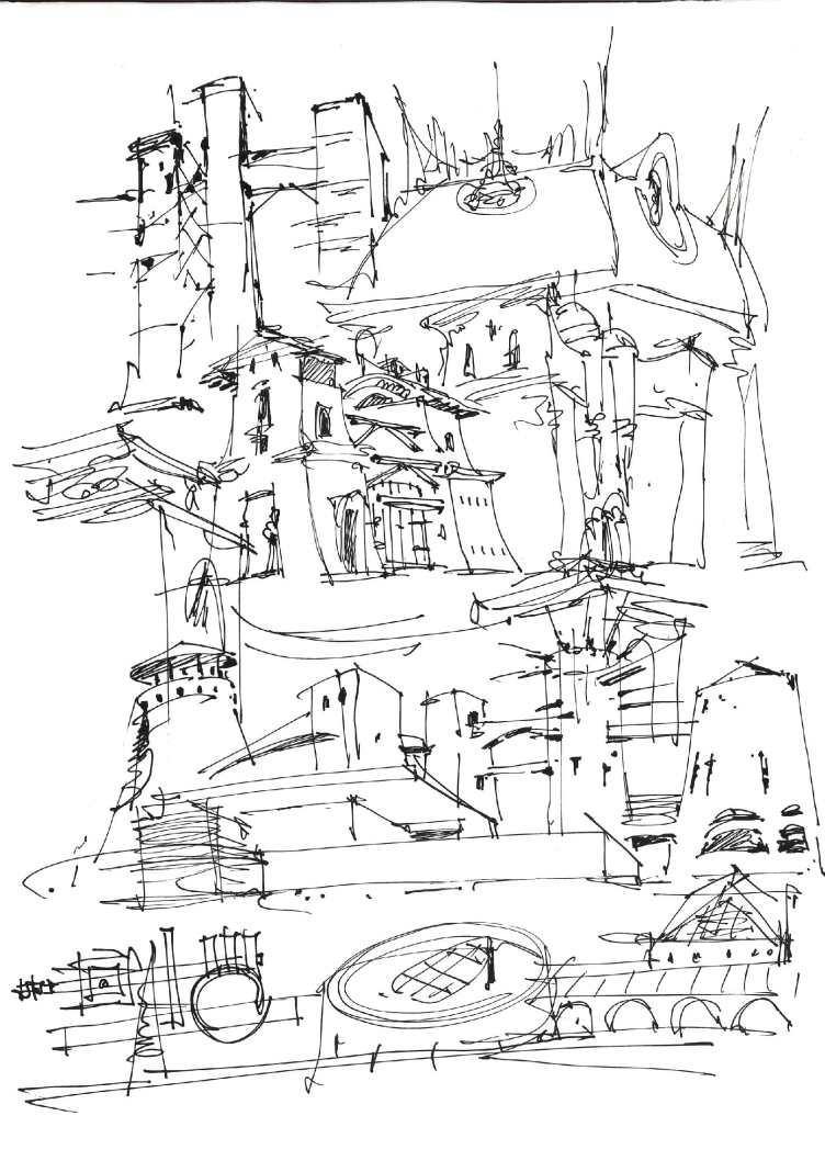
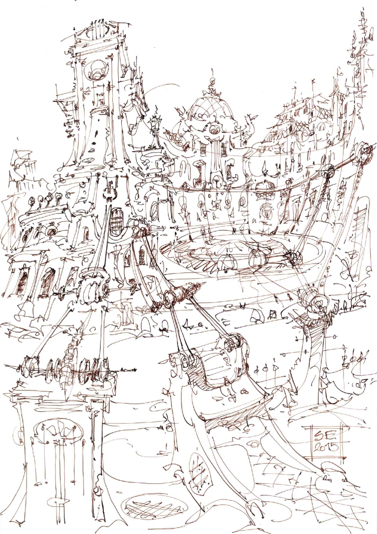
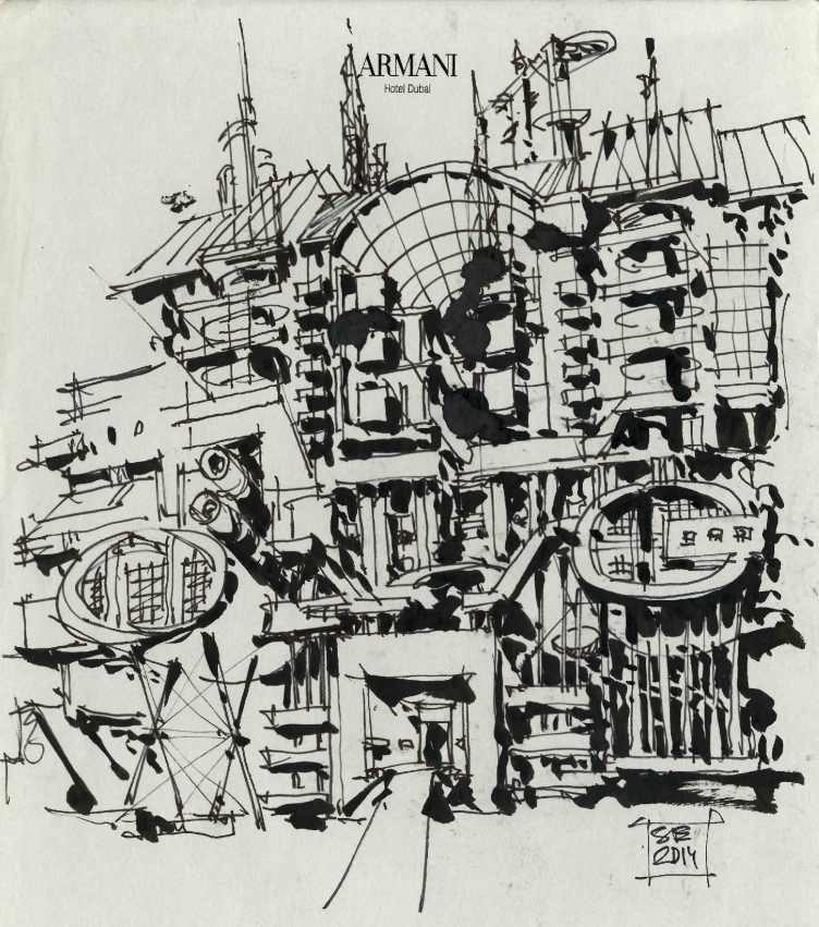
Wednesday, "A3" gallery opened the exhibition entitled "Estrin Code". We spoke to its curator Anastasia Dokuchaeva and the author of the exhibited graphic works, architect and artist Sergey Estrin.
***
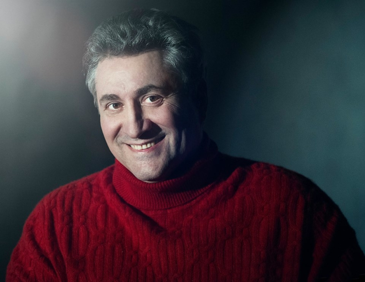
Sergey Estrin. Photograph © Natalia Toskina
Archi.ru:
Is the new exhibition connected in any way with the one that you did last year? Do your graphic exhibitions come in some certain order or do they just happen spontaneously?
Sergey Estrin:
Last year's show is not connected with what we have here today virtually in any way. Back then, I treated this event rather lightly. As a result, the exposition was made up of works that were just lying at hand. This time around, however, I approached the matter more seriously: I invited the curator Anastasia Dokuchaeva, with whom we thought out the concept and the structure of the show. The difference also lies in the fact that last year I was basically trying to share about my hobby because this was how I thought of my drawing. Today, this means a lot more to me, so, because of this the show took on a greater scale.
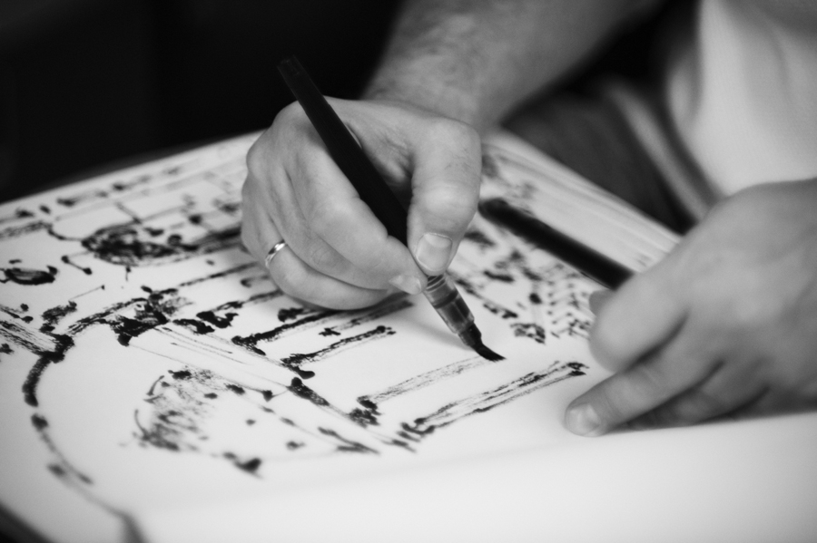
Sergey Estrin at work / photo courtesy of the exhibition organizers
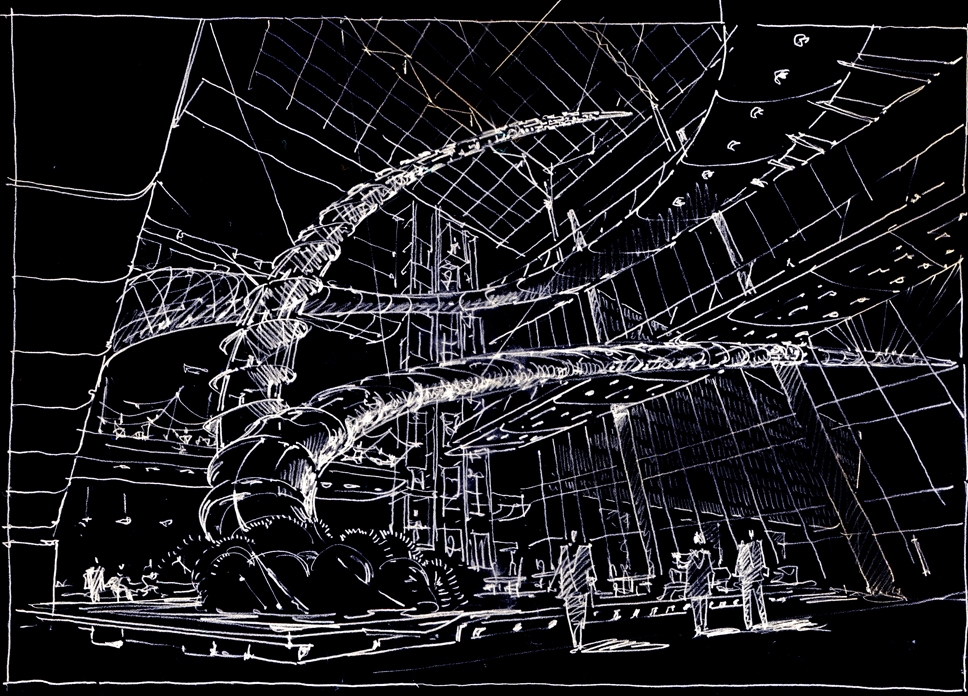
Architectural graphics. Sergey Estrin.
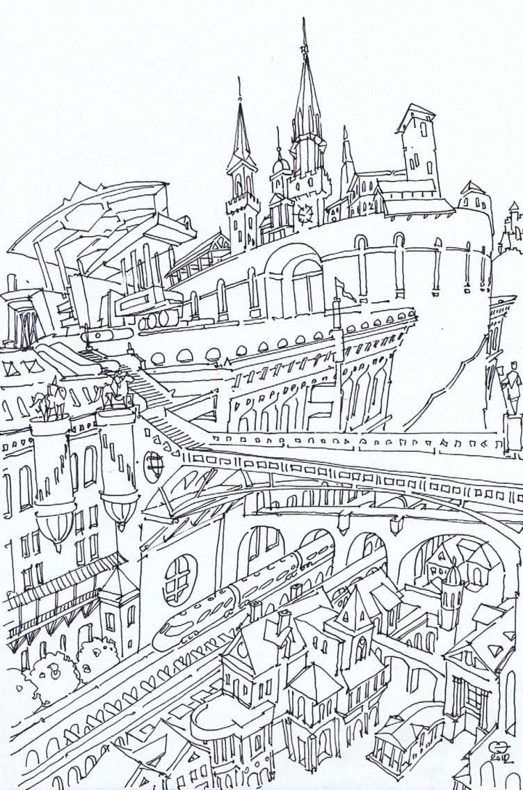
"Bridge House". Sergey Estrin
Besides exhibitions, you were spotted as a participant of charity auctions - I am speaking about the recent auction named "Arkhidar" ("Archgift" - translator's note), where your pictures were sold pretty successfully. How long have you been taking part in such events, and why?
Sergey Estrin:
As a matter of fact, this was the first time I ever took part in such a charity auction. This was a perfectly sincere impulse on my part. I simply responded to the organizers' call who were raising funds for treating kids with serious heart issues, and provided my works for the auction. I am happy that they were sold at such a good price, and I am happy that this really made a positive difference.
Back to the exhibition! It is named "Estrin Code". Why this name?
Anastasia Dokuchaeva:
A great name for an exhibition must always have multiple meanings. We did not come up with the name "Estrin Code" at once but we liked it the moment we came up with it. It has a lot of hidden meanings to it, and it can be understood on different levels. For example, one might think that this is the access code to Sergey Estrin's creative lab. At the same time, you cannot crack this code mechanically and just go ahead to break and enter. What matters here is not his construction activity but his architectural drawings per se, the artist's fantasies that are not even meant to ever become a reality. In this connection, we get a lot of moves and links that explain how the architectural images are born and how the develop. As a result, a person that has come to the show gets kind of a pass to the interesting world of the creative and professional activity of a real architect. "Estrin Code" is also the password to the author himself - not only as a professional but also as a human being.
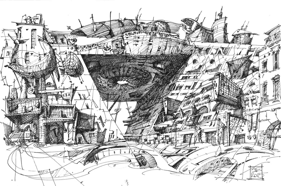
Architectural graphics. Sergey Estrin.
"Just a sketch". Sergey Estrin
Sergey Estrin:
As for me, I was always interested in the creative life of my colleagues, it was always interesting for me to see how they work, how they design things and how they communicate with their customers. As a rule, these sides of their life keep a pretty low profile. I, on the other hand, by doing this exhibition, tried to lift the veil a little bit - assuming that my creative career can also be interesting to somebody.
Works of which years of origin will be showcased at the exposition? Or are they united by something else other than the time of their origin?
Anastasia Dokuchaeva:
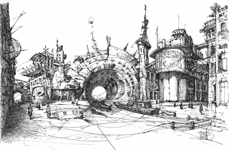
We did not organize the pictures chronologically, and the exposition will show the works of different periods. There will be also the earliest works of 1991 and the ones that were only recently created. Most of the exhibited works, however, have been created over the last 4-5 years. The exposition consists of several sections that are grouped into some certain theme blocks. For example, there will be a line having to do with Sergey Estrin's futuristic and avant-garde experiments. A group of pictures based on live impressions. Sergey's got a huge variety of architectural ideas, so we were looking to create an all-rounded an versatile exhibition.
"Metallic interwoven ornament". Sergey Estrin
"A Rather Axial Composition". Sergey Estrin
Sergey Estrin:
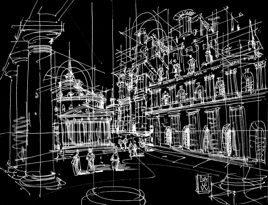
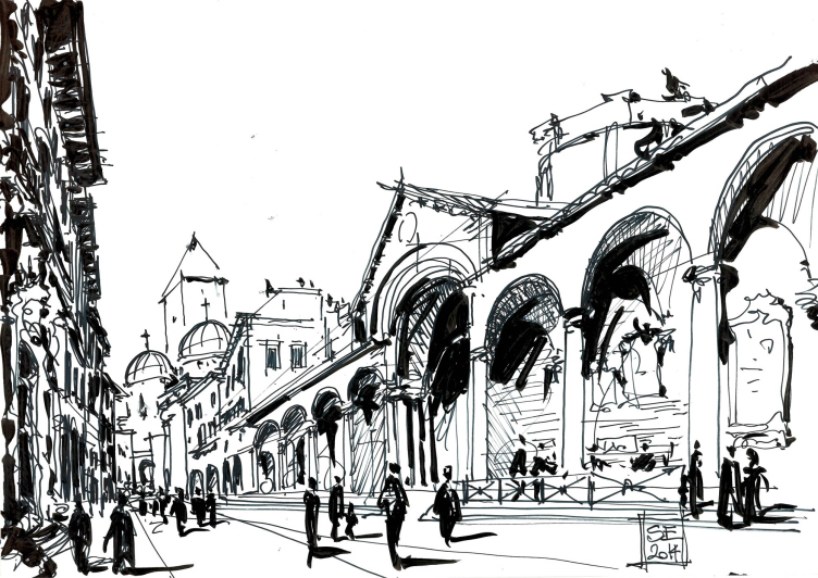
I would even put it in a slightly different way. To me, the exhibition is quite concrete, it shows the sketches of real-life buildings and spaces - exhibited next to my architectural fantasies. As a matter of fact, it will be ninety perfect fantasy works in which emotion always prevails - which makes them all the more interesting. And, as you go further, you can trace the use of various tools, techniques, and materials. A drawing, just like an architectural project, must be based on some certain idea, and, once you've got that covered, you go in for details: shape, light, silhouette, texture, background, and so on...
Architectural graphics. Sergey Estrin
How will the exposition be organized?
Anastasia Dokuchaeva:
I will not reveal the whole secret but I will say that, when organizing the exposition, the last thing that we wanted to do was lose the freedom and openness of the gallery space. Hence the interesting contrast between the analytical "museum" approach and some "anti-classic" techniques - almost "cave paintings" but ones that were created by an artist and in good taste.
Sergey Estrin:
The architect thinks big, he operates large-scale shapes and volumes. This is why, at the show, the visitor is going to see a play of the scales with a clearly cut motion vector and the main thought that is easily read. An important part in this will be also played by the light.
Remembering your love of experiments and unconventional approaches to drawing I feel like asking - what surprises are we in for this time around?
Sergey Estrin:
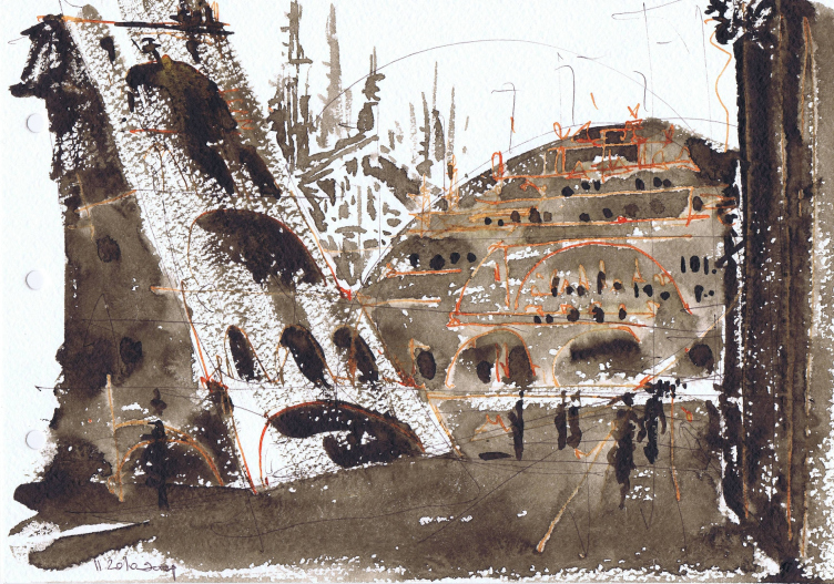
This time, there is very little room left for novelties, really - the exhibition turned out to be a really large-scale as it is. Besides I did not feel like turning new tricks just to be spectacular. That being said, there is always room for experiment in my career. For example, not long ago I tried to draw on leather shoes with a soldering iron. That was rather interesting. The soldering iron leaves traces that look like paint strokes. This, of course, is a totally different genre which does not fit in with this specific exhibition. Still, at the exposition you will see my drawings on glass - something that I did not do last time. The drawing is made from the other side of the glass, and all the layers are executed in the mirror-like fashion. And - you work as if you were "rewinding" the whole thing like a magnetic tape: first you do the light finishing strokes and only in the end you do the base. And this is not such an easy thing to do considering the fact that I always work without any preliminary sketches or studies. To my mind, studies and sketches take life away from the picture, and tracing the original outlines kills the original sincere emotion. When I was a member of the judging panel at "Archgraphics" contest, this was the first thing that caught the eye. And it seemed to me such a waste that sometimes a great picture with a great idea behind it would lose its quality after it was traced over the sketch, as if life was drained away from it.
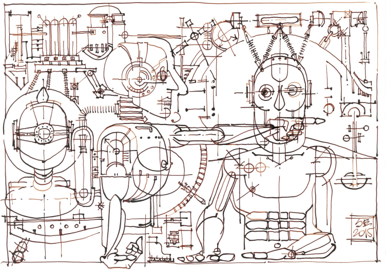
"From my impressions, I am a robot". Sergey Estrin
Recently, besides the architectural drawings, you started doing caricatures that depict the process of communication between the architect and his customer. Will these caricatures also be represented at the show?
Anastasia Dokuchaeva:
I think that these could become the subject of an independent exhibition. Currently, we would like to draw the viewers' attention to the architectural themes most of Sergey Estrin's works are dedicated to. However, yes, we do plan to exhibit a few of such pictures - not exactly the caricature type but close to it - so as to amuse the visitors a bit.
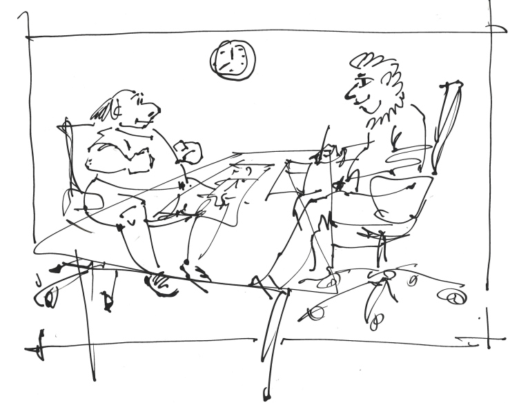
"Meeting with a Client". Sergey Estrin
Apart from the drawings per se, a special part of the exhibition is dedicated to the architectural projects of Sergey's architectural studio. Which was the fundamental principle the exposition was built on? How did you select the works to be exhibited?
Sergey Estrin:
The architectural part will be represented not by any specific projects but by sketches of them. We deliberately refrain from making this all-too-architectural and we deliberately refrain from showcasing the chain of a project developing from a pencil drawing to a complete building. However, a keen observer may try to guess the already-complete projects in the tracing paper sheets on display.
Anastasia Dokuchaeva:
As an art expert, it was really interesting to me to watch it myself and show it to our visitors how the experimental graphic works are born and how the develop. This is a complex path, a whole world of ideas that far to often are destined to forever remain beautiful fantasies and abstractions, and rarely live to become implemented as real-life projects.
How are your architecture and your graphics interconnected? Is your master command of graphics in any way instrumental in your architectural career or in communicating with your clients?
Sergey Estrin:
This is extremely helpful when you are working with a client. By drawing architecture and coming up with new ideas in front of the customer's eyes, you can achieve what I call an instant effect. If the architect has such skills, the designing process is also easier for him to do. You can spin the building around in paper, look at it from different angles, and feel its every line and detail. You cannot really achieve this effect by using the computer alone. Besides, when the architect has mastered the drawing skills, he is not dependent on the visualizing guys and he avoids the necessity to wait for them to develop a 3D model. I can draw all the architecture on the fly, show it to my client real-time and then make sure that this idea gets implemented the way I intended it to be. And this is what I try to get my employees to do.
Architectural graphics. Sergey Estrin.
"Layers". Sergey Estrin
Are your employees also capable of drawing architecture?
Sergey Estrin:
Few of my new employees can draw. Regretfully, most of them cannot and, what's worse, they fail to see the value of drawing. And, of course, this saddens me. Although when we take people in, this is not a necessary requirement, rather a nice bonus if the person can draw. And I am sincerely happy when I see my employees master a certain language that allows for them to obtain information and get their ideas across without distortion. Looking up a lot of similar projects online and opening up a lot of tab pages in your web browser is not the most effective way of designing things. Drawing is a different level of perceiving the information that lets you memorize details and themes a lot more effectively and accurately. This method teaches you to go straight to the bottom of things. In the nearest future I am going to read a lecture named "In Fashion". I am going to give this topic a full coverage in it.
How important do you think it is for a great architect to be a great artist as well? Can one exist without the other?
Sergey Estrin:
The entire history of architecture shows that the architect does not necessarily need to be an artist. This is something that he can do without. Talented artists among the architects are few and far between. The thing is that these are two different professions. However, it is difficult working successfully without being able to adequately express your ideas. Take Maximiliano Fuksas, for example. Absolutely all the publications of his works are accompanied by an author's sketch that falls short of a real artist level but nonetheless is a fine example of great architectural graphics. In his every sketch, you immediately see the architectural idea. With such architectural drawing, he sets the direction for the entire project. I think that this is a fixed principle with Fuksas and his trademark approach to design that is very appealing to me. Of course, you can do without such drawings - there are different approaches out there. For example, when I was studying at Moscow Institute of Architecture under the guidance of Vladimir Kubasov, who was a great drawer, I thought that this was the one and only true approach to architecture. However, after I graduated I started working for Andrew Meerson, a person of great unconventional thinking whom I never saw holding a pencil in his hand. And this did not prevent him from being a great architect.
"Bridge House". Sergey Estrin
And how long have you been drawing? How did you start?
Sergey Estrin:
I've been drawing ever since I was a kid. I learned the basics of drawing at an art school in the "Palace of Young Pioneers", and then I did a lot of drawing preparing for my entrance exams to the institute. And after I graduated from Moscow Institute of Architecture I successfully laid off this hobby and only did architecture all my life using my skills solely for the professional purposes. It is only recently that I started drawing for the sake of drawing, and over such a short while my hobby took on such serious magnitude.
Anastasia Dokuchaeva:
Now what we are seeing is a positive trend of coming back to graphics and to arts in general. Back in the 1970-1980's graphics were generally considered to be elite art, only accessible to few. When the nineties came, all the walls came down. The modern art started to gain momentum. Today we see more and more young artists working in this trend which is actually global.
You have already mentioned that you more than once were a member of the judging board of "ArchGraphics" contest. Say, what is the most important to you when you evaluate this or that work - the unconventional technique, interesting use of tools, the actuality of the theme, or, maybe, inspiration?
Sergey Estrin:
I generally pay more attention to the works that I understand, looking at which I immediately see just what they were created for. The pictures must always carry some direction of thought and interesting ways of its expression. If these things are there, the picture is beautiful. Evaluating the contest works I saw that we have lots and lots of talented young people in this country. And even among the large number of the yet-amateurish student works you can see the really talented boys and girls that will achieve their measure of success sooner or later. And I will repeat myself here that to me the main criterion in evaluating this or that work is its emotionality. What I don't like is the "girlish" works - with each detail neatly drawn but lacking the character and having no identity.
Do you make sure the works of your own answer these requirements?
Sergey Estrin:
Of course I do! In my works, emotion is all that matters. Although one must say that, if you are drawing architecture, achieving emotionality is a tough call. Architecture is by default a reserved thing. In this sense, a fine example is set by the prisons of Giovanni Piranesi. You just want to know when to stop - or your emotionality will leave your picture devoid of its meaning.
Architectural graphics. Sergey Estrin.
The exhibition is opening today. Can you name the main reason why it is worth visiting?
Anastasia Dokuchaeva:
The exhibitions of drawings, let along architectural drawings, are few and far between. Because of that, this exhibition is an important event that is not to be missed by any means. This exhibition is meant for a wide circle of visitors, and everyone will discover for himself or herself something new and memorable.
Sergey Estrin:
I think that this particular exposition is interesting first of all because of the fact that it proposes a great number of technological solutions still staying within the boundaries of its main theme - architecture. Second of all, I've heard many times that after my exhibitions and seminars people take up drawing - even those who never did it before. And I hope that this time around my world will also encourage some people to take up drawing. Quite possibly, that's the main beauty of it.
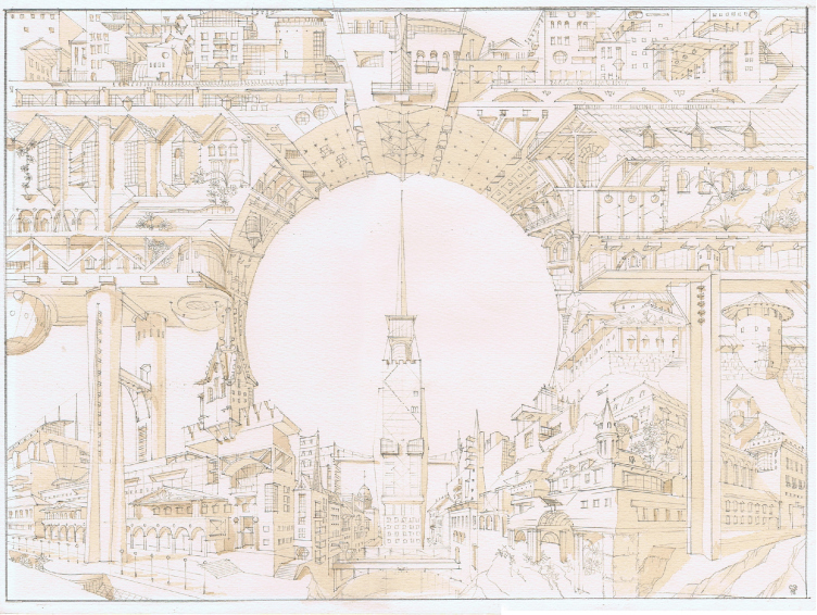
"Something from Padua". Sergey Estrin

