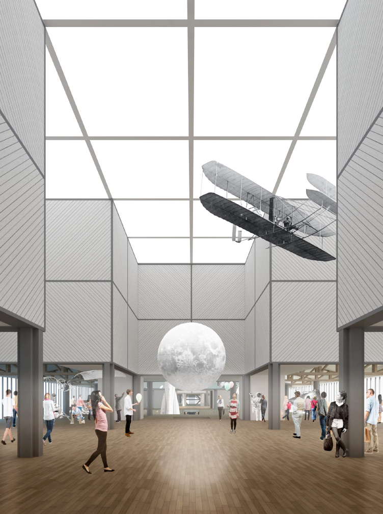
Concept of Science and Technology Museum in Tomsk © Studio 44
Concept of Science and Technology Museum in Tomsk © Studio 44
In mid-March, it became known that the project by "Studio 44" - the one that won the best-proposal contest for Tomsk Science and Technology Museum - was approved by the governor, and now we have grounds to hope that this project will become a rare, if not the only, case in Russia of a project being implemented as a consequence of an architectural contest. We revised the project yet again, and in the next few days we are planning to share about the other proposals of the second round of the contest: the project by Asadov Architectural bureau and the other three finalists.
***
The contest-winning project by Nikita Yavein is radically different from all the other proposals of the final contest round. On the most general level, we could say that all the other projects are dominated by the futuristic motifs of hi-tech and advanced technologies. Their keywords might be "science fiction" and "linear progress".
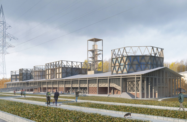
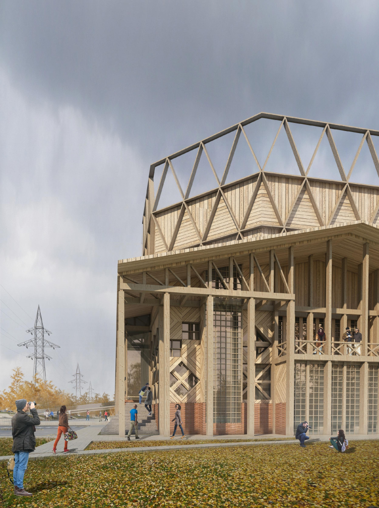
The project by "Studio 44" is also not devoid of the hi-tech imagery but here it is treated in an entirely different way, the operative word being "museum" in its historical context. In its upper tiers, about two thirds of it, the museum is made of wood which is remarkable in itself; the bricks and concrete only manifest themselves in the ground floor. Second of all, and most importantly, the author description carefully enumerates a large number of historical and contextual connotations, so, there is nothing to guess, really, one can find or fail to find the parallels as he proceeds with the text. The most ancient level of analogy: the ships with Cossacks that Boris Godunov sent in the year of 1604 to protect the local Eusht Tatars from the neighboring Kyrgyz - in exchange for the Tatars becoming part of Russia, of course - and the wooden fortress that was built here immediately after the Cossacks arrived, the one that originally served only the defense purpose and then was turned into the place of Siberian exile of the political prisoners. The ships and the fortress are meaningfully framed by the ground floor galleries that were an indispensable part of palaces and churches of the XVII century, the architects giving these galleries a special notice. The next Tomsk that we see is "the governor's one" built to the regular plan with houses sporting wooden upper rooms resting on stone basements, a city with an air of richness and importance, even though so stealthy at the same time that back in the day Mikhail Speransky thought of "having everyone hanged" here. Further on, the chronology of the "architectural prototypes of the museum" includes the Triumphal Arch and the Pavilion that were both built to celebrate the arrival of the Crown Prince of Russia, the future Emperor Nicolas II; the last step of this pre-history being the Moscow Trade Show of 1923 that took place on the spot where now the Gorky Park is.
The span of these parallels is more than three centuries wide, and it is this historical pileup, remarkably deep and detailed, that becomes one of the main distinctive features of this project. One gets a desire to unravel it for what is is worth; it presents a whole new level of treating the context that penetrates deep inside and picks into its basket all the cultural and subcultural artifacts you could possibly think of. It is like archaeology of meanings; this is the way an archaeologist clears away the dust from his excavation - layer by layer, carefully writing down his every step. What is also important here is the fact that the "layers" have not been entirely removed, there is no direct path to the ancient "wooden fortress"; what matters here is the very fact of such pileup of layers, and the multiplicity of allusions. The presence of the active parallel text that sometimes explains things and sometimes only adds to the confusion but nevertheless remains an indispensable part of this work of art in its own right reminds the conceptualism of the 1980's in its "paper architecture" aspect - just like the entire complex of associations reminds a lot of sheets of tracing-paper, semitransparent drawings superimposed on one another. Different meanings shine and show though each other, both mentally and visually, forming two "tag clouds": the first one is notional, consisting of ships, fortresses, galleries, emperors and governors, and the second one is visual, both in approximately the same way - meaning not giving the answers but only getting us wondering, searching and trying to unravel the mystery (this is what science is all about, anyway), so the architects came up with this charade. One more thing - the two "clouds" surely interact with one another.
Concept of Science and Technology Museum in Tomsk © Studio 44
Facades. Concept of Science and Technology Museum in Tomsk © Studio 44
All-Russian trade fair. Developed view of the cenral architectural ensemble of the fair, 1923.
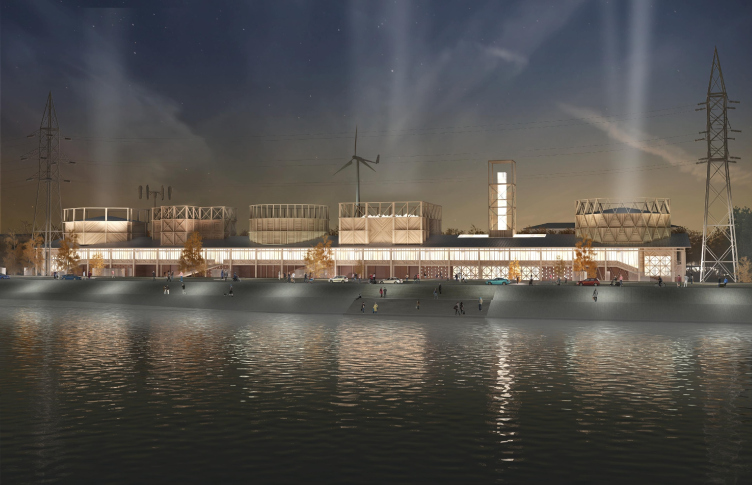
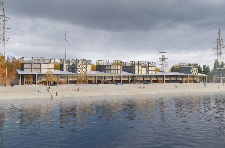
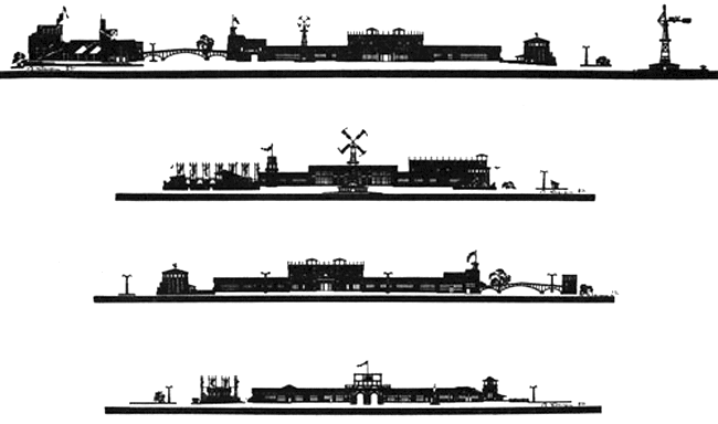
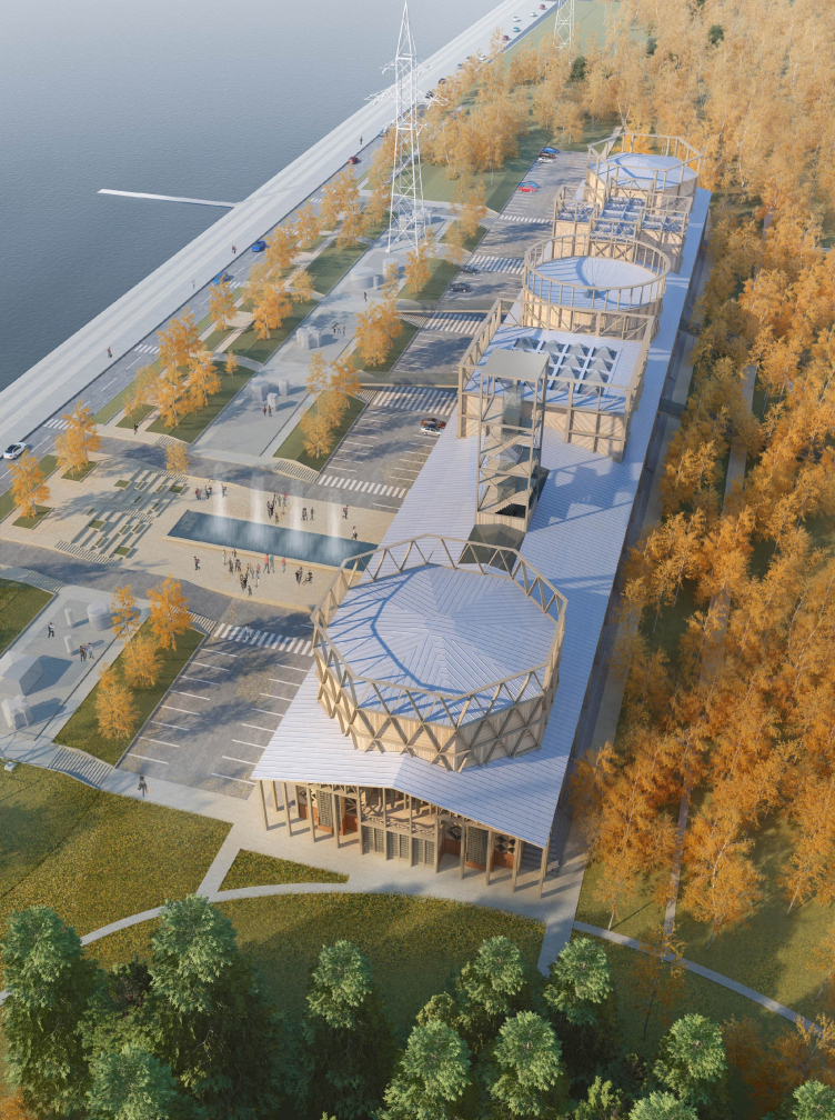
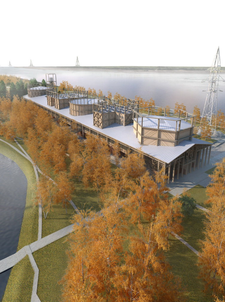
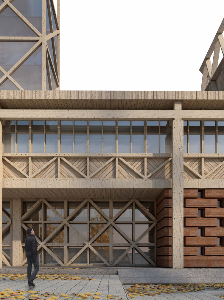
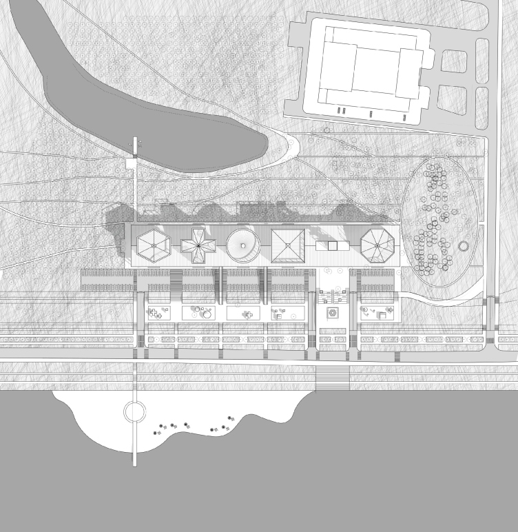
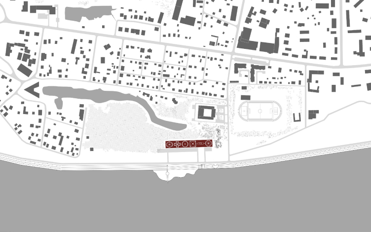
In terms of the project's plastics, the final analogy that the authors bring, that of Moscow Trade Show 1923, is arguably the main one, the resemblance here is obvious, one can only compare and enjoy finding the similarities. The resemblance with the architecture of the historical trade show is evident and pretty soon one starts seeing direct quotations: the faceted towers with their diagonal bracing are akin to the pavilion of the Moscow City Bank, the long wooden peripteral units with their zigzag framework filling of the gently sloping gables - ditto; the large faceted volume growing from behind the portico we can also see nearby, in the building of the main pavilion, the same technique becoming the main part of the design solution of the side walls of the museum building. Apart from these "basic" quotations, there are also quotations of the "beacon" kind that only sharpen the resemblance: the windmill and the latticed tower. The show consisted of pavilions and occupied a significantly greater territory, while the museum is a single building strung upon an enfilade of its halls - but still their silhouettes have a lot in common. The museum looks like the trade show just like Jerusalem Wall of the Nikolo-Ugreshsky Monastery in the Moscow area looks like a medieval city without being one - it can be treated as an architectural staging or a thematic theater decoration. Even their locations are somewhat similar - the museum, just like the territory of the trade fair back in 1923, stretches between a few ponds and a river.
Concept of Science and Technology Museum in Tomsk © Studio 44
Thus, the fact of their quoting is deliberately disclosed by the authors. Within the project, it creates some extra "subject matter" that gives the visitors some extra food for thought. Why this specific trade fair?
The architecture of large-scale trade shows is a thing that is interesting in itself - due to the fact that the fair pavilions and booths are by definition temporary structures. And - this is exactly why a lot of new architectural ideas has been tried on exhibition stands over the years. The language of the architecture of the expo pavilions allows for a great leeway; besides, there is the "expo" function that a museum and a trade show share. So, on a word, it is not at all surprising that it was a trade show that was chosen as a prototype.
Besides, it is the Moscow Trade Show of 1923 that is arguably considered to be the catalyst of the Russian avant-garde. It was the first show of the Soviet industrial achievements, an attempt to find its own identity made by the young worker-and-peasant state, and a mass communication tool as well - not yet full of stale propaganda, as its successors would soon be, but full of genuine search for the new forms and self-identification. Back in the day, Shchusev called this trade show an architectural one and predicted that it would be a source of learning for generations of architects to come. However, this "new economic policy" trade show was destined to be forgotten for a long time until a couple of years ago when "Garage", while opening its pavilion designed by Sigeru Ban, reminded Gorky Park about its roots. So, the pavilions of the trade fair of 1923 were extremely diverse: from the oriental Azerbaijan and Turkmen pavilions to the "progressive" "Makhorka" by Melnikov, from the wooden engineering structures, such as the pedestrian bridge over the Garden Ring, to Zholtovsky's free speculation on the subject of classics - he built the nucleus of the fair: the double arch at the entrance, the "main house", and the pavilion of mechanic engineering.
His colleagues frowned on Zholtovsky for his soft spot for the classic forms and their all-too-obvious presence in his constructions - the way today's architectural community will maybe frown on Nikita Yavein for his exact quoting. However, neither before nor after this did Zholtovsky's classic get such an interesting interpretation. Powerless against the charms of the first soviet tractor or maybe following the time-tested protocol of the quick-mount fixtures, he easily entwines the classic arches and gables into the lightweight framework enhancing the effect of the openwork lattices without really taking the trouble to employ any decorative elements. The frameworks lay bare the intricate inner structure, as if turning it inside out. Shadows of the recognizable shapes, due to their somewhat "festive light-mindedness", easier interact with one another, forming a new alloy that is flexible and, what is particularly important, tolerant to later additions.
It is this specific language that Nikita Yavein uses for his museum, the whole thing being, to my mind, about not reproducing the objects but about "taking after" them, or maybe even reviving the architectural language that once played a very important part but was comparatively soon forgotten and replaced by the standard propaganda - which prevented it from exploring its full potential. The authors of the Tomsk project propose to make this language come alive, accentuating and exploring its valuable features and the possibilities that it presents.
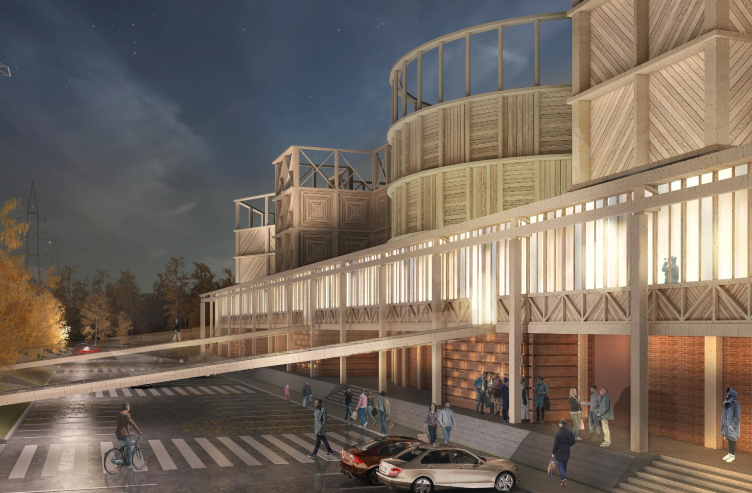
Its main strong point is its high adaptivity, the ability to absorb extremely diverse topics without any damage to its integrity. The transparent overlapping structures are akin to the Meyerhold stage constructions - they generally have a lot in common with the theater props that are capable of carrying different meanings, and the architects make the most of this tolerance introducing into these structures a lot of the original stories that were described in the beginning of this article. The gangway boards that run above the road to the river bank remind about the ships that moored to the Tom' banks four hundred years ago - now the imaginary "ship" finds itself ashore just like Noah's Arch after the Great Flood.
Concept of Science and Technology Museum in Tomsk © Studio 44
And, while the "navy" theme, if I'm not mistaken, was not extensively represented at the Moscow Trade Show, the second theme that Nikita Yavein explores, namely, that of the medieval wooden fortress, gets the fullest possible coverage here. Drawn by Zholtovsky, Kokorin, and Kolli, the central part of the 1923 trade show was stylized by the then-modernist techniques to look like a wooden fortress. Back then, there appeared a whole "Russian Town" next to the Garden Ring - with buttresses at its corners, at the entrance, and near the bridge, it would have quite easily passed for the stage backdrop for some Russian fairy-tale, not really looking like the actual old Russian wooden fortress, the kind that we know thanks to the historian Anatoly Kirpichnikov. One way or another, it was a single image that Zholtovsky took directly from the preceding epoch using its "folklore" quality and, livening it up somewhat with the freedom of openwork structures, placed at the exhibition. Nikita Yavein uses this all in his project, only the buttresses of the decorative fortress are lining up in a museum enfilade.
Concept of Science and Technology Museum in Tomsk © Studio 44
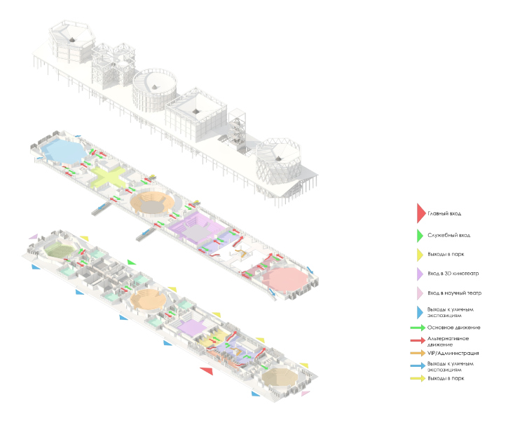
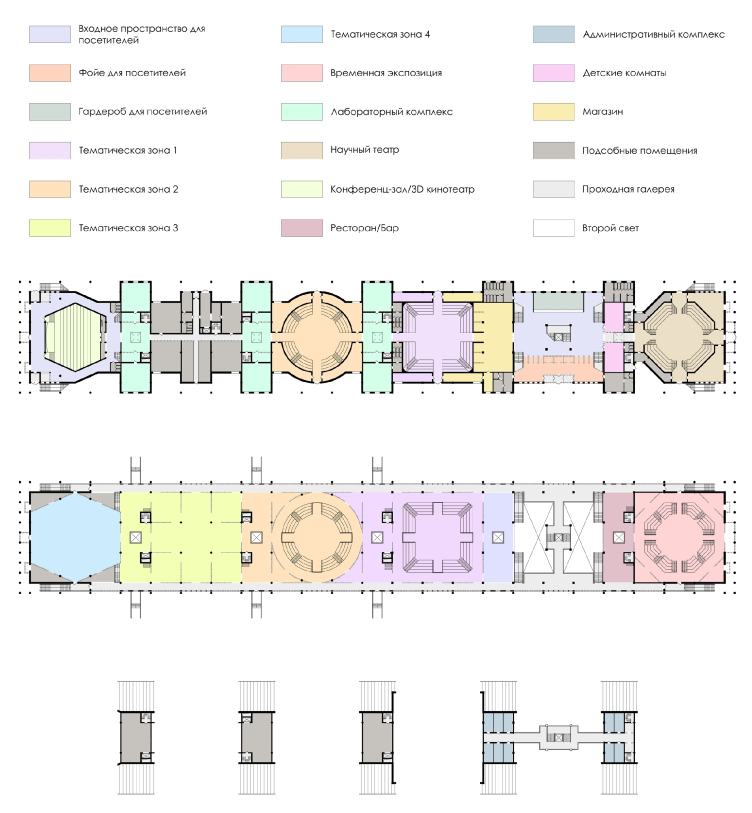
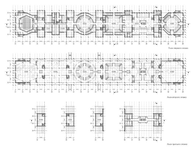
Plans of the floors. Concept of Science and Technology Museum in Tomsk © Studio 44
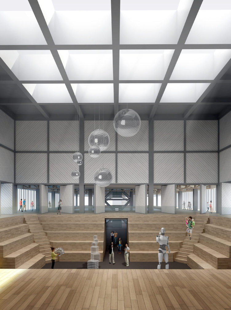
Concept of Science and Technology Museum in Tomsk © Studio 44
The plastic of the Moscow Trade Show of 1923 is also interesting because of the fact that it took a lot from the wooden modernist architecture: the outside frameworks, the ornamental arrays of diagonal boards, and even the transparency of its structures that was for years successfully tested on the pseudo-Russian romantic little palaces and verandas. Cleared from all the unnecessary decorations, and still retaining its modern qualities, this version of wooden architecture appeared to be capable of uniting the classic gable and post-industrial associations, with the towers and buttresses, of course, being the most reminiscent of something pertaining to red-brick factory buildings, something like a memorial to the river industry. As for the lattices of which the building consists as much as the Pompidou Museum does of pipes, they look like a peculiar variety of what I would call "wooden retro hi-tech", while the whole thing, when put together, brings us to the popular movie genre of steampunk, only here, instead of nuts, bolts, and washers, we see wooden beams and lattices.
Concept of Science and Technology Museum in Tomsk © Studio 44
But then again, the "neo-Russian" theme was one of the main ones in those little palaces - and it is quite appropriate here, the authors especially stressing that the glass corridors, that stretch along the walls on the outside and form an alternative route for the visitors, originate from the wooden galleries of the Russian temples of the XVII–XVIII centuries. Meanwhile, while these "wooden galleries" may have been an important part of the Russian life, the very notion of a gallery is of an Italian southern origin. This is why the medieval resource is not really felt in these galleries - even though the author's idea is very interesting in itself - and as for the resemblance between the gallery and the "silver age of the Russian poetry", it is truly charming and adds a lot of warmth to the museum, the kind of warmth that offsets the "factory" flavor.
The wooden modernism is there on the technical level, and, as for the image of a city house of the XVIII century with a stone basement floor, it looks as if it were suspended on the framework of imaginary "power lines": the bulky rock-face blocks with their joints filled with glass and glowing in the dark remind us of a fortress as much as a town. And here we are to get back to Zholtovsky's fair again: it was him who showed just how easily the avant-garde freedom can unite the gables of our times with the medieval towers and wooden galleries.
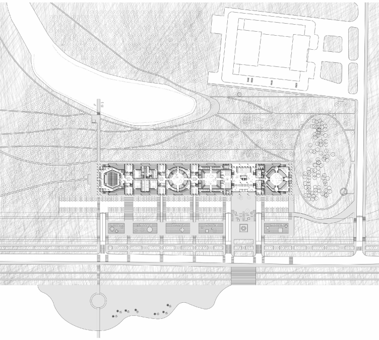
Master plan. Concept of Science and Technology Museum in Tomsk © Studio 44
What is interesting is that, based on the plastics developed by Zholtovsky, and using the peripter with gables for the basic volume, Nikita Yavein deliberately - as if for the balance reasons - enhances the constructivist theme putting it into the row of meaningful associations, namely, likening the "tower" halls, to simple geometric shapes of Malevich: from the square to the famous Greek Cross. This cross also has a lot of interesting things about it, and, possibly, some of the clues to unraveling the mystery of this project. We remember that the masters of avant-garde not only were busy denying the past but they also wanted to take this past and, clearing it from the later-added lacquer finish, find the original truth in it and bring it to the world. Malevich's cross is exactly of this kind - it is an attempt to pull a thread bypassing, say, the XIX century directly into the XV century and find there something of meaning and of value. One gets a feeling that the authors of the museum in Tomsk tried to use the key that the the avant-garde artists invented but did not use to its full potential in order to create their own version of historical context. The authors chose the kind of avant-garde that did not deny the classics and was interested in its Russian roots.
Location plan. Concept of Science and Technology Museum in Tomsk © Studio 44
To cap it all, wood is a very interesting material in its own right but at the same time very challenging to work with - in the XX century it was in fact banned due to general fire safety considerations, and the Russian cities were overbuilt with reinforced concrete boxes - the houses stopped being wooden. Proposing to build a museum from wood, even if with a concrete basement floor is by all means a brave move. However, finding the right image for the wooden building is difficult - simply because there are about five options to choose from, and they all are hackneyed beyond belief. Even if we are to proceed from the wooden Tomsk the way it was two hundred years ago, neither a log cabin, nor the wooden upper floor can be the right prototype for us. As far as today's wood is concerned, there are a few branches (if we are to cast away the log cabins as unabashedly retrograde): the simplicity of the Scandinavian House; Bionic Snakes covered with wood single roofing, the brave ribbed frameworks of the gyms and airport terminals where wood perfectly matches metal - the direct successors of the large-span framework arches of the early XX century.
Of course, the techniques of the Moscow Fair of 1923 were also used in Moscow's "neo-avant-garde" of the 2000's but not often, and rather sporadically; a lot rarer than the corner balconies and the "ribbon" windows. In the Tomsk museum, Nikita Yavein acts in a brave, almost declarative, fashion: he makes an attempt to revive the style of the time when the architectural avant-garde was still in the making, an attempt to use its lucky, and sometimes histrionic, ability to imbibe different meanings. The result is an amazing construction indeed, akin to some wooden mechanism, some "steam-driven airplane", a memory of the epoch when people's dreams of technical progress, though looking a bit naive from today's standpoint, were a true source of inspiration for many people. A position that is more than appropriate for a science and technology museum.
Plan. Concept of Science and Technology Museum in Tomsk © Studio 44
Master plan. Concept of Science and Technology Museum in Tomsk © Studio 44
Plans of the floors. Concept of Science and Technology Museum in Tomsk © Studio 44
Section view. Concept of Science and Technology Museum in Tomsk © Studio 44
Concept of Science and Technology Museum in Tomsk © Studio 44
Concept of Science and Technology Museum in Tomsk © Studio 44


