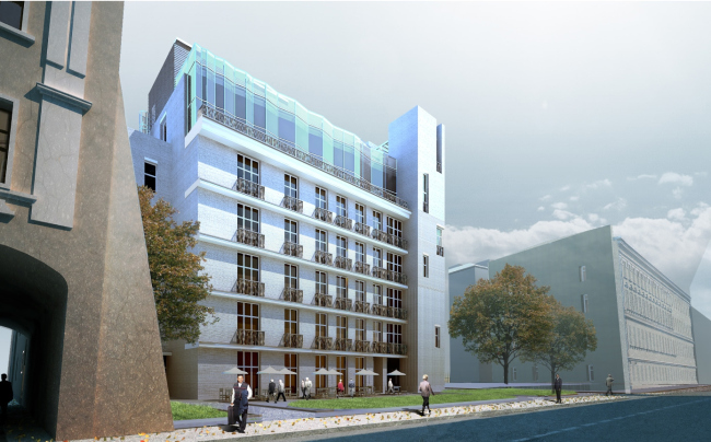
| Apartment hotel with an underground parking garage in the Elektrichesky Alley, Moscow, Russia 2014 © Bavykin Architectural Studio |
The project was prepared for the land site on which last spring there was taken down, though protected by the local people, the deputy Elena Tkach, and "Archnadzor", the remainder of the architect Sokolov's mansion. Truth be told, the house looked pretty ugly; it had no protected status whatsoever, the better half of it consisting of the so-called "soldier brickwork", the kind that was used in the first post-war years, faulty and sloppy-looking. The house was demolished legitimately and lawfully, with the permit issued by the demolition committee working under the supervision of deputy mayor Khusnullin.
The coordinator of "Archnadzor" Rustam Rakhmatullin proposed to restore the Sokolov mansion true to the original - meaning, because there was very little left of it, in fact, to build it from scratch in the original shapes, or, to be still more exact, to build a completely new building within the confines of the old building - a small single-story monument to the mansion at the heart of Moscow. The rhetoric that the historic preservation activists used, called the new project - the one that was to be built here instead of the mansion - nothing other than a "concrete-and-glass giant", the classic cliché of the 1980's that gave away their unwillingness to take even a brief look at the new project, for the simple reason that any substitution of the building that they defended they considered as “evil” by default.
Meanwhile, concrete and glass are there in virtually any building in this day and age, but they are not that important here, after all. The subtle, considerate of both their environment and plastics, and generally "intelligent" projects are still few and far between even in the center of Moscow as it is. The architect Aleksey Bavykin, together with his daughter Natalia Bavykina, has been designing for this land site since 2010, and is now ready with a third version, complying to the ever new restrictions. Initially, the house used to occupy the whole site, then it got cut down to the size of the blueprint of its predecessor, and the outlines if its plan took on an intricate plan following the jagged annexes that once stood here (it is just baffling why this was to be done if the original house had been demolished anyway - but the specifications are to be observed and the architects did precisely that, with their height being even a bit smaller than what was actually permitted). We asked Aleksey Bavykin about the Sokolov Mansion, and he said that in his opinion, had there been as much as a little something left of the original house, something that was worth the preserving effort (Bavykin graduated from Moscow Institute of Architecture majoring in restoration, so he must know something about the subject and the possibilities if conservation), he would not have taken up this project under any circumstances. And - he hates modern replicas and remakes, does not think that they make any sense and he would never have signed up to build a "remake".
The architects are sure of their righteousness, and the project, truth be told, is worth implementing, so let us go there and take a closer look.
***
A dog ran across the sky and disappeared... As for the dialogue of "Let's-talk-architect-to-architect", that is so attractive in any reconstruction, it failed to work out either in the first or in the second case. And how could it have been otherwise? The little house that was built back in 1884 by the "reduced in his circumstances and modest in his desires artist and architect Sokolov" - with a grand entrance, rusticated pilasters, and semicircular gable simply fell into pieces. Not into ruins but into pieces: the ruins are something that is romantically attractive while the pieces inspire at best a feeling of pity rather than any interest to one's history.
The house changed hands, got re-planned from time to time, and kept receiving additions all the time as well: in 1899 - a conservatory, and in 1903 - a single-story volume of a kitchen... After 1917, this house that, according to records, had the status of a "private flat", met with the fate of the so called "communal housing" - with the inevitable construction of extra partitions, cutting and sawing new passages and the inevitable driving of nails and spikes into the walls of the anteroom in order to secure tubs, sledges, and bicycles. And in the 1970's, even this idyllic and smelling of pies, boiled laundry, and cabbage soup, life came to an end: the house was turned into an office building with an ill-closing lopsided entrance door, new haphazardly placed partitions and the unwashed cracked windows. Since that day, devoid of any masters, the house, started to rapidly disintegrate past the point of no return. And nobody cared for the fact that it once was a mansion, so rare in this part of town, that once there was probably a little front garden in front of it, and for sure a garden behind it, to which you could walk out of the back terrace. Even the roof timber had long since rotted away...
So, what kind of "dialogue" can we speak here about? At best, a soliloquy about a modern replica, so disliked by Bavykin "building something new, only exactly like something old"…
***
Designing in one of Moscow's narrowest and shortest alleys, squeezed between the pseudo-Russian facade of the Firsanov alms-house and the silhouette of the Vulykh Tower, both bristling with corbel arches, is a tall order indeed. The place does not provide any territorial or even emotional starting points: there are but inexpensive tenement buildings, diluted by an odd soviet-era house here and there. There is no viewing point from which the building could be perceived as a whole - you either only see the top or the bottom of it. Some see one corner, and some see the opposite one, and thus search can go on forever. Ironically, thanks to the twist of his architectural fate and the customer's whim, Bavykin had to go through this quest twice.
The first time it happened was back in 2010 when on the red housing line, a manifesto of a house was to appear: the clear-cut protrusion of the glass penthouse, the irregular colonnade of the trees merging into a sculptural crown, and the jagged grilled of cornice marquee.
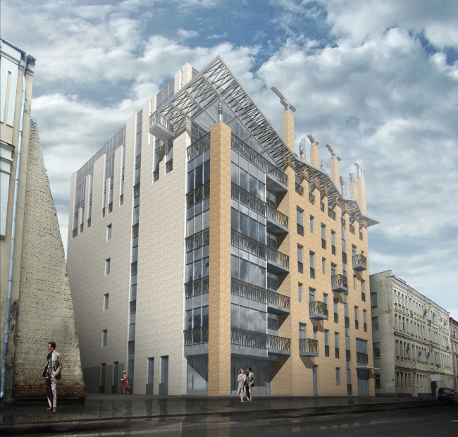
| House in the Elektrichesky Alley, 2010. View from the Elektrichesky Alley © Bavykin Architectural Studio |
The return to the dire confines of the Elektrichesky Alley in 2013 did not look either bright or declarative at first sight. Still, there is something wrong with this "declaratively low profile". In the second version, there was virtually nothing left of "Brusov's Brother". Except maybe for the bronze-patinated canes in the railings of the balconies and the glass volume of the penthouse that undulates in the sunlight with the faceted glass of its outside wall…
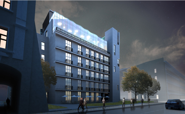
| Apartment hotel with an underground parking garage in the Elektrichesky Alley, Moscow, Russia 2014 © Bavykin Architectural Studio |
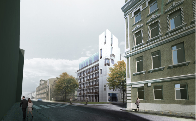
As for the house, it took on the tripartite quality, earlier alien to it; the house stepped back from the red line, practically completely fit the blueprint of the long-gone mansion, and immediately stopped domineering in the street perspective , leaving this privilege up to the already-mentioned Firsanov alms-house that back in the soviet days failed to escape the destiny of being overbuilt with a couple of stories and bring turned from an a-la Russ souvenir box into a granny's trunk that had obviously seen much service. And, set against the background of such visual centerpiece, the exquisite, almost ethereal, volume of the apart-hotel cannot but keep one's attention glued to it. You look over your shoulder yet again and then you at once grasp the position of the corner tower that inexorably puts you in the mind of the ancient castles and fortresses or maybe the building of Mosselprom. "We designed this tower as a small centerpiece, in the spirit of what I would call "low-rise verticals", so very much in the spirit of the old Moscow - Aleksey Bavykin shares - you must remember all those belfries, corner turrets, and other little accents, many of which were destroyed during the soviet years. So, thinking about this little tower, we somehow wanted to get back to this old Moscow's rhythm with its low-rise verticals".
And on the inside, behind the all-but-impermeable denseness of the walls, within the layer-cake of the stories, the architects were able to reconcile the contraries: on the ground and underground, everything starts with the chute of the park lift, on the second, third, ... fifth - turns into a bedroom with a bathroom attached to it, and on the sixth - transforms into the part of the penthouse that is not covered by the free planning. And so, set deep inside the composition, it is this "false" tower that catches the eye from virtually every conceivable angle, like a beacon in the city's seaway.

| Apartment hotel with an underground parking garage in the Elektrichesky Alley, Moscow, Russia 2014 © Bavykin Architectural Studio |
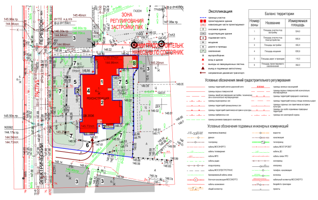
| Land plot layout diagram combined with the transportation organization plan of the territory. Apartment hotel with an underground parking garage in the Elektrichesky Alley, Moscow, Russia, 2014 © Bavykin Architectural Studio |

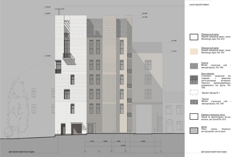
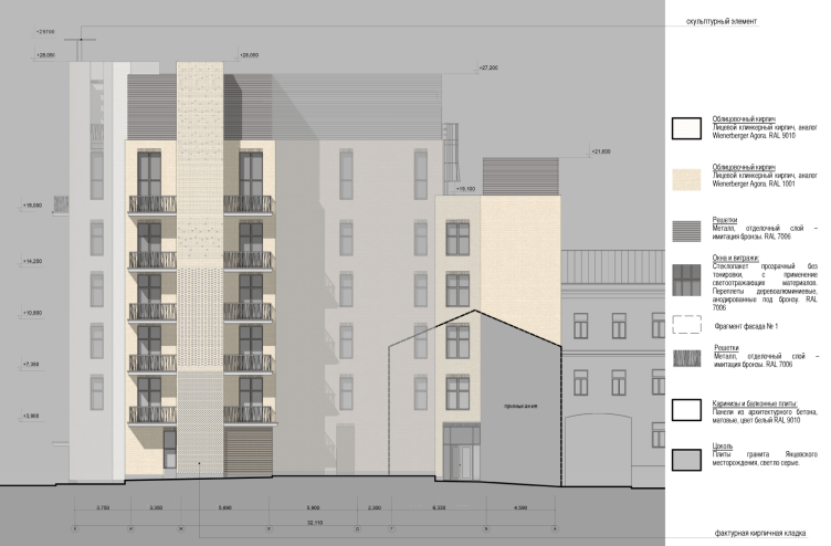
| Sweep circuit of the facades along the Elektrichesky Alley. Apartment hotel with an underground parking garage in the Elektrichesky Alley, Moscow, Russia, 2014 © Bavykin Architectural Studio |

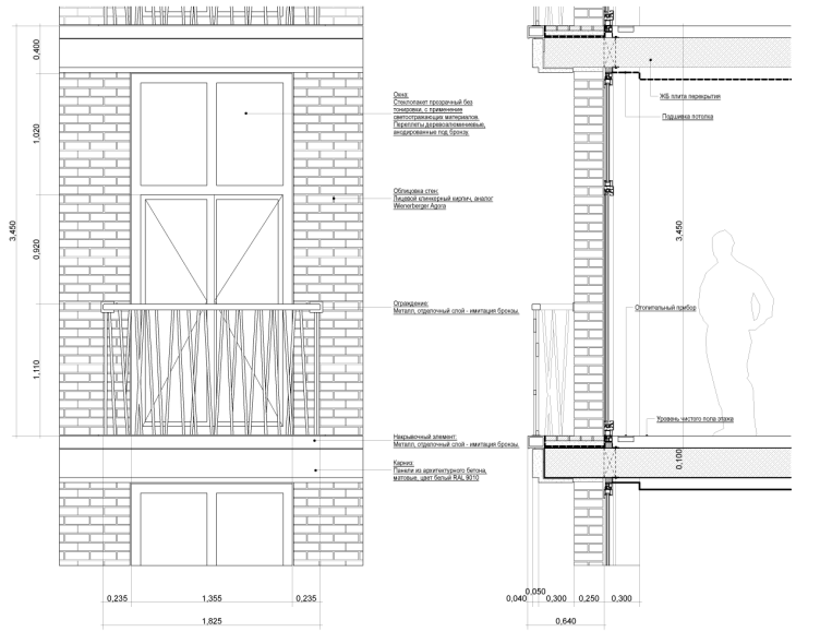
| Plan of facade fragment N1. Apartment hotel with an underground parking garage in the Elektrichesky Alley, Moscow, Russia, 2014 © Bavykin Architectural Studio |
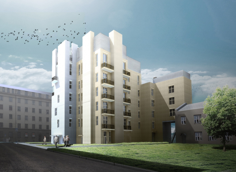
The volume standing opposite to the tower - the third one in the array viewable from the alley - completely mimics the surrounding houses. And this mimicry works exactly like a paper clip that attaches the middle volume to the surrounding cityscape, making it its integral part.
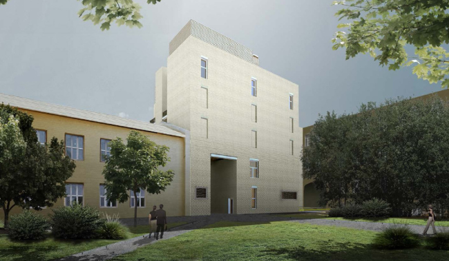
| Apartment hotel with an underground parking garage in the Elektrichesky Alley, Moscow, Russia, 2014 © Bavykin Architectural Studio |

| Apartment hotel with an underground parking garage in the Elektrichesky Alley, Moscow, Russia, 2014 © Bavykin Architectural Studio |
One will also see here the unconventional brick facing of the walls - the kind that Moscow architecture has already grown unused to. Today, when it comes to facing, the first things that come to mind are its color and its material, not its plastic possibilities. In our case, the coveted (in the dull Moscow sun) plastics and ripples of the facade's scale armor is achieved by simple shifting of the bricks back and forth one fourth of their size, with equal or varying steps, beating the rhythm in and out of time. Imitating the joints remaining from the decomposed brickwork and thus hinting of the affinity of this house to some earlier structure - as if the vertical protrusion in the yard used to belong to some broken entity that left regular pieces of brickwork behind it: you can see something like this in the city monasteries and even in the city yards if you look really close - the textured pattern of the brickwork makes the task of examining the facades not only interesting but also throws in some story in the vein of some alternative history novel - treated in a very subtle way for those who understands the very subject of ruins. In the arch in the Mozhaiskoe Shosse, this theme was "killed" personally by the then-mayor of Moscow Yuri Luzhkov but the architectural ideas do no die - they transform and get enriched with new techniques.
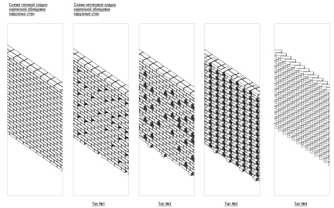
| Brickwork types. Apartment hotel with an underground parking garage in the Elektrichesky Alley, Moscow, Russia, 2014 © Bavykin Architectural Studio |
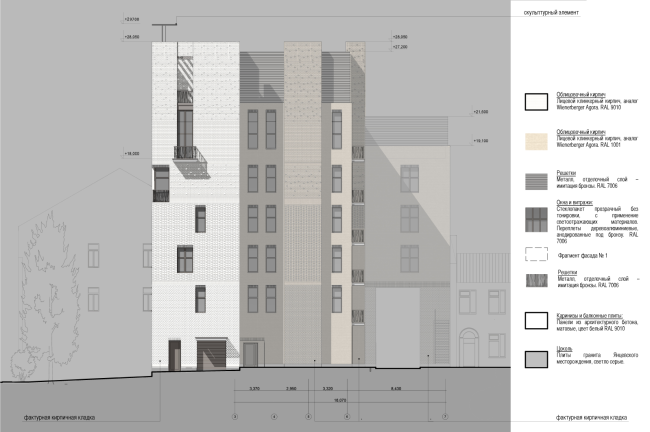
| Facade diagram in axes 1-7. Brickwork types. Apartment hotel with an underground parking garage in the Elektrichesky Alley, Moscow, Russia, 2014 © Bavykin Architectural Studio |
In this version of the project, little is left of the teeth of the "crown" of the "outlaw" order without the capitals - but the house in many respects takes after the good old tenement in the Moscow yard with its circumstance-conditioned plan, its cavities and protrusions, and haphazard annexes - it is this image that prevails here, and it helps the house to be at one with its environment.
So maybe we should not even regret the fact that we will never again see those sculptures, those crowns peacefully resting on top of the columns, reflecting and multiplying in the glass surface of the penthouse , and the fact that the Bavykin dog will never shoot across the sky above the Ekektrichesky Alley...
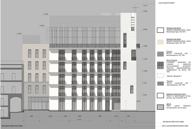
| Facade diagram in axes A-K. Brickwork types. Apartment hotel with an underground parking garage in the Elektrichesky Alley, Moscow, Russia, 2014 © Bavykin Architectural Studio |
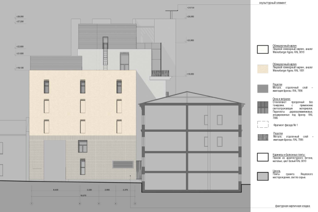
| Facade diagram in axes 1-7. Apartment hotel with an underground parking garage in the Elektrichesky Alley, Moscow, Russia, 2014 © Bavykin Architectural Studio |
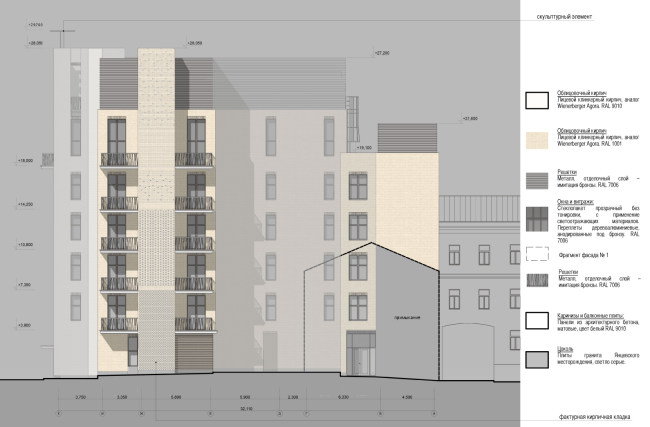
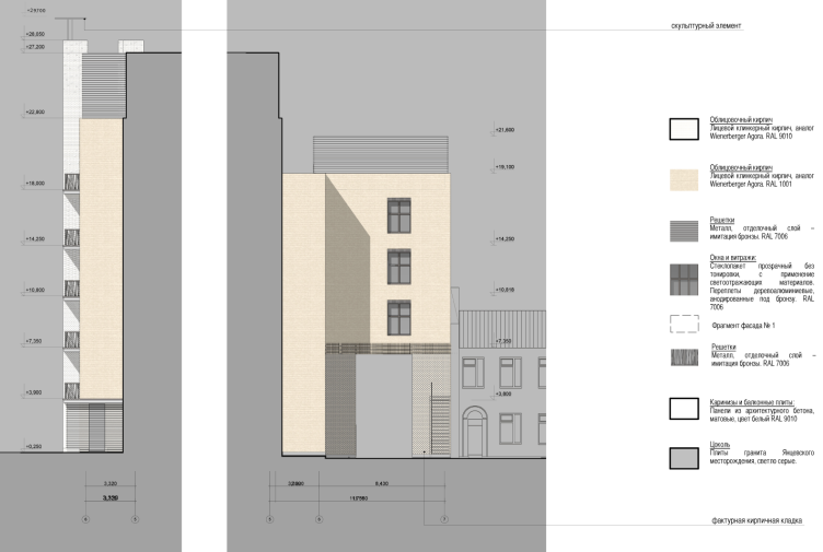
Facade diagram in axes K-A. Apartment hotel with an underground parking garage in the Elektrichesky Alley, Moscow, Russia, 2014 © Bavykin Architectural Studio

| Facade diagram in axes 6-5 and 5-7. Apartment hotel with an underground parking garage in the Elektrichesky Alley, Moscow, Russia, 2014 © Bavykin Architectural Studio |
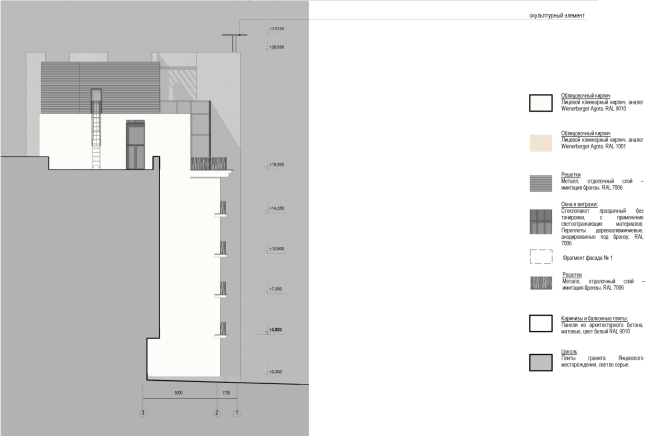
| Facade diagram in axes 3-1. Apartment hotel with an underground parking garage in the Elektrichesky Alley, Moscow, Russia, 2014 © Bavykin Architectural Studio |
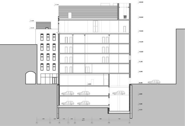
| Section view 2-2. Apartment hotel with an underground parking garage in the Elektrichesky Alley, Moscow, Russia, 2014 © Bavykin Architectural Studio |
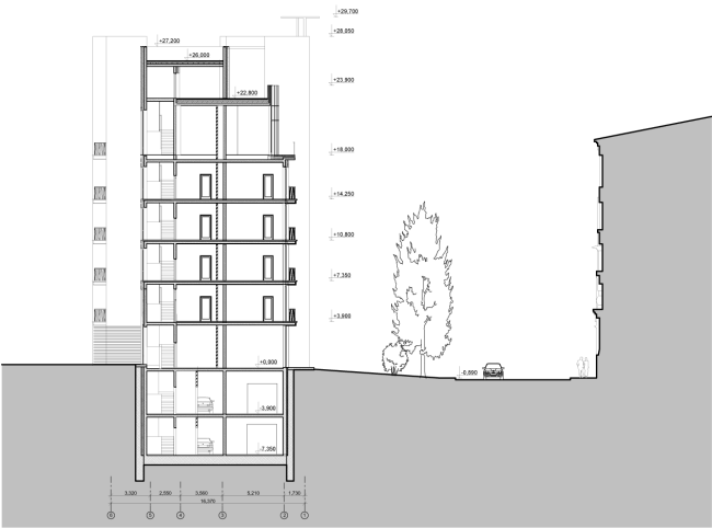
| Section view 1-1. Apartment hotel with an underground parking garage in the Elektrichesky Alley, Moscow, Russia, 2014 © Bavykin Architectural Studio |
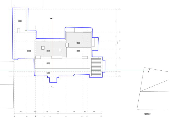
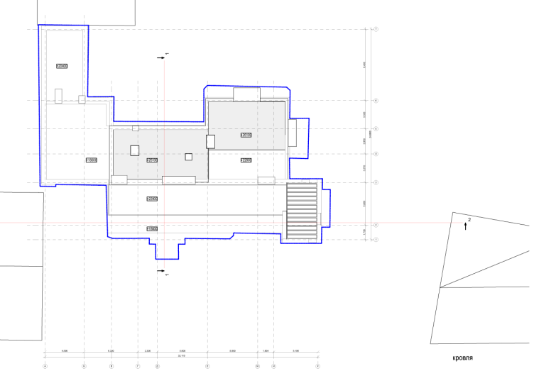
| Roof plan. Apartment hotel with an underground parking garage in the Elektrichesky Alley, Moscow, Russia, 2014 © Bavykin Architectural Studio |
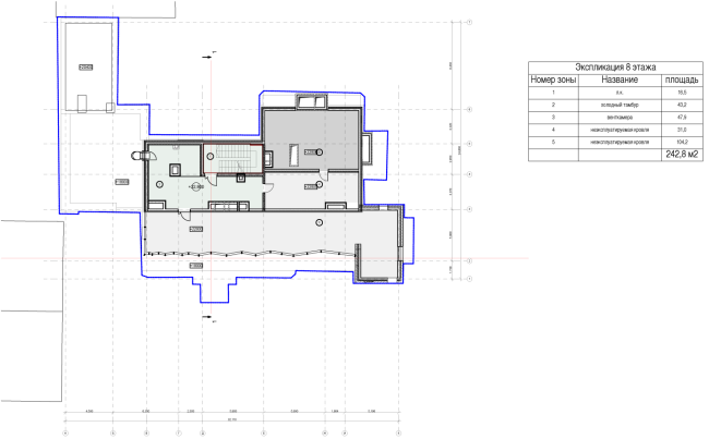
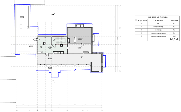
| Plan of the 7th floor. Apartment hotel with an underground parking garage in the Elektrichesky Alley, Moscow, Russia, 2014 © Bavykin Architectural Studio |

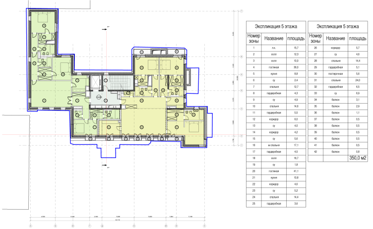
| Plan of the 5th floor. Apartment hotel with an underground parking garage in the Elektrichesky Alley, Moscow, Russia, 2014 © Bavykin Architectural Studio |

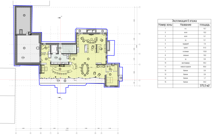
| Plan of the 6th floor. Apartment hotel with an underground parking garage in the Elektrichesky Alley, Moscow, Russia, 2014 © Bavykin Architectural Studi |
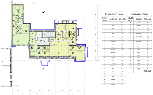
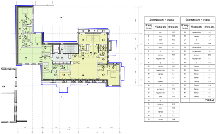
| Plan of the 4 th floor. Apartment hotel with an underground parking garage in the Elektrichesky Alley, Moscow, Russia, 2014 © Bavykin Architectural Studio |

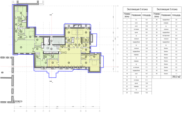
| Plan of the 3rd floor. Apartment hotel with an underground parking garage in the Elektrichesky Alley, Moscow, Russia, 2014 © Bavykin Architectural Studio |
-
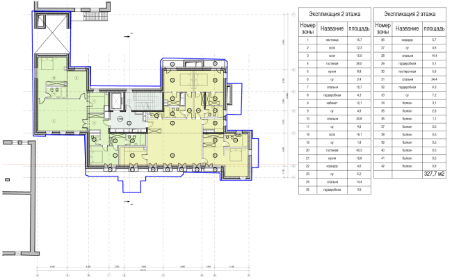
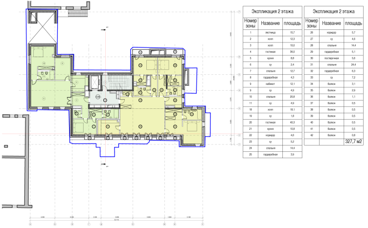
| Plan of the 2nd floor. Apartment hotel with an underground parking garage in the Elektrichesky Alley, Moscow, Russia, 2014 © Bavykin Architectural Studio |

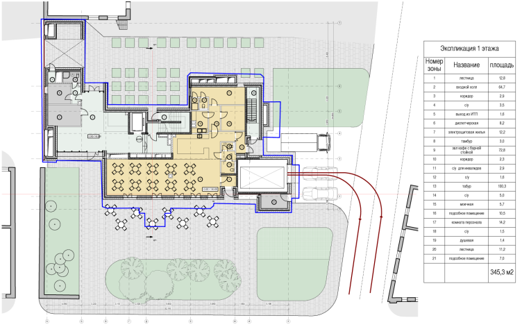
| Plan of the 1st floor. Apartment hotel with an underground parking garage in the Elektrichesky Alley, Moscow, Russia, 2014 © Bavykin Architectural Studi |

| Plan of the 1st floor. Apartment hotel with an underground parking garage in the Elektrichesky Alley, Moscow, Russia, 2014 © Bavykin Architectural Studio |

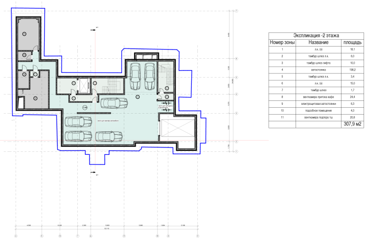
| Plan of the -1st floor. Apartment hotel with an underground parking garage in the Elektrichesky Alley, Moscow, Russia, 2014 © Bavykin Architectural Studio |
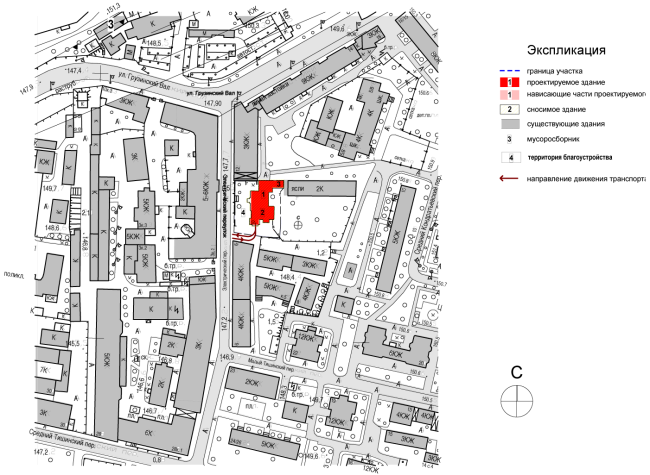
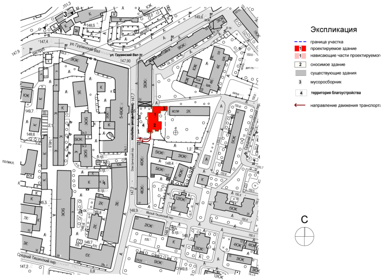
| Location plan. Apartment hotel with an underground parking garage in the Elektrichesky Alley, Moscow, Russia, 2014 © Bavykin Architectural Studio |
So maybe we should not even regret the fact that we will never again see those sculptures, those crowns peacefully resting on top of the columns, reflecting and multiplying in the glass surface of the penthouse, and the fact that the Bavykin dog will never shoot across the sky above the Ekektrichesky Alley...
The hotel with apartments and an underground parking garage in the Elektrichesky lane. Project, 2014
Copyright: © Aleksey Bavykin Architects
House in the Elektrichesky Lane, 201. View form the Elektrichesky Lane
Copyright: © Aleksey Bavykin and Partners
The hotel with apartments and an underground parking garage in the Elektrichesky lane. Project, 2014
Copyright: © Aleksey Bavykin Architects


