По-русски

Life on the Level

In Moscow area, architect Roman Leonidov and designer Svetlana Fiantseva are building a residential house whose elongated one-story volume looks like it is opposed to the verticals of the city.

30 April 2014
Object
mainImg
Architect:
Roman Leonidov
Svetlana Fiantseva
Object:
Private residential house in Moscow area
Russia, Moscow

Project Team:
Author of the project: Roman Leonidov. Interior design: Svetlana Fiantseva
Private residential house in Moscow area © "Roman Leonidov and Partners"

This project is a brilliant example of the kind of housing that the really wealthy people opt for - people that are tired of ostentatious luxury. As Roman Leonidov reminisces, the customer put his requirements on this nutshell: "No frills, no buildup". At the same time, money was practically no object - it was just that the architects had to invest primarily into finding a simple yet graceful solution that would provide the future inhabitants of the house with maximum comfort and would not, at the same time, distract them from doing what they would come here to do - namely, contemplate the nature.

Private residential house in Moscow area © "Roman Leonidov and Partners"

And, yes, there are a lot of things to contemplate out there: for the construction of this house, the customer purchased a magnificent piece of forest land. The tall pine trees that are there on it create the all-but-impenetrable green screen that protects the land site from the outside world better than any man-made fence would. 

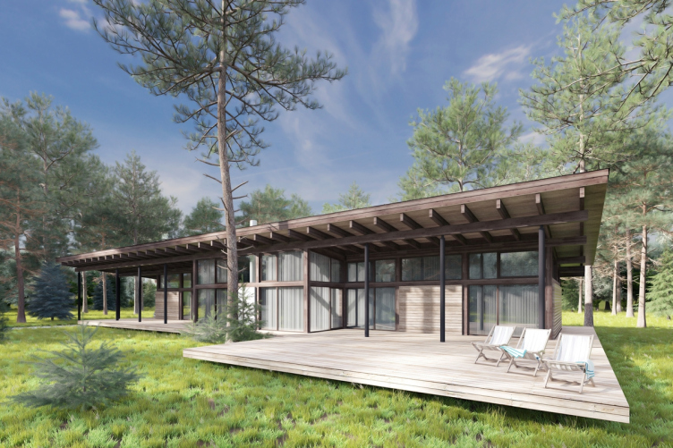
"We came up with the vision of this house almost at once - Roman Leonidov reminisces - the task of opening it up, as much as possible, to the surrounding beautiful scenery necessitated for the huge windows, while the customer's desire to get a terminally functional house prompted to us the idea of a single-story volume of a very simple layout". In fact, this is a parallelepiped that is placed on the land site in such a way as to "catch" as many beautiful views as possible. For the very same purpose, out of the main volume, Roman Leonidov pulls the cube of the living room, while the entrance area, on the other hand, gets a little "pushed in", thanks to which the plan gets some sophistication, however moderate. From a bird's height view, however, one can only guess about that: the house is covered by a wide rectangular roof that conceals all the tectonic nuances. 
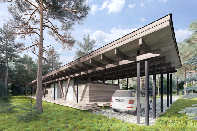
Private residential house in Moscow area © "Roman Leonidov and Partners"

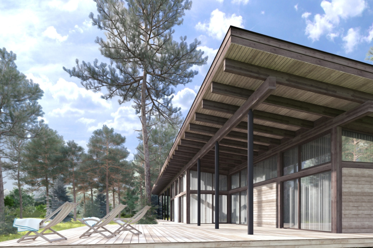
The meaning of the roof with such powerful overhangs is hard to overestimate. First of all, such structure helps protect the premises from excessive heat in the summertime and from losing this same heat during the winter. Second of all, the slight angle of inclination helps to make a few rooms double-height, should this be necessary. And finally, thanks to these huge overhangs, in the immediate proximity of the house, the architects make the barbecue zone and the parking stalls. The solution of the latter is charmingly simple: "breaking off" the terrace, Roman Leonidov runs under the continuing surface of the roof a paved area, flanking its opposite side with an array of slender round-section supports. 
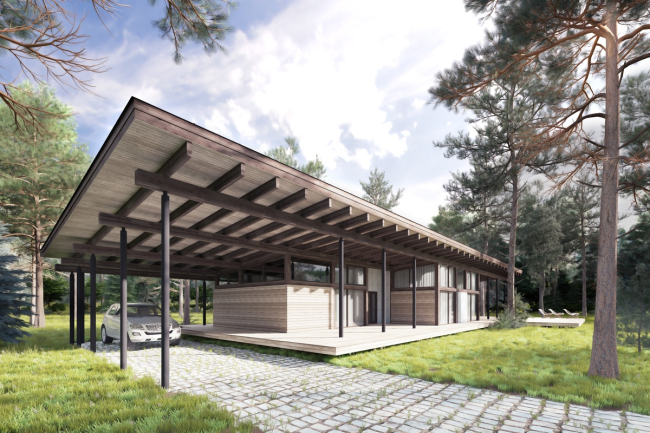
Private residential house in Moscow area © "Roman Leonidov and Partners"

It only makes perfect sense that the volume of such a simple shape is also terminally thought-out and laconic in its materials. Quite predictably, the main part here is played by the wood - one can hardly find a material more resonant to the woodland surroundings than this. Roman Leonidov uses the timber of two colors, assembling the bearing structure from the dark broad boards, while the thinner boards of a lighter color are used to make the partitions wherever transparent glass surfaces would have been inappropriate. The central "public" block of the building is also "fixed" by concrete panels, the rough surface of which serves as the perfect background for the wooden framework. Such an addition, apart from performing the construction function, has also an aesthetic meaning: the customer asked to highlight, in the image of the building, its contemporary origin as well, and, by introducing the main construction material of the century, Roman Leonidov gives a modern twist to the "good old wooden house". 
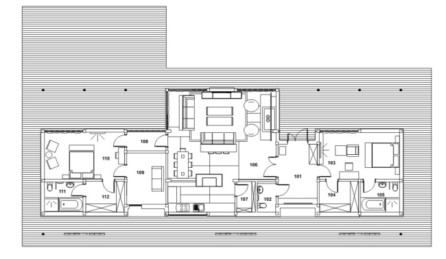
Private residential house in Moscow area © "Roman Leonidov and Partners"

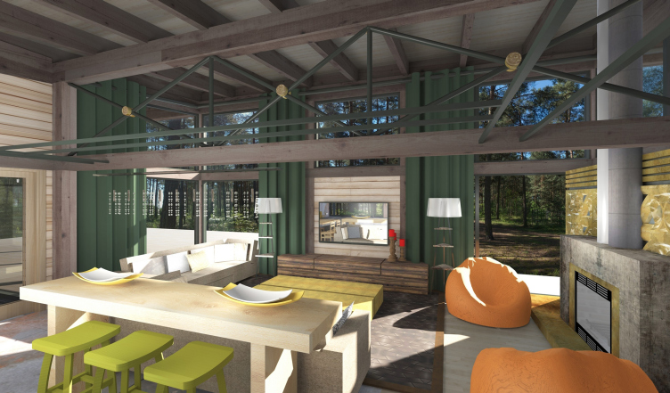
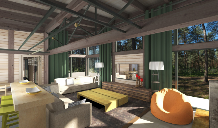
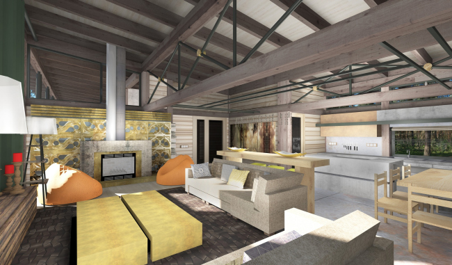
On a par with the wood, the concrete is present even in the interior design of the house. In particular, it is used to decorate the fireplace and the kitchen area. And, just as the house itself is in fact a laconic horizontally oriented volume, the main pieces of the furniture here "develop" horizontally, sporting shapes that are reserved and laconic, at times bordering on ascetic. "But a few premises of the house sport any particular "faceting", otherwise the house is completely natural and free of any cumbersome details" - explains Svetlana Fiantseva, the author of the interior design project. One of such "wrought" territories is the area of the living/dining room, in which the muffled natural tones of wood and concrete are "diluted" with bright colorful accents - the mint green, orange, and the grass green. According to the authors' idea, such color palette goes a long way to make the house even more resonant with its surroundings, bringing the latter in from the outside not only through the large windows but also by means of the bright colors. 
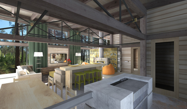
Private residential house in Moscow area © "Roman Leonidov and Partners"

Apart from the spacious living room combined with the dining room and a large kitchen, the house also has in it two bedrooms, each of which has a bathroom and a closet of its own. The architects place these residential blocks separately, one in each wing of the house - the role of the "buffer zone" here is played not only by the nucleus of the living room but also by the guest room and the lobby that flank it from either side. Yet another bedroom is designed directly in the anteroom, adjoining from the opposite side to the wet zone of the kitchen. "From the rational planning standpoint, the advantages of the single-story volume are hard to overestimate - says Svetlana Fiantseva - the premises are arranged in such a way that the people who will live here will have an opportunity to rest and be left alone even if there is a large company partying hard in the other part of the house". 

This effect is strengthened even more by the ramified terrace. Running along the entire perimeter of the house, it accentuates its connection with the surroundings and gives the people still more possibilities to actively spend their time both indoors and outside. 

Private residential house in Moscow area © "Roman Leonidov and Partners"

Private residential house in Moscow area © "Roman Leonidov and Partners"
Private residential house in Moscow area © "Roman Leonidov and Partners"

zooming


Architect:
Roman Leonidov
Svetlana Fiantseva
Object:
Private residential house in Moscow area
Russia, Moscow

Project Team:
Author of the project: Roman Leonidov. Interior design: Svetlana Fiantseva

30 April 2014

Headlines now
The Golden Crown
The concept for a dental clinic in Yekaterinburg, developed by CNTR Studio, revolves around the idea of a “mouth full of gold”: pristine white porcelain stoneware walls are complemented by matte brass details. To avoid an overly literal interpretation, the architects focused on the building’s proportions, skillfully navigating between sunlight requirements and fire safety regulations.
Flexibility and Integration
Not long ago, we covered the project for the fourth phase of the ÁLIA residential complex, designed by APEX. Now, we’ve been shown different fence concepts they developed to enclose the complex’s private courtyards, incorporating a variety of public functions. We believe that the sheer fact that the complex’s architects were involved in such a detail as fencing speaks volumes.
A Step Forward
The HIDE residential complex represents a major milestone for ADM architects and their leaders Andrey Romanov and Ekaterina Kuznetsova in their quest for a fresh high-rise aesthetic – one that is flexible and layered, capable of bringing vibrancy to mass and silhouette while shaping form. Over recent years, this approach has become ADM’s “signature style”, with the golden HIDE tower playing a pivotal role in its evolution. Here, we delve into the project’s story, explore the details of the complex’s design, and uncover its core essence.
Gold in the Sands
A new office for a transcontinental company specializing in resource extraction and processing has opened in Dubai. Designed by T+T Architects, masters of creating spaces that are contemporary, diverse, flexible, and original, this project exemplifies their expertise. On the executive floor, a massive brass-clad partition dominates, while layered textures of compressed earth create a contextually resonant backdrop.
Layers and Levels of Flight
This project goes way back – Reserve Union won this architectural competition at the end of 2011, and the building was completed in 2018, so it’s practically “archival”. However, despite being relatively unknown, the building can hardly be considered “dated” and remains a prime example of architectural expression, particularly in the headquarters genre. And it’s especially fitting for an aviation company office. In some ways, it resembles the Aeroflot headquarters at Sheremetyevo but with its own unique identity, following the signature style of Vladimir Plotkin. In this article, we take an in-depth look at the United Aircraft Corporation (UAC) headquarters in the Moscow agglomeration town of Zhukovsky, supplemented by recent photographs from Alexey Naroditsky – a shoot that became only recently possible due to the fact that improvements were finally made in the surrounding area.
Light and Shadow
In this article, we delve into the architectural design of the “Chaika” house by DNK ag architects, which was recently completed in 2023 as part of the collection of signature designs at ZILArt. As is well-known, all the buildings in this complex follow a design code, yet each one is distinct. This particular building stands out not only for its whiteness and minimalism but also for the refined use of a limited number of techniques that, together, create what can confidently be called synergy.
Casus Novae
A master plan was developed for a large residential area with a name of “DNS City”, but now that its implementation began, the plan has been arbitrarily reformatted and replaced with something that, while similar on the surface, is actually quite different. This is not the first time such a thing happens, but it’s always frustrating. With permission from the author, we are sharing Maria Elkina’s post.
Treasure Hunting
The GAFA bureau, in collaboration with Tegola and Arkhitail, organized an expedition to the island of Kilpola in Karelia as part of Moskomarkhitektura’s “Open City” festival. There, amidst moss and rocks, the students sought answers to questions like: what is the sacred, where does it dwell, and what sustains it? Assisting the participants in this quest were landscape engineer Evgeny Levin, artist Nicholas Roerich, a moose, and the lack of cellular connection. Here’s how the story unfolded.
Depths of the Earth, Streams of Water
In the Malaya Okhta district, the Akzent building, designed by Stepan Liphart, was constructed. It follows a classic tripartite structure, yet it’s what you might call “hand-drawn”: each façade is unique in its form and details, some of which aren’t immediately noticeable. In this article, we explore the context and, together with the architect, delve into how the form was developed.
Fir Tree Dynamics
The “Airports of Region” holding is planning to build an airport in Karachay-Cherkessia, aiming to make the Arkhyz and Dombay resorts more accessible to travelers. The project that won in an invitation-only competition, submitted by Sergey Nikeshkin’s KPLN, blends natural imagery inspired by the shape of a conifer seed, open-air waiting spaces, majestic large trees, and a green roof elevated on needle-like columns. The result is both nature-inspired and WOW.
​A Brick Shell
In the process of designing a clubhouse situated among pine trees in a prestigious suburban area near Moscow, the architectural firm “A.Len” did the façade design part. The combination of different types of brick and masonry correlates with the volumetric and plastique solutions, further enhanced by the inclusion of wood-painted fragments and metal “glazing”.
Word Forms
ATRIUM architects love ambitious challenges, and for the firm’s thirtieth anniversary, they boldly play a game of words with an exhibition that dives deep into a self-created vocabulary. They immerse their projects – especially art installations – into this glossary, as if plunging into a current of their own. You feel as if you’re flowing through the veins of pure art, immersed in a universe of vertical cities, educational spaces – of which the architects are true masters – and the cultural codes of various locations. But what truly captivates is the bold statement that Vera Butko and Anton Nadtochy make, both through their work and this exhibition: architecture, above all, is art – the art of working with form and space.
Flexibility and Acuteness of Modernity
Luxurious, fluid, large “kokoshniks” and spiral barrel columns, as if made from colorful chewing gum: there seem to be no other mansion like this in Moscow, designed in the “Neo-Russian-Modern” style. And the “Teremok” on Malaya Kaluzhskaya, previously somewhat obscure, has “come alive with new colors” and gained visibility after its restoration for the office of the “architectural ecosystem” as the architects love to call themselves. It’s evident that Julius Borisov and the architects at UNK put their hearts into finding this new office and bringing it up to date. Let’s delve into the paradoxes of this mansion’s history and its plasticity. Spoiler: two versions of modernity meet here, both balancing on the razor’s edge of “what’s current”.
Yuri Vissarionov: “A modular house does not belong to the land”
It belongs to space, or to the air... It turns out that 3D printing is more effective when combined with a modular approach: the house is built in a workshop and then adapted to the site, including on uneven terrain. Yuri Vissarionov shares his latest experience in designing tourist complexes, both in central Russia and in the south. These include houseboats, homes printed from lightweight concrete using a 3D printer, and, of course, frame houses.
​Moscow’s First
“The quality of education largely depends on the quality of the educational environment”. This principle of the last decade has been realized by Sergey Skuratov in the project for the First Moscow Gymnasium on Rostovskaya Embankment in the Khamovniki district. The building seamlessly integrates into the complex urban landscape, responding both to the pedestrian flow of the city and the quiet alleyways. It skillfully takes advantage of the height differences and aligns with modern trends in educational space design. Let’s take a closer look.
Looking at the Water
The site of Villa Sonata stretches from the road to the water’s edge, offering its own shoreline, pier, and a picturesque river panorama. To reveal these sweeping views, Roman Leonidov “cut” the façade diagonally parallel to the river, thus getting two main axes for the house and, consequently, “two heads”. The internal core – two double-height spaces, a living room and a conservatory, with a “bridge” above them – makes the house both “transparent” and filled with light.
The White Wing
Well, it’s not exactly white. It’s more of a beige, white-stone structure that plays with the color of limestone – smoother surfaces are lighter, while rougher ones are darker. This wing unites various elements: it absorbs and interprets the surrounding themes. It responds to everything, yet maintains a cohesive expression – a challenging task! – while also incorporating recognizable features of its own, such as the dynamic cuts at the bottom, top, and middle.
Urban Dunes
The XSA Ramps team designed and built a three-part sports hub for a park in Rostov-on-Don, welcoming people of all ages and fitness levels. The skate plaza, pump track, and playground are all meticulously crafted with details that attract a diverse range of visitors. The technical execution of the shapes and slopes transforms this space into a kind of sculptural composition.
Proportional Growth
The project for the fourth phase of the ÁLIA residential area has been announced. The buildings are situated on an elongated plot – almost a “ray” that shoots out from the center of the area towards the river. Their layout reflects both a response to Moscow’s architectural preferences over the past 15 years, shifting “from blocks to towers”, and an interpretation of the neighboring business park designed by SOM. Additionally, the best apartments here are not located at the very top but closer to the middle, forming a glowing “waistline”.
The “Staircase” Building
In designing the “Details” residential complex in New Moscow, Rais Baishev spiced up the now-popular Moscow theme of a “courtyard” building with an idea drawn from the surrealist drawings by Maurits Escher. He envisioned the stepped silhouettes and descending slopes as a metaphysical mega-staircase, creating a key void within the courtyard that gave the project an internal “spine”. This concept is felt both in the building’s silhouette and on its façades.
Projection of the Quarter
No one doubted that the building that Vladimir Plotkin designed as part of the “Garden Quarters” would be the most modernist of all. And it turned out just that way: while adhering to the common design code, the building successfully combines brick and white stone, rhythmically responding to the neighboring building designed by Ostozhenka, yet tactfully and persistently making a few statements of its own. This includes the projection of the ideal urban development composition “14–9–6”, which can be found right next door, mathematical calculations, including those for various types of terraces (and perhaps the only reminder of the Soviet past of the Kauchuk rubber factory!), and the white “cross-stitch” pattern of the façade grid.
Domus Aurea
In this issue, we examine the “Tessinsky-1” house, designed by Sergey Skuratov and completed in 2023. Located in the middle of the Serebryanicheskaya Embankment district, at the intersection of its main streets, this house assumes a sort of “nodal” role: it not only responds to everything around it and preserves many memories of the former EMA factory within itself, but it weaves all this into a newly directed pattern, reconciling bright “gold” and dark-colored brick, largely with the help of the new, modern-yet-archaic Columba brick, which, come to think about it, is the most precious element here.
The Chimney of Nikola-Lenivets
In this issue, we are examining the “Obelisk House” designed by KATARSIS and built for the Arkhstoyanie 2023 festival. However, it was only finished later on, and this is why we are examining it now. It seems to us that after the “Obelisk House” appeared in Nikola-Lenivets, a dialogue and a few inner connections appeared between the temporary structures built here. These houses no longer look like “accidental neighbors”, more of which below.
​Periscope by the Bay
The jury awarded the second place in the competition for a public and cultural center in Petropavlovsk-Kamchatsky to the companies GORA (“Mountain”) and M4. In the consortium’s proposal, the building resembles a sperm whale with a calf swimming next to it or a periscope, whose lenses capture the most spectacular views from the surrounding landscape.
From Arcs to Dolmens
While working on the competition project for Petropavlovsk-Kamchatsky, ASADOV Architects prioritized the value of the natural and urban environment, aiming to preserve the balance of the location while minimizing the resemblance of the volume that they designed to a “traditional building”. The task was challenging, and the architects created three versions, one of which having been developed after the competition, where their main proposal took third place. However, the point of interest here is not the competition result but the continuity of creative thinking.
Hide and Seek
The ID Moskovskiy house, designed by Stepan Liphart in St. Petersburg, in the courtyards near Moskovskiy Avenue beyond the Obvodny Canal and recently completed, is notable for several reasons. Firstly, it has been realized with considerable accuracy, which is particularly significant as this is the first building where the architect was responsible not only for the facades but also for the layouts, allowing for better integration between the two. On the other hand, this building is interesting as an example of the “germination” of new architecture in the city: it draws on the best examples from the neighborhood and becomes an improved and developed sum of ideas found by the architect in the surrounding context.
The Big Twelve
Yesterday, the winners of the Moscow Mayor’s Architecture Award were announced and honored. Let’s take a look at what was awarded and, in some cases, even critique this esteemed award. After all, there is always room for improvement, right?
Above the Golden Horn
The residential complex “Philosophy” designed by T+T architects in Vladivostok, is one of the new projects in the “Golubinaya Pad” area, changing its development philosophy (pun intended) from single houses to a comprehensive approach. The buildings are organized along public streets, varying in height and format, with one house even executed in gallery typology, featuring a cantilever leaning on an art object.
Nuanced Alternative
How can you rhyme a square and space? Easily! But to do so, you need to rhyme everything you can possibly think of: weave everything together, like in a tensegrity structure, and find your own optics too. The new exhibition at GES-2 does just that, offering its visitor a new perspective on the history of art spanning 150 years, infused with the hope for endless multiplicity of worlds and art histories. Read on to see how this is achieved and how the exhibition design by Evgeny Ace contributes to it.
Blinds for Ice
An ice arena has been constructed in Domodedovo based on a project by Yuri Vissarionov Architects. To prevent the long façade, a technical requirement for winter sports facilities, from appearing monotonous, the architects proposed the use of suspended structures with multidirectional slats. This design protects the ice from direct sunlight while giving the wall texture and detail.