По-русски

Four Islands of Cape Green

"Architectural Group DNK" is building a settlement of "Reka-Reka" ("River-River") next to Zvenigorod. "We got hold of a splendid opportunity to design the entire settlement and think through its every detail - from the general master plan and housing projects to the elements of landscape and interior design" - share the architects about their project.

21 October 2013
Object
mainImg
Object:
“Reka-Reka” Settlement
Russia

Project Team:
Architects: Daniel Lorentz, Natalia Sidorova, Konstantin Khodnev, Andrew Taranukha, Maria Kochurkina, Anna Averianova, with the participation of Yuri Klevakin, Nadezhda Kulikova, Catherine Kobycheva. Chief Designer Sergei Stroganov. The developer of the project: "Vector Investments"

2012 — 2013

The duplication of one and the same word, in many world languages, stands for the superlative degree, the quintessence of this or that idea. The proverbial "cafecafe" in Spanish, for example, guarantees that what you are having is not just any coffee but the ultimate coffee experience in the world. This also holds true for the settlement of "Reka-Reka" - not only is it situated on the bank of the Moskva River, but also is inscribed into one of its most picturesque bends, and it was specifically this artery that became the main town-forming element of this complex master plan.
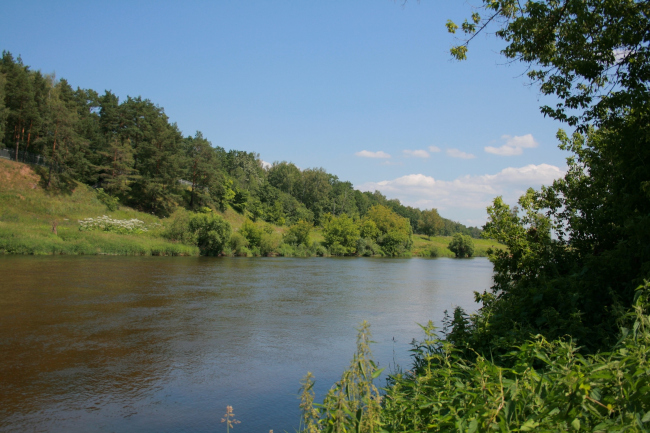
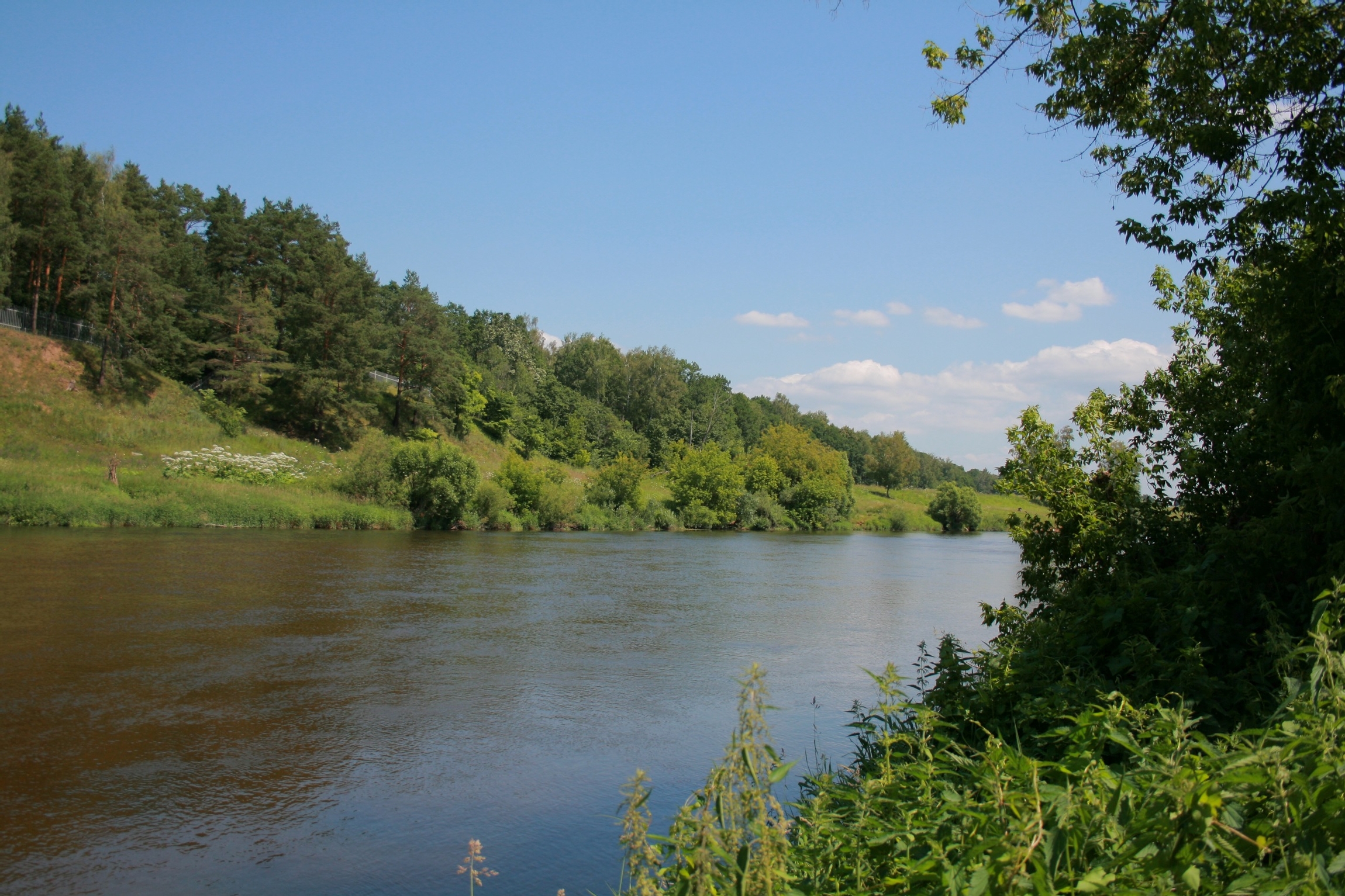
View of the opposite bank of the river 

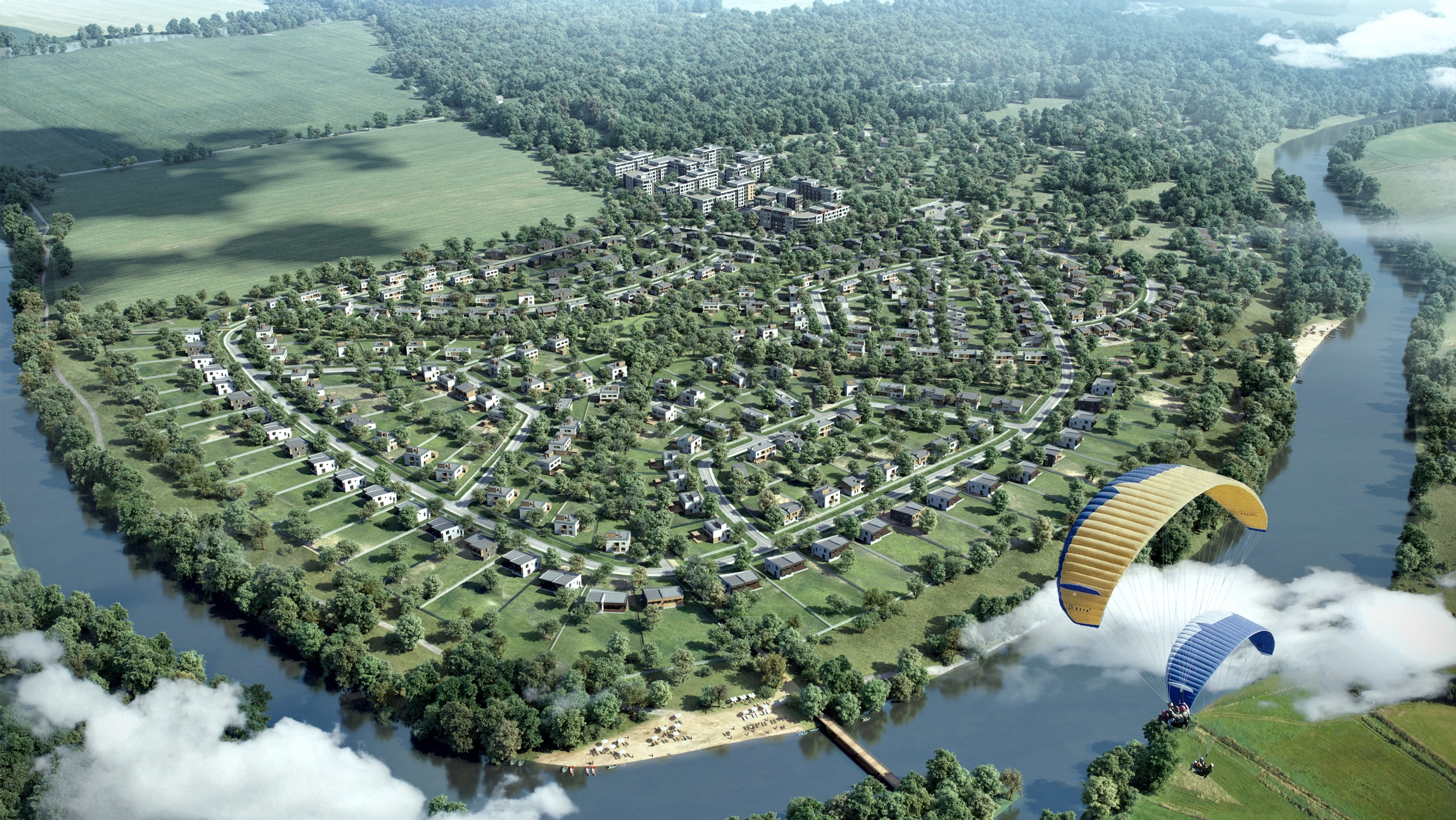
View form the south side

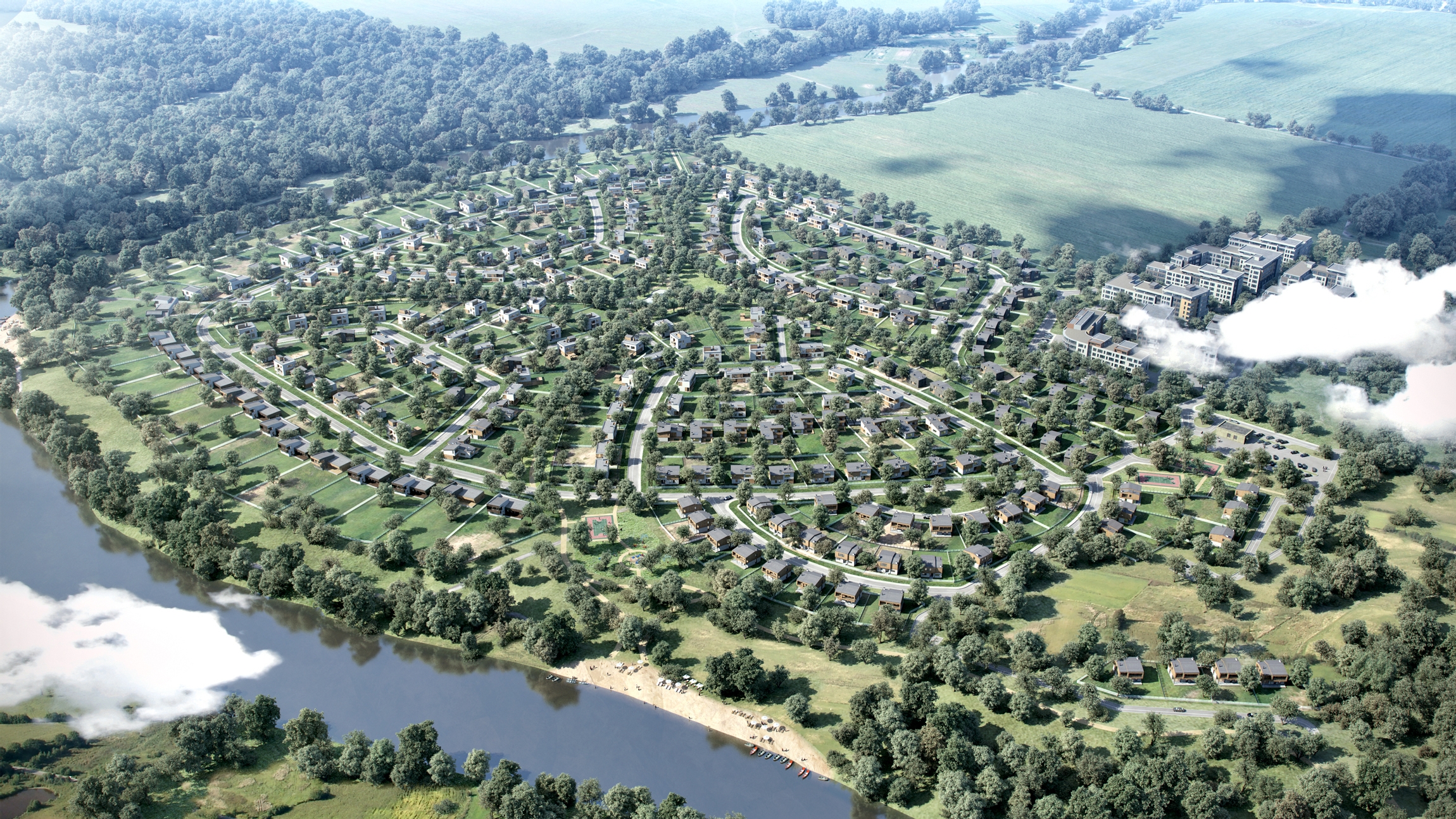
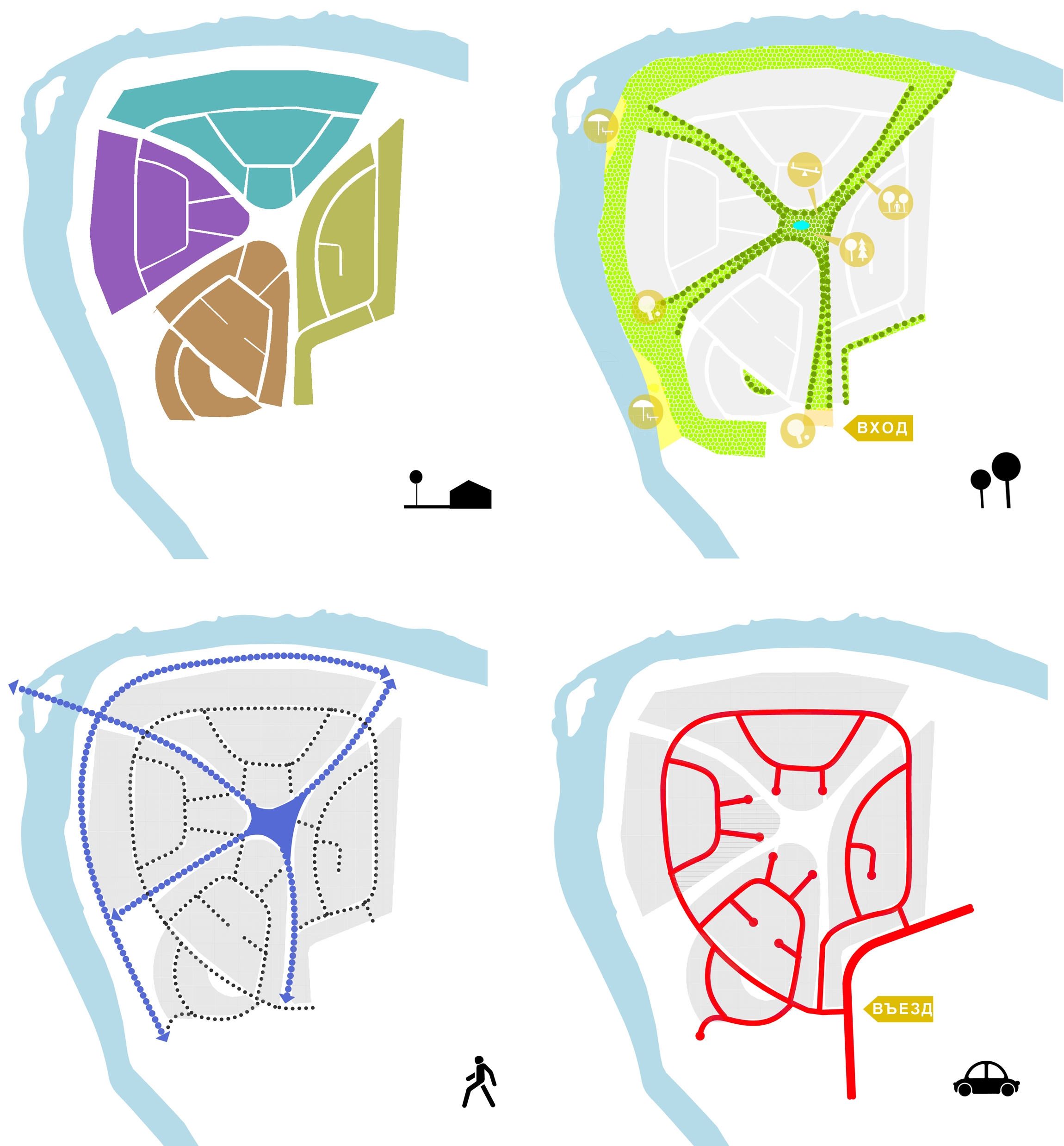
The settlement is located 48 kilometers away from Moscow Ring Road and only two kilometers away from Zvenigorod, in the bend of the Moskva River. With is 49 hectares of total area, the land site is situated on a picturesque meadow. In this spot, the riverbed makes such a spectacular turn that the planning of the settlement had no choice but to follow it. If for no other reason, this had to be done in order to give the first line the maximum number of properties - the largest in their area, they open up to the riverside in a picturesque fan, while the access road skirts the green cape, tracing the smooth turn of the waterway. And, because the road makes a circle and gets back to the settlement's main driving entrance, one can say that the architects throw a lasso over the territory, leaving but one line of land sites on the outside and organizing the main area on the inside.

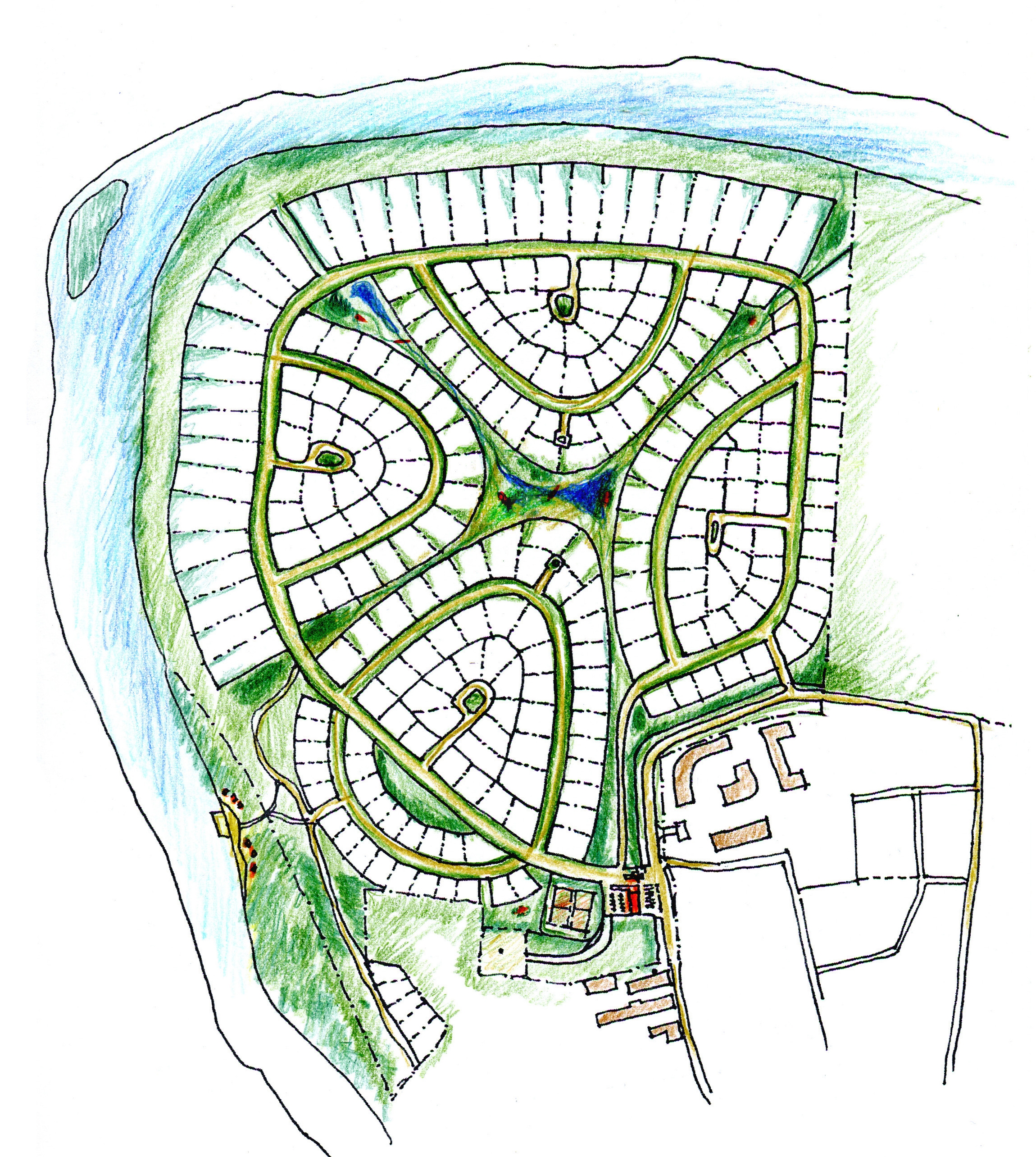
Sketch of the master plan 

Out of the many possible scenarios of planning out this "core", the architects ultimately chose the "island" principle of placing the land sites. The four "islands" on the plan are separated from each other with the diagonals of park and pedestrian territories. These boulevards merge in the center to make a park with a decorative creek and connecting it to the settlement's main recreational zones - the beach and the fitness center, as well as with the landscaped embankments. As a continuation of one of the boulevards, a small bridge is built leading to the opposite bank covered with woody hills.

The green boulevards will be completely automobile-free which will provide for the comfort and safety of pedestrian walks. Apart from that, the project provides for each of the areas getting a landscaping treatment of its own with a certain type of trees and a corresponding name. "This is why we do not expect any navigation problems here. To answer the question "Where are you now?" one will only have to say, just by looking around, "At the maple boulevard!" - explains Konstantin Khodnev, adding that the structure of the semi-circular shoreline park strip and its adjacent diagonal boulevards will provide the opportunity for going for pedestrian walks, on the one hand, quite versatile in terms of their routes, and, on the other hands, equally accessible for the public.


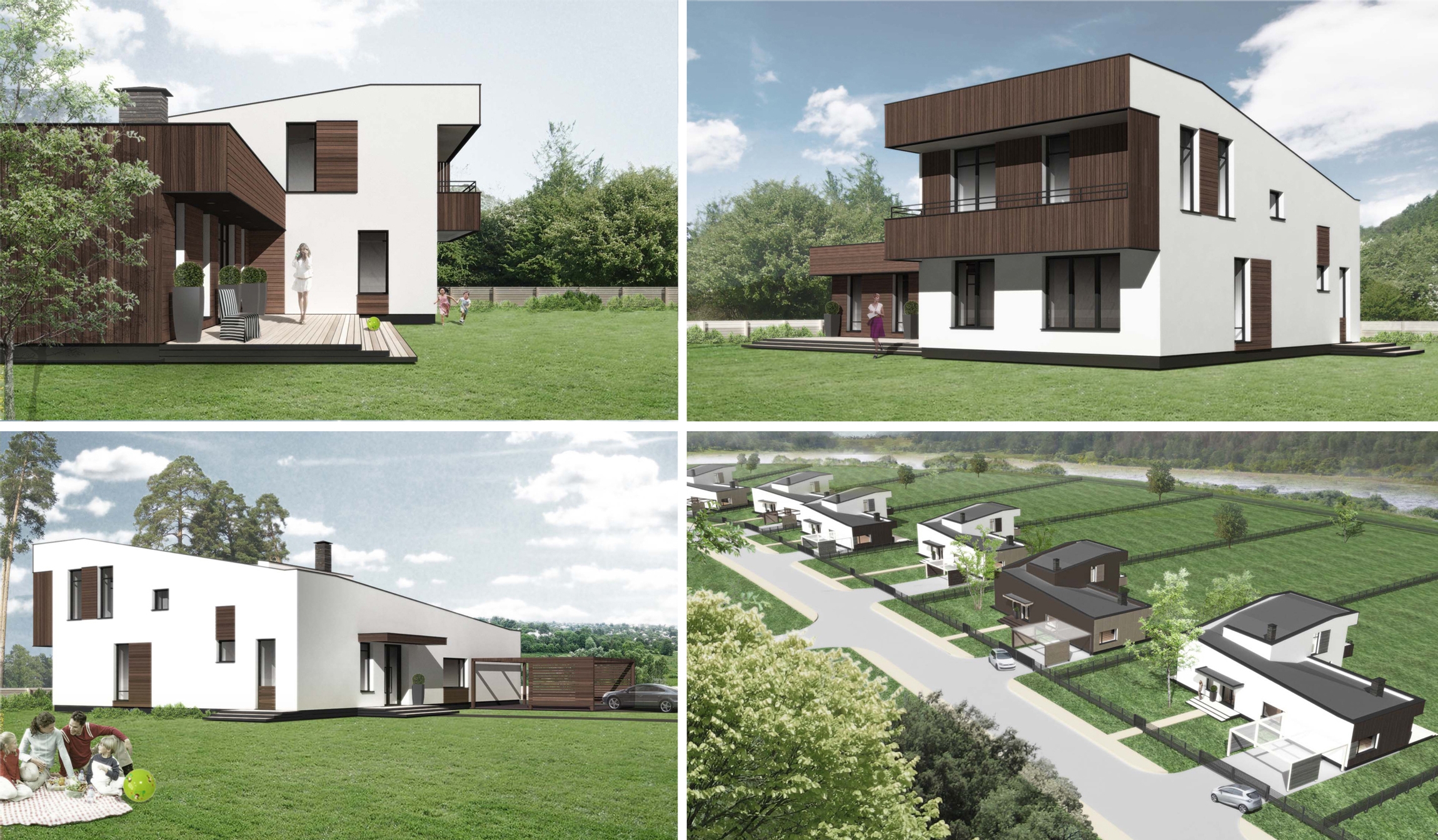
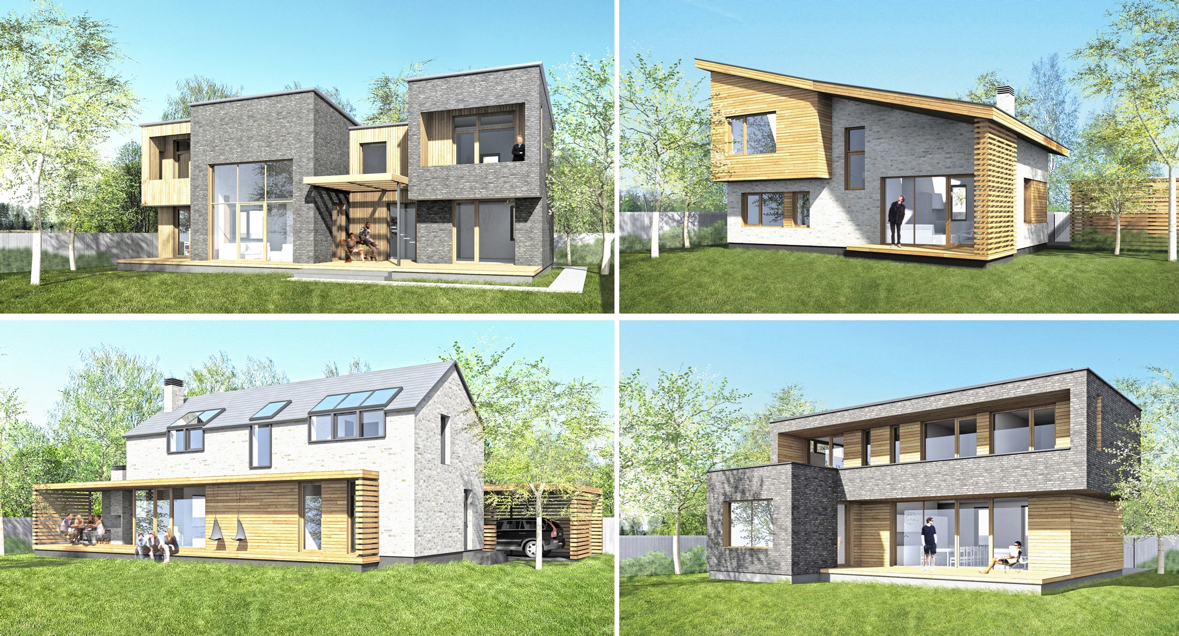
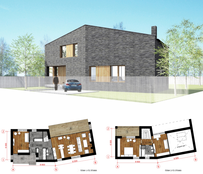
Totally, the settlement includes 220 land sites. The developer from the very start made a decision that the settlement should consist of houses executed in a single style - whole in overall impression and its ideology but at the same time providing for reasonable variety. This is why "Architectural Group DNK" got the task of creating several lines of houses that would be different in size, silhouette, and facade solutions but at the same time would match one another and together added to the overall beauty of the settlement. And, because "Reka-Reka" is a comfort class settlement, the houses were also to be compact and at the same time functional and capacious. One will hardly dispute the fact that DNK, a company that is equally successful both in creating one-of-a-kind exclusive projects, and processes for developing large-scale territories, was the perfect candidate for this task. On the basis of these unified stylistic fundamentals, and the choice for the facade materials and solutions, the architects build whole "bank of ideas".
 

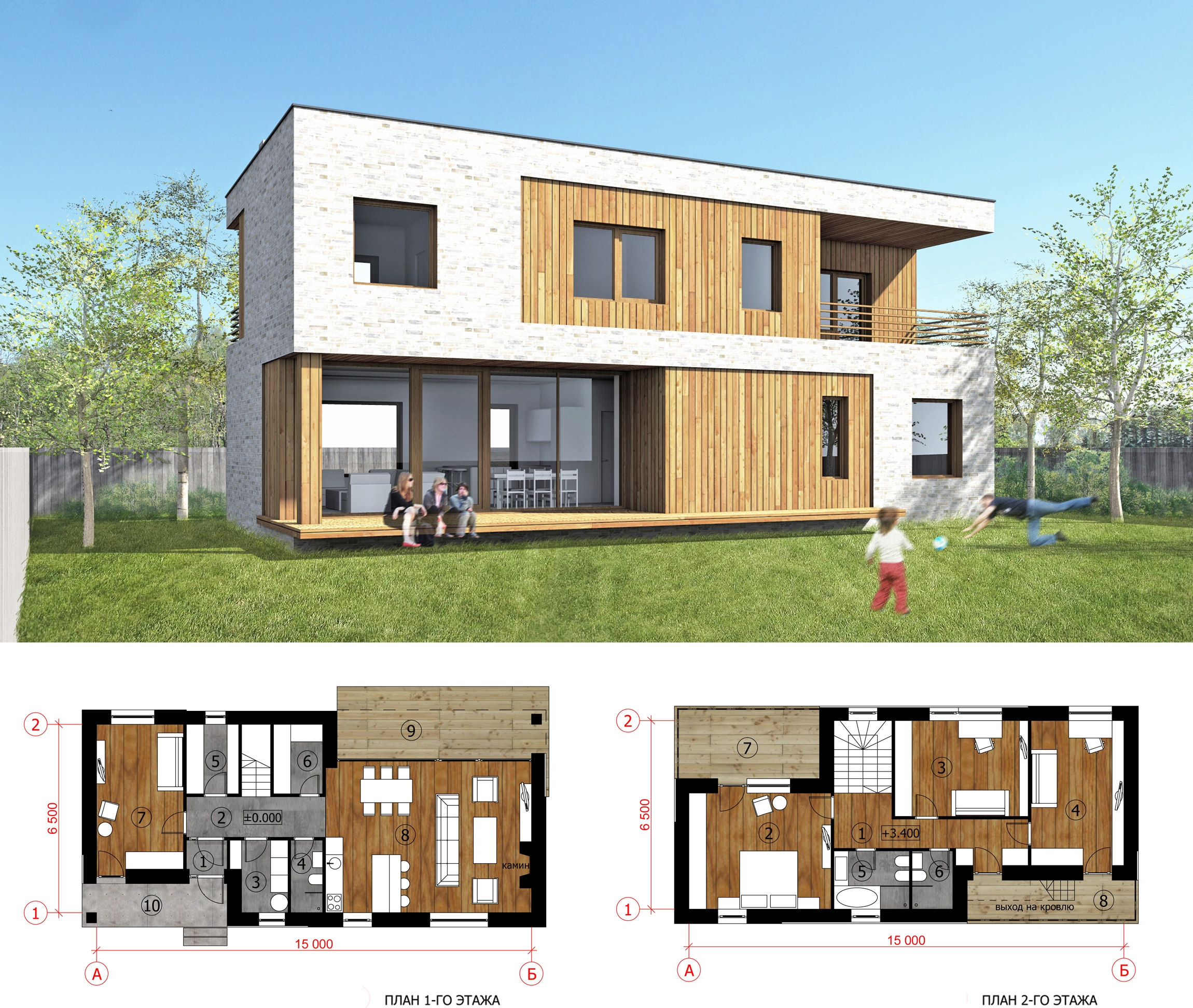
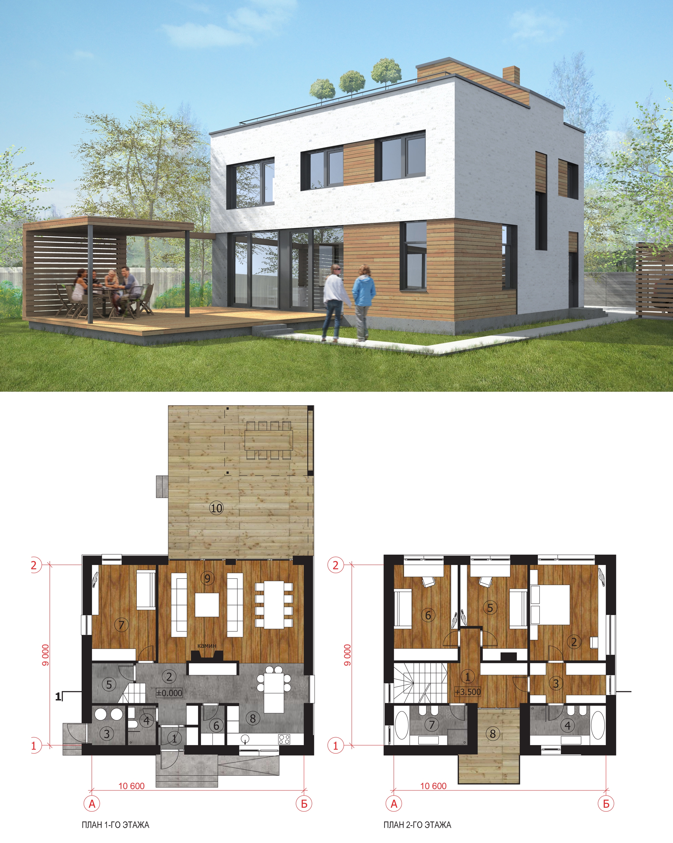
140 square-meter house.

170 square-meter house.

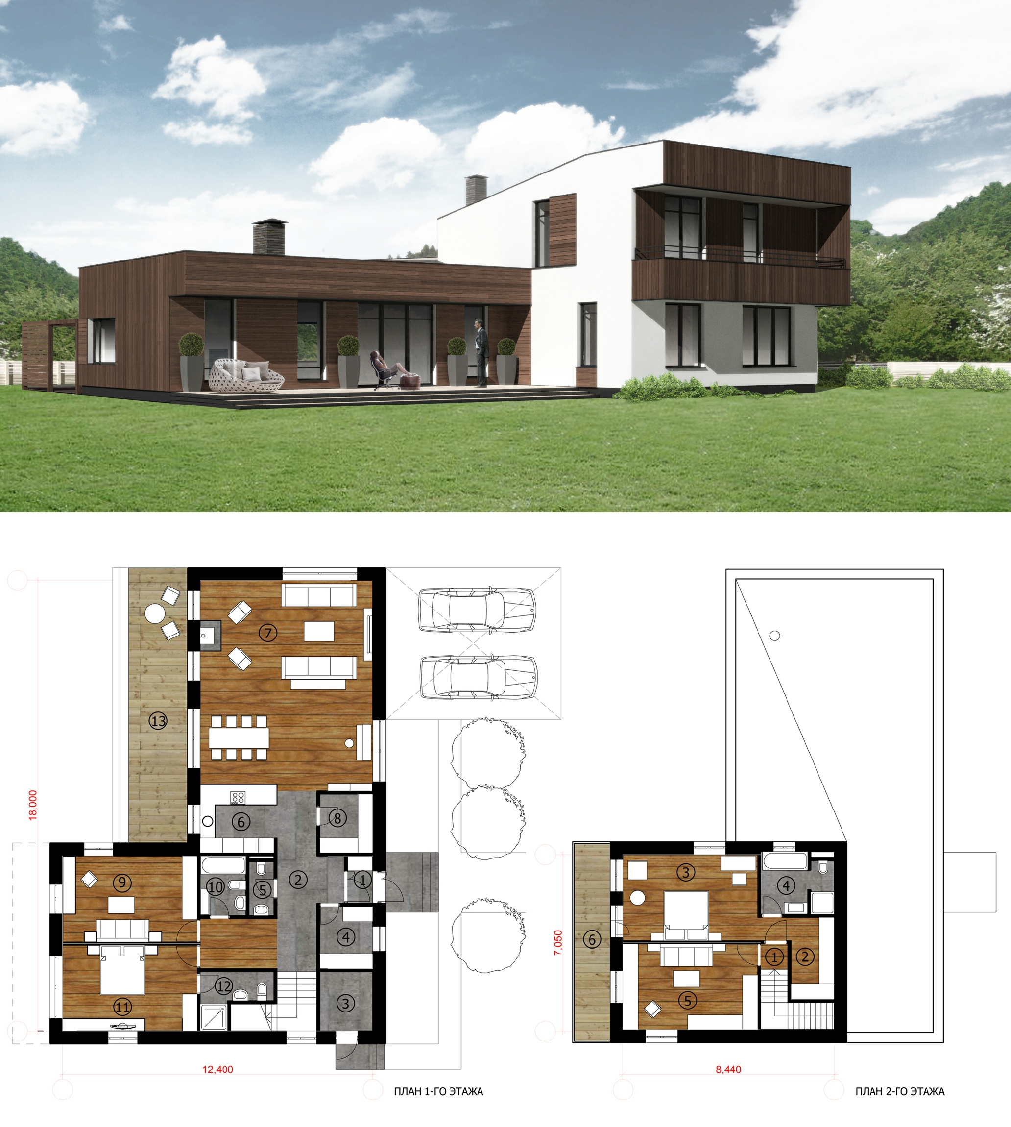
"One of the most difficult challenges was finding the right "character" for these houses - Daniel Lorentz shares - We took the path of mixing our feelings - the sturdiness that is characteristic for these type of residences plus the lightness and casualness of the classic typology of a summer home. As a result, we got a small up-to-date villa for living outside the city that can be both a place of permanent residence as well as a pure summer home". Saying "up to date", the architect gives a very accurate description of the style of the settlement's future houses that will sport dynamic-looking cantilevers cut into the main parallelepipeds of the terraces and the bidirectional roof pitches. All the houses will be built from natural and long-performance, though not super-exclusive, materials: the facades will be executed from Flemish bricks and moisture resistant wood siding, almost each project getting the design of its own which should bring even more variety to the settlement. 

240 square-meter house.

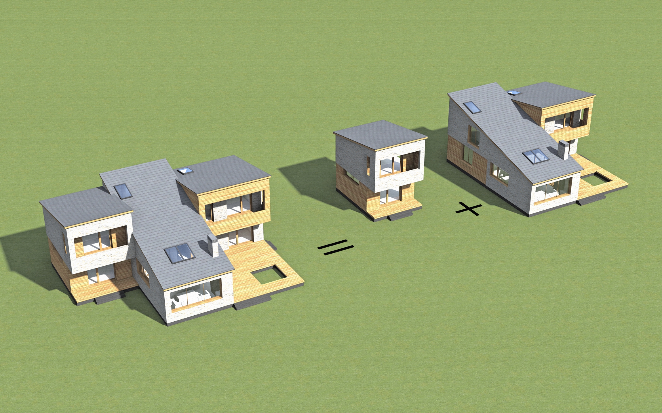
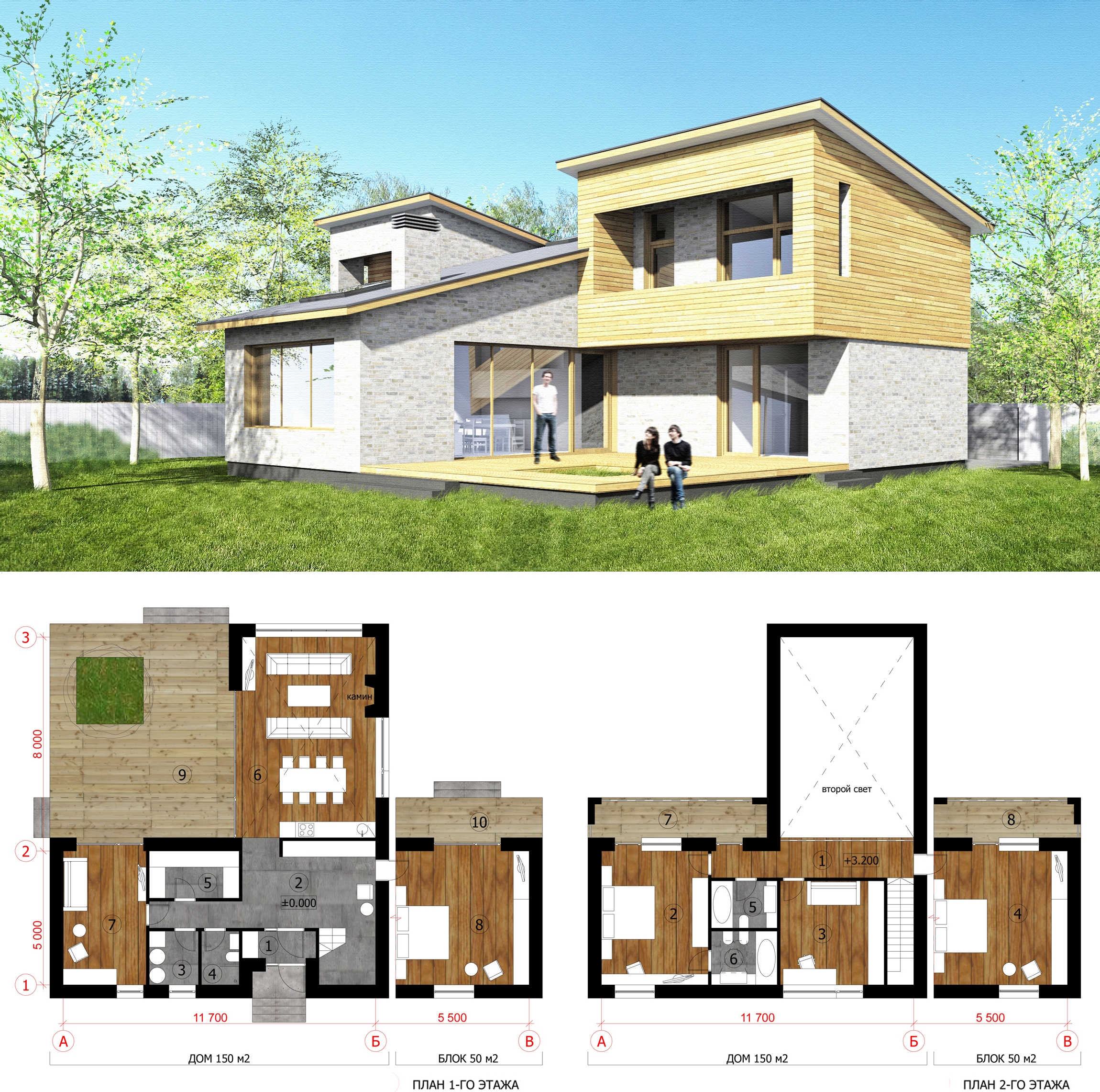
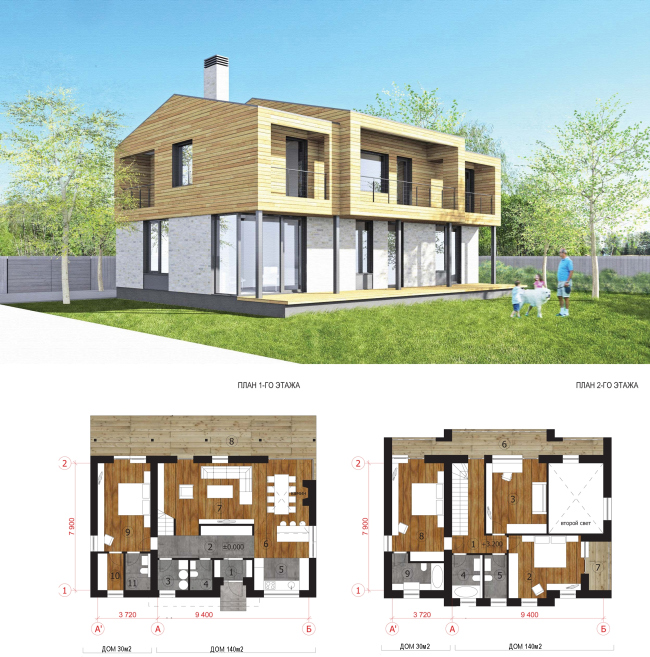
Apart from the usual housing typology, "Architectural Group DNK" developed two types of cottages with pilot names of "transformers" or "houses to grow into". They are designed for those who are still unsure of the necessity of a larger house or those who has no financial possibility to build one immediately after purchasing the plot of the land. "Transformer" consists of the main module (125-150 square meters) and the annex module (55 square meters) and is designed in such a way that in terms of composition it looks complete both in the small and in the augmented version. It should be mentioned here that the owner of the house gets all the necessary "annex" papers even if he purchases only the main module so he is able to add it to his house at any moment that he chooses: the position of the house on the land site provides for such a possibility, just as the structure of the main volume does - in this case, one of the window openings is simply replaced by the door.

"House to grow into" concept

House to grow into

Presently, the settlement sees the road construction work in full swing, the communications are being laid, and the pilot group of houses of different types is being built. We hope that Moscow Region will indeed ultimately get a settlement that the simple city inhabitants have dreamed of for so long - with moderate-sized and inexpensive private houses that at the same time boast well-thought layouts, high-quality facades of natural materials, and "author" architecture.

215 square-meter house.
House to grow into. Type 2.
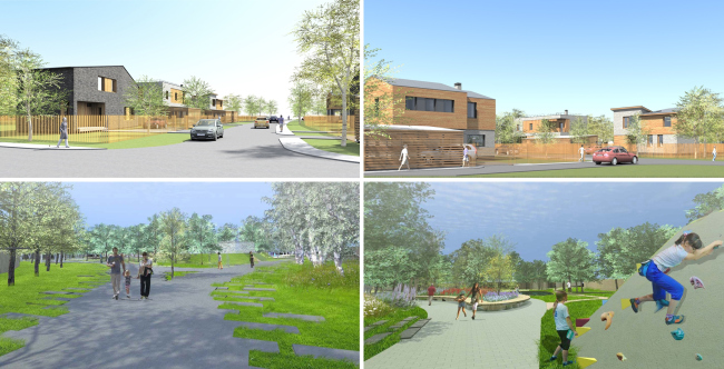
Streets and the central parking pert of the settlement
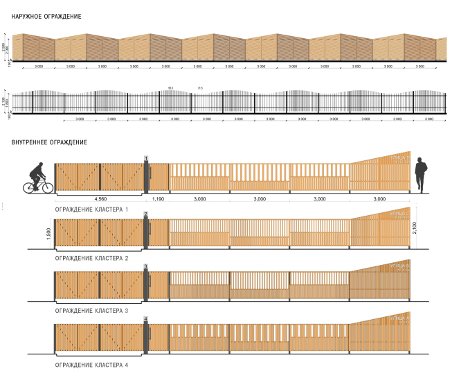
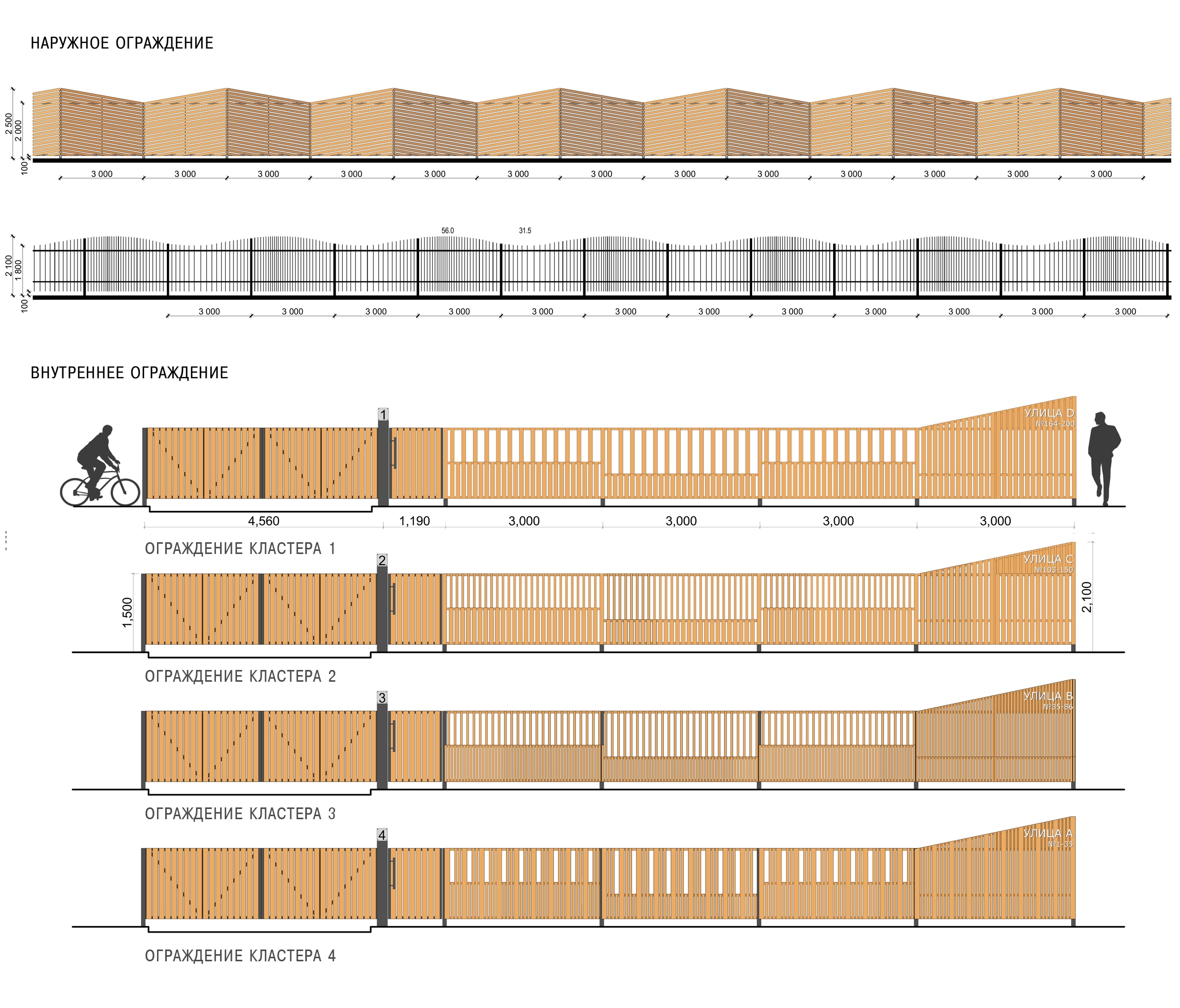
Landscape design elemrnts. Fences of the settlement and its land sites

zooming
zooming
zooming
zooming
zooming
zooming
zooming
zooming
zooming
zooming
zooming
zooming
zooming
zooming
zooming
zooming


Object:
“Reka-Reka” Settlement
Russia

Project Team:
Architects: Daniel Lorentz, Natalia Sidorova, Konstantin Khodnev, Andrew Taranukha, Maria Kochurkina, Anna Averianova, with the participation of Yuri Klevakin, Nadezhda Kulikova, Catherine Kobycheva. Chief Designer Sergei Stroganov. The developer of the project: "Vector Investments"

2012 — 2013

21 October 2013

Headlines now
The Golden Crown
The concept for a dental clinic in Yekaterinburg, developed by CNTR Studio, revolves around the idea of a “mouth full of gold”: pristine white porcelain stoneware walls are complemented by matte brass details. To avoid an overly literal interpretation, the architects focused on the building’s proportions, skillfully navigating between sunlight requirements and fire safety regulations.
Flexibility and Integration
Not long ago, we covered the project for the fourth phase of the ÁLIA residential complex, designed by APEX. Now, we’ve been shown different fence concepts they developed to enclose the complex’s private courtyards, incorporating a variety of public functions. We believe that the sheer fact that the complex’s architects were involved in such a detail as fencing speaks volumes.
A Step Forward
The HIDE residential complex represents a major milestone for ADM architects and their leaders Andrey Romanov and Ekaterina Kuznetsova in their quest for a fresh high-rise aesthetic – one that is flexible and layered, capable of bringing vibrancy to mass and silhouette while shaping form. Over recent years, this approach has become ADM’s “signature style”, with the golden HIDE tower playing a pivotal role in its evolution. Here, we delve into the project’s story, explore the details of the complex’s design, and uncover its core essence.
Gold in the Sands
A new office for a transcontinental company specializing in resource extraction and processing has opened in Dubai. Designed by T+T Architects, masters of creating spaces that are contemporary, diverse, flexible, and original, this project exemplifies their expertise. On the executive floor, a massive brass-clad partition dominates, while layered textures of compressed earth create a contextually resonant backdrop.
Layers and Levels of Flight
This project goes way back – Reserve Union won this architectural competition at the end of 2011, and the building was completed in 2018, so it’s practically “archival”. However, despite being relatively unknown, the building can hardly be considered “dated” and remains a prime example of architectural expression, particularly in the headquarters genre. And it’s especially fitting for an aviation company office. In some ways, it resembles the Aeroflot headquarters at Sheremetyevo but with its own unique identity, following the signature style of Vladimir Plotkin. In this article, we take an in-depth look at the United Aircraft Corporation (UAC) headquarters in the Moscow agglomeration town of Zhukovsky, supplemented by recent photographs from Alexey Naroditsky – a shoot that became only recently possible due to the fact that improvements were finally made in the surrounding area.
Light and Shadow
In this article, we delve into the architectural design of the “Chaika” house by DNK ag architects, which was recently completed in 2023 as part of the collection of signature designs at ZILArt. As is well-known, all the buildings in this complex follow a design code, yet each one is distinct. This particular building stands out not only for its whiteness and minimalism but also for the refined use of a limited number of techniques that, together, create what can confidently be called synergy.
Casus Novae
A master plan was developed for a large residential area with a name of “DNS City”, but now that its implementation began, the plan has been arbitrarily reformatted and replaced with something that, while similar on the surface, is actually quite different. This is not the first time such a thing happens, but it’s always frustrating. With permission from the author, we are sharing Maria Elkina’s post.
Treasure Hunting
The GAFA bureau, in collaboration with Tegola and Arkhitail, organized an expedition to the island of Kilpola in Karelia as part of Moskomarkhitektura’s “Open City” festival. There, amidst moss and rocks, the students sought answers to questions like: what is the sacred, where does it dwell, and what sustains it? Assisting the participants in this quest were landscape engineer Evgeny Levin, artist Nicholas Roerich, a moose, and the lack of cellular connection. Here’s how the story unfolded.
Depths of the Earth, Streams of Water
In the Malaya Okhta district, the Akzent building, designed by Stepan Liphart, was constructed. It follows a classic tripartite structure, yet it’s what you might call “hand-drawn”: each façade is unique in its form and details, some of which aren’t immediately noticeable. In this article, we explore the context and, together with the architect, delve into how the form was developed.
Fir Tree Dynamics
The “Airports of Region” holding is planning to build an airport in Karachay-Cherkessia, aiming to make the Arkhyz and Dombay resorts more accessible to travelers. The project that won in an invitation-only competition, submitted by Sergey Nikeshkin’s KPLN, blends natural imagery inspired by the shape of a conifer seed, open-air waiting spaces, majestic large trees, and a green roof elevated on needle-like columns. The result is both nature-inspired and WOW.
​A Brick Shell
In the process of designing a clubhouse situated among pine trees in a prestigious suburban area near Moscow, the architectural firm “A.Len” did the façade design part. The combination of different types of brick and masonry correlates with the volumetric and plastique solutions, further enhanced by the inclusion of wood-painted fragments and metal “glazing”.
Word Forms
ATRIUM architects love ambitious challenges, and for the firm’s thirtieth anniversary, they boldly play a game of words with an exhibition that dives deep into a self-created vocabulary. They immerse their projects – especially art installations – into this glossary, as if plunging into a current of their own. You feel as if you’re flowing through the veins of pure art, immersed in a universe of vertical cities, educational spaces – of which the architects are true masters – and the cultural codes of various locations. But what truly captivates is the bold statement that Vera Butko and Anton Nadtochy make, both through their work and this exhibition: architecture, above all, is art – the art of working with form and space.
Flexibility and Acuteness of Modernity
Luxurious, fluid, large “kokoshniks” and spiral barrel columns, as if made from colorful chewing gum: there seem to be no other mansion like this in Moscow, designed in the “Neo-Russian-Modern” style. And the “Teremok” on Malaya Kaluzhskaya, previously somewhat obscure, has “come alive with new colors” and gained visibility after its restoration for the office of the “architectural ecosystem” as the architects love to call themselves. It’s evident that Julius Borisov and the architects at UNK put their hearts into finding this new office and bringing it up to date. Let’s delve into the paradoxes of this mansion’s history and its plasticity. Spoiler: two versions of modernity meet here, both balancing on the razor’s edge of “what’s current”.
Yuri Vissarionov: “A modular house does not belong to the land”
It belongs to space, or to the air... It turns out that 3D printing is more effective when combined with a modular approach: the house is built in a workshop and then adapted to the site, including on uneven terrain. Yuri Vissarionov shares his latest experience in designing tourist complexes, both in central Russia and in the south. These include houseboats, homes printed from lightweight concrete using a 3D printer, and, of course, frame houses.
​Moscow’s First
“The quality of education largely depends on the quality of the educational environment”. This principle of the last decade has been realized by Sergey Skuratov in the project for the First Moscow Gymnasium on Rostovskaya Embankment in the Khamovniki district. The building seamlessly integrates into the complex urban landscape, responding both to the pedestrian flow of the city and the quiet alleyways. It skillfully takes advantage of the height differences and aligns with modern trends in educational space design. Let’s take a closer look.
Looking at the Water
The site of Villa Sonata stretches from the road to the water’s edge, offering its own shoreline, pier, and a picturesque river panorama. To reveal these sweeping views, Roman Leonidov “cut” the façade diagonally parallel to the river, thus getting two main axes for the house and, consequently, “two heads”. The internal core – two double-height spaces, a living room and a conservatory, with a “bridge” above them – makes the house both “transparent” and filled with light.
The White Wing
Well, it’s not exactly white. It’s more of a beige, white-stone structure that plays with the color of limestone – smoother surfaces are lighter, while rougher ones are darker. This wing unites various elements: it absorbs and interprets the surrounding themes. It responds to everything, yet maintains a cohesive expression – a challenging task! – while also incorporating recognizable features of its own, such as the dynamic cuts at the bottom, top, and middle.
Urban Dunes
The XSA Ramps team designed and built a three-part sports hub for a park in Rostov-on-Don, welcoming people of all ages and fitness levels. The skate plaza, pump track, and playground are all meticulously crafted with details that attract a diverse range of visitors. The technical execution of the shapes and slopes transforms this space into a kind of sculptural composition.
Proportional Growth
The project for the fourth phase of the ÁLIA residential area has been announced. The buildings are situated on an elongated plot – almost a “ray” that shoots out from the center of the area towards the river. Their layout reflects both a response to Moscow’s architectural preferences over the past 15 years, shifting “from blocks to towers”, and an interpretation of the neighboring business park designed by SOM. Additionally, the best apartments here are not located at the very top but closer to the middle, forming a glowing “waistline”.
The “Staircase” Building
In designing the “Details” residential complex in New Moscow, Rais Baishev spiced up the now-popular Moscow theme of a “courtyard” building with an idea drawn from the surrealist drawings by Maurits Escher. He envisioned the stepped silhouettes and descending slopes as a metaphysical mega-staircase, creating a key void within the courtyard that gave the project an internal “spine”. This concept is felt both in the building’s silhouette and on its façades.
Projection of the Quarter
No one doubted that the building that Vladimir Plotkin designed as part of the “Garden Quarters” would be the most modernist of all. And it turned out just that way: while adhering to the common design code, the building successfully combines brick and white stone, rhythmically responding to the neighboring building designed by Ostozhenka, yet tactfully and persistently making a few statements of its own. This includes the projection of the ideal urban development composition “14–9–6”, which can be found right next door, mathematical calculations, including those for various types of terraces (and perhaps the only reminder of the Soviet past of the Kauchuk rubber factory!), and the white “cross-stitch” pattern of the façade grid.
Domus Aurea
In this issue, we examine the “Tessinsky-1” house, designed by Sergey Skuratov and completed in 2023. Located in the middle of the Serebryanicheskaya Embankment district, at the intersection of its main streets, this house assumes a sort of “nodal” role: it not only responds to everything around it and preserves many memories of the former EMA factory within itself, but it weaves all this into a newly directed pattern, reconciling bright “gold” and dark-colored brick, largely with the help of the new, modern-yet-archaic Columba brick, which, come to think about it, is the most precious element here.
The Chimney of Nikola-Lenivets
In this issue, we are examining the “Obelisk House” designed by KATARSIS and built for the Arkhstoyanie 2023 festival. However, it was only finished later on, and this is why we are examining it now. It seems to us that after the “Obelisk House” appeared in Nikola-Lenivets, a dialogue and a few inner connections appeared between the temporary structures built here. These houses no longer look like “accidental neighbors”, more of which below.
​Periscope by the Bay
The jury awarded the second place in the competition for a public and cultural center in Petropavlovsk-Kamchatsky to the companies GORA (“Mountain”) and M4. In the consortium’s proposal, the building resembles a sperm whale with a calf swimming next to it or a periscope, whose lenses capture the most spectacular views from the surrounding landscape.
From Arcs to Dolmens
While working on the competition project for Petropavlovsk-Kamchatsky, ASADOV Architects prioritized the value of the natural and urban environment, aiming to preserve the balance of the location while minimizing the resemblance of the volume that they designed to a “traditional building”. The task was challenging, and the architects created three versions, one of which having been developed after the competition, where their main proposal took third place. However, the point of interest here is not the competition result but the continuity of creative thinking.
Hide and Seek
The ID Moskovskiy house, designed by Stepan Liphart in St. Petersburg, in the courtyards near Moskovskiy Avenue beyond the Obvodny Canal and recently completed, is notable for several reasons. Firstly, it has been realized with considerable accuracy, which is particularly significant as this is the first building where the architect was responsible not only for the facades but also for the layouts, allowing for better integration between the two. On the other hand, this building is interesting as an example of the “germination” of new architecture in the city: it draws on the best examples from the neighborhood and becomes an improved and developed sum of ideas found by the architect in the surrounding context.
The Big Twelve
Yesterday, the winners of the Moscow Mayor’s Architecture Award were announced and honored. Let’s take a look at what was awarded and, in some cases, even critique this esteemed award. After all, there is always room for improvement, right?
Above the Golden Horn
The residential complex “Philosophy” designed by T+T architects in Vladivostok, is one of the new projects in the “Golubinaya Pad” area, changing its development philosophy (pun intended) from single houses to a comprehensive approach. The buildings are organized along public streets, varying in height and format, with one house even executed in gallery typology, featuring a cantilever leaning on an art object.
Nuanced Alternative
How can you rhyme a square and space? Easily! But to do so, you need to rhyme everything you can possibly think of: weave everything together, like in a tensegrity structure, and find your own optics too. The new exhibition at GES-2 does just that, offering its visitor a new perspective on the history of art spanning 150 years, infused with the hope for endless multiplicity of worlds and art histories. Read on to see how this is achieved and how the exhibition design by Evgeny Ace contributes to it.
Blinds for Ice
An ice arena has been constructed in Domodedovo based on a project by Yuri Vissarionov Architects. To prevent the long façade, a technical requirement for winter sports facilities, from appearing monotonous, the architects proposed the use of suspended structures with multidirectional slats. This design protects the ice from direct sunlight while giving the wall texture and detail.