По-русски

From monumentality to media

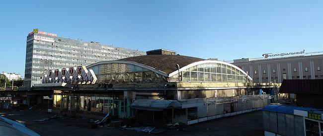
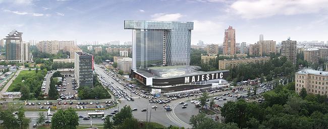
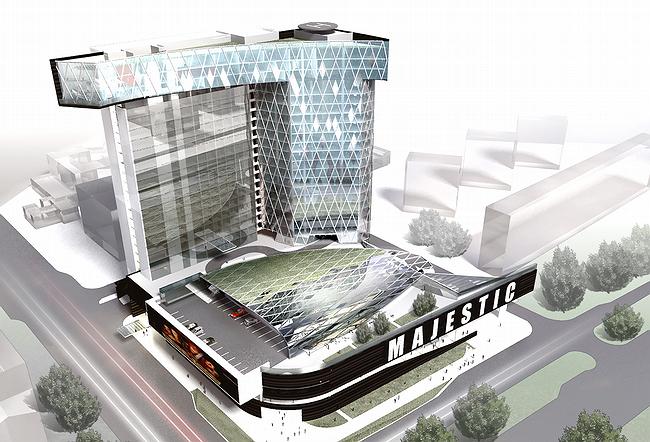
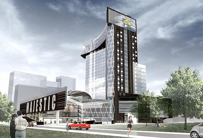
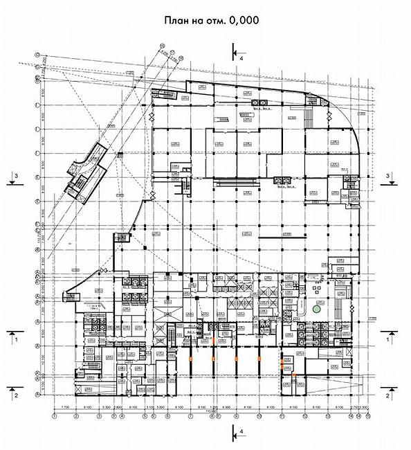
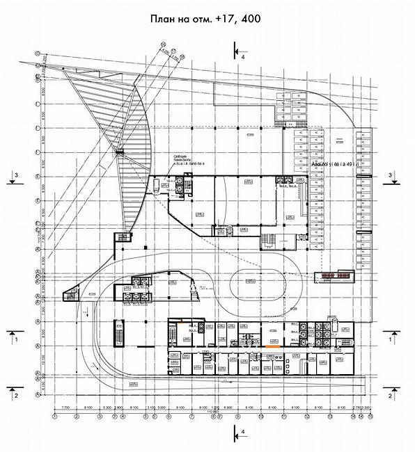
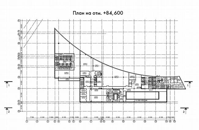
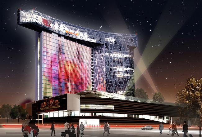
In the place of the existing Cheremushkinsy market there will be a modern retail and entertainment complex with a rounded building above with offices and hotel, and a panoramic restaurant on the upper level. The hotel’s façade will be turned into a huge screen that consists of led-lights.

29 January 2008
Object
mainImg
Object:
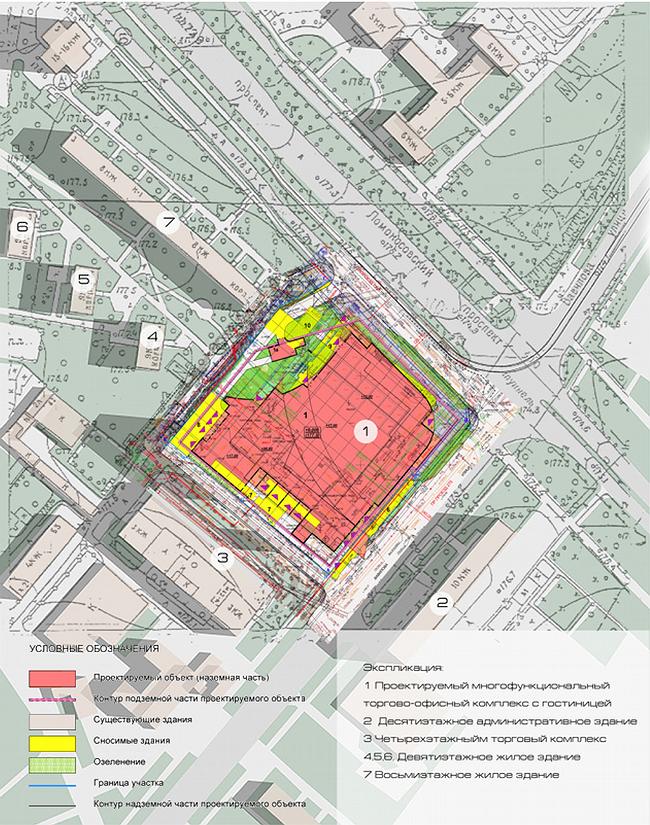
Multifunctional trade-business complex with a hotel and underground garage-parking (in the place of Cheremushkinsky market area)
Russia, Moscow, Vavilov street, 64\1

Project Team:
A.Assadov, K.Saprichian, E.Vdovin, A.A.Assadov, A.Shtanuk (Assadov's studio), Y.Ravkin (Artistic center of Y.Ravkin), engineers: T.Novoselova (AO 'Promstroiproekt'), P.Rafelson, G.Karklo (Assadov's studio)

3.2003 — 2008

Client - OOO 'Cheremuskinsky rynok'

The wind of change sweeps over the streets and squares, tousling roofs, thinning boulevards, dropping among houses 30storied towers and taking to nothing so cherished houses, districts and gardens. Is it the wind’s fault that in the place of former fields there is not a vacant spot and for further experiments they have to put new onto old?

Now it is turn of one of the veteran guards of south-west – Cheremushkinsky market privede the nearby areas from Gagarinskaya square to Kaluzhskaya, first with farm products, then Chinese manufactory and in the end – mix of all that. There have been for long discussions over its reconstruction with enlargement and potential additional building. According to the order of Moscow Government №1138-ПП on18.12.01 “Additional measures on regulation of market trade in Moscow”, the construction’s owner OOO “Cheremushkinsky” gathered finances and was considering different variants on reconstruction which gradually got larger and occupied the whole market’s site hiding under the new storyes the old surface. By 2003 the concept had entirely got rid of architectural allusions on the unordinary construction that had been there for 30 years.

Historical note
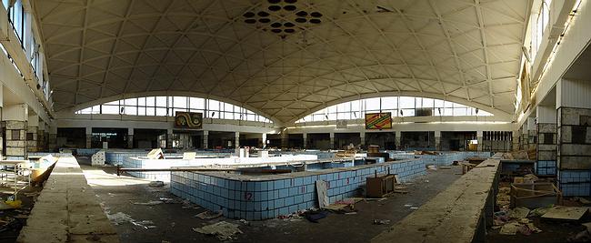
In 1970’s in Moscow were built a few unique buildings for farm products trade. It was supposed that it would be like a fair with products from all over the country. And they were built accordingly. Huge open halls, under high and beautiful ceilings is being done roaring trade, painted with all fruit and vegetable colors. For covering large market rooms without intermediate supports was used one of the modern of that time technologies – reinforced arched shells. Many world-known stars of architecture of architecture, such as Alvaro Siza and Oscar Niemeyer, that time made constructions main elements of which were coverings that combined values of concrete and steel. Each material did it share in providing reliability of a construction and in result there appeared unseen before compositions. Such work required from those who made projects knowledge, experience, knowledge of calculation systems and special intuition concerning constructions, vision of their work in space. So, in work was engaged of the best constructors – N.V. Kancheli. He made projects of Basmanski and Danilovski roofs in the form of folded shell, and also the sail-like roof of Cheremushkinsky market. These buildings, built almost in one period, after the tragedy in Baumanskaya street in February, 2006, were automatically put in the black list of potentially dangerous, demolition of which depends how soon new projects that will take their places will be approved.

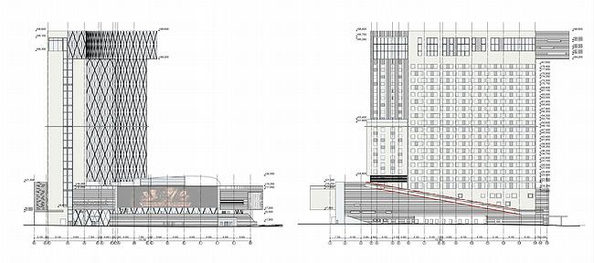
The tragedy of 2006 – the Basmanny market breakdown immediately made the constructions of such type an undesirable element of scenery, so conceptual architectural projects were activated and passed to project stage. Most of the corner part between Vavilov street and Lomonosov prospect was occupied by 4-storey building, in the middle of which there was an atrium cover with transparent shell (a slight refer to concrete sails of the old market). Along south-west boarder of the site there was a 19-storey board of the hotel by the market. Quite traditional composition suddenly was broken by a huge gap in the high balk making a huge window viewing sunset, there are no other visual orientations in that direction. Or rather, corner stairs-lift block framed with glass alone rises over the stylobate and only on the top, 19th storey joined the hotel building by the glass gallery.

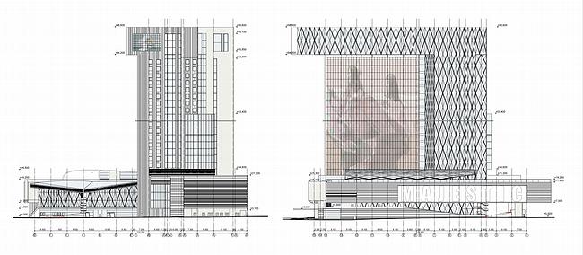
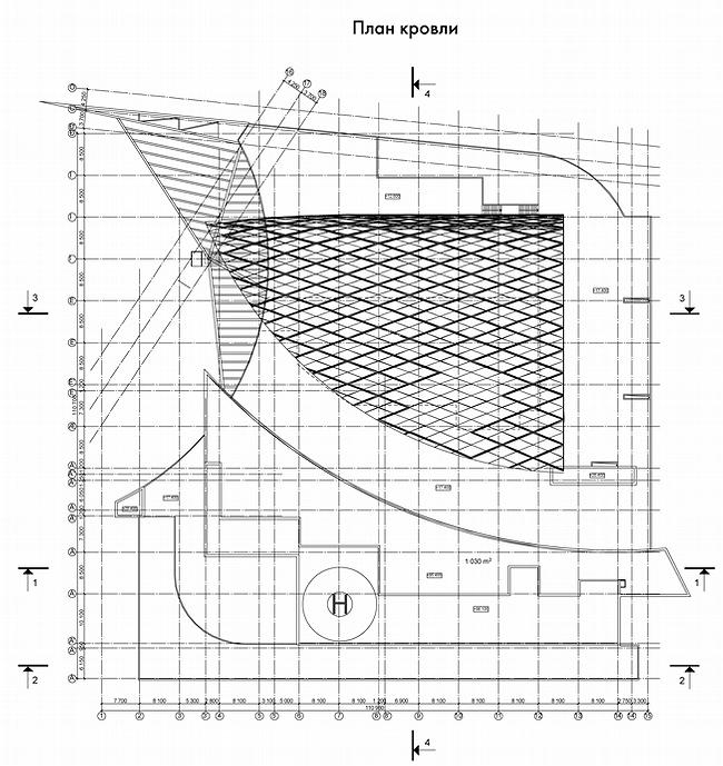
Such detailed description is given not without purpose. Many of the ideas have evolved for the past five years from abstract outrageous to energetic modern architecture complimented by most advanced technologies. The broad stylobate part repeats the site’s outline and above it is place a high and long building. In contrast to the rounded exterior corner of the stylobate, the vertical building is curves in smooth arch and in top has the attic storey with almost 12 meters console extension, like an illusionist’s wave of hand that stopped over the “magic top hat” – arched extension of the stylobate’s atrium, through which beams projectors’ light. And like a silver coat, flat surface of the hotels wall “ falls” from it that took the place of the old “window to nowhere”. It is here, not in the illusionist’s hat, miracles will happen every night. Instead changeful charm of sunset, the audience will have most advanced light technologies that can turn a wall into a unique almost 3 000 m2 screen showing any dynamic image with the help of thousands special lamps.

Engineering note
The basis of the media-façade’s technology is the integration of LEDs into metal construction of lamella type, which is put in front of the building’s facade. So, the total light transparency of glassing becomes just a little less. Installations can be put not only plain surfaces, but curved as well. Image on facade is created due to red, green and blue lights. Three or five of them in this color combination form one pixel. Quality of an image depends on number and intensity of lights, i.e. on pixel resolution and can be changed during exploitation. Media-facade is able to transmit tv-channels, animation or video clips from local devices, and also unique programs of dynamic building illumination. Static images are also can be used, but technical features of media-facade depend on distance of apprehension. Actually, media-facades can be set the way that an image can be seen from 20 meters distance, but this requires considerable expenses. Most rational is the distance in 50-300 meters from a viewer, this allows to reduce number of pixels (LEDs). In this case, self-cost of media-facade will be 4-5 times less than street screens.

Uniform glassing of the wall-screen is cut with thin vertical and horizontal imposts whereas curved facades of the high building and cover over the atrium are cut with metal structure from continuous metal cores. The net is the bearing construction of the shell as well as décor element which theme echoes in large glassed vertical stylobate’s surfaces. Some facades of the vertical building and stylobate are designed with use of dark brown panels, like thin lines that line stylobate in horizontal stripes and the high building into vertical ones.

Alternating of glass surfaces and dark insertions are to compositionally unite the new complex and the administrative building of 1970’s on the opposite side of Vavilov street. Though here such ethic will hardly influence on the image of the building that is being constructed. It will never be able to get lost among neighbors. This the product of another epoch, another culture that brought another means of influence then monumentality. Comes the era of “media” architecture where not form, proportions, texture and color will express the authors ideas, but the entire exterior of a building will become an interactive tool of transferring an information and emotional charge from the author to the audience.

zooming
zooming
zooming
zooming
zooming


Object:
Multifunctional trade-business complex with a hotel and underground garage-parking (in the place of Cheremushkinsky market area)
Russia, Moscow, Vavilov street, 64\1

Project Team:
A.Assadov, K.Saprichian, E.Vdovin, A.A.Assadov, A.Shtanuk (Assadov's studio), Y.Ravkin (Artistic center of Y.Ravkin), engineers: T.Novoselova (AO 'Promstroiproekt'), P.Rafelson, G.Karklo (Assadov's studio)

3.2003 — 2008

Client - OOO 'Cheremuskinsky rynok'

29 January 2008

Headlines now
A Step Forward
The HIDE residential complex represents a major milestone for ADM architects and their leaders Andrey Romanov and Ekaterina Kuznetsova in their quest for a fresh high-rise aesthetic – one that is flexible and layered, capable of bringing vibrancy to mass and silhouette while shaping form. Over recent years, this approach has become ADM’s “signature style”, with the golden HIDE tower playing a pivotal role in its evolution. Here, we delve into the project’s story, explore the details of the complex’s design, and uncover its core essence.
Gold in the Sands
A new office for a transcontinental company specializing in resource extraction and processing has opened in Dubai. Designed by T+T Architects, masters of creating spaces that are contemporary, diverse, flexible, and original, this project exemplifies their expertise. On the executive floor, a massive brass-clad partition dominates, while layered textures of compressed earth create a contextually resonant backdrop.
Layers and Levels of Flight
This project goes way back – Reserve Union won this architectural competition at the end of 2011, and the building was completed in 2018, so it’s practically “archival”. However, despite being relatively unknown, the building can hardly be considered “dated” and remains a prime example of architectural expression, particularly in the headquarters genre. And it’s especially fitting for an aviation company office. In some ways, it resembles the Aeroflot headquarters at Sheremetyevo but with its own unique identity, following the signature style of Vladimir Plotkin. In this article, we take an in-depth look at the United Aircraft Corporation (UAC) headquarters in the Moscow agglomeration town of Zhukovsky, supplemented by recent photographs from Alexey Naroditsky – a shoot that became only recently possible due to the fact that improvements were finally made in the surrounding area.
Light and Shadow
In this article, we delve into the architectural design of the “Chaika” house by DNK ag architects, which was recently completed in 2023 as part of the collection of signature designs at ZILArt. As is well-known, all the buildings in this complex follow a design code, yet each one is distinct. This particular building stands out not only for its whiteness and minimalism but also for the refined use of a limited number of techniques that, together, create what can confidently be called synergy.
Casus Novae
A master plan was developed for a large residential area with a name of “DNS City”, but now that its implementation began, the plan has been arbitrarily reformatted and replaced with something that, while similar on the surface, is actually quite different. This is not the first time such a thing happens, but it’s always frustrating. With permission from the author, we are sharing Maria Elkina’s post.
Treasure Hunting
The GAFA bureau, in collaboration with Tegola and Arkhitail, organized an expedition to the island of Kilpola in Karelia as part of Moskomarkhitektura’s “Open City” festival. There, amidst moss and rocks, the students sought answers to questions like: what is the sacred, where does it dwell, and what sustains it? Assisting the participants in this quest were landscape engineer Evgeny Levin, artist Nicholas Roerich, a moose, and the lack of cellular connection. Here’s how the story unfolded.
Depths of the Earth, Streams of Water
In the Malaya Okhta district, the Akzent building, designed by Stepan Liphart, was constructed. It follows a classic tripartite structure, yet it’s what you might call “hand-drawn”: each façade is unique in its form and details, some of which aren’t immediately noticeable. In this article, we explore the context and, together with the architect, delve into how the form was developed.
Fir Tree Dynamics
The “Airports of Region” holding is planning to build an airport in Karachay-Cherkessia, aiming to make the Arkhyz and Dombay resorts more accessible to travelers. The project that won in an invitation-only competition, submitted by Sergey Nikeshkin’s KPLN, blends natural imagery inspired by the shape of a conifer seed, open-air waiting spaces, majestic large trees, and a green roof elevated on needle-like columns. The result is both nature-inspired and WOW.
​A Brick Shell
In the process of designing a clubhouse situated among pine trees in a prestigious suburban area near Moscow, the architectural firm “A.Len” did the façade design part. The combination of different types of brick and masonry correlates with the volumetric and plastique solutions, further enhanced by the inclusion of wood-painted fragments and metal “glazing”.
Word Forms
ATRIUM architects love ambitious challenges, and for the firm’s thirtieth anniversary, they boldly play a game of words with an exhibition that dives deep into a self-created vocabulary. They immerse their projects – especially art installations – into this glossary, as if plunging into a current of their own. You feel as if you’re flowing through the veins of pure art, immersed in a universe of vertical cities, educational spaces – of which the architects are true masters – and the cultural codes of various locations. But what truly captivates is the bold statement that Vera Butko and Anton Nadtochy make, both through their work and this exhibition: architecture, above all, is art – the art of working with form and space.
Flexibility and Acuteness of Modernity
Luxurious, fluid, large “kokoshniks” and spiral barrel columns, as if made from colorful chewing gum: there seem to be no other mansion like this in Moscow, designed in the “Neo-Russian-Modern” style. And the “Teremok” on Malaya Kaluzhskaya, previously somewhat obscure, has “come alive with new colors” and gained visibility after its restoration for the office of the “architectural ecosystem” as the architects love to call themselves. It’s evident that Julius Borisov and the architects at UNK put their hearts into finding this new office and bringing it up to date. Let’s delve into the paradoxes of this mansion’s history and its plasticity. Spoiler: two versions of modernity meet here, both balancing on the razor’s edge of “what’s current”.
Yuri Vissarionov: “A modular house does not belong to the land”
It belongs to space, or to the air... It turns out that 3D printing is more effective when combined with a modular approach: the house is built in a workshop and then adapted to the site, including on uneven terrain. Yuri Vissarionov shares his latest experience in designing tourist complexes, both in central Russia and in the south. These include houseboats, homes printed from lightweight concrete using a 3D printer, and, of course, frame houses.
​Moscow’s First
“The quality of education largely depends on the quality of the educational environment”. This principle of the last decade has been realized by Sergey Skuratov in the project for the First Moscow Gymnasium on Rostovskaya Embankment in the Khamovniki district. The building seamlessly integrates into the complex urban landscape, responding both to the pedestrian flow of the city and the quiet alleyways. It skillfully takes advantage of the height differences and aligns with modern trends in educational space design. Let’s take a closer look.
Looking at the Water
The site of Villa Sonata stretches from the road to the water’s edge, offering its own shoreline, pier, and a picturesque river panorama. To reveal these sweeping views, Roman Leonidov “cut” the façade diagonally parallel to the river, thus getting two main axes for the house and, consequently, “two heads”. The internal core – two double-height spaces, a living room and a conservatory, with a “bridge” above them – makes the house both “transparent” and filled with light.
The White Wing
Well, it’s not exactly white. It’s more of a beige, white-stone structure that plays with the color of limestone – smoother surfaces are lighter, while rougher ones are darker. This wing unites various elements: it absorbs and interprets the surrounding themes. It responds to everything, yet maintains a cohesive expression – a challenging task! – while also incorporating recognizable features of its own, such as the dynamic cuts at the bottom, top, and middle.
Urban Dunes
The XSA Ramps team designed and built a three-part sports hub for a park in Rostov-on-Don, welcoming people of all ages and fitness levels. The skate plaza, pump track, and playground are all meticulously crafted with details that attract a diverse range of visitors. The technical execution of the shapes and slopes transforms this space into a kind of sculptural composition.
Proportional Growth
The project for the fourth phase of the ÁLIA residential area has been announced. The buildings are situated on an elongated plot – almost a “ray” that shoots out from the center of the area towards the river. Their layout reflects both a response to Moscow’s architectural preferences over the past 15 years, shifting “from blocks to towers”, and an interpretation of the neighboring business park designed by SOM. Additionally, the best apartments here are not located at the very top but closer to the middle, forming a glowing “waistline”.
The “Staircase” Building
In designing the “Details” residential complex in New Moscow, Rais Baishev spiced up the now-popular Moscow theme of a “courtyard” building with an idea drawn from the surrealist drawings by Maurits Escher. He envisioned the stepped silhouettes and descending slopes as a metaphysical mega-staircase, creating a key void within the courtyard that gave the project an internal “spine”. This concept is felt both in the building’s silhouette and on its façades.
Projection of the Quarter
No one doubted that the building that Vladimir Plotkin designed as part of the “Garden Quarters” would be the most modernist of all. And it turned out just that way: while adhering to the common design code, the building successfully combines brick and white stone, rhythmically responding to the neighboring building designed by Ostozhenka, yet tactfully and persistently making a few statements of its own. This includes the projection of the ideal urban development composition “14–9–6”, which can be found right next door, mathematical calculations, including those for various types of terraces (and perhaps the only reminder of the Soviet past of the Kauchuk rubber factory!), and the white “cross-stitch” pattern of the façade grid.
Domus Aurea
In this issue, we examine the “Tessinsky-1” house, designed by Sergey Skuratov and completed in 2023. Located in the middle of the Serebryanicheskaya Embankment district, at the intersection of its main streets, this house assumes a sort of “nodal” role: it not only responds to everything around it and preserves many memories of the former EMA factory within itself, but it weaves all this into a newly directed pattern, reconciling bright “gold” and dark-colored brick, largely with the help of the new, modern-yet-archaic Columba brick, which, come to think about it, is the most precious element here.
The Chimney of Nikola-Lenivets
In this issue, we are examining the “Obelisk House” designed by KATARSIS and built for the Arkhstoyanie 2023 festival. However, it was only finished later on, and this is why we are examining it now. It seems to us that after the “Obelisk House” appeared in Nikola-Lenivets, a dialogue and a few inner connections appeared between the temporary structures built here. These houses no longer look like “accidental neighbors”, more of which below.
​Periscope by the Bay
The jury awarded the second place in the competition for a public and cultural center in Petropavlovsk-Kamchatsky to the companies GORA (“Mountain”) and M4. In the consortium’s proposal, the building resembles a sperm whale with a calf swimming next to it or a periscope, whose lenses capture the most spectacular views from the surrounding landscape.
From Arcs to Dolmens
While working on the competition project for Petropavlovsk-Kamchatsky, ASADOV Architects prioritized the value of the natural and urban environment, aiming to preserve the balance of the location while minimizing the resemblance of the volume that they designed to a “traditional building”. The task was challenging, and the architects created three versions, one of which having been developed after the competition, where their main proposal took third place. However, the point of interest here is not the competition result but the continuity of creative thinking.
Hide and Seek
The ID Moskovskiy house, designed by Stepan Liphart in St. Petersburg, in the courtyards near Moskovskiy Avenue beyond the Obvodny Canal and recently completed, is notable for several reasons. Firstly, it has been realized with considerable accuracy, which is particularly significant as this is the first building where the architect was responsible not only for the facades but also for the layouts, allowing for better integration between the two. On the other hand, this building is interesting as an example of the “germination” of new architecture in the city: it draws on the best examples from the neighborhood and becomes an improved and developed sum of ideas found by the architect in the surrounding context.
The Big Twelve
Yesterday, the winners of the Moscow Mayor’s Architecture Award were announced and honored. Let’s take a look at what was awarded and, in some cases, even critique this esteemed award. After all, there is always room for improvement, right?
Above the Golden Horn
The residential complex “Philosophy” designed by T+T architects in Vladivostok, is one of the new projects in the “Golubinaya Pad” area, changing its development philosophy (pun intended) from single houses to a comprehensive approach. The buildings are organized along public streets, varying in height and format, with one house even executed in gallery typology, featuring a cantilever leaning on an art object.
Nuanced Alternative
How can you rhyme a square and space? Easily! But to do so, you need to rhyme everything you can possibly think of: weave everything together, like in a tensegrity structure, and find your own optics too. The new exhibition at GES-2 does just that, offering its visitor a new perspective on the history of art spanning 150 years, infused with the hope for endless multiplicity of worlds and art histories. Read on to see how this is achieved and how the exhibition design by Evgeny Ace contributes to it.
Blinds for Ice
An ice arena has been constructed in Domodedovo based on a project by Yuri Vissarionov Architects. To prevent the long façade, a technical requirement for winter sports facilities, from appearing monotonous, the architects proposed the use of suspended structures with multidirectional slats. This design protects the ice from direct sunlight while giving the wall texture and detail.
Frozen Magma
A competition for the creation of a public and cultural center was held in Petropavlovsk-Kamchatsky. Three architectural companies made it to the final, and we consider it important to share about the work of each. Let’s start with the winner – the consortium led by Wowhaus.
Campus within a Day
In this article, we talk about what the participants of Genplan Institute of Moscow’s hackathon were doing at the MosComArchitecture booth at the “ArchMoscow” exhibition. We also discuss who won the prize and why, and what can be done with the territory of a small university on the outskirts of Moscow.