По-русски

Office Drive

"SPEECH Choban&Kuznetsov" Bureau continues with the implementation of the interior design project for the offices of VTB Bank in the "Federation" Complex. Yet another, the 59th floor is completed.

25 April 2013
Object
mainImg
Firm:
SPEECH
Object:
Interior design of the offices of VTB bank in the “Federation” tower, Moscow City
Russia, Moscow

Project Team:
Authors of the project: Sergey Choban, Sergey Kuznetsov. Chief architect of the project: Igor Chlenov. Architects of the project: Alexandra Rusakova, Anna Deryabina, Marina Digileva, Aleksey Kargin, Alexandra Kavitskaya, Olga Kalugina

2010 — 2012 / 2011 — 2012

“VTB” Company

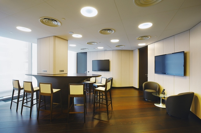
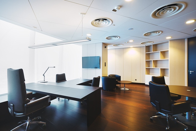
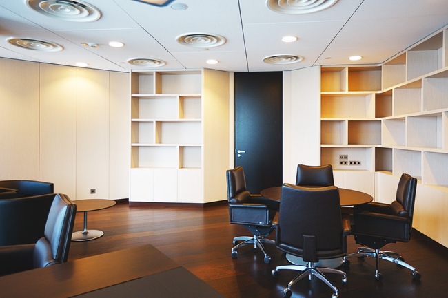
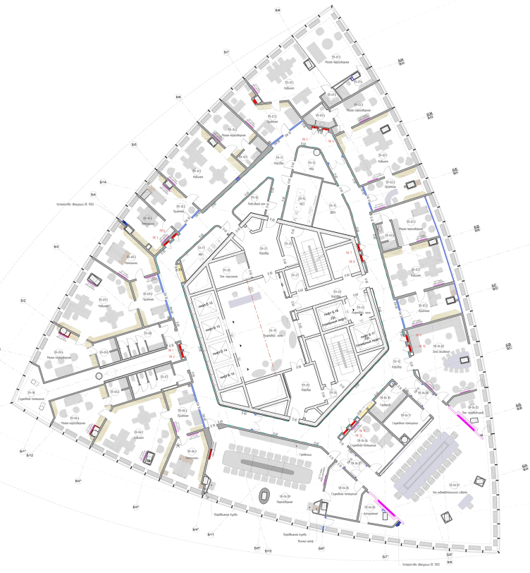
The difference between the 59th floor and the other levels consists in the fact that here, besides the six comfortable office blocks, there is also a cluster of executive premises. The latter includes a few spacious halls and occupies one of the corners of the tower. The main space is used for the multifunctional hall of the board of directors that neighbors on a large dining hall and a waiting room for the guests of the bank. For each of these zones, "SPEECH Choban&Kuznetsov" bureau found a dedicated palette of interesting solutions.


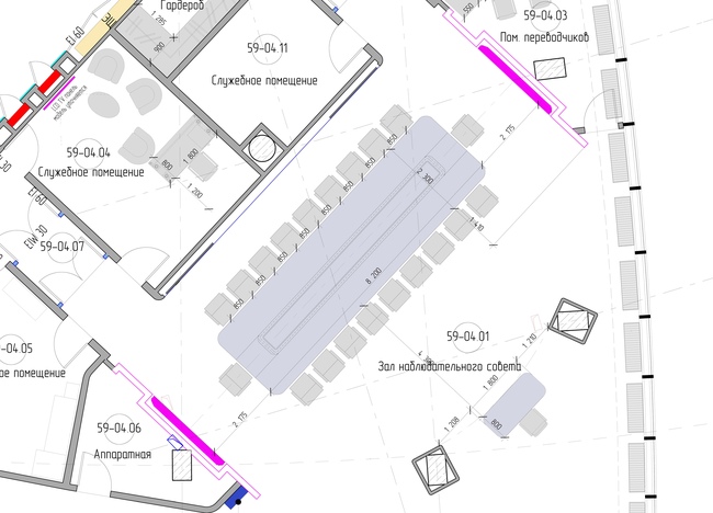
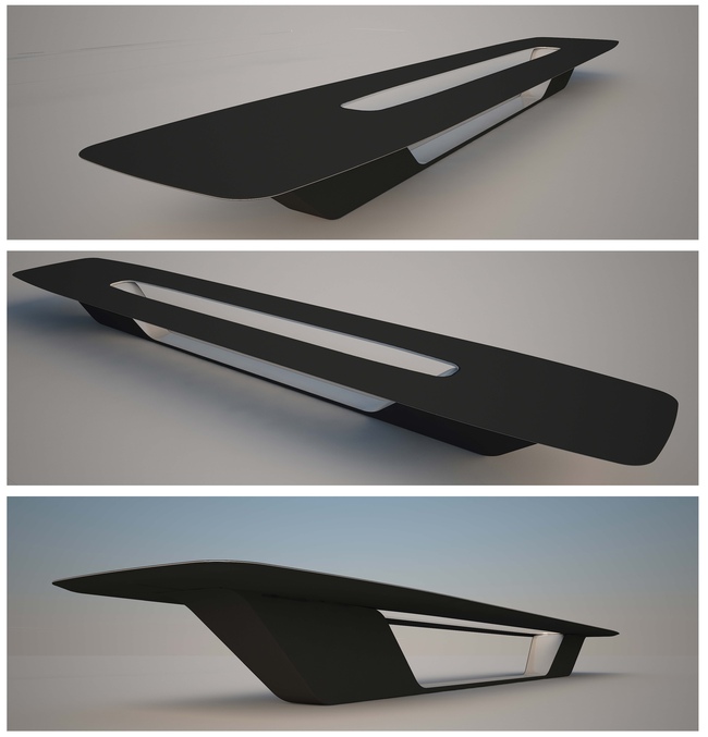
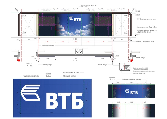
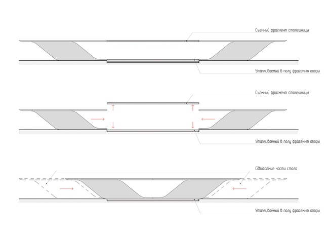
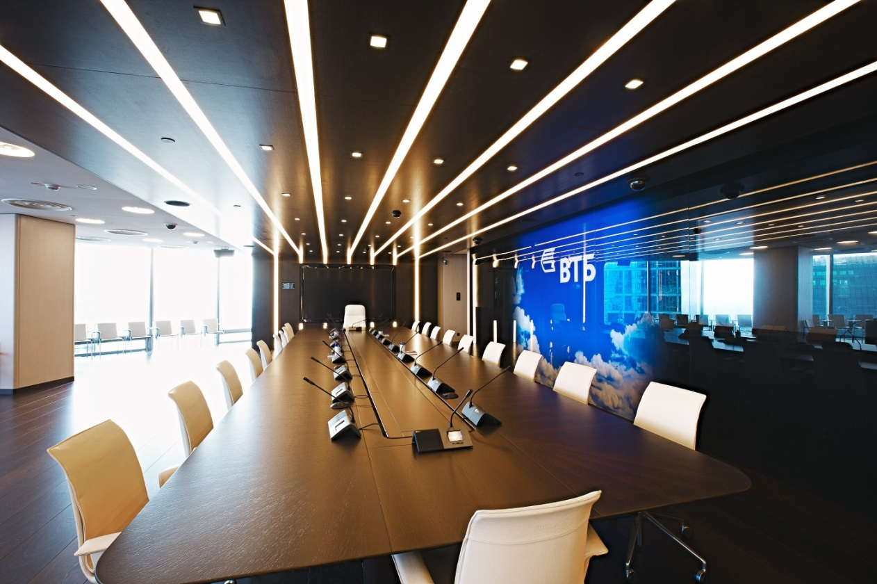
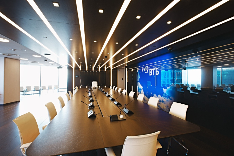
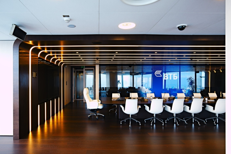
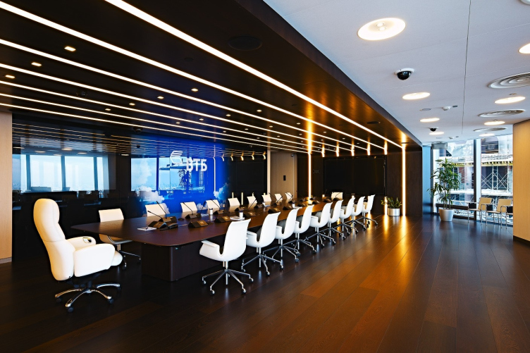
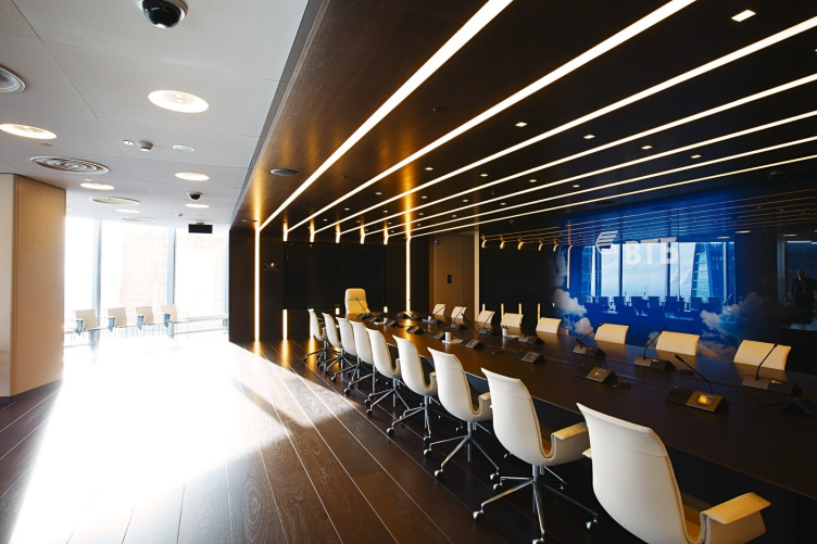
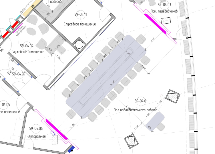
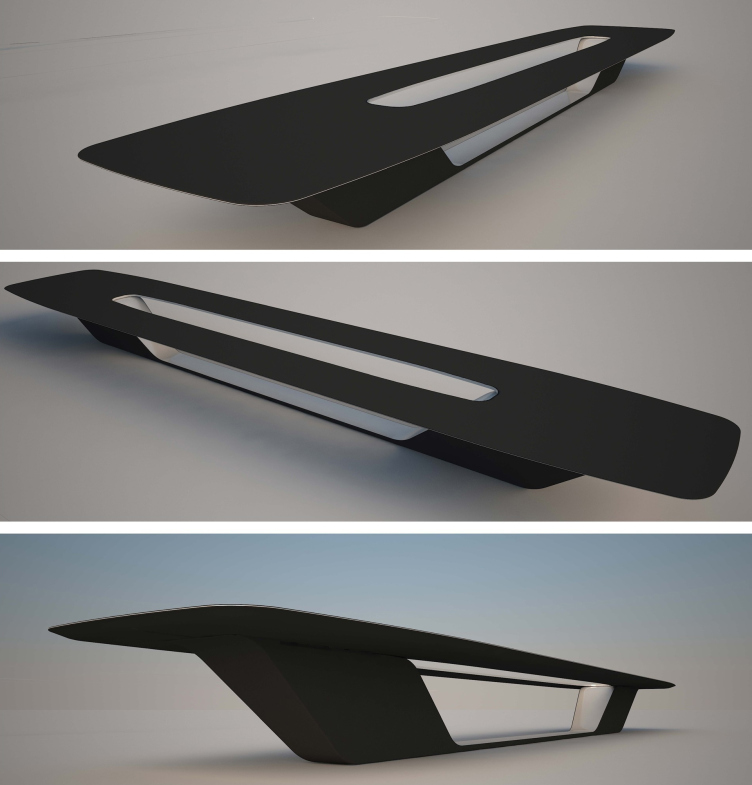
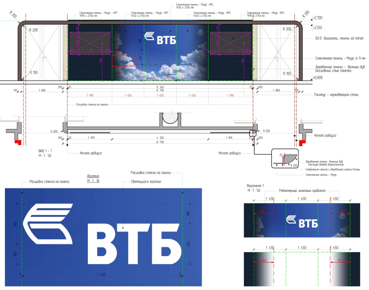
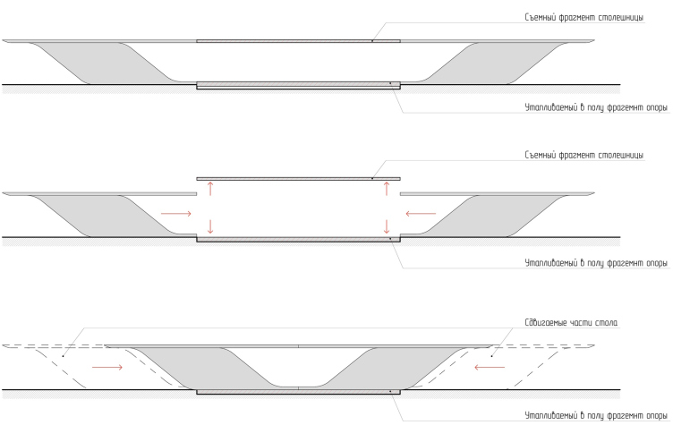
The hall of the board of directors can in fact be used in two modes: for organizing panel sessions and for organizing conferences. In the former case the large rectangular table, with a capacity of 22 persons and equipped with all the necessary means of audio and video support, is used in the normal operation mode, while in the latter case, when the larger part of the hall, the one that adjoins the glass facade, is turned into an auditorium, it transforms. Half of the tabletop folds vertically downward, while the table itself turns into the presidium stand turned to the audience. In order to accent the table area in either of the two using modes, the walls and the ceiling around it are coated with wooden panels that form a peculiar shell or a capsule with rounded corners, a shell that looks as if it was installed inside the hall. A special effect is also created by the lights that dissect the wooden shell of the capsule like parallel stripes. The finishing touch is made by the glass panel painting that decorates the rear wall of the hall and depicts a deep blue sky, white clouds, and the logo of VTB. It is in fact made up of four flare-free glass panels that cover up the monitors that are only visible when they are on.


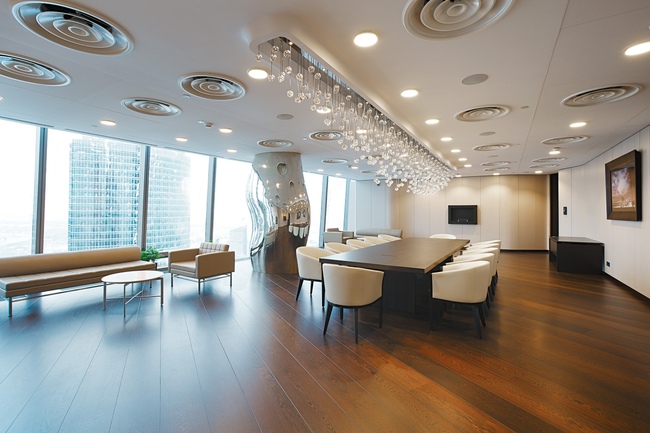
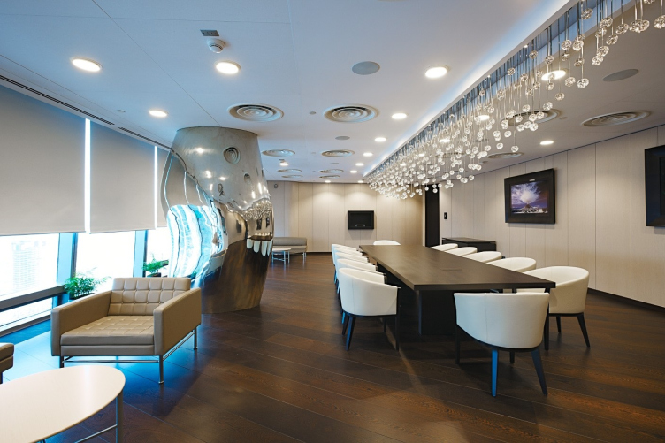
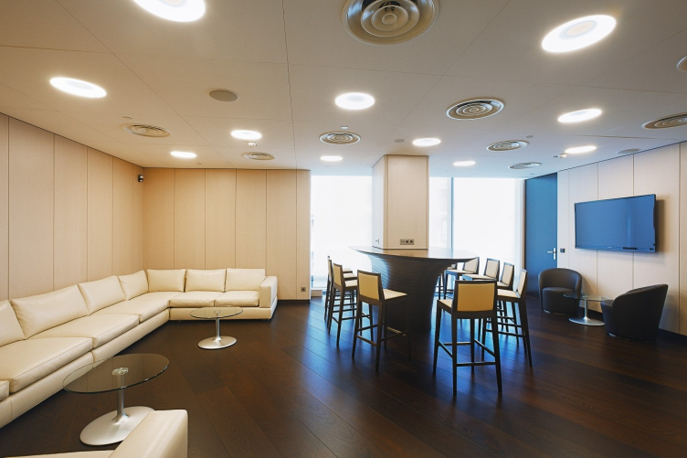
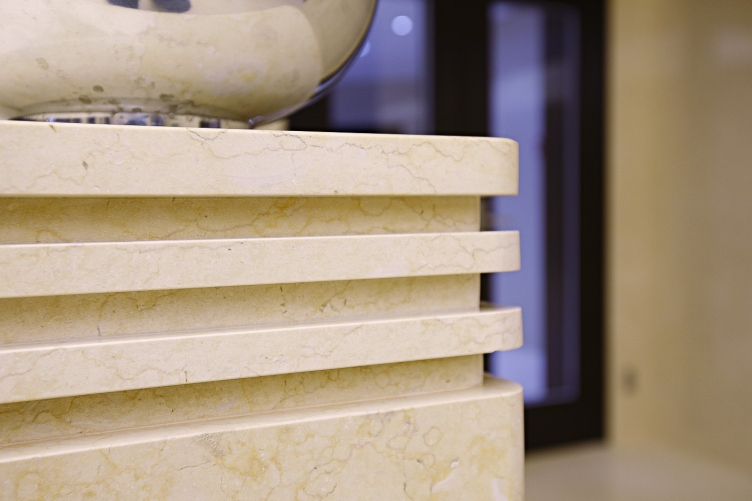
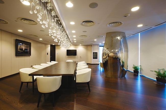
The room that is adjacent to the board of directors' hall can also be used in several ways: as the before-the-session waiting room and as the dining room for the members of the board, to name but two. Its main decoration consists of two art objects vying for the right to be considered the centerpiece of this interior: the sculptural volume that resembles an arrested pillar of liquid metal (it disguises a most trivial column), and the impressive-looking chandelier with a hundred of little glass balls that look like water drops that are never to reach the tabletop. For the production of the metallic shell of the column, a unique alloy of white bronze was used, the kind that only one Italian company works with. The two halves of the shell were cast by the original plaster model, and then welded and polished only on the spot. This art object makes the interior of the dining room more dramatic and at the same makes the atmosphere in the dining room more relaxed because it also works as a funhouse mirror.


The chandelier in the shape of the glass rain was designed in conjunction with the table and together they present a single composition for the creation of which the architects even had to make changes to the structure of the lowered ceiling. Out of the narrow opening with curved edges (the plaster shapes are installed into the ceiling), there hang little glass balls, suspended on thin metallic rods that form a "wave" that falls the lowest towards the center of he table and "picks up" at its edges. The function of the source of light is performed here by a fiber-optic technology that provides the floodlight effect producing the impression of the entire structure hovering in the air.
 

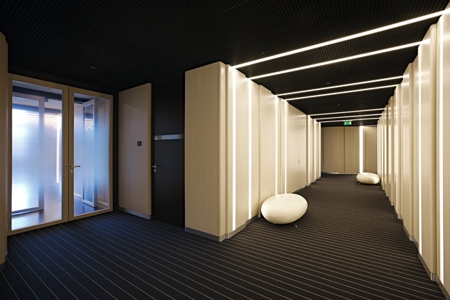
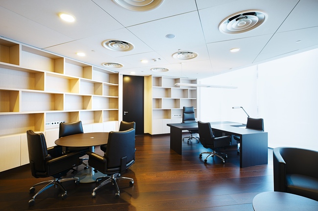
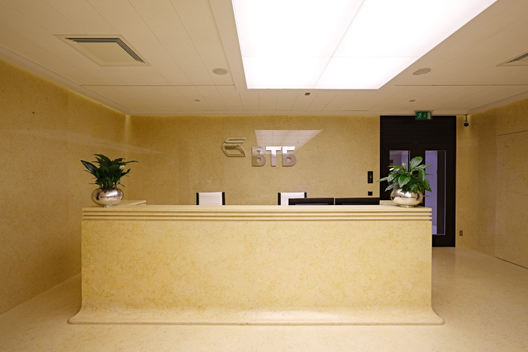
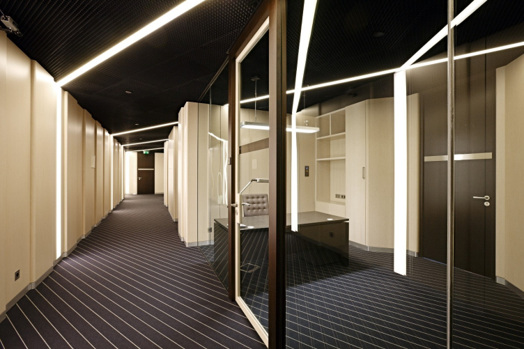
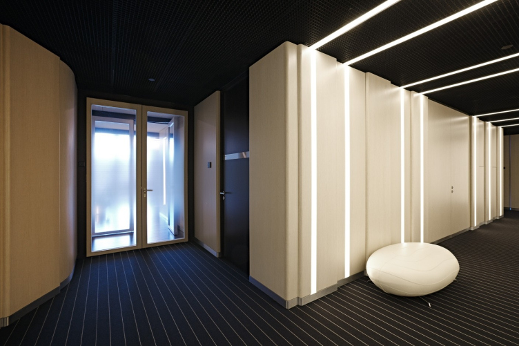
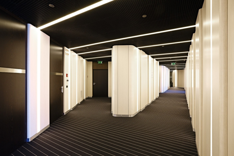
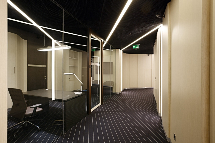
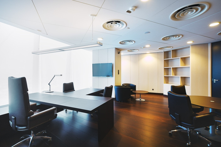
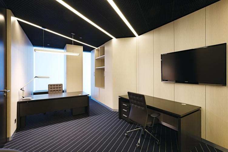
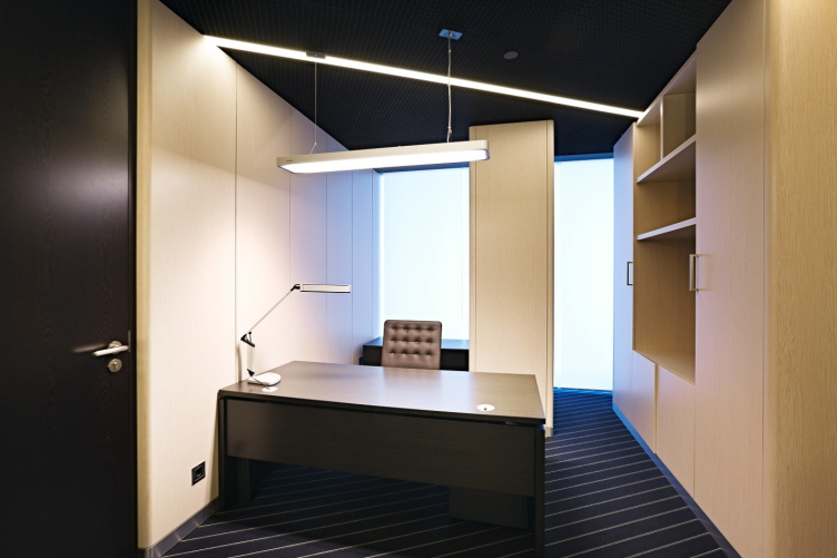
The remaining part of the floor, including the corridors and the offices, is designed just as imposing, even if a bit more pragmatic. The functional and the typological differences of the new floor left their mark on its deigning solution. The basic principle - the contrastive combination of wooden and glass walls - is kept here as well but it is treated here in an entirely different way. Most of the walls here are coated with panels of bleached oak (it is only the reception areas that are separated from the corridors with glass partitions that have the dark wooden portals cut into them), whose color and texture are accentuated by the dramatic light design and more radical color design of the ceiling (black perforated open-grid type). In spite of the fact that the materials are so respectable and traditional, in the best sense of the word, the office looks a little like it had been taken out of some sci-fi movie - first of all, because of the lights that are installed into the walls and the ceiling. The position and the width of each of the dome lights is defined by a grid of parallel lines superimposed on the plan of the floor: it traverses at different angles the ceiling structures and the walls of the corridors that skirt the central stair and elevator unit, thanks to which the surfaces of the walls and the accent elements (the lines on the carpet, the ceiling panels, and he dome lights) look as if the belong to different space systems. This creates a peculiar optical effect of a "transformable space" that is multiplied manifold at the expense of the reflections in the glass partitions.
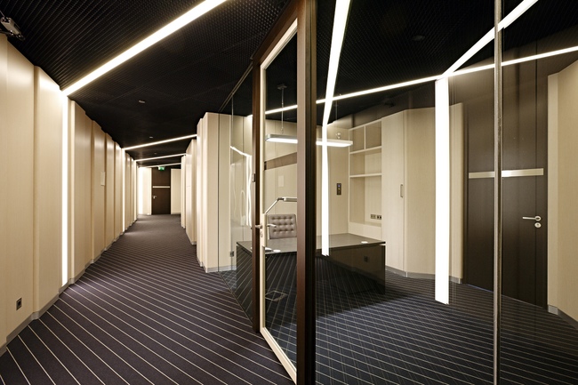
 

The lights inserted into the wooden panels became a constituent part of the original wall covering. The considerable length of the corridors required a solution that was to be simultaneously aesthetic, technological, and inexpensive. So, instead of mounting the bleached oak panels horizontally (which would require particular precision at the joints; this solution was in fact used on the lower floors), it was decided to mount the panels vertically, from the floor up to the level of the lowered ceiling. The architects developed a special bracing that could easily hold the panels under their own weight: each of the panels has rounded edges and is mounted overlapping its neighbor, which, coupled with the illuminant inserts, creates an interesting play of light all along the length of the corridor.


A most important role in the interior decoration is played by the unconventional design of the ceilings. Here the architects used the open-grid ceilings with cells that are filled with black cassettes. Usually such "brutal" structures are used in public spaces of a lower profile but in this case their use is not due to the economy reasons. The Hunter Douglas panels that are installed here have small-scaled cells and extra perforation of the laths - which creates a monolith structural surface. They, in turn, conceal the vents (also painted black), the electrical wiring, and other technical units necessary for supporting a comfortable microclimate in the office. Behind the ceiling panels they are practically invisible, but the “permeable” surface creates an interesting visual effect - the ceiling looks much higher that it actually is.


Firm:
SPEECH
Object:
Interior design of the offices of VTB bank in the “Federation” tower, Moscow City
Russia, Moscow

Project Team:
Authors of the project: Sergey Choban, Sergey Kuznetsov. Chief architect of the project: Igor Chlenov. Architects of the project: Alexandra Rusakova, Anna Deryabina, Marina Digileva, Aleksey Kargin, Alexandra Kavitskaya, Olga Kalugina

2010 — 2012 / 2011 — 2012

“VTB” Company

25 April 2013

Headlines now
The Golden Crown
The concept for a dental clinic in Yekaterinburg, developed by CNTR Studio, revolves around the idea of a “mouth full of gold”: pristine white porcelain stoneware walls are complemented by matte brass details. To avoid an overly literal interpretation, the architects focused on the building’s proportions, skillfully navigating between sunlight requirements and fire safety regulations.
Flexibility and Integration
Not long ago, we covered the project for the fourth phase of the ÁLIA residential complex, designed by APEX. Now, we’ve been shown different fence concepts they developed to enclose the complex’s private courtyards, incorporating a variety of public functions. We believe that the sheer fact that the complex’s architects were involved in such a detail as fencing speaks volumes.
A Step Forward
The HIDE residential complex represents a major milestone for ADM architects and their leaders Andrey Romanov and Ekaterina Kuznetsova in their quest for a fresh high-rise aesthetic – one that is flexible and layered, capable of bringing vibrancy to mass and silhouette while shaping form. Over recent years, this approach has become ADM’s “signature style”, with the golden HIDE tower playing a pivotal role in its evolution. Here, we delve into the project’s story, explore the details of the complex’s design, and uncover its core essence.
Gold in the Sands
A new office for a transcontinental company specializing in resource extraction and processing has opened in Dubai. Designed by T+T Architects, masters of creating spaces that are contemporary, diverse, flexible, and original, this project exemplifies their expertise. On the executive floor, a massive brass-clad partition dominates, while layered textures of compressed earth create a contextually resonant backdrop.
Layers and Levels of Flight
This project goes way back – Reserve Union won this architectural competition at the end of 2011, and the building was completed in 2018, so it’s practically “archival”. However, despite being relatively unknown, the building can hardly be considered “dated” and remains a prime example of architectural expression, particularly in the headquarters genre. And it’s especially fitting for an aviation company office. In some ways, it resembles the Aeroflot headquarters at Sheremetyevo but with its own unique identity, following the signature style of Vladimir Plotkin. In this article, we take an in-depth look at the United Aircraft Corporation (UAC) headquarters in the Moscow agglomeration town of Zhukovsky, supplemented by recent photographs from Alexey Naroditsky – a shoot that became only recently possible due to the fact that improvements were finally made in the surrounding area.
Light and Shadow
In this article, we delve into the architectural design of the “Chaika” house by DNK ag architects, which was recently completed in 2023 as part of the collection of signature designs at ZILArt. As is well-known, all the buildings in this complex follow a design code, yet each one is distinct. This particular building stands out not only for its whiteness and minimalism but also for the refined use of a limited number of techniques that, together, create what can confidently be called synergy.
Casus Novae
A master plan was developed for a large residential area with a name of “DNS City”, but now that its implementation began, the plan has been arbitrarily reformatted and replaced with something that, while similar on the surface, is actually quite different. This is not the first time such a thing happens, but it’s always frustrating. With permission from the author, we are sharing Maria Elkina’s post.
Treasure Hunting
The GAFA bureau, in collaboration with Tegola and Arkhitail, organized an expedition to the island of Kilpola in Karelia as part of Moskomarkhitektura’s “Open City” festival. There, amidst moss and rocks, the students sought answers to questions like: what is the sacred, where does it dwell, and what sustains it? Assisting the participants in this quest were landscape engineer Evgeny Levin, artist Nicholas Roerich, a moose, and the lack of cellular connection. Here’s how the story unfolded.
Depths of the Earth, Streams of Water
In the Malaya Okhta district, the Akzent building, designed by Stepan Liphart, was constructed. It follows a classic tripartite structure, yet it’s what you might call “hand-drawn”: each façade is unique in its form and details, some of which aren’t immediately noticeable. In this article, we explore the context and, together with the architect, delve into how the form was developed.
Fir Tree Dynamics
The “Airports of Region” holding is planning to build an airport in Karachay-Cherkessia, aiming to make the Arkhyz and Dombay resorts more accessible to travelers. The project that won in an invitation-only competition, submitted by Sergey Nikeshkin’s KPLN, blends natural imagery inspired by the shape of a conifer seed, open-air waiting spaces, majestic large trees, and a green roof elevated on needle-like columns. The result is both nature-inspired and WOW.
​A Brick Shell
In the process of designing a clubhouse situated among pine trees in a prestigious suburban area near Moscow, the architectural firm “A.Len” did the façade design part. The combination of different types of brick and masonry correlates with the volumetric and plastique solutions, further enhanced by the inclusion of wood-painted fragments and metal “glazing”.
Word Forms
ATRIUM architects love ambitious challenges, and for the firm’s thirtieth anniversary, they boldly play a game of words with an exhibition that dives deep into a self-created vocabulary. They immerse their projects – especially art installations – into this glossary, as if plunging into a current of their own. You feel as if you’re flowing through the veins of pure art, immersed in a universe of vertical cities, educational spaces – of which the architects are true masters – and the cultural codes of various locations. But what truly captivates is the bold statement that Vera Butko and Anton Nadtochy make, both through their work and this exhibition: architecture, above all, is art – the art of working with form and space.
Flexibility and Acuteness of Modernity
Luxurious, fluid, large “kokoshniks” and spiral barrel columns, as if made from colorful chewing gum: there seem to be no other mansion like this in Moscow, designed in the “Neo-Russian-Modern” style. And the “Teremok” on Malaya Kaluzhskaya, previously somewhat obscure, has “come alive with new colors” and gained visibility after its restoration for the office of the “architectural ecosystem” as the architects love to call themselves. It’s evident that Julius Borisov and the architects at UNK put their hearts into finding this new office and bringing it up to date. Let’s delve into the paradoxes of this mansion’s history and its plasticity. Spoiler: two versions of modernity meet here, both balancing on the razor’s edge of “what’s current”.
Yuri Vissarionov: “A modular house does not belong to the land”
It belongs to space, or to the air... It turns out that 3D printing is more effective when combined with a modular approach: the house is built in a workshop and then adapted to the site, including on uneven terrain. Yuri Vissarionov shares his latest experience in designing tourist complexes, both in central Russia and in the south. These include houseboats, homes printed from lightweight concrete using a 3D printer, and, of course, frame houses.
​Moscow’s First
“The quality of education largely depends on the quality of the educational environment”. This principle of the last decade has been realized by Sergey Skuratov in the project for the First Moscow Gymnasium on Rostovskaya Embankment in the Khamovniki district. The building seamlessly integrates into the complex urban landscape, responding both to the pedestrian flow of the city and the quiet alleyways. It skillfully takes advantage of the height differences and aligns with modern trends in educational space design. Let’s take a closer look.
Looking at the Water
The site of Villa Sonata stretches from the road to the water’s edge, offering its own shoreline, pier, and a picturesque river panorama. To reveal these sweeping views, Roman Leonidov “cut” the façade diagonally parallel to the river, thus getting two main axes for the house and, consequently, “two heads”. The internal core – two double-height spaces, a living room and a conservatory, with a “bridge” above them – makes the house both “transparent” and filled with light.
The White Wing
Well, it’s not exactly white. It’s more of a beige, white-stone structure that plays with the color of limestone – smoother surfaces are lighter, while rougher ones are darker. This wing unites various elements: it absorbs and interprets the surrounding themes. It responds to everything, yet maintains a cohesive expression – a challenging task! – while also incorporating recognizable features of its own, such as the dynamic cuts at the bottom, top, and middle.
Urban Dunes
The XSA Ramps team designed and built a three-part sports hub for a park in Rostov-on-Don, welcoming people of all ages and fitness levels. The skate plaza, pump track, and playground are all meticulously crafted with details that attract a diverse range of visitors. The technical execution of the shapes and slopes transforms this space into a kind of sculptural composition.
Proportional Growth
The project for the fourth phase of the ÁLIA residential area has been announced. The buildings are situated on an elongated plot – almost a “ray” that shoots out from the center of the area towards the river. Their layout reflects both a response to Moscow’s architectural preferences over the past 15 years, shifting “from blocks to towers”, and an interpretation of the neighboring business park designed by SOM. Additionally, the best apartments here are not located at the very top but closer to the middle, forming a glowing “waistline”.
The “Staircase” Building
In designing the “Details” residential complex in New Moscow, Rais Baishev spiced up the now-popular Moscow theme of a “courtyard” building with an idea drawn from the surrealist drawings by Maurits Escher. He envisioned the stepped silhouettes and descending slopes as a metaphysical mega-staircase, creating a key void within the courtyard that gave the project an internal “spine”. This concept is felt both in the building’s silhouette and on its façades.
Projection of the Quarter
No one doubted that the building that Vladimir Plotkin designed as part of the “Garden Quarters” would be the most modernist of all. And it turned out just that way: while adhering to the common design code, the building successfully combines brick and white stone, rhythmically responding to the neighboring building designed by Ostozhenka, yet tactfully and persistently making a few statements of its own. This includes the projection of the ideal urban development composition “14–9–6”, which can be found right next door, mathematical calculations, including those for various types of terraces (and perhaps the only reminder of the Soviet past of the Kauchuk rubber factory!), and the white “cross-stitch” pattern of the façade grid.
Domus Aurea
In this issue, we examine the “Tessinsky-1” house, designed by Sergey Skuratov and completed in 2023. Located in the middle of the Serebryanicheskaya Embankment district, at the intersection of its main streets, this house assumes a sort of “nodal” role: it not only responds to everything around it and preserves many memories of the former EMA factory within itself, but it weaves all this into a newly directed pattern, reconciling bright “gold” and dark-colored brick, largely with the help of the new, modern-yet-archaic Columba brick, which, come to think about it, is the most precious element here.
The Chimney of Nikola-Lenivets
In this issue, we are examining the “Obelisk House” designed by KATARSIS and built for the Arkhstoyanie 2023 festival. However, it was only finished later on, and this is why we are examining it now. It seems to us that after the “Obelisk House” appeared in Nikola-Lenivets, a dialogue and a few inner connections appeared between the temporary structures built here. These houses no longer look like “accidental neighbors”, more of which below.
​Periscope by the Bay
The jury awarded the second place in the competition for a public and cultural center in Petropavlovsk-Kamchatsky to the companies GORA (“Mountain”) and M4. In the consortium’s proposal, the building resembles a sperm whale with a calf swimming next to it or a periscope, whose lenses capture the most spectacular views from the surrounding landscape.
From Arcs to Dolmens
While working on the competition project for Petropavlovsk-Kamchatsky, ASADOV Architects prioritized the value of the natural and urban environment, aiming to preserve the balance of the location while minimizing the resemblance of the volume that they designed to a “traditional building”. The task was challenging, and the architects created three versions, one of which having been developed after the competition, where their main proposal took third place. However, the point of interest here is not the competition result but the continuity of creative thinking.
Hide and Seek
The ID Moskovskiy house, designed by Stepan Liphart in St. Petersburg, in the courtyards near Moskovskiy Avenue beyond the Obvodny Canal and recently completed, is notable for several reasons. Firstly, it has been realized with considerable accuracy, which is particularly significant as this is the first building where the architect was responsible not only for the facades but also for the layouts, allowing for better integration between the two. On the other hand, this building is interesting as an example of the “germination” of new architecture in the city: it draws on the best examples from the neighborhood and becomes an improved and developed sum of ideas found by the architect in the surrounding context.
The Big Twelve
Yesterday, the winners of the Moscow Mayor’s Architecture Award were announced and honored. Let’s take a look at what was awarded and, in some cases, even critique this esteemed award. After all, there is always room for improvement, right?
Above the Golden Horn
The residential complex “Philosophy” designed by T+T architects in Vladivostok, is one of the new projects in the “Golubinaya Pad” area, changing its development philosophy (pun intended) from single houses to a comprehensive approach. The buildings are organized along public streets, varying in height and format, with one house even executed in gallery typology, featuring a cantilever leaning on an art object.
Nuanced Alternative
How can you rhyme a square and space? Easily! But to do so, you need to rhyme everything you can possibly think of: weave everything together, like in a tensegrity structure, and find your own optics too. The new exhibition at GES-2 does just that, offering its visitor a new perspective on the history of art spanning 150 years, infused with the hope for endless multiplicity of worlds and art histories. Read on to see how this is achieved and how the exhibition design by Evgeny Ace contributes to it.
Blinds for Ice
An ice arena has been constructed in Domodedovo based on a project by Yuri Vissarionov Architects. To prevent the long façade, a technical requirement for winter sports facilities, from appearing monotonous, the architects proposed the use of suspended structures with multidirectional slats. This design protects the ice from direct sunlight while giving the wall texture and detail.