По-русски

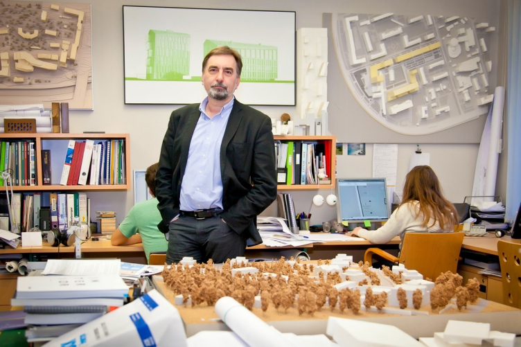
Sergey Skuratov: public spaces are more important than the architecture itself

The leader of "Sergey Skuratov Architects" speaks about the current projects of his studio.

11 April 2013
Interview
mainImg

Archi.ru: Sergey, your architectural studio has suddenly disappeared from the list of our steady newsmakers. What is the reason of such hiatus? What is your creative team up to, presently?


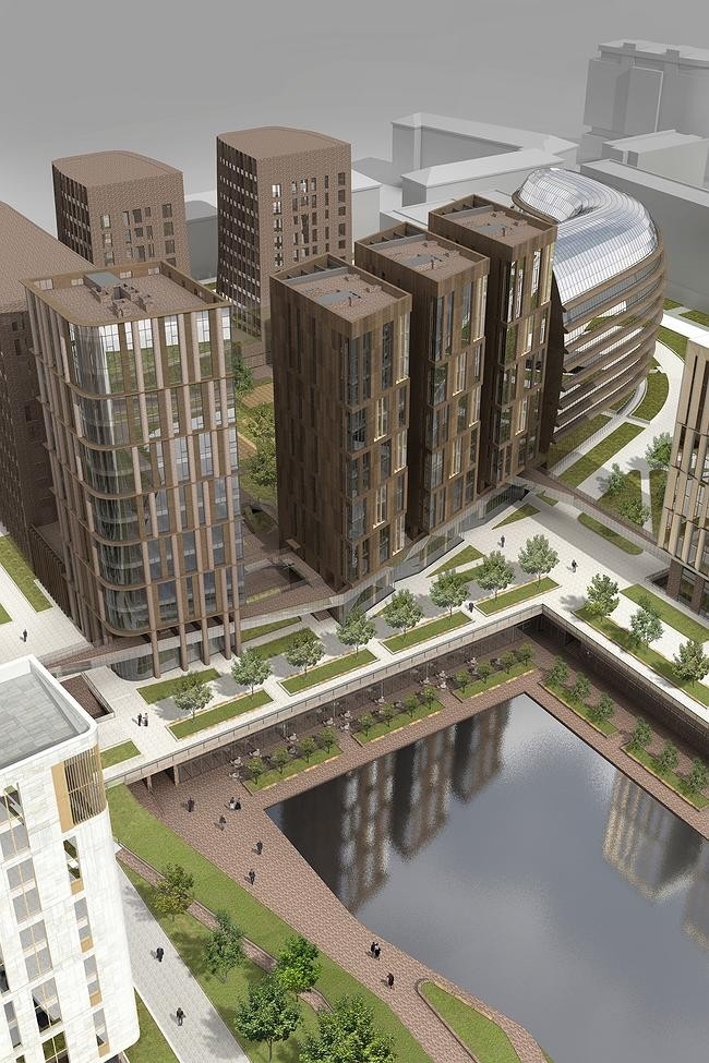
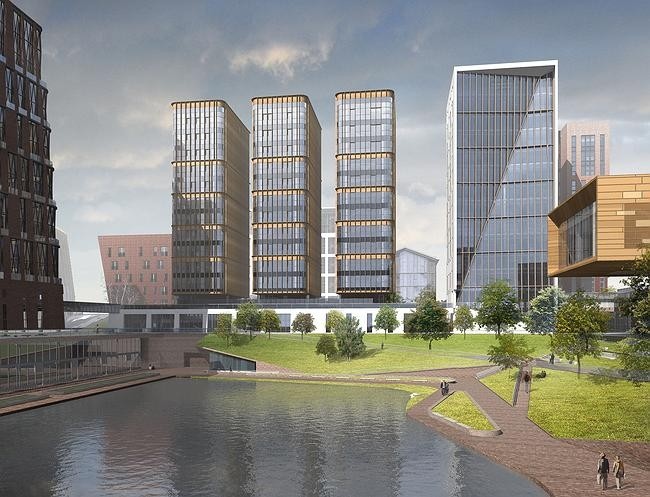
Sergey Skuratov: We spend most of our time working on the "Garden Quarters" project. After this project was purchased by "Binbank", things started to get done really quickly there. The first stage of development is now being completed - it is the first and the fourth quarters - there, the facades are being coated with the Hagemeister Flemish bricks and natural stone, the stained-glass windows are being installed, and the improvement of the adjacent territory is nearly finished. Concurrently to this, we are preparing the detailed design of the second stage - these are the second and the third quarters the construction of which has also begun already, the construction pit has been made, the foundation plate has been laid, and the slurry wall has been built as well.

A good third of our employees spends their every other working day at the construction site. I will admit that for our team, the "Garden Quarters" have become a piece of work that is not only very interesting but also challenging - it is a test of our professionalism, and it is a point of honor for us to stand up to it. The architects that are under 30-35 years of age are discovering for themselves a new side to our profession - they start to realize that the beautiful pictures are only the beginning of any project. I, as the leader of the studio and as their mentor, am very proud of my people: they do great detailed drafts, they delve into the nuances of the project, and thanks to this approach we were able to turn even the complex and tedious stage of the preparation of the specification documents into an exciting and creative experience.
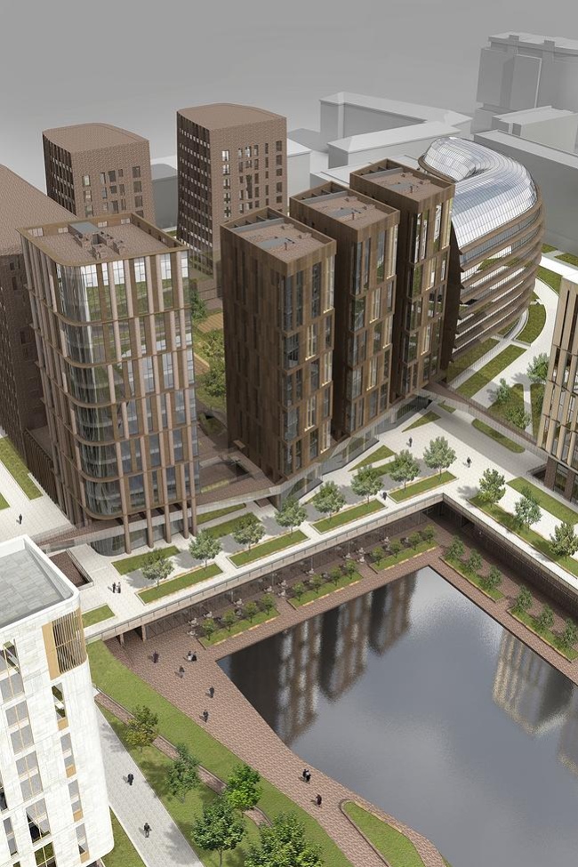
 

"Garden Quarters"

Archi.ru: Does your studio develop the specification documents for the objects by other architects that will be built in the "Garden Quarters"?


Sergey Skuratov: No, only for our own. But, yes, we do go through the specs of our colleagues, give them an odd piece of advice, and sometimes even provide them with our already developed units and solutions, even if it means that they are to be duplicated from project to project, making "Garden Quarters" a single work of town-planning art.


Archi.ru: Now, nearly six years after the start of this project, do you still consider the consortium of the architects to be a good idea?


Sergey Skuratov: Well, of course it would have been easier to do the whole thing all by myself. And it is not so much that I trust myself more, it is just that the interaction of people, especially creative people, is a very complex process by definition. But the city is not created by one architect and with one idea, so the project definitely benefitted from the input by other authors. Even though I have to admit that I ultimately feel tremendous moral responsibility for everything that is going on in the "Garden Quarters", without really making much difference between the houses that were designed by me or designed by my colleagues.


Archi.ru: As far as I know, the inner public areas in "Garden Quarters" are also done by your studio?


Sergey Skuratov: Yes, and this is exactly what we are doing full-time these days. We invited Bernard Pictet, the French artist and designer, expert in glass, and we include his works into the interior of each of the lobbies, framing them in the appropriate manner. I will not uncover all the details so far but I hope this will become the highlight and the most intriguing part of the project.


Archi.ru: What other projects by your studio are also starting to get implemented?


Sergey Skuratov: The Rostov project, due to its complexity, is getting all the necessary approvals in Moscow, and we hope that this year the construction will be launched. We are also getting the approvals for the project of a residential complex at Novoalekseevskaya. For that project, by the way, we have already chosen the finishing material - it will also be Hagemeister, but of a lighter shade of color than in "Garden Quarters", and without the vertical joints, which will give the masonry an interesting texture. I should say here that this house came out pretty unsophisticated both in terms of the materials and its plastics but, because it is all surrounded by endless gloomy parallelepipeds, we thought it wise to make an accent on the reserved type of architecture. What we wanted to do was cushion the shock that is inevitable when a God-forsaken lot gets a new bright object. It is my general conviction that the environment needs only to be transformed by degrees: living in a city where each and every house screams uniqueness must be pretty tough...
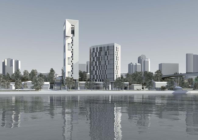
Residential complex in Rostov-on-Don 


Also, the house on the Burdenko Street is almost completed - right now its upper part is being finished; what we still need to do is "hem" the cantilever with bricks and make the upper beam. The improvement of the adjacent territory is also completed and now we are working on the interior design of the public areas. The entrance lobby, according to our plan, will be completely finished with wood: the house itself is built of dark bricks and comes out pretty "brutal" and in some way even inaccessible-looking, this is why we are doing the contrastive interiors, immersing the newcomers into the atmosphere of wood that feels light and warm. Although, we treat the wood in an unconventional way here and we are also preparing a surprise, hopefully, an interesting one.


Archi.ru: Last year, you won a few tenders, including a most unexpected one - for the reconstruction of the "Russian Lounge" in Kennedy Center in Washington. Its overall area is but 250 square meters. Why did you choose to commit yourself to such a "small-scale" project?


Sergey Skuratov: I never really avoided doing small-scale projects. On the contrary, I am convinced that working on serious town-planning tasks must be preceded by working with smaller volumes and designing interiors. And there are several such projects in our portfolio, in fact. On the one hand, this is indeed the "Russian Lounge" that we are doing at the invitation from the Vladimir Potanin Foundation (this project being monitored by Natalia Zolofova). The main goal of the "Russian Lounge" is renovating its space which would help, let's say, break the common for American society stereotypes about Russia, so the interior must do exactly that - show our country without the stereotypical hackneyed images. The artist of this project is Valery Koshlyakov who painted several new canvases specifically for this place. One of the few interior design items that will remain in the lounge after its reconstruction will be the crystal chandelier that was presented to the Kennedy Center by Ireland - we found a way to spin this fact and insert it into the modern interior in the correct way.

Besides, we are now building our first country villa, literally from scratch, doing everything: the house, the maintenance structures, improving the land plot, the interiors, too. We have been working for almost a year already, and now the construction is beginning. And I admit that it is a great experience working on the interiors after you came up with the shape of the space all by yourself. And again, the interior and the exterior exist in contrast to one another - I am sure that in the country this technique is quite appropriate, all the more so because there is a lot of glass in that house.


Archi.ru: Was it a contest project or was it ordered directly as a "Villa by Skuratov"?


Sergey Skuratov: I was invited directly. Such a level of trust and respect entails, of course, a lot of obligations but it is also very inspiring, and I thank my destiny for this experience.


Archi.ru: Getting such freedom of creation must be practically impossible in a big city, isn't it? A characteristic example is the project of a residential complex on the Paveletskaya Embankment where you originally proposed a futuristic pedestrian bridge but then had to simplify the project, at the same time downgrading the housing class. As far as I know, it is still being modified?


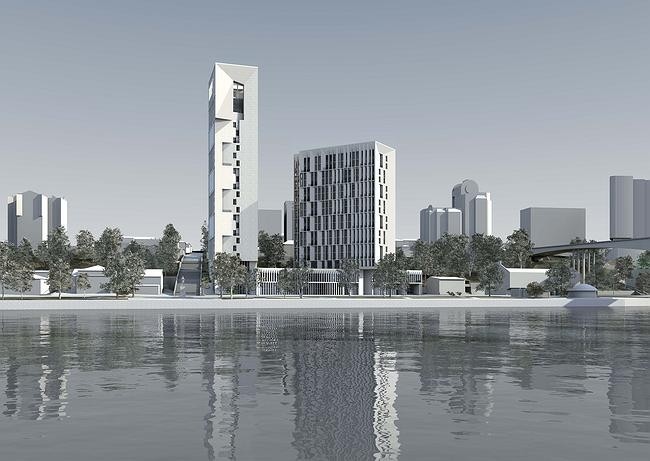
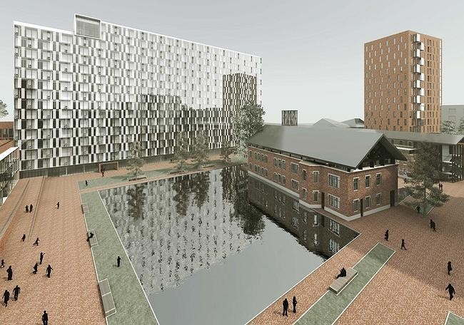
Sergey Skuratov: That's quite a complicated story, really. We did win the international competition, particularly due to our idea of building a spectacular pedestrian bridge over the Moskva River, i.e. we were the only competitors that really thought through the connection of this land to the city area. But then the commissioner gave up on this idea, and we had to remove the bridge from the project and consequently we had to redo the project with consideration of its isolated situation. Besides, in the first, as well as in the second version we kept the factory buildings intact, placing our bets on the expressiveness of the brick, and then we had to forego even that. Well, I admit, we did a fair bit of wishful thinking: we loved the ruins so much that we really tried to make the best of them. In actuality, they are in a despicable state, and it is hard to see any beauty in them - at least, our commissioner couldn't. And, sadly, the city did not back us up either; they did not recognize these objects as worthy of preserving. So now we are making crucial changes both to the positioning of the volumes and their architectural design but I still hope that we will be able to keep the spirit of the initial concept. At least it is still based on the idea of "dissolving" the bricks and turning them gradually into the transparent glass.
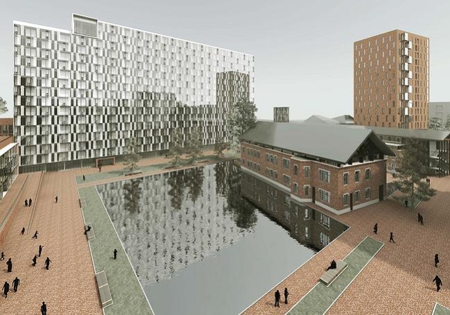
Residential complex on the territory of Moscow's former printing and publishing integrated works

What really worries me in terms of this project is how the public areas are going to be designed. In the "Garden Quarters" the theme of the public spaces penetrating into the residential enclave was a priority for me because I really wanted to avoid making again the mistake of the 2000's when in the middle of the city there appeared the "rich people only" restricted area. On the Paveletskaya Embankment, implementing such a noble idea is many times more difficult - it is a lot further away from the center of the city, and it presents a different contest. And still I am convinced that you just cannot shut off this piece of the city from its inhabitants - because in that area it will be the only "civilized" fraction of the social life, and, consequently, the unique and only chance to breathe new life into that part of the city. However, thinking about the comfort of the city environment, we have to at the same time think about the comfort and safety of its inhabitants and this is why right now we are searching for the solution that would help us to separate the dwellers of the complex and other people without really building any extra walls or fences.
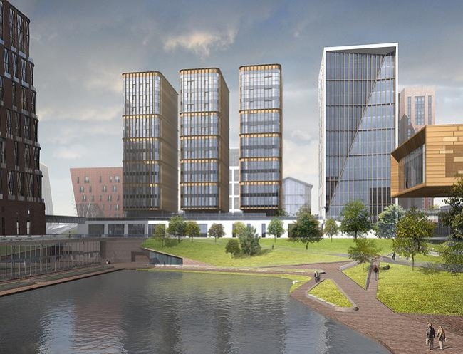
 

"Garden Quarters"

Archi.ru: Luckily, the interest for the public areas is on the rise lately which increases the chances of your ideas becoming a reality.


Sergey Skuratov: The public spaces are really becoming a most important part of the city environment - luckily, Moscow has finally started catching up on the world trends. If we get back to the example of the "Garden Quarters", I should note that this project was originally based on the dominance of social life. The commissioner is gathering a whole group of people, a ruling board, if you want, that will be responsible for the social life of the whole project - it includes marketing experts, sociologists, and I was also invited. I will make a bold statement that such filling the project with meaning is in many ways more important than the architecture per se.

In this sense I am quite optimistic in terms of what is going on in Moscow and what is being done to Moscow. The new management of Moscomarchitecture is trying to pursue a policy of openness, rationality, and collectiveness, and, as it seems to me, Sergey Kuznetsov's team has so far been successful in it. The main architect of the capital is trying to filter down the stream of previously approved projects that has crashed down upon him. Originally, this was done by Khusnullin's group, but it let past a lot of projects that demonstrated not just dense but super-dense housing. It is great that the main architect realizes that you cannot build on Moscow's every vacant site: the city cannot grow when it gets eaten up by the construction sector. What I also like is the fact that Sergey Kuznetsov actively invites the young to take part in the architectural process. The "short list" of Moscow architecture is indeed short, and inviting new teams is not only justified but desirable. Quite recently I was a member of the jury panel in the contest for a business center at the Byelorussian Square, and there were several studios of people in their 30's and 40's. They all should be building in the city, they really should! Architecture is, of course, an age-related profession, experience is really important in it, but without gradual upgrading its staff we cannot expect it to develop successfully.


Archi.ru: And do you still participate in contests yourself, by the way? Somehow, your studio was not on the list of those companies that did the Polytechnic Museum project.


Sergey Skuratov: We submitted our application for the participation in this contest together with the Dutch bureau Neutelings Riedijk Architects but we did not pass into the second round. Well, win a few, lose a few - a contest is always a lottery. Right now we are going to do the contest for the project of the last house at "Ostozhenka", and also the contest for the housing project of 10 hectares in the west of Moscow - they plan to build a mixed-use development there. Both tenders are limited-access and international ones - of course, there are no guarantees whatsoever that we are going to win at least one of them but we like competing and we are good at it; this trains our team and improves our professional skills, so I always value this experience very much.

I generally like the recently-implemented idea of such "consulting tenders", like the one that was dedicated to the Berezhkovskaya Embankment. Long-term thinking is something that both our city and its architects really should develop. Any half-experienced designer can draw a facade, there are only a dozen techniques, and you don't have to be a rocket scientist to use them in this or that combination. But the contact with the surrounding houses - this is something that you have to feel and take into consideration. Of course, the architect cannot breathe a new live into the old block with a wave of his magic wand but creating the various prerequisite conditions for society to accept and use this project is something that that can and must be done. And this can only be done by practicing the responsible approach at every designing stage. In April, at "Golden Section", there will be a master class that I decided to name "Architecture without Much Words", and I am going to speak specifically about this. About the fact that we must be extremely careful when we work with the arsenal of the techniques and devices that the modern designer has at his disposal. Any word said in passing will tell on our society and on our living space. And, if we do not want our city to turn into a screaming garish mass but become a comfortable place to live in, we need to be attentive to every little detail. Conciseness and clarity of gesture are still things that do make a difference, and, as an architect, I see my mission in striving, in every project that I am doing, to achieve this clarity, ruthlessly cutting off all the unnecessary "words", materials, and techniques.

zooming
zooming
zooming


11 April 2013

Headlines now
The Golden Crown
The concept for a dental clinic in Yekaterinburg, developed by CNTR Studio, revolves around the idea of a “mouth full of gold”: pristine white porcelain stoneware walls are complemented by matte brass details. To avoid an overly literal interpretation, the architects focused on the building’s proportions, skillfully navigating between sunlight requirements and fire safety regulations.
Flexibility and Integration
Not long ago, we covered the project for the fourth phase of the ÁLIA residential complex, designed by APEX. Now, we’ve been shown different fence concepts they developed to enclose the complex’s private courtyards, incorporating a variety of public functions. We believe that the sheer fact that the complex’s architects were involved in such a detail as fencing speaks volumes.
A Step Forward
The HIDE residential complex represents a major milestone for ADM architects and their leaders Andrey Romanov and Ekaterina Kuznetsova in their quest for a fresh high-rise aesthetic – one that is flexible and layered, capable of bringing vibrancy to mass and silhouette while shaping form. Over recent years, this approach has become ADM’s “signature style”, with the golden HIDE tower playing a pivotal role in its evolution. Here, we delve into the project’s story, explore the details of the complex’s design, and uncover its core essence.
Gold in the Sands
A new office for a transcontinental company specializing in resource extraction and processing has opened in Dubai. Designed by T+T Architects, masters of creating spaces that are contemporary, diverse, flexible, and original, this project exemplifies their expertise. On the executive floor, a massive brass-clad partition dominates, while layered textures of compressed earth create a contextually resonant backdrop.
Layers and Levels of Flight
This project goes way back – Reserve Union won this architectural competition at the end of 2011, and the building was completed in 2018, so it’s practically “archival”. However, despite being relatively unknown, the building can hardly be considered “dated” and remains a prime example of architectural expression, particularly in the headquarters genre. And it’s especially fitting for an aviation company office. In some ways, it resembles the Aeroflot headquarters at Sheremetyevo but with its own unique identity, following the signature style of Vladimir Plotkin. In this article, we take an in-depth look at the United Aircraft Corporation (UAC) headquarters in the Moscow agglomeration town of Zhukovsky, supplemented by recent photographs from Alexey Naroditsky – a shoot that became only recently possible due to the fact that improvements were finally made in the surrounding area.
Light and Shadow
In this article, we delve into the architectural design of the “Chaika” house by DNK ag architects, which was recently completed in 2023 as part of the collection of signature designs at ZILArt. As is well-known, all the buildings in this complex follow a design code, yet each one is distinct. This particular building stands out not only for its whiteness and minimalism but also for the refined use of a limited number of techniques that, together, create what can confidently be called synergy.
Casus Novae
A master plan was developed for a large residential area with a name of “DNS City”, but now that its implementation began, the plan has been arbitrarily reformatted and replaced with something that, while similar on the surface, is actually quite different. This is not the first time such a thing happens, but it’s always frustrating. With permission from the author, we are sharing Maria Elkina’s post.
Treasure Hunting
The GAFA bureau, in collaboration with Tegola and Arkhitail, organized an expedition to the island of Kilpola in Karelia as part of Moskomarkhitektura’s “Open City” festival. There, amidst moss and rocks, the students sought answers to questions like: what is the sacred, where does it dwell, and what sustains it? Assisting the participants in this quest were landscape engineer Evgeny Levin, artist Nicholas Roerich, a moose, and the lack of cellular connection. Here’s how the story unfolded.
Depths of the Earth, Streams of Water
In the Malaya Okhta district, the Akzent building, designed by Stepan Liphart, was constructed. It follows a classic tripartite structure, yet it’s what you might call “hand-drawn”: each façade is unique in its form and details, some of which aren’t immediately noticeable. In this article, we explore the context and, together with the architect, delve into how the form was developed.
Fir Tree Dynamics
The “Airports of Region” holding is planning to build an airport in Karachay-Cherkessia, aiming to make the Arkhyz and Dombay resorts more accessible to travelers. The project that won in an invitation-only competition, submitted by Sergey Nikeshkin’s KPLN, blends natural imagery inspired by the shape of a conifer seed, open-air waiting spaces, majestic large trees, and a green roof elevated on needle-like columns. The result is both nature-inspired and WOW.
​A Brick Shell
In the process of designing a clubhouse situated among pine trees in a prestigious suburban area near Moscow, the architectural firm “A.Len” did the façade design part. The combination of different types of brick and masonry correlates with the volumetric and plastique solutions, further enhanced by the inclusion of wood-painted fragments and metal “glazing”.
Word Forms
ATRIUM architects love ambitious challenges, and for the firm’s thirtieth anniversary, they boldly play a game of words with an exhibition that dives deep into a self-created vocabulary. They immerse their projects – especially art installations – into this glossary, as if plunging into a current of their own. You feel as if you’re flowing through the veins of pure art, immersed in a universe of vertical cities, educational spaces – of which the architects are true masters – and the cultural codes of various locations. But what truly captivates is the bold statement that Vera Butko and Anton Nadtochy make, both through their work and this exhibition: architecture, above all, is art – the art of working with form and space.
Flexibility and Acuteness of Modernity
Luxurious, fluid, large “kokoshniks” and spiral barrel columns, as if made from colorful chewing gum: there seem to be no other mansion like this in Moscow, designed in the “Neo-Russian-Modern” style. And the “Teremok” on Malaya Kaluzhskaya, previously somewhat obscure, has “come alive with new colors” and gained visibility after its restoration for the office of the “architectural ecosystem” as the architects love to call themselves. It’s evident that Julius Borisov and the architects at UNK put their hearts into finding this new office and bringing it up to date. Let’s delve into the paradoxes of this mansion’s history and its plasticity. Spoiler: two versions of modernity meet here, both balancing on the razor’s edge of “what’s current”.
Yuri Vissarionov: “A modular house does not belong to the land”
It belongs to space, or to the air... It turns out that 3D printing is more effective when combined with a modular approach: the house is built in a workshop and then adapted to the site, including on uneven terrain. Yuri Vissarionov shares his latest experience in designing tourist complexes, both in central Russia and in the south. These include houseboats, homes printed from lightweight concrete using a 3D printer, and, of course, frame houses.
​Moscow’s First
“The quality of education largely depends on the quality of the educational environment”. This principle of the last decade has been realized by Sergey Skuratov in the project for the First Moscow Gymnasium on Rostovskaya Embankment in the Khamovniki district. The building seamlessly integrates into the complex urban landscape, responding both to the pedestrian flow of the city and the quiet alleyways. It skillfully takes advantage of the height differences and aligns with modern trends in educational space design. Let’s take a closer look.
Looking at the Water
The site of Villa Sonata stretches from the road to the water’s edge, offering its own shoreline, pier, and a picturesque river panorama. To reveal these sweeping views, Roman Leonidov “cut” the façade diagonally parallel to the river, thus getting two main axes for the house and, consequently, “two heads”. The internal core – two double-height spaces, a living room and a conservatory, with a “bridge” above them – makes the house both “transparent” and filled with light.
The White Wing
Well, it’s not exactly white. It’s more of a beige, white-stone structure that plays with the color of limestone – smoother surfaces are lighter, while rougher ones are darker. This wing unites various elements: it absorbs and interprets the surrounding themes. It responds to everything, yet maintains a cohesive expression – a challenging task! – while also incorporating recognizable features of its own, such as the dynamic cuts at the bottom, top, and middle.
Urban Dunes
The XSA Ramps team designed and built a three-part sports hub for a park in Rostov-on-Don, welcoming people of all ages and fitness levels. The skate plaza, pump track, and playground are all meticulously crafted with details that attract a diverse range of visitors. The technical execution of the shapes and slopes transforms this space into a kind of sculptural composition.
Proportional Growth
The project for the fourth phase of the ÁLIA residential area has been announced. The buildings are situated on an elongated plot – almost a “ray” that shoots out from the center of the area towards the river. Their layout reflects both a response to Moscow’s architectural preferences over the past 15 years, shifting “from blocks to towers”, and an interpretation of the neighboring business park designed by SOM. Additionally, the best apartments here are not located at the very top but closer to the middle, forming a glowing “waistline”.
The “Staircase” Building
In designing the “Details” residential complex in New Moscow, Rais Baishev spiced up the now-popular Moscow theme of a “courtyard” building with an idea drawn from the surrealist drawings by Maurits Escher. He envisioned the stepped silhouettes and descending slopes as a metaphysical mega-staircase, creating a key void within the courtyard that gave the project an internal “spine”. This concept is felt both in the building’s silhouette and on its façades.
Projection of the Quarter
No one doubted that the building that Vladimir Plotkin designed as part of the “Garden Quarters” would be the most modernist of all. And it turned out just that way: while adhering to the common design code, the building successfully combines brick and white stone, rhythmically responding to the neighboring building designed by Ostozhenka, yet tactfully and persistently making a few statements of its own. This includes the projection of the ideal urban development composition “14–9–6”, which can be found right next door, mathematical calculations, including those for various types of terraces (and perhaps the only reminder of the Soviet past of the Kauchuk rubber factory!), and the white “cross-stitch” pattern of the façade grid.
Domus Aurea
In this issue, we examine the “Tessinsky-1” house, designed by Sergey Skuratov and completed in 2023. Located in the middle of the Serebryanicheskaya Embankment district, at the intersection of its main streets, this house assumes a sort of “nodal” role: it not only responds to everything around it and preserves many memories of the former EMA factory within itself, but it weaves all this into a newly directed pattern, reconciling bright “gold” and dark-colored brick, largely with the help of the new, modern-yet-archaic Columba brick, which, come to think about it, is the most precious element here.
The Chimney of Nikola-Lenivets
In this issue, we are examining the “Obelisk House” designed by KATARSIS and built for the Arkhstoyanie 2023 festival. However, it was only finished later on, and this is why we are examining it now. It seems to us that after the “Obelisk House” appeared in Nikola-Lenivets, a dialogue and a few inner connections appeared between the temporary structures built here. These houses no longer look like “accidental neighbors”, more of which below.
​Periscope by the Bay
The jury awarded the second place in the competition for a public and cultural center in Petropavlovsk-Kamchatsky to the companies GORA (“Mountain”) and M4. In the consortium’s proposal, the building resembles a sperm whale with a calf swimming next to it or a periscope, whose lenses capture the most spectacular views from the surrounding landscape.
From Arcs to Dolmens
While working on the competition project for Petropavlovsk-Kamchatsky, ASADOV Architects prioritized the value of the natural and urban environment, aiming to preserve the balance of the location while minimizing the resemblance of the volume that they designed to a “traditional building”. The task was challenging, and the architects created three versions, one of which having been developed after the competition, where their main proposal took third place. However, the point of interest here is not the competition result but the continuity of creative thinking.
Hide and Seek
The ID Moskovskiy house, designed by Stepan Liphart in St. Petersburg, in the courtyards near Moskovskiy Avenue beyond the Obvodny Canal and recently completed, is notable for several reasons. Firstly, it has been realized with considerable accuracy, which is particularly significant as this is the first building where the architect was responsible not only for the facades but also for the layouts, allowing for better integration between the two. On the other hand, this building is interesting as an example of the “germination” of new architecture in the city: it draws on the best examples from the neighborhood and becomes an improved and developed sum of ideas found by the architect in the surrounding context.
The Big Twelve
Yesterday, the winners of the Moscow Mayor’s Architecture Award were announced and honored. Let’s take a look at what was awarded and, in some cases, even critique this esteemed award. After all, there is always room for improvement, right?
Above the Golden Horn
The residential complex “Philosophy” designed by T+T architects in Vladivostok, is one of the new projects in the “Golubinaya Pad” area, changing its development philosophy (pun intended) from single houses to a comprehensive approach. The buildings are organized along public streets, varying in height and format, with one house even executed in gallery typology, featuring a cantilever leaning on an art object.
Nuanced Alternative
How can you rhyme a square and space? Easily! But to do so, you need to rhyme everything you can possibly think of: weave everything together, like in a tensegrity structure, and find your own optics too. The new exhibition at GES-2 does just that, offering its visitor a new perspective on the history of art spanning 150 years, infused with the hope for endless multiplicity of worlds and art histories. Read on to see how this is achieved and how the exhibition design by Evgeny Ace contributes to it.
Blinds for Ice
An ice arena has been constructed in Domodedovo based on a project by Yuri Vissarionov Architects. To prevent the long façade, a technical requirement for winter sports facilities, from appearing monotonous, the architects proposed the use of suspended structures with multidirectional slats. This design protects the ice from direct sunlight while giving the wall texture and detail.