По-русски

Golden Expo Sail

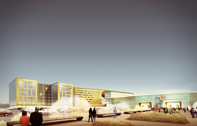
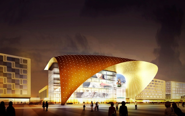
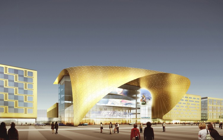
This year, the Saint Petersburg project of "Expoforum" developed by Eugene Gerasimov and Sergey Choban has entered the phase of active implementation. According to the renovated version of the project, the Shushary congress and exhibition complex will get golden facades and impressive parabolic marquees.

24 April 2013
Object
mainImg
Object:
ExpoForum
Russia, St. Petersburg, Pushkinsky district, Shushary location

Project Team:
Gerasimov E.L., Tchoban S.E., Hivrich V.F., Lassen M. (Matthias Lassen), Golovko O.V., Oskolkova T.B., Markov I.G., Soluyanov I. F. nps tchoban voss: Valeria Kashirina, Igor Markov, Kenan Ozan, Dorothee Dietz, Hannes Topper, Silvia Grischkat, Rene Hoch Werner Sobek Ingenieure

2007 — 2009 / 2009 — 2016

ZAO “ExpoForum”

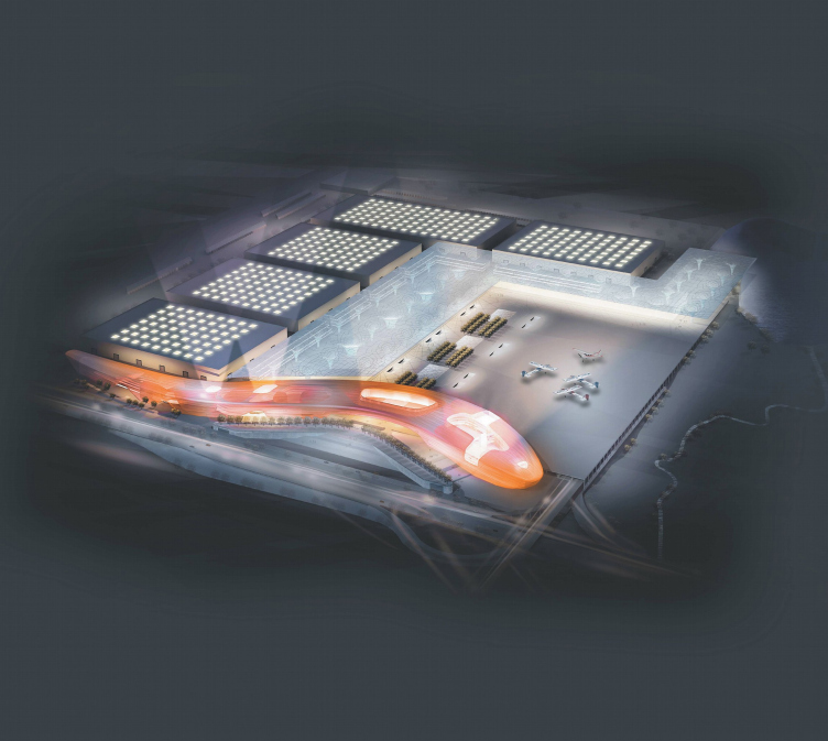
The story of construction of a grand-scale expo complex in the city of Saint Petersburg was covered by Archi.ru back in 2009. Back then, a joined team of Eugene Gerasimov architects and nps tchoban voss offered to the city an elegant composition of several parallelepipeds that would house the expo halls, and the "arch" building that was fully covered in glass of bright shades and colors and looked like a cross between a snake and a bullet train. This version was approved as the main concept; however, in the course of the development of the land site and narrowing the specifications, the architectural and planning solution of "Expoforum" underwent such drastic changes that it now made sense to speak about the development of a new project.


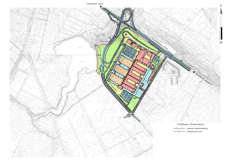
The changes affected not only the architectural image of the future exhibition center but also the provisions of the master plan. At this point we will remind you that the complex will be built in the Pushkinsky district of Saint Petersburg, on the ground of the former "Shushary" state-owned farm: located a ten minutes' drive away from the "Pulkovo" airport, this site borders on the Peterburgskoe Highway, the Pulkovo Lake, and the residential area that belongs to the farm. It is pretty obvious that from the standpoint of successful development of the expo business the key factor is the proximity to the international airport, this is why the front part of the complex still faces the highway. The way the main territory is used, however, was dramatically rethought and rearranged by the architects.


First of all, the transport infrastructure of the future "Expoforum" was more carefully thought out. While originally the architects placed the pavilions and the congress center on the land site of a square shape one of the edges of which in fact "barged into" the shore area of the lake causing legitimate questions, now the site took on a shape of a smoothed-out trapeze with its edges fringed by automobile roads. The territory of the exhibition center is accessible by two fully-fledged driveways - from the southeast and the northern sides of the land site, the northern crossing with the Peterburgskoe Highway being more developed and presenting a grand-scale flyover, because on this side the exit from the main two-level parking garage is situated. The architects also provided for a traffic circle on the rear side of the complex - it will help to separate more efficiently the traffic flows that are headed to different halls of "Expoforum".


Location plan

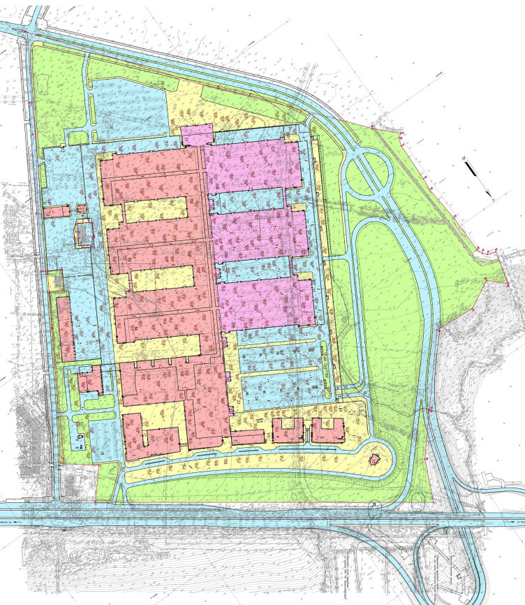
The composition of the complex itself also changed beyond recognition. In the original version of the project, the public and recreation space occupied as much as a third of the entire site - in fact, the whole roof of the underground parking garage was treated as an open-air venue for public events or even for exhibiting airplanes and heavy machinery. Upon a closer look at this idea, however, the architects admitted that the climate of Saint Petersburg is not exactly conductive for organizing frequent auto or aviation trade fairs, and this is why the land site is now filled with buildings almost completely: instead of a giant windswept "marching ground" there appears a system of wind-protected squares, courtyards, and little streets. The function of the centerpiece of the composition is still performed by the covered pedestrian passage; now, however, the buildings of the exhibition center are evenly spaced on its either sides, so on the layout "Expoforum" looks like a tree pictogram with branches shooting off its trunk.


New master plan

As far as the functions are concerned, no significant changes were made to the project. As earlier, "Expoforum" includes the expo, congress, and business centers, 3 and 4-star hotels, as well as a freight forwarding unit and the engineering infrastructure facilities without which launching such a massive organism into operation would have been impossible. The congress center, the hotels, and the two business centers are joined together and placed in the front housing line - one can say that these are the magnificent upper branches of that "tree" and the main facade of the entire "Expoforum", its "face" that will welcome the visitors coming down the Peterburgskoe Highway. Perpendicularly behind these buildings, there are the expo halls. "Ultimately, these halls are nothing more than plain hangars - simply because nothing more effective has been invented so far to serve the expo functions - Eugene Gerasimov explains - The only novelty that we introduced was breaking them up into separate segments. They used to be simply huge but now their area has shrunk while their numbers have grown". Analogously, the "snake" building from the previous project was fractured: each object of the first line can function independently - this helps to make the construction priorities as convenient to the investors as possible, as well as to provide for more effective and efficient operation later on. By the way, about the construction priorities: first, there will be built the buildings of the first line and three expo halls out of six, while the above-ground parking garage will be placed on the territory that will later on be used to build another three expo halls (the parking stalls being moved underground).
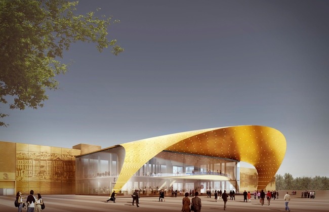
 

And, while originally this facade was facing the highway with rainbow colors, now the complex is designed in an entirely different way. While the golden casing is still there, the architects change it from a uniform coating into a net with cells of different sizes. Interesting is the fact that this is not rigid orthogonal grid - each cell sports rounded, as if melted, corners (at one of the facades they even turn into windows of a completely round shape), which serves to soften the rigid geometry of the buildings and makes them look very much like the good old punch cards. The theme found by the architects is both winsome and unobtrusive; it is more than appropriate in the buildings meant to showcase the achievements in the field of high-tech solutions.


The arch also survived into the new project, although, while it was a pass-through one and served the function of the entrance gate to the territory of "Expoforum", now the characteristic parabolic shape was given to the marquee of the north entrance. It is perceived as a golden sail whose edges are drawn down to the ground, and the main canvas is spread out by the gusts of Saint Petersburg wind.


For the other facade, the architects also chose the golden amber color. According to Eugene Gerasimov, there were several reasons for the monochrome solution. First of all, the architects needed a more reserved tone, one that would "pull" together the composition of various volumes, and at the same time one that would not leave a "mottled" or "overcrowded" impression. Second of all, this very tone was the perfect choice for adding some "flavor" of Saint Petersburg's classical architecture into the image of the new complex - the photos of its most famous buildings will be photo-printed on the ceramic panels of the expo halls' facades. In fact, the whole facade will turn into a giant canvas that is broken by slightly-less-transparent verticals of the galleries and overpasses into separate segments, each of which displays a theme of its own. One can see the Bronze Horseman, the Palace Bridge, and the Arch of the Joint Staff in here - when viewed from the road, the pictures will change like the frames of a movie, or rather, and this comparison will be even more appropriate for Saint Petersburg, canvases in an art museum. The museum association is enhanced by the color of the coating that the architects chose - it really looks like a golden frame of some work of art, but then again, the pictures that are there on the ceramic panels get the hew of an opaque sepia that we often see on the old photographs and in the old movies.


EXPOFORUM. The first version of the project © SPEECH, Evgeny Gerasimov and Partners
EXPOFORUM. Project, 2009 © SPEECH, Evgeny Gerasimov and Partners
zooming
zooming
zooming
zooming


Object:
ExpoForum
Russia, St. Petersburg, Pushkinsky district, Shushary location

Project Team:
Gerasimov E.L., Tchoban S.E., Hivrich V.F., Lassen M. (Matthias Lassen), Golovko O.V., Oskolkova T.B., Markov I.G., Soluyanov I. F. nps tchoban voss: Valeria Kashirina, Igor Markov, Kenan Ozan, Dorothee Dietz, Hannes Topper, Silvia Grischkat, Rene Hoch Werner Sobek Ingenieure

2007 — 2009 / 2009 — 2016

ZAO “ExpoForum”

24 April 2013

Headlines now
The Golden Crown
The concept for a dental clinic in Yekaterinburg, developed by CNTR Studio, revolves around the idea of a “mouth full of gold”: pristine white porcelain stoneware walls are complemented by matte brass details. To avoid an overly literal interpretation, the architects focused on the building’s proportions, skillfully navigating between sunlight requirements and fire safety regulations.
Flexibility and Integration
Not long ago, we covered the project for the fourth phase of the ÁLIA residential complex, designed by APEX. Now, we’ve been shown different fence concepts they developed to enclose the complex’s private courtyards, incorporating a variety of public functions. We believe that the sheer fact that the complex’s architects were involved in such a detail as fencing speaks volumes.
A Step Forward
The HIDE residential complex represents a major milestone for ADM architects and their leaders Andrey Romanov and Ekaterina Kuznetsova in their quest for a fresh high-rise aesthetic – one that is flexible and layered, capable of bringing vibrancy to mass and silhouette while shaping form. Over recent years, this approach has become ADM’s “signature style”, with the golden HIDE tower playing a pivotal role in its evolution. Here, we delve into the project’s story, explore the details of the complex’s design, and uncover its core essence.
Gold in the Sands
A new office for a transcontinental company specializing in resource extraction and processing has opened in Dubai. Designed by T+T Architects, masters of creating spaces that are contemporary, diverse, flexible, and original, this project exemplifies their expertise. On the executive floor, a massive brass-clad partition dominates, while layered textures of compressed earth create a contextually resonant backdrop.
Layers and Levels of Flight
This project goes way back – Reserve Union won this architectural competition at the end of 2011, and the building was completed in 2018, so it’s practically “archival”. However, despite being relatively unknown, the building can hardly be considered “dated” and remains a prime example of architectural expression, particularly in the headquarters genre. And it’s especially fitting for an aviation company office. In some ways, it resembles the Aeroflot headquarters at Sheremetyevo but with its own unique identity, following the signature style of Vladimir Plotkin. In this article, we take an in-depth look at the United Aircraft Corporation (UAC) headquarters in the Moscow agglomeration town of Zhukovsky, supplemented by recent photographs from Alexey Naroditsky – a shoot that became only recently possible due to the fact that improvements were finally made in the surrounding area.
Light and Shadow
In this article, we delve into the architectural design of the “Chaika” house by DNK ag architects, which was recently completed in 2023 as part of the collection of signature designs at ZILArt. As is well-known, all the buildings in this complex follow a design code, yet each one is distinct. This particular building stands out not only for its whiteness and minimalism but also for the refined use of a limited number of techniques that, together, create what can confidently be called synergy.
Casus Novae
A master plan was developed for a large residential area with a name of “DNS City”, but now that its implementation began, the plan has been arbitrarily reformatted and replaced with something that, while similar on the surface, is actually quite different. This is not the first time such a thing happens, but it’s always frustrating. With permission from the author, we are sharing Maria Elkina’s post.
Treasure Hunting
The GAFA bureau, in collaboration with Tegola and Arkhitail, organized an expedition to the island of Kilpola in Karelia as part of Moskomarkhitektura’s “Open City” festival. There, amidst moss and rocks, the students sought answers to questions like: what is the sacred, where does it dwell, and what sustains it? Assisting the participants in this quest were landscape engineer Evgeny Levin, artist Nicholas Roerich, a moose, and the lack of cellular connection. Here’s how the story unfolded.
Depths of the Earth, Streams of Water
In the Malaya Okhta district, the Akzent building, designed by Stepan Liphart, was constructed. It follows a classic tripartite structure, yet it’s what you might call “hand-drawn”: each façade is unique in its form and details, some of which aren’t immediately noticeable. In this article, we explore the context and, together with the architect, delve into how the form was developed.
Fir Tree Dynamics
The “Airports of Region” holding is planning to build an airport in Karachay-Cherkessia, aiming to make the Arkhyz and Dombay resorts more accessible to travelers. The project that won in an invitation-only competition, submitted by Sergey Nikeshkin’s KPLN, blends natural imagery inspired by the shape of a conifer seed, open-air waiting spaces, majestic large trees, and a green roof elevated on needle-like columns. The result is both nature-inspired and WOW.
​A Brick Shell
In the process of designing a clubhouse situated among pine trees in a prestigious suburban area near Moscow, the architectural firm “A.Len” did the façade design part. The combination of different types of brick and masonry correlates with the volumetric and plastique solutions, further enhanced by the inclusion of wood-painted fragments and metal “glazing”.
Word Forms
ATRIUM architects love ambitious challenges, and for the firm’s thirtieth anniversary, they boldly play a game of words with an exhibition that dives deep into a self-created vocabulary. They immerse their projects – especially art installations – into this glossary, as if plunging into a current of their own. You feel as if you’re flowing through the veins of pure art, immersed in a universe of vertical cities, educational spaces – of which the architects are true masters – and the cultural codes of various locations. But what truly captivates is the bold statement that Vera Butko and Anton Nadtochy make, both through their work and this exhibition: architecture, above all, is art – the art of working with form and space.
Flexibility and Acuteness of Modernity
Luxurious, fluid, large “kokoshniks” and spiral barrel columns, as if made from colorful chewing gum: there seem to be no other mansion like this in Moscow, designed in the “Neo-Russian-Modern” style. And the “Teremok” on Malaya Kaluzhskaya, previously somewhat obscure, has “come alive with new colors” and gained visibility after its restoration for the office of the “architectural ecosystem” as the architects love to call themselves. It’s evident that Julius Borisov and the architects at UNK put their hearts into finding this new office and bringing it up to date. Let’s delve into the paradoxes of this mansion’s history and its plasticity. Spoiler: two versions of modernity meet here, both balancing on the razor’s edge of “what’s current”.
Yuri Vissarionov: “A modular house does not belong to the land”
It belongs to space, or to the air... It turns out that 3D printing is more effective when combined with a modular approach: the house is built in a workshop and then adapted to the site, including on uneven terrain. Yuri Vissarionov shares his latest experience in designing tourist complexes, both in central Russia and in the south. These include houseboats, homes printed from lightweight concrete using a 3D printer, and, of course, frame houses.
​Moscow’s First
“The quality of education largely depends on the quality of the educational environment”. This principle of the last decade has been realized by Sergey Skuratov in the project for the First Moscow Gymnasium on Rostovskaya Embankment in the Khamovniki district. The building seamlessly integrates into the complex urban landscape, responding both to the pedestrian flow of the city and the quiet alleyways. It skillfully takes advantage of the height differences and aligns with modern trends in educational space design. Let’s take a closer look.
Looking at the Water
The site of Villa Sonata stretches from the road to the water’s edge, offering its own shoreline, pier, and a picturesque river panorama. To reveal these sweeping views, Roman Leonidov “cut” the façade diagonally parallel to the river, thus getting two main axes for the house and, consequently, “two heads”. The internal core – two double-height spaces, a living room and a conservatory, with a “bridge” above them – makes the house both “transparent” and filled with light.
The White Wing
Well, it’s not exactly white. It’s more of a beige, white-stone structure that plays with the color of limestone – smoother surfaces are lighter, while rougher ones are darker. This wing unites various elements: it absorbs and interprets the surrounding themes. It responds to everything, yet maintains a cohesive expression – a challenging task! – while also incorporating recognizable features of its own, such as the dynamic cuts at the bottom, top, and middle.
Urban Dunes
The XSA Ramps team designed and built a three-part sports hub for a park in Rostov-on-Don, welcoming people of all ages and fitness levels. The skate plaza, pump track, and playground are all meticulously crafted with details that attract a diverse range of visitors. The technical execution of the shapes and slopes transforms this space into a kind of sculptural composition.
Proportional Growth
The project for the fourth phase of the ÁLIA residential area has been announced. The buildings are situated on an elongated plot – almost a “ray” that shoots out from the center of the area towards the river. Their layout reflects both a response to Moscow’s architectural preferences over the past 15 years, shifting “from blocks to towers”, and an interpretation of the neighboring business park designed by SOM. Additionally, the best apartments here are not located at the very top but closer to the middle, forming a glowing “waistline”.
The “Staircase” Building
In designing the “Details” residential complex in New Moscow, Rais Baishev spiced up the now-popular Moscow theme of a “courtyard” building with an idea drawn from the surrealist drawings by Maurits Escher. He envisioned the stepped silhouettes and descending slopes as a metaphysical mega-staircase, creating a key void within the courtyard that gave the project an internal “spine”. This concept is felt both in the building’s silhouette and on its façades.
Projection of the Quarter
No one doubted that the building that Vladimir Plotkin designed as part of the “Garden Quarters” would be the most modernist of all. And it turned out just that way: while adhering to the common design code, the building successfully combines brick and white stone, rhythmically responding to the neighboring building designed by Ostozhenka, yet tactfully and persistently making a few statements of its own. This includes the projection of the ideal urban development composition “14–9–6”, which can be found right next door, mathematical calculations, including those for various types of terraces (and perhaps the only reminder of the Soviet past of the Kauchuk rubber factory!), and the white “cross-stitch” pattern of the façade grid.
Domus Aurea
In this issue, we examine the “Tessinsky-1” house, designed by Sergey Skuratov and completed in 2023. Located in the middle of the Serebryanicheskaya Embankment district, at the intersection of its main streets, this house assumes a sort of “nodal” role: it not only responds to everything around it and preserves many memories of the former EMA factory within itself, but it weaves all this into a newly directed pattern, reconciling bright “gold” and dark-colored brick, largely with the help of the new, modern-yet-archaic Columba brick, which, come to think about it, is the most precious element here.
The Chimney of Nikola-Lenivets
In this issue, we are examining the “Obelisk House” designed by KATARSIS and built for the Arkhstoyanie 2023 festival. However, it was only finished later on, and this is why we are examining it now. It seems to us that after the “Obelisk House” appeared in Nikola-Lenivets, a dialogue and a few inner connections appeared between the temporary structures built here. These houses no longer look like “accidental neighbors”, more of which below.
​Periscope by the Bay
The jury awarded the second place in the competition for a public and cultural center in Petropavlovsk-Kamchatsky to the companies GORA (“Mountain”) and M4. In the consortium’s proposal, the building resembles a sperm whale with a calf swimming next to it or a periscope, whose lenses capture the most spectacular views from the surrounding landscape.
From Arcs to Dolmens
While working on the competition project for Petropavlovsk-Kamchatsky, ASADOV Architects prioritized the value of the natural and urban environment, aiming to preserve the balance of the location while minimizing the resemblance of the volume that they designed to a “traditional building”. The task was challenging, and the architects created three versions, one of which having been developed after the competition, where their main proposal took third place. However, the point of interest here is not the competition result but the continuity of creative thinking.
Hide and Seek
The ID Moskovskiy house, designed by Stepan Liphart in St. Petersburg, in the courtyards near Moskovskiy Avenue beyond the Obvodny Canal and recently completed, is notable for several reasons. Firstly, it has been realized with considerable accuracy, which is particularly significant as this is the first building where the architect was responsible not only for the facades but also for the layouts, allowing for better integration between the two. On the other hand, this building is interesting as an example of the “germination” of new architecture in the city: it draws on the best examples from the neighborhood and becomes an improved and developed sum of ideas found by the architect in the surrounding context.
The Big Twelve
Yesterday, the winners of the Moscow Mayor’s Architecture Award were announced and honored. Let’s take a look at what was awarded and, in some cases, even critique this esteemed award. After all, there is always room for improvement, right?
Above the Golden Horn
The residential complex “Philosophy” designed by T+T architects in Vladivostok, is one of the new projects in the “Golubinaya Pad” area, changing its development philosophy (pun intended) from single houses to a comprehensive approach. The buildings are organized along public streets, varying in height and format, with one house even executed in gallery typology, featuring a cantilever leaning on an art object.
Nuanced Alternative
How can you rhyme a square and space? Easily! But to do so, you need to rhyme everything you can possibly think of: weave everything together, like in a tensegrity structure, and find your own optics too. The new exhibition at GES-2 does just that, offering its visitor a new perspective on the history of art spanning 150 years, infused with the hope for endless multiplicity of worlds and art histories. Read on to see how this is achieved and how the exhibition design by Evgeny Ace contributes to it.
Blinds for Ice
An ice arena has been constructed in Domodedovo based on a project by Yuri Vissarionov Architects. To prevent the long façade, a technical requirement for winter sports facilities, from appearing monotonous, the architects proposed the use of suspended structures with multidirectional slats. This design protects the ice from direct sunlight while giving the wall texture and detail.