По-русски

Fundamental Transformer

"Express-House" built by Gary Chang and Totan Kuzembaev in Pirogovo resort is a project that evolved from a quick-mounting pavilion up to a fundamental structure.

09 January 2013
Object
mainImg
Firm:
Totan
Object:
Matryeshka House (Domestic Express – a Weekend House)
Russia

2008 — 2008 / 2008 — 2009

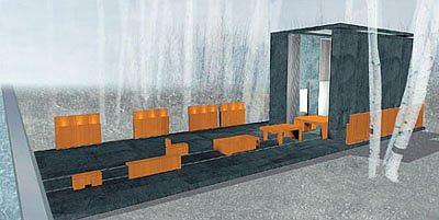
Initially, "Express-House" was designed by the Hong-Kong architect Gary Chang who was invited by Totan Kuzembaev to take part in designing "Pirogovo" resort back in 2005. Gary is the master of transformations - in the "Commune by the Great Wall" he built the most winsome "Suitcase" hotel, and, having come to Moscow area, he decided to carry on with his exploits in this particular genre. Due to the fact that the initial task was to create not so much a house as a show room, the architect came up with a project where not only the interior could be transformed but the entire building could be transformed as well. Hence the name of "Express" (although initially Gary proposed to call it a "Matryoshka") - in this house everything was easily taken apart and put back together again in accordance with the visitors' needs. The Gary house was in fact a box, each wall of which could open up, so the building virtually merged with the environment, while the inner premises (for example, the staircase leading to the second floor, the bathroom or the closet) would turn into pylons, around which one could walk like he would walk around the park. An even more interesting solution Gary proposed for the furniture - it was "packed" into a special transformable module consisting of several cubes put inside one another - these would emerge out of the house on rails and unfold into a table, a bed, and even a spa.


Matryoshka ("Russian Nest Doll"- transl.) ("Express-House") by Gary Chang

In this aspect, the project enthralled the connoisseurs of the contemporary architecture, including Alexander Ezhkov, who dreamed of implementing Gary's idea in "Pirogovo" and make the "Express-House" one of the symbols of the resort. These ambitious plans were checked by the global economic crisis - implementing all of Gary Chang's ideas proved to be a task not only challenging but expensive too, and this is why the idea of building a pavilion "for everyone" (and season-adjustable, too, because it's obvious that in the wintertime the couch and the spa on rails are not really on the top of the needs list) - this idea was soon forgotten, and the project of the Hong-Kong architect found a new commissioner. The pavilion did not satisfy him as a place of permanent residence though, so it was now necessary to reconsider the entire project with the consideration of its new function, so it stood to reason that this work was commissioned to Totan Kuzembaev studio that had supervised the project from the very start. "At first we communicated with Gary rather actively on this issue, but gradually it became clear that adjusting the house for our climate and making it a place of somebody's permanent residence would incur some really radical changes, so we decided to carry on with this project unassisted", - the architect reminisces.
 

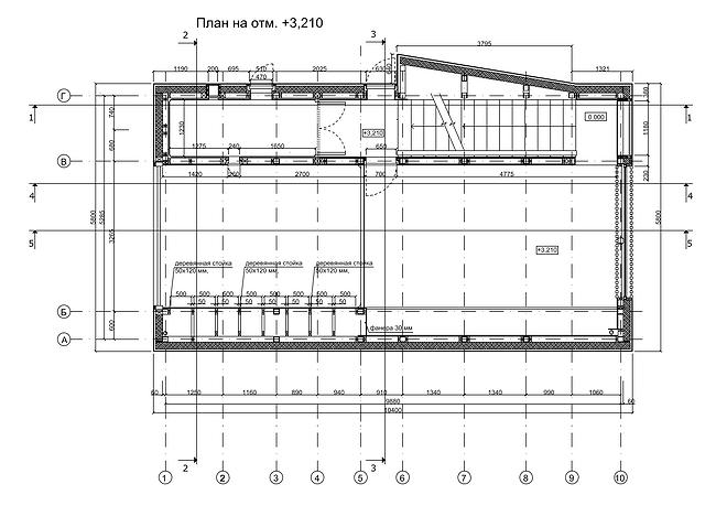
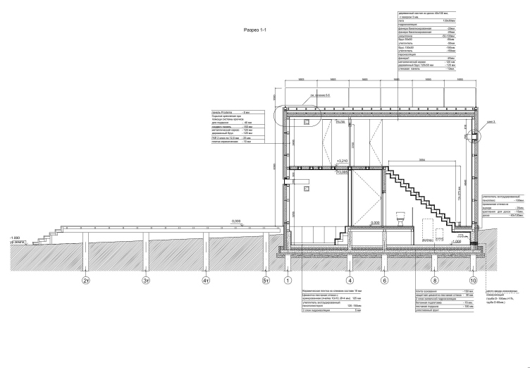
Starting his work on re-doing the "Express", Totan Kuzembaev tried to stick as much as possible to the principle of universal transformability that lies at the heart of this project - if not for the outer walls, then at least for the interior spaces. The overall composition was also preserved - the house that looks like a laconic rectangle on the layout, is augmented by a large terrace, again, of a rectangular shape. In the initial project, it was this "ship deck" that the pieces of furniture would proudly ride on, and initially Kuzembaev gave up only on the idea of the guideways - the terrace presupposed an open-air swimming pool, and on the south side it was equipped with a mobile fence; still more options were designed for the interior premises of the house. For example, one could get down into the basement by shifting out the floor panels of the first floor, and the double-height space of the living room could be transformed with the help of the mobile panel that formed a second level with an extra bedroom, and with the help of the folding stairway provided access to the roof area.

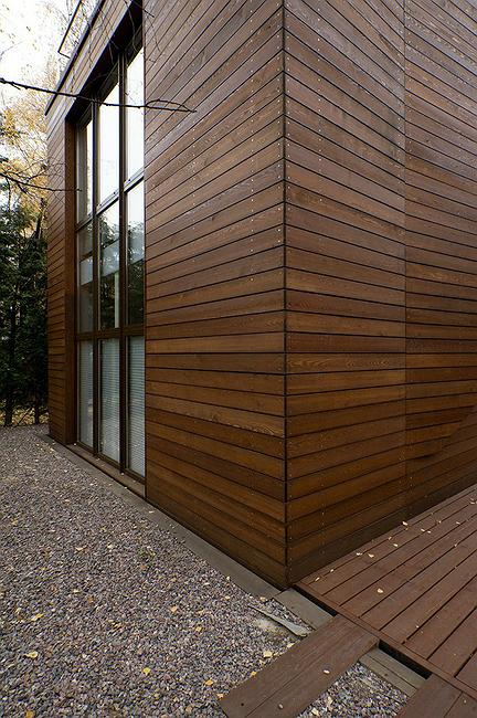
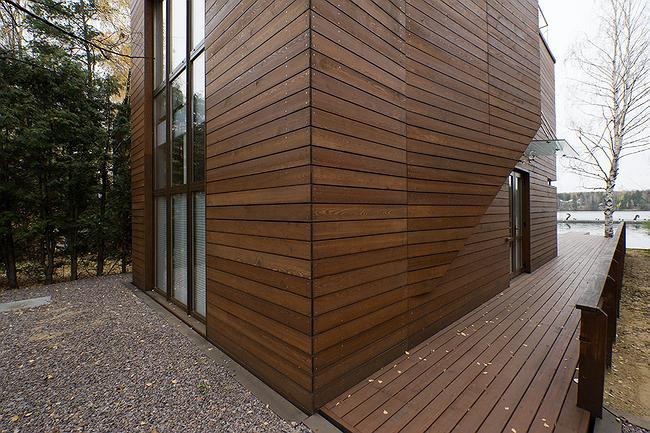
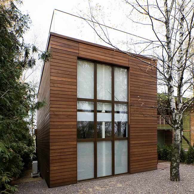
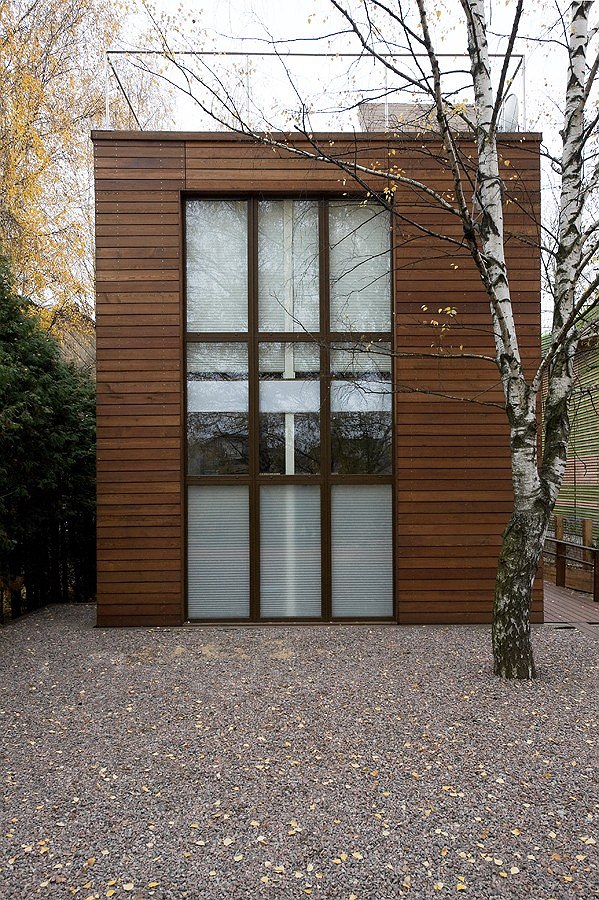
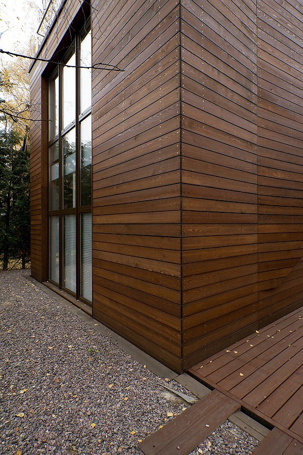
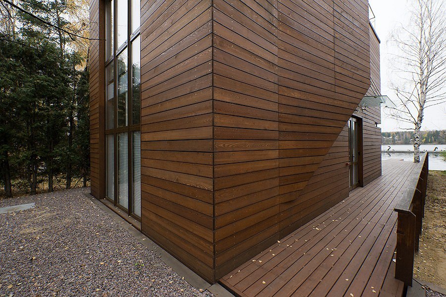
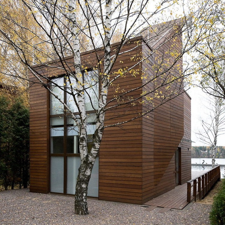
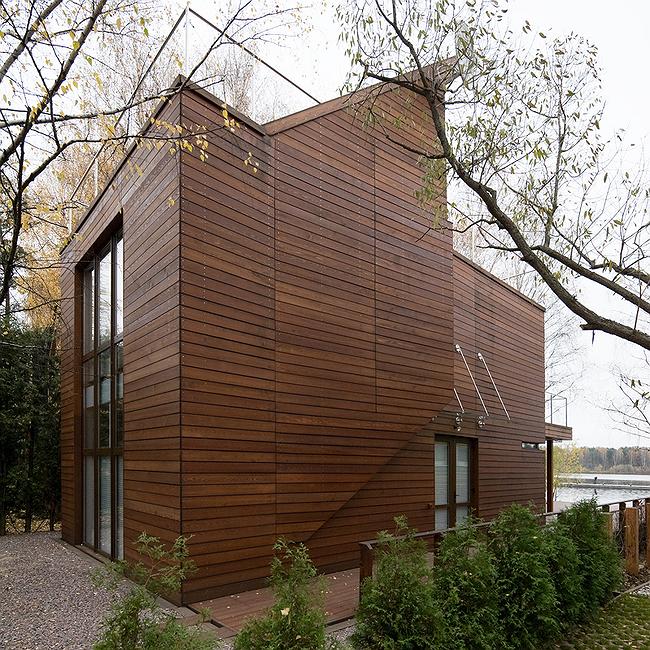
Regretfully, after the final cost sheet was drawn up, the commissioner considered even these "half-measures" too expensive, so the architects had to reconsider their project yet again. "Now it was clear that there was only one way left to make it still less expensive - by replacing all the transformable elements with fundamental ones - Totan Kuzembaev says, shrugging his shoulders - and so it turned out that two stained-glass panels in the living room, one of which was turned eastward and the other westward, turned into nine standard glass units grouped vertically into threes, the mobile panel was replaced with a fundamental floor deck of reinforced concrete; the folding stairway gave way to the usual one that connects the first floor not only with the second one but also with the accessible roof area. And because the new stairway in fact runs through the building, inscribing it into the original dimensions was quite a tall order - but the architects found a compromise by partially taking it out of the confines of the main rectangular volume. The laconic shape of the box was thus made a little more sophisticated - it looked as if the architects cut its south facade in the middle and bent out part of the wall, thanks to which the house got a diamond-shaped bay window turned westward and to the water. At the same time it is cut into the main volume in such a way that the "bulge" is reduced to minimum and plays rather a decorative part, signifying the house entrance, while over the flat roof, on the other hand, there is a small gazebo-turret that is the perfect spot for contemplating the vistas of the Klyazma Lake.
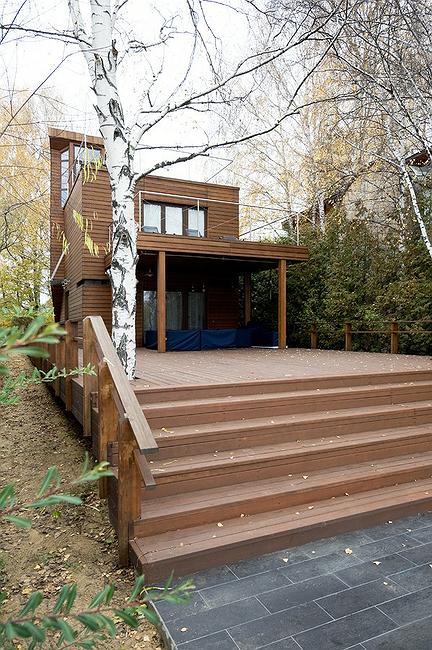
 

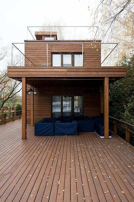
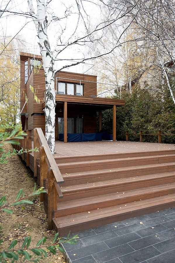
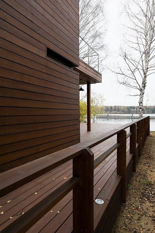
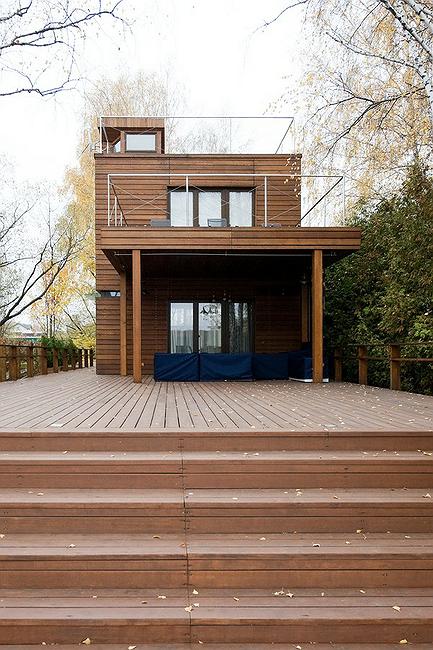
Accordingly, the floor deck is dissected in such a way that the second floor gets a fully-fledged balcony of its own. It rests upon square-section columns, the architects providing not two but even four rests, so the terrace gets a deep niche - visually, it is that same depot out of which the transformable furniture would exit in the original project. Incidentally, it is this awning that the spare furniture is actually stored under - sofas and armchairs. No more guideways are there of course, and the furniture pieces are not of the folding type but they can still be spread over the "deck" with no problem.
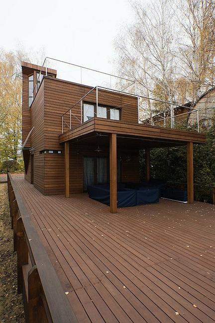
 

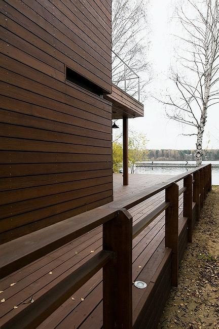
The railings of the balcony, just as the railings of the accessible roof area, are made of transparent glass and thin metallic truss rods that in fact make these constructions invisible - when viewed from a side, this house, coated with wooden panels, indeed looks like a set of boxes placed on top of one another. One gets a feeling as if the whole structure designed by Gary Chang got arrested while still partially taken apart - even though the architects had to forego all the technical intricacies, visually Totan Kuzembaev was able to implement the transformer idea even in the fundamental structure.

zooming
zooming


Firm:
Totan
Object:
Matryeshka House (Domestic Express – a Weekend House)
Russia

2008 — 2008 / 2008 — 2009

09 January 2013

Headlines now
The Golden Crown
The concept for a dental clinic in Yekaterinburg, developed by CNTR Studio, revolves around the idea of a “mouth full of gold”: pristine white porcelain stoneware walls are complemented by matte brass details. To avoid an overly literal interpretation, the architects focused on the building’s proportions, skillfully navigating between sunlight requirements and fire safety regulations.
Flexibility and Integration
Not long ago, we covered the project for the fourth phase of the ÁLIA residential complex, designed by APEX. Now, we’ve been shown different fence concepts they developed to enclose the complex’s private courtyards, incorporating a variety of public functions. We believe that the sheer fact that the complex’s architects were involved in such a detail as fencing speaks volumes.
A Step Forward
The HIDE residential complex represents a major milestone for ADM architects and their leaders Andrey Romanov and Ekaterina Kuznetsova in their quest for a fresh high-rise aesthetic – one that is flexible and layered, capable of bringing vibrancy to mass and silhouette while shaping form. Over recent years, this approach has become ADM’s “signature style”, with the golden HIDE tower playing a pivotal role in its evolution. Here, we delve into the project’s story, explore the details of the complex’s design, and uncover its core essence.
Gold in the Sands
A new office for a transcontinental company specializing in resource extraction and processing has opened in Dubai. Designed by T+T Architects, masters of creating spaces that are contemporary, diverse, flexible, and original, this project exemplifies their expertise. On the executive floor, a massive brass-clad partition dominates, while layered textures of compressed earth create a contextually resonant backdrop.
Layers and Levels of Flight
This project goes way back – Reserve Union won this architectural competition at the end of 2011, and the building was completed in 2018, so it’s practically “archival”. However, despite being relatively unknown, the building can hardly be considered “dated” and remains a prime example of architectural expression, particularly in the headquarters genre. And it’s especially fitting for an aviation company office. In some ways, it resembles the Aeroflot headquarters at Sheremetyevo but with its own unique identity, following the signature style of Vladimir Plotkin. In this article, we take an in-depth look at the United Aircraft Corporation (UAC) headquarters in the Moscow agglomeration town of Zhukovsky, supplemented by recent photographs from Alexey Naroditsky – a shoot that became only recently possible due to the fact that improvements were finally made in the surrounding area.
Light and Shadow
In this article, we delve into the architectural design of the “Chaika” house by DNK ag architects, which was recently completed in 2023 as part of the collection of signature designs at ZILArt. As is well-known, all the buildings in this complex follow a design code, yet each one is distinct. This particular building stands out not only for its whiteness and minimalism but also for the refined use of a limited number of techniques that, together, create what can confidently be called synergy.
Casus Novae
A master plan was developed for a large residential area with a name of “DNS City”, but now that its implementation began, the plan has been arbitrarily reformatted and replaced with something that, while similar on the surface, is actually quite different. This is not the first time such a thing happens, but it’s always frustrating. With permission from the author, we are sharing Maria Elkina’s post.
Treasure Hunting
The GAFA bureau, in collaboration with Tegola and Arkhitail, organized an expedition to the island of Kilpola in Karelia as part of Moskomarkhitektura’s “Open City” festival. There, amidst moss and rocks, the students sought answers to questions like: what is the sacred, where does it dwell, and what sustains it? Assisting the participants in this quest were landscape engineer Evgeny Levin, artist Nicholas Roerich, a moose, and the lack of cellular connection. Here’s how the story unfolded.
Depths of the Earth, Streams of Water
In the Malaya Okhta district, the Akzent building, designed by Stepan Liphart, was constructed. It follows a classic tripartite structure, yet it’s what you might call “hand-drawn”: each façade is unique in its form and details, some of which aren’t immediately noticeable. In this article, we explore the context and, together with the architect, delve into how the form was developed.
Fir Tree Dynamics
The “Airports of Region” holding is planning to build an airport in Karachay-Cherkessia, aiming to make the Arkhyz and Dombay resorts more accessible to travelers. The project that won in an invitation-only competition, submitted by Sergey Nikeshkin’s KPLN, blends natural imagery inspired by the shape of a conifer seed, open-air waiting spaces, majestic large trees, and a green roof elevated on needle-like columns. The result is both nature-inspired and WOW.
​A Brick Shell
In the process of designing a clubhouse situated among pine trees in a prestigious suburban area near Moscow, the architectural firm “A.Len” did the façade design part. The combination of different types of brick and masonry correlates with the volumetric and plastique solutions, further enhanced by the inclusion of wood-painted fragments and metal “glazing”.
Word Forms
ATRIUM architects love ambitious challenges, and for the firm’s thirtieth anniversary, they boldly play a game of words with an exhibition that dives deep into a self-created vocabulary. They immerse their projects – especially art installations – into this glossary, as if plunging into a current of their own. You feel as if you’re flowing through the veins of pure art, immersed in a universe of vertical cities, educational spaces – of which the architects are true masters – and the cultural codes of various locations. But what truly captivates is the bold statement that Vera Butko and Anton Nadtochy make, both through their work and this exhibition: architecture, above all, is art – the art of working with form and space.
Flexibility and Acuteness of Modernity
Luxurious, fluid, large “kokoshniks” and spiral barrel columns, as if made from colorful chewing gum: there seem to be no other mansion like this in Moscow, designed in the “Neo-Russian-Modern” style. And the “Teremok” on Malaya Kaluzhskaya, previously somewhat obscure, has “come alive with new colors” and gained visibility after its restoration for the office of the “architectural ecosystem” as the architects love to call themselves. It’s evident that Julius Borisov and the architects at UNK put their hearts into finding this new office and bringing it up to date. Let’s delve into the paradoxes of this mansion’s history and its plasticity. Spoiler: two versions of modernity meet here, both balancing on the razor’s edge of “what’s current”.
Yuri Vissarionov: “A modular house does not belong to the land”
It belongs to space, or to the air... It turns out that 3D printing is more effective when combined with a modular approach: the house is built in a workshop and then adapted to the site, including on uneven terrain. Yuri Vissarionov shares his latest experience in designing tourist complexes, both in central Russia and in the south. These include houseboats, homes printed from lightweight concrete using a 3D printer, and, of course, frame houses.
​Moscow’s First
“The quality of education largely depends on the quality of the educational environment”. This principle of the last decade has been realized by Sergey Skuratov in the project for the First Moscow Gymnasium on Rostovskaya Embankment in the Khamovniki district. The building seamlessly integrates into the complex urban landscape, responding both to the pedestrian flow of the city and the quiet alleyways. It skillfully takes advantage of the height differences and aligns with modern trends in educational space design. Let’s take a closer look.
Looking at the Water
The site of Villa Sonata stretches from the road to the water’s edge, offering its own shoreline, pier, and a picturesque river panorama. To reveal these sweeping views, Roman Leonidov “cut” the façade diagonally parallel to the river, thus getting two main axes for the house and, consequently, “two heads”. The internal core – two double-height spaces, a living room and a conservatory, with a “bridge” above them – makes the house both “transparent” and filled with light.
The White Wing
Well, it’s not exactly white. It’s more of a beige, white-stone structure that plays with the color of limestone – smoother surfaces are lighter, while rougher ones are darker. This wing unites various elements: it absorbs and interprets the surrounding themes. It responds to everything, yet maintains a cohesive expression – a challenging task! – while also incorporating recognizable features of its own, such as the dynamic cuts at the bottom, top, and middle.
Urban Dunes
The XSA Ramps team designed and built a three-part sports hub for a park in Rostov-on-Don, welcoming people of all ages and fitness levels. The skate plaza, pump track, and playground are all meticulously crafted with details that attract a diverse range of visitors. The technical execution of the shapes and slopes transforms this space into a kind of sculptural composition.
Proportional Growth
The project for the fourth phase of the ÁLIA residential area has been announced. The buildings are situated on an elongated plot – almost a “ray” that shoots out from the center of the area towards the river. Their layout reflects both a response to Moscow’s architectural preferences over the past 15 years, shifting “from blocks to towers”, and an interpretation of the neighboring business park designed by SOM. Additionally, the best apartments here are not located at the very top but closer to the middle, forming a glowing “waistline”.
The “Staircase” Building
In designing the “Details” residential complex in New Moscow, Rais Baishev spiced up the now-popular Moscow theme of a “courtyard” building with an idea drawn from the surrealist drawings by Maurits Escher. He envisioned the stepped silhouettes and descending slopes as a metaphysical mega-staircase, creating a key void within the courtyard that gave the project an internal “spine”. This concept is felt both in the building’s silhouette and on its façades.
Projection of the Quarter
No one doubted that the building that Vladimir Plotkin designed as part of the “Garden Quarters” would be the most modernist of all. And it turned out just that way: while adhering to the common design code, the building successfully combines brick and white stone, rhythmically responding to the neighboring building designed by Ostozhenka, yet tactfully and persistently making a few statements of its own. This includes the projection of the ideal urban development composition “14–9–6”, which can be found right next door, mathematical calculations, including those for various types of terraces (and perhaps the only reminder of the Soviet past of the Kauchuk rubber factory!), and the white “cross-stitch” pattern of the façade grid.
Domus Aurea
In this issue, we examine the “Tessinsky-1” house, designed by Sergey Skuratov and completed in 2023. Located in the middle of the Serebryanicheskaya Embankment district, at the intersection of its main streets, this house assumes a sort of “nodal” role: it not only responds to everything around it and preserves many memories of the former EMA factory within itself, but it weaves all this into a newly directed pattern, reconciling bright “gold” and dark-colored brick, largely with the help of the new, modern-yet-archaic Columba brick, which, come to think about it, is the most precious element here.
The Chimney of Nikola-Lenivets
In this issue, we are examining the “Obelisk House” designed by KATARSIS and built for the Arkhstoyanie 2023 festival. However, it was only finished later on, and this is why we are examining it now. It seems to us that after the “Obelisk House” appeared in Nikola-Lenivets, a dialogue and a few inner connections appeared between the temporary structures built here. These houses no longer look like “accidental neighbors”, more of which below.
​Periscope by the Bay
The jury awarded the second place in the competition for a public and cultural center in Petropavlovsk-Kamchatsky to the companies GORA (“Mountain”) and M4. In the consortium’s proposal, the building resembles a sperm whale with a calf swimming next to it or a periscope, whose lenses capture the most spectacular views from the surrounding landscape.
From Arcs to Dolmens
While working on the competition project for Petropavlovsk-Kamchatsky, ASADOV Architects prioritized the value of the natural and urban environment, aiming to preserve the balance of the location while minimizing the resemblance of the volume that they designed to a “traditional building”. The task was challenging, and the architects created three versions, one of which having been developed after the competition, where their main proposal took third place. However, the point of interest here is not the competition result but the continuity of creative thinking.
Hide and Seek
The ID Moskovskiy house, designed by Stepan Liphart in St. Petersburg, in the courtyards near Moskovskiy Avenue beyond the Obvodny Canal and recently completed, is notable for several reasons. Firstly, it has been realized with considerable accuracy, which is particularly significant as this is the first building where the architect was responsible not only for the facades but also for the layouts, allowing for better integration between the two. On the other hand, this building is interesting as an example of the “germination” of new architecture in the city: it draws on the best examples from the neighborhood and becomes an improved and developed sum of ideas found by the architect in the surrounding context.
The Big Twelve
Yesterday, the winners of the Moscow Mayor’s Architecture Award were announced and honored. Let’s take a look at what was awarded and, in some cases, even critique this esteemed award. After all, there is always room for improvement, right?
Above the Golden Horn
The residential complex “Philosophy” designed by T+T architects in Vladivostok, is one of the new projects in the “Golubinaya Pad” area, changing its development philosophy (pun intended) from single houses to a comprehensive approach. The buildings are organized along public streets, varying in height and format, with one house even executed in gallery typology, featuring a cantilever leaning on an art object.
Nuanced Alternative
How can you rhyme a square and space? Easily! But to do so, you need to rhyme everything you can possibly think of: weave everything together, like in a tensegrity structure, and find your own optics too. The new exhibition at GES-2 does just that, offering its visitor a new perspective on the history of art spanning 150 years, infused with the hope for endless multiplicity of worlds and art histories. Read on to see how this is achieved and how the exhibition design by Evgeny Ace contributes to it.
Blinds for Ice
An ice arena has been constructed in Domodedovo based on a project by Yuri Vissarionov Architects. To prevent the long façade, a technical requirement for winter sports facilities, from appearing monotonous, the architects proposed the use of suspended structures with multidirectional slats. This design protects the ice from direct sunlight while giving the wall texture and detail.