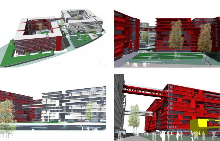
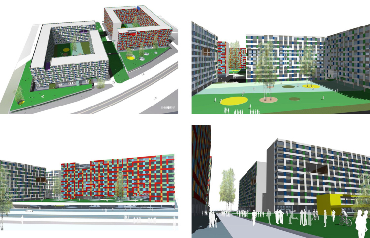
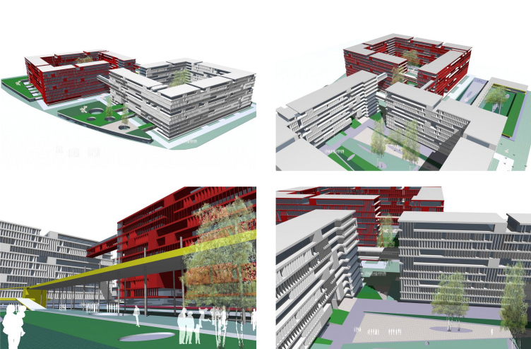
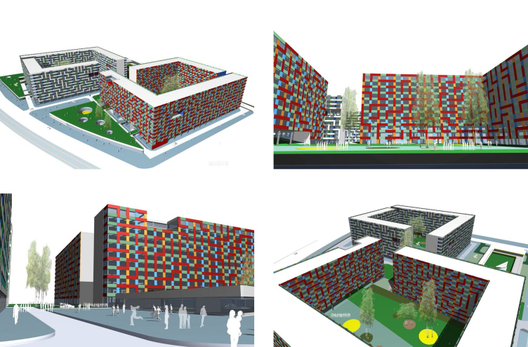
The architects tried a multitude of different options
of arranging the living volumes on the plot that has the shape of a trapeze
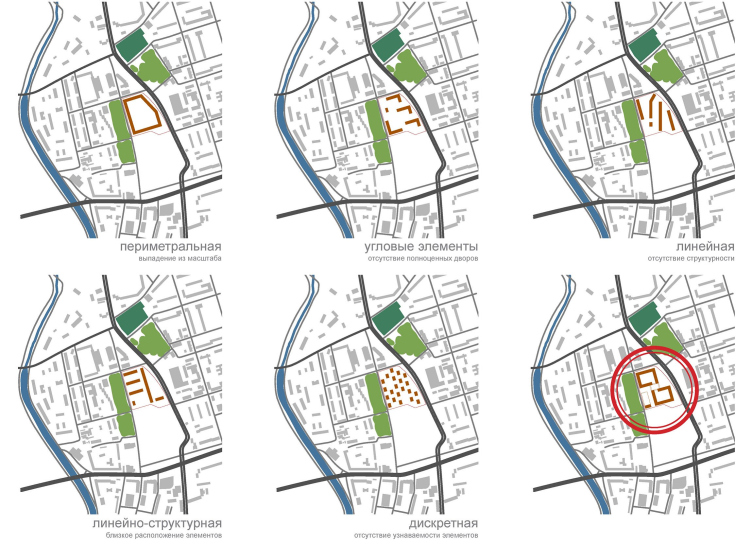
with one of its squares rounded. The first and the most obvious choice was to
build along its perimeter but that would have inevitably led to the new complex
falling out of proportion of the surrounding houses. After that, the architects
tried to place the houses in the “staggered” manner – the result was rather
effective but it left the architects devoid of any possibility to make
fully-fledged courtyards that are just about the only way in the megalopolis to
give the huge apartment building an atmosphere of coziness and security. The similar
limitation was shown by both linear and discrete housing when the architects
would scatter over the land plot a dozen of separately standing towers, which
left the place devoid of any conceivable identity. And this is how “Reserve”
again ended up with the idea of building in blocks.
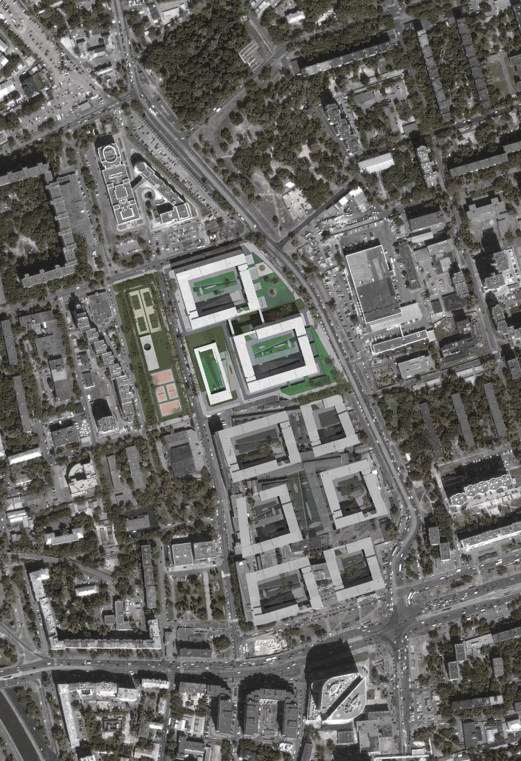
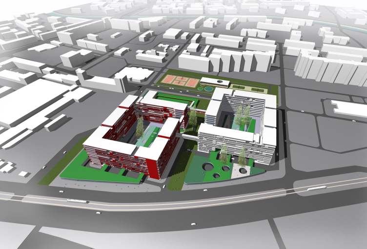
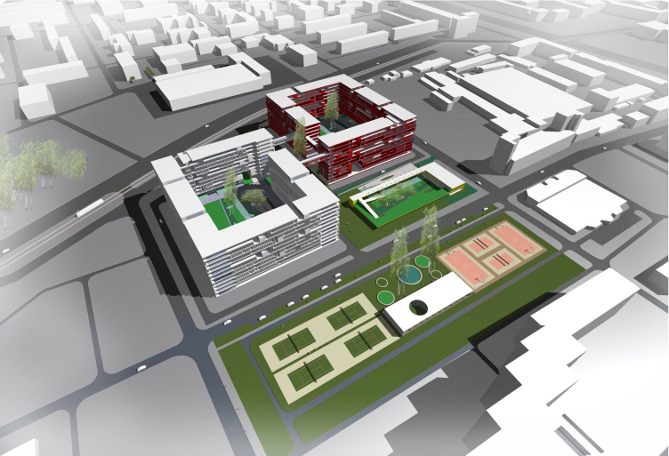
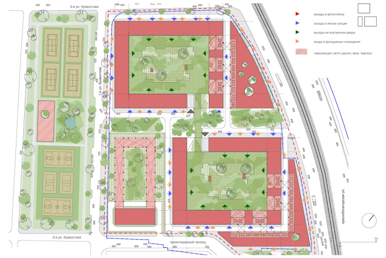
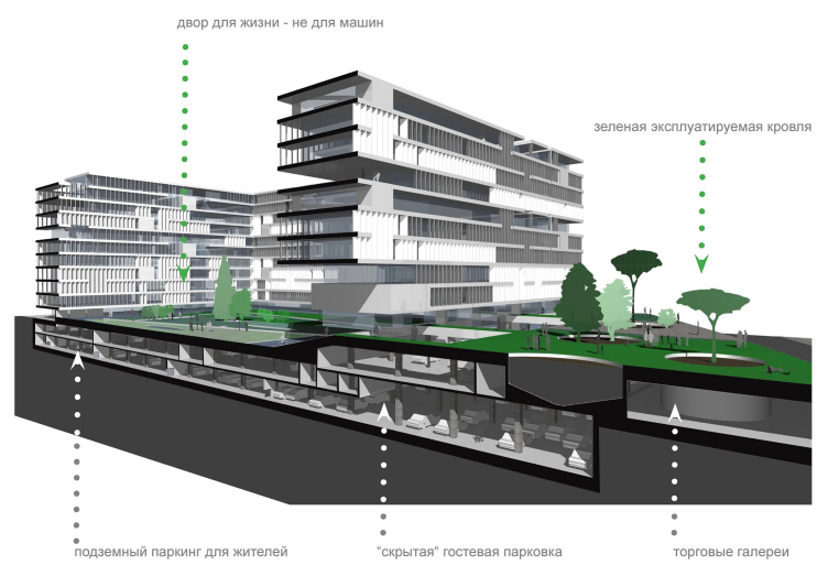
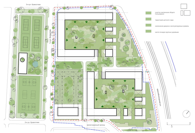
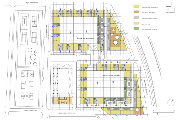
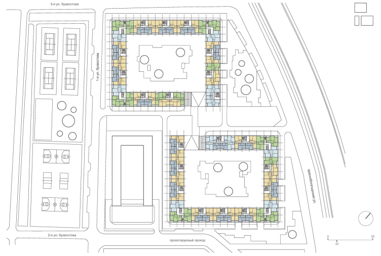
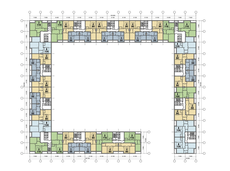
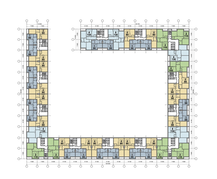
The trapeze of the plot got split into two
conditional halves, inside each of which the architects designed a rectangular-layout
house with a large courtyard. The perimeters of each of the two houses are opened
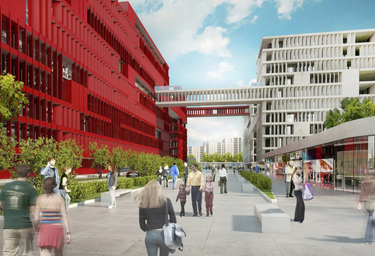
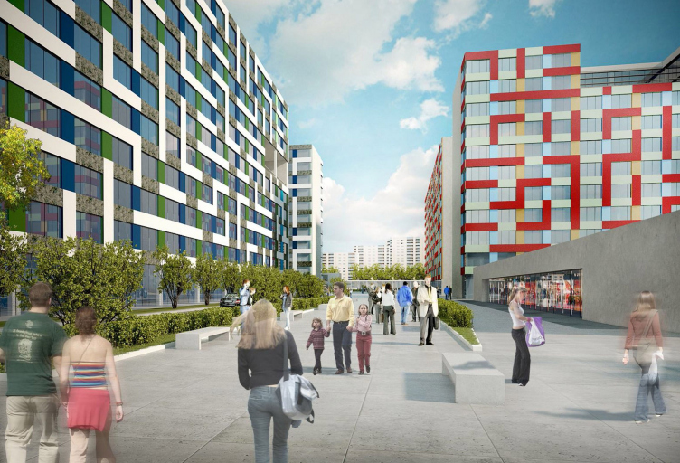
in such a way that they enter into an obvious dialogue. Between them, the
architects design a wide boulevard, over which, on the seventh-story height
they flung a few pedestrian overpasses - thanks to this the two tall buildings
will not look as if they are standing to close to one another and will not meld
against the cityscape, at the same time looking a doubtless couple, and not
some volumes that were built next to one another by sheer chance.
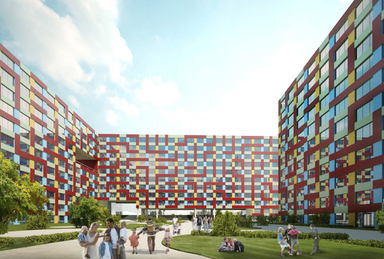
Thus, on the land plot, there appeared two
rectangular layout houses, four hundred plus apartments each, and two large,
also rectangular, courtyards for their tenants. Vladimir Plotkin would not have
been himself, however, if he had not been able to make this simple and
terminally rational layout grow into a volume that is as original as it is
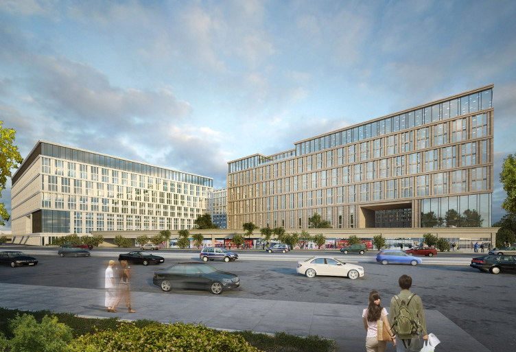
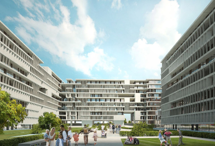
visually striking. First of all, instead of filling the parallelepipeds to
their fullest, the architect raises them above the ground on the supporting
elements and pierces them with arches and niches of various width and height. This
serves to both improve the insolation of the apartments and to visually
fracture the massive planes of the facades, as well as to stop the courtyards
from looking as if their walls were closing in. The idea of even finer
fracturing is introduced with the help of the so-much-like-"Reserve"
vertical lamelli that alternate with blind inserts here. What is peculiar here
is the fact that for each of the floors the architects developed a unique
combination "narrow stripes / wide plaques", and the floors are
separated from one another with the horizontals of the floor decks, which helps
to maximally diversify the pattern of the facade and enrich it checkered light
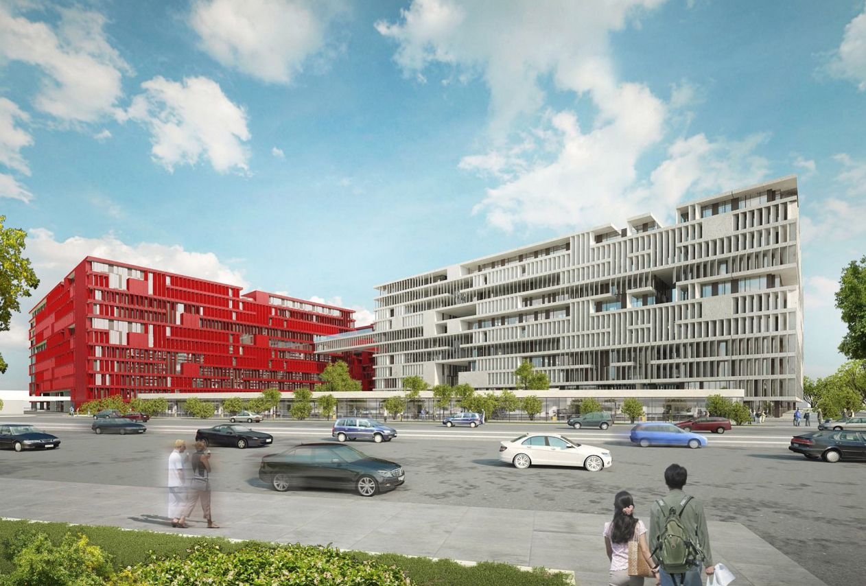
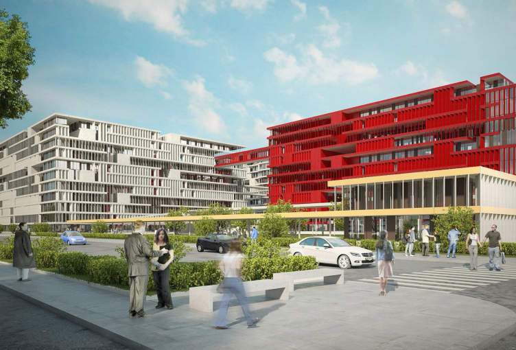
and shade. What is interesting here is that only one of the two buildings is
going to be finished in white color that is traditionally associated with
lamelli. The other building is going to be finished in red, this red not being
the pastel fake-brick tinting but the very screaming color of the fire engine:
such a couple will hardly go unnoticed. In the panorama of this neighborhood,
this residential complex will doubtlessly become a strong color accent, and the
adjacent streets of Bukhvostova and Krasnobogatyrskaya will look like the are
basking in its brightness.
Getting back to the solutions of the
masterplan, one should definitely mention the fact that the houses are not
situated strictly opposite to one another but with a little shift because the
architects are placing them diagonally and alongside

