По-русски

Red and White Palindrome

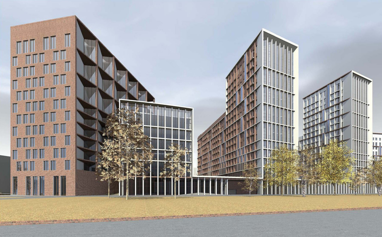
In the vicinity of “Elektrozavodskaya” metro station on the river Yauza's waterfront, the architectural studio “Sergey Skuratov Architects” is designing a new mixed-use development.
05 December 2011
Object
mainImg
Architect:
Sergey Skuratov
Object:
Architectural concept of a mixed-use residential complex on Bolshaya Pochtovaya
Russia, Moscow, Bolshaya Pochtovaya str., vl. 30, 34

Project Team:
Chief of corporate authors: S.Skuratov. Chief project architect: V.Obvintsev; Architect: K.Kharitonova

2011 — 2011

ZAO “Firma ”Gloria"
The construction site consists of three distinct sections: two of them have the shape of long trapezes stretching from the street to the riverside, while the third one is an acute triangle that “cuts in” from the side of the city center. Accordingly, the project implied that it was necessary for the architects to provide for the construction priorities - Sergey Skuratov decided that the trapezes would be used for the residential blocks with large pedestrian yards, while the triangle bordering on the “outside world” would house the office center. The architect plans to place the additional offices in the two surviving factory buildings one of which commands the waterfront, and the other, conversely, faces the Bolshaya Pochtovaya st. Yet another historical building is located in the end of the block under construction – and Skuratov preserves part of it, incorporating the old picturesque tower of square section into the new development.It is this tower that becomes a starting point of its kind in the new architectural system of coordinates.On top of its red-brick facing, Skuratov puts white decorative elements – one may consider this as a micro injection of pseudo-gothic style that the architect employs to accentuate the true age of the tower and at the same time set the palette of the entire development.While the façades of the houses facing the tower are predominantly red, the planes that are turned here at angles are decorated in white.In fact, Sergey Skuratov treats each and every volume of this project as a “rollover”:the houses that look as if they are made of bricks from one standpoint turn out to be plastered from the other side, while those that are initially perceived as snow-white suddenly show an odd dark-red side.On the façades of some houses, Skuratov goes as far as to “marry” his materials – and then they are mixed in the myriads of red and white pixels, or one color goes in “rib” pattern on top of the other, or is present in the shape of deep slants.The altitude difference of the construction site allowed building a two-story underground parking lot under the development.Close to the river side, the development is placed on one-storey stylobate, while the houses on the street side are designed as separately standing ones. The stylobate is decorated in the typical “Skuratov” fashion:its façade is made of wide vertical ridges that afterwards “sprout up” high above on the sidewalls of the residential towers.The office building that is designed on the third, triangular section, also got a very interesting solution.Sergey Skuratov designed it as a “split-off” that in the plan looks like scissors with the blades going off to the sides.


Architect:
Sergey Skuratov
Object:
Architectural concept of a mixed-use residential complex on Bolshaya Pochtovaya
Russia, Moscow, Bolshaya Pochtovaya str., vl. 30, 34

Project Team:
Chief of corporate authors: S.Skuratov. Chief project architect: V.Obvintsev; Architect: K.Kharitonova

2011 — 2011

ZAO “Firma ”Gloria"

05 December 2011

Headlines now
The Heart Lies Within
The second-phase building of the Evgeny Primakov School already won multiple awards while still in the design stage. Now that it’s completed, some unfinished nuances remain – most notably, the exposed ceiling structures, which ideally should have been concealed. However, given the priority placed on the building’s volumetric composition, this does not seem critical. What matters more is the “Wow!” effect created by the space itself.
Magnetic Forces
“Krylatskaya 33” is the first large-scale residential complex to appear amidst the 1980s “micro-districts” that harmoniously coexist with the forests, the river, the slopes, and the sports infrastructure. Despite its imposing scale, the architects of Ostozhenka managed to turn the complex into something that can be best described as a “graceful dominant”. First, they designed the complex with consideration for the style and height of the surrounding micro-districts. Second, by introducing a pause in its tallest section, they created compositional tension – right along the urban planning axis of the area.
Orion’s Belt
The Stone Khodynka 2 office complex, designed by Kleinewelt Architekten for the company Stone, is built with an ergonomic layout following “healthy building” principles: natural light, ventilation, and all the necessary features for an efficient office environment. On the outside, it resembles – like many contemporary buildings – an iPhone: sleek, glowing, glass-and-metal, edges elegantly rounded. Yet, it responds sensitively to the Khodynka context, where the main theme is the contrast between vertical and horizontal lines. The key intrigue lies in the design of the “stylobate” as a suspended passage, leaving the space beneath it open for free pedestrian movement.
Grigory Revzin: “It Was a Bold Statement Made on the Sly. Something Won”
In this article, we discuss the debates surrounding the circus competition and the demolition of the CMEA building with the most renowned architectural critic of our time. A paradox emerges in the process: while nostalgia for the Brezhnev era seems to be in vogue in Russia, a landmark building – the “axis” of the Warsaw Pact – has been sentenced to demolition. Isn’t that strange? We also find out that wow-architecture has made a comeback as a post-COVID trend. However, to make a truly powerful statement, professionals still remain indispensable.