|
Published on Archi.ru (https://archi.ru) |
|
| 05.12.2011 | |
|
Red and White Palindrome |
|
|
Anna Martovitskaya |
|
| Architect: | |
| Sergey Skuratov | |
| Studio: | |
| Sergey Skuratov architects | |
|
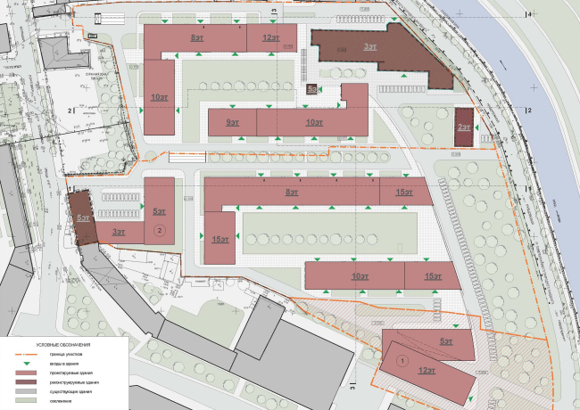
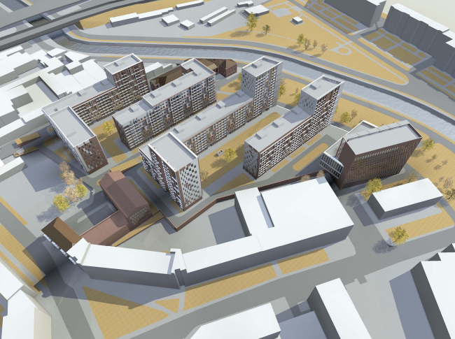
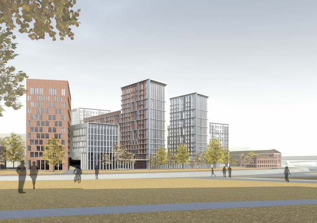
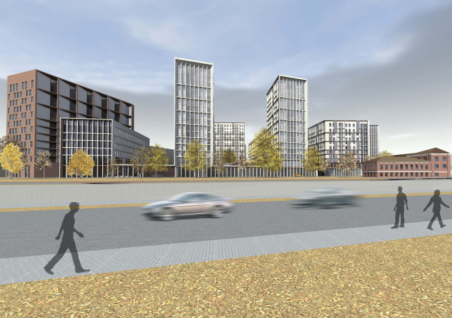
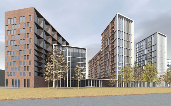
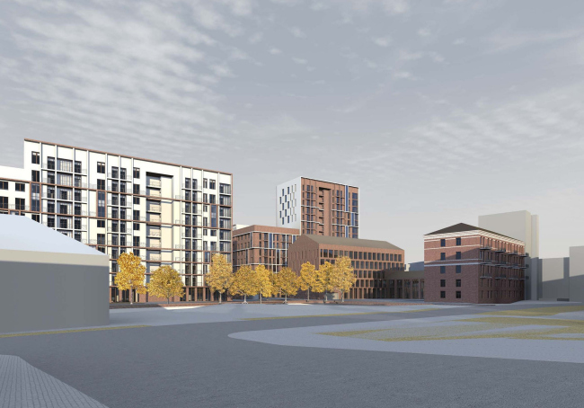
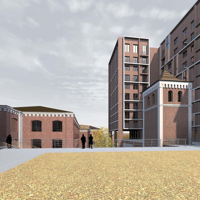
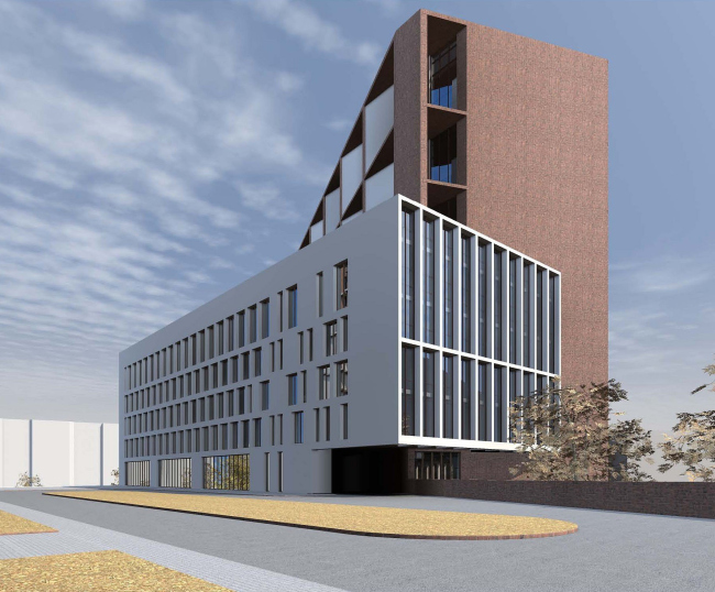
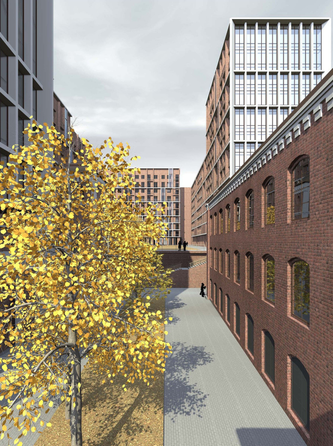
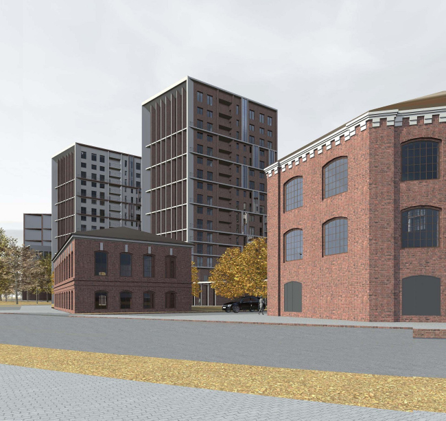
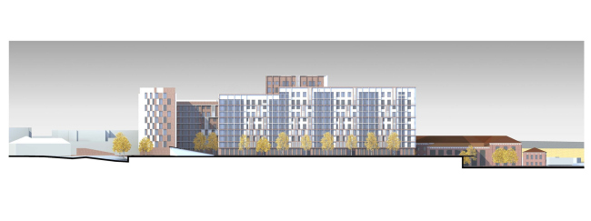
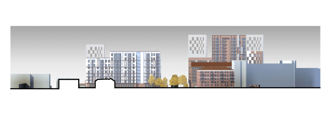
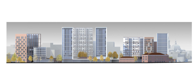
In the vicinity of “Elektrozavodskaya” metro station on the river Yauza's waterfront, the architectural studio “Sergey Skuratov Architects” is designing a new mixed-use development. The construction site consists of three distinct sections: two of them have the shape of long trapezes stretching from the street to the riverside, while the third one is an acute triangle that “cuts in” from the side of the city center. Accordingly, the project implied that it was necessary for the architects to provide for the construction priorities - Sergey Skuratov decided that the trapezes would be used for the residential blocks with large pedestrian yards, while the triangle bordering on the “outside world” would house the office center. The architect plans to place the additional offices in the two surviving factory buildings one of which commands the waterfront, and the other, conversely, faces the Bolshaya Pochtovaya st. Yet another historical building is located in the end of the block under construction – and Skuratov preserves part of it, incorporating the old picturesque tower of square section into the new development.It is this tower that becomes a starting point of its kind in the new architectural system of coordinates.On top of its red-brick facing, Skuratov puts white decorative elements – one may consider this as a micro injection of pseudo-gothic style that the architect employs to accentuate the true age of the tower and at the same time set the palette of the entire development.While the façades of the houses facing the tower are predominantly red, the planes that are turned here at angles are decorated in white.In fact, Sergey Skuratov treats each and every volume of this project as a “rollover”:the houses that look as if they are made of bricks from one standpoint turn out to be plastered from the other side, while those that are initially perceived as snow-white suddenly show an odd dark-red side.On the façades of some houses, Skuratov goes as far as to “marry” his materials – and then they are mixed in the myriads of red and white pixels, or one color goes in “rib” pattern on top of the other, or is present in the shape of deep slants.The altitude difference of the construction site allowed building a two-story underground parking lot under the development.Close to the river side, the development is placed on one-storey stylobate, while the houses on the street side are designed as separately standing ones. The stylobate is decorated in the typical “Skuratov” fashion:its façade is made of wide vertical ridges that afterwards “sprout up” high above on the sidewalls of the residential towers.The office building that is designed on the third, triangular section, also got a very interesting solution.Sergey Skuratov designed it as a “split-off” that in the plan looks like scissors with the blades going off to the sides. NoneNoneNoneNoneNoneNoneNoneNoneNoneNoneNoneNoneNoneNone |
|
