По-русски

A square symphony

Playing with scale and simple forms, Nikolai Lyzlov managed to transform atrium of an office building into something Cyclopean and bewitching, a fantasy of Piranesi. They planned to realize the building, but the crisis changed plans and probably it will remain on paper. It would be interesting to see it constructed. However the project seems to be interesting on paper as well. Like Piranesi’s.

29 January 2009
Object
mainImg
Architect:
Nikolas Lyzlov
Object:
Project of a mixed-use complex with apartments and an underground car-parking (in the place of "President-service, "Mirax-Plaza" complex)
Russia, Moscow

Project Team:
Lyzlov Nikolai Vsevolodovich, Lyzlov Nikolai Nikolaevich, Ermolaeva Olesya Nikolaevna, Chepurnoi Evgeny Aleksandrovich

6.2007 — 8.2008

Client: ZAO "International Centre Development"

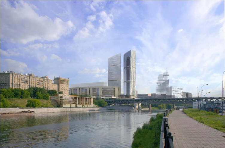
This project was aimed to replace the “President-service” building constructed in 1970 on the site, surrounded by “Mirax-Plaza” complex from the three sides. The presidential service has already moved to the new building, and the place was supposed to be occupied by another office part of the ”Plaza”, under the contract with “Mirax”. It took them much time to choose the project chose long, about year and a half. Among the earlier variants there were the two towers similar to skyscrapers of “Plaza”. Then, there would grow a glass forest, mini-City, at the corner of Kutuzovaka and the Third Ring. But the two last projects were designed by Alexander Asadov and Nikolai Lyzlov, and the final (at the moment when the crisis changed plans of “Mirax”) was Nikolai Lyzlova's project.

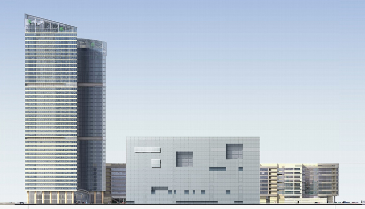
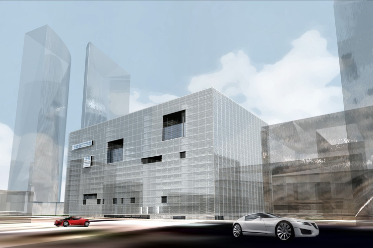
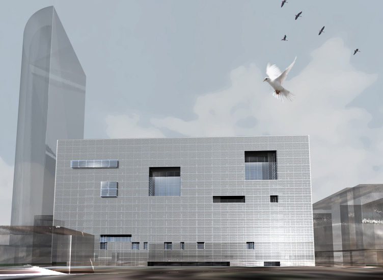
The building which would replace "President-service" is a simple and large parallelepiped with a large inner yard. Outside it is covered by a silvery metal grid, Nikolai Lyzlov said he was inspired by the building of embassy of the Netherlands in Berlin, constructed by Rem Koolhaas. The grid is small, and despite some transparency, the facade is absolutely covered, "wrapped up". The effect of protective green net which is used when a building is under reconstruction – it is vaguely seen the inside.

The three walls turned to “Mirax-Plaza” buildings are entirely covered and become an absolutely neutral background for Sergey Kiselyov's more active stone facades. The fourth, the only clear one, which views Kulneva street, and is front has assmetrical rectangular gaps in its new “skin”. They are few, most of them are niches, but there are two shiny glass ledges-oriel windows. Instead of the texture, there are three: net, gap and niche. Together they remind the “sea-fight” game increased many times and joints of grid planes are cells here. The smallest "ship" is the gap of one cell (height of 1storey), and the biggest one is four to four. Lower a few cells merge into horizontal and form entrances. They give the image of scale of the building which, hanging over the entrance looks absolutely cyclopean. The building is a huge package. What is there inside it?

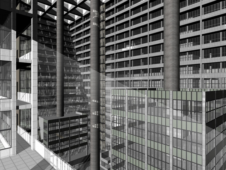
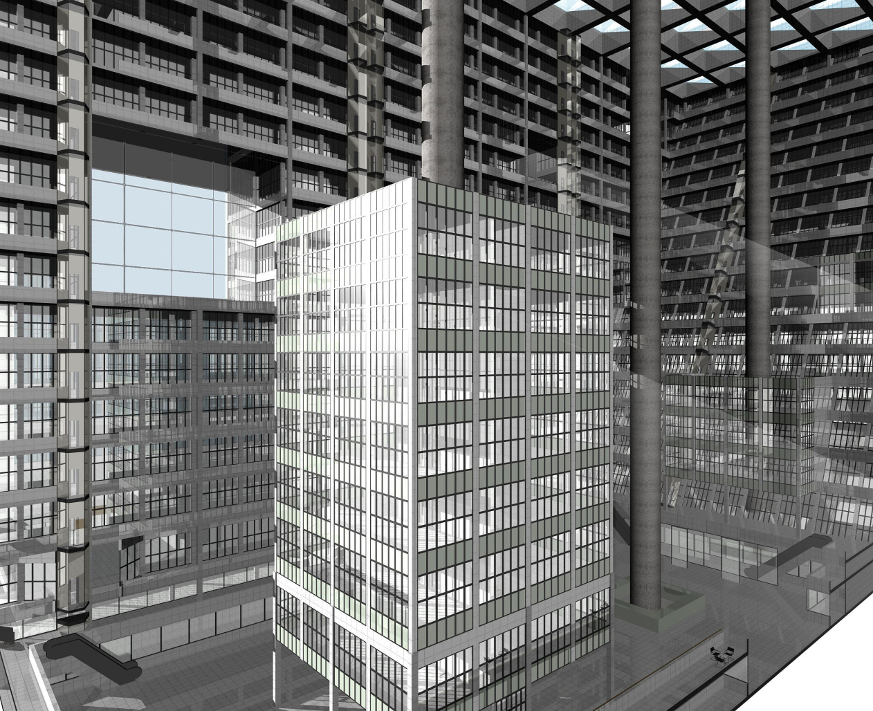
Everything is right, the key is inside. There is a huge atrium, interior, which Nikolai Lyzlov calss “Piranesian”. Must say, the common words “atrium” and "interior" are strange here. But “Piranesian” is fine. Here is the effect is similar to fantastic Piranesi work. It is important, that it is achieved purposely and as a result it is interesting to observe what creates the scarily romantic image within minimalist and modernist architecture.

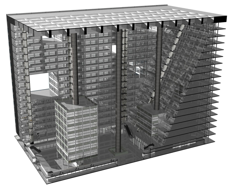
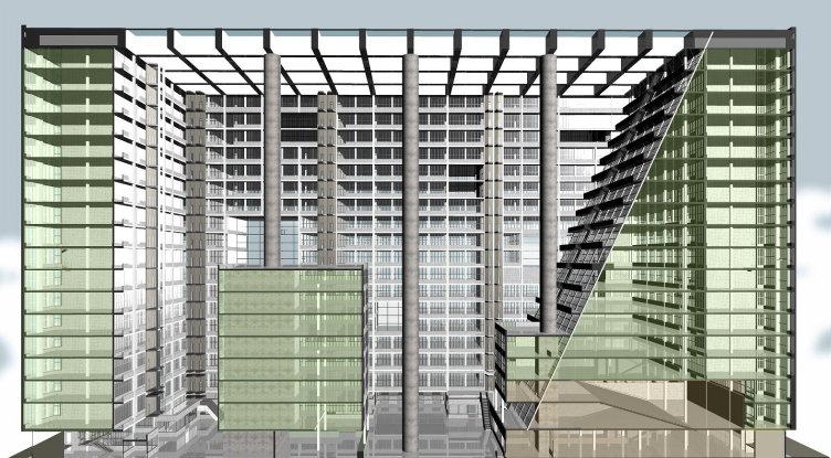
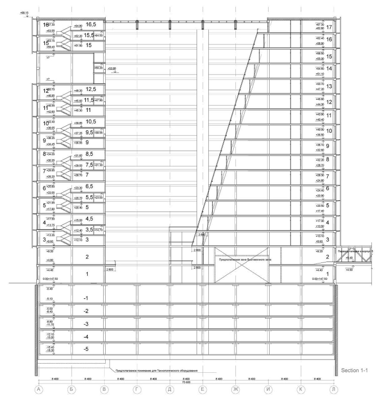
First of all, the key is its size. There is no net inside and all the 16 storeys are seen and are lined by loggias. This is not an atrium anymore but the indoor area, a part of the city, like a snail retracted into its shell. In general, 16 storey for modern Moscow is a quite a norm. Only when they are placed like mushrooms or boards around the city, when it is possible to look at them from afar, and be interested only in its entranced being close. The story is different here, the space is enclosed and covered outside, the scale is concentrated and makes respect it. We are used to consider a space with ceiling an interior, but it is too huge for interior. The "ceiling" is lined into cells by deep concrete edges, sized about 8 to 8 m each and each could be a room.

Cyclopean roof is supported by the three round columns, each is 3 m in diameter, anyway they look thin on the height of 16 storeys. Columns are built in a line, for some reason, resemble lamp posts – then it is obvious how large they are. But the strongest method, in my opinion, is that the two columns are partially "deepened” into office floors. To one of them stuck a 7storey rectangular beehouse, it is thread right on the column and is hanging on it. The building is hanging on the column and surrounded by the city – a city in city. The bottom part of other column is buried in the mass of storeys which diagonally, like an amphitheater, extend from top to bottom, taking additional space from the atrium.

The giant, closed and cellular space is supposed to be impressing – want to see it constructed at least to see and feel what it is like inside. However, it is enough to have images, moreover, its graphic variant has an additional, “Piranesian” charm (we know engravings by Piranesi mostly). Anyway it is obvious the project was designed to be constructed but can exist virtual world – it has large "paper", and so comprehensive, potential.

First, the new building is absolutely unlike the nearby building of “Mirax-plaza” by Sergey Kiselev' and Sergey Lyzlov said the both authors were happy with the fact. In a way, it is opposite to “Plaza” – it would be more like a palace, despite the intelligent modesty of Kiselev’s project by standards of Moscow last year. ”Mirax-plaza” is a modest project, and the one in its yard is minimalist. It looks like a declaration of minimalism, as well as many other projects by Nikolai Lyzlov. But that is not all.

Second, the project is similar to the building "President-service" of 1970 (one can assure, the last is not demolished yet). It is rectangular, with the same yard, with the same stripes of windows. But, the new project is larger, the yard is roofed, windows are replaced with balconies, covered with the net, but the origin is seen. Even not knowing that Nikolai Lyzlov is a sincere admirer of architecture of 1970s, a glance at the project gives a thought that the architect decided to construct in the place of "President-service" its good follower.

The space of atrium can be considered as a plastic reflection on the theme of modernist architecture and modern city – this covered yard is similar to a piece of street taken "separately", compressed, integrated – it gives emotions. At some point this is a performance – a banal comparison now, but proper here (unlike in many others). And the play is obviously about a modernist city, and characteristic for an anti-utopia horror the author makes into one of the heroes of the work (may be the main). Anyway, this is not a play, but an architectural fancy. And it takes us back from modernism to Piranesi.

The third and the main, in my opinion, feature of the project is its latent (or hidden) classic image. Huge round supports are similar to columns, cells in the ceiling remind caissons, and balconies stepping down the south end are like an amphitheater. Certainly, they are far from prototypes (if there are such), but they intensify impression. Because a pipe for communications and beams of the atrium can be of size, but a 16storeyed column or a room-sized caisson do is suppresses.

Two things come to mind. Architecture of 1970s so beloved by Nikolai Lyzlov were developing from minimalism and brutalism to classicism , but very original. For example, alike square caissons (much smaller) can be found in pavilion of the Lenin steam locomotive constructed by Leonid Pavlov.

And that Russian avant-guard in the end of 1920s was engaged in geometrical clearing and reconsideration of classical forms. Small elements grew and abstracted up to full (or nearly full) unrecognizability, opening geometrical nature.

It seems to me, in the project of Nikolai Lyzlov something is similar – some movement towards to a side where the shadow lays. However, not an image of a church or column is being reconsidered, and romantic spirit of Piranesi’s engravings appears to be very close to modern architecture.


Architect:
Nikolas Lyzlov
Object:
Project of a mixed-use complex with apartments and an underground car-parking (in the place of "President-service, "Mirax-Plaza" complex)
Russia, Moscow

Project Team:
Lyzlov Nikolai Vsevolodovich, Lyzlov Nikolai Nikolaevich, Ermolaeva Olesya Nikolaevna, Chepurnoi Evgeny Aleksandrovich

6.2007 — 8.2008

Client: ZAO "International Centre Development"

29 January 2009

Headlines now
The Golden Crown
The concept for a dental clinic in Yekaterinburg, developed by CNTR Studio, revolves around the idea of a “mouth full of gold”: pristine white porcelain stoneware walls are complemented by matte brass details. To avoid an overly literal interpretation, the architects focused on the building’s proportions, skillfully navigating between sunlight requirements and fire safety regulations.
Flexibility and Integration
Not long ago, we covered the project for the fourth phase of the ÁLIA residential complex, designed by APEX. Now, we’ve been shown different fence concepts they developed to enclose the complex’s private courtyards, incorporating a variety of public functions. We believe that the sheer fact that the complex’s architects were involved in such a detail as fencing speaks volumes.
A Step Forward
The HIDE residential complex represents a major milestone for ADM architects and their leaders Andrey Romanov and Ekaterina Kuznetsova in their quest for a fresh high-rise aesthetic – one that is flexible and layered, capable of bringing vibrancy to mass and silhouette while shaping form. Over recent years, this approach has become ADM’s “signature style”, with the golden HIDE tower playing a pivotal role in its evolution. Here, we delve into the project’s story, explore the details of the complex’s design, and uncover its core essence.
Gold in the Sands
A new office for a transcontinental company specializing in resource extraction and processing has opened in Dubai. Designed by T+T Architects, masters of creating spaces that are contemporary, diverse, flexible, and original, this project exemplifies their expertise. On the executive floor, a massive brass-clad partition dominates, while layered textures of compressed earth create a contextually resonant backdrop.
Layers and Levels of Flight
This project goes way back – Reserve Union won this architectural competition at the end of 2011, and the building was completed in 2018, so it’s practically “archival”. However, despite being relatively unknown, the building can hardly be considered “dated” and remains a prime example of architectural expression, particularly in the headquarters genre. And it’s especially fitting for an aviation company office. In some ways, it resembles the Aeroflot headquarters at Sheremetyevo but with its own unique identity, following the signature style of Vladimir Plotkin. In this article, we take an in-depth look at the United Aircraft Corporation (UAC) headquarters in the Moscow agglomeration town of Zhukovsky, supplemented by recent photographs from Alexey Naroditsky – a shoot that became only recently possible due to the fact that improvements were finally made in the surrounding area.
Light and Shadow
In this article, we delve into the architectural design of the “Chaika” house by DNK ag architects, which was recently completed in 2023 as part of the collection of signature designs at ZILArt. As is well-known, all the buildings in this complex follow a design code, yet each one is distinct. This particular building stands out not only for its whiteness and minimalism but also for the refined use of a limited number of techniques that, together, create what can confidently be called synergy.
Casus Novae
A master plan was developed for a large residential area with a name of “DNS City”, but now that its implementation began, the plan has been arbitrarily reformatted and replaced with something that, while similar on the surface, is actually quite different. This is not the first time such a thing happens, but it’s always frustrating. With permission from the author, we are sharing Maria Elkina’s post.
Treasure Hunting
The GAFA bureau, in collaboration with Tegola and Arkhitail, organized an expedition to the island of Kilpola in Karelia as part of Moskomarkhitektura’s “Open City” festival. There, amidst moss and rocks, the students sought answers to questions like: what is the sacred, where does it dwell, and what sustains it? Assisting the participants in this quest were landscape engineer Evgeny Levin, artist Nicholas Roerich, a moose, and the lack of cellular connection. Here’s how the story unfolded.
Depths of the Earth, Streams of Water
In the Malaya Okhta district, the Akzent building, designed by Stepan Liphart, was constructed. It follows a classic tripartite structure, yet it’s what you might call “hand-drawn”: each façade is unique in its form and details, some of which aren’t immediately noticeable. In this article, we explore the context and, together with the architect, delve into how the form was developed.
Fir Tree Dynamics
The “Airports of Region” holding is planning to build an airport in Karachay-Cherkessia, aiming to make the Arkhyz and Dombay resorts more accessible to travelers. The project that won in an invitation-only competition, submitted by Sergey Nikeshkin’s KPLN, blends natural imagery inspired by the shape of a conifer seed, open-air waiting spaces, majestic large trees, and a green roof elevated on needle-like columns. The result is both nature-inspired and WOW.
​A Brick Shell
In the process of designing a clubhouse situated among pine trees in a prestigious suburban area near Moscow, the architectural firm “A.Len” did the façade design part. The combination of different types of brick and masonry correlates with the volumetric and plastique solutions, further enhanced by the inclusion of wood-painted fragments and metal “glazing”.
Word Forms
ATRIUM architects love ambitious challenges, and for the firm’s thirtieth anniversary, they boldly play a game of words with an exhibition that dives deep into a self-created vocabulary. They immerse their projects – especially art installations – into this glossary, as if plunging into a current of their own. You feel as if you’re flowing through the veins of pure art, immersed in a universe of vertical cities, educational spaces – of which the architects are true masters – and the cultural codes of various locations. But what truly captivates is the bold statement that Vera Butko and Anton Nadtochy make, both through their work and this exhibition: architecture, above all, is art – the art of working with form and space.
Flexibility and Acuteness of Modernity
Luxurious, fluid, large “kokoshniks” and spiral barrel columns, as if made from colorful chewing gum: there seem to be no other mansion like this in Moscow, designed in the “Neo-Russian-Modern” style. And the “Teremok” on Malaya Kaluzhskaya, previously somewhat obscure, has “come alive with new colors” and gained visibility after its restoration for the office of the “architectural ecosystem” as the architects love to call themselves. It’s evident that Julius Borisov and the architects at UNK put their hearts into finding this new office and bringing it up to date. Let’s delve into the paradoxes of this mansion’s history and its plasticity. Spoiler: two versions of modernity meet here, both balancing on the razor’s edge of “what’s current”.
Yuri Vissarionov: “A modular house does not belong to the land”
It belongs to space, or to the air... It turns out that 3D printing is more effective when combined with a modular approach: the house is built in a workshop and then adapted to the site, including on uneven terrain. Yuri Vissarionov shares his latest experience in designing tourist complexes, both in central Russia and in the south. These include houseboats, homes printed from lightweight concrete using a 3D printer, and, of course, frame houses.
​Moscow’s First
“The quality of education largely depends on the quality of the educational environment”. This principle of the last decade has been realized by Sergey Skuratov in the project for the First Moscow Gymnasium on Rostovskaya Embankment in the Khamovniki district. The building seamlessly integrates into the complex urban landscape, responding both to the pedestrian flow of the city and the quiet alleyways. It skillfully takes advantage of the height differences and aligns with modern trends in educational space design. Let’s take a closer look.
Looking at the Water
The site of Villa Sonata stretches from the road to the water’s edge, offering its own shoreline, pier, and a picturesque river panorama. To reveal these sweeping views, Roman Leonidov “cut” the façade diagonally parallel to the river, thus getting two main axes for the house and, consequently, “two heads”. The internal core – two double-height spaces, a living room and a conservatory, with a “bridge” above them – makes the house both “transparent” and filled with light.
The White Wing
Well, it’s not exactly white. It’s more of a beige, white-stone structure that plays with the color of limestone – smoother surfaces are lighter, while rougher ones are darker. This wing unites various elements: it absorbs and interprets the surrounding themes. It responds to everything, yet maintains a cohesive expression – a challenging task! – while also incorporating recognizable features of its own, such as the dynamic cuts at the bottom, top, and middle.
Urban Dunes
The XSA Ramps team designed and built a three-part sports hub for a park in Rostov-on-Don, welcoming people of all ages and fitness levels. The skate plaza, pump track, and playground are all meticulously crafted with details that attract a diverse range of visitors. The technical execution of the shapes and slopes transforms this space into a kind of sculptural composition.
Proportional Growth
The project for the fourth phase of the ÁLIA residential area has been announced. The buildings are situated on an elongated plot – almost a “ray” that shoots out from the center of the area towards the river. Their layout reflects both a response to Moscow’s architectural preferences over the past 15 years, shifting “from blocks to towers”, and an interpretation of the neighboring business park designed by SOM. Additionally, the best apartments here are not located at the very top but closer to the middle, forming a glowing “waistline”.
The “Staircase” Building
In designing the “Details” residential complex in New Moscow, Rais Baishev spiced up the now-popular Moscow theme of a “courtyard” building with an idea drawn from the surrealist drawings by Maurits Escher. He envisioned the stepped silhouettes and descending slopes as a metaphysical mega-staircase, creating a key void within the courtyard that gave the project an internal “spine”. This concept is felt both in the building’s silhouette and on its façades.
Projection of the Quarter
No one doubted that the building that Vladimir Plotkin designed as part of the “Garden Quarters” would be the most modernist of all. And it turned out just that way: while adhering to the common design code, the building successfully combines brick and white stone, rhythmically responding to the neighboring building designed by Ostozhenka, yet tactfully and persistently making a few statements of its own. This includes the projection of the ideal urban development composition “14–9–6”, which can be found right next door, mathematical calculations, including those for various types of terraces (and perhaps the only reminder of the Soviet past of the Kauchuk rubber factory!), and the white “cross-stitch” pattern of the façade grid.
Domus Aurea
In this issue, we examine the “Tessinsky-1” house, designed by Sergey Skuratov and completed in 2023. Located in the middle of the Serebryanicheskaya Embankment district, at the intersection of its main streets, this house assumes a sort of “nodal” role: it not only responds to everything around it and preserves many memories of the former EMA factory within itself, but it weaves all this into a newly directed pattern, reconciling bright “gold” and dark-colored brick, largely with the help of the new, modern-yet-archaic Columba brick, which, come to think about it, is the most precious element here.
The Chimney of Nikola-Lenivets
In this issue, we are examining the “Obelisk House” designed by KATARSIS and built for the Arkhstoyanie 2023 festival. However, it was only finished later on, and this is why we are examining it now. It seems to us that after the “Obelisk House” appeared in Nikola-Lenivets, a dialogue and a few inner connections appeared between the temporary structures built here. These houses no longer look like “accidental neighbors”, more of which below.
​Periscope by the Bay
The jury awarded the second place in the competition for a public and cultural center in Petropavlovsk-Kamchatsky to the companies GORA (“Mountain”) and M4. In the consortium’s proposal, the building resembles a sperm whale with a calf swimming next to it or a periscope, whose lenses capture the most spectacular views from the surrounding landscape.
From Arcs to Dolmens
While working on the competition project for Petropavlovsk-Kamchatsky, ASADOV Architects prioritized the value of the natural and urban environment, aiming to preserve the balance of the location while minimizing the resemblance of the volume that they designed to a “traditional building”. The task was challenging, and the architects created three versions, one of which having been developed after the competition, where their main proposal took third place. However, the point of interest here is not the competition result but the continuity of creative thinking.
Hide and Seek
The ID Moskovskiy house, designed by Stepan Liphart in St. Petersburg, in the courtyards near Moskovskiy Avenue beyond the Obvodny Canal and recently completed, is notable for several reasons. Firstly, it has been realized with considerable accuracy, which is particularly significant as this is the first building where the architect was responsible not only for the facades but also for the layouts, allowing for better integration between the two. On the other hand, this building is interesting as an example of the “germination” of new architecture in the city: it draws on the best examples from the neighborhood and becomes an improved and developed sum of ideas found by the architect in the surrounding context.
The Big Twelve
Yesterday, the winners of the Moscow Mayor’s Architecture Award were announced and honored. Let’s take a look at what was awarded and, in some cases, even critique this esteemed award. After all, there is always room for improvement, right?
Above the Golden Horn
The residential complex “Philosophy” designed by T+T architects in Vladivostok, is one of the new projects in the “Golubinaya Pad” area, changing its development philosophy (pun intended) from single houses to a comprehensive approach. The buildings are organized along public streets, varying in height and format, with one house even executed in gallery typology, featuring a cantilever leaning on an art object.
Nuanced Alternative
How can you rhyme a square and space? Easily! But to do so, you need to rhyme everything you can possibly think of: weave everything together, like in a tensegrity structure, and find your own optics too. The new exhibition at GES-2 does just that, offering its visitor a new perspective on the history of art spanning 150 years, infused with the hope for endless multiplicity of worlds and art histories. Read on to see how this is achieved and how the exhibition design by Evgeny Ace contributes to it.
Blinds for Ice
An ice arena has been constructed in Domodedovo based on a project by Yuri Vissarionov Architects. To prevent the long façade, a technical requirement for winter sports facilities, from appearing monotonous, the architects proposed the use of suspended structures with multidirectional slats. This design protects the ice from direct sunlight while giving the wall texture and detail.